

Family life. Family drama. Family secrets. The Deadliest Bouquet #1, available in August from Image Comics, is an emotionally driven drama about grief, choices, and family relationships.
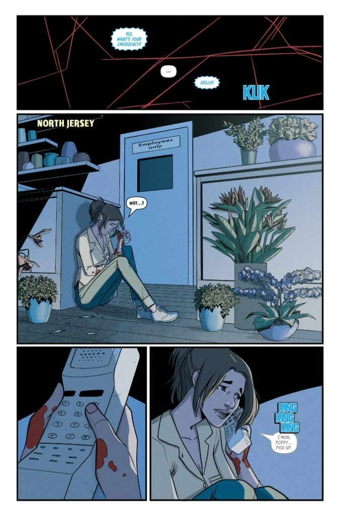
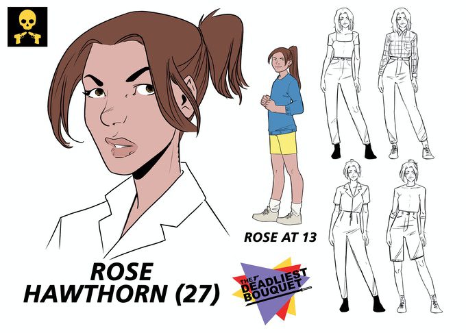
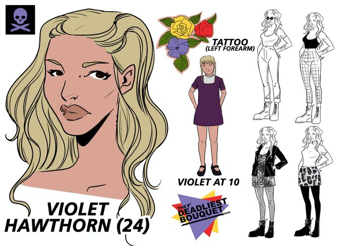
Set in North Jersey in 1998, The Deadliest Bouquet opens with a tragedy followed by a heated homecoming. Three sisters, Rose, Poppy, and Violet, all return to their childhood home and are forced to confront their past after their mother is murdered. Suspicious police detectives, concerned extended family members, and lowlifes in bars, all play second fiddle to the three central sisters. They are dynamic characters who lead the narrative with visual flair.
Much of the story amounts to nothing more than a single room family drama. It has a knowingly beautiful pomposity that would fit snugly into an episode of Desperate Housewives, while also containing a certain visual dynamism that is unique to comic books. The characters are larger than life and the power play between the sisters and supporting cast is portrayed not only through the playful script but also the clever composition of the panels and pages. Rose, Poppy, and Violet fight for dominance on the page, sidelining the majority of the other characters, but occasionally the tense standoff between the sisters is broken by a well placed extra who suddenly draws the reader’s curiosity or attention.
Erica Schultz’ script is packed with mystery and tension. She slowly draws out the backstory, linking the present day with the characters’ histories. This allows artist Carola Broelli to use some wonderful transitions on the page, leaping back and forth in time. The shift from the present of the narrative to the past is obvious but not jarring; the story flows back and forth smoothly like a well oiled machine. The reader never becomes lost between the time periods, thanks in part to the color palettes used by Gab Contreras, and this allows the creators to control the secret at the heart of the story. The characters grow naturally before the readers eyes as the unravelling narrative gives context to the central characters lives and personalities.
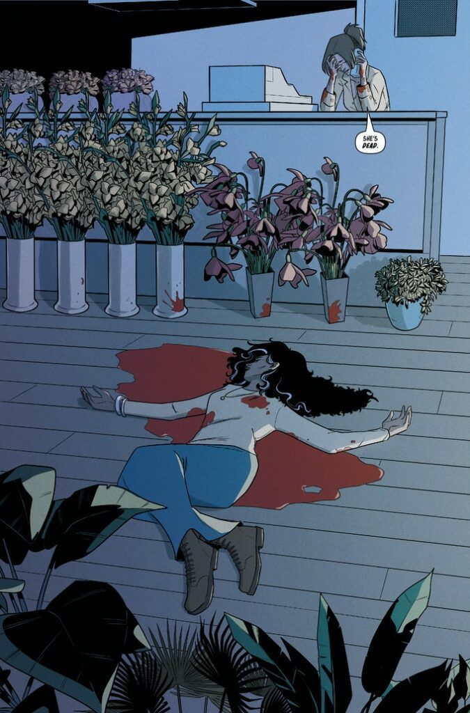
Broelli’s artwork is concise, with strong defining lines and shapes. There are no superfluous backgrounds or details. As is the way with comics, everything serves a purpose whether it’s simple scene setting or mood building. Broelli controls the reader using a minimal amount of information and her grasp of negative space really pays off. Moments of importance stand out on the page and Broelli showcases the strong female characters with striking images that break the rigid panels, making them the readers focus of attention.
One of the highlights of The Deadliest Bouquet is the lettering provided by writer Erica Schultz. The carefully concise script gives Schultz a lot of control over placement and composition for the speech balloons and caption boxes. The speech enhances the visuals while also providing pacing direction for the narrative. The timing for the arguments and punchlines to the jokes comes from the careful placed speech balloons, and throughout The Deadliest Bouquet, the timing is impeccable. Add to that the superb addition of symbols in the caption boxes, allowing for complex conversations to carry across pages and scenes like voice overs in a television show, and you have a wonderful example of lettering serving a narrative.
The Deadliest Bouquet is advertised as 90s nostalgia mixed with an espionage thriller, however that wasn’t my experience of this first issue. Perhaps because this was originally produced via Kickstarter as a single, 120 page, graphic novel, and lasting impressions may vary between readers. Reading this single, first issue, it is easy to overlook the historical setting as you get swept away by the family drama unfolding before you. Any nostalgia within the comic is background at best, unlike a certain Netflix television show that wears its historical setting like a mask to hide the disfigured narrative behind it. Schultz and Borelli are, at least in this first issue, more interested in telling a story than making their readers gush over memory lane.
As an opening issue to a series, The Deadliest Bouquet is a sure-fire hit. It is engaging, has natural and relatable characters, and uses the medium to great effect. The complexity of the comic is buried in the narrative and the artwork is deceivingly straightforward, drawing the reader into this dysfunctional family and the world they inhabit. If you missed the Kickstarter campaign, then this new release through Image Comics is the perfect way to catch up.