Knights Temporal #3 hits your local comic book store on September 25, but thanks to AfterShock Comics, Monkeys Fighting Robots has an exclusive four-page preview to share with you.
The series is by Cullen Bunn and Fran Galán, with letters by Dave Sharpe. It’s the story of a medieval knight who finds himself shattered across time and space after an encounter with an evil necromancer. The knight exists over and over again in different eras, and in each one he seeks to stop the villain’s evil plans.
About Knights Temporal #3: Hunting a sorcerer is tricky business under the best of circumstances. But Auguste de Riviere has found his crusade — and his very existence — scattered across countless times and places. Now, his prey has unleashed the most unexpected of threats. Auguste is confronted by…Auguste?
Bought to life by AfterShock alum Cullen Bunn (UNHOLY GRAIL, DARK ARK, BROTHERS DRACUL, WITCH HAMMER) with art from Fran Galán (Tales from the Suicide Forest, Unleash), this is time travel at its most beguiling!
“KNIGHTS TEMPORAL is a perfect pull list addition for readers who are looking for something unlike anything else they’ve read. It’s a book with lots of action and humor and horror, but it will challenge the readers, too. And the characters will appeal to readers in a big way, I think.” – Series writer Cullen Bunn
Take your first look at KNIGHTS TEMPORAL #3:
Are you reading KNIGHTS TEMPORAL? Sound off in the comments!
A comparison of personalities between the central cast member’s leads the plot into new territory in this week’s Postal Deliverance #3 published by Top Cow. The writer uses tragedy to stir old emotions and to get to the heart of the characters.
Postal Deliverance is a close examination of the family and the effects of separation and loss. It is as emotionally moving as it is disturbingly violent. Since its inception, Postalhas grown as a comic and with this maturity comes difficult questions, not all of them with answers.
Postal Deliverance #3 Credit: Top Cow Comics
An Emotional Crutch
There’s an election coming to Eden, heralding in a turbulent period of change. Meanwhile Laura is rediscovering her maternal instincts and the cycle of violence begins again.
The third issue in this series continues to compare the characters of Laura and Mark. Bryan Hill wants to illustrate the difficulties in escaping from your past and starting a new life. At the end of the previous run Laura managed to escape the confines of Eden but, as Hill demonstrates in this issue, she has not been able to get away from herself.
Hill gives each of the two central characters a foil to spa with, allowing the reader insight into the minds of the characters. For Laura this is Magnum who acts almost like her conscience as she argues with herself over her interaction with Pascal. Through their conversations Hill is able to portray Laura’s anxieties and the real reason she avoids getting involved with Pascal, until outside interference makes it impossible for her to stay away.
Hill uses Maggie in a similar way for developing Mark’s character. She stands on the side-line, indicating to Mark aspects of the world around him as he tries to reconcile one side of his life with the other; being a father and being the Mayor of Eden.
Postal Deliverance #3 Credit: Top Cow Comics
Deliverance From Violence
The art has a deliberate realist style adding to the human drama that is unfolding. Raffaele Ienco uses bleached coloring across most of the pages, serving two purposes. Firstly, it adds to the realism of the scenes. Ienco has used natural colors to make the reader more comfortable and settle into this world. The character driven plot requires a certain level of believability and by making the images as realistic as possible, the emotional drama is heightened and more identifiable.
The second aspect of the coloring is that it represents where the two central characters stand, from an emotional perspective. The blend of oranges and muted yellows creates an autumnal feel throughout reflecting the later stages of Laura and Marks relationship with Eden. They have moved beyond the glorious summer and are now looking for a way to quietly retire from their responsibilities. The coloring gives the comic an enduring sense of maturity which in turn is reflected in the characters and plot.
Ienco’s style serves the characters well, bringing out the strong emotional aspects of their personalities. He produces wonderfully detailed faces, packed with expression and emotion. The characters are brought to life via the artist’s attention to detail and choice of viewpoints. The reader cannot escape from the emotional impact of, for example, Pascal’s distraught face when Ienco illustrates it from a low angle, filling the panel. A series of cut away shots, jumping from one character to the next, also has the same emotional impact. The conflicting interests of the characters are illustrated perfectly by three contrasting facial expressions.
There is a complex narrative at play throughout the entire issue. Often the words that the characters say contradict their actions and being able to read the underlying truth is not always straight forward. Troy Peteri’s placement of the speech balloons make a big difference to the pacing of each scene, thereby allowing the reader the right amount of time to digest the interplay between images and speech.
Peteri uses joined and connected speech balloons to slow down the flow of conversation, adding natural pauses. This gives the impression that the cast members are taking their time with the speech, constructing sentences carefully to make a point.
Postal Deliverance #3 Credit: Top Cow Comics
Conclusion
Issue three of Postal Deliverance is a complicated family drama with a handful of shocking moments. The Mother/Son relation between Laura and Mark is explored at great length despite the two characters never sharing a scene. This emotional drama is captivating and the sense of loss suffered by a number of the character’s feels very real. There is a rawness to the emotional context and the heart of the story is a deep seated, painful longing for a lost family.
After the first two issues, Hill, Ienco and Peteri pull back from the violence and display the aftereffects of years of ingrained cruelty. The emotional baggage and mental traumas dictate the central character’s actions despite themselves and ultimately creates a surprisingly moving story. The sub title for this series holds dominance over the narrative but, in the end, can either Laura or Mark find their deliverance from Eden?
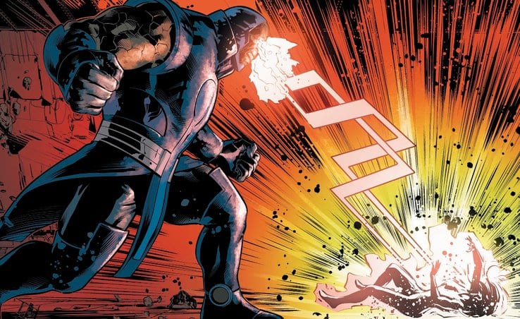
If you haven’t read Justice League Odyssey #12, turn back now as there will be spoilers ahead.
In the last issue, Darkseid used his Omega Beams to turn Green Lantern Jessica Cruz into ash. This shocking ending was a gut punch to fans of the character. The biggest question is, what happens next? There may be a few clues in the preview below.
Justice League Odyssey #13 hits your local comic book shop on September 11, but thanks to DC Comics, Monkeys Fighting Robots has an exclusive five-page preview for you to check out.
The book is written by Dan Abnett, with art by Will Conrad, Cliff Richards helped with finishes, Rain Beredo handled colors, and letters are by Andworld Design. Conrad and Beredo worked on the main cover, and Lucio Parrillo worked on the variant.
About the issue: Sepulkore is activated! The entire Ghost Sector has been imprisoned and enslaved as a new realm of Apokolips, with Darkseid as its supreme ruler! Returned to power, with reborn New Gods at his side and the Ghost Sector as an implacable fortress, Darkseid sets his sights on the remaining universe! Can anyone stand in his way? Where are Justice League Odyssey? And what are the shocking identities of the heralds who now do Darkseid’s malevolent bidding?
Do you have Justice League Odyssey on your pull list? Let us know what you think of the book in the comment section below.
CHECK OUT THE JUSTICE LEAGUE ODYSSEY #13 PREVIEW BELOW
Marvel Comic’s GHOST-SPIDER ANNUAL #1 out this week, packs panel hopping action and a heart-filled message of loving yourself all in one package.
With the story taking place on Earth-616 (Marvel’s main earth), Ghost-Spider Annual #1 follows Ghost-Spider as she encounters classic X-Men villain Arcade, as he sets a trap to catch Spider-Man. Instead of catching the main web-slinging hero, he instead entangles Ghost-Spider in his game of life or death, thus prompting her to engage in a gauntlet of Spider-Man’s villains to save a ‘damsel in distress.’ With this standalone plot there is no need to read Ghost-Spider #1, but here is our review to catch you up.
Interior Art by Pere Pérez, Colors by Rachelle Rosenberg
Web of Tales
With Ghost-Spider narrating the important aspects on why she is on earth, writer Vita Ayala wastes no time throwing the titular character in Arcade’s gauntlet. With the promise, if she can make it through the villains while saving the citizen, she can go free. The best part of Arcade’s plan isn’t intended for Ghost-Spider. It was set up for Spider-Man years prior, and she happens to fall into the trap. The bonus, is Arcade constantly calling her Spider-Man since it is pre-recorded.
Ayala bookends the story incredibly well, starting with Gwen declining an invitation to hang out, then ending with her meeting with those that invited her. With her inner-monologue, Ayala shows Ghost-Spider at her most vulnerable, continually doubting herself, but having the intentions to help others no matter the danger. By the end of her adventure, she realizes that “People deserve to feel happy and be safe.” Then realizes that she can’t keep isolating herself, as a hero she can’t do it all alone
Great use of paneling and colors for a unique fight with The Lizard. Interior Art by Pere Pérez, Colors by Rachelle Rosenberg
Web of Art
As Ghost-Spider Annual #1 is heavy in action scenes, the art needed to match this tone and pace, which artist Pere Pérez does magnificently. Each fight is styled or drawn different to make them stand out, with the Lizard fight (shown above) being the most uniquely paneled, with great use of colors. The amazing panels aren’t limited to the fights. Pérez draws mundane action with an impact that feels as if you’re there.
The art also stands out because of Rachelle Rosenberg’s colorwork. To make hits impact harder, Rosenberg voids the panel of back color or adds a bright solid to contrast the characters to highlight the motions. This working of colors works well with action-heavy panels, like when Ghost-Spider swings fast or uses her spider-sense.
The duo of Pérez and Rosenberg work in perfect harmony with one another, bringing forth some amazing panel work. Their fluidness for every action sequence flows perfectly while giving the trip to Murderworld a phenomenal comic book feeling.
Amazing landing, plus one of the coolest looking usage of the spider-senses yet! Interior Art by Pere Pérez, Colors by Rachelle Rosenberg
Web of Letters
Clayton Cowles lettering for Ghost-Spider Annual #1 falls short the same manner as Ghost-Spider #1 did (Review, again in case), where the location fonts are stylized to the point they are hard to read. With Earth-616 reading as Earth-GIG (Pictured Below). Besides the hard to read font style there are a few fights void of sound effects, while others have it. This seems more like a stylistic choice, but kills some of the impact, looking weird at times.
Ghost-Spider’s Web of Survival (Conclusion)
Ghost-Spider Annual #1 feels as if it should’ve been the first issue of the series. Ayala writes an amazing Ghost-Spider making her feel relatable, and a fun hero to read. This is a great book for a newcomer to enjoy.
Memorable Quote: “I learned this trick from watching Black Widow on Viewtube.” – Ghost-Spider
Dear Readers on The Web
What did you think of your visit to Murderworld? Let us know in the comment section below.
Hal Jordan has been on a journey through the multiverse for the past few issues, searching for the missing Green Lanterns and desperately devising a plan to defeat the Anti-Man; the galactic menace has been terrorizing the universes via his anti-matter abilities. But before confronting him, Hal and his assembled team of Lanterns must escape the grasp of Zundernell, the self-proclaimed guardian of Earth-15.
Story
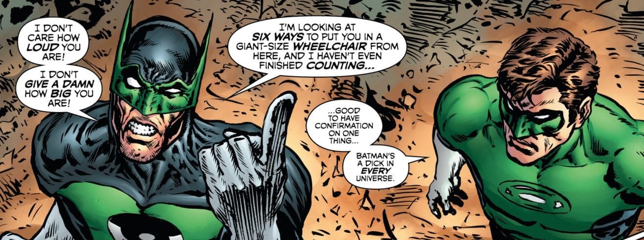
In THE GREEN LANTERN #10, Hal and team found themselves face to face with the gold-plated Zundernell, who proceeded to break the lamp of Tangent leaving her vulnerable to a rapid aging process. The giant claims to have struck out in fear, but Bat-Lantern will have none of it.
Hal’s response to Bat-Lantern’s anger is reminiscent of his interactions with the Dark Knight in most stories: a witty retort in the face of someone deemed too much of a “dick in every universe.” But this moment is short-lived when they soon discover Zundernell has in fact captured the missing Lanterns and plans to use them for his own purposes. And soon enough, the golden overlord uses his powers to control the members of Hal’s team, setting them against the hero.
Grant Morrison’s writing raises readers’ anticipation to new levels in this issue. Watching Hal maneuver his way through an army of his fellow officers, while knowing an unimaginable threat grows closer, allows us to share in the Lantern’s desperation.
Artwork
Liam Sharp’s penciling, Steve Oliff’s coloring, and Tom Orzechowski’s lettering are just as astounding as they’ve routinely been in this series. Sharp gives the Zundernell exaggerated features to highlight both his eccentricity and gigantic features. Oliff adds brilliant colors to this character as well, but also uses darker shades when detailing the ominous features of the multiverse that has been wrecked by the Anti-Man. Additionally, Orzechowski’s lettering shifts styles seamlessly between each Lantern character to emphasize their unique manner of speech.
Comic Covers
Sharp’s main cover artwork for the book depicts Hal and Star Sapphire from Earth-11 in fighting poses, showing the dimensional barriers that have been crossed in order to bring these Lantern characters together. Paul Pope and Bruno Seelig put together the variant cover, showing Hal craft a mysterious symbol with his ring, suggesting it may be involved in the hero’s exploits within the story.
Conclusion
The story told in THE GREEN LANTERN #11 is the perfect prelude to the coming battle with the nefarious Anti-Man. We’re anxiously waiting for Hal and his band of emerald heroes to take on this villain who threatens the entire multiverse.
What did you think of Zundernell in all of his weirdness? Let us know in the comments below!
Venom #18 hits your local comic book shop on September 11, but thanks to Marvel Comics, Monkeys Fighting Robots has an exclusive four-page preview to share with you.
The book is by writer Donny Cates and artist Iban Coello, with colors by Rain Beredo and letters by Clayton Cowles. The cover is by Kyle Hotz and Dan Brown.
About the issue: ABSOLUTE CARNAGE TIE-IN! Carnage’s unlikely and symbiotic allies swarm Venom and his family! As all hell continues to break loose as Carnage’s army swarms the streets of New York, Eddie Brock has his hands full at Rex’s Warehouse!
Prodigal Son is a new series on FOX starting September 23rd, 2019, which centers around a young profiler whose father is an infamous serial killer. It’s a dark police procedural wrapped around a family drama with a chilling and heart-wrenching musical score created by Nathaniel Blume.
Playing a serial killer known as “The Surgeon” is everyone’s favorite former progenitor of the Lycans, Michael Sheen. The show’s lead, Sheen’s profiler son, Malcolm Bright, is played by former Walking Dead “Jesus” Thomas Payne. Fans of the long-lived zombie series might not even recognize Payne who is transformed from his former look.
PopAxiom interviews Nathaniel about making music and cracking bones for the Prodigal Son.
Hello Trumpet My New Friend
Thanks to mom, Nathaniel “… picked up the trumpet at age 11.” As he puts it: “She just thought it would be a good thing for me to try.”
As it turns out, Nathaniel had “… had an affinity toward that [trumpet] and music in general.”
“In the 90s, I started to seek out trumpet music. And at the time, John Williams’ Jurassic Park score was one of the first things that stuck out; scores like JFK, Stargate and Independence Day from David Arnold.”
As high school came to an end, playing the trumpet was still mostly a hobby. “By the time I got to college and started writing, it took hold that it was what I wanted to pursue.”
Nathaniel calls professor and author of The Score: Interviews with Film Composers, Michael Schelle, “an encouraging figure” who “pointed in the direction of composing.”
https://www.youtube.com/watch?v=26C6JqBdb20
About Prodigal Son
Nathaniel followed that inspirational gesture to shows like Legends of Tomorrow, The Flash, and the CNN Documentary Series 60s, 70s, 80s, etc. The current destination: Prodigal Son. “I got the script for the pilot and immediately had a lot of ideas.”
How does one get into the mindset of creating music for a show about a police profiler and his serial killer dad? For Nathaniel, “The jumping point was … The Surgeon.”
“I got on eBay, found a surgical tool kit, bone cutter, I got a plastic tarp to double as a bodybag, and had a sampling session here at the studio where I recorded all these sounds … slamming the bodybag, cutting gauze with scissors …”
But the deep dive into detail didn’t end there as Blume also snapped, “… dried-out chicken bones with the bone cutter.”
HIGH ANXIETY
Nathaniel took this “… slew of material … and made a playable instrument out of it which acts as a foundation for the percussion in the score.”
But Prodigal Son is more than just a nerve-chilling soundtrack. “At heart, the story is really a family drama. The protagonist is dealing with the baggage of having a serial killer father, and his relationship with his mother and sister, who also have their baggage.”
For Nathaniel, the balance between family and fright was a key part of the sonic puzzle. “The score straddles that world of giving the show the emotional nature it needs at times but also playing on the tensions, horror, and thriller aspect of the story.”
“It’s fun keeping the tension and anxiety high for people for an hour.”
Musical Mindsets
Cracking bones makes getting into the mindset of Prodigal Son a more direct experience. How does that compare to scoring for a superhero show, film, or documentary? “The initial process isn’t that different. You really have to come up with a sound world and the emotions and the feelings from scratch in any case.”
“The differences come with a TV program that goes on, for a season or even years. The challenges that come with that is how do you stay in that sound world but also make it feel like it’s shifting and adapting with the show.”
For a movie: “… you get more time to sit with it, but then you create the music, it works, and you’re done.”
The CNN Decades Series demanded something entirely different that the usual purpose of music in movies and television: “… they really didn’t want to tell the audience how to feel. They wanted to let the audience figure that out for themselves.”
Wrapping Up
What working composer today does Nathaniel look forward to hearing from? “I always look forward to what John Williams does.”
“But really, since I’m in a building with three other composers, Blake Neely. Sherri Chung, and Daniel James Chan, it’s always fun to see what they’re doing. We all work together and support each other.
Nathaniel adds a recent Oscar-winner to the list, “I went to USC with Ludwig Göransson (Black Panther), so I’m always excited to see what he’s doing.”
Prodigal Son is the latest addition to Nathaniel’s continuing work, “… co-composing The Flash and Arrow with Blake.”
Thanks to Nathaniel Blume and Rhapsody PR for making this interview possible.
Want to read more interviews, reviews, Op-Eds, and more? CLICK HERE.
Spawn #300, out today from Image Comics, uses an all-star team of artists to set up Spawn for the next 300 issues to come.
(Edited to reflect printing errors for artist’s credit)
Of course, no Spawn issue is without typos and mistakes. On the very first pages of this book, the artists are listed in the wrong order. The 1st chapter with Capullo is extremely long compared to the Opena chapter that is 2 pages. This book is a thick over-sized special that’s all-inclusive. When it comes to Spawn readers, whether you started at 1 or 299, this issue is for everyone. Todd McFarlane handles the script for 4 of the 5 chapters and Scott Snyder jumps in for chapter 2.
The first chapter recaps what has been happening recently in the story and establishes Spawn’s plan for the future. Capullo does a fantastic job with this chapter. With his style and detail, his work is always a treat to see in a Spawn book. It gives a taste of old Spawn to new readers who may only know him from Batman.
We also get to see Capullo’s version of a fairly new character and an updated old favorite. He always has such amazing character designs; all the lines adding extra detail that most people would overlook make his characters look so much more grotesque, scarred, and disfigured. This section is action-packed and brutal; it’s not hard at all to see why I like it so much.
Al Simmons seems to lose his costume and his powers, then makes his own costume out of what he finds lying around while plunging spikes through his arms. The first chapter welcomes New 52 Batman lovers with open arms, and channels the older energy of Spawn in a fresh modern style.
Chapter 2 Story: Scott Snyder/Pencils: Todd McFarlane
Snyder provides the script and McFarlane pencils the interior pages for the first time in over 20 years for this chapter. A character that has been on the covers previous to this issue undergoes a transformation with an awesomely huge new ax. It is short, and it is sweet, but this chapter illuminates the pages.
Chapter 3 Story: Todd McFarlane/Pencils: Jason Shawn Alexander
Alexander might have the perfect style for horror. McFarlane is obviously a veteran, and he shows it in Spawn #300. Every chapter of this book fits each artist’s style to perfection.I began reading Spawn when I saw Alexander’s covers for the “Dark Horror” arc.
His work is so dark and gritty, and in some panels, his environments look downright dirty. The style reminds me of the crayon drawings of the crazy people in horror stories. They have been so traumatized, they can’t talk, but they draw to explain what happened to them
Chapter 4 Story: Todd McFarlane/Pencils: J Scott Campbell
McFarlane says at the end of the book that this chapter shows characters of Spawn can constantly change just like Spawn himself. Here we see Priest take on a new role in what is sure to get some older Spawn books selling.
J Scott Campbell does a great job drawing so many of the characters from the history of spawn and then creating a new one. Fittingly enough, J Scott Campbell designs a female character for the Spawn mythos; McFarlane uses his talents for exactly what he is known for.
On the last two pages, Opena channels his work on Seven to Eternity and leaves us with a cliffhanger to take into 301 and beyond.
This is a perfect record-tying issue for Spawn. It is not too convoluted with a history that new readers are left confused, and it has enough old flavor to keep longtime readers satisfied. Spawn #300 is a historic issue that will be a key for many collectors. The bonus is that the interiors deliver something for fans to look forward to for many issues to come.
What did you think of the 300th issue? Let us know in the comments.
The world is ending. The anti-life equation is taking out heroes left and right, and the fate of the universe rests in the hands of…Booster Gold? I’m not liking those odds in DCeased: A Good Day to Die, out this week from DC Comics.
Mr. Terrific can see three potential responses: one scientific, one magical, and one he doesn’t even want to think about. He, Big Barda, Mr. Miracle, Blue Beetle, and Booster Gold will do what they can, no matter the price.
The Writing
With the main DCeased story thus far, writer Tom Taylor has taken an overdone concept and presented it in a fresh and emotionally-compelling manner. The DCeased: A Good Day to Die one-shot shifts focus away from the core Justice League members, offering a different storytelling approach in the process.
The writing is very fast-paced. Taylor wastes no time on exposition to recap the events of the story’s first four issues. In turn, this makes the storytelling feel more engrossing and urgent.
The book walks a fine tonal line. The world is very much ending, and we see several favorite characters killed off by the end of DCeased: A Good Day to Die. Taylor counterbalances that fact with gallows humor, though, injecting levity without undermining the dark tone. The characters he chose to include here play off one another brilliantly, possessing a charming dynamic even despite the dire circumstances.
The humor serves as a spoonful of sugar to offset the overwhelming dread, but characters’ deaths still carry emotional heft. It’s a delicate balancing act; a hair in either direction could send the book careening into tonal dissonance. Taylor gives the reader a bit of hope, only to snatch it away. Fortunately, he manages to pull it off with impressive results.
Taylor’s work on DCeased has been inspired thus far. Despite the lofty standards set, DCeased: A Good Day to Die manages to stand out as one of the highpoints.
The Artwork
A team of four different artists provide pencil and ink work for DCeased: A Good Day to Die. Laura Braga pencils the majority of the book, while Darick Robertson covers several pages focused on Constantine’s narrative. The two styles are distinct, yet they meld nicely together.
Not every element falls into place on the artistic side. There are occasional awkward poses and confusing choices of setting throughout. That said, perhaps Braga’s greatest strength is how she conveys emotional pitch through subtle expressions. Mastering facial expressions is among the most difficult facets of comic book illustration. The ability to convey the emotional meaning and weight of a statement with a subtle shift of an eyebrow or twinge of the lip is the sign of talent as an illustrator.
Colorist Rain Beredo had his work cut out for himself with DCeased: A Good Day to Die. The detailed settings splattered with a deluge of gore are a challenging subject. However, Beredo presents a final product that is vibrant, yet restrained. Colors pop off the page, without overpowering the rest of the work, or overwhelming the reader with an unintelligible mess of clashing tones.
Final Thoughts
DCeased: A Good Day to Die is an awesome addition to perhaps DC’s best event of 2019. Grab a veggie plate and dig into it.
Another very cool looking page. There's even some neat lettering work in this book.
IT Chapter Two is a flawed but effective companion to Warner Bros. 2017 hit horror film. Back in 2017, IT arrived in theaters at a time where 80’s nostalgia was at an all-time high due to the success of Netflix’s hit sci-fi series, Stranger Things. While the film didn’t offer as many references to the 80’s like Stranger Things, it did an amazing job depicting what it was like being a kid during that decade. Now, two years later the second half has arrived and it doesn’t stick the landing without being a bit muddled.
Adapted from one of Stephen King’s best novels, IT Chapter Two continues the story of The Losers Club. Now grownup and far away from Derry, the Losers return to fulfill an oath 27 years in the making. Pennywise has returned from its slumber and the Losers unite to face off against their fears and put them to bed once and for all. Directed by Andy Muschietti and written by Gary Dauberman, IT Chapter Two features an impressive cast consisting of James McAvoy, Jessica Chastain, Jay Ryan, Isaiah Mustafa, James Ransome, Andy Bean, Bill Skarsgard, and Bill Hader.
Bill Hader, Jessica Chastain, James McAvoy, James Ransome, Isaiah Mustafa, and Jay Ryan in IT CHAPTER TWO
Gary Dauberman is the only returning writer from the last film, and he ultimately has written a screenplay that is a solid companion to its predecessor. However, IT Chapter Two is riddled with plot inconsistencies and repetitive sequences that can grow tiring. For example, the Losers spend most of the second act walking around Derry getting caught up in the shenanigans of Pennywise. Audiences will sit through Bill, Beverly, Mike, Ben, Eddie, and Richie each spending time somewhere in Derry with flashbacks from the summer of 1989 filling in missing pieces. There are also several more instances that will cause laughter this time around, but some of the jokes are present at the wrong time during the film’s final moments.
Regardless of that, there are several flashbacks to the young losers to bring in that adolescent charm of the original, but this only emphasizes that the adult cast doesn’t have the same appeal a group of young teenagers has. The development of the adult Losers relies heavily on their child persona, which isn’t entirely bad but outside of that, the adult Losers offer nothing new to their characters. However, the lack of development may have been purposely done to illustrate how they can’t grow up entirely until they conquer their fears. As for the finale, describing it as predictable would be ridiculous because if you are familiar with the novel then the film’s ending should be somewhat predictable. With that being said, after a series of repetitive sequences, IT Chapter Two offers a heartwarming conclusion that may cause a few tears.
Bill Skarsgard as Pennywise in IT CHAPTER TWO
The performances from the adult Losers are well done and the chemistry between them is still present just like it was with the younger cast. Skarsgard once again gives a menacing, gruesome, and unhinged performance as Pennywise. McAvoy, Chastain, Ryan, Mustafa, and everyone else all do an amazing job portraying the adult Losers. Hader is definitely a standout, as he steals every scene he is present in for the most part, but nowhere near oscar worthy as most will claim. His comedic banter never gets old it is just placed in the wrong spots on multiple occasions.
Visually the film is beautiful but also a downgrade from its predecessor, while the cinematography from Checco Varese is fine, especially during the high stakes finale, it is a shame Chung Chung-hoon did not return. The CGI is in full effect here, and most of it looks acceptable at best. Some shots of Pennywise’s gaping mouth just look ridiculous though, this was an issue in the last film and it’s doubled here. Other shots of Pennywise’s final form are quite impressive though. Benjamin Wallfisch returns to once again provide a charming, yet terrifying score that beautifully accompanies each frame.
Jessica Chastain as Beverly Marsh in IT CHAPTER TWO
Muschietti directs the film amazingly for the most part, but the pacing is a bit all over the place in some spots. For instance, during the house of mirrors sequence, Pennywise spends far too much time banging his head on a mirror while Bill (McAvoy) counters him with an annoying round of kicks to the opposite mirror, all while a child looks on in fear. Muschietti does a great job of building tension in the repetitive sequences of the Losers walking around Derry, and the transitions between the flashbacks are well done.
While IT Chapter Two isn’t as good as its predecessor, it is a worthy companion that just has a few mishaps here and there with mostly the writing and technical aspects. These mishaps can’t outshine the performances from the cast, the emotional investment, an impressive final act, and an overall satisfying wrap up to one of the best coming of age tales.