Do you like flow that makes the beat go woah? Then, put on your reading glasses because Quarter Killer #1 will teach you some classes.
My horrible rhyming skills aside, Comixology Original’s, Quarter Killer #1 has a funky fresh style that’ll make you smile.
On The Track
On the bombastic beat (Lines/Colors) is Jamie Jones, with Vita Ayala and Danny Lore bringing the lyrical (Scripts) heat. But, look out below, because here comes Adrienne Lopes’ editing flow (Edits). But, you need not search a mile because Ryan Ferrier brings the style (Design/Letters). Acting as the whipping cream on top is Tim Daniel and the street team (Logo).
Okay, no more rhyming.
Killer Lyrics (Story)
Quarter Killer #1’s strength is how it starts off small and focused, then quickly erupts into a large world. Ayala and Lore’s premise starts easy, guiding readers into the world by seeming as a one and done issue, but the duo quickly lay seeds for the future. By the end of Quarter Killer #1 the world and characters start to feel connected, while expanding.
Music is a massive inspiration for Quarter Killer #1, which Ayala and Lore showcase brilliantly. This inspiration shines within the first page with the creative team’s introduction (seen above). Even during dialogue, characters talk with a particular beat or style that feels unique. By the end of the issue, you’ll wonder why there was no CD.
Although each character is unique in their own regard, one shines the brightest—Quentin Kidd AKA QK, which makes sense as they are the main character. QK is a fresh, collective, and a fan of old school currency (quarters), while mysterious to boot. The few moments Ayala and Lore sprinkle throughout of their background makes you yearn for more.
Funky Fresh Art
For a Cyberpunk story, Jones’ art makes the world a delightful place to live in. Throughout Quarter Killer #1 the mix of bright colors and heavy lines melds beautifully with the portrayal of story beats. During the few fighting scenes Jones’ darker colors help show QK’s electrical weapon to the extreme.
Throughout, Jones uses varying degrees of clashing colors that elegantly showcase the motions in panels. These colors can be seen in stiff moments to make them pop.
For a debut issue Quarter Killer #1 has a fair bit of dialogue. Luckily Ferrier’s bubble placement easily guides the reader’s eyes. But, that’s not all Ferrier adds, as his loudly colorful sound effects pop off the page.
A Quarter For The Quarter Killer
Quarter Killer #1 hits the musical theme the dream team was aiming for. Luckily that’s not all it brings to the spinning table, as it features a uniquely fresh cast that’ll make it last.
Memorable Quote: “All aboard this janky-ass car! Next stop–that money! -Hi Top
I love Hi Top’s name and style. Plus, I didn’t think it was that janky of a car!
Extra Track: I’m a sucker for a logo, and damn does Daniel deliver a banging one!
For The Music Lovers
Did you get a chance to check out the Comixology Original? If so let us know what you think down below!
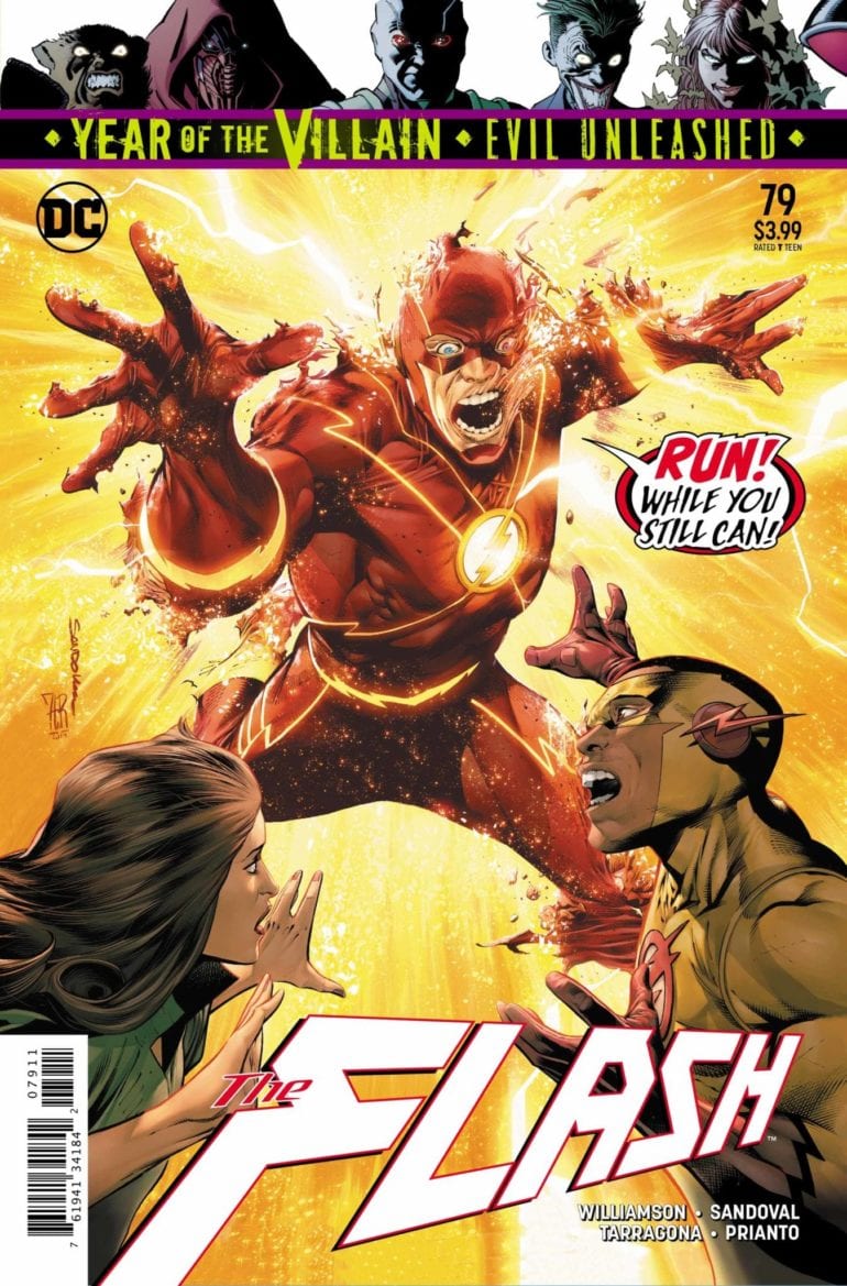
The Speed Force is dying. With the new forces making their way into the main DC Earth, Flash and his fellow speedsters have been slowing down. To fight this, the Speed Force unleashes its most dangerous avatar, Black Flash, to kill the other forces avatars. Barry gathers the four together, but Psych, the avatar of the Sage Force panics and runs for it. Barry takes Fuerza and Steadfast, the avatars of the Strength and Still Forces respectfully, back to the Speed Lab in the Flash Museum for safety. When he tries to go after Psych, Black Flash beats Barry to him and kills the Sage Force user. Can the Flash save the others from their fates?
**Some Spoilers Below**
Story:
At the Flash Museum, Fuerza demands to be released, but Commander Cold refuses. This causes her to demand the location of Barry, who arrives in that same moment with Psych’s body. Fuerza scolds the Speedster, but the rest of the group realizes Barry is becoming faster. When the Black Flash killed Psych, it uncoupled the Sage Force from the Speed Force.
Meanwhile, the revitalized Rogues go to find the final member: Lisa Snart, the Golden Glider. She runs an ice rink for abused youths, but her brother is able to convince her to return to crime. Soon after they make their move, a certain pair of young speedsters make it their business to go after them.
The focus of this story is, unfortunately all over the place. While the previous issues have been focused on this Black Flash threat, that has begun to be pushed into the background. Due to the Year of the Villain, more focus has been put on the Rogues in preparation for their next arc. We’re still in the middle of this one, and it treats the Black Flash as if he didn’t just murder another force avatar! This should have been treated as a big deal, as the stakes have never been higher, but it comes off as a forgotten plot point.
There’s also not a lot of action to keep even the common reader entertained. This was trying to be one of those character development issues, as seen with Golden Glider. While I enjoyed the new life she has, growing as a character and being seen as more kindhearted, I am not a fan of how quickly she threw it away. This could have been a beautiful send-off for the character, especially with her new line of work. Instead, it’s tossed off to set up for the future. It feels like a wasted opportunity, and I can only hope it pays off.
Art:
While I may have issues with the story, the art is a positive that continues to hold the book together. Rafa Sandoval’s art is just breathtaking, especially in the designs of the characters. One of the best looking parts is a reveal of another player in this story. While I won’t reveal who it is, but he looks amazing in Sandoval’s style. Arif Prianto takes that style to the next level with great colorwork. This team has worked hard to make this arc look great, and the effort certainly shows.
Conclusion:
While beautiful to look at, this chapter to the Death of the Speed Force arc falls flat. It focuses more on the Year of the Villain than it does the already exciting storyline. I don’t think the next arc will be bad, but it’s causing the current one to go off the rails. With the team of Rogues back together, it should straighten itself out, but there is worry. This needs to focus on the Black Flash threat, not the threat to come.
Mr. Freeze finally reveals the plan he’s been working on in the background over the last several issues in Detective Comics #1012, out this week from DC Comics.
Women bearing a particular physical profile are going missing in Gotham. We know who’s behind it. The question: how long will it take Bruce to find out?
The Writing
In his run on Detective Comics thus far, writer Peter J. Tomasi’s focused largely on smaller, self-contained narratives. In contrast to Tom King’s sweeping Batman run, most of Tomasi’s stories are standalones, or maybe two-parters. With Detective Comics #1012, though, the writer expands into what feels like a larger narrative.
As alluded to, Tomasi’s spent the last several issues laying the groundwork for this story as part of the Year of the Villain event. Taking place before the events of Batman #77, the writer delivers the true opening chapter to follow the prologues. The writing still hews to much of the same sharp, driving storytelling we’ve seen from Tomasi thus far on the title. But, given that it’s just the beginning of the story, much of the issue still feels like setup.
The writing is largely expository. We get the details of Freeze’s plan, involving kidnapping women with similar profiles to that of his beloved wife. Nearly half of the book focuses on Freeze explaining his plan through expository dialogue. Batman, in turn, picks up on the thread after noting a strange 911 call from a victim. While he opens the book with a somewhat melodramatic soliloquy, Bruce doesn’t really impact the plot itself until the two-thirds mark.
Detective Comics #1012 isn’t the most exciting chapter of Tomasi’s run. It’s engaging enough, though, to keep the reader’s attention, promising an interesting story is to come.
The Artwork
Doug Mahnke provides art for Detective Comics #1012. From a stylistic point of view, it’s a strong showing; the artist’s sketchy linework is appealing and eye-catching as always. It’s less consistent in terms of layout, though.
Mahnke packs many of the pages with panels. And, in many cases, the layout of the page doesn’t feel particularly calculated or purposeful. As a result, panels have a tendency to overlap and overshadow one another. This effect is further accentuated by the visual busyness of many of the illustrations. The eye is not always drawn to any particular part of the panels (or of the page, for that matter).
Overall, the art in Detective Comics #1012 feels like something of a mixed bag. It’s stylistically interesting and appealing, but the unfocused layout can make one’s eyes a little tired.
In contrast, the colors, courtesy of artist David Baron, are on-point through the issue. They’re skillfully deployed, and in some cases, truly leap off the page. A brief conversation between Batman and Bullock near the book’s end, for instance, has a great noir tone to it courtesy of Baron’s colors, which lends the scene much more gravitas.
Final Thoughts
Detective Comics #1012 is a respectable work. Not a high point in the run, but it feels like we’re building to something bigger.
SFSX (Safe Sex) #1 by Tina Horn, Michael Dowling, Steve Wands and Laurenn McCubbin unleashes a powerful, erotic, revolutionary, gorgeous and sex-positive narrative that will open your mind as to what constitutes true freedom in a world hell-bent on crushing you.
From Image– Notorious kink writer TINA HORN teams up with artist MICHAEL DOWLING (Unfollow, Death Sentence) for SFSX, a social thriller about sex, love, and torture that reads like SEX CRIMINALS in Gilead crossed with Oceans 8—with a SUNSTONE twist! In a draconian America where sexuality is bureaucratized and policed, a group of queer sex workers keep the magic alive in an underground club called the Dirty Mind. Using their unique bondage skills, they resolve to infiltrate the mysterious government Pleasure Center, free their friends, and fight the power.
SFSX (Safe Sex)#1 Written by: Tina Horn Art by: Michael Dowling Letters by: Steve Wands Edited & Designed by: Laurenn McCubbin
Story
It’s very rare to find a piece of art, let alone a comic book that challenges and changes a reader. And not in the “I don’t agree with this new take on Whatever-Man arc” (and that’s not a dig on that type of story). Challenging means it’s such a unique experience that it’s making you question the story and your own preconceptions as you read it. Changing means you are different after finishing it. SFSX (Safe Sex) #1 does that and much, much more.
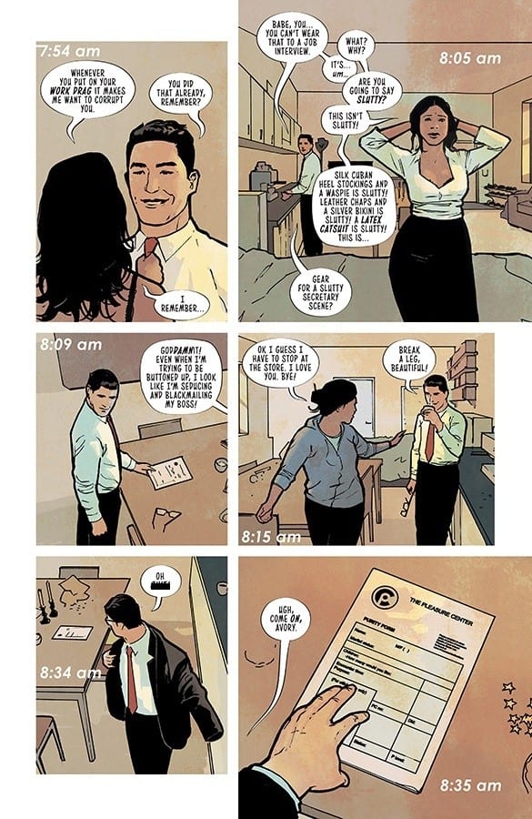
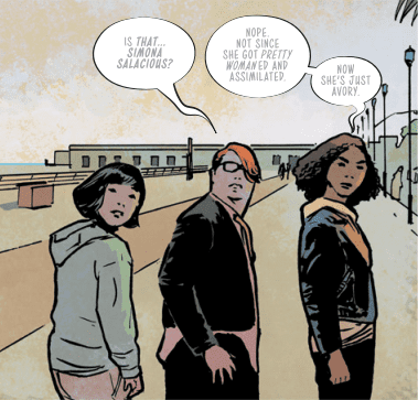
This book, right of the gate, let’s you know what its intentions are; it opens with a graphic group-sex scene. But Horn doesn’t write it as a mere shock. Using the main character’s Avery’s narration, the writer immediately grounds the kink, making it less about what the act actually is and to what that act actually means. Avery is relatable in that her ultimate goal is true freedom and her ownership of her role in such a large setting shows you how strong of an individual she is. It’s great writing that creates the main character we can follow even in just about in any situation, no matter how graphic or how tender; this book even does both at once.
And what a world it is. It’s fucking scary. This is a totalitarian government hidden behind the facade of family groups and centers. One aiming to stamp out individuality. The Party, the ruling agency, has control over everything; people can’t even fuck their spouses without logging it. It’s details like that, daring little details, that make this future being created so unique.
Horn is also building a great mystery though, and make no mistake this is also an engaging thriller (a genre also built on teasing and tantalizing). Whatever is happening with Avery’s husband George is a great hook. And it can’t be good. Nothing ever good resides on the thirteen floor of any building in any story (great detail again by Horn).
Art
There’s a moment in SFSX (Safe Sex) #1 where Avery uses the term “glittery and gritty” to describe her world. That phrase can also be used to describe Michael Dowling’s remarkable art. This book is beautiful and seductive. It has delicate line work and the colors create a moody, sexy atmosphere that is both elegant, yet lurid. The figures, architecture and landscapes are also rendered on the realistic side giving it the grounding feel also present in the writing. It’s a great symbiosis that works so well, it almost seems effortless.
Steve Wands also does some remarkable work with lettering. He fills his pages with small touches like word balloons filled with fading letters to indicate someone talking under their breath. Avery’s narration is also rendered in purple. It being the only lettering not in black helps accentuate what she is saying and also her individuality.
Conclusion
SFSX (Safe Sex #1) is without a doubt a must buy. It’s a book that grabs you and forces you to think. But it does so with a hell of a story, a great main character and a revolutionary attitude that is hopefully infectious. Grab it this book at your local comic book shop!
LUMBERJANES #66 is out from Boom! Box this Wednesday, and it’s leaving readers with the question; is there ever a good time to trust a god or goddess? The answer is probably not. Just ask any expert in mythology or lore.
The Lumberjanes appear to be enchanted by Freya.
***SPOILER WARNING****
If the goddess Freya suddenly showed up on your doorstep, would you trust her? What about if she showed up on your campgrounds? Well, regardless of how you feel on the matter, that’s exactly what the Lumberjanes did in Lumberjanes #66.
One would think that their previous encounters with mischievous gods and goddess would be enough to teach them a lesson, but then again the Lumberjanes have always had an overly strong sense of adventure. So this all likely seemed like another fun story to add to the list, right? And in their defense, Freya is the sort of goddess that would be attracted to and compliment the Janes of Lumber.
The preoder cover is a dynamic piece, even if it doesn’t fit in perfectly with the plot at hand.
Lumberjanes #66 split the campers into two groups. One team was off with Freya – joyfully drinking up all the juice in the land. And the other was on an alien hunt, while also talking about feelings and stuff. The balance between these two plots was comical and sometimes absurd – and thus perfectly in fashion with the Lumberjanes. It’s clear that Shannon Watters and Kat Leyh know how to write a perfectly balanced Lumberjanes issue.
It was delightfully refreshing to see a cheeky and mythologically accurate Freya running amok with the ‘Janes. Here was a Freya full of boasting, with broad shoulders and all of the knick-knacks her fables have spoken of. There’s something intensely satisfying about seeing gods and goddesses respectfully shown within comics.
Freya’s big personality was almost too much for these pages. Between her loud exclamations, her plotting, and a jealous Diane, there was hardly any room for the other Roanoke girls to have a moment. But that’ll surely change soon.
Meanwhile, the rest of the Lumberjanes were off hunting aliens? It was comical watching them follow the trail of a goddess, and all the while convinced they were about to stumble upon little green men. It is a classic Lumberjanes moment, in that sense.
As was the heavy inclusion of emotions; though it came from an unexpected source. Once again, love is in the air. But it isn’t our queen couple for once. A new relationship is being hinted at, while the two lovers are split between groups, there’s little room for doubt about how these two feel.
This month’s badge looks pretty interesting. Too bad it’s only available to Lumberjanes.
The mythological elements steadily bled into Lumberjanes #66. Freya was a delight – even if she behaved the way of any god or goddess, and did exactly as she pleased. Her portrayal in this issue was perfection. She was broad of shoulder, bold of spirit, and full of life. And let’s not forget all of the details that made her character feel more like herself. Everything from her Falcon’s Cloak to her brother Freyr’s Hanky has found its way into the issue.
Kanesha C. Bryant (artist) and Maarta Laiho (colorist) are the two responsible for making this issue a delightful and visual read. And they clearly had some fun here. Freya’s antics were larger than life in some instances. In other ways, she was made more child-friendly (such as the pile of juice boxes instead of the obvious alcohol it could have been).
Lumberjanes #66 had one of the best uses of a montage in quite some time. It showed a decent length of time, but more importantly, it showed off how even the Lumberjanes can find it exhausting trying to keep up with a goddess.
Finally, Aubrey Aiese was the letterer for this issue, and her work was the finishing touch needed to this tale. Between Freya and Diana, we had multiple characters speaking it what was essentially all-cap locks, but Aiese managed to show this without it being too jarring or frustrating for readers.
And Freya and her massive personality and booming voice. Sounds about right, doesn’t it?
Lumberjanes #66 was one of those fun issues where you just find yourself waiting for the other shoe to drop. Or perhaps that feeling only comes to readers who also immerse themselves in lore. Regardless, it was fascinating watching the Lumberjanes interact with yet another goddess – not to mention watching two totally different goddesses interact in such a manner. The next issue is sure to be a chaotic one! What do readers think will happen?
FEARLESS #3, out this Wednesday from Marvel Comics, brings together some of our favorite and most powerful female characters. This collection of short stories isn’t afraid to have fun or take risks with their heroines.
The Invisible Woman takes front and center for the latest Fearless issue.
***SPOILER WARNING***
Fearless has been a massive undertaking – one that has consistently lived up to its name. The series brings together some of the best leading ladies in Marvel comics, and gives female creatives a chance to have fun and do something never done before.
Fearless #3 is just one part of a four-issue miniseries, and like the first three, it contains within it three separate plots. And of course, it’s full to the brim of our favorite Marvel heroines. So if you’ve ever wanted a see these ladies interact, now’s your chance.
The entire premise behind Fearless has been groundbreaking from the start. Never before has Marvel tried to do something of this scale, with this many female writers and artists before. It’s been refreshing and exhilarating at the same time. Having so many of our favorites together almost feels like icing on the cake.
The other element that makes the series work so well is the decision to split it into different short stories. Finally, we’re getting a chance to see so many overlooked sides of the world, from character interactions we’ve been dying for to characters that could use a little bit more screen (erm, page) time.
Look at the creative lineup for this issue! Is it any wonder that it ended up being amazing?
‘Campfire Song’ is the only short story that will carry through every issue in the series. It also combines the most characters into one plot, so there are no complaints here. It’s the anchor plot, but it also has some fun along the way.
Captain Marvel, Storm, Invisible Woman, and Ms. Marvel have all found themselves in the same place – a camp, believe it or not. The three elders are there to be motivational speakers to a bunch of teenage girls, Kamala included. And naturally, whenever so many heroes congregate, something is bound to go wrong.
Seanan McGuire has clearly been enjoying writing for so many heroes at once. It seems like everyone has gotten their moment (or two), especially in this issue. More importantly, even the little things were not overlooked in this plot. Small things, like the grunge way Carol dressed, or the determination behind every move Kamala makes. It all adds up and goes a long way in reminding us just how diverse these characters are.
The plot has also made a point of not overlooking the young girls at the same – several of which fall under the mutant or inhuman bracket. Who knows, maybe one day we’ll see these girls become heroes or geniuses in their own right.
Claire Roe and Rachelle Rosenberg were the artists for this issue. And they worked well as a team here – portraying our ladies perfectly, right down to the way they move and their preferred dressing styles. Their portrayal of everyone’s powers was charming and deserve some extra credit.
It’s starting to look like Ms. Marvel’s gut was right on the money.
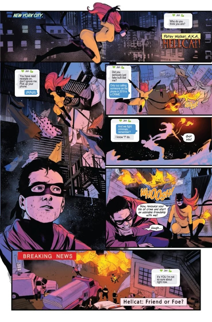
Next up in the lineup is a new short story to throw into the mix, ‘Copycat.’ This short plot brings several other favorites to the series – Hellcat, She-Hulk, and Jessica Jones. If that isn’t enough to sell you on it, perhaps the promise of Jessica Jones beating somebody up will help?
Zoe Quinn brings us a Hellcat who has more or less gotten her stuff together, after everything she’s been through. But she’s still got a lot on her plate – and having a fake Hellcat running around the world is certainly not helping things.
She-Hulk’s panic-texting is full-on amazing. It’s the sort of texting you’d expect to see from your bestie about to have a monumental breakdown, and we’re here for it. We could all use a friend like Jennifer.
Speaking of friends, Jessica Jones’ part in this plot is so satisfying; it’ll make you wish the Netflix series was still airing. There is something so satisfying about her beatdowns. Probably the sheer force put out, while she’s just all sorts of done with the fight.
The artwork for this mini-plot was brilliant – our three ladies kicking butt and taking names. And let’s not forget how amazing all of their hair looked. Marika Cresta and Irma Knivila were the artists for this short, and they went all out on the fight scenes and drama. The cute little creature was an adorable touch as well – precisely the sort of critter that Patsy would come across, no?
This text conversation is pure perfection.
And finally, the last short in this issue is the shortest of them all – being only a couple pages long. It’s appropriately titled ‘Jubilation’ and features none other than Jubilee herself, and of course, Wolverine (he’s an honorary heroine, in this issue).
Jubilee’s thirst for life and general enjoyment of everything fun shines bright through in this miniaturized plot. And it’s balanced nicely with Wolverine’s gruffness and his need to lecture her about social media (who’s the rat that told him how Instagram works?).
Alyssa Wong wrote the script, which managed to fit in several funny moments despite its short run. And yet everything about it screamed ‘Jubilee’ as it was the perfect fit for a beloved character.
Meanwhile, Alti Firmansyah provided the artwork, giving an overall ‘80s look to the story. You’ll almost feel like you’re watching the classic cartoons all over again (the only exception being how Instagram is around, of course). And finally, Rachelle Rosenberg provided the vibrant colors that genuinely completed the look �� full of ‘80s color style and everything.
This is not a conversation we expected to see between Jubilee and Wolverine.
Fearless #3 may have been made up of three different short stories, but it had a cohesive feel to it. The primary focus on heroines helped, as did the sequential feeling to the artwork itself. Combined with a sense of liberation, this whole issue felt like a celebration of heroines. And there’s little doubt that this was the true intent.
Another element that tied the whole issue together was the lettering, which was all done by one artist, Cardinal Rae. This may seem like a small touch, but it had a significant payoff in the end. And it shows off smart thinking from the higher-ups.
The next issue should wrap up the only long-running short in the series, but it’ll also likely bring with it two more quirky shorts. And frankly, we already know that they’re going to be loads of fun.
Harleen #1, out this week from DC Comics Black Label, is a fresh, new clinical approach to the origins of Harley Quinn.
Harley Quinn is a character that has exploded into popular culture since Margot Robbie and Suicide Squad, and many people think her relationship with the Joker is some kind of @#$%ed up modern-day fairy-tale. Hopefully, many of those people will read this series by Stjepan Sejic and figure out for themselves that this is not one of those Hollywood relationships to idolize.
Stjepan Sejic writes and illustrates this new imagining of Dr. Harleen Quinzel. Gabriela Downie takes care of the letters and makes it very easy on the eyes. Lately, the Harley stories have been a strain on my eyes to read. Her books have had red and yellow on red and yellow backgrounds, but in Harleen #1 the words are less strenuous. Immediately this book is more enjoyable than most Harley Quinn issues of the past few years.
Sejic’s art throughout the entire issue is a pleasure to look at. He has an uncanny ability to make each panel look realistic, but still holds onto that sketchy style that appears almost unfinished. Books like this really get to show off the difference between cover art and interior art, especially with this being an over-sized issue. Sejic’s covers can be so crisp that it looks like a high-def photo, but this interior work is obviously drawn with a deadline. Whether Sejic is working on 60 pages of story or one cover his work is no less remarkable. The realism in the interior pages comes from his colors more so than any of the actual line work.
Dr. Harleen Quinzel is a young and promising psychologist with a passion for rehabilitation over incarceration. After a science symposium, Harley unexpectedly meets her future lover. As the Joker sets off explosions to steal some weapons, he pulls a gun on her causing her life to flash before her eyes, and he lets her off “with a warning.” That’s typically not a first encounter that inspires romantic feelings, so how Harley comes to fall in love with him is quite the mystery that I’m looking forward to seeing unfold in these pages.
Dr. Quinzel pleads with her pharmacist friends for pills to no avail; nothing is helping her nightmares except alcohol. She avoids interviewing Joker for weeks before she can put it off no longer. Harley prepares herself by watching videos from other sessions and familiarizing herself with all his lies, but nothing can actually prepare her for a one-on-one interview with the man himself.
Dr. Quinzel is not the only person in this story who has yet to realize their full potential. Harvey Dent is still going by Harvey Dent, and Harley mentions, in a mere five months both of them will have become killers. If that doesn’t excite you about the remaining two issues of this series then you just aren’t a fan of these characters.
Harleen #1 gives you a more in-depth look at the psychiatrist before Joker corrupted her. This story elaborates on why Harley got mixed up with the Joker in the first place, and what her intentions were. The best aspect of the Joker is the way he can manipulate anyone into killing just by pretending to open up to them finally. I’m excited to see how he accomplishes that with Dr. Harleen Quinzel in Sejic’s version of events.
What did you think of the first issue of Harleen? Let us know in the comments below.
Timothy Hunter made a vow to never use magic again last issue, for the sole purpose of protecting his mother from the cult group The Cold Flame. But his mother’s odd behavior may call this decision into question. On top of that, Dr. Rose is caught in the middle of a deadly fight with the treacherous Mr. Davies, right in the middle of Tim’s school.
Find out what becomes of Tim and Rose when BOOKS OF MAGIC #12 hits stores on Wednesday, September 25.
Story
Tim’s mother has been behaving strangely since returning home last issue, obsessively begging him to show her the Books of Magic. What’s more, she admits to casting a spell on her husband so there would be no intrusions. After spending time with her, Tim realizes this woman isn’t his mother after all; it’s a member of The Cold Flame.
Shocked in utter disbelief, Tim uses an impressive force of magic to force the evildoer out of his house. But the there’s no time for rest, as his bully Tyler arrives almost immediately, alerting him to a dangerous magical battle taking place at the school. Feeling some sense of responsibility, and wanting to get away from his mother’s impostor, the young wizard races to the school intending to use his full magical power once again. But upon arrival, Tim learns that Tyler’s request was all part of the evil Mr. Davies’ ploy to corner the young wizard in a trap, leaving Tim uncertain if he can trust anyone anymore.
Kat Howard has been slowly revealing Tim’s descent into misery throughout this series, and his actions taken in BOOKS OF MAGIC #12 is the culmination of that work. He’s lost almost every form of support in his life, and it’s clear the boy is ready to take out his hurt on the world. Unfortunately for Davies, Tim’s decided the treacherous teacher is the most suitable punching bag, satisfying that all-too-common teenage angst most readers have experienced.
Artwork
The artwork in this issue beautifully suits its high-paced, action-packed story. Tom Fowler’s pencils, emboldened by Brian Churilla, Craig Taillefer, and Fowler’s inks, captures the brilliance of the magical fights within this issue. From the shambles of Mr. Davies’ office to the shattered glass in Tim’s bedroom, the ability of this art to draw readers into the action is astounding.
Marissa Louise’s colors respond well to each scene, shifting to intense purples and yellows during both fights, while sticking to more subdued colors in the transition scenes. Todd Klein’s letters work in a similar fashion by using more dynamic, large fonts in the more active scenes.
Comic Cover
Kai Carpenter’s main cover depicts Tim attacking a person (presumed to be Mr. Davies) with his screwdriver wand. The anger in our protagonist’s face is consuming his entire fighting stance, showing the high level of hatred he has for the teacher.
Conclusion
The action-packed BOOKS OF MAGIC #12 is just the issue to take this series to a new level of intensity. Despite his troubles, Tim’s magical ability has improved dramatically, and he’s ready to unleash it upon the world.
What did you think of Tim’s actions in this book? Let us know in the comments below!
Billy Batson unleashes fury on the World’s Finest in Batman/Superman #2, an action-packed chapter out this week from DC Comics.
At the end of Batman/Superman #1, the Robin lurking in the Batcave is revealed to be an infected Billy Batson, the Shazam Who Laughs, and this issue picks up right where it left off.
Joshua Williamson scripts this feverishly paced issue while David Marquez pencils some of the most gorgeous interior art in comics right now. Alejandro Sanchez adds glowing and vivid colors that keep comic readers coming back for multiple reads. There is enough detail in the pencils and colors to spend a good hour admiring them.
John J. Hill takes care of the letters and does a phenomenal job with the non-stop action in this issue. The lettering is fresh and always evolving as the size varies with almost every sentence spoken. The word bubbles clearly show what is meant to be heard by everyone and what is intended for themselves. If I were a letterer for DC Comics, this is definitely an issue I would love to work on, as it looks like it was fun as hell to be a part of.
Williamson is a fantastic writer when it comes to horror, so having him writing a Batman Who Laughs story is a treat. As more and more heroes are infected with the BWL’s toxin, tapping into his horror background promises to be quite the ride. That being said, the best part of this series so far is Marquez’s artwork and Sanchez’s colors.
When there’s magic, laser eyes, expensive technology, lightning, and a fortress of solitude, boring art, and dull colors should never be allowed. I don’t think I’ve ever seen a night battle glow so much in the moonlight and lightning blasts. Sanchez’s colors pop off the page like there are little diamonds in the paper.
Marquez adds so much detail into every fraction of his work. Where some artists will save all the detail work for the focus of each panel, Marquez spends time on fingernails and chin dimples. I can’t say enough of how gorgeous this book is and how many times I’ve looked through it without reading it.
Batman/Superman #2, starts with Gordon getting the Batman Who Laughs into the GCPD armory. Gordon makes a point to mention all the evidence, weapons, and poisons stored in this vault, so now we know the BWL has access to some of the most dangerous items and plenty of information on Gotham’s worst criminals. If we know anything about Batman, it’s that information is just as useful of a weapon to him as a Batarang.
In true Joker fashion, Shazam changes back into Billy Batson multiple times to trick Batman and Superman into letting their guard down or holding back. It works every time. Their desire to always save everyone works against them at every turn. Now that the Batman Who Laughs has access to the GCPD armory there isn’t a weakness he doesn’t know how to exploit. No one in the DC Universe is safe.
Batman/Superman #2 is exactly what the casual fan wants when they pick up a comic featuring the World’s Finest. Plenty of action from the start and gorgeous fight scenes make this a book any reader would enjoy. As the Batman Who Laughs continues to wreak havoc on the DC Universe, and his plan unfolds, the World’s Finest heroes will have to work together in ways they’ve never had to before.
Strap in for the ride; the infection is spreading.
What did you think of the 2nd issue of Batman/Superman? Let us know in the comments below.
Steve Rogers has undergone many shifting circumstances throughout the past few issues, and they don’t seem to be decreasing. After being framed for the murder of General Thunderbolt Ross by Wolfgang von Strucker, the hero turned himself in to prevent collateral damage, only to be sprung from prison by none other than Sharon Carter and the Daughters of Liberty. Together, this epic team is on a mission to clear Steve’s name by taking on corrupt organizations. They plan to start with the Watchdogs, an extremist group hell-bent on enforcing their sense of “tradition” upon society’s most vulnerable.
Readers will be able to join Steve and the Daughters for the fight when CAPTAIN AMERICA #14 hits stores on Wednesday, September 25th.
Story
Steve and the Daughters haven’t worked together long, but they’re already proving to be a formidable, seamless team. The story initially features Echo, an experienced fighter herself, showcase equally amazing abilities to infiltrate the Watchdogs base bar. She pretends to cozy with one of the most unsuspecting meatheads, then proceeds to take out the criminals one by one as Steve runs the team’s strategic operations.
Steve eventually joins the fray and leads the team through the compound in search of their leaders. Here readers are treated to plenty of splendid action as Steve, White Tiger, and Echo take on the Watchdogs. The ease with which this team of heroes takes down such hate-filled villains is satisfying, but hearts stop when they uncover the true purpose of the organization. It’s a secret that hides beneath the organization’s dedication to keeping their traditions in place, no matter how many people they hurt in the process.
In this issue writer Ta-Nehisi Coates offers a brilliant critique of traditionalism, an all too common trait found among many in our country today. This ideology, rather than opening up the mind to new possibilities, encourages us to cling to the ways things have always been done—with force if necessary. In response, Coates presents Steve as the ideal for each and every American, simultaneously acknowledging one’s potential fear of change while embracing the beauty it can bring.
Artwork
The artwork within this issue brings to mind the classic adventures crafted by Jack Kirby himself. Each element helps to craft this action-packed story—from Matt Milla’s multilayered coloring in the fast-paced scene transitions to Niko Walter’s fleshed out fighting poses of Steve and the Daughters. In addition, letterer Joe Caramagna’s dynamic changes in fonts helps readers gauge the character’s emotions, matching each piece of dialogue with the scene’s level of intensity.
Comic Covers
Main Cover
Alex Ross’ main cover artwork features Steve fighting off a team of soldiers superimposed over a larger version of his. The background image depicts the hero in his traditional garb, which serves as a metaphor for Steve’s reflection of his previous status as a beloved hero.
Variant Cover
Patch Zircher and Jason Keith’s unique variant cover features a warping of Steve, first showing him in civilian clothes and then shifting to the Captain America suit. However, we see a third Steve—the one caught in between these identities. This places our focus on Steve’s struggle to define himself after his defamation at the hands of Hydra Cap and the Power Elite.
Conclusion
CAPTAIN AMERICA #14 offers us an exciting look at Steve in his best element: fighting social evils. It’s great to see him kicking butt with the powerhouse that is the Daughters, too.
Are you enjoying Steve’s collaboration with the Daughters? Let us know in the comments below!