The relationship between art and the artist has always been intriguing. The complicated, messy balance between self-infatuation and emotional sacrifice has perhaps never been more exemplified than in Grant Morrison’s ANIMAL MAN (1988). The audacity one has to have to write oneself into one’s work, especially as an omnipotent and relentless God, is astounding. One would think Morrison could not be more self-obsessed, until they later describes themselves as a dying chimp at a typewriter, somehow lucky enough to have stumbled upon a masterpiece.
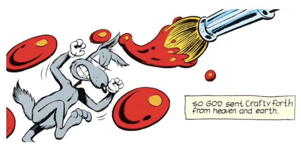
ANIMAL MAN is the story of Buddy Baker. Baker is a small-time superhero who happened upon a spaceship that gave him the ability to emulate the skills of nearby animals. At times Buddy seems embarrassed by his origins; other times, he seems befuddled by his anonymity. A pretty straightforward story, until we meet Crafty Coyote in issue 5, titled “The Coyote Gospel.” Crafty is a refugee from a cartoon universe filled with senseless violence. Having sought an audience with his God, a being on a throne holding a paintbrush, Crafty is expelled from his universe. This is the first time we meet Morrison in the pages of their work, and they seem to revel in the pain they inflict on their characters.
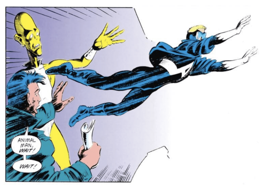
Having professed themselves omnipotent, Morrison breaks all the rules. Characters look off the page and seem to be able to see the reader’s face, screaming in terror. Other characters break the edge of the panels on the page and find themselves confusedly wandering through the gutter. One seemingly immortal villain is ultimately killed by other characters pushing on the sides of the panel he’s in until it shrinks enough to crush him. Much of Morrison’s genius comes from the fact that it is through Buddy that we see them break the rules. Buddy becomes aware of the gutters on the page, the reader looking at the page, and the God that’s pulling the strings.
In a quest for answers, Buddy seems to leave the world of his comic book altogether. He walks through Limbo, where he meets retconned characters and a dying chimp that is typing the words to issues of ANIMAL MAN. He even visits the apartment of Grant Morrison, where they talk together about Buddy’s pain and existence. “It’s all here. This is where I write the wrongs of the world,” Morrison tells him.
And at last, we see how it all fits. Morrison must create stakes and conflict, and for that, they need the character to feel pain. In the end, is the writer really a god or merely a devil?
Morrison’s meditation on an artist’s relationship with their art is a worthwhile read that manages to somehow feel like something beyond just a comic book. When Morrison put themselves in their work, they also gave themselves license to break all the rules and blow our minds.
What is your favorite example of an artist putting themselves in their work? Do you agree with Morrison and think writers are often cruel to their characters? Comment below!
Anyone with any minor interest in Rooster Teeth’s animated series RWBY knows that saying the franchise has grown dramatically since its inception is a terrible understatement. RWBY has evolved beyond just being a web series, there’s a comedy spinoff, a Japanese manga series, games on consoles and smartphones alike, a tabletop board game, a spinoff novel, and now a comic series published by DC Comics.
If you’re a RWBY fan, and you already read comics, this series was made for you. If you don’t already read comics, this is an excellent way to start. The setting brings us back in time to the fourth season of the show where the four main characters, Ruby Rose, Weiss Schnee, Blake Belladonna, and Yang Xiao Long (Ultimately making the initials R W B Y for their team name) are separated as the result of the season 3 finale. This is an interesting part of the storyline, and it appears the comic will shed more light on the characters’ lives during their time apart.
Panel from issue # 1 showing Ruby separated from her teammates (Silhouetted in the back) as she sets of with the remaining members of team JNPR
While the first issue does attempt to catch the reader up on what happened in the first three seasons of the show, it helps more to bring previous viewers back into the setting of the fourth season than it does to bring new readers in for the first time. Thus, making the target audience somewhat exclusive to previous fans of the series. That being said, what writer Marguerite Bennett has given us so far is very worthwhile for the committed fan base.
After first establishing our setting in issue # 1, the following four have been short stories revolving around each of the four leads, showing character histories and tales we have never seen in the show. Additionally, with the narrative focusing entirely on one character per issue, we get a more personal look into his or her perspectives and struggles during this time.
Each issue is well crafted to fit the tones and settings for each character with coloring and minor detailing in the art style that brings it all together. Issue #5, revolving around Weiss, does this immensely well as the story shifts between her locked away in her room to flashing back to her time in school with her friends. The palettes go from a dark and dreary background to a vibrant and lush school grounds with colorful uniforms and faces.
From issue # 5 from left there’s Weiss locked in her room and the right her reminiscing about school
The art style transitions well for the character designs and adds details the 3D character models from the show are lacking. Kudos to Mirka Andolfo on her execution. That, combined with the mentioned coloring by Arif Prianto, which maintains and adds an extra layer to the color theme within the franchise, really brings together a style that is fresh but still respectful to the source material.
Each of these short stories feels quite genuine to the overall series. As if they were ideas planned for the show to begin with, though I can not confirm this theory. Regardless there’s clear communication between the writers at DC and Rooster Teeth.
Without telling too much, Bennett first catches our attention in issue two by giving us some long-awaited info about Ruby’s mother, who is only spoken about in brief instances in the show. We also get to see some history between Blake and Adam following that in issue four, which better explains their relationship by showing it to us directly.
Flashbacks like these are difficult in the show as one can imagine, they would have to make new models dedicated to these specific scenes making additional expenses for short-lived purposes. So it is refreshing to get to see these scenes played out here. The only gripe I have so far is that there is not a lot of notable fight choreography, which is strange since that is something the show is acclaimed for.
That being said, now that we have reached the point where they have covered the four leads introductions, I am excited to see what other tales Bennett will be telling as the issues progress from here. I would prefer if they do not try to tell four different narratives across the span of each issue, maybe tell the perspective of one character for a few, then move on to the next. This would help with pacing.
With the new season RWBY Vol. 7 right around the corner, it would be great to see if any of the stories in the comic tie in to the show. A brief reward to dedicated readers goes a long way. I highly recommend the digital comic experience for anyone looking to pick it up. They’re only $0.99 on Comixology, and you can tell they’re optimized explicitly for the platform.
What other series would you love to see stylized as a comic book? Let us know in the comments!
The big two comic book houses have their share of horror books to read on a chilling Halloween night. But it’s safe to say the folks at Image Comics have taken the horror comic and perfected it. There’s a plethora of graphic novels and ongoing series in the Image library that are just as gruesome, terrifying, and visceral as any prose or film out there.
Just in time for Halloween, here are a few examples of great scary books from Image Comics.
‘68
Zombies and war, need more be said? ‘68 was created and written by Mark Kidwell, and depicts a zombie apocalypse during the height of the Vietnam War. The story follows the various survivors, both civilian and military, and how the living dead in 1968 affected the war efforts and protests in America. The artwork is insane and gross, perfect for filling that itch for blood and gore this time of the year. There are six volumes to read, each with their own set of stories and characters in this harsh world.
Gideon Falls
Less gore, but more psychological horrors, Gideon Falls features two congruent story lines – one about the town’s new Catholic priest, the other about a conspiracy theory obsessed recluse. Both are having these strange visions of The Black Barn, an otherworldly barn that has appeared throughout history, causing madness and chaos in its wake. The series is downright scary and unsettling. And Andrea Sorrentino delivers this gritty, unique artwork that adds layers to the already chilling story.
Ice Cream Man
Are you looking for an addictive horror anthology? Ice Cream Man by W. Maxwell Prince, with artwork by Martin Morazzo, features a new tale of existential horror in each issue. In the center of the chaos is the Ice Cream Man, a trickster demon who shares the tales of terror of his own making. A creative and downright scary read, Ice Cream Man is perfect for indulging your horror sweet tooth.
Infidel
A “haunted house story for the new millennium,” Infidel is a deeply striking graphic novel about an American Muslim woman and her multi-racial neighbors who move into a building haunted by entities that feed off xenophobia. Writer Pornsak Pichetshote, artist Aaron Campbell, and colorist José Villarrubia take common horror tropes and add contemporary issues like racism to make this one truly terrifying book.
Nailbiter
Grim and gory, Nailbiter is not for the faint of heart. The story takes place in Buckaroo, Oregon, which happens to be the birthplace of sixteen of the most evil serial killers in the world. When an FBI profiler investigating the town goes missing, an NSA agent must work with the serial killer known as “Nailbiter” to find his friend and uncover what truly makes a murderer. A suspenseful plot that keeps you in the dark, you’ll be, well, biting your nails in anticipation to find out what happens next.
Revival
When the dead come back to life in rural Wisconsin, Officer Dana Cypress has to deal with the media scrutiny, religious zealots, and government quarantine that has come with them. Revival, written by Tim Seeley, with art by Mike Norton and colors by Mark Englert, is described as a “rural noir.” It’s not your typical zombie horror story, but rather an intriguing small town mystery, that presents its readers with some unique concepts.
Severed
Set in 1916, Severed tells the story of Jack, an orphan who runs away from his adoptive home in search of his biological father. But the road ahead of him is filled with all sorts of terrors, including the child-eating monster he calls The Nightmare. Writer Scott Snyder is a master of horror, and does an absolutely fantastic job in setting the atmosphere of early twentieth century America. You’ll care for every character Jack comes across, and tremble whenever The Nightmare appears on the page.
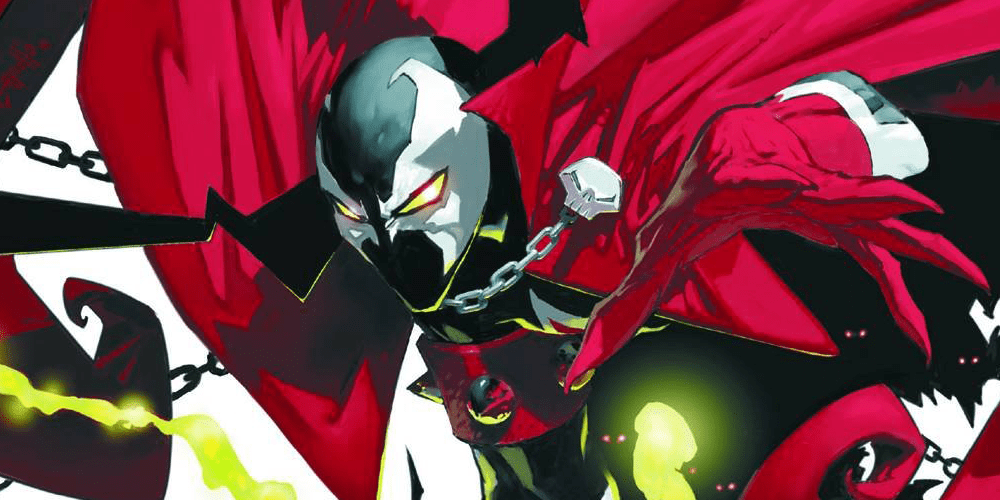
Spawn
What would this list be without the horror comic that helped launch Image Comics itself? Created by Todd McFarlane in 1992, Spawn has primarily been the story of Al Simmons, who made a bargain after his death, and returned to Earth as a hell-spawn: one of Hell’s elite officers. Over 300 issues in, Spawn is considered the greatest independent comic series of all time. And for good reason. It’s action-packed and exciting, with dark and intriguing story lines, and masterful artwork that is striking and highly detailed. There’s a plethora of titles featuring the character, all available for you to devour this Halloween (and year-round).
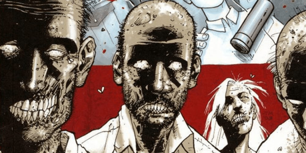
The Walking Dead
Another seminal series for both horror and comics. The Walking Dead follows a group of survivors in the months and years after a zombie apocalypse, led by police officer Rick Grimes, who travel in search of a safe and secure home. Robert Kirkman created a world where no one character was truly safe and where the people were more monstrous than the undead. Yes, the series was a bit of a slow burn, but over the course of the series you really get a good understanding of how and why the characters’ evolved as civilization declined and eventually rebuilt. Furthermore, that slow burn was met with a feeling of constant dread. Much like the zombies that suddenly crept up behind a person, so did that terror of what could possibly happen once you turned the page.
Wytches
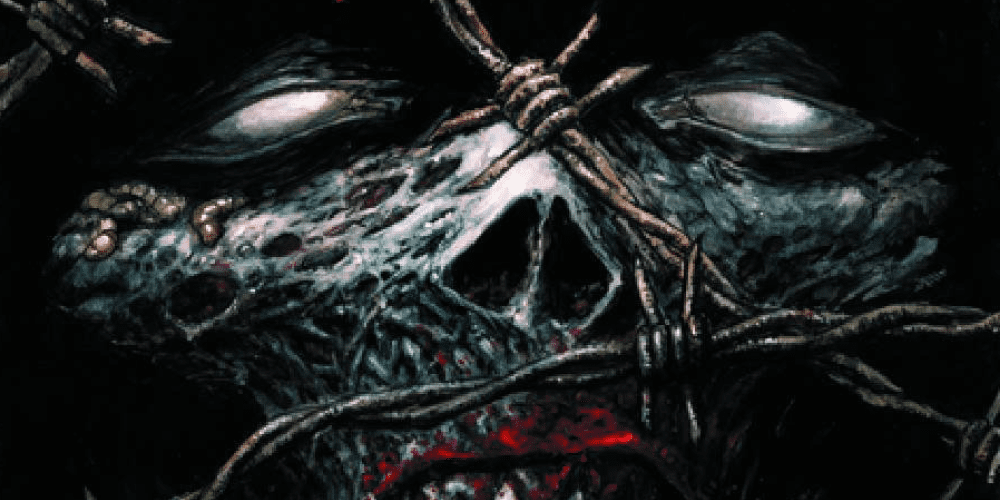
Another Scott Snyder entry on this list, Wytches takes the concept of these dark, magical beings with cauldrons and broomsticks, and makes them much more visceral and horrifying than ever before. The story is about the Rooks family, who move to a remote town escape a haunting trauma. But something evil is waiting for them in the woods just beyond town. Watching from the trees. Ancient…and hungry. This book is absolutely perfect for Halloween, or any night of the year if you’re looking for a dark and twisted tale. The utterly creepy artwork by Jock adds layers to the horrifying experience when reading this book, with mangled monsters and backgrounds that look like they were splattered onto the page.
Have we missed your favorite scary title from Image Comics? Let us know your favorite in the comments. Happy Halloween!
Looking for more comics to devour this Halloween season? Check out these other lists:
From the mind of Hellboy, creator Mike Mignola and writer/artist Warwick Johnson-Cadwell comes a new graphic novel steeped in folklore and classic monster myth. Our Encounters With Evil: Adventures of Professor J.T. Meinhardt And His Assistant Mr. Knox is a unique and intelligent monster tale steeped in literary tradition and comedy in a way that only Mignola’s imagination can offer.
In a story that follows the characters from Mr. Higgins Comes Home, Professor Meinhardt, Mr. Knox, and Mary Van Sloan set out on a series of monster hunts and misadventures. From chasing vampires in the Carpathian Mountains to being pursued by werewolves, the two inquisitive slayers meet a cast of strange and intriguing characters both villain and ally in their quest against creatures of the night.
Mignola has once again imagined a brilliantly unique yet somewhat familiar supernatural landscape with lore pulled from European and literary mythologies. Instead of Lovecraftian monstrosities or undead Russian wizards, Meinhardt and Knox hunt down good ol’ vampires. This story pulls heavily from classic literary works like Bram Stoker’s Dracula, Sherlock Holmes, and even Joseph Conrad’s Heart of Darkness. The concept and world may wear its influences on its sleeve, but it’s handled in such a way that it’s just a treat to see how and where these influences manifest in the story.
While the concept and characters may belong to Mignola, Our Encounters With Evil is brought to life by the talents of Warwick Johnson-Cadwell. Cadwell’s writing here fits the “less is more” approach that Mignola books often have, leaving the bulk of plot development to take place visually. There are a couple of exceptions to this rule, one of these being a story told through journal entries and the other being the exposition points. Now, exposition can often be a bad word when it comes to writing, but somehow Mignola always manages to team with writers that know how to use it properly. There’s a sort of “sitting around the campfire and swapping ghost stories” vibe that Cadwell uses here. The hunters and the people they meet will often give one another information about ancient beasts through narratives of their own. While these may be information dumps in a sense, they’re delivered in such an entertaining way that it doesn’t really matter.
The real stars of the writing here are the humor and character work. Professor Meinhardt and Mr. Knox come across as intelligent monster hunters at the start. Competent, however? Debatable. Without getting into spoilers, the circumstances of their victories are so stunning and hilarious that it’s a wonder how these two have stayed alive for so long. Well, that wonder is likely due to the prowess of master hunter Mary Van Sloan, who works as the hyper-competent foil to the two leads. The way that Cadwell plays with romantic-era monster tropes and humorously turns them on their head is this novel’s crowning achievement. While spooky at times, the clever humor lands on all fours throughout the book.
Cadwell’s art is pitch-perfect for anything with Mignola’s name on the cover. Artists that work on Mignola’s books always have an intriguing and strange style that works alongside Mignola’s own work, and Our Encounters with Evil is no exception. The simplistic yet effective visuals give the story its “spooky and strange” aesthetic while also being a great vehicle for the visual humor. Even the sound effects are given over to Cadwell’s unique vision, blending in perfectly with whatever chaos is happening in the panels without contrasting with the overall tone. Clem Robins’ handles letters and does so with sharp attention to stresses during dialogue. Bold and irregular letters set the mood during fights or panic. The real highlight is the authentic look of handwritten journal entries near the end of the story.
Our Encounters With Evil is an endlessly clever and surprisingly hilarious horror graphic novel. Mignola and Johnson-Cadwell have created a story that derives influence from literature and mythic monsters of old, and still stands on its own as a unique creation. Any fan of Gothic horror, classic monsters or even just witty humor are in for a definite treat when this book hits shelves on November 13th.
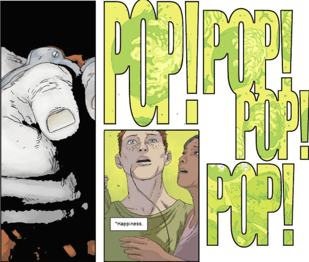
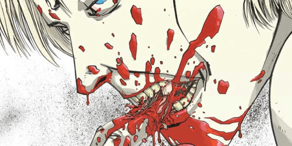
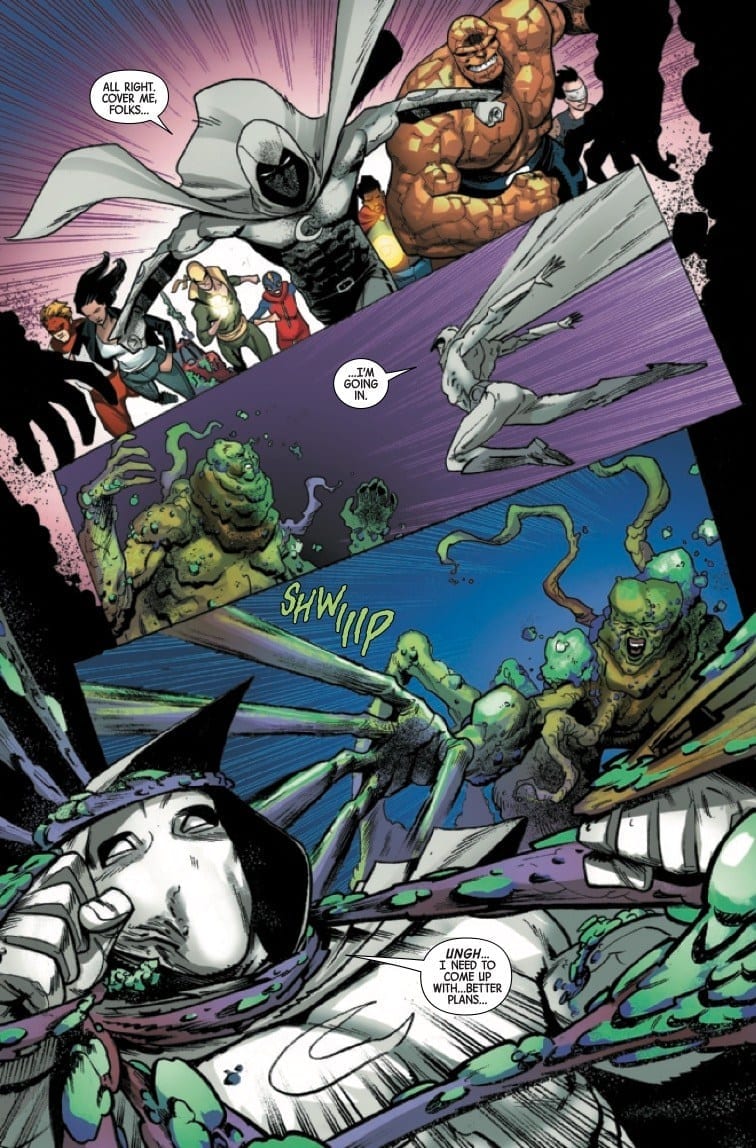
CONTAGION #5, available in stores Wednesday, October 30th, is the concluding chapter to this five-part miniseries. We’ve witnessed the outbreak of a parasitic fungus that’s infected New York’s heroes, beginning with the Fantastic Four (minus Ben Grimm) and continuing its rampage among the remaining protectors. But the contagion, known as the Urchin, has laid waste the Avengers and most everyone on the scene, leaving the future to an unlikely hero: Moon Knight. Will he find a way to stop the threat that took down Earth’s mightiest heroes?
Story
To the casual comic book fan, the vigilante hero Moon Knight may seem like a Batman knock-off, especially with his brooding, assortment of gadgets, and guilt complex. But beneath Marc Spector’s gruff exterior lies a fractured psyche, allowing him remain largely immune to psychological controls (like the Urchin) that could best even the Dark Knight. This special talent give the hero reason enough to plan an infiltration of the creature’s mind.
After becoming successfully absorbed by the Urchin, Moon Knight searches for the core of the creature’s mind, but runs into various zombified versions of the heroes under its control. One of these is the freshly absorbed Pie after a hard-fought battle. Enraged at the monster for absorbing a child, Moon Knight slices the mental tendrils to bits before they can take over Pie’s mind. And now the two bravely face the inner workings of the Urchin in a rescue mission that could potentially spell the end for everyone.
Writer Ed Brisson makes this version of Moon Knight relatable and distinct in his personality, representing those of us who feel like their inner thoughts are full of madness. This hero shows us that despite the mental issues affecting us—depression, anxiety, bipolar disorder, and more—we all have the capacity within us to save the day. We just need a supportive team to have our backs.
Artwork
Adam Gorham, Roge Antonio, Mack Chater, Damian Couceiro, and Stephen Segovia’s illustrations, in conjunction with Veronica Gandini’s coloring, are a charming blend of psychedelic bliss and disturbing horror. The fungi-covered heroes and buildings of New York’s Yancy street bring to mind apocalyptic images in classic sci-fy stories. But the really enjoyable elements are found within the Urchin itself; Moon Knight’s journey through this twisted mangle of minds is reminiscent of a Magic School Bus trip within someone’s body, depicting colorful, organ-like structures set in front of a backdrop of membranes and tissues. What’s more, the art within the Urchin meshes well with VC’s Cory Petit’s lettering, which seems to follow Moon Knight in each panel as he tumbles around in the chaos.
Comic Covers
Main Cover
Juan José Ryp & Jesus Aburtov’s cover artwork depicts Ruby, the unwillingly host of the Urchin, along with the main roster of Avengers in calcified (or “fungified”) form. The group is set against a backdrop of fungi-covered buildings and bridges as well. These images together show how the contagion, much like any disease of the body or mind, infects everything around us.
Variant Cover
Ryan Browne’s variant cover illustration is much like the main cover in its focus on the characters infected forms. But instead of the heroes, this version places the focus on Yancy Street resident Ruby. Readers are brought back down to earth by seeing the true damage this contagion has wrecked on normal people.
Conclusion
The message in CONTAGION #5 hits home, but the wrap up seemed a bit rushed. It would have been nice to learn more about the intricacies of the Urchin and see exactly how it exerted so much power over our heroes. Still, the series was a blast to read and brings light to one of Marvel’s most overlooked Moon-themed characters.
Were you satisfied with the conclusion of this series? Let us know in the comments below!
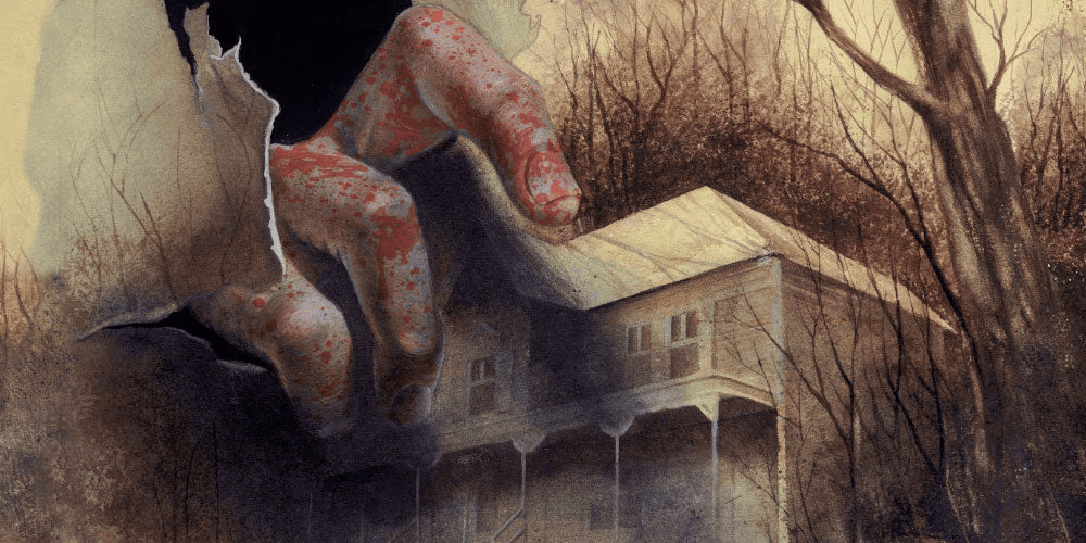
With escaped convicts, oncoming storms, and old relics, Scooby Doo and the gang would feel right at home on Brody Island in Basketful of Heads #1, out this week from DC Comics.
Basketful of Heads #1 is written by Joe Hill, illustrated by LEOMACS, colored by Dave Stewart, and lettered by Deron Bennett. This issue from Hill and company gears up for a fun and exciting romp through a small coastal tourist trap. If 80’s horror is your flavor then look no further.
While Basketful of Heads #1 has all the makings of the first 5 minutes of an episode of Scooby Doo, it introduces the characters in a streamlined way that doesn’t reveal too much but gives the readers people to care about. Strong characters are the most important part of a horror story. Writers have to make us care about the people these terrifying things are happening to or there’s no suspense, nothing with any scare value, because we don’t care.
Joe Hill creates a gang that we can invest some emotion into with his first chapter of Hill House Comics. Hill sets the bar pretty high for this story by referencing Shawshank Redemption as the name of the prison the convicts have escaped from, so we’ll see if making readers think of Andy Dufresne is at his own peril or a worthy comparison.
This book looks like it could be an offshoot of the Archie universe as well. The artwork and layout bring back feelings of nostalgia and simpler times, when your mom called you home with a loud whistle or a car horn. Soft lines and and pale colors give this issue a look of yesteryear.
Stewart’s faded colors bring the beach town to life. He does a magnificent job of capturing the weather change with his color palette. Nothing is too bright and everything looks like it’s being viewed through a pair of aviator sunglasses. A storm starts to roll in and that beautiful pre-storm orange rolls in with it, when the sun has to break through the cloud cover close to sunset, it’s the beauty right before the destruction.
All the chaos of the day on Brody Island comes together as Basketful of Heads #1 brews up the perfect storm. Summer is over, convicts have escaped, a tropical storm is coming, there’s a cursed ax in a display case, and the sheriff running the town has a huge house, so he’s definitely up to some extra curricular activities in his free time, or he’s taking bribes and robbing all the tourists.
There’s so much to focus on in Basketful of Heads #1 that there’s no way to predict how this narrative unfolds, and that’s what I like about this story. It’s set up in such a way that it could be an homage to 80’s horror, or it could be something completely different. The title leads me to believe it will be the latter.
Hopefully a dog will show up to help, every gang needs a good boy.
What did you think of Basketful of Heads #1? What do you think of the debut of Hill House Comics? Do you think this will be the HBO Max’s Millarworld? Let us know in the comments below.
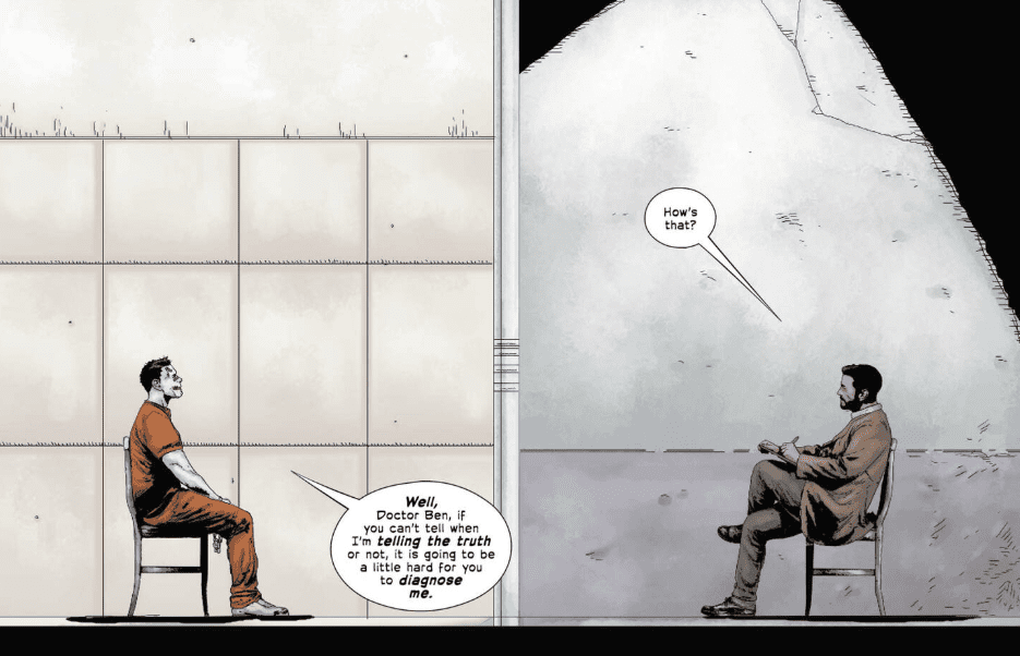
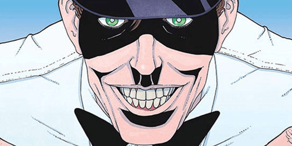
Dr. Ben Arnell tries a new approach at a cure with Joker: Killer Smile #1, from DC Comics Black Label this week.
Jeff Lemire is writing this new haunting horror. Andrea Sorrentino treats us to some exquisite Joker panels. Jordie Bellaire has the task of coloring those beautiful panels while Steve Wands handles the letters.
Lemire and Sorrentino are a dream team and finally getting to read a Joker story from them is something I’ve been looking forward to since this title was announced. Sorrentino uses unique paneling and layouts in so many of the books he works on, and I can’t get enough of it. Gideon Falls has some of the best paneling in comics and this team takes that with them to whatever title they treat the world with. In Joker: Killer Smile #1 he uses teeth shaped panels and illustrates inside Wands’s lettering. It is always amazing to see when teams work so well together in the creative process.
Sorrentino has the perfect style for dark and haunting stories like this one. The shadows appear to have a mind of their own, like something from Little Nemo‘s nightmares. Anything could be hiding among them waiting for the right moment to strike. He can easily build suspense with just his art. It is a remarkably useful talent to have for the horror genre.
Bellaire’s colors give Sorrentino’s art a different feel than what we’re used to seeing from him. A softer and brighter palette gives a more hopeful outlook than other Sorrentino artwork. Joker: Killer Smile #1 instantly reminded me of the Ice Cream Man series from Image comics. The artwork seems almost cheerful until the evil is realized.
Wands does a fantastic job with the lettering. I always love huge letters filled with story art. It gives the impression that the sound is the most prominent aspect of the panel. Visually seeing the impact takes the back seat to the brutal noise it makes during the beat-down. We’ve all seen those World Star videos with smacks heard ’round the world, and Batman gives the Joker one of those.
Joker: Killer Smile #1 follows Dr. Ben Arnell as he tries to fix the Joker. He claims he’s working towards this so he can use what he learns to help other people. His boss gives him something to think about by mentioning he might be doing this for his own ego, and this is obviously something that sticks with him.
Lemire uses children’s stories within the main plot to drive the narrative in a few of his stories. I actually love this tactic he uses as it is always a nice change of pace. Most of Lemire’s work is sad AF, so any moment of happiness, even for a brief moment, is a relief to the senses. It’s like he sits down to write a children’s version of every story he does, so he can use it at any time. Here we meet Mr. Smiles and he is about as evil as it gets when it comes to cuddly creatures.
This is a supernatural horror in the same vein of The Shining. A man is unraveling, he’s losing time, and his memory is failing him. Dr. Ben thinks he can shut out the Joker’s attempts to corrupt his mind, and he’s very confident in that fact. He is very wrong, oh so very, very wrong.
What did you think of Joker: Killer Smile #1? Let us know in the comments below.
The Crimson Witch continues her quest to raise the demon Razazel in Conan #10 as she is impregnated and delivers twins. The children (fraternal twins named Razza, a boy, and Zazella, a girl) are intended to carry on the glory of Razazel by helping their mother kill a warrior whose blood has grown powerful through a lifetime of slaying his enemies. The sacrifice will bring the powerful demon to Earth, where we can assume he doesn’t have mortals’ best interests in mind.
(I had triplet girls in the Crimson Witch baby shower pool)
The story jumps around in time as we see the kids next around age four or five when they’re playing hide and seek. Mother Crimson Witch calls them to her, announcing she’s leaving to find “a slayer unlike any other.” As she mentions him, the Barbarian arrives and appears to lop her head off while the children are hiding.
(Wonder who she means?)
The Crimson Witch somehow survives the attack, thanks in part to her children sewing her head back on, and said spawn continue on, searching for Conan. For years, they follow him, waiting for his blood to strengthen as he does what he does best. When they are finally able to catch him, they attempt to use him to raise Razazel, with gruesome results.
Jason Aaron, whose work on Thor has made him as synonymous with the Asgardian as Walt Simonson (yeah, I said it), has indelibly put his prints on Conan using the same methods that gave the Thunder God an identity away from Chris Helmsworth’s portrayal in the movies. The combination of over-the-top murder combined with real humanity makes Conan, specifically this story, almost touching.
These aren’t evil children, at least not in the classic sense. They regular kids, playing regular games, raised by a mother who loves them. Classic Conan stories would see the twins as a monstrous duo with the Crimson Witch raising them solely to do her bidding. Aaron’s story gives a glimpse of a mother who dotes on her babies with those babies respecting her and seeing her only as their mother. But, you know, also planning to murder Conan in order to bring Razazel to Earth.
The artwork is well-suited for the story. Mahmud Asrar’s pencils are perfectly imperfect. A Jim Lee or Andy Kubert would be overkill for a run like Conan’s. The art, with Matthew Wilson’s colors, creates a definite mood, and that mood is dark. From the first page to the final splash, everything about this comic moans darkness and witchcraft. Conan is only a bit character, for the most part, with the children and their mother at the forefront. The lettering, done capably by VC’s Travis Lanham, moves the story along without distraction and shines with era-appropriate calligraphy.
It’s easy for a book like Conan to get lost in a cycle of old stories and stereotypical barbarian banter and bloodshed, but this team seems to have not only a solid grasp on the title character but the ability to humanize its villains as well.
How do you like the flow of Jason Aaron’s Conan? Provide your opinions below.
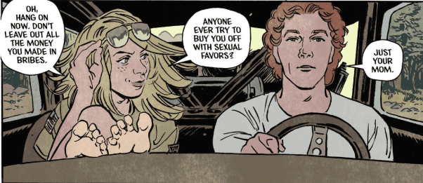
RUNAWAYS #26, out this Wednesday from Marvel Comics, brings with it a lot of changes to our ragtag group of young heroes. The kid gloves are off in the latest issue, but the real question is: do the Runaways know that yet?
Packing up and shipping off.
***SPOILER WARNING***
That last few issues of the Runaways have brought with them a lot of changes. And this issue appears to be no exception. The Runaways, for good or bad, have decided to trust the mysterious Doc Justice. And we all know the Runaways track record when it comes to trusting adults.
Rainbow Rowell clearly has a long-term plan for the Runaways, and specifically what they might potentially be facing when it comes to the legacy of the Pride. As it turns out, just because you kill the leaders of an organization (however unintentionally that may have been), it doesn’t automatically mean their plans will magically go away.
But of course, nothing is ever as clean-cut or straightforward as it seems. Doc Justice looks like the perfect solution to the Runaways problem. And that’s not sitting easy with us. In fact, it seems more than a little bit suspicious.
That Rowell was able to introduce a character who overall seems to be so helpful and kind, and have him come off as anything but shows her skill in writing. Though admittedly, his pained looking smiles go a long way in leaving us concerned as well.
And this is all while juggling several other subplots in the series. Recall that almost every character has their own hopes and goals, though some of them are being more vocal about that fact than others.
Look at that mansion!
There is one subplot the rest of the characters seem to have forgotten about, but that Rowell won’t let us readers ignore. Gibb. He’s been slowly starving this whole time, thanks to his need for sacrifices as food.
Well, it seems a solution has been found. And the answer is not a pretty one. The Runaways has never been a series to pull its punches, so that shouldn’t be overly surprising. What is surprising (spoiler warning) is seeing apparently killing a dog for the sake of Gibb. Typically here’s where we’d say that this isn’t a moment you should let your kids see, but this is the Runaways we’re talking about.
To be fair, this whole subplot actually started out kind of cute. And maybe just a touch gross. There’s something cute about the idea of Molly’s cat trying to help Gibb out. Old Lace just took it to a whole new (and disturbing) level. And we’ve got to wonder; how will the rest of the Runaways deal with this development? Assuming they even notice.
Gibb isn’t looking so good. Nor is Doc Justice, for that matter.
Runaways #11 has a lot of artwork worth noting upon. We already mentioned one subtly hidden within the artwork (Doc Justice’s expressions). But there’s more going on behind the scenes as well. Everyone else looks normal, so this seems like an intentional choice for Doc’s character in particular.
Andrews Genolet was the lead artist for this issue, and he’s the one who made the expressions we already talked about. Meanwhile, Dee Cunniffe provided some absolutely brilliant (literally) colors to the mix. And finally, VC’s Joe Caramagna’s lettering was on point.
And a quick peek at the description for this issue, alongside the massive creative team.
Runaways #11 is setting up for several big events, from the looks of things. And we’re stuck here wondering how the Runaways will handle all of this hitting them at once because it’s not looking good.
Dark Horse Comics’ Hellboy Universe is a daunting one with its 20 plus year history, luckily Wednesday’s HELLBOY AND THE B.P.R.D.: LONG NIGHT AT GOLOSKI STATION is a quick, quirky and fun entry-level comic.
Art by Matt Smith, colorist Dave Stewart, letterer Clem Robins
All Aboard The Story Train
Long Night At Goloski Station is exactly what its name implies; a continuous night at a train station. The reason this is important? When a story takes place all in one night and location, it’s easier to tell a focused, new reader friendly story. That’s exactly what Mike Mignola achieves.
Finding a single issue in the Hellboy Universe that invites new readers, while telling an in-canon story that barely references past events is hard. Luckily, Mignola crafts a story that revolves around minimum core characters (only Hellboy), and minimum references all wrapped in a tightly focused one and done tale. Mignola can achieve this feat with the classic story beats: horror, comedy, and love that is seen throughout his famous Universe.
This is made more astonishing when looking at the casting of Long Night At Goloski Station. The one shot’s cast primarily revolves around five main characters, and a few mentioned/shown. Simplicity in the story and cast works to Mignola’s benefit while making Long Night At Goloski Station less intimating.
Art by Matt Smith, colorist Dave Stewart, letterer Clem Robins
Art
Long Night At Goloski Station is interior artist Matt Smith’s first foray into the Hellboy Universe. Not to be confused with Matt Smith (Matthew Dow Smith) who worked on some titles in the 90’s. Turns out there are a few Matt Smith’s in the entertainment industry.
Smith’s style works perfectly for the one-shot, as it mirrors Mignola’s style just not as heavily inked. This likeness is the best-case scenario for newcomers, as it will ease them into Mignola’s unique style. Smith’s characters do look a little more human-shaped, but for the story being told the art works.
The action scenes throughout are fluid while containing a fair amount of chaos transpiring around them. When a character busts through a door it explodes with the splintered wood flying around. In more dramatic cases of action, colorist Dave Stewart voids the background, then adds a dramatic color effect.
Stewart’s name is a staple in the Hellboy Universe. Having been on nearly every title/issue, it’s rare you don’t see Stewart’s name attached to a title. Stewart’s colors continue to help the Universe thrive, voiding panels when needed, or making them more bombastic. There’s a reason he has stuck around these comics, and in Long Night At Goloski Station it shows.
Another veteran joins the team in the form of letterer Clem Robins. Robins continues the trend of knowing what works for a Hellboy comic and showcasing it in the one-shot. With great bubble placement, and the ability to make small sound effects sound large, or large ones feel more substantial, it makes sense why he has also stuck around.
Art by Matt Smith, colorist Dave Stewart, letterer Clem Robins
Train Leaving After a Long Night At Goloski Station
Long Night At Goloski Station may be the best recent Hellboy jumping on point for anyone interested in the character and his world. By combining an easy to follow fun story and art akin to Mignola’s, Long Night At Goloski Station makes for a straightforward entry story for new comers.
Cover Story: Mignola’s famous cover of having the location, characters, and specific items smack dab in the center returns for Long Night At Goloski Station. Some may think it’s not much. But, as a Mignola fan it’s always awesome to see these covers!
New/Old Members of The B.P.R.D.
Did you read Long Night At Goloski Station as a newcomer or long-standing fan of the Universe? Let us know what group you fall under and what you thought below!
Plus, check out why you should start reading the Hellboy Universe if you aren’t already!


")


")