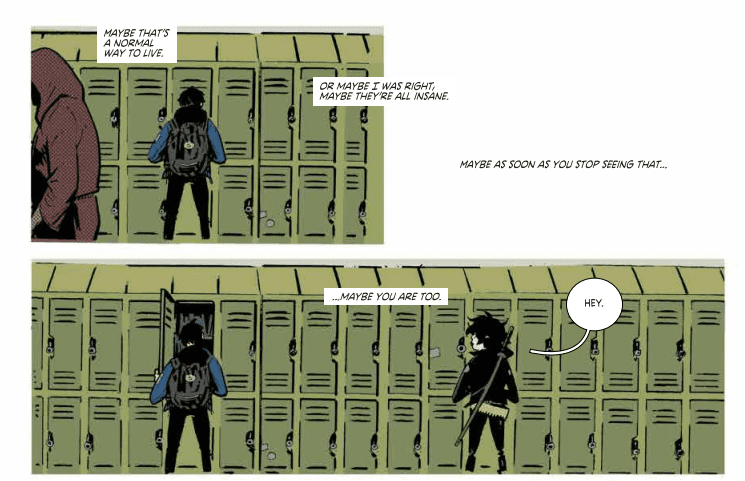
Most of her people have abandoned her. Many of her closest advisors betrayed her. Things seem bleak for our heroine in Red Sonja #10, out this week from Dynamite Entertainment.
Of course, appearances can be deceiving…if you know how to leverage your situation, and fortunately, Sonja may have a plan. Beyond that, she may find additional help from an unexpected source close to Dragan himself.
The Writing
The majority of Red Sonja #10 is focused away from the titular character. Instead, we first have a flashback-within-a-flashback, showcasing more of Domo’s tactical wisdom, which he imparts to Sonja. After this, another flashback gives us insight on Minnas’s backstory, and how he came to serve Dragan.
One of the best elements writer Mark Russell brings to the series is the way he weaves themes and motifs into the story. There are multiple narrative threads in play in this single issue. However, Russell manages to tie them together by the book’s end. It’s almost poetic how well these seemingly-disparate narratives converge, giving the work a mature, well-constructed feel.
In Red Sonja #10 for instance, we see Minnas practicing divination in the past to determine how best to manage Dragan’s growing influence. But, while his medium can accurately see the future, it’s responses can be cryptic and tend toward misinterpretation. It’s a kind of monkey’s paw scenario that proves to be his downfall…but may also be key to his revenge. This, in turn, relates directly to Domo’s lesson from earlier in the book: “hubris is suicide.”
The only real complaint is that there are parts of the extended flashback which overlap with the present. It effectively showcases the dramatic irony of the situation, as we understand the fallacy of taking the theraphim’s advice literally. However, it can be a bit confusing on a first read through, as it makes it a little difficult to keep straight whether the dialogue is meant to be read as in the present, or in the past.
Beyond those minor gripes about craft, though, Red Sonja #10 is another excellent chapter in Russell’s story.
The Artwork
Artist Mirko Colak is takes over visual duties once again for Red Sonja #10. As with previous issues, Colak’s work flows well from panel to panel. One picks up on a sense of cohesion throughout which keeps the reader vested in the story.
The visuals are not exceptionally detailed or expressive, though. Characters’ faces, for instance, tend to remain stony and closed-lipped throughout the book. They only really feel especially lively when conveying over-the-top emotion. Otherwise, they’re largely inscrutable.
If we compare Colak’s work in Red Sonja #10 to that of artist Bob Q in our previous issue, there is a clear gap in the level of detail conveyed in the artwork. The backgrounds are fairly sparse and limited, while character designs feel a bit sketchier. This could be chalked up to a stylistic preference, but for my money, it feels somewhat unfinished.
The colors provided by artist Dearbhla Kelly, however, nicely capture the mood of the narrative. We see different sequences dominated by specific color schemes: dusty desert browns, icy blues, and twilight pinkish-purples. Kelly employs subtle shifts in tones to render shadows and really bring the art to life.
Final Thoughts
Red Sonja #10 offers a rich, interwoven story that deepens the narrative and fleshes out a couple of characters about whom we knew relatively little. It’s worth picking up.
Image’s Deadly Class by Rick Remender, Wes Craig, Jordan Boyd and Rus Wooton continues to be one of the best books in the medium with another intense, somber and absolutely gorgeous issue. This is sequential storytelling at it’s best.
From Image- BONE MACHINE,” Part Two A nice, relaxing trip to a remote cabin in the woods—what could go wrong?
Deadly Class #41 Written by: Rick Remender Pencils and Inks by: Wes Craig Colors by: Jordan Boyd Letters by: Rus Wooton
MILD SPOILERS BELOW
Story
After a couple of issues with some big action, violence and turns, Deadly Class #41 slows down a bit. The bulk of this issue is spent inside the thoughts of the main character Marcus. This allows writer Rick Remender to bust out a first-person narrative. Remender is an excellent writer, and as much as Deadly Class is a sort of high concept comic, it’s when Rememender gets inside the heads of his characters that his talent really shines. Marcus’ thoughts tell us how much the character has changed since we first met him; he’s less angry young punk and more of a morose assassin and sort of school leader. But he still sees through the bullshit at King’s Dominion. Remender’s prose here flows with elegance, yet feels like the thoughts of a teenager (albeit a smart one who is also a deadly killer). It’s a tough balancing act the scribe has been able to pull in every issue.
Excellent use of layout and composition!
The biggest plot development here is Saya’s return to the school and the reaction she gets from her re-appearance. Her return signals a big status change for the former bad-ass Yakuza, and where Remender takes Saya’s story from here is going to be a ride.
The end of the issue takes us out of Marcus’ head and we get our most plot-driven scene in the issue. The scene takes place in a carnival and ends in a murder, but it plays out like kids hanging at a fair. That dichotomy has always been one of the titles’ strongest narrative tools.
Great way of balancing a page. And look at those colors!
Remender’s dialog also continues to be great. His teenagers talk like kids do, but there’s an element of word weariness to their talks too. These kids may be kids, but collectively they have been through more shit than any adult.
Art
Of course, the art is fucking fantastic. Since the first issue, Wes Craig has done nothing but create sheer comic book magic on every page. Deadly Class #41 is no different. Craig continues to create some of the best page layouts in modern comics. There is a balance and flow to his panels that draw on everything from Frank Miller to manga. His linework is also highly energetic, yet is clearly meticulous in composure. His inks give everything weight and form.
The use of composition, colors, figures and letters on this are sublime.
When you add in Jordan Boyd’s colors, everything comes alive. Boyd is one of the best colorists in comics and pulls from a diverse palette that changes in order to suit mood and atmosphere.
The lettering in this issue is also a knockout. This issue (like a lot of Deadly Class) is very heavy on the number of words on a page. But letterer Rus Wooton’s clear letters alow for easy reading and his font just looks fucking good on the page. The layouts allow for heavy busts of words, yet it doesn’t take away from the art at all. It’s in fact integral to the whole package working. All you have to do is read the great sequence at the end of the issue to understand. It all comes together.
Conclusion
Deadly Class #41 is another great issue in one of the best on-going titles you can get right now. Comics like this are the reason you want to go to a store every week or month and not trade wait or read digitally. You want to hold this book and you want to flip these pages. It’s time you all attended King’s Dominion if you haven’t yet.
Deadly Class #41 is available at your local comics shop on November 6, 2019.
IDW Publishing’s political thriller Pandemica, written by New York Times best selling author Jonathan Maberry, reaches its second explosive issue this week. Mixing modern political concerns with theoretical end world scenarios, Pandemica is a hard hitting apocalypse story that cuts close to the bone.
When new strains of old diseases start wiping out large populations of ethnic groups, a small undercover team try to uncover the cause. This leads to the uncovering of a disturbing conspiracy and a highly motivated white supremacy organisation hell bent on gaining control of the government, and then the world. But their plans are starting to slip out of their control. In a world of modified and untested diseases, is anyone safe?
Pandemica #2 Credit: IDW Publishing
Unsteady Beginnings
This is issue focuses on two characters and their actions in the ‘end days’. De, who the reader got to know in the previous issue, and Chick, a young more reckless agent. Maberry introduces them in action, raiding a secret bioweapons laboratory. He uses the situation to portray the main characteristics of both De and Chick so that the reader gets to know them by their actions.
At this point some of the script is difficult to swallow. The conversation between the two characters is forced with Chick’s attitude coming off as unnatural in the circumstances. De’s speech does not have the same affect so the problem lays with Maberry’s attempt to portray Chick’s personality.
This is not the only issue with the opening sequence. Some of the compositions within the panels are questionable, creating uncomfortable, sometimes unnatural, positions for the characters. There is even a lettering decision regarding De’s internal dialogue that is out of place and makes the words appear like an afterthought, added at the last moment.
However, to counter the negative, there are some wonderful little touches in that opening sequence and an important aspect of the narrative is revealed. The way in which it is revealed isn’t groundbreaking, via an interrogation with a predictable end, but the information itself adds extra depth and mystery to the story.
Alex Sanchez has an eye for exciting action shots. His use of stacked panels with images that cross the borders and gutters leads the reader through the pages at an alarming rate. His line work is precise and highly detailed in the foreground and the background. This produces some horrific images further down the line that really highlight the disturbing nature of the diseases spreading throughout America.
Pandemica #2 Credit: IDW Publishing
Building Visuals
The structure of the story is broken into two parts, one set in the present day and the other set in the future. In the first issue that jump was like an epilogue, similar in style to the final episode of the first series of Dollhouse. It was intriguing but also a contrast to the style of the rest of the comic. In this issue that step from present to future story-lines is more natural. Although there is still a big gap between the two time periods, and a lot of questions that need to be answered. It has, however, become clearer how the two are related.
Maberry is cleverly filling in the gap in the narrative, dropping plot points a bit at a time as if he is building a tower that the reader has already seen the top of. The tone of the two time periods is also creeping closer to each other thanks to the color work by Jay Fotos. There is still a distinct difference between future and past, mainly in the colors of the background, but Fotos is altering elements of the earlier time period to match the future world seen at the end of each issue.
As mentioned Sanchez’s artwork packs the panel’s with action, even during the conversational scenes set in labs or offices. There is a sense of urgency throughout which is mirrored in the placement of speech balloons by Shawn Lee. He breaks large speeches up into smaller segments, linked by touching balloons with a break in the outline. This extends the time within a number of panels but also emphasises personality traits of the characters speaking.
Pandemica #2 Credit: IDW Publishing
Conclusion
Pandemica has a hard hitting central theme. Ethnic cleansing and the rise of white supremacy is a terrifying part of the modern world. Maberry takes the hatred and single-mindedness to the Nth degree with disturbing consequences. However, after that initial shock, this reads like any number of political thrillers that can be found in comics or books. A series of set pieces move the narrative on but they are filled with cliches and obvious outcomes.
It is an enjoyable read, quick and easy, and will appeal to fans of the Jack Ryan series (in whatever format you enjoy the stories). It has elements of Dan Brown books mixed with the movie 28 Days Later. A weak start to the issue means that the comic is fighting to keep the reader interested but the later stages of the comic is where the best parts are.
“Wild Wild West, Jim West, desperado, rough rider. No, you don’t want nada.” These profound lyrics from Will Smith feel like they were written exclusively for Undiscovered Country #1, out this week from Image Comics.
Scott Snyder and Charles Soule bring an over-the-top history-based fantasy to the table with Undiscovered Country #1. Giuseppe Camuncoli is the visual creator of the team, and Daniele Orlandini takes care of the inks, and Matt Wilson has the colors. Lettering for this book is done by the one and only Crank!.
Snyder is never secretive about his creative process, especially when teaming up with another writer. This first issue takes readers behind the curtain and explains how this story came together and gives insight into the painstaking process of designing logos and covers. Future writers will always be thankful for insights into other’s methods, as it can help tremendously when you might find yourself with writer’s block.
Soule is not a writer I am very familiar with outside of his work with Marvel. Admittedly, I lost interest in Curse Words pretty early on in the series, but not because it wasn’t good, just not something I’m usually into. That being said, the humor and fantasy in that story is a perfect experience for the craziness in store in Undiscovered Country.
What starts out as something that feels very realistic, and honestly, it’s not that much of a stretch of the imagination to believe it could happen in the real world, quickly turns into something akin to Seven to Eternity or East of West. It doesn’t take any scientific analysis to see why New Republic Pictures have already optioned this property.
I am a massive fan of Camuncoli’s work on this issue. He does a magnificent job of catching the emotions on the faces of his characters. You can easily see the anxiety and nerves the characters are going through. The group doesn’t have the dreaded same face syndrome either, so it’s easy to differentiate the people we are being introduced to, right as they are thrown into the flames.
Orlandini works seamlessly with Camuncoli’s pencils. The lines are thin, detailed, and show the entropy taking place in this world. Inks in this issue are precise and keep the panels clean. There are no lines just for the sake of it, so our eyes focus precisely where they should.
Wilson’s colors bring this doomed world to life. There’s a virus-killing through the world outside of the United States of America. Infrastructure is crumbling as people have new priorities. There’s a haze covering the world, physically and metaphorically, and it shows. Everyone’s clothes are worn, faded, mismatched, and it truly feels like the people are helpless. Colors are paramount to making this world feel real, and Wilson nails it.
Snyder, thanks Crank! for giving a voice to all the characters with a real visual flair, and I’d have to agree with the sentiment. For a colossal world-building adventure like Undiscovered Country, it’s refreshing to know that someone, as respected as Crank, is along for the journey. A creator-owned title with so many big names working on it will be huge for the industry, and hopefully, fill that giant hole left at Image since The Walking Dead ended.
Undiscovered Country is immediately poised for success. It has already been optioned ahead of the release of the first issue, it has two great writers working on the comic and the screenplay, the world is expansive and can go on for as long as the creative team wants it to, and it is based on history and real-life events. It is action-packed, intriguing, and I’ve been hooked since the ashcan.
I will be recommending Undiscovered Country to any readers who have been looking for something else to dive into after The Walking Dead has left them with a void to fill. Fans of Black Science, East of West, and any other adventure books will love this as well.
Whatever these people studied and trained for, nothing could prepare them for what they’ve stepped into. The United States of America has become something no one has ever seen before, and Uncle Sam needs you to join the revolution.
What did you think of Undiscovered Country #1? What events and conspiracies would you like to see come up in the story? Let us know in the comments below.
In a time when countless comic book writers have attempted to give dark twists to the characters we know and love, All-Star Superman stands out and demonstrates that this isn’t necessary, and certainly shouldn’t be done to the Man Of Steel.
Superman’s personality has been altered time and time again by various authors, all trying to put his or her touch on the Man Of Steel. Still, there are absolute values the character possesses that should never be changed. Not only does All-Star Superman tell the story of a character with these ideals, but it gives one of the purest interpretations of them we have seen in years.
By the time I began reading comic books, decades had passed since the golden and silver ages. For most of us, this was the case. We never got to experience the classic tales of heroism written for children, nor the bright and hopeful storylines of those times. Long before I was introduced to the medium, writers were already looking for ways to darken the iconic characters. Frank Miller published his amazing The Dark Knight Returns, and Alan Moore and Dave Gibbons gave us a gritty satire of the superhero genre in the acclaimed maxiseries Watchmen. While I thoroughly enjoy gritty and dark tales, Grant Morrison and Frank Quitely demonstrate to us in their superb 12-issue series All-Star Superman that dark isn’t the way to handle the last son of Krypton.
In All-Star Superman, Morrison tells the story of the final days of the Man Of Steel after Lex Luthor successfully overloaded his cells by drawing him too close to the sun. In the final year that Superman has to live, he tells Lois his identity, fights some of his most iconic villains one last time, and reaches closure on things he never thought he would. It is a heart-warming and fantastic tale that, despite the sad knowledge that the Man Of Tomorrow will never see it, could not be a more hopeful telling of the Superman story.
With help from the art of Quitely, Morrison creates a beautiful contrast from the works of Miller and Moore, demonstrating that the darkness from the real world does not necessarily need to seep onto the panels. His eternal optimism most strongly characterizes Morrison’s pure interpretation of Superman. Even when it seems there is no possible way to solve a problem, when you are backed into a corner, Superman will always find away. Superman doesn’t win all of his battles by merely punching the bad guy, in many ways the Man of Steel sees his nemeses not as villains, but as people. It doesn’t matter if Lex killed Superman; Superman will never return the favor because it is never right to take a life. Do not misunderstand me; I recognize that this may not be the case in everyday life. A police officer or a member of the military could not go into battle with the goal of zero casualties, because it would result in his or her death. But Superman is not human. He is an alien superhero with the powers of a god. Superman can save thousands without putting his own life in danger nearly all of the time. The times the invulnerable Kryptonian is forced to endanger his own life do not affect Superman either, which is highlighted with stories such as All-Star Superman. They show us that in Superman’s constant devotion to the values of truth, justice, and the American way, he will never bend his principles, even when knocking at death’s door.
Under typical circumstances, All-Star Superman wouldn’t have changed my concept of what a comic could be, because it merely embodies everything I want from a Superman book. It reads like another Superman story; only this is one of the beautiful comics that understands the character. What caused this particular comic to have such a substantial impact on me was its release date. I’ve read boxes worth of comics in my time as a fan of the medium, but this was the first recent one that seemed to understand how comics could be an escape from the real world. I’ve read so many comics that assert that humans and heroes are naturally corrupt beings and that the idea that Superman would be so close to a flawless being is complete lunacy. I do not understand what caused people to lose their faith in humanity, but I don’t believe it. All-Star Superman showed me during a time when dark superhero stories saturated the market, that they don’t have to be dark. None of us will indeed be as good as the Superman immortalized on the pages we read each month, but there’s a reason he’s known as the Man Of Tomorrow. Superman stands as a beacon of what we can be, an ideal of what the future could be like if we only showed a bit more empathy and tried to do more good. I don’t believe that the heroes of the world would be corrupt and indistinguishable from the villains of the world, such as in Garth Ennis’ The Boys. In a world where superheroes exist, there would be enough good people to save the world every time. That may sound too hopeful, but All-Star Superman gives me hope.
What’s everyone’s favorite Superman comic? Leave your answer in the comments below!
The Jawinn Comic Drive, in partnership with Operation Gratitude and Collectors Paradise, is collecting comic books to send to US military members deployed overseas, and you can help them hit their goal!
Jawinn Comic Drive was founded by Jason Inman (Jawinn = Jason William Inman), himself an Army vet and author. 2019 marks the five year anniversary of the Comic Drive, and over those five years, Jawinn has sent over 134,964 comic books to service members and their families.
From November 1st through November 30, Jason is looking to collect 15,000 comics for Operation Gratitude to send to the service members to read in their care packages through the holidays and the new year. The comics can be from any company or genre and can include graphic novels and trade paperbacks! Jason just asks that you keep the books family-friendly, as some comics will be sent to soldiers’ family and children.
Let Jason tell you about the project himself:
Old and new comics in new and fine condition are welcome, but please make sure the comics are in good reading condition. If you wouldn’t read a book that’s falling apart, please don’t gift it to a soldier. Plus, if you wish to include personal letters of support to the servicemen, send them along with your comics!
If you want to add other items you see on their list — batteries, deodorant, sunscreen, please feel free to add those to the package as well! Please make sure to put “Jawiin Comic Drive for Service Members” in the Product Donation Information Section. The rest of the form is pretty self-explanatory.
2 – Box and ship the comics and the donation form to:
Operation Gratitude , 21100 Lassen St. Chatsworth, CA 91311
(IMPORTANT: Please include a donation form in EVERY box even if they’re part of the same donation. Sometimes cartons don’t all arrive at the same time.)
3 – Send a picture of your comics and the number of books you are donating to jawiincomicdrive@gmail.com. (If you don’t send your number to the email, they will have an inaccurate count and the drive could fail. Let’s get these soldiers some comics for the new year!)
And for Los Angeles locals:
For Los Angeles locals, all three Collectors Paradise comic shops will serve as drop off locations. And for every comic book dropped off to a Collectors Paradise location, the store will match the donation with an equal number of comic books.
To help kick off the drive, Collectors Paradise’ brand new NoHo Arts District location will host a Jawiin Comic Book Drive event on Sunday, November 10th, 2019 (the day before Veterans Day), featuring several LA-based comic book artists! If you donate more than 25 comics during the event you will get a free sketch from:
About Operation Gratitude: Every year, Operation Gratitude sends 250,000+ individually addressed care packages to Soldiers, Sailors, Airmen and Marines deployed overseas, to their children left behind, and to New Recruits, Veterans, First Responders, Wounded Heroes, and their Caregivers. Each package contains food, hygiene products, entertainment, and handmade items, as well as personal letters of support.
Mike Flanagan’s Doctor Sleep successfully blends elements of Stephen King’s novels and serves as a proper continuation to Stanley Kubrick’s horror masterpiece, The Shining. Flanagan has been making a name for himself since his successful film Oculus released back in 2013. Now, fresh off last year’s well-received Netflix series The Haunting of Hill House, Flanagan has crafted a worthy companion to one of the best horror films ever.
Based on King’s 2013 novel of the same name, Doctor Sleep picks up nearly four decades after the events of The Shining. Danny Torrance, now all grown up, is a struggling alcoholic who remains haunted by the events that unfolded at the Overlook hotel during his childhood. After hitting rock bottom, Danny starts getting clean and meets Abra, a young girl who shares his ability to shine. After Abra becomes the target of an immortal group known as the True Knot, Danny attempts to save her before it’s too late. Directed and written by Flanagan, Doctor Sleep stars Ewan McGregor, Rebecca Ferguson, Kyliegh Curran, and Cliff Curtis.
Rebecca Ferguson as Rose the Hat in DOCTOR SLEEP
Flanagan’s script is an absolute treat that manages to effectively balance itself as a sequel to The Shining novel and film. There are several callbacks to Kubrick’s film and a third act that fans will absolutely adore. Flanagan spends enough time developing all of the major characters, even though a lot of the True Knot members aren’t developed that well outside of Rose the Hat. He takes time to reconnect audiences with Danny and fully flesh out this downward spiral he has been on for quite a while so that viewers can sympathize with his struggles. Speaking of Rose the Hat, she is going to go down as one of the greatest on-screen horror villains. The character is calculated, charismatic, very memorable and it helps that she is brought to life by such an amazing actress.
Ewan McGregor is incredible as Danny and the expressions on his face just help see what the character is going through. Since his father went insane when he was a kid, Danny hasn’t fully recovered from that and he sadly adopted his father’s alcoholism as well. Luckily, he decides he doesn’t want to go down that same road and he starts fresh. He now uses his ability to shine in order to give dying elderly a peaceful passing. Mcgregor is very believable in the role and his performance makes it easy for audiences to get behind Danny.
Ewan McGregor as Danny Torrance in DOCTOR SLEEP
Also, Doctor Sleep does a great job of spending equalling enough time with its villains and protagonist. Now, the standout in this film is Ferguson who stars as Rose the Hat, an immortal psychic who leads the True Knot. The group feeds on the life force of individuals that shine in order to live longer and stay young. Ferguson is giving one of her best performances to date in this role, she brings a seductive charm to the character and her delivery is amazing. Ferguson just makes Rose the Hat come across as such a dominant presence and her fate probably could have been handled a bit better.
Doctor Sleep is very chilling, calm, and very atmospheric thanks to Flanagan’s camera work. His attempts at recreating famous shots from The Shining aren’t the best, but still very impressive. The film really is at its best when Flanagan just does his usual thing by creating a world viewers can get hooked on like a hypnotic drug and remaining true to the Doctor Sleep aspect of it. Towards the end, the film stumbles a bit and the final act feels rushed and not finished. The problem is that everything prior is paced very slowly just like The Shining, but then the pace picks up at a decent rate and then it rushes through its third act. However, Doctor Sleep is still a solid film overall despite its hiccups.
Adding to that, the score for Doctor Sleep is fantastic and it just makes the film so much more interesting. Composed by the Newton Brothers, it consists of some revamped tunes from Kubrick’s film and several new pieces for this continuation. There is one scene in particular where a familiar tune plays and it will cause nostalgia for some and send chills down your spine all at once.
Kyliegh Curran as Abra in DOCTOR SLEEP
Also, Curran is a surprising delight as Abra. The character has a hint of darkness lingering in her that becomes apparent by the pleasure she finds in hurting Rose the Hat. Curran gives a performance that perfectly balanced that innocence and that inner darkness, which may or may not become an issue for her later in life. The chemistry between her and McGregor is amazing to watch unfold. Her encounters with Rose the Hat are all very tense and chilling because Curran brings a sense of overconfidence to the character. It’s one of those rare occasions where the child actor isn’t a bother and viewers will actually want to see more of her as the film progresses.
Doctor Sleep is by far the best Stephen King film this year. It really only stumbles when it wants to be overly nostalgic and recreate things from The Shining. However, Flanagan spends a remarkable amount of time telling the primary story, and connecting viewers with the characters. IA film that effectively acts as a middle ground between several works was never going to be an easy task, but Flanagan has done a great job with Doctor Sleep and it wraps up the story of Danny Torrance in a beautiful way.
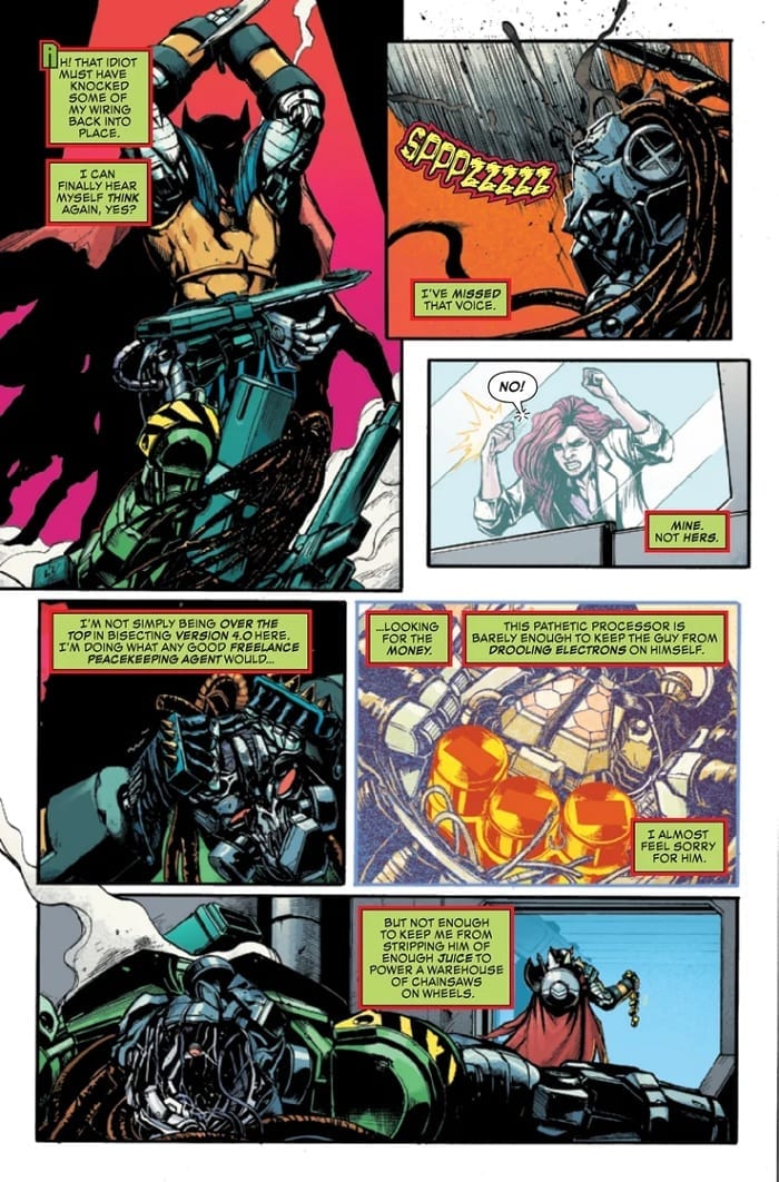
Death’s Head and crew are still trapped and fighting it out with Dr. Necker in Death’s Head #4, out this week from Marvel Comics. And, although it may be a little unbalanced, the book manages to tie the story together with a satisfying conclusion.
The Writing
In earlier issues, the individual characters’ conflicts felt rather disjointed. With Death’s Head #4, though, the dots finally connect, giving each member of the main cast a defined arc. Whether it’s overcoming fear of obsolescence, commitment, or a lack of self, the characters all get the chance to grow and develop by the end of the book.
For Death’s Head, the challenge is to overcome the objectification forced upon him. To Necker, all versions of Death’s Head are an object to be possessed. As she says “That’s the one good thing about these older models—sometimes banging on them makes them work better,” clearly conveying how she sees the character: as a tool to be manipulated. Both Death’s Head and Vee need to assert their—for lack of a better term—humanity, rebelling against their condition. It’s a novel approach to a character who, generally speaking, tends toward the brutish and flat in portrayal.
The human characters are developed as well, giving Hulkling and Wiccan a sense of genuine purpose. Hawkeye is the exception here; while Kate Bishop is always a welcome addition, she really doesn’t contribute much to the narrative, nor do we see her grow or learn anything.
But, while characterization is a strongpoint of Death’s Head #4, the narrative can be a bit hit-or-miss. Tini Howard’s writing throughout the series is fairly impressive. However, the author seems to put more weight on some facets of the story than others, leading to issues in pacing. As a result, some parts feel overdone, while other elements are hand-waived away.
The book’s climax, for example, is not totally satisfying; after all the running and fighting in the last half of the series, the final confrontation feels like a bit of a nonevent. It’s not enough to overshadow the book’s strengths, but it can make the reader feel that some core components of the narrative were effectively afterthoughts.
The Artwork
Artist Kei Zama’s work in Death’s Head #4 pays homage to the edgy, nineties-style look of earlier Death’s Head comics, while still managing to make the book feel unique and wholly her own. It’s richly-stylized and detailed, feeling like a cross-pollination of vintage and modern aesthetics. We have the heavier lines and more angular designs, paired with a contemporary eye for composition, giving us some of the best of both worlds.
The art flows nicely, maintaining a cohesive feel. Each image hits the story beats well and preserves a sense of kinetic energy from panel to panel.
The only real complaint is that there are times throughout the book at which it can be difficult to make out what’s on the page. Through all the chrome and shadows in Death’s Head #4, figures can sometimes blend or be engulfed by too much darkness. This can make it hard to decipher what the artist is trying to convey at some moments.
The colors by artist Felipe Sobreiro are impressive as well. Despite employing a wide range of tones, he manages to keep everything coherent and cohesive.
Final Thoughts
Death’s Head #4 is a respectable ending to a solid four-part story. While the book might have benefited from the space afforded by a couple more issues, it’s worth checking out.
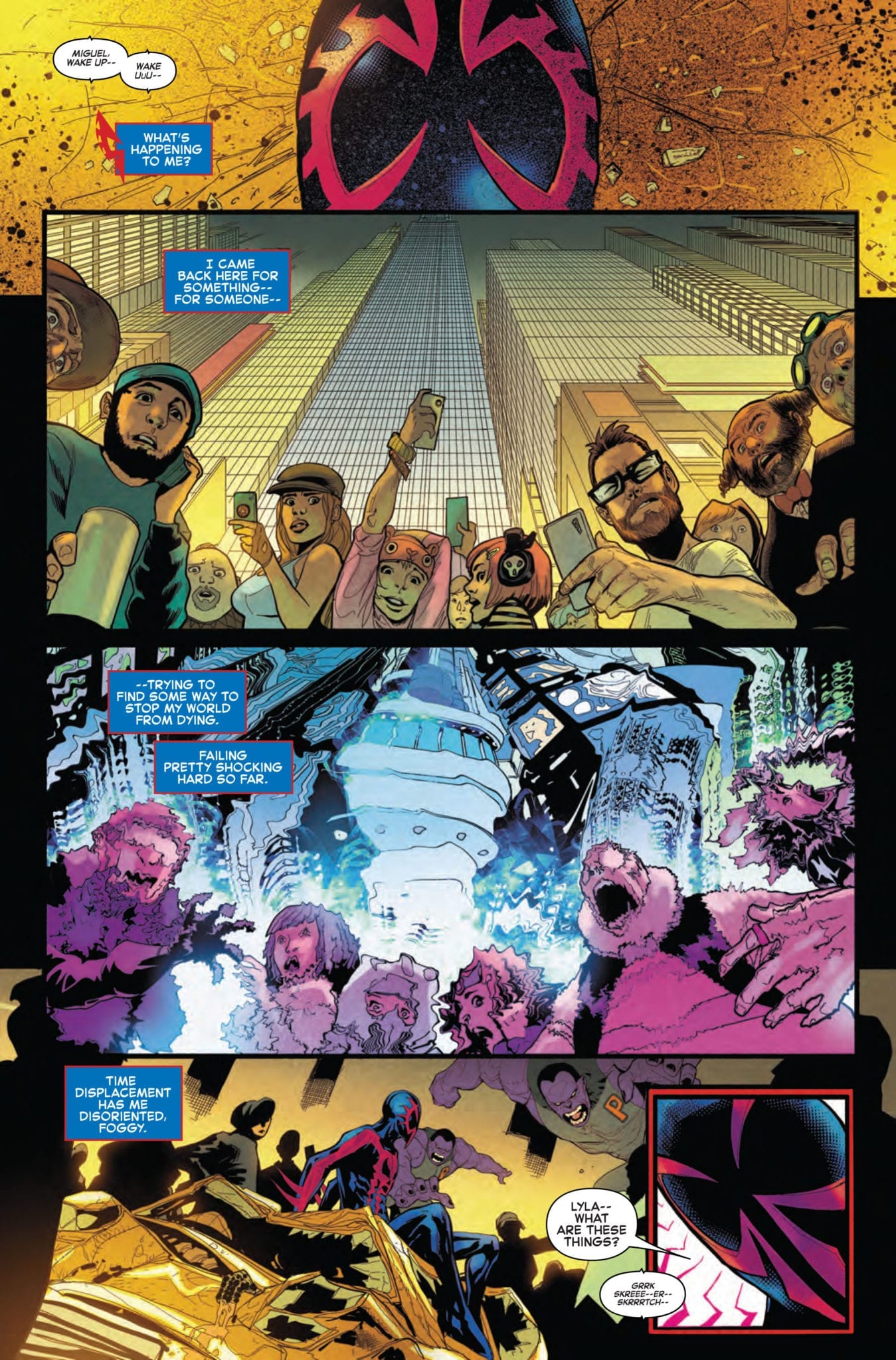
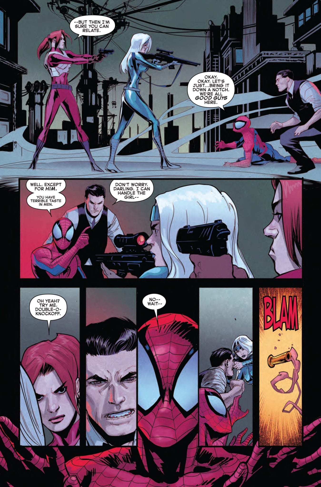
Amazing Spider-Man #33 hits your local comic book store November 6th, but thanks to Marvel Comics, Monkeys Fighting Robots has an exclusive five-page preview for you.
About the issue: THE FUTURE IS IN PERIL! Miguel O’Hara’s mysterious return to the present threatens his life and his entire future. But why?
As for OUR time’s Spider-Man, he’s got his hands full with classic villains, family problems and international incidents that intertwine in terrifying ways!
Amazing Spider-Man #33 is by writer Nick Spencer and artist Patrick Gleason (drawing for Marvel after spending the last 19 years working exclusively for the Distinguished Competition), with colors by Matt Wilson and letters by Joe Caramagna.
This preview sees Miguel O’Hara, Spider-Man 2099 himself, back in the present day and on the run from the Roxxon Corporation. Miguel is trying to “find some way to stop [his] world from dying,” and Peter Parker is an integral part of his plan.
ASM #33 kicks off the Marvel 2099 event that will be running through November and December. The event will take place over the next three issues of Amazing Spider-Man, as well as an Alpha issue, an Omega issue, and seven one shot tie-ins (Spider-Man 2099, Doom 2099, Punisher 2099, Conan 2099, Venom 2099, Fantastic Four 2099, and Ghost Rider 2099).
Check out the AMAZING SPIDER-MAN #33 preview below:
Are you reading Amazing Spider-Man? Who is your favorite Spider-Person? Sound off in the comments!
You can’t escape the current superhero cinema takeover that is happening at the moment, especially with ‘comic book’ movies everywhere. They are breaking sales records, overloading the shops with tie-in merchandise, and generally making their presence known. The one thing this surge in superhero cinema doesn’t seem to be affecting is the sale of monthly comics, the source of all of these movies.
At one time, the river of ideas ran the other way, with the comic book movie adaptation being an event of its own. Especially if you remember a time before streaming and almost instant releases on DVD/TV/Internet. The comic book adaptation served a purpose beyond merchandising: they existed as a replacement for the film after it had left the cinema. If you were a fan of Planet of the Apes, for example, then the only way to enjoy the characters between movie releases was to buy the comics.
Times have changed, and the need for direct replicas of movies in a comic book format has been disappearing for a few decades. However, adaptations haven’t gone away; instead they too have evolved over time.
Below, I look at a handful of movies that have made their way onto the pages of a comic. I am not interested here in continuing stories, although some of the examples below have spun out into ongoing comics, I am focusing on comics that are direct adaptations of a specific film. The choices I have made highlight how different approaches can produce very different products, and even enhance the original source material.
Blade Runner Adaptation from Marvel
Blade Runner
As a movie, it is well renowned almost to the point of worship. Often cited as one of the best Science Fiction movies ever made, Ridley Scott’s vision is beautiful to behold.
When adapting such a visual treat, the writers and artists over at Marvel were left with a very difficult task. However, in September 1982 Marvel published their adaptation which captured the image of the movie in a very direct way.
Adapting the story proved to be easy in the end. Archie Goodwin took all of the major scenes and condensed them down to a few pages and panels, streamlining the scope of the movie into easily digestible chunks. Goodwin used the, now much maligned, voiceover to give the reader all of the information that was lost via the transition from screen to page. Whereas Harrison Ford wanted the character to ‘do’ more in the movie instead of relaying all of the information via voiceover, Goodwin did the opposite. This meant that scenes were compacted and lost some of the long, establishing shots that made the movie so memorable.
However, almost to counter this, the artists Al Williamson and Carlos Garzon attempted to capture the specific look of the movie. They did this by choosing to recreate the movie almost like a series of stills, with each panel representing a single shot of the film. They stretched the borders and changed the height and width of the panels to give the comic the same sense of vastness of location but also to heighten the claustrophobic character interactions. The cast are rendered as close to the actors’ appearance as possible, again embedding the impression of movie stills.
The comic is a colorful, engaging accompaniment to the movie but offers nothing more, and in some aspects less, than the source material. There are some beautifully drawn panels, but they just remind the reader of the excellent scenes that they are mimicking and as a result, remind the reader what they are missing out on by reading the comic instead of watching the film.
Japanese Adaptation of Planet Of The Apes
Planet of the Apes
When the first Planet of the Apes movie came out in 1968 the concept of watching the movie when ever you wanted to or even owning a copy was still years in the future. Out of all of the comics on this list, the Planet of the Apes adaptations were primarily replacements for the movies, an attempt to keep the franchise in the public eye for as long as possible. There wasn’t any real artistic agenda behind them.
Or was there?
The thing about Planet of the Apes is that even at the start, there was massive interest in the designs and concepts. When Pierre Boulle’s novel ‘La Planète des singes’ was first optioned for a film no-one, the author included could imagine how popular those apes would become. So popular that in 1974, Marvel Comics published a Planet of the Apes magazine that would eventually include adaptations of all five original movies.
This was not the first adaptation of the movie however. In 1968 a Japanese magazine, Bôken’ô, printed the first comic book Apes, written and drawn by Jôji Enami. Elements of the design were different, partially because the final designs were not available at the time the manga comic went in production, and some of the story elements were also changed. Most notably, the scene with the Statue of Liberty reveal was omitted to keep the ending a secret: even back then spoilers were a big thing.
Despite these changes, Saru no Wakusei (Planet of Monkeys) is a faithful adaptation but given the Manga treatment. The recognizable elements of the movie are kept intact; for example, the Apes look like the characters played by Kim Hunter and Roddy McDowall, albeit simplified. However, the usual traits familiar to Manga readers are also there within the art: limited backgrounds, concentrations on characters’ faces, and motion lines. Jôji Enami has taken an American movie and turned it into a Japanese science fiction fable.
Over the years, different adaptations of Planet of The Apes have been published. Marvel’s comic was a fairly straightforward transition from movie to comic. The publisher also adapted the follow-up films and attempted to link them with a continuing comic strip. Later, a new movie was made by Tim Burton with a new adaption published. Most recently, in 2018, BOOM! Studios released a beautiful illustrated hardback graphic novel based on Rod Serling’s original script.
Comparing the different takes on the franchise would be an entirely different article, but the commitment by the comic creators to produce engaging comics has kept the franchise alive for over 50 years.
Dick Tracy Adaptation
Dick Tracy
Dick Tracy started as a comic strip way back in the 1930s. As it grew in popularity it was adapted many times, on radio, television and, of course, for the big screen. In 1990 Disney, bullied by Warren Beatty, made a big budget, brightly colored comic book action movie adaptation. To complete the circle the movie itself got the comic book treatment but instead of aping other adaptations, or even mimicking the original Chesteer Gould strips, the comic by Kyle Baker went in a different direction.
It stands out for two reasons. Firstly, it was the third part of a trilogy. The movie adaptation formed the closing part of the story, which was expanded on in two prequels. This approach is all the rage these days with Marvel releasing prequel comics for all of their big-budget movies, but this wasn’t the norm back in 1990.
The first two parts of the trilogy, Big City Blues and Dick Tracy Vs The Underworld, set up the world that the movie inhabited, expanding the character arcs and adding context to some of the more unexplained plot points. They act as wonderful lead in comics but also stand as great stories by themselves.
The second reason the Dick Tracy adaptation stands out is because of the sublime artwork by Baker. There is no desire to create lifelike images of the cast like in the Blade Runner comic, or even to create a realistic world for the narrative to exist in. Instead, Baker goes all out on creating an atmosphere that captures the postmodern playfulness of the Disney movie while acknowledging the violent nature of the original strips. The emphasis is on the concepts inherent in the story and the emotional aspects of the characters. Vast swathes of color indicate a character’s presence within the interchangeable backdrops.
The narrative follows the movie plot pretty closely, but this was easy to achieve because the movie is as close to a moving comic as you are likely to get. This makes the transition of narrative simple from screen to page without suffering any loss or discomfort between the two mediums. Baker then captures the energy of the actors within his singular style. The end product is a fluid, dynamic collection of panels that almost move before your eyes.
The movie might get mixed reviews but the adaptation is pure modern comic book gold.
Bram Stoker’s Dracula Adaptation from Topps
Bram Stoker’s Dracula
Everyone knows Dracula. The crafty vampire gets into everything from german expressionist films, Hammer Horror movies set in the 1970’s, Marvel Comics, and even an alluring appearance in Buffy The Vampire Slayer. In 1992 Francis Ford Coppola, inspirational director and Marvel Universe Movie hater, brought his own take on the character to the big screen, It was a highly erotic, visual spectacular than tweaked known Vampire Lore. However, it was the Topps Comics Production adaptation written by Roy Thomas and drawn by Mike Mignola and John Nyberg that really pushed the boundaries of the Dracula story.
Whereas the majority of the dialogue was taken directly from the script of the movie, the heavy shadowed art style of Mignola gives the comic a unique look, besting even Coppola’s visual flair. The impression of horror is gouged out of the page, leaving large black recesses for the characters to get lost in. This darkness, a reflection of the hopelessness of the titular character, takes over every page, Brief flashes of white, or moments of lighter tones, interrupt the overpowering darkness but ultimately this is a story set in the depths of night, on the verge of a new age that is about to begin with a horrific world war.
Modern fears are explored within the subtext of the story. The danger of sexual predators from within as well as without is a topic that is as relevant today as it has been since the day Stoker wrote his original novel. Thomas and Mignola take the essence of the film, the underlying themes, and accentuates them. The characters have a resemblance to the actors, but the expressionistic style creates a distance that the film fails to achieve. The story becomes about the struggles and relationships of the characters, not about spotting the guest appearances or wondering if Winona Ryder and Keanu Reeves are expertly portraying suppressed Victorian’s or simply wooden actors.
Whereas the film has some trouble escaping the actors’ limitations and Coppola’s emphasis on style over substance, the comic is able to bring character back into the tale. More so than other titles on this list, the adaptation of Bram Stoker’s Dracula uses the movie as an inspiration and surpasses that source material in visual storytelling. Sitting down for a couple of hours to read this comic is ultimately more satisfying than watching the film.
Adaptation of Aliens entitled Newt’s Tale
Aliens
Initially it might not be clear what makes the Aliens adaptation that much different from many other comic books of its time. The Dark Horse comic, written by Mike Richardson, was published in two parts and told the story of the movie with the twist being, it was told from the point of view of Newt, the annoying little girl that just got in the way.
Aliens: Newt’s Tale allowed the writer to adapt the screenplay written by James Cameron but give everything a slightly new angle. It was new but old at the same time. The scenes that the reader knows from the film are given different emphasis or importance because it is all relayed through this young girl who, obviously, doesn’t have the same view on the world as the gung-ho marines or their reluctant guide. Richardson uses this opportunity to look at the Aliens story-line and give it a fresh new spin.
The other aspect of Newt’s Tale that makes it stand out among other movie adaptations is the fact it includes many of the deleted scenes which have been included in later, extended cuts of the film. Richardson got the chance to cut and paste the original working script into the finished product, thus expanding his story without altering the overall narrative too much. All of Newt’s experiences before the Marines show up gives the story a more human element that was lacking from the film. As a war film Aliens is tremendous, but for character motivation or empathy, it is sorely lacking. Richardson is able to inject the narrative with a bit of the human character it needs to distinguish the humans from the xenomorphs.
By taking this approach with the adaptation, Dark Horse was able to sell the concept of the comic as a movie tie-in but also as something new, buying into that completist nature that many comic and science fiction fans have. You haven’t seen the full Aliens until you have read Newt’s Tale.
More Bram Stoker’s Dracula artwork by Mike Mignola
Adapt Or Perish
Over the years strong bonds have grown between the Movies and Comics. At various stages one of the mediums has feed the other, fuelling a spring of ideas and creativity. At the moment most of that traffic is heading one way, from the page into the multi-plex but in the past the comic book industry has gained from its big screen counterpart.
The Movies that have filled the cinemas have inspired a host of writers and artists to experiment with his or her craft to create new ways of telling a story. The differences between the live-action Dracula and it’s comic book counterpart expresses more than just personal interpretation but also differences between the mediums. There are somethings that a movie simply cannot do that a comic book can, and by comparing adaptations to its source material, you begin to get a sense of what those differences are.


")