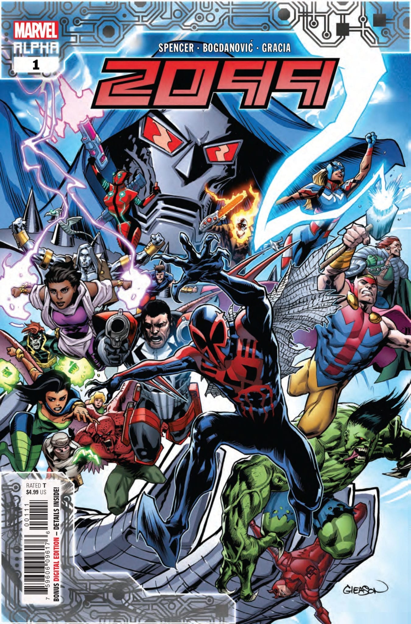
2099 Alpha #1 hits your local comic book store November 20th, but thanks to Marvel Comics, Monkeys Fighting Robots has an exclusive five-page preview for you.
About the issue: 80 years ago, the Marvel Universe was born. 80 years from now, will it die?! THE FUTURE IS IN PERIL! Events of AMAZING SPIDER-MAN have been leading to this for months. Something is happening in 2099 that spans Nueva York and beyond and will shake up the official Marvel Future forever. This is not a drill!
2099 Alpha #1 is by writer Nick Spencer and artist Viktor Bogdanovic, with colors by Marte Gracia and letters by Joe Caramagna. The main cover is by Patrick Gleason and Guru-eFX.
Spencer has been building to this event for a few months now in Amazing Spider-Man. Following this Alpha issue, 2099 will continue over the next three issues of ASM, and conclude in an Omega issue. There will also be seven one shot tie-in issues focused on various 2099 characters (Spider-Man 2099, Doom 2099, Punisher 2099, Conan 2099, Venom 2099, Fantastic Four 2099, and Ghost Rider 2099).
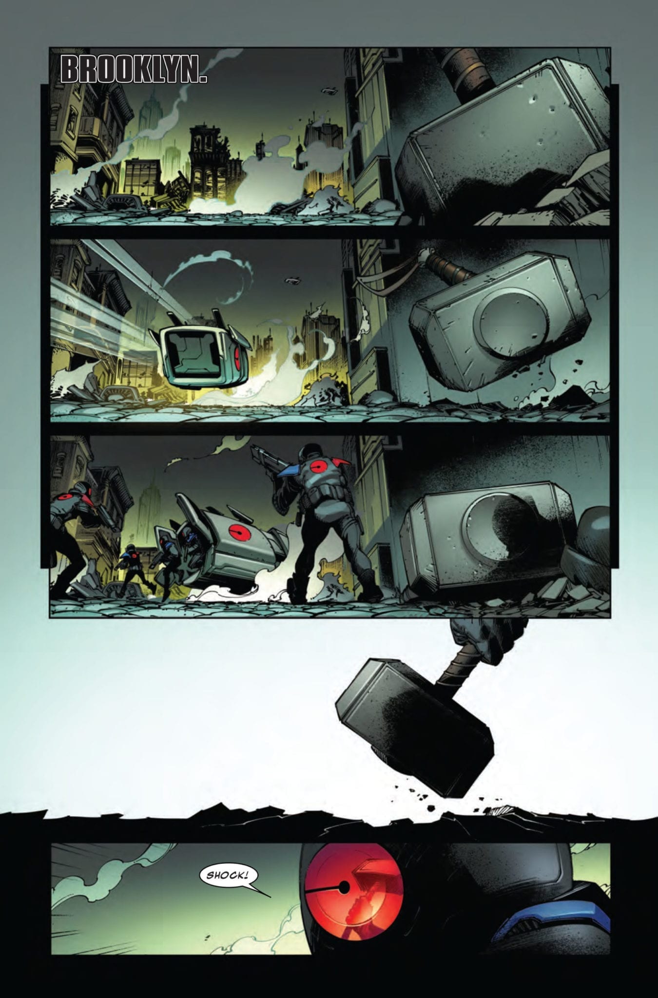
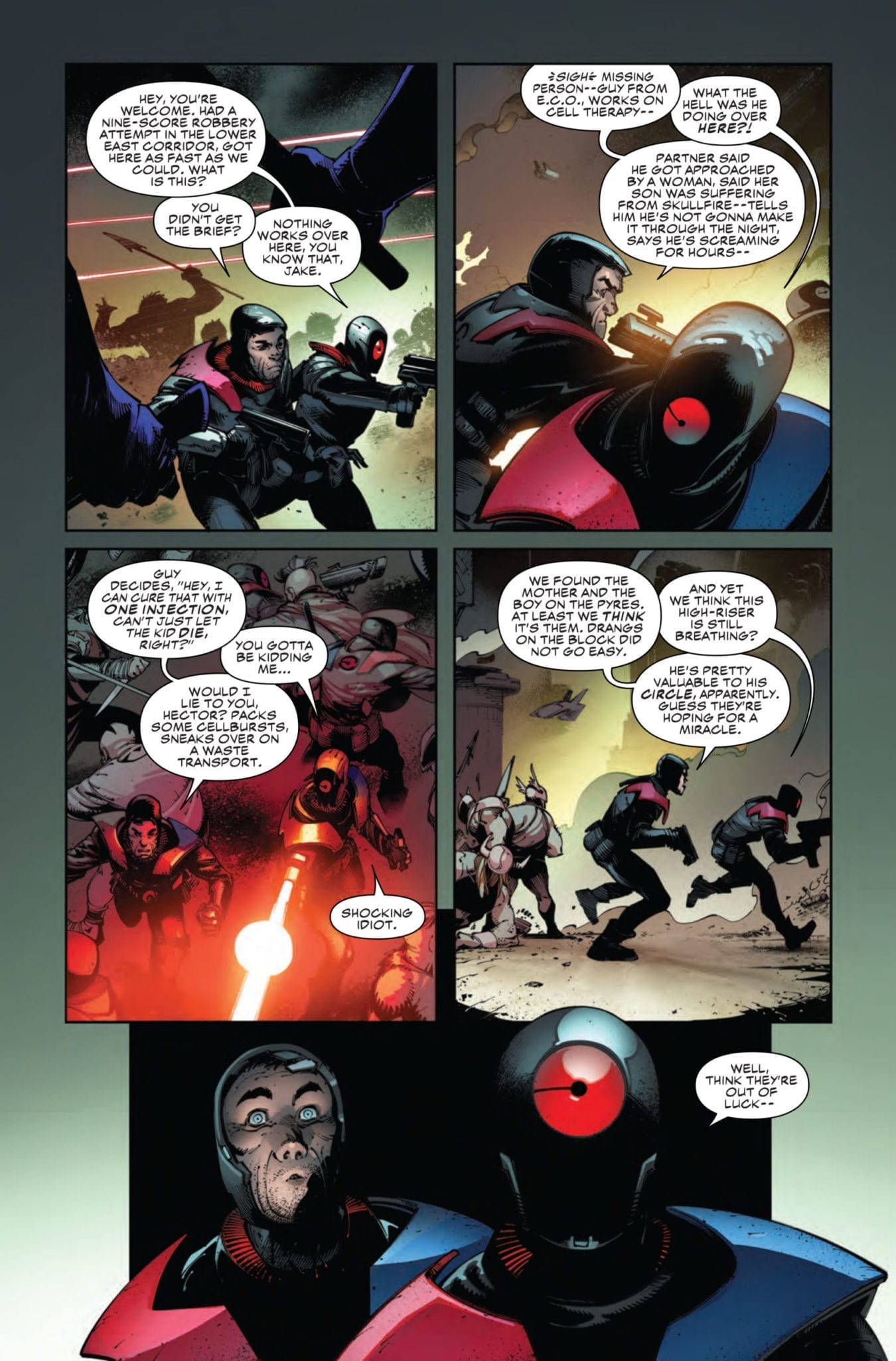
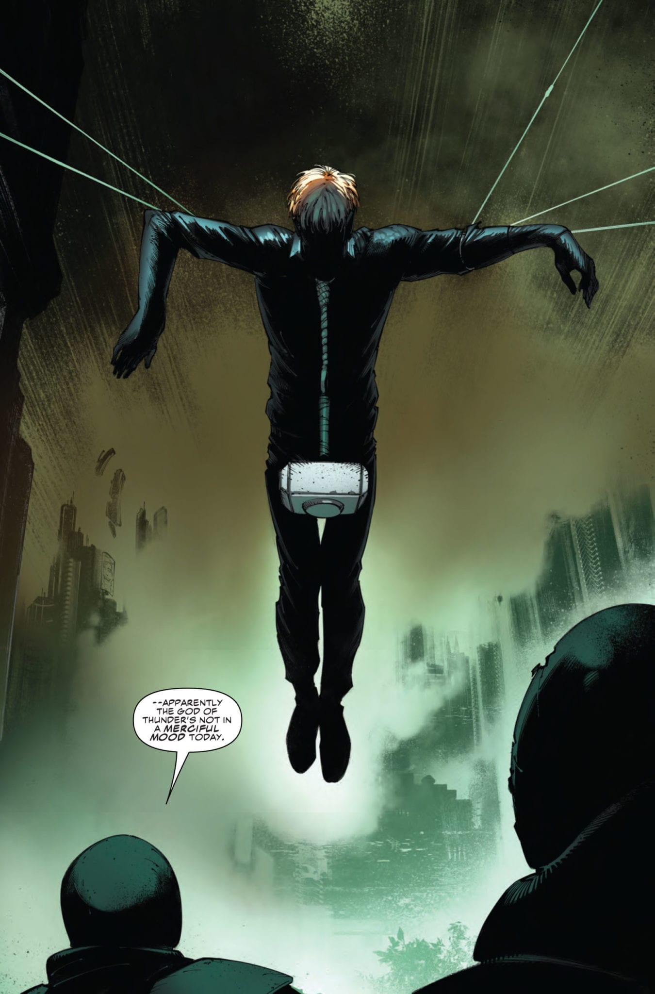
Check out the 2099 ALPHA #1 preview below:
Are you excited for the return of MARVEL 2099? Sound off in the comments!
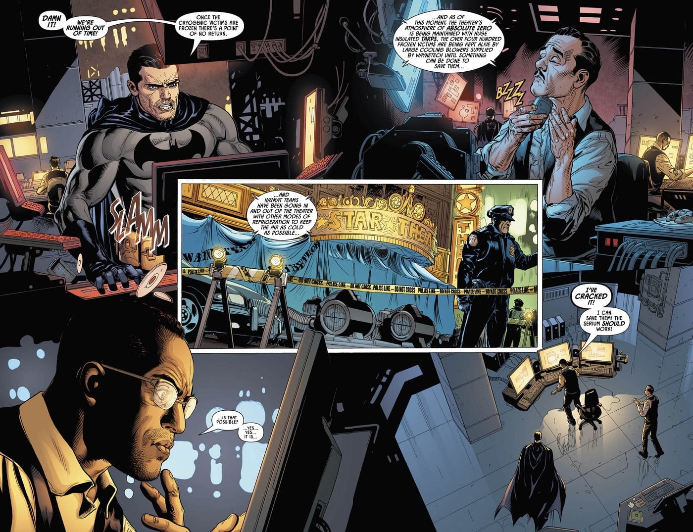
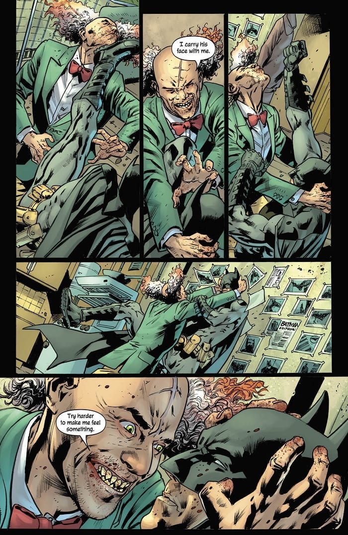
Mr. Freeze finally has his beloved wife back by his side. But, as we see in Detective Comics #1015, out this week from DC Comics, something’s a little…off…about the revived Nora.
The Frieses terrorize the city while Bruce, Alfred, and Lucius rush to find a way to rescue Freeze’s victims. Over the course of their crime spree, though, Victor begins to notice a change Nora’s demeanor. She doesn’t merely engage in criminal acts for profit…she seems to enjoy hurting people.
The Writing
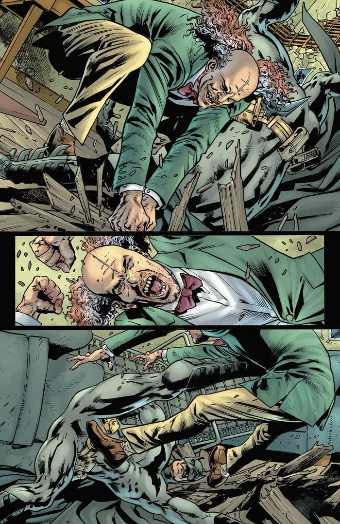
Writer Peter J. Tomasi gives us a well-paced and engaging story. The tension surrounding Batman’s race against time mounts as the book progresses. We feel the desperation and frustration of the characters as time ticks away.
Detective Comics #1015 gives us a reasonably-surprising twist, which serves as the narrative focal point of the book. It doesn’t come out of nowhere, though; Tomasi did a solid job of foreshadowing this surprise in earlier issues. As a result, it feels like a natural and reasonable course of events in the tale at this point.
The tables have turned entirely by the end of the book. It makes for some dynamic and engaging storytelling, and one of the more interesting stories we’ve seen in some time focused around Mr. Freeze.
There are some points at which the writing comes up short, though, and the issues lie mainly in characterization. The manner in which Bruce decides to test his serum, for example, feels inconsistent with his character. Batman is supposed to have a great tactical mind; here, though, he takes unnecessary risk for little apparent reason. As a result, he ends up handicapping himself throughout much of Detective Comics #1015.
Speaking of breaches of characterization, we see even more of this from Nora. She makes a snap decision that, while not unreasonable given the circumstances, doesn’t seem well-established based on what we’ve seen of the character thus far. As mentioned, this twist doesn’t come out of nowhere; however, the way it’s scripted makes it fall a little flat. The result is an interaction between Nora and Victor that feels stilted. The dialogue relies on melodrama that reads like the teleplay to a somewhat-dated soap opera in order to reach the necessary emotional pitch.
The Artwork
Overall, artist Doug Mahnke brings many of the same strengths to the table in Detective Comics #1015 as we’ve seen in other recent issues. This time, he’s backed up by fellow artist Jose Luis (not to be confused with José Luis García-López).
The work is dynamic and lively, yet it’s still fairly clean. Although Mahnke opts to dedicate much of the book to tightly-cropped panels with close-up illustrations focused on characters, the reader rarely feels lost in the setting. At only a couple of points did it feel a little spatially muddled, but nothing too distracting.
That said, the character designs are not always as consistent as in previous issues. There are panels, especially in the first half of Detective Comics #1015, where characters are depicted from awkward angles, or appear somewhat bloated or chunky. It’s not distracting enough to overshadow the positive aspects of the artwork, but it does produce some less-than-stellar panels.
The colors by artist David Baron are again vivid and varied. The shocking blue of the ice immediately draw the reader’s eye. The colors are well-balanced, though, despite the wide range of tones employed.
Final Thoughts
Detective Comics #1015 is not without flaws, but it’s plenty serviceable. It’s worth grabbing a copy to keep up with Tomasi’s ongoing story.
In Justice League/Black Hammer – Hammer of Justice #5, writer Jeff Lemire, artist Michael Walsh and letterer Nate Piekos bring us a finale that values whispers over big booms.
When we last saw our band of world-swappers, Mr. Mxyzptlk had given them an ultimatum: ALL of you swap back to your worlds willingly, or not at all. With the Justice League stranded on Black Hammer farm, fighting monsters from Lady Dragonfly’s cabin, and the Black Hammer crew being questioned by the Specter, there are plenty of reasons for them to want to get back to where they came from. But not for Golden Gail. Finally, able to return to her older form, she could stay in the DC Comics Universe as a normal woman and not live a perpetually pre-pubescent life.
The ensuing chaos and conflict, in many ways, seems predictable and underwhelming at first glance. Heroes act heroically; villains act villainously. But the true beauty of the issue, and the series at large is the juxtaposition between Lemire’s parodies of other characters and their DC counterparts. DC’s Shazam is naive but a good kid at heart, Lemire’s version of Shazam, Golden Gail, is everything but. Martian Manhunter and Barbalien are Martians who have lost their homes, but Barbalien is resentful of his homeworld and martian homophobia.
Lemire seems to be putting his down-to-earth characters into a predictable and more simplified world to help show how they don’t really fit in with the creations he borrowed from. Their battles against huge odds are out of joint. As the issue comes to a close, Lemire offers the DC characters the opportunity to join his pace. Not for a worldwide threat, not for a multiverse destroyer, just for dinner. As characters sit and put their feet up, we see Lemire at his best. The calm back and forth over a warm meal, the real-life stakes for his larger-than-life characters.
Michael Walsh’s art is simply breathtaking. It manages to blend the raw and almost messy look of Dean Ormston’s work, the original artist on the Black Hammer series, and the more neat, controlled style of art that is more often seen in comics by DC or Marvel. Throughout the issue, Walsh uses a darker pallet for his colors. It’s like looking at the characters through a blue veil. Yet somehow, it sets the mood in such a way that doesn’t feel gloomy, but relaxing and intimate. In this issue, Lemire has a pretty heavy word to page ratio. Piekos’ clear lettering and placement makes the journey through each page smooth and simple.
While Lemire, Walsh and Piekos’ crossover series Justice League/Black Hammer: Hammer of Justice may seem underwhelming at first, it’s because it is in the “underwhelming” that this creative team truly shines. In the quiet moments between the punches and zaps. This series grounds our DC heroes and reminds us why we love our Black Hammer characters so much. It reminds us that in this world heroes still cry, they eat, they sleep, and they even get scared.
In Event Leviathan #6, writer Brian Michael Bendis, artist Alex Maleev, and letterer Josh Reed invert their series finale to show us something we wanted more than what we thought we wanted. It’s impossible to write about an issue like this without getting right into the spoilers, so please don’t read on if you haven’t already read the issue.
First, Bendis finally reveals to us who the mysterious Leviathan really is. It’s the kind of reveal that makes you go: “Wait… who?” A few quick visits to various Wikipedia pages, and you’ll fill in all the gaps. Leviathan is Mark Shaw, one of many to call himself Manhunter. Specifically, Mark Shaw was one of the successors of Paul Kirk’s Manhunter mantle. He worked as a government agent under Sarge Steel, he dabbled in Amanda Waller’s Suicide Squad, and he even went on a rampage killing all who had ever been called a manhunter. He never quite managed to kill Manhunter Kate Spencer, though, one of the detectives investigating the Leviathan terrorist attacks.
There are a few ways one can respond to this kind of development. My first response was to start thinking who I thought would have made a better Leviathan under the mask. It was the fact that I could come up with so many examples that made me pause. Maybe what Bendis, Maleev, and Reed are showing us is that Leviathan’s identity isn’t the point. It doesn’t matter who Leviathan is, because in the end, Leviathan stands for something. Leviathan poses a question. Are the heroes doing their jobs in saving the world? Could Superman, Batman, and Wonder Woman do more?
As events progress through the issue, one thing seems to be clear in Bendis’ writing: he is taking his time. We don’t get the major showdown that puts a bandaid over the damage Leviathan has caused. We don’t even really get any kind of physical confrontation at all. Instead, Superman and Leviathan talk. We are reminded why Shaw has become such an incredibly dangerous character. He has planned for every contingency, and his gospel speaks to something deep in people. Even trusted heroes like Golden Guardian have taken his side.
The summary of Leviathan’s gospel is chillingly kept until the final page. Shaw is bent over an issue of the Daily Planet that outs him to the world. His disappointment isn’t in his loss; he doesn’t seem to believe he has lost. Shaw’s frustration is that he couldn’t make someone as logical as Superman see the truth. “They would rather I burn this all to the ground than try to fix it,” he mutters. “Fine.” Bendis and Maleev truly shine here as they play against villain stereotypes. He isn’t laughing maniacally. He doesn’t even smile. He’s eerily normal. And he’s not done either.
The art of this issue is as gorgeous as all the issues before. Maleev’s use of color is almost hypnotic. There doesn’t seem to be a single solid color in the entire issue, and the blended blues and reds that act as the backdrop to each panel create a mood fit for the end of the world. Characters are drawn so beautifully as Maleev constantly brings us back to the look on their faces. Rarely do we see any character hint at a smile or frown. They all stoically press on for what they must do next, whether “evil” or “good.”
Reed’s lettering graciously steps back to allow Maleev’s art to shine. This is far from a silent comic, yet Reed’s use of space is so masterful that you seem to be able to hear the silences more than the words. That goes without saying for the sign language portion of the comic. Though not an everyday moment in comics, the “subtitles” for the sign language are placed so that the reader gives no thought to who it is that’s signing. Finally, it’s worth praising Bendis and Reed both for their reoccurring newspaper pages. Never once did they resort to button mashing to fill content, but with each issue, they gave us a fully furnished newspaper cover to help immerse us in the world.
Event Leviathan #6 was not the comic I expected it to be. This espionage thriller doesn’t end with a twist to leave everyone reeling. It only feels just to call the “villains” villains in quotation marks. The mystery and reveal are ordinary and mundane. That might be what makes it so brilliantly troubling. And the best part is it’s not over yet.
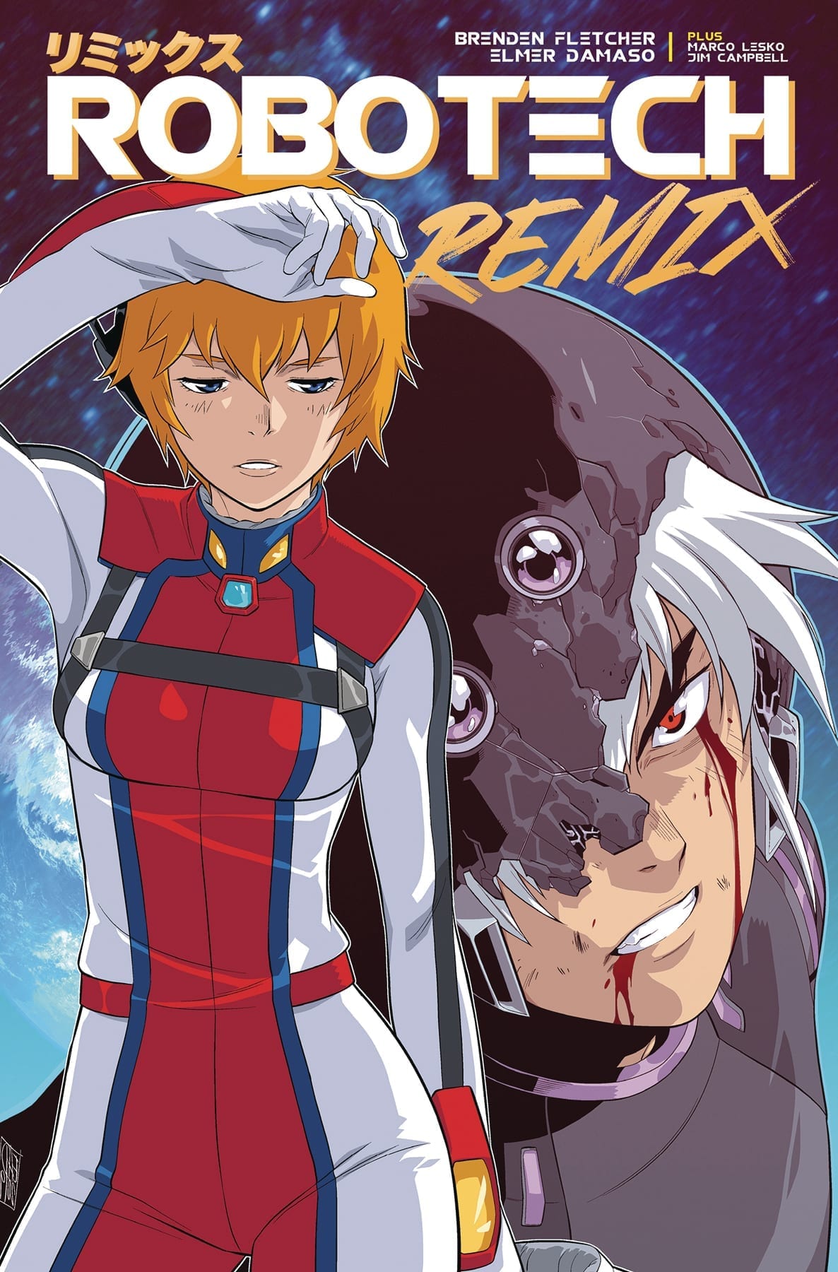
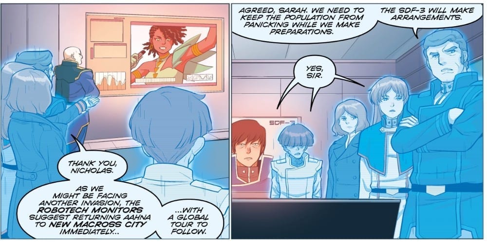
With the second issue of Robotech: Remix by Titan Comics, the book is starting to feel like it is tackling too much. Can this comic remain in the air or will too many complexities cause it to crash to the ground?
Dana Sterling traveled back in time and saved her past – but has she lost her future? Faced with new enemies, old friends, and parents who barely know her name, can the half-Zentraedi Robotech ace cave out a place for herself in the cosmos?
Writing
This series has hit a bit of a snag. With the reappearance from a familiar face, it’s hard to tell if it really is them or not. Is this the actual character the readers followed in the previous series or one from the alternate dimension Dana Sterling comes from? It’s hard to tell and it feels like this uncertainty will not let up any time soon.
Also, Brenden Fletcher is really trying to push the characters from Robotech II: The Sentinels and make the reader love them. This can be understandable given how the characters never did get a proper show (as their’s was canceled and compiled to a movie). Still, the whole other universe plot needs to flow properly or risk the entire book not garnishing enough of an audience.
Artwork
The artwork does maintain the level of quality of the previous issue. With Elmer Demaso on art, the characters look sharp and dynamic. Though when the more comical moments occur it is a bit offsetting. More unwelcome than offsetting as Demaso’s work is so appealing when not having the characters use anime ascetics (like sharpened teeth) for the comedy.
The colorwork by Marco Lesko helps with more Sci-Fi effects of the issue. From helping to distinguish characters as holograms to displaying the power of a force shield. It also is very useful for helping with the opening flashback to set the mood for the issue.
Jim Campbell on lettering helps with the auditory beats of the story. Special attention is paid to when annunciate their words and shout out as they attack. The little details like this helps the story to flow.
Conclusion
Robotech: Remix #2 isn’t bad but it does feel overly ambitious. It is trying to deal with a very complex concept like alternate realities while at the same time introducing new cast members. This is a delicate balance and one which may fall apart quickly if the creative team isn’t careful. Fingers crossed they able to maintain the balance but it could easily crash if they don’t succeed.
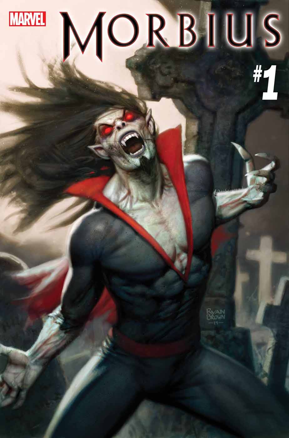
Marvel’s forgotten vampire of the 90s, Morbius has returned thanks to a story by Vita Alaya and art by Marcelo Ferreira, Robert Poggi, and Dono Sanchez-Almara. Does the new book help to put a spell on the reader or does it leave a bad taste in their mouth?
Morbius, the living vampire has been in search of a cure for his condition for years. He may be on the verge of finding it but it seems it will come at a price.
Writing
This issue offers a basic setup and succeeds in its initial goal of reintroducing Morbius to the audience. Considering how long it has been since the living vampire wasn’t simply a guest appearance in an issue or used as a plot device, proper introductions are definitely in order. By having the Melter be a punching bag for Morbius, the mindset and methods of character are showcased in a very clear manner.
The story by Vita Ayala not only helps everyone get up to speed on the character but also introduces a complication. The first arc in this new series will focus on Morbius’ attempt to find a cure but as the first issue is quick to point out, this is not going to be an easy process. The only thing really missing for the book is some support characters. Morbius is in need of a moral compass and someone to help bounce ideas off of for this book to succeed. Hopefully, the second issue will provide this missing element.
Artwork
The artwork helps to cement this issue as one comic fans need to pick up. The pencil work by Marcelo Ferreira helps demonstrate just how terrifying Morbius is when he descends on criminals. The sheer look of terror on their faces is palatable and makes it clear even if you are working for a supervillain, you aren’t always prepared for everything.
Robert Pogai as Inker adds a sense of speed and power to the issue. The scenes of Morbius battling the Melter’s crew is made more intense thanks to proper inking. Fantastic use of speed lines and shadowing properly illustrate how savage Morbius’ abilities are.
With any vampire comic, the appearance of blood is common. Through the skill of Dono Sanchez-Almara as a colorist, this detail makes sure to catch the eye and offers bone-chilling images of Morbius. The many scenes of him with his mouth covered with the blood of his enemies drives home the idea Morbius is not one to fight with kid gloves on.
The storytelling is aided through the use of VC’s Clayton Cowles lettering work. The roars and screeches Morbius unleashes as he brings his own brand of justice is made auditory thanks to proper lettering. It also assists in making the fear and frustration the characters display much more vivid.
Conclusion
Morbius #1 accomplishes what it set out to do. It reintroduces the character by showcasing the suspense and carnage which needs to be included in a book like this. If the series is able to keep this level of intensity moving forward then the resurrection of Morbius will be one for the ages.
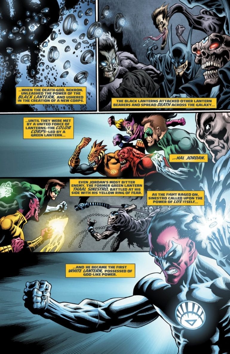
When the Dark Multiverse was revealed in Dark Knights: Metal, it intrigued me. A second multiverse where things went wrong instead of right? The possibilities are endless! When the series Tales of the Dark Multiverse was announced, I was super excited to see them! We first got a dark version of Knightfall that saw Azrael go entirely off the deep end, becoming a venom powered Batman. We then saw Lois Lane take the role of the Eradicator in the Death of Superman, bringing an Injustice style of order to the world. Now we have a darker take on one of the darkest Green Lantern stories in DC’s history: Blackest Night. How much darker can the night get?
**Some Spoilers Below**
Story:
Starting from the climax of Blackest Night, we instantly see where things have gone wrong. Where in our universe Sinestro shared the power of the White Lantern to overpower Nekron, he doesn’t in this universe. Without that necessary back up, the death god killed the white entity, allowing the Black Lanterns to overtake the universe.
A few weeks later, we see a pair of survivors fighting to stay alive in San Francisco. Lobo was able to stave off the infection due to his Czarnian biology, while Dove is immune to the infection. Before they are torn apart by Black Lantern Titans, Sinestro arrives wielding both a black and white ring. He disables the zombified heroes and approaches the survivors with a plan to save the universe.
This is honestly the best issue or Tale of the Dark Multiverse yet. We have tons of cool action sequences and terrifying concepts, as seen with previous issues, but we also get great character moments. The small gripe the series has is that while it is cool to see such massive changes to the stories we know and love, to make them work, some of the characters have to make huge changes, such as Lois Lane becoming incredibly hateful of the League in the last issue. In this one, you can see a natural progression of character development. Lobo is still that darkly humorous bounty hunter, Dove that hopeful hero, and even Sinestro is still his stuck up self. It felt like this was supposed to be an alternate ending to the story instead of a What If. It’s a shame this came after Halloween because this is a damn near perfect horror story.
Art:
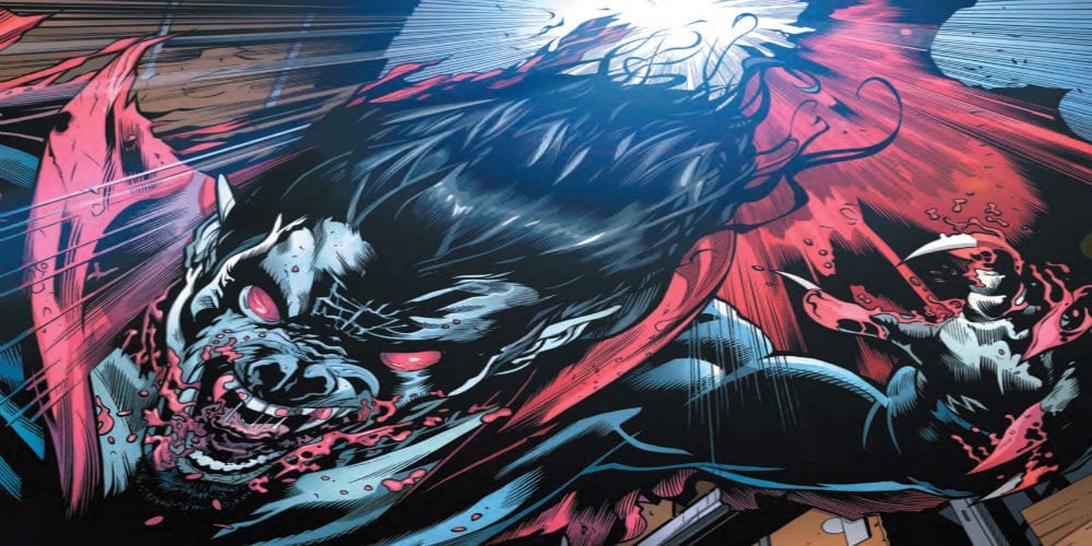
While I do enjoy the story and think it’s the best that has been put out, I have to say that the artwork is just okay. It’s not terrible, but at the same time, it isn’t anything to write home about. In defense of the team, they do make some pretty gnarly designs that encapsulate the horror of Blackest Night. The best piece done in the issue is definitely when the team goes to Apokolips to find the New Gods as Black Lanterns. They’re as terrifying as they sound, and I think it shows they tried. It’s hard to compare this team to Ivan Reis in the original story, but their art fits just enough.
Conclusion:
Overall, this was a great tale from the dark side. Blackest Night was already a terrifying story, and this creative team took it a step further. We have grand action sequences and horrific imagery that captures the feel of the original story. The art might not be on the same level as the original tale, but it does the job and give us terrifying designs to new the Black Lanterns. I can only hope Infinite Crisis will live up to this Tale from the Dark Multiverse.
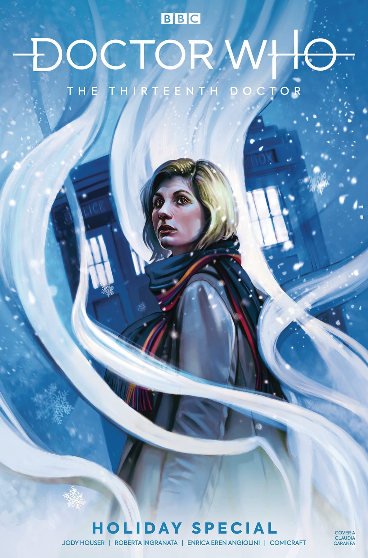
Doctor Who The Thirteenth Doctor Holiday Special Credit: Titan Comics
Following on from the tradition started by Nu-Who since it’s return in 2005, Titan Comics are releasing the first part of their 13th Doctor Holiday Special this week. Along with the companions from last years successful series, Ryan, Yasmin, and Graham, The Doctor returns with a visit to a festive, little town where not all is as it seems.
After a year of writing the monthly comics, Jody Houser is more than comfortable with the characters and the tone of Jodie Whittaker’s take on the famous Time Lord. Without a second wasted, she throws the cast into a festive story, packed with the kind of adventure you’d expect from the longest running science fiction series.
Doctor Who The Thirteenth Doctor Holiday Special Credit: Titan Comics
A Festive Doctor
While planning a festive adventure it becomes apparent that not is all as it should be in the TARDIS. Someone has been altering the Doctor’s memories, and the memories of her companions. But more disturbing is that the TARDIS herself appears to have been tampered with.
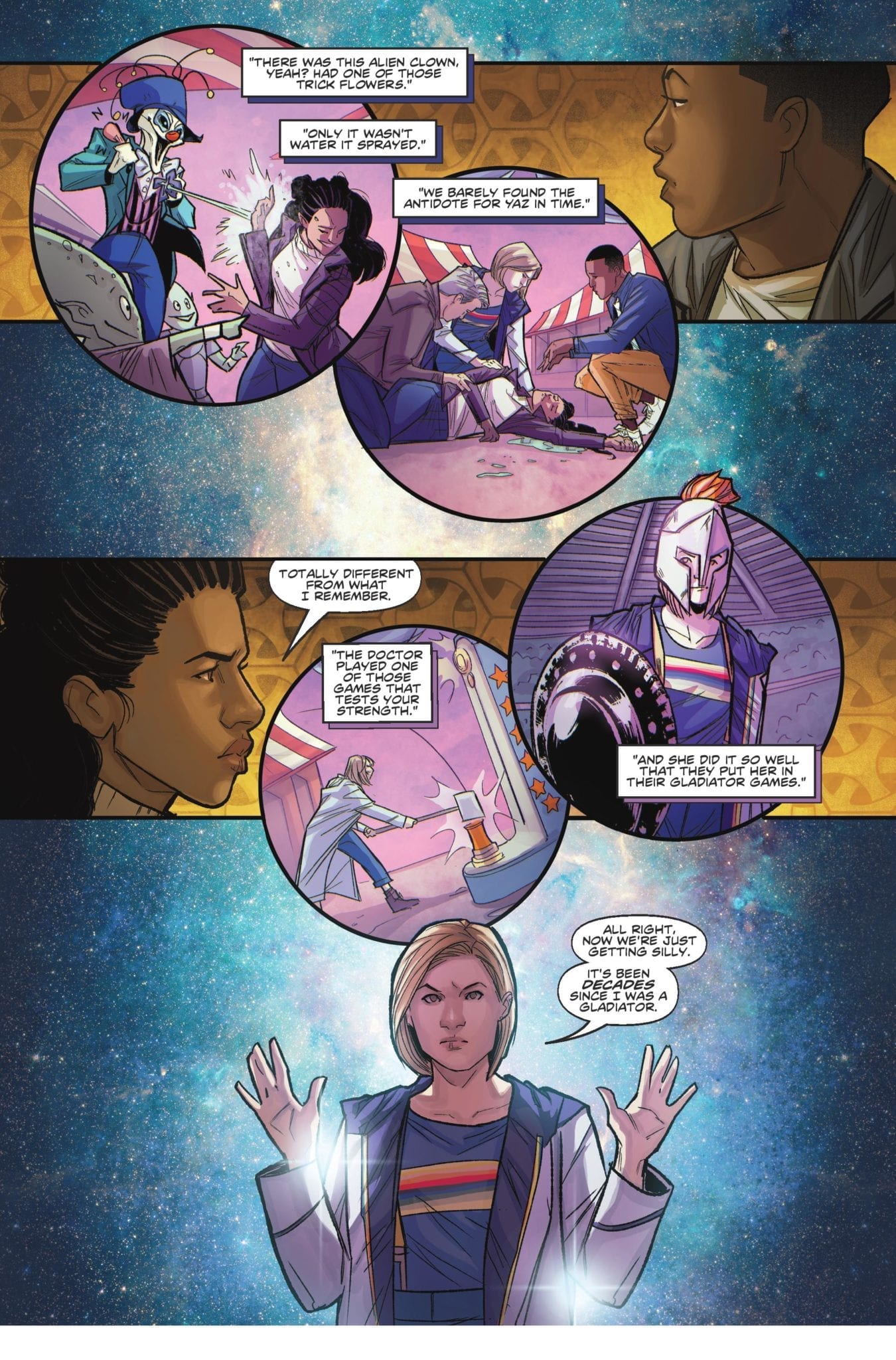
Houser uses this mystery as the jumping off point for the Holiday madcap adventure. There is nothing more exciting than a festive mystery and the 13th Doctor is perfectly matched for this kind of caper. Houser draws on the fun elements of the 11th T.V. series, something that she did a number of times in her first year on the comic. She is able to draw out a whimsical idea and make it believable within the confines of a Doctor Who story. The secret to her success is that she never ventures too far away from the human drama at the heart of the 13th Doctor.
The opening of this issue, for example, portrays a family deciding on what to do for the holidays. A mundane situation made otherworldly by the location. However, Houser keeps the narrative tightly structured around what these four characters do and their interactions with each other even after they enter an alien world. The plot itself hinges on the Doctor’s concern for her ‘family’ and the potential harm that has been done to them.
The characterisations of the central cast are perfect replicas of their television counterparts. If you have read any of the 13th Doctor comics this year this will come as no surprise. It is one of the most striking elements of the comic. Al Ewing got Matt Smith’s incarnation spot on and Houser captures the energy and wonder of Jodie Whittaker. The conversations are a joy to read with humorous banter flowing across the pages.
Doctor Who The Thirteenth Doctor Holiday Special Credit: Titan Comics
Dreams of Festive Villages
Roberta Ingranata uses soft lines which creates a dreamlike quality to a lot of the artwork throughout this comic. The delicate touch, coupled with expressive facial and body gestures, makes the comic easily accessible; the visuals are comforting and easy to follow. This approach opens up the audience for the comic, pulling in ardent fans or first time readers.
Ingranata’s layouts are also easy to follow. The transition from the present time to flashback memories is instantly recognisable on the page because of the change in panel shape. Memories tumble across the page inside circular panels, often with a different color scheme provided by Enrica Eren Angiolini, reminiscent of the visions of sugar-plums from Clement Clarke Moore’s festive poem Twas The Night Before Christmas.
This is not the first subtle reference to Christmas and as the story progresses neither the writer or artists resist the urge to sprinkle the comic with a touch of festive magic. The overall feel of the comic is one of Christmas wonder, with an element of mystery. Reading this is like snuggling up in front of a fire to watch an old TV movie that you only ever see at Christmas, but that you know inside and out.
The punchy script has a rhythm to it. The vocal beats have been provided by the small, broken speech balloons placed almost poetically across the page. With the magical visual style that this issue of Doctor Who has it is difficult to integrate the lettering but Richard Starkings and Sarah Hedrick do an outstanding job. By spacing the text out into several balloons, spreading the speech around the panels, it allows the artwork to shine through.
The sound effects are almost the opposite, in that they jump out of the page at you. They are bold and have an old school comic vibe to them, however they work just as successfully as the speech. There is a jovial element to this comic that the sound effects pick up and run with. There is something warm and cosy about the bubbly, bright yellow sound of the TARDIS arriving next to a tiny Christmas village.
Doctor Who The Thirteenth Doctor Holiday Special Credit: Titan Comics
Conclusion
The story is new but it feels old. The artwork is very modern but familiar and warming. The Doctor is, especially as portrayed here, the perfect holiday hero; she is full of wonder and excitement but there is a serious side, glimpsed briefly just beneath the surface.
Jody Houser has embraced the Holiday Special tradition and crafted a warmhearted, exciting adventure with, surprisingly, cute Toy Soldiers as the creature of the week. The artwork is magical with a strong sense of humour but still manages to great some moments of tension squeezed in there.
This comic is a great addition to the Doctor Who methos and, just like Christmas, the second part can’t come soon enough.
We saw Bruce uncover the culprit behind a gruesome murder in our first issue. Now, with The Batman’s Grave #2, out this week from DC Comics, he has to survive the encounter…and avoid being taken out by a distrustful Gotham PD in the process.
The Writing
An extended fight sequence between Bruce and the murderer he discovered in our last issue occupies the book’s first half. Writer Warren Ellis offers minimal dialogue or exposition here, instead keeping the reader’s attention fixated on the blow-by-blow action. At the book’s midpoint, though, the story pivots to become a heavily dialogue-centric thriller tale.
The Batman’s Grave #2 offers engaging storytelling and an intriguing premise. Ellis manages to forge a unique persona and voice for our three central figures (Bruce, Alfred, and Jim Gordon). Each feels like a distinct and fully-fleshed out character in his own right. This can be undercut at some points, though, by inconsistency in the dialogue.
The characters’ stilted and stiff dialogue was perhaps my main objection to the first issue. While it’s better in The Batman’s Grave #2, the quality of the lines vary throughout. Occasional, awkwardly-worded statements jump out to the reader, interrupting the otherwise smooth flow. For instance, a sentence like “In the meantime, I will have a quiet word with the troops about not thinking about shooting you on sight,” could have been shortened considerably and achieved a greater effect as a result.
Alfred continues his intellectual sparring match with Bruce through the second half of the book. However, it still feels like an afterthought; an under-baked element that doesn’t quite land as intended. Rather than a genuine critique, it reads as rather sophomoric and reductive, presenting offhand observations as serious commentary.
Those issues aside, Ellis’s writing is solid overall. One feels the plot unfold slowly and methodically in these early issues, while maintaining a sense of tension throughout the book.
The Artwork
Artist Bryan Hitch provides some engaging and highly-dynamic work for The Batman’s Grave #2. Keeping the reader’s interest through a multipage, blow-by-blow fight sequence isn’t easy; however, he creates an impressive continuity of motion that manages to hold one’s attention. The work draws the reader’s eye fluidly across the page from one panel to the next.
As mentioned in discussing our first issue, Hitch’s artwork is richly-detailed. He allows readers to really immerse themselves in this world, attending to even the smallest background elements.
Of course, some facets of the work are more hit-or-miss. For instance, Hitch uses a lot of close-cropped and off-center images during the fight sequence in The Batman’s Grave #2. The effect is disorienting, but one gets the sense this was a deliberate move to underscoresthe chaos of the fight. As a side effect, though, some panels simply feel uncomposed and oddly-framed.
Alex Sinclair’s colors are a real visual treat here. Sickly green tones dominate the book’s first half, underscoring the twisted nature of the case at hand. Sinclair opts for a bright gold as a dominant tone for the book’s second half; an interesting choice, given it’s a night sequence. The effect works, though, giving the viewer an impression of the blinding lights of the Gotham skyline.
Final Thoughts
The Batman’s Grave #2 continues on from the first issue, improving on key shortcomings in that first book, without dropping the ball in any other departments. Although the dialogue could use some polish, the intriguing narrative and excellent artwork make it worth picking up.
If you’re into weird, character-driven sci-fi and are not reading Philip Sevy’s Triage, you’re doing it wrong. Sevy’s five-part series features some of the most visually interesting world building on comic book shelves today, and the way it reinvents the popular comic trope of the same character alternate universes is simply astounding. Issue Three if the miniseries is on shelves today, and if the cover alone doesn’t sell you on buying a copy, allow us to give it a shot.
THE STORY
Issue Two ended with our trio of heroes in a pretty tough spot. Evie, the “real world” part of the three, has reluctantly brought her girlfriend, Tab, into a dangerous, cross-world hunt, by bringing the titanic ally powered Hunter into her world. Orbit, from a universe very similar to the superhero worlds of Marvel and DC, has tried to go to-to-to with the assassin, and ended up getting her ass handed to her. Their heroes only option is to teleport to the homeworld of the third of their third counterpart, Marco. It is a cruel and harsh post-apocalyptic landscape, and as we’ll find out in this issue, the land itself isn’t even half the danger.
THE WRITING
Once again, Philip Sevy rocks the character development in a story that is, ironically, about three alternate-universe versions of the same person. We get a little bit of backstory on Orbit, which explains to us why she’s so cocky, and we meet some of the people that matter the most to Marco. In an especially exciting turn of events, Tab ends up being teleported to Marco’s world along with the trio, and it is fascinating to watch a character deal with the knowledge that they’re not the main character in the story in which they find themselves. Combine that with Evie’s conviction that she doesn’t belong at the center of a story and you get one hell of a tense relationship dynamic.
This issue is a lot more emotional than it is action-packed, which is not a bad thing for a character builder as good as Sevy. However, one thing about this comic that did stand out was just how much internal monologue there was on each page. That’s not to say that the dialogue Sevy writes for inside his character’s brains is bad, just that it’s a little distracting from what’s going on. When the reader’s eye is so focused on reading all that info, it’s possible to forget about the (breathtaking) landscape images that Sevy provides of Marco’s world.
THE ART
What’s ironic about this is that Sevy already does such an incredible job conveying his characters emotions in the way he draws a page. Sevy uses facial expressions like Mike Mignola uses ancient statues in a graveyard: they populate the page to set a mood, not just to fill in the image of what’s happening in a scene. Characters faces appear outside of dialogue scenes, giving readers the pain they’re going through. It’s a useful storytelling tool that can’t work anywhere outside a comic book, proving that Sevy doesn’t just know his characters and his sci-fi, he knows his medium.
THE LETTERING
The only component of this book’s pages that doesn’t have Philip Sevy’s name on it is the lettering by Frank Cvetkovic, but that doesn’t mean that Cvetkovic’s work isn’t seamless. Cvetkovic can convey sound and emotion in his work without distracting from the page at all. A character’s screams look just as in-place as weird alien technology or a superhero outfit. With so many different types of textual information that make up this story, from dialogue to thought boxes to digital messages, this is an impressive feat.
OVERALL THOUGHTS
Triage shows absolutely no sign of slowing down after issue three, but that doesn’t mean what’s going to happen next is at all predictable. It is a pull-no-punches, logic-challenging tour de force across a weird universe that you can’t help but get sucked into. The only thing that matches how much a reader will feel for these characters is how dangerous their situation is getting. If that sounds like your kind of entertainment but you haven’t started this series yet, we can’t recommend Triage #3 enough. But we’ll warn you: just like Evie, Orbit, and Marco are linked when they travel, we think picking up this issue will have Triage #1 and #2 coming to your collection as well.
For more reviews like this, follow us on Twitter. And for all the best comic book reviews, discussion, and news, stay tuned to Monkeys Fighting Robots.