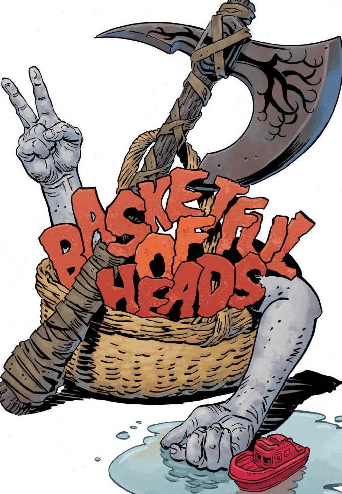
Heads start rollin’ and they keep talkin’ in Bastketful of Heads #2, out this week from DC Comics Black Label.
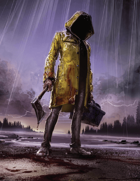
After the first issue started off like an adventure with Scooby and the gang, the 2nd chapter picks up right where it left off, just before the perfect storm of chaos hits Brody Island.
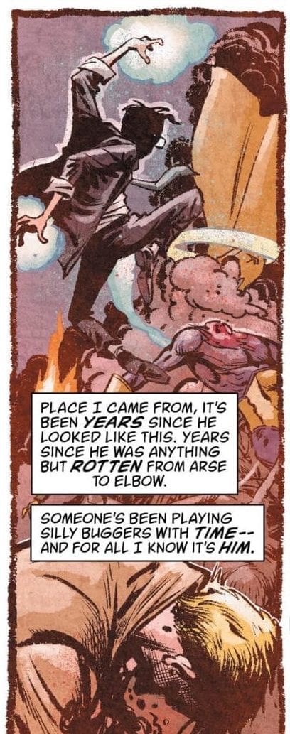
Joe Hill has started off the Hill House Comics imprint with a really fun horror comedy; a genre we don’t quite see often enough and we see it done well even less. The movie I always come back to for a great reference to what a amazingly executed horror comedy looks like is The Cottage with Andy Serkis. Obviously, this doesn’t seem like it would be much of a comedy, but once the heads start talking it’s hard not to laugh.
Leomacs handles the art for this book, and is very reminiscent of Francesco Francavilla. If you’re a fan of Afterlife with Archie this is another book for you. The full page depicting the first decapitation is t-shirt material if I’ve ever seen it. If Hill House comics needed another image for advertising, that would be a home run.
Dave Stewart is back at the colors again. The only light source throughout the issue is the storm itself. Any bright colors are very pale to depict a dark environment, and the scenes of extreme violence are accompanied with bright red to catch the reader’s attention. Aside from the violent panels, the book is shrouded in darkness for a very realistic portrayal of an island in the middle of a devastating storm.
Deron Bennett is on the hook for the letters in Basketful of Heads #2. This is not the first time I’ve reviewed two books in one week that share an artist. When you’re good at what you do other creators will seek you out to work on their books with them, and soon enough you’ll start to see the same names every week. Bennett’s word bubbles are very easy to read, even after the art is compacted more than usual with the borders on each page. He varies the way each sound looks so that we don’t mistake it for a constant or consistent sound.
It would appear that someone was wrong about these escaped convicts. The sheriff said back in issue 1 that they were non-violent and not a serious problem, but now they’re cutting off fingers and shooting at women.
As Brody Island is cut off from the mainland by the storm, more details come to the surface. At least one of these prisoners is definitely not what he seems, and it adds some extra suspense for the series going into the next chapter.
I am definitely enjoying Basketful of Heads so far. Since it’s only a six issue mini-series and the covers are amazing, I’ll be on board for the entire run. If you like an 80’s style horror story with art that brings back the nostalgia of old pulp horror creature features, or the original Friday the 13th, then Basketful of Heads from Joe Hill and Hill House comics is a title that should be on your pull list.
There’s something else going on with Brody Island. Something only a few people know about. What could be keeping these severed heads alive? Is there some type of witchcraft? I’m betting on some kind of ancient burial ground that might tie in with the Sea Dogs story.
What did you think of Basketful of Heads #2? With two titles out from Hill House comics what do you think so far? Let us know in the comments below.
Diving into the mind of the Martian Manhunter, what horrors will they find and how will they escape? Find out in Martian Manhunter #10, out this week from DC comics.
Steve Orlando, Riley Rossmo, Ivan Plascencia, and Deron Bennett are at it again with an exciting chapter for J’onn J’onnz and his partner. This series has been a delight and the closest comparison out there to the increasingly popular Immortal Hulk. Joshua Middleton has also been pumping out some incredible variant covers for this series.
Orlando is providing an incredibly entertaining look at the Martian Manhunter. As another character that I have no prior knowledge about, this story is a standalone masterpiece. When discussions arise about the best runs or stories of the year, I cannot recall anyone ever mentioning a Martian Manhunter story, but depending on how this series ends, this could be a story that grows the fandom for the Manhunter for many years to come.
Rossmo is the biggest reason that this book has been so amazing. It is a style that stands out among the rest, and I’ve been in love with it since The Batman Who Laughs one-shot. The martian monster designs are terrifying to imagine encountering at any point in time. It doesn’t even have to be in a dark alley, the sun can be out, flowers blooming, children laughing and playing, then one of these things shows up and I’d already consider it hell on Earth. When it comes to monster designs, the artists of today are coming up with stuff that would make H.R. Giger and Clive Barker jealous.
Plascencia is an amazing colorist to have on a title like this. Many of you will know him from working with Greg Capullo on Batman, but he is becoming a common name to see on the cover. With these slime greens, burning reds, alien blood purples, and the dark greys of death and destruction, this is what comics are meant to look like. This quality of work is why we keep coming back every week for more.
There have been a number of books lately that don’t seem to have much for the letterer to do in the issue. Martian Manhunter #10 is not that comic. Trapped in the mind of the Manhunter, there is so much happening and Bennett gets to showcase his skills during all the chaos. Just about every noise in the book seems like it would be pretty disgusting and the lettering does its best to make it worse.
This is a great series and I can’t say enough about it. Every aspect of the book is amazing from every member of the creative team from top to bottom. After 10 issues, I know it’s good. You should know it’s good by now. Put the last 2 issues on your pull list.
How do you think this story stacks up in the history of the Martian Manhunter? Do you think this would be great material for an origin movie? Let us know what you think in the comments below.
Hot on the heels of last months special, DC Comics and the Sandman Universe return to the seedy world of John Constantine in a brand new ongoing series of Hellblazer. Simon Spurrier returns for writing duties with a new artistic team all ready to impress.
Newly arrived in the present, John Constantine has to find a place for himself in this world while the forces of the occult have their own ideas on the role that he will play. The more things change, the more things stay the same.
John Constantine Hellblazer #1 Credit: DC Comics
Casting A Spell
In last months Hellblazer Special, Simon Spurrier reintroduced John Constantine to the DC Universe, setting up this new ongoing series. Spurrier took the opportunity to remind readers about the long and complicated past of the modern day wizard and how it all fits in with this relaunch. And, in short, it doesn’t. At least not in any material way. This new series is about finding a home for Constantine in the modern world, which itself is about reconciling past beliefs with modern ideologies.
The character of John is there from the very beginning. If you have read any previous Hellblazer comics you will recognise the arrogant, crude, devil may care attitude of the central character from the moment Spurrier introduces him. The writer wants this representation to be the original character, not a new version but the actual one created in the 1980’s by Alan Moore, and Spurrier has captured the essence of Constantine perfectly.
Of course, by bringing the character forward in time, unchanged, it instantly creates a conflict between the past and the present. The world has moved on but John jasn’t and a large part of this issue is about that fish-out-of-water aspect of the story. John is at odds with the modern world and Spurrier uses this narrative thread to comment on the society, politics, and modern culture.
Like all of the best Hellblazer stories, this isn’t just about the adventures of John, it is also an investigation into the complexities of life in the UK. Spurrier understands this and sets the narrative around aspects of modern life; from tower block gangs to disappearing teenagers.
John Constantine Hellblazer #1 Credit: DC Comics
Drawing The Magic
John Constantine: Hellblazer #1 is also a successful horror story. Modern sensibilities are challenged within the story and, more impressively, within the artwork. Aaron Campbell is a natural when it comes to illustrating disturbing images and the pages are filled with repugnant yet realistic scenes set to haunt your dreams.
Campbell builds up the images with layer upon layer of thin, rough pencil lines. This creates a sense of depth to the panels and adds the illusion of movement. This style differentiates Hellblazer from other DC titles, distancing itself from the usual Superhero stories on offer. It is also a clearer reflection of the substance of the story, with this comic having an Age 17 rating. The language and concepts involved are not straightforward and play in the grey area of moral understanding. Campbell’s artwork is an extension of this; it is not clear cut, not clean and easy to follow.
There is a dark, overpowering atmosphere throughout this comic that, like Constantine’s predicament, is uncomfortable and unnerving. This is mainly provided by the coloring by Jordie Bellaire. She blends the colors into the dark shadows in almost every panel, giving the entire piece an ominous feel. Even when the page features a lot of light, there is still the encroaching darkness.
Bellaire also assigns color schemes to certain aspects of the comic. Different scenes, different places, and even specific actions have their own hue. This allows for an easy reading experience but also builds sight recognition for some elements of the story. When the reader reaches a scying sequence or a ghostly apparition, it is instantly recognisable as such.
The page layout has a hand-drawn appearance, with the panel borders creating inconsistent gutters on the page. This is picked up by Aditya Bidikar for his lettering by giving the speech balloons the appearance of also being hand-drawn. Coupled with the changing font size within the balloons, the lettering adds to the comic’s sense of personality and individualism.
Watch out for the switching between upper and lower case type within the speech. This tends to illustrate the different speech patterns of the characters and highlight when characters are talking to themselves. It is another example of this comic going that extra step to create something different to what a mainstream audience may be used to.
John Constantine Hellblazer #1 Credit: DC Comics
Conclusion
Constantine has never really fit into the main DC Universe. The character is difficult to get on with, a true anti-hero who often thinks of himself before others. More often than not, Hellblazer comics require the reader to exert effort to understand the deeper meanings within the stories. And, above all else, Hellblazer comics are a dark reflection of the time they are written.
With all of this in mind, the latest Sandman Universe release ticks all the relevant boxes. Simon Spurrier clearly has an understanding of the character and the world in which Constantine exists. The rest of the creative team have produced something above and beyond a typical monthly comic from one of the big two publishers. The Vertigo brand lives on within these pages.
If you are easily offended or don’t have a stomach for horror, then there will be very little on offer within the pages of Hellblazer, but for everyone else this is a gem waiting to be found.
This Wednesday, Marvel Comics’ PUNISHER 2099 #1 shows a future that isn’t so bright or nice in a multitude of ways.
The Future Isn’t Paved in Gold
Punisher 2099 #1 is the exact opposite of what you’d expect from a title revolving around Marvel Comics’ famous antihero. On one hand, it’s unique and different from other Punisher titles. But, in the other hand, it’s not what you typically want from the gun-toting (sometimes psychotic) skull-wearing killer. Instead, Punisher 2099 #1 revolves around Public Eye officer Hector Tago as he delves deeply into the corruption that surrounds him. Joining his ranks is this era’s previous Punisher, Jake Gallows. Though, it’s never stated if this is the same Gallows from the original series. Comic timelines, am I right?
Instead of making Punisher 2099 #1 a usual Punisher tale of revenge for one’s family, writers Lonnie Nadler and Zac Thompson change it up. This time around, Tago becomes the Punisher, not for revenge, but to oppose the “system” he worked for. In the future, the police wear body cams, much like ours now, but they’re immensely advanced. There’s also the Social Score they use for the populace. Are you doing your part for the major Corporations? If so, your score goes up. If not, or if you look bad towards others, it goes down.
Nadler and Thompson have some grand ideas that they showcase in Punisher 2099 #1. Some they dive into, others they don’t, which is where one of Punisher 2099 #1’s pitfalls happens. For a 30 page comic, it includes great worldbuilding moments, yet it feels like it never truly explores what the duo are presenting. During one moment, a new concept will come to light, then immediately be dropped. This happens to the extreme when Tago becomes the Punisher.
This transformation happens off-screen with the suit appearing out of nowhere, making it feel like Punisher 2099 #1 originally was the beginning part of a larger picture. The team introduces the suit towards the last few pages while retaining a mystery around it. This “suit it” feels last second and rushed.
Punisher 2099 #1 feels like a comic setting something up that’ll pay off later in the series. But, with it being a one-shot, it never feels like it rewards the reader with a payoff in the issue. This could be boiled down to the creative team only having one issue to flesh out a whole new character and their background/city while trying to tie it into the main 2099 event. When events get tie-ins with new characters/places, the creators on said issue have the harrowing task of tying it into the event, while still making it stand out on its own. Two opposing things.
On one side you want the comic to tie into the event, yet you also want it to be able to be read completely on its own. This seemed to be the problem with Punisher 2099, as the creators are forced to make everything fit into these 30 pages as part of a larger “2099” story.
Perhaps if this event leads to a new line of comics based on these 2099 characters, Nadler and Thompson’s story will be able to fulfill its potential. There are teases of awesomeness in this one issue; if given even a miniseries, Punisher 2099 can shine.
Interior art – Matt Horak, Eoin Marron. Colors – Rachelle Rosenberg. Lettering – Joe Sabino
A Spiraling City
Matt Horak and Eoin Marron share art duties. At times, it seems one works on a “flashbacks” while the other works on the primary story. But, it’s not told what art duties they share. What can be said is their panel placement looks fantastic at times. The duo showcases a great sense of making a page seem unique and fun while having a great flow. But at times the art being portrayed in the foreground looks muddy, especially when compared to the great backgrounds.
The backgrounds seen throughout Nueva York are beautifully cyberpunk. They feel gritty, dirty, filled with sketchy lines, and a place you wouldn’t want to live. Yet when it comes to characters or objects that should jump off the page, they never do. Instead, they look obscure, hard to process, unfocused. Or in the action scenes, they feel stiff, when they should be fluid.
The colors come courtesy of Rachelle Rosenberg, and most of the time, the colors are great! Showcasing a neon-esque color palette, Rosenberg proves that she has a great understanding of futuristic feeling colors. Yet, when a face takes over a greater amount of a panel or is showcased more so than usual, the colors start to make the face feel inorganic, coming off with a weird plastic look.
Punisher 2099 #1 is heavy in dialogue, which shows more in some scenes than others. At times, letterer Joe Sabino has his work cut out for him. During some moments in Punisher 2099 #1, Sabino is able to move the dialogue boxes around to help guide the reader while not covering art. But in heavier dialogue/narration scenes, this isn’t possible, which starts to make the reading feel like a chore while blocking the art.
Interior art – Matt Horak, Eoin Marron. Colors – Rachelle Rosenberg. Lettering – Joe Sabino
A Future Imperfect
Punisher 2099 #1 is toted as a one-shot, yet it reads akin to the first issue of an ongoing. If the team had a larger page count or a mini-series to flesh out their ideas, Punisher 2099 could’ve been a fun twist on the long-running mytho. Instead, the one-shot feels cluttered, while the art never hits the epic feeling it’s going for.
Cover Story:I absolutely loved Marvel 2099 growing up. I remember finding issue one of Punisher, Spider-Man and falling in love with the covers, but the costumes were what drew me in. I loved the costume in the ’90s, but still, I think this new costume is amazing! Especially on the cover. Sadly, in the interior, the costume doesn’t look as badass. But major props to cover artist Patch Zircher and Java Tartaglia for making the costume and cover look amazing!
Reader’s of Punisher 2099
What did you think of the Marvel 2099 tie-in? Also, did you read the edge filled original ’90’s series?
If you’d like to check out our coverage on other Marvel 2099 titles go here. Wanting more info on the titles to read for Marvel 2099? Check out the website!
The Final Battle of the Freedom Fighters has begun!
The Freedom Fighters are making their final push against the Third Reich. Over the past year, they have been prepping for an assault on the Nazi’s base within the Cheyenne Mountain. It all started from the moment they destroyed a Nazi book depository to spark the fire of freedom to try and bring back Uncle Sam. When he returned, Hitler II brought back the Cyborg Overman to face them. Throughout their battles, they’ve freed cities, lost allies, and gained new powers. All of it has been building to this final push. Will the Freedom Fighters win and return America to its former glory?
**Some Spoilers Below**
Story:
The team continues their assault on the mountain headquarters of the Reich while a fellow rebel takes to the radio to send out a broadcast to everyone. Before the Freedom Fighters get too far, Cyborg Overman returns for a fight. Uncle Sam stands up to the cyborg menace and orders the rest to head inside and find the two captured members of the team.
Once they make it inside, they are soon stopped by the Plasstic Men, who threaten to tear them all apart. Refusing to allow them to attack her friends, Phantom Lady uses her power to cause them to stretch out to their limit and their deaths. Meanwhile, Adolf Hitler III prepares to finish off the team with a nuclear device beneath the mountain.
This issue might turn some people off due to it being around 95% of it being an action sequence. I am not one of those people. This is the culmination of nearly a year of this storytelling, and it is full of so many memorable moments. From the first page, readers will feel the weight of the Freedom Fighter’s fight as we pan to see Americans that we’ve seen through the maxi-series tuning in to the broadcast. It gives a sense of finality as the rest of the Fighters fight on to take on the Nazis.
The only real downside is the brutal and sudden deaths of the Plasstic Men. They were shown to be some of the most brutal enemies the Freedom Fighters faced. However, they were killed with a single portal from Phantom Lady like they were nothing but ordinary foot soldiers. This also raises questions on why Phantom Lady waited so long to do this, how did the portal stretch them to death, and why does she feel like she’s a monster for it? We won’t get any of these answers with one issue left, but that is more of a nitpick than a problem.
Art:
This is probably the best the series has looked on its entire run. Eddy Barrows brings his A-game with his masterful designs best shown during the action sequences. Uncle Sam fighting Overman is one of if not one of the best looking fight sequences this year. It only gets better when Adriano Lucas’ colorwork comes into play. Throughout the series, we had darker colors to match the darker tone of the world. But with the Freedom Fighters turning the tide, vibrant reds, whites, and blues cover the battlefield, and it’s simply breathtaking. There’s not much left to say other than it’s just flat out gorgeous.
Conclusion:
The penultimate issue of the Freedom Fighters will undoubtedly be one to remember. Fantastic art, incredible action, and a story where you feel the weight of the stakes at hand. What started as a group of C-List superheroes have evolved into one of the best comics on the shelves. Go out now and pick up your issue today. I highly recommend it.
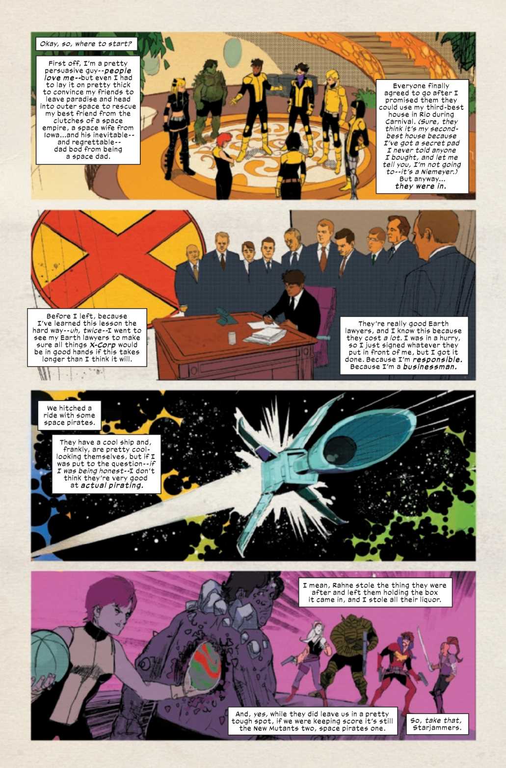
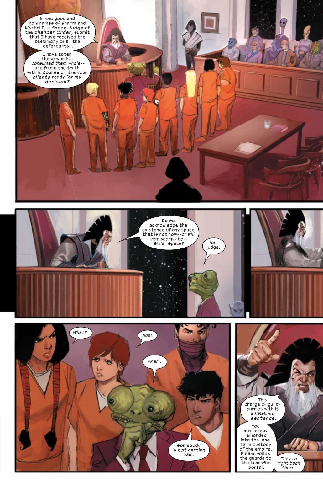
Join Marvel Comics’ New Mutants as they battle the space legal system and join the Imperial Service this Wednesday in NEW MUTANTS #2!
That’s putting it lightly!
Court Date For The New Mutants!
What’s better than fighting aliens in space with your fists? Fighting aliens in space through the legal system! Well, it would be, if you had a reliable space lawyer (unlike the New Mutants, whose space lawyer should lose their license). Speaking of whom, is there any chance we could get a spin-off featuring the lawyer in New Mutants #2? Because – albeit short – the courtroom scene in this issue was hilariously great!
Jonathan Hickman and Ed Brisson start New Mutants #2 a few weeks after the previous issue (review here) with Bobby da Costa regaling said events. Although the series revolves around the team, the writing duo focuses more on da Costa throughout this issue. When Sam comes into the picture, who was the reason they went to space in the first place, this focus is especially strong. And you would think Sam’s rescue should essentially conclude this story arc, right? Nope, the New Mutants are now tasked with helping in the Imperial Service.
Hickman and Brisson’s story is fast-paced, essentially feeling as if multiple story lines were shoved into one issue. At times this pacing feels natural, but other moments the duo should’ve lingered longer, or focused more on the team itself. The first issue maximized the team by focusing the story around them while making them feel like a family, whereas New Mutants #2 reads like a Bobby and Sam spin-off.
Art by Rod Reis, Letters by VC’s Travis Lanham
A Little Less Action, A Little More Conversation
New Mutants #1 had bombastic space-faring action, with zips, zaps, and spectacular sword fights galore! Issue two includes just one hyper impactful punch (as brutal as the famous “one punch” Guy Gardner received from Batman). This impact is felt due to Rod Reis’ phenomenal art. Even in a single panel, where only a punch is thrown, Reis’ chaotically wonderful art shines through. Reis gives said panel such ferocity that he may have punched the readers themselves.
The remainder of New Mutants #2 is void of violence, yet the energy Reis’ pencils provide in character-centric panels still speaks volumes. Each character’s action speaks just as loud as their words. When the plot calls for characters standing/sitting around, Reis’ adds varying amounts of angles and poses that help give high-end energy that breathes life into the characters. This energy is carried into the colors, which Reis also handles. The colors continue looking watercolor-esque, which is absolutely jaw-dropping. As mentioned with the punch, Reis’ uses colors to help portray emotions and impact.
Seeing that New Mutants #2 doesn’t contain as much action as the previous issue, there aren’t many moments for sound effects. But nonetheless, Travis Lanham’s lettering continues to help carry New Mutants. This is due to Lanham’s playing with fonts, and by changing sizes and colors. Most importantly, Lanham’s bubble placement creates perfect flow. In no panel did the dialogue clash with what was being portrayed. Instead, they help guide the reader through the page.
Art by Rod Reis, Letters by VC’s Travis Lanham
Conclusion
The story beats in New Mutants #2 feels a bit too fast, as each moment whizzes by. When you finally get your head wrapped around a moment, it’s over. If the duo had slowed down the pacing in some moments, giving the story time to breath, the flow would have benefited greatly. Besides that small speed factor, New Mutants continues to be an amazing series, with Reis’ art being a standout.
Memorable Quote: “I think I’m in Love.” – Bobby da Costa
John Constantine: Hellblazer #1 from DC Comics hits your local comic book shop this Wednesday, and Monkeys Fighting Robots was able to speak with writer Si Spurrier and artist Aaron Campbell about the new Black Label series.
About the book: John Constantine is back in London, back to his old tricks-and just in time, as things have become very dark indeed in his old stomping grounds. A small-time gang lord has found himself dealing with a big-time outbreak of supernatural weirdness…and without any allies to call on and nothing left to call his own, John doesn’t have much choice about taking a paycheck from one of London’s worst, or accepting the help of one of the gang lord’s would-be foot soldiers. But what should be an open-and-shut exorcism turns out to be nothing but…and the author of this madness may just be getting started on their terrible masterpiece!
Rounding out the creative team: Jordie Bellaire handled colors, letters are by Aditya Bidikar, John Paul Leon worked on the cover, and Charlie Adlard brought the variant cover to life.
John Constantine: Hellblazer #1 starts off a new ongoing series spinning out of the Sandman Universe Presents: Hellblazer one-shot that dropped in October. Spurrier and Campbell talk about that below, as well as storytelling building blocks, and the bond between writer and artist.
Monkeys Fighting Robots: What are the elements that make up John Constantine that if you removed any, it would cease to be a Constantine comic?
Si Spurrier: Conscience.
Take that away, and all that’s left is a toxic user and manipulator who can’t escape his addiction to the darkness, and can’t stop betraying the people he loves.
Leave the conscience in place, and you have one of the most compellingly fascinating characters ever created. A bastard who knows he’s a bastard and hates it, but keeps being one anyway.
Aaron Campbell: This is pretty much the same thing as conscience, but I would narrow in specifically on the idea of regret as well. Regret is a potent force in John’s life, so much so that it acts like a beacon for the spirits of all those he ever screwed over. It keeps him tethered firmly to his past, forcing him to face his crimes whether he wants to or not. But I believe his regret isn’t just focused on the rearview. I get a real sense that John deeply regrets everything he knows he has yet to do.
MFR: What’s your reaction when you see a page colored by Jordie Bellaire for the first time?
Spurrier: A bruised chin.
She’s good. She’s really, really good.
Campbell: Jordie is amazing. It took her no time to figure out how to color my work. It’s pitch-perfect. And when my stuff gets weird and more experimental, she really lets loose, and it is spectacular.
MFR: There are a few silent panels in the first issue. Can you talk about the relationship between artist and writer when there are no words to convey the story and or emotion?
Spurrier: Silent panels are a ridiculously important part of the storytellers’ kit. They do a dozen different jobs depending on the story or the vibe — increasing tension, inserting pauses, creating the illusion of time passing, and so on — but whatever the goal they really do speak to a total trust in the artist’s ability to convey information. As writers, we often have to fight the tendency to overwrite or over-explain, or – conversely – to lean into the juxtaposition of narrative text and imagery to an overwhelming degree. I’ve been guilty of both, at times.
A smart artist who totally gets the story and instinctively channels the correct mood – an artist like Aaron, in fact – mitigates the need for, or risk of, either.
You can always tell when an artist doesn’t get it, or when a writer doesn’t have enough trust, because you’ll find the text and the art both delivering exactly the same message. In fact, that’s become so perniciously prevalent in mainstream comics — constantly handholding the reader to make sure they definitely get what’s going on — that I’ve noticed some editors have learned to abhor silent panels, as nature abhors a vacuum. They’re wrong to do so.
Hellblazer is not the sort of comic that holds your hand.
Campbell: Panels, whether they are silent or filled with dialogue and exposition, all exist within the broader vocabulary of comics. A silent panel is like a punctuation mark. It creates a shift in pace.
So I’ve never really noticed much of a difference in terms of the relationship we share to the page. A panel with no text simply gives me a good chance to connect directly to the viewer. Without words, they are forced to really observe the artwork, take a beat, and process the surrounding narrative. It’s the closest I get to being able to look at the reader directly in the eye. So in those moments, I try to really ramp up the tension and emotional impact in a desperate attempt to get them to linger in that space for just a little while longer.
MFR: We have the first appearance of K-Mag in issue one. Can you talk about the process of creating a new character, especially a villain? Comics have been around for just a bit; how do you stay original?
Spurrier: Switch on the news. Absorb. And when you’ve finished puking your guts up, recontextualize and recombine to make something new. Remember: there’s nothing so awful in aaaaallllll of fiction that it hasn’t been out-awfulled by something real.
For me, the trick — and this is why so many spandex villains just don’t do it for me — is to remember that nobody thinks they’re evil. (At least, very few people, who aren’t also objectively mentally unwell.) “Villains” always have a reason, or at least an excuse, or at the very very least a fuck-ton of retrospective guilt, to psychically sidestep anything so simplistic as a Manichean concept of Eeeevil.
In K-Mag’s case, he’s constructed this flimsy savior complex built around years of resentment and persecution he’s faced, which allows him to see himself as the protector and educator of a group of young delinquents and outcasts, who are shunned and hated by an increasingly racist, biased and loveless world. Which, y’ know, makes him sound like a pretty great guy.
Except that, in practice, he’s the leader of a gang of teenage crack dealers, who frequently sends his young wards out on territorial bloodletting missions to expand his turf, and who practices a particularly vile form of magical scrying involving copious amounts of gore. Also, he has cool tattoos.
Campbell: In reading Si’s description of K-Mag I found myself considering John Landis approaching Rick Baker and saying something to the effect of, “yeah so if you could just create the most realistic on screen depiction of the transformation of a werewolf in the history of cinema that would be great. And make sure we get lots of good shots of individual, I mean thousands of individual, hairs growing out of pores in highly realistic-looking flesh, that would be nice also.” And then I imagine John Landis just leaving and Rick Baker staring blankly into the middle distance for quite some time.
At least that’s the head-canon I made up when I saw that I was going to have to design and then wrap a tessellation pattern of magpies around a human form covering every single square inch of K-Mag’s body and I would have to do this over and over again through many panels. But who doesn’t like a challenge!
MFR: Simon, with a Black Label book, does this change your writing style?
Spurrier: I mean… not really? Part of the job is to understand your audience will be different depending on publisher, character, and tone. Brainstorming never happens in isolation. The process of coming up with ideas to suit a world where people wear leotards and fly, or a world where rusty spaceships have laser beam dogfights without being troubled by the laws of physics, or a world where people use prayer as currency, is exactly the same as coming up with ideas to suit a world where people drop c-bombs like punctuation and every shadow has something horrible lurking in it. You start with the context, you remind yourself of the possibilities and boundaries of your project, and then you just think really really hard until either you have a story or your brain explodes. That’s writing.
MFR: Aaron, is there one panel or page from the first issue that you are most proud of, and why?
Campbell: I have to go with page two. I just love the way the Blake Angels came out. I imagined their faces like masks covering something that possesses no understanding of humanity. They don’t even realize that the eyes they wear should be directed toward their target and maybe blink every once in a while. It’s the vacant, over-the-shoulder look of absolute disregard. They still give me the creeps.
MFR: Because I loved the film since the beginning, and now it’s starting to grow on people, do you want to see Keanu Reeves make another Constantine film?
Spurrier: Ha. My sense is that, whereas that’s a decent film, it’s not the Constantine I grew up reading in Hellblazer comics. (In the same way that I might opine that whereas the John Constantine who’s been seen lately in various roles within the DCU is hugely enjoyable to read, and has featured in some really cracking stories, he too is not the same Constantine I grew up reading in Hellblazer comics.)
So. I would watch and enjoy another Keanu Constantine film, without for one moment caring that it bears remarkably little relationship to its supposed source material.
An aside: as consumers, we’re a lot better at performing these sort of mental acrobatics than content-providers give us credit for. We’re born with a need for good stories, but we have learned this unhealthy and fussy urge to taxonomize every story relative to every other. Who cares if Wolverine is on three different teams? Who cares if it’s literally impossible for Batman to be investigating five different crimes on opposite sides of the planet all in the same week? Are the stories good? Most of us instinctively think like this and relax into the fiction. A few unhappy souls get so hung up on the minutiae that it consumes them when things don’t perfectly tally.
So it goes with Constantine. You either pick the version you love the most, or you read/watch them all and enjoy them on their own merits. For what it’s worth, our version is as close to the one from the classic 300-issue run of Hellblazer as we can make him, walking the streets and getting in trouble amidst our own highly fucked-up real world. But we’re not claiming he’s THE Constantine, any more than is dear old Keanu.
Campbell: What I would love to see is… [It was at this point that the hideous unknowable THING that had been tittering and worrying at Aaron’s studio door burst forth unleashing its nameless primordial appendages and dragging him into some audient void from whence no words could escape.]
MFR: Gentlemen, thank you so much for your time and best of luck with the new series.
John Constantine was created by Alan Moore, Steve Bissette, John Totleben, Jamie Delano, and John Ridgway.
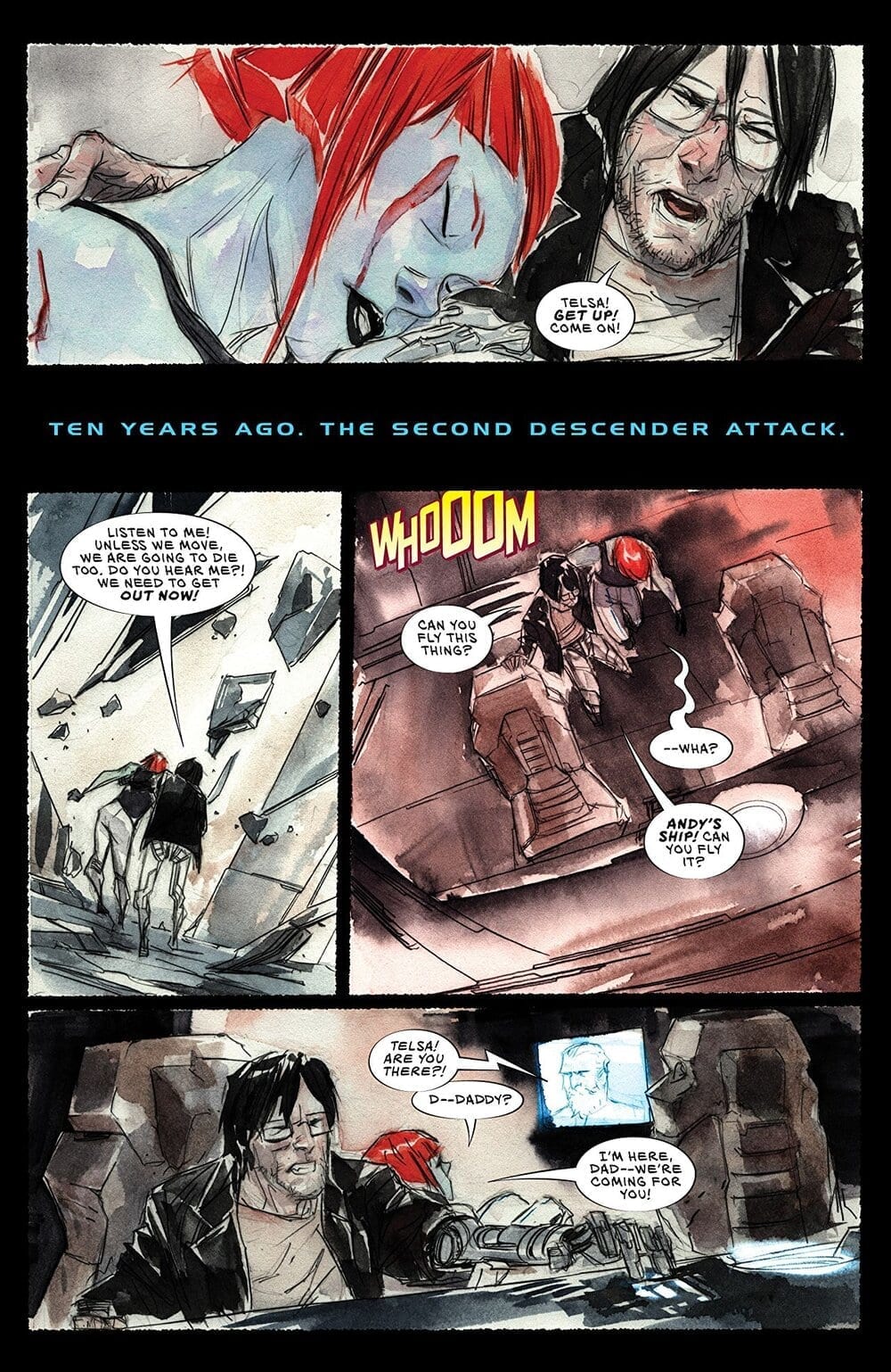
ASCENDER #7, available in stores on Wednesday, November 27th, is unique in this series in that it features the story of Telsa, one of the main characters from the DESCENDER series. Mila and Andy recently ran into her at the Sampson docks and asked her to help them escape from Mother’s vampiric forces. The former solider refused to help, hoping to escape the demons of the past. But an attack on their ship propels her into the bay, leaving her at the mercy of the ocean, and what lies within its water depths.
Story
Telsa, starring into the eye of a giant whale, loses all hope of escape. A horde of vampiric shark creatures flank her sides, leaving her exposed to the larger being’s gaping mouth, which engulfs her.
With her first mate Helda left above water on the ship, Telsa faces her deepest regrets in the form of flashbacks, which take place during the 10-year gap between DESCENDER and ASCENDER. We see how the hero struggled to fulfill her duty as a soldier despite the utter hopeless left in the aftermath of the machine wars.
Writer Jeff Lemire brilliantly retells the story of Jonah through the medium of Telsa and her predicament. Much like the biblical figure, Telsa finds herself in the belly of an aquatic creature after refusing to partake in the destiny laid out before her. Our hero spends this time reliving her past regrets and finds the courage to be the person she was meant to be. What’s more, we learn of her initial encounter with Mother’s vampiric creatures and how she escaped from them.
Artwork
The artwork within ASCENDER #7 sets a dreary, dystopic tone fitting of the narrative. Dustin Nguyen’s unique penciling, ink work, and coloring offers a bleak yet emotive expressionism that’s hard to find in comics today. His relatively simple drawing style create highly expressive faces that allow us to actually feel the regret, fear, and rage of Telsa and Helda. There’s also a clever juxtaposition between the dull shades of the undead word of Niyrata and the brighter colors of the living.
Steve Wands’ lettering offered a few cool features as well. One such feature is the use of a font style reminiscent of Star Wars to represent time jumps, which helps readers relive Telsa’s memories as those it were read from a storybook.
Comic Cover
Nguyen’s cover artwork features Telsa plummeting to depths of the ocean, all the while watched by the eye of what looks to be an enormous whale. We feel her utter helplessness as she faces forces beyond her control.
Conclusion
ASCENDER #7 frames its story with the Jonah’s narrative, yet moves past the original by showing the people around Telsa who encouraged her to become the hero she is today. Readers will be anxious to see if she escapes her prison in the watery depths and continues the fight.
What other questions does this issue bring up regarding Telsa’s past? Let us know in the comments below!
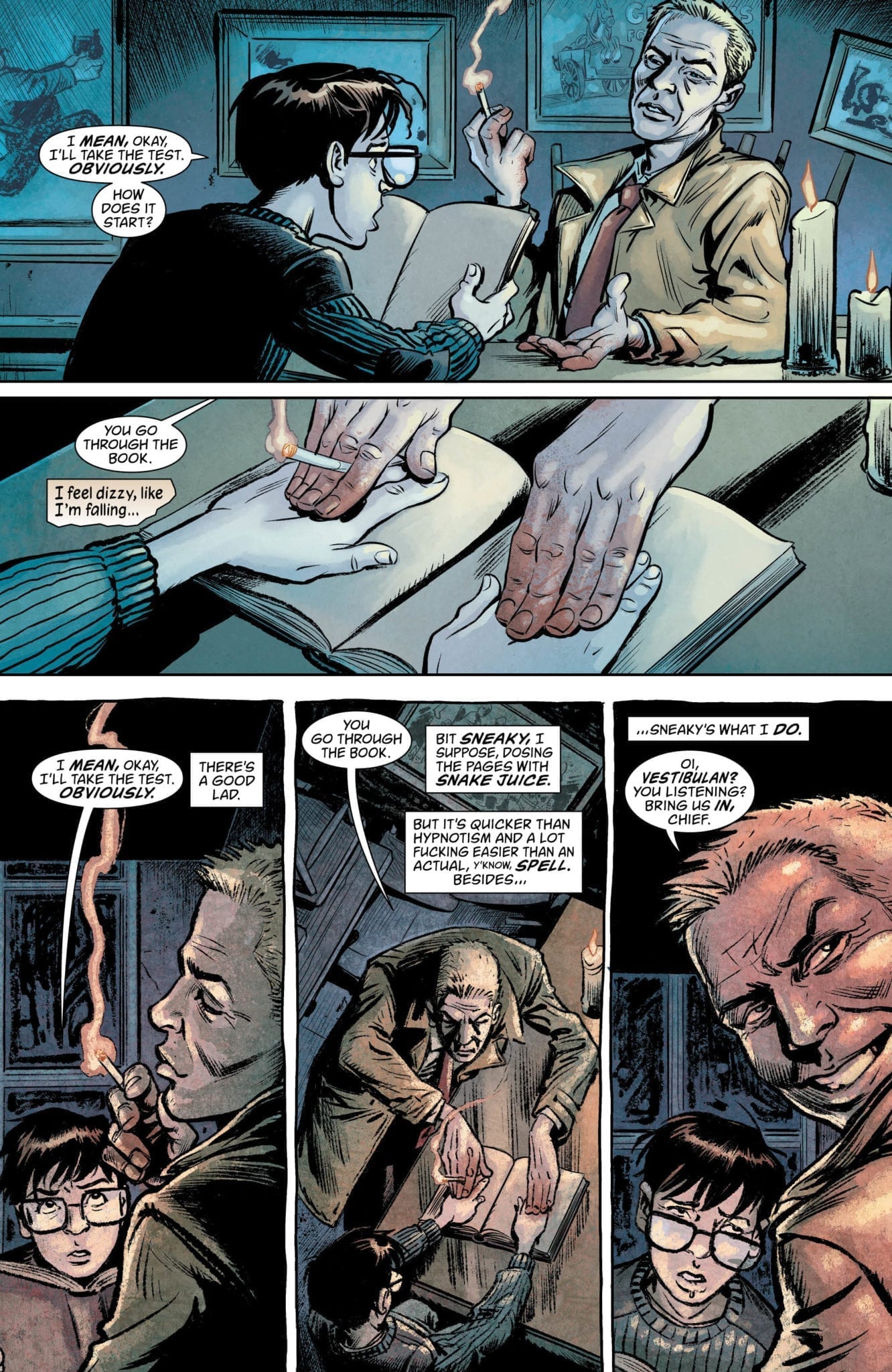
Hitting stores on Wednesday, November 27th, BOOKS OF MAGIC #14 brings together Timothy Hunter and John Constantine, another power sorcerer who’s made a name for himself in the DC universe. The latter has beckoned the younger wizard to visit him in exchange for a mysterious book, which Tim expects is one of the coveted Books of Magic. Caught in waves of self-doubt, trying to determine if he’s good or evil at his core, he jumps at Constantine’s invitation. But will the infamous con-man live up to his word?
Story
Stepping into their agreed upon meeting place, an old bar named the Fox and Owl, Tim is brought to a table where Constantine has laid open the book. Though it seems to be blank, he claims Tim need only place his hands on the pages so he can begin a “test.” Convinced the more experienced sorcerer will kill him if he doesn’t comply, Tim plunges in, desperately hoping this dubious test will remedy his existential angst.
In the world of the book Tim meets the Vestibulan, a cursed angel who refused to take a side in the war between Heaven and Hell. He’s roped in by Constantine to ensure Tim doesn’t cheat on the test due to his impartiality. But back in the bar, the con-man’s true intentions are revealed in the form of Bita and Maz Ghūl, two cannibals who have agreed to literally eat Tim once the poison on the book’s pages kills him.
Why would Constantine want to kill Tim? The answer lies in an alternate future timeline the warlock visited in which the boy grows up to be an all-powerful tyrant.
Writers Kat Howard and Simon Spurrier structure this story to reflect both Constantine and Tim’s perspective. This gives readers a fuller understanding of each character’s motivations and perspectives in the midst of shared experiences. In this way, we are able to relate to the story’s more dubious characters.
Readers will eagerly jump at the opportunity to see Tim combat the forces in the book and, ultimately, Constantine himself.
Artwork
Tom Fowler’s penciling and Craig Taillefer’s ink work, combined with Jordan Boyd’s coloring, create gritty tones fitting of this issue. One get’s the feeling they’re reading a John Constantine comic due to the dark lines and shading. However, there are also plenty of bright colors and swirling lines remain (specifically inside the book) to remind us of the weird magic ever present in Tim’s world.
Todd Klein’s lettering was fantastic in this issue as well. To fit with the dual narrative of Constantine and Tim, Klein uses differing background types for their dialogue boxes. Tim’s
Comic Cover
Kai Carpenter’s cover artwork features Tim reading the mysterious book while Constantine creeps up behind him with a knife, alerting readers to the danger posing the series main character.
Conclusion
BOOKS OF MAGIC #14 brings together two of DC’s most popular sorcerers in a tale of existential angst and betrayal. We’re anxious to learn more about Constantine’s connection to Tim in the coming issues.
Do you think Constantine’s actions were justified? Let us know in the comments below!
Post-apocalyptic chaos ensues after electricity stops working in the IFC’s film Radioflash starring Dominic Monaghan (Lost, Lord of the Rings) and Brighton Sharbino (Zoe Valentine), with writing and direction by Benjamin McPherson (Man in the Moon). The father and daughter pair make their way to safety while the score from composer Ramin Kousha layers the film in dread and hope.
In Radioflash, Monaghan plays Chris, father of Sharbino’s Reese. The pair seem like a relatively happy couple despite the death of the family’s matriarch. However, their quiet dinner gets weird fast when all the electricity goes out from one minute to the next. Reese heads to the garage to use an old radio left by grandpa Frank played by Will Patton (Swamp Thing, Halloween). Chris and Reese start making their way to grandpa’s house as the world slowly crumbles into chaos.
PopAxiom found a working radio and was able to contact Ramin despite the electromagnetic disturbance to talk about making music for a tornado of sharks and the end of civilization as we know it.
Iran to Los Angeles
Born in Iran, Ramin says there’s a musical core that comes from his ancestry. “I learned piano when I was five or six years old. After a couple years, I started to get private lessons and learned about musicianship, harmony, and different areas of music. At the same time, I was playing around with Persian instruments like the Santur and Setar.”
Ramin eventually “… moved to L.A to study film composition.”
After a rich education that includes meeting a legend of film composition (more on that later), Ramin opened his own studio “…doing freelance work for different projects while meeting producers and directors and getting more work as a composer.”
Movies At Home
Growing up in Iran meant that getting the latest Hollywood films wasn’t as easy as heading to the local movie theater. “We didn’t have a cinema to go watch English language foreign movies. It was T.V. or DVD and then later online. I would watch everything usually a couple of months after a movie was released in the U.S.”
There was also a healthy community of film lovers who helped each other out. “People would pass around movies too.”
Storm With Teeth
One movie that got passed around by word-of-mouth A LOT back in 2013 was Sharknado. Ramin composed the score for the zany film about, well, a shiver of sharks inside of one of nature’s most potent wind events. What was the experience like for Ramin? “I had so much fun.”
A twist of fate connected Ramin to the cult-favorite film. “I had a previous relationship with the director, Anthony C. Ferrante. We often talked about our upcoming project and when he mentioned he was working on Sharknado I was really interested and that is how I got involved. Suddenly it became this big movie of the year. I was lucky.”
Working on Sharknado was fun, but also fast and furious. “They gave me two weeks. It’s a very fast process.”
It’s normal for composers to score films and television programs with temp tracks chosen by the director or editor as a placeholder. For Sharknado, Ramin says, “Some scenes had a temp track. I believe the opening had some.”
Of course, the main attraction is the title of the film. For Ramin, the storm of predators wasn’t even there. “While I was working, they were doing the visual effects. So, my picture had no sharks. They would write on the screen, ‘tornado of sharks’ or ‘sharks flying.’”
About Radioflash
Ramin and the film’s editor Simon Van Gelder were loosely working together before Radioflash. “I was sending him demos for various projects. He introduced me, and I started scoring some scenes and was brought on for the project.”
In regards to the previously mentioned temp tracks, “Radioflash didn’t have any temp music.”
For the most part, Ramin likes that better and instead prefers to get into the director’s head. “Ben and I watched the film several times, and he told me about his vision.”
Ramin elaborates on his communication with the writer/director, “Ben is an amazing painter and was able to visually describe the story with his unique artistic approach. It helped me understand his vision and the direction he wanted for the music.”
Another essential part of Ramin’s relationship with the visionary behind the film: “Ben is open to trying new ideas. First we tried sampling many instruments such as guitar, violin and cello as well as many Iranian instruments such as Santur, daf and kamancheh. Later we started mixing these sample sounds with many synthesizers and analogs. The unique part about the Radioflash story was that the movie starts in today’s modern era with internet and technology accessible and therefore I used mostly electronic combined with the orchestra. As the movie goes on, the power and internet are no longer available and my music shifts to use more organic and orchestral instruments.”
Setting the Mood
After the viewings, discussions and creative powerpoint presentation, Ramin “… had 1 or 2 weeks to put together the sound palette.”
“The opening scene was very challenging,” said Ramin. “I tried many different styles and sounds to put the audience in the right place and did a lot of experimenting with Middle Eastern instruments.”
As for the experience of working on Radioflash and making the end of a civilized society sound creepy and cool: “It was challenging, but it was super-fun.”
Wrapping Up
Ramin is a mix of musical influences. “What I do right now is a combination of my Persian background, my orchestra training, and using analog synths.”
Up next Ramin says, “I just finished a project with a French director name Kader Ayd, the story is about the famous French singer Charles Aznavour who passed away one year ago.”
Who would the composer love to work in the future? “… Alfonso Cuaron or Paul Thomas Anderson. I love Get Out, so I’d love to work with Jordan Peele.”
Ramin rattles off many names when asked who influences him from a classical or composition point-of-view. “Strauss, Arvo Pärt, Ennio Morricone and Alexander Desplat. When it comes to more synth scores, I love John Carpenter, Cliff Martinez, Jóhann Jóhannsson. Alexander Desplat is another. I try to listen to all kinds of music and scores to broaden my musical taste and knowledge.”
Oh, about the legend that Ramin met in school: “I was lucky, there was a class at UCLA where John Williams came as a guest. We had a great conversation. He started teaching. It was a couple hours in a very small group, so we could sit down with him face-to-face. It was an amazing experience.”
Radioflash is available on VOD.
Thanks to Ramin Kousha and Impact24 PR for making this interview possible.
Want to read more interviews like this? CLICK HERE.


")


")


 Why would Constantine want to kill Tim? The answer lies in an alternate future timeline the warlock visited in which the boy grows up to be an all-powerful tyrant.