Home Blog Page 367

Ranked: The Ten Best Gambling Movies of All Time

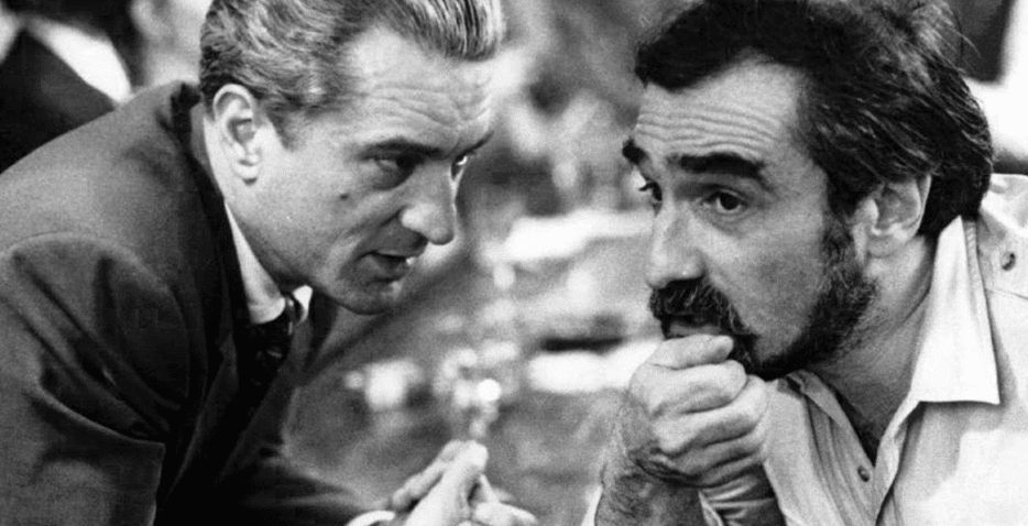
10 Reasons Why Martin Scorsese's CASINO is a Classic

There have been several casino and gambling movies released in the last sixty years. When you are done playing your favorite game at the Lucky Nugget casino, that are offering the greatest games on their online casino platform, you can relax by watching a classic gambling movie. Many gambling films have gone to achieve classic status and box office success among audiences worldwide. Here are the ten best gambling movies of all time you must watch:

 Casino

Even though it doesn’t show a lot of gambling, it is a gold standard for gambling movies. The story is about Nicky Santoro and Ace Rothstein, who are gangsters. They move to Las Vegas to make their mark. Ace operates the Tangiers Casino while Nicky is a

tough, strong man who shakes down the locals. Their weakness shows when Ace falls in love with a hustler and Nicky indulges in drugs. This leads to their downfall. The movie is about greed, power, love, and deception-ingredients for a mobster classic.

 21

21 is common and a favorite among gamblers. It is a classic underdog story where the player beats the house, and it also highlights the game of blackjack. In the movie, the protagonist who is Ben Campbell, wishes to study medicine at Harvard Medical

School but cannot afford school fees. He is introduced to a math teacher by the name Micky Rosa. He runs a card counting club with five other students. Ben joins the group, and they visit Las Vegas and other casinos in the US to use their skills and win big.

 Casino Royale

In the whole of the James Bond series, the poker game at Casino Royale is the most powerful. 007’s mission is to kill and take part in a game of high-stakes poker. He is supposed to stop banker Le Chiffre who is a terrorist, from winning. There is the $10m buy-in that would unsettle most professional players. However, when it comes to Bond, there is more at stake than just money. In the final, $115m is at stake. There is a surprise when Le Chiffre beats other players, but Bond seals the victory in a flush. This game of poker attracts a large audience around the world.

 Ocean’s Eleven

This is the coolest gambling movie that has ever been made. Danny Ocean plans to score the largest casino heist in history. He targets three casinos simultaneously: the Mirage, the Bellagio, and the MGM Grand, all owned by Terry Benedict. Even though the plan is risky, it is done perfectly. Ocean’s Eleven is among the most famous casino movies.

 Maverick

The movie is based on the 1950’s TV series. It is about a con called Bret Maverick, who tries to raise $25,000 to be in an all five-card poker tournament. He tries to raise funds by playing card games and even entering into debts. After getting the full amount, he gets to the game and wins the $500,000. Unfortunately, the money is stolen. There are further twists in the movie as he tries to get his money back.

Fear and Loathing in Las Vegas

The story follows oddball journalist Raoul Duke and his lawyer Dr. Gonzo. They are headed to Las Vegas to look for the American Dream. They encounter weird and wonderful characters along the way, from gamblers to racers via police and hitchhikers. Their objective is the American Dream, but they experience a lot of fear and loathing.

The Cincinnati Kid

The Cincinnati Kid is a Steve McQueen classic. The main character, Eric Stoner, is an upcoming gambler with luck on his side. He travels from town to town to look for beautiful women and high-stake games. The story joins Stoner as he gets in New Orleans. He plans to go up against Lance Howard, who is the best at Stud Poker. Stoner wins in the early rounds but is defeated by Howard in the end. The game requires a lot of intelligence and wit to play, making it famous.

 Rounders

Rounders is your conventional gambling skim. The talented poker player loses money to a gangster and turns his back on the game. He then goes back to the game to help a friend and save himself. The movie ends with Mike McDermott embracing his love for the game by dropping out of law school and boarding a plane to Las Vegas to participate in the World Series of Poker.

Monkeys Fighting Robots Youtube

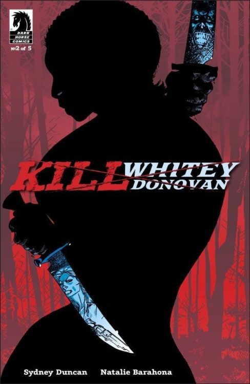
Review: Cooking Dinner with the Enemy in KILL WHITEY DONOVAN #2

Writer Sydney Duncan and artist Natalie Barahona return for a tense second issue of “Kill Whitey Donovan.” This new chapter never eases off the sense of foreboding with a mix of dreadful flashbacks and hostage scenarios. If this comic continues in such a fashion, this could be one of the most thrilling series in recent memory.

Hattie and Anna knew that executing their plan to kill ”Whitey” Donovan would be difficult, but they never anticipated their path to find him would be a literal inferno of war; hunted by the evil Tyson and his devil dogs, attacked by Confederate soldiers–with no allies yet to be found–can they possibly survive long enough to find the vengeance they so desperately seek?

Writing/Plot

Sydney Duncan‘s pacing in this issue is similar to the last in that it’s a tight interweaving of introspective dialogue and suspenseful sequences. This issue primarily focuses on Hattie’s background, and it does so through nightmares and flashbacks. The terror and struggle of being a black woman in the deep south in this era is never lost in the plot. Hattie’s efforts to blend in and hide her intentions takes her to embarrassing – and sometimes darkly humorous – situations. Duncan knows how to let the art do the talking, as there are several passages of wordless panels highlighting tension. There actually isn’t much internal narration in this issue as compared to the last. However, there is one specific scene that has a bit of a “people don’t talk like that” feeling to it. Poetic metaphorical prose is a fantastic and beautiful tool in a writer’s box. This being said, it doesn’t always work based on context or character. Outside of this, “Kill Whitey Donovan” continues to be a thrill to read in terms of pacing and character building.

Art Direction

Natalie Barahona’s artwork only seems to get more impressive in this second issue. The foggy environmental art sticks around, wrapping the atmosphere in a sort of thriller tension. The reader can almost feel the humidity of the South through the panels. The other feature that sticks out even more in this chapter is the stellar character art. The plethora of tertiary characters is matched by Barahona’s fantastic facial detail. Mainstream comics can especially be obsessed with making each and every character look essentially perfect. It’s fantastic to see artists like Barahona focus on making human art that looks like, well, humans. The digital sheen may throw some more classically-minded readers off, but that’s their loss. This is truly fantastic work here.

“Kill Whitey Donovan” #2 is an issue that capitalizes on the atmosphere put forth in the debut issue while ramping up the tension of its historical context. Duncan’s scripts are paced with stellar dialogue and quiet moments of terror. Barahona’s art is murky and atmospheric while also being beautiful and human. This is certainly turning out to be a must-read going into the new year.


Monkeys Fighting Robots Youtube

ARMAGEDDON 2001: The Unexpected Vs the Inevitable

Who is Monarch
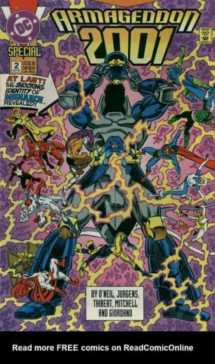
The final issue revealing the "Shocking Identity of Monarch"

Some endings are inevitable, some endings catch us by surprise. Armageddon 2001, written in 1991 by Archie Goodwin, Dan Jurgens and Dennis O’Neil, is a textbook example of an inevitable ending. Until it isn’t. The writers opt for a twist, though they set up a different ending. They undercut their own story, insisting on the unforeseen.

The Premise of Armageddon 2001

The story takes place in multiple times. We begin in 2001, ten years in the future from when DC published the story. We follow Matthew Ryder; a man imbued with time travel powers trying to find the true identity of 2001’s mysterious tyrant, Monarch. All Ryder knows is Monarch was once a superhero. He travels back to 1991 to investigate, and in a series of annuals, we learn about the future. When Ryder, now called Waverider, places his hand on an individual, he can see their future. He plans to make contact with each hero until he uncovers Monarch.

The Problem with Monarch

Goodwin and the company seemed to think their story was centered around a twist. Monarch had to be someone unexpected. One hero is actually fighting Monarch in all the possible futures, proving they aren’t one and the same. Hank Hall, AKA Hawk, fights alongside his partner Dove. As people are ticked off the list, it becomes clearer and clearer who’s future we haven’t seen. Waverider places his hand on Captain Atom’s shoulder in the penultimate issue, and the issue ends abruptly.

Readers quickly figured out what the next issue would entail. Captain Atom was Monarch. A leak from DC apparently confirmed suspicions. But the creative team caught wind that everyone knew where the finale was going. In a final panic, they changed the script for their finale. Captain Atom was not going to be Monarch, Hawk was. The one hero you wouldn’t expect… because it was impossible. With no explanation for the inconsistencies, the series ended, and a good story died.

Inevitable Vs. Unexpected

Captain Atom as Monarch was inevitable. The story led us there, and leaked or not readers knew. So what? Not all endings need to be a twist. We know that Romeo and Juliet are going to die. It’s clear Walter White is going to implode. Thelma and Louise are sure to careen off a cliff at some point. That’s what is so brilliant. Those endings are inevitable, and the slow march to the conclusion has you on the edge of your seat.

An inevitable conclusion is just as satisfying, perhaps more so than a twist ending. When the audience feels like they have more knowledge than the characters, they sit in suspense as they can do nothing about the characters’ downfall. It’s this dramatic irony that makes some works so enticing. Twists don’t need the same kind of care and set up. A writer can simply do the unexpected, whether that’s the best for the story or not.

Dramatic irony insists a writer know their characters. What are the consequences of creating these people? What is their ultimate end? But furthermore, dramatic irony insists that there must be stakes. We have to care about these characters and events because if they’re going to die, we have to wish they wouldn’t. Otherwise, we glance at our watches until the guillotine comes down, yawning happily that their snore-fest lives are over.

What’s Next?

Armageddon 2001 placed shock over plot and character development. Interestingly enough, they had set up a perfect ending. Captain Atom was a loveable character whose demise would be tragic. They had high stakes, but the marketing had already assured “you’re never going to guess who Monarch is.”

Unfortunately, Armageddon 2001 has not acted as the martyr it should have. Writers and editors push for the shock and awe to this day. The “you’ll never guess what happens next” endings are valued over the “things get worse, but you already knew that didn’t you?” endings. Perhaps because it hurts to write such endings, creating a character that is admirable and watching them endlessly fall has got to be tough. But ultimately, it leaves people caring.

Monkeys Fighting Robots Youtube

Review: Cold-Blooded Murder in DETECTIVE COMICS #1018

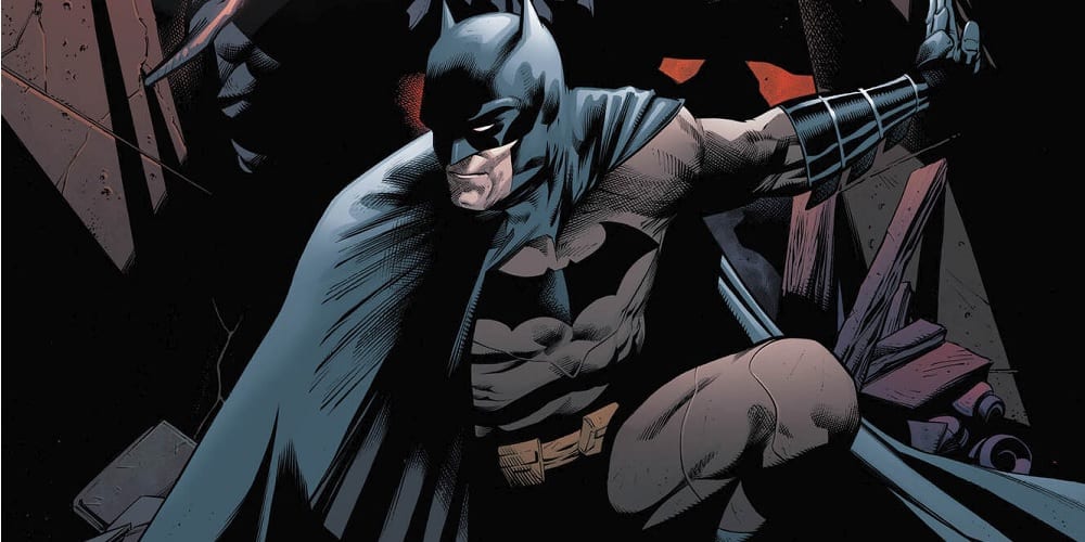
The holidays arrive in Gotham in Detective Comics #1018, out this week from DC Comics. But despite the festivities, the discovery of a brutal, ritualistic mass murder means the city is set to have anything but a silent night.

It’s up to Batman to crack the case before the next sacrifice takes place. However, the explanation may be even stranger than the crime.

Page #1

The Writing

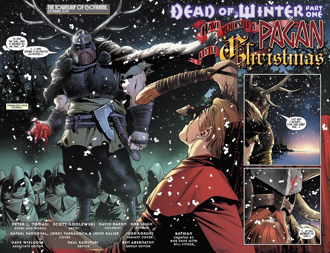
The story’s setup catches the reader from the first page. The book seems to introduce us several hundred years before the modern day, suggesting Gotham was once just a tiny, pre-Christian viking outpost. This prologue serves to provide flavor for a story, though it’s significance doesn’t become clear until the book’s end.

Detective Comics #1018 is a well-paced story, keeping the reader locked into the action on the page. Truth be told, this may be some of Tomasi’s best work yet on the series. It’s especially a treat for readers who more enjoy the “detective” aspect of Batman’s persona, rather than the superheroics.

The tone and premise are reminiscent of the classic Batman graphic novel The Long Halloween in some regards. The storytelling here is less action-centric, with Tomasi opting instead for more of a stripped-down sleuth narrative. We see Batman is called to the scene of a macabre multiple homicide, but each twist in the story just raises more questions, heightening the tension and mystery.

This seems to be the first Detective Comics story to take place following the events of Batman #77. Bruce is alone in Wayne Manor, isolated as the snow falls. Although it’s not a dominant theme, we see Bruce wrestle with his loss and trauma, which lends pathos and added dimension to the story. It’s especially prescient that Detective Comics #1018 takes place during the holidays. This allows Tomasi to really highlight Bruce’s loneliness.

Page #2

Page #3

The Artwork

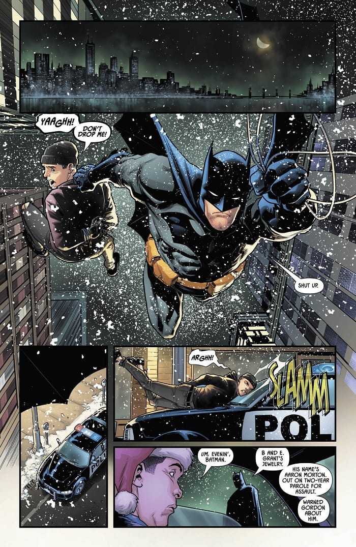
Artist Scott Godlewski provides illustrations for Detective Comics #1018. By and large, the artist does a great job of capturing the tone of story. Godlewski conveys the frosty, wintery atmosphere of the setting well, grounding us in the season. The level of detail employed in the backgrounds serves this effect, too, making the reader feel transported to Gotham.

One of the most notable elements at play is the expressiveness of the character designs. Godlewski leans slightly into a cartoonish style, but in doing so, lends the work a much more expressive feel.

The book has a sense of aesthetic cohesion, with the snow falling throughout, while the use of similar visual motifs in terms of layout helps as well. The visuals mesh well with the tone of the writing, giving the book a darker and shadowy, yet nonetheless vibrant look. Detective Comics #1018 is a visually-striking book, all things considered.

Of course, the colors from David Baron help to sell the immersion and dynamism. As usual, Baron’s work is on-point, with a dominant greenish hue contrasting against icy blues and stony grays. It’s moody and tone-appropriate.

Page #4

Final Thoughts

Detective Comics #1018 is a winner. It’s compelling and interesting visual storytelling with a notably darker edge to the narrative. This issue is definitely worth picking up.

Monkeys Fighting Robots Youtube

Exclusive Preview: QUANTUM & WOODY #1

Exclusive Preview: QUANTUM & WOODY #1

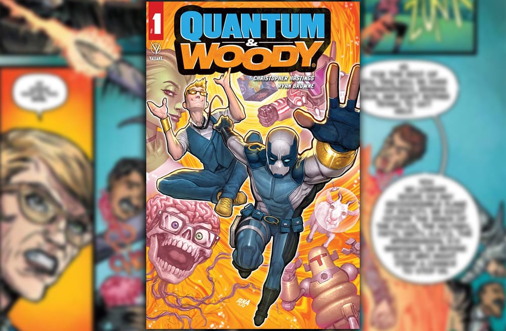
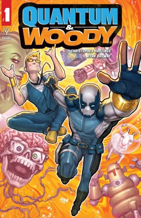
Quantum & Woody #1 hit your local comic book store on January 29, but thanks to Valiant Entertainment, Monkeys Fighting Robots has an exclusive four-page preview.

Quantum & Woody #1 is written by Christopher Hastings, with pencils & inks by Ryan Browne, Ruth Redmond handles colors, and you will read Hassan Otsmane-Elhaou letters.

The lines of sight used on page three are very well done, Browne talked with us about his philosophy as a visual storyteller and creating excitement with camera angles.

“I’m always aware of how shot selection affects the emotion/mood of the given panel. Simple stuff like a shot from below a figure makes them more imposing and a shot looking down on a character makes them look small and meek. Extreme close-ups to increase the intensity, tilted camera angles create a more dynamic and uneasy feeling for the viewer, and wide establishing shots are good to have at least once per page so the reader remembers where everyone is in relation to one another. I think about film a lot more than I think about comics with my storytelling and I think that shows,” said Browne.

About the issue:
Quantum & Woody — the worst superhero duo in the world — are Earth’s LAST hope against stopping a coalition of mad scientists from destroying the planet!

Quantum & Woody #1 has an FOC (final order cutoff) of January 6, so if you like what you see, bug your local comic book shop.

Monkeys Fighting Robots Youtube

Exclusive Marvel Comics Preview: AMAZING SPIDER-MAN #37

Exclusive Marvel Comics Preview: AMAZING SPIDER-MAN #37

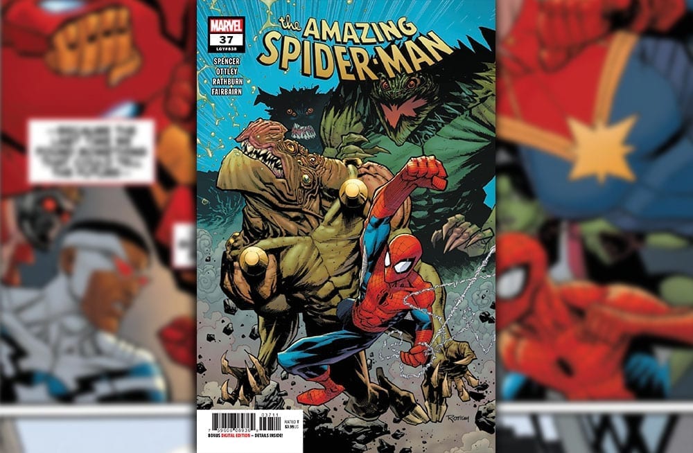
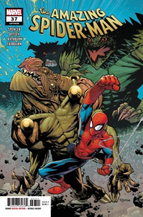
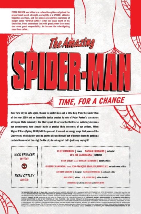
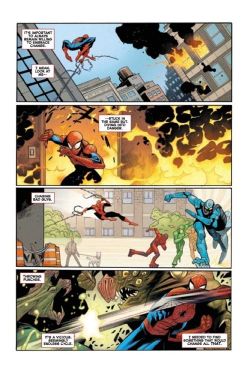
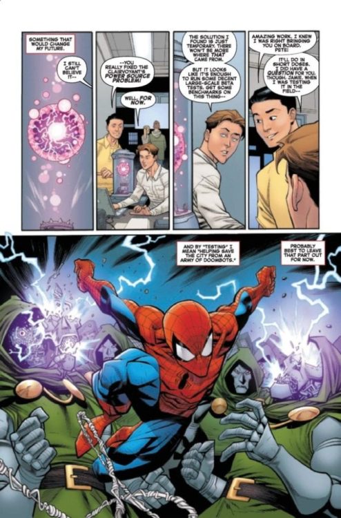
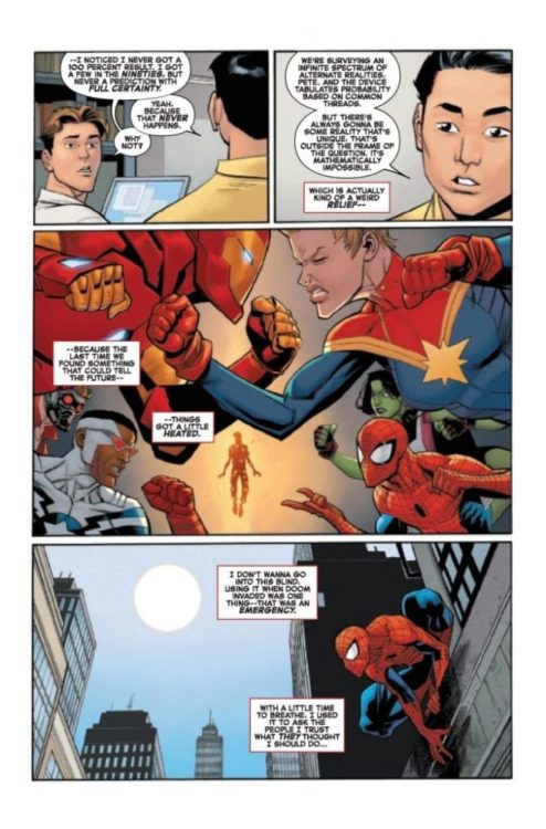
Amazing Spider-Man #37 doesn’t hit your local comic book store until January 8, but thanks to Marvel Comics, Monkeys Fighting Robots has an exclusive three page-preview for you.

About the issue:
There are too many problems in New York City, and Spidey can’t be in four places at once– unless he CAN?! Peter’s life is as complicated as ever, but can science be the answer? It’s a new year, and the buildup to “Last Remains” and much more starts here.

Amazing Spider-Man #37 is written by Nick Spencer, with art by Ryan Ottley, Cliff Rathburn is the inker, Nathan Fairbairn worked on colors, and you will read Joe Caramagna’s letters. Ottley and Fairbairn created the cover, and Anthony Gambino was the designer on the issue.

Stan Lee and Steve Ditko created Spider-Man.

Monkeys Fighting Robots Youtube

Review: HAWKEYE: FREEFALL #1 Hits the Mark

Hawkeye: Freefall #1

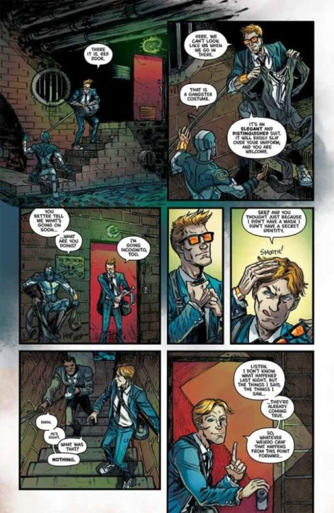
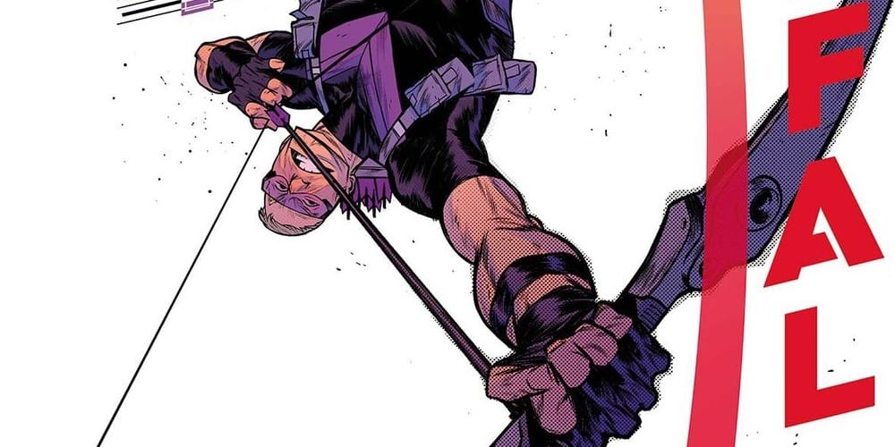
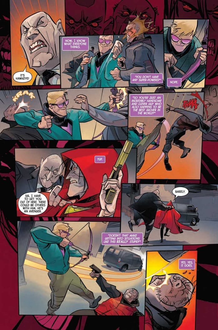
Somebody’s wearing Clint’s clothes in Hawkeye: Freefall #1, out this week from Marvel Comics. No, not his hawkeye costume; rather, someone’s lurking in the New York underbelly in his old Ronin outfit. The titular archer has his hands full with trying to clear his name and save the day in this engaging new title.

Page 2

The Writing

The writing by Matthew Rosenberg is snappy and well-paced throughout Hawkeye: Freefall #1. We have Clint serving as a narrator to externalize his own internal monologue throughout the book. While this could easily grow dull and exposition-heavy, Rosenberg manages to avoid those pitfalls and keep the reader’s attention.

The book manages to engage the reader with a fun tone and well-pointed dialogue. Clint is likable and fresh, narrating the book with sarcasm and personable wit. Even for those who aren’t regular readers of the character, this book offers plenty of charm to win one over.

From a thematic standpoint, there is some light social commentary about wealth polarization and its relationship to criminal justice in Hawkeye: Freefall #1. The theme is well-keeled, delivering Rosenberg’s point while never feeling too heavy-handed. It’s always nice to see these themes appear, and specifically, to see them handled well.

Although this is a Hawkeye book, a few other familiar heroes turn up, too. While their presence doesn’t add too much to the story, they provide some good banter and back-and-forth with Clint. As the series progresses, it will be interesting to see how this group dynamic plays out.

Overall, Rosenberg’s work is very engaging. The final pages of the book provide enough of a hook to keep readers coming back for the next issue.

Page 3

Page 4The Artwork

Artist Otto Schmidt’s character designs in Hawkeye: Freefall #1 are sleek. They are simultaneously refined, yet just a little sketchy. The angular designs can make the work feel a little stiff at some points, but overall, the style works well alongside the action.

Speaking of dynamism, the page payouts vary widely throughout the book. It hits the story beats effectively, but can be a bit overwhelming at times. There are some points at which it’s not immediately clear where the artist want to focus the reader’s eye.

Schmidt is very selective about the level of detail employed in the book. The backgrounds feel more fleshed-out and grounded in the slower, quieter moments. He lets the environment fall away, though, during the more kinetic action sequences. The viewer’s attention is focused primarily on the characters, which works well for a story that tends to be so character-driven.

That said, many of the backgrounds throughout Hawkeye: Freefall #1 tend to be on the duller side. We have lots of gradient colors, with little actual scenery. While the coloring is admittedly skilled, it’s not the most exciting presentation. While it may sound a little contradictory regarding the above comments about the art feeling overwhelming at times, it would be nice to get a little more detail in the world of the book.

Page 5

Final Thoughts

Hawkeye: Freefall #1 is an intriguing new series. Fans of the character and newcomers alike should both find plenty here worth reading.

Monkeys Fighting Robots Youtube

Review: THE FLASH #85 Sees Preparation for the Battle against Cold

The Flash slows down to build characters

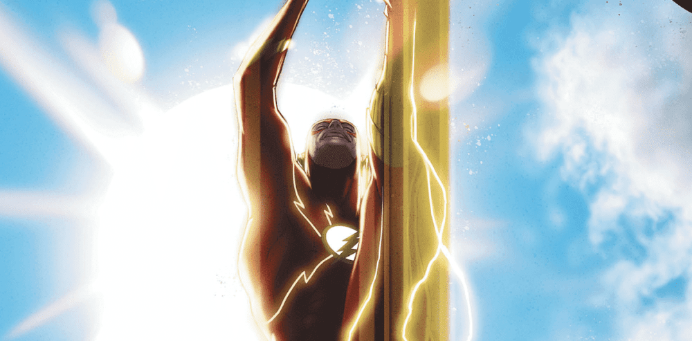
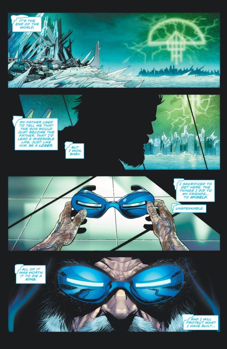
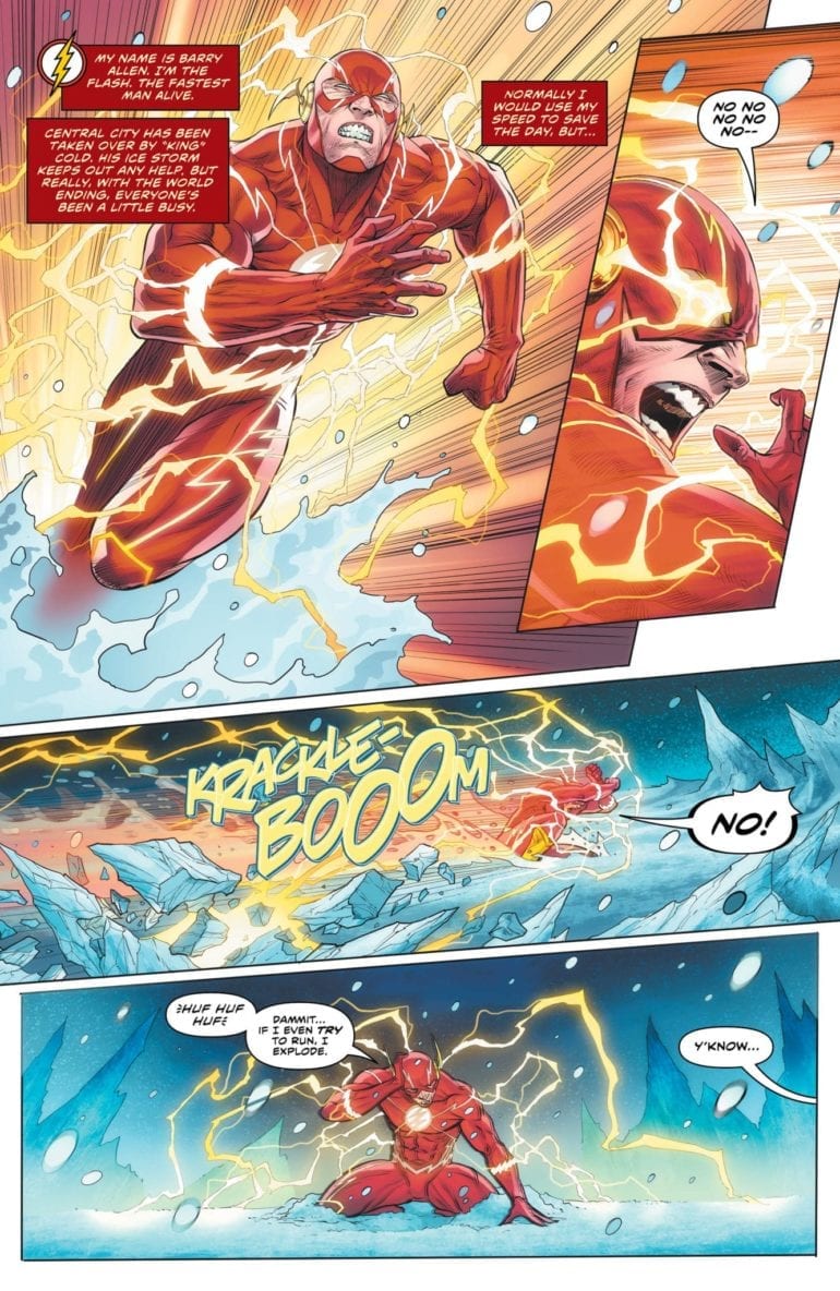
The Rogues have won. As the Legion of Doom has begun their assault on the world, newly empowered Rogues have taken Central City. The Flash Family is overcharged after the Death of the Speed Force arc, rendering them useless. Despite the valiant efforts of Commander Cold, most resistance has been crushed by Snart’s rule. This control continues for months until a surprising ally steps forward.

Led by Golden Glider, the other members of the Rogues have freed the Flash and his sidekicks. They now hide and prepare to defeat the frozen tyrant. Will Central City return to normal?

The Flash 85 cover

**Some Spoilers Below**

Story: 

As the grip of “King” Cold tightens, the Rogues continue to train the speedsters. With their powers out control, Kid Flash and Avery Rely on the training and power dampening collars to keep them under control. Barry, on the other hand, has been struggling to maintain control without it. Golden Glider comes out to talk to him, explaining how the Rogues have been in the same shoes as him.

 After a brief ice skating lesson, which helps understand how the speed force can be controlled, the teams come up with a new plan. To change the City back to normal, the speedsters and Rogues have to get the last pieces of Mirror Master’s Mirror.

The Flash 85 p1

So while this has some action, the highlight of this issue is the humanization of the Rogues. The Villainous team has always been fan favorites to their blue-collared, more grounded view on the world. When they joined the Legion of Doom, I was worried they threw away this outlook. But this issue proves that it continues to be their defining trait. By the end of this issue, readers will see more connections between the villains and Flash than ever, learning to cherish them more.

The only problem I have with this issue is that Captain Cold has wholly left his character behind. With the other villains, they have these moments of redemption that allow readers to connect to them and hope they become heroes. In this arc, Cold has done nothing to make us root for his change. It’s a bad sign when the man who set his family home on fire gets more sympathy than Leonard Snart. There’s no doubt that he’ll change back before the end, but right now, he’s insufferable.

The Flash 85 p2

Art:

Christian Duce continues to bring his best work to the Flash series. Every page is an imaginative and sometimes epic feast for the eyes. With every character design and every cool action piece, Duce gives us more grounded, emotional moments. One of the best looking moments doesn’t come from an action sequence but with the ice skating lesson between Flash and Golden Glider. It’s very smooth and emotional for the pair, and you can tell through not just the dialogue but the illustrations. Luis Guerrero takes this great work even further with masterful, vibrant colorwork. Together, these two continue to deliver the best looking arc the Flash series has had.

Flash 85 p3

Conclusion:

Overall, this issue does a fantastic job of setting up the final conflict against Cold. Not just in terms of action, but also giving us a slower chapter to attach to the characters. The Flash Series has always been known to have a more grounded set of villains, but by the end of this issue, you will hope they can get out of this fight on the right side of the law. As the weeks countdown for the end of this arc, it’s clear that this will go down as one of the more memorable issues in the current arc. With a promise of an action-packed battle to come, go pick up this issue today and see the preparations take place.


Monkeys Fighting Robots Youtube

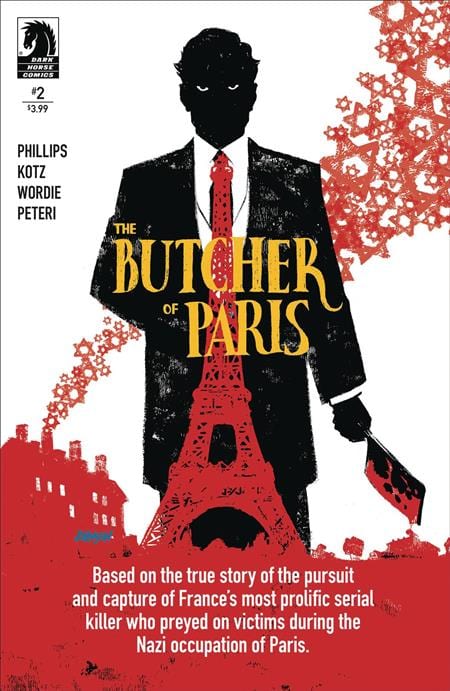
Review: The Reign of Beasts in THE BUTCHER OF PARIS #2

“The Butcher of Paris” #2 is a more quiet and contemplative chapter than its predecessor. However, the successfully confident prose of writer Stephanie Phillips works in tandem with a consistently great art team to create another engrossing comic issue.

In Nazi occupied Paris, the death toll mounts, but the killer’s motive and whereabouts remain unknown. The investigation uncovers a name–a doctor, whose skill and expertise match that of the meticulous crimes. But is this doctor the sadistic killer operating in the shadows, or just another victim of the Gestapo?

Writing/Plot

Phillips approaches this issue with more of an investigative script than the first. There are discoveries, speculations and conversations abound here. This admittedly makes for a less exciting issue than the first. However, the dialogue among these characters is written with an immense attention to detail and character that this is still a highly engaging read. This is a chapter with the genre additions of crime procedural and political thriller tossed in. Different groups, namely the Gestapo and the French detective, have their own motives for stopping this serial killer. The struggle of a city under the occupation of a hostile force while also having to deal with a monstrous murderer is never lost. The tension feels like a pressure cooker with too many items on boil – and this is meant in the best way possible.

Art Direction

Once again artist Dean Kotz is on hand to deliver is easily identifiable atmospheric penciling to “Butcher of Paris.” His character drawings are distinct from one another and the facial expressions of individuals are believably natural. The beauty of comic art like this is how tonally perfect it is. It’s reminiscent of a French graphic novel of sorts in its artistic personality. An element that assists this is the washed watercolors of Jason Wordie that give the world life. The art makes for distinctly memorable sequences, such as a conversation in a morgue and the lush interior of a French cabaret. The art team does stellar work bringing this historical horror to life.

“The Butcher of Paris” #2 is a stirring issue that takes its time to increase the tension of the overall plot. Stephanie Phillips’ script is filled with fascinating and naturalistic conversations. Kotz and Wordie’s art brings a unique, almost European graphic novel style and atmosphere to the story that works brilliantly. The atmosphere continues to feel oppressive as the whereabouts of this monstrous butcher becomes more unclear. If you were a fan of the first, be sure to come back for this follow up at your local comic shop on 1/8.


Monkeys Fighting Robots Youtube

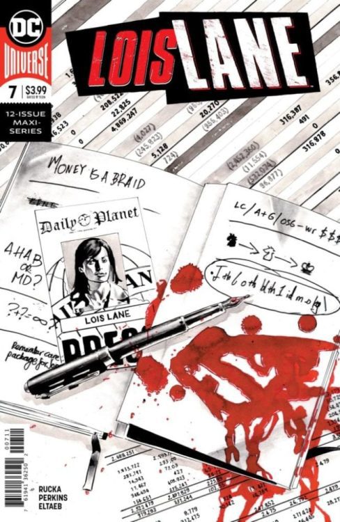
LOIS LANE #7, Another Brilliant Chapter in the LOIS LANE Series

Lois Lane #7, written by Greg Rucka, art by Mike Perkins, colors by Gabe Eltaeb and letters by Simon Bowland, is just another chapter in the awesomeness that is Lois Lane. Following the quiet and tempered previous issue, this issue sets up big things in small ways. Never overstepping their mark, this creative team holds back just enough to keep us wanting more.

Writing

Rucka manages to set a tone in the first panel of anything he’s writing. Where other dynamics feel forced, Lois Lane establishes a rapport among characters that shouldn’t work. Yet it does. Lois and the Question don’t seem to have significant ties beyond this series, but their chemistry works. But best of all, Ruck shows us how Lois sees Clark. Their quiet intensity and why they work so well is never clearer than in these pages. And while this issue ends on a cliffhanger, Rucka’s windup has been so gradual; the cliche feels earned.

Art

The art by Perkins feels like something out of a hardboiled detective story. A fitting tone for the woman behind the Planet’s great successes. But as mysterious as Perkins’ work may feel, it is also curiously personal. Rarely overdoing the action, Perkins continually comes back to the characters’ faces. The action is secondary to how it affects Lois or Renee. He is forever interested in the human element. He wants to give this story a face, even if The Question doesn’t have one…

Coloring

The colors by Eltaeb are downright manipulative, in the best way. Eltaeb establishes a lot of the dangerous scenes in bleak colors. When a peeping cameraman is found on a rooftop taking pictures of Lois, the scene is set at night. It’s blues and greys and whites that make each scene have an edge. But then Eltaeb lulls us into a sense of security. Lois’ room is bright; the colors are warm. It makes it twice as jarring when we realize that Lois and Renee might not be as safe as we’d hope.

Lettering

Bowland’s lettering is simple and to the point. It serves its purpose and doesn’t tend to push boundaries by being experimental. The clear and concise format that Bowland takes mirrors Lois’ no-nonsense attitude.

Lois Lane #7 is everything that you would want from a comic like this. The characters are familiar yet mysterious; the events have quiet builds to loud crescendos. This creative team is at their best, and the story their telling is full of intrigue. Pick up Lois Lane #7 at a local comic shop near you!

Monkeys Fighting Robots Youtube