Home Blog Page 366

Review: MILES MORALES: THE END #1 Offers A Strange Glimpse Of The Future

Miles Morales

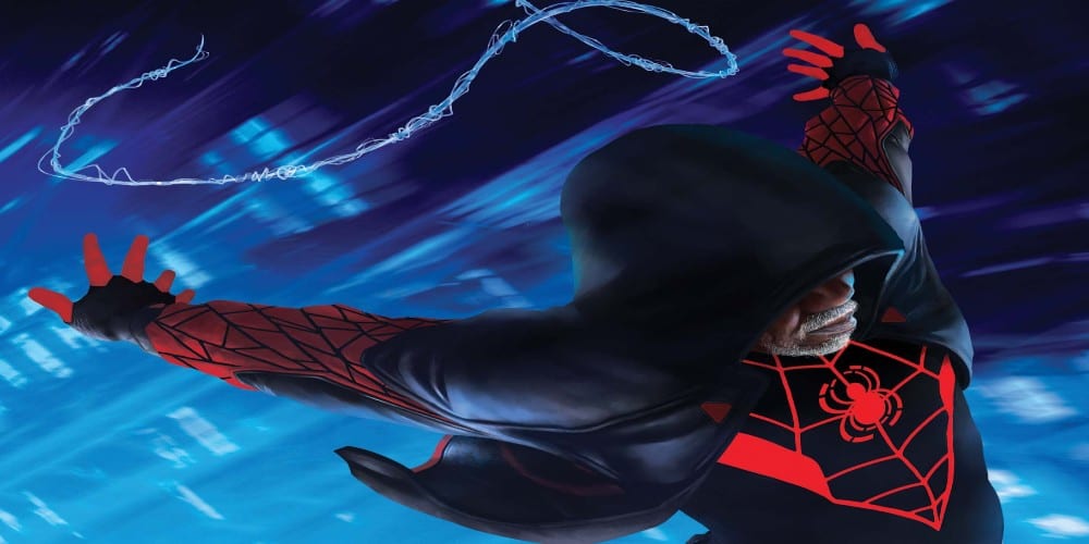
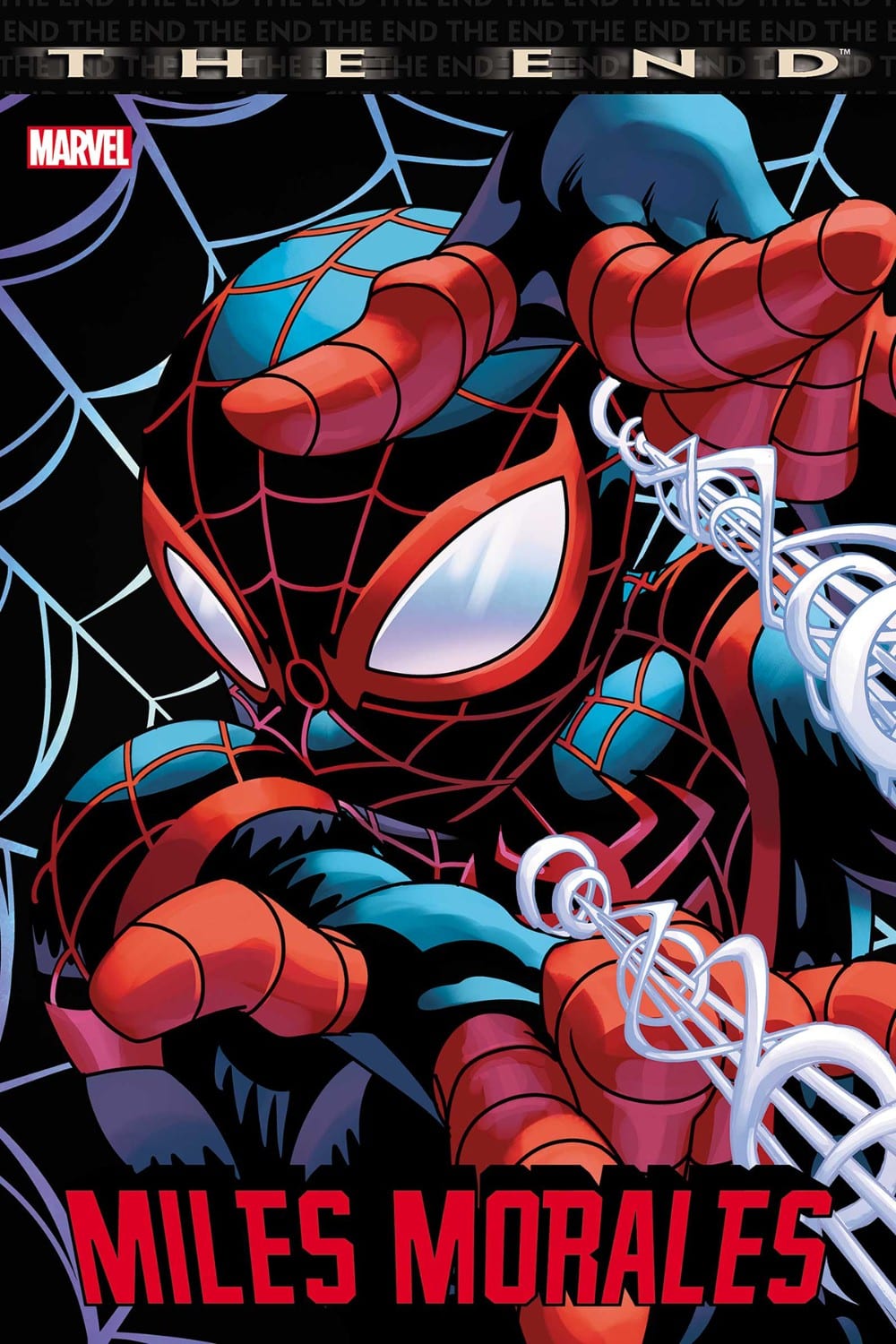
With Miles Morales: The End Saladin Ahmed, Damion Scott, and Dono Sanch-Almaraez bring a glimpse of what the future would be for Miles Morales: Spider-Man. Does this trip to the future present a satisfying ending or one which is best left unexplored?

Summary

THE FINAL MILES MORALES STORY! Humanity makes its last stand in the only place strong enough to survive: BROOKLYN. Former Spider-Man, Miles Morales, leads the last bastion of civilization into the future! Penned by MILES MORALES: SPIDER-MAN author SALADIN AHMED!
Miles Morales

Writing

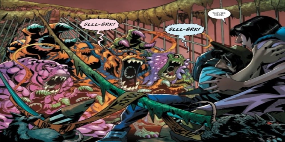
Marvel’s The End books help to showcase a “final” issue and offer an ending a character may not usually receive. With Miles Morales: The End, the reader sees an older Miles facing a world of monsters and a band of zealous raiders to protect Brooklyn, the last safe haven in a world gone mad. It’s a good premise, but for some reason, it just feels like Miles deserves more. His character always worked to try to prove his own path and be seen by the world as being different than Peter Parker. It feels like a story showing him finally able to become more significant than his predecessor would be the ideal way to go.

Of course, Saladin Ahmed was the writer on Miles Morales: Spider-Man, so he does know a thing or two about the character. A future where Miles can keep the home he loved and protected feels like something the character would be satisfied to achieve. It’s a proper enough execution, but you can’t help but wonder if there couldn’t be a grander story to tell.
Miles Morales

Artwork

The art by Damion Scott presents a unique look at this post-apocalyptic world. The juxtaposition between the safety of Brooklyn and the chaos of the rest of the Earth is present. Yet, the character designs seem off as if they don’t fit in such a setting. As if they need to be more grizzled and hardened.

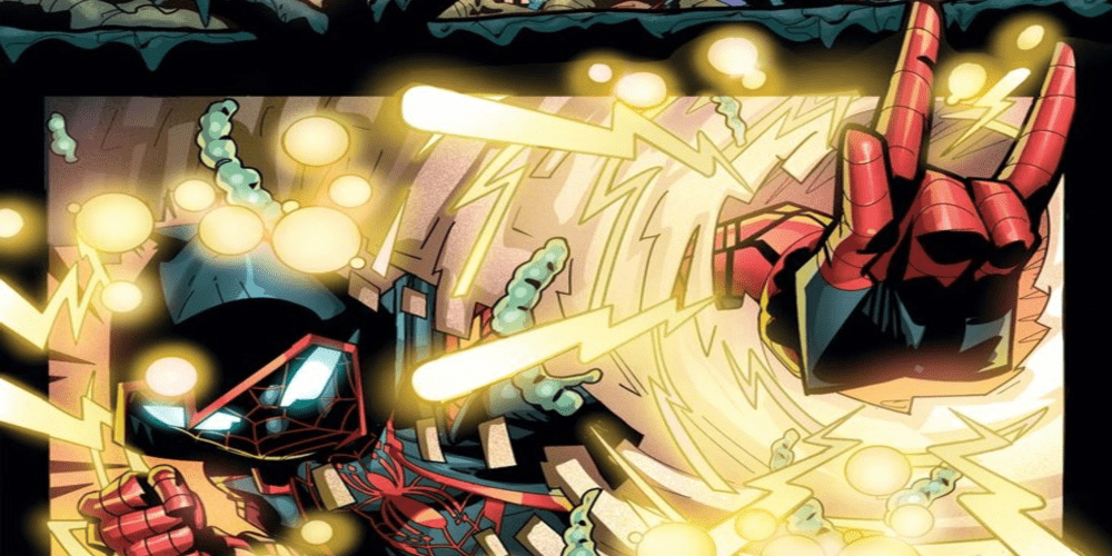
The colorwork by Dono Sanchez-Almara aids in the overall art experience, as it adds some excellent technical and action effects in the issue. The color also helps to show character intensity, especially with adding emotions to the eyes.
Miles Morales

The lettering by VC’s Cory Petit adds to the issue’s inability to keep the hard edge associated with post-apocalyptic futures. The lettering seems better suited for a more light-hearted issue instead of one trying to tell the final emotional adventure of a character. It isn’t terrible, but it doesn’t give the issue the boost it needs.

Conclusion

The story doesn’t give Miles a chance to become great but instead shows a future where he can keep his home safe. Though not as grand as one would think a final story for Miles Morales: Spider-Man would be, its still an interesting read. Fans of the character should check out for themselves and see if its an ending they agree with or not.

Monkeys Fighting Robots Youtube

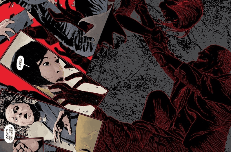
GIDEON FALLS #20 – Don’t Drink the Dirty Evil Black Water

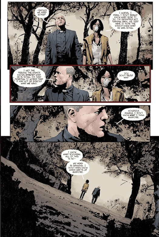
Father and Mother get to the village at the center as they prepare for death, in Gideon Falls #20, out this week from Image Comics.

First Impressions

After some mind bending reveals in previous issues, the journey to the center of it all begins here. Our characters are confused and ill prepared, but they’re running towards the danger. Everyone is preparing for the next step, but they don’t really know what that step is.

Creative Team

Jeff Lemire is following three groups in this issue and doing a magnificent job of pacing. After finally finishing Twin Peaks in a binge over the weekend, I’m able to pick out more similarities in the two stories. The only reason I even started watching Twin Peaks is because Lemire mentions it quite a bit. Gideon Falls is the weirdest and most evil parts of Twin Peaks. GF is what TP would be if it completely focused on the Black Lodge with a narrative much easier to follow, but without the comedy and awkwardness.

Art

Andrea Sorrentino continues to amaze with his work on this title every month. Nothing I can say about his work that I’ve not already said in previous reviews. His work is amazing, it’s haunting, and his panel layouts are unique in the industry. If there was a way to capture the weirdness of David Lynch cinema on a comic book page, Sorrentino does it.  If I needed someone to draw one of my nightmares, I know exactly who to call.

Dave Stewart nails the colors for Gideon Falls, just like he does for every title he works on. He gets it. I would be surprised if he’s given any notes about how things should look anymore. Bright colors are toned down, and the only color that ever stands out is red. If I’ve learned anything from Twin Peaks it’s that red and black usually mean something is not right. Red doors, red rooms, red curtains, just stay away from the red stuff!

A bunch of bugs kept letterer Steve Wands busy this issue. The way the sounds of the bugs looks makes it feel like it’s a loud and bold sound that just burns into your mind and drives you crazy. Like your dryer squeaking or the brakes of a train screeching, you just want the sound to stop immediately. The sound still haunts you.

My 2 cents

The story feels like it’s winding down to a resolution, but if this story is anything like Twin Peaks was, it could go on forever. Since Gideon Falls is more of a narrative, hopefully we can expect an ending without more questions, but I think that was what drew people to Twin Peaks. It’s so strange and dreamlike that just about every scene can be interpreted a different way by different people.

We’ve seen that the Black Barn is connected to many different realities, but will it behave like the Black Lodge? If they find and destroy the barn, what happens to those other realities? Do they still exist? How will the characters be able to get back to their own world?

Can they even defeat this kind of evil? Check back next month for the next chapter of Gideon Falls.

What do you think of Gideon Falls? Have you seen Twin Peaks? What the hell did I just watch in Twin Peaks? Let us know in the comments below.


Monkeys Fighting Robots Youtube

Review: The Final Battle Rages in RED SONJA #12

Red Sonja #12

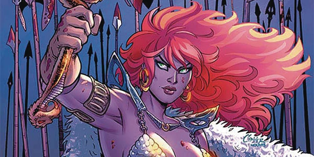
It all comes down to this. With Red Sonja #12, out this week from Dynamite Entertainment, we have the final showdown between Sonja’s rag-tag band and the full might of the Zamoran Empire.

Can the barbarian queen and her forces pull it off? Dragan has the numbers and the resources, but Sonja still holds the only bridge across the Vilayet Sea. Plus, she has more cards up her sleeve than she lets on.

Red Sonja #12 Page 1

The Writing

Mark Russell’s writing in Red Sonja #12 is tense and fast-paced. We’re locked in minute-by-minute, watching the climactic battle unfold. We don’t know how Sonja and her Hyrkanian forces can win, but she seems to have one trick after another she can use to harry Dragan and strike where her enemy is vulnerable.

We can chalk how Sonja’s plans unfold up to a combination of tactical brilliance and sheer luck in timing. As a result, a Hyrkanian victory still feels plausible, even despite the overwhelming odds. The storytelling is tight, but doesn’t stretch the belief of the reader, which is a very fine line to walk.

Scattered throughout the book are flashbacks to Sonja playing a game against her old mentor, Domo. Russell used this framing device throughout his run as a means to make a direct address to the reader about the broader themes of his work on the series. Here, we see the writer expound on the nature of war and violence: cyclic, and ultimately futile. However, we also see Sonja manage to triumph against her master, not through overwhelming force, but through cunning and compassion, which adds layers of profundity to the work.

Red Sonja #12 manages to feel climactic, epic, and satisfying as the conclusion to this story. Truth be told, the writer’s run on the character has been so well-constructed from a narrative standpoint, this could even work as a standalone, 12-issue maxiseries. Despite the tight storytelling and conclusion, Russell manages to setup several conflicts that will come with the next story arc. It’s a fully-formed finale, yet with a hook to bring readers back for issue #13.

Red Sonja #12 Page 2 Red Sonja #12 Page 3

The Artwork

I’ve had some gripes regarding Mirko Colak’s style from time to time during his run on the series. Few of those critiques hold up with Red Sonja #12, though.

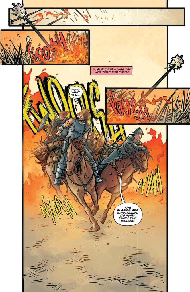
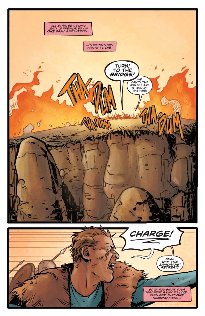
Colak’s artwork is well-suited to Russell’s writing. The grime and grit of war is palpable throughout the book. In addition, we have some marvelously kinetic action sequences brought to life with lively, dynamic illustrations. In earlier issues, I commented that the artist’s figures sometimes felt rather static and lifeless; here, though, the characters practically leap off the page at points.

The visuals are not always the most clear and distinctive in Red Sonja #12. This has been another recurring complaint about Colak’s style throughout the run. In this chapter, though, it feels less like an artistic oversight, and more a product of the chaotic battle scenes on the page. While not perfect, the composition of individual panels is solid.

Red Sonja #12 is a very…well…red book. Irony red tones, courtesy of colorist Dearbhla Kelly, dominate the pages of this issue. The palette works well as a backdrop to the fighting. Plus, by employing a significant amount of blue-green to compliment the reds, there is plenty of contrast going on.

Red Sonja #12 Page 4

Final Thoughts

Red Sonja #12 is a masterfully-crafted conclusion to what may be one of the best stories in the history of the character. Go out and buy every issue of this run NOW.

Monkeys Fighting Robots Youtube

Panel Breakdown: STAR #1 By Kelly Thompson, Javier Pina, and Filipe Andrade

Welcome to PANEL BREAKDOWN, a weekly series where we take a look at our favorite panels of a comic book. This week we are talking about the new Marvel Comics series STAR #1 (of 5) written by Kelly Thompson, with art by Javier Pina & Filipe Andrade, Jesus Aburtov gave the book colors, and you are reading Clayton Cowles’ letters.

The first issue establishes Ripley Ryan as a wildcard force in the Marvel Universe. The unpredictability of the character is entertaining, and the artwork of Pina and Andrade demands attention.

About STAR #1:
BORN OF THE REALITY STONE, THE BREAKOUT CHARACTER FROM CAPTAIN MARVEL FLIES SOLO!
Ambitious reporter Ripley Ryan rocked New York City when she became the hero STAR, adored by everyone. But in truth she was Dr. Minerva’s attempt at a Kree-human Super-Soldier. Desperate for the strength to control her own destiny, she tried to kill Captain Marvel – and failed. Ripley was left, defeated and powerless, in the Raft…or so she thought. The Reality Stone has found her, and now no prison can hold her. You thought you knew what the Infinity Stones were capable of. Think again.


Do you have STAR on your pull-list, let me know what you think after you read it.

Monkeys Fighting Robots Youtube

Panel Breakdown: STAR WARS #1 By Charles Soule And Jesús Saiz

Welcome to PANEL BREAKDOWN, a weekly series where we take a look at our favorite panels of a comic book. This week we are talking about the new Star Wars series written by Charles Soule, with art by Jesús Saiz, Arif Prianto & Saiz worked on colors, and Clayton Cowles added the letters.

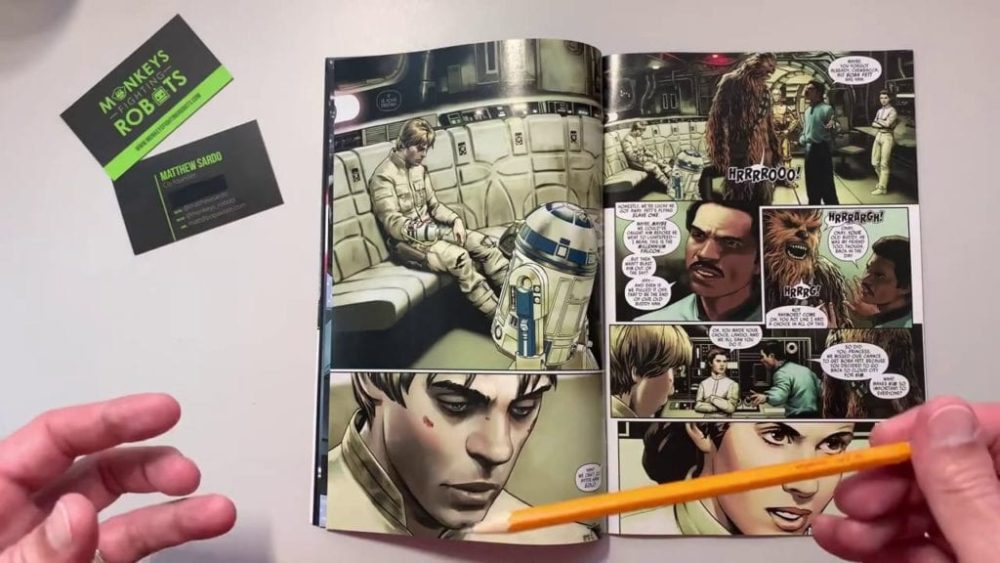
The new series takes place right after Luke’s confrontation with Darth Vader in Empire Strikes Back. I was hooked immediately, and one of the main reasons was Saiz’s artwork. Powerful is the word that comes to mind with the combination of Saiz’s work and Soule’s words as you turn to the last page.


What did you think of Star Wars #1, did you have a favorite panel? Comment below with your thoughts.

About Star Wars #1:
“No…I am your father.”
In the wake of the events following The Empire Strikes Back, it is a dark time for the heroes of the Rebellion. The Rebel fleet…scattered following a disastrous defeat at the Battle of Hoth. Han Solo…lost to the bounty hunter, Boba Fett, after being frozen in carbonite. And after being lured into a trap on Cloud City and bested in a vicious lightsaber duel against the evil Darth Vader, Luke Skywalker…learned the horrible truth about his past. Vader did not kill Luke’s father Anakin–Vader is Luke’s father! Now, after narrowly escaping the dark lord’s clutches, and wounded and reeling from the revelation, Luke, Princess Leia, Lando Calrissian, the Wookiee Chewbacca, and the droids C-3PO and R2-D2 must fight their way back to the Rebel Alliance-for the fate of the entire galaxy is at stake! After so many losses is victory still possible? But, what Leia, Luke, and their ragtag band of freedom fighters do not realize is that they have only traded one Imperial trap for another! Enter the cunning and vengeful Imperial Commander Zahra, at the helm of the Tarkin’s Will!

Monkeys Fighting Robots Youtube

Box Office Flashback: January – Corrupt Cops, A Classic Cartoon, And An Important Book

One-hundred-plus years of film-making provides a long, rich, and deep history to look back on. Retro reviews and analysis of old films are practically necessary full-time specialties. Month after month, films release, vying to grab as much attention as possible en route to great financial success. Some rise, some fall, but regardless of box office numbers, some films transcend and rake in pop culture currency for decades.

Let’s take a look back ten, twenty, and thirty years at the biggest movies released in January.

1990 • Internal Affairs27.7 Million

internal affairs-film-1990

Superheroes dominate the box office today, but in the early 90s, thrillers captured many of the dollars at movie theaters. We had Basic Instinct, Cape Fear, and Single White Female between 1991 and 1992 alone. A year earlier was Internal Affairs, which featured Richard Gere playing a corrupt cop and Andy Garcia playing the officer investigating Gere. Not sure how many even remember this movie, but it took the box office win for the month over a beloved film that’s spawned six sequels and a TV spinoff — Tremors. The action flick starring Kevin Bacon and Fred Ward took only 16.6 million at the box office but went on to super-cult status that’s likely not going to end any time soon. Cut Tremors’ box office take in half, and you get third place, a comedy film called Ski Patrol.

Of note is the fourth place release this month, Leatherface: Texas Chainsaw Massacre III. Horror sequels never die!

2000Fantasia 200059.8 Million

fantasia-disney-film-2000

Ah, 2000, a time before Disney owned Star Wars, Marvel, Pixar, and 80 percent of the box office. At this time, Disney was cranking out mostly mediocre films while re-purposing older, much more successful animated films for a modest profit. Remember Beauty and the Beast: The Enchanted Christmas? Not many do. But that was Disney at this time (and arguably still?), and in January of 2000, they took the box office crown with an update to their acclaimed classic film Fantasia. The sequel, aptly titled, Fantasia 2000, got a digital makeover and added a few new parts. It just barely won the box office title over Next Friday, the sequel to the gangsta comedy Friday, which took in 57.3 million.

After that, though, things go off the deep end. In third place for the month was My Dog Skip at 34.1 million, followed by Down To You in fourth place at 20 million. That’s January for you.

2010 • Book of Eli94.8 Million

book of eli-denzel washington-2010

Just ten Januaries ago, we were still only one Marvel movie in, and the month was its usual peculiar self for movie releases. Book of Eli starred Denzel Washington and Mila Kunis in a post-apocalyptic quandary to save the Bible. Directed by the Hughes Brothers, the film didn’t receive critical success but does linger on in the memory of pop culture movie fans.

Taking a look at the rest of the month, you’ll notice that Book of Eli had some interesting competition. Trailing by 30+ million is Tooth Fairy, a film starring Dwayne “The Rock” Johnson, as the titular character. It was a strange time, indeed. Mel Gibson returned to a leading role during this month with Edge of Darkness, which took in 43.3 domestically and 81 million worldwide against a budget of 80 million. No bueno.

Two more cult favorites came out this month though. The first was Legion, the film starring Paul Bethany as an angel fighting the wrath of God and all his other angels. Also, Daybreakers, the future-noir vampire story featuring Ethan Hawke and Willem Dafoe.

January 2020

The Grudge is already out and not getting the best reviews. But January is undoubtedly the month where anything goes. The horror franchise is popular, and it could eke out a victory over Dolittle starring Tony Stark’s alter-ego Robert Downey, Jr. But this month is surprisingly loaded with possible winners. Underwater is the deep-sea horror flick starring Kristin Stewart. Who knows, right? On January 17, Bad Boys 4 Life goes head-to-head with Dolittle. A week later, The Turning, another horror film starring Finn Wolfhard from Stranger Things, crawls into theaters.

My prediction …

It’s tough to call. Bad Boys seems tacked on here which might mean the studio has little faith in the film. But that doesn’t mean it might not be a hit. Robert Downey is testing the power of his celebrity. He might turn out to be the winner here with Dolittle though family movies don’t tend to do as well in January since the kids are back at school and parents back at work. The Turning could turn out to be the sleeper success here.

What do you think will be the biggest money-maker released in January?

Monkeys Fighting Robots Youtube

Frank Miller: The Transition From Comics To Illustrated Novels

Frank Miller going from comics to illustrated novels.

Frank Miller. Most people likely know the name for his work on Batman, for better or worse. Well, critics won’t have to cringe much longer, because he’ll soon be going from comics to the illustrated novel, Cursed. Many critics, including Monkeys Fighting Robots, point out that while Miller’s storytelling is still pretty good, his messages can be confusing. However, they also highlight Miller’s strengths while expressing his desires. All of which culminate in his illustrated novel career.

The Frank Miller Brand

Miller’s work is best described as “pulpy” sensational tales calling back to the days of old. From the likes of Doc Samson to The Shadow, these stories inspire what would become superheroes. Miller himself found Superman and Batman during the Silver Age in both the comics and the Superman Fleischer cartoons. His earliest work in comics demonstrates a contrast with the swashbuckling Silver Age against pulp elements. Perhaps the most significant contribution to his pulpy style is in Batman: The Dark Knight Returns.

The Dark Knight Returns isn’t a dark tale about Batman needing to fix the world; according to YouTuber Matt Draper, it’s about Batman emerging as a legend. The series demonstrates how the Dark Knight’s pulpy beginnings revitalize him. Just wearing the costume makes Bruce feel alive after years of retirement. More importantly, it changes how the world looks at comics. No longer just a means of entertainment, but a method of looking at their own world. Strangely, the events of the 80s are still relevant. At his best, Frank Miller demonstrates how the contrast between any subjects, highlights their importance.

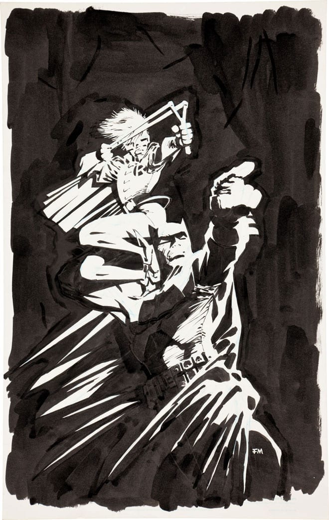
Miller artwork for an anniversary

The Art of Miller

Miller’s style is all about contrast, especially on where characters fit into a bigger world. While most of Millar’s illustrations look rough and sketchy, it’s a style that highlights where characters stand in-story. Whether it’s how someone looks against the background or their posture’s communication, the heightened contrast demonstrates their place and motivations. The Dark Knight Returns features numerous panels that highlight the action taking place. The multiple captions and dialog that go along these figures also demonstrate a dynamic. While the world in the panels shows one piece, the captions reveal a hidden interior.

Unfortunately, when the focus becomes one-sided, as is the case in The Dark Knight Strikes Again, any meaning becomes devoid. Because of how 9/11 traumatized him, Miller changed what would have been a fun romp into a rage fest. From letting Metropolis be destroyed by Brainiac to Batman brutally killing Dick Grayson after Grayson was driven insane, it’s nothing but Miller taking his frustrations out on others.

The Frank Miller Gap

Some of those frustrations also come in All-Star Batman and Robin, which further alienated people from Miller’s work. Some critics even strike out against Frank Miller for some of his less controversial pieces. 300, for example, was called out for its less ‘woke’ depiction of people with deformities (though that has more to do with Zack Snyder’s movie adaptation). Similarly, The Dark Knight III is given a notably cold reception by critics like Newsarama’s David Pepose. Miller barely even has any sway in the series other than generating the idea. Brian Azzarello and Andy Kubert actually do most of the work. Miller on his own, however, doesn’t get an easy time despite admitting guilt for his past actions with “I wasn’t thinking clearly.”

Frank Miller takes the time to think and act more clearly in Superman Year One. Unfortunately, a number of people who looked up to him now feel nothing but shame. A few critics like Adi Tantimedh of Bleeding Cool seem to assume the worst and nitpick this series. People like Pepose, meanwhile, like it mainly for nostalgia. But living solely for past glory is not the best thing to do. Some fans, including Pepose, are growing tired of the dialogue-heavy content of Miller. Miller likely recognized this and decides to do a farewell story with The Dark Knight Returns: The Golden Child.

The Dark Knight Retires

The Golden Child is Frank Miller entrusting his legacy to the younger generation. That is perhaps best represented through Jon Kent. Despite being a toddler, he’s wise beyond his years, a “floating little Buddha” by Miller’s description. Jon’s potential mirrors the hope Miller has for creators who can propel comics to new heights in ways he no longer can. While comics have outgrown Miller, he finds a medium that seems like a perfect fit.

Cursed With Contrast

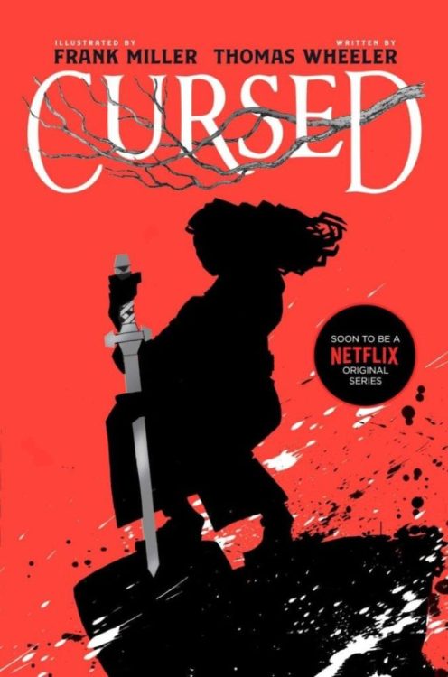
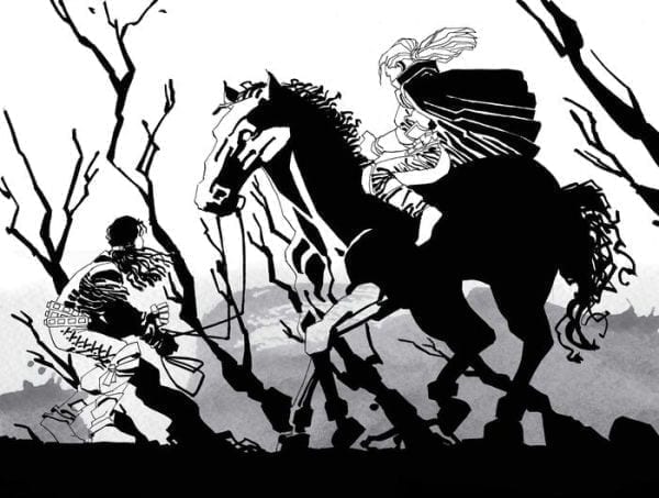
A Frank Miller original for Cursed
What can you get out of this picture?

Miller’s new story Cursed with writer Tom Wheeler uses Miller’s contrasting art style to help tell the story. Unlike comics, which put more focus on the artwork, illustrated novels like this focus more on the writing. The captions that fans like to criticize Miller for suit more definite meanings unlike visuals that are more subliminal. Yes while Wheeler does the writing in this work, it evokes Miller’s style. Every thought, every little detail as plain as day. Miller’s artwork evokes the same message, acting in parallel so that the reader can choose the written word or image. It’s like reading Sin City in a simpler form. If the Netflix series this novel is advertising works out, Miller might get a better audience. No one will ever forget the legend of Frank Miller, and maybe that legend can be revitalized.

What do you all think? Is Frank Miller just grasping at straws? Or do illustrated novels do him better justice? Leave your thoughts in the comments.

Monkeys Fighting Robots Youtube

Review: HIS DARK MATERIALS SEASON 1 – A Dark Adaptation of an Excellent Book Series

Philip Pullman’s His Dark Materials Trilogy is an acclaimed, ambitious, and controversial series of young adult novels. The TV series was equally ambitious, being the most expensive British TV series ever made.

In an alternative world that’s similar yet different to our own there is a young orphan called Lyra Belacqua (Dafne Keen). She lives under the protection of Jordan College in Oxford but longs to visit the Arctic, like her explorer uncle, Lord Asriel (James McAvoy). Lyra seemingly gets a chance to live her dream when she becomes the assistant to Mrs. Coulter (Ruth Wilson). Lyra quickly gets sucked into an adventure involving missing children, waterfaring travelers, armored bears, and an authoritarian regime called The Magisterium.

I’m a huge fan of the novels, so this put me in a unique position when reviewing the series. I was excited to see the story brought to life, but I had a certain picture in my head, which would blur my judgment. So I may as well state some of the changes I wasn’t keen on. I preferred the industrial, Victorian world in the novels, then the 1930s art-deco look of the series, the de-aging of Lord Boreal (Ariyon Bakare), the aging up of Will Parry (Amir Wilson), and the portrayal of Lee Scoresby (Lin-Manuel Miranda). Other changes, like Lyra’s hair color, is something I can overlook.

Every adaptation makes changes, that is the nature of the beast. Even faithful adaptations I liked such as A Clockwork Orange, Lord of the Rings, The Hunger Games series, and the first few seasons of Game of Thrones which made changes. There were two major aspects the His Dark Materials series needed to get right: the tone and the religious themes. And the series does get these parts right, mostly.

When the series moves northwards, it does turn into a darker story that experimentation on children death, children losing their souls, and betrayals. When the story moved to the North, it became darker and more engaging. The best episodes of the season were “The Lost Boy,” “The Dæmon Cages,” and “Betrayal” because they stuck to the dark tone of novels. These episodes include a child who escaped a secret facility without his soul, showing the horrors of Bolvangar and the tragedy at the end of the novel.

Philip Pullman is a vocal atheist and a critic of organized religion. His views influenced His Dark Materials. The 2007 film adaptation of The Golden Compass chose to underplay these themes so it could appeal more to Middle American audiences. This was a move that backfired because it upset fans of the novels. The TV series was much more overt about the religious element. The first episode introduced Father MacPhail (Will Keen), the leader of a powerful organization with the Magisterium, the church in Lyra’s world. The Magisterium figures did dress in religious clothing, and in the final episode of the series, Asriel points out that the Magisterium had been suppressing humanity for centuries. However, due to the art-deco look, The Magisterium comes across as an authoritarian, fascist government than an overarching religious organization.

The first season of His Dark Materials was eight episodes long, with each episode being around 55 minutes long. However, the first novel was only 400 pages long, so the series had to stretch and expand the story. The first three episodes of the series suffered because they really drag out the story. The length wasn’t used to showcase Lyra’s world, and many of these episodes were overly talky. The third episode, “The Spies,” where Lyra ends up in the protection of the Gyptians. The events in these episodes could have easily have been condensed into one or two.

The series improves a lot when the action moves to the Arctic. The story kicks up a gear as Lyra, and the Gyptians look for the meeting children, getting involved with the politics of armored bears, and saving Lord Asriel. The episodes in the second half of the season become more focus, like Lyra helping Iorek Byrnison (Joe Tandberg) get his armor back, finding the lost child, and having a whole episode set in Bolvangar.

There were some positive changes in the series. The series surprised audiences early on by showing characters who appear in the second novel, The Subtle Knife. The series established Will’s domestic struggles where he looks after his mother (Nina Sosanya). This was only told in passing in the novels. “The Dæmon Cages” expanded on the events in Bolvagar to great effort. There was haunting imaginary like the showing of the children who were severed from their dæmons. They became apathetic half-lives, and their dæmons acted like tortured animals. This episode was better at showing the nurses being odd than the books did.

The cast also took their time to grow on me. Dafne Keen’s Lyra started as a precocious child instead of the wild child she was in the novel. But as the series progress, she became more like the character she was in the novels: someone who’s smart, brave, and able to lie out of a situation, and showed she could handle the emotional scenes. McAvoy only got to shine in the final episode of the season, where he’s more willing to do horrific actions. Wilson was great at showing Mrs. Coulter as a dark and manipulative character, especially in the second episode, when she controls Lyra. But she also acted as a raged filled beast, which goes against the characterization in the novels. There was a great supporting cast with actors like Clarke Peters, Anne-Marie Duff, and Nina Sosanya. My favorite was James Cosmo as Farder Coram, a man who takes Lyra under his wing and tutors her. He had a powerful moment in the episode “Armour” when he tells Lyra what happened to his son.

While His Dark Materials was the most expensive British TV series, there were still limitations. The CGI for the dæmons and the bear were fantastic, and it needed to be. But some of the settings were clearly limited. When Lyra and the Gyptians arrived at Trollesund. It was obvious that the episode was filmed on a beach in Wales. Most of the action set in the North were filmed in a studio, and it showed because the CGI backdrops were obvious, and despite the characters standing sub-zero temperatures, there was no visual breath.

The first season of His Dark Materials was a successful adaptation that did stick close to the source material. However, it was at times frustrating because of the slow start and some of the changes the showrunners decided to make.

Monkeys Fighting Robots Youtube

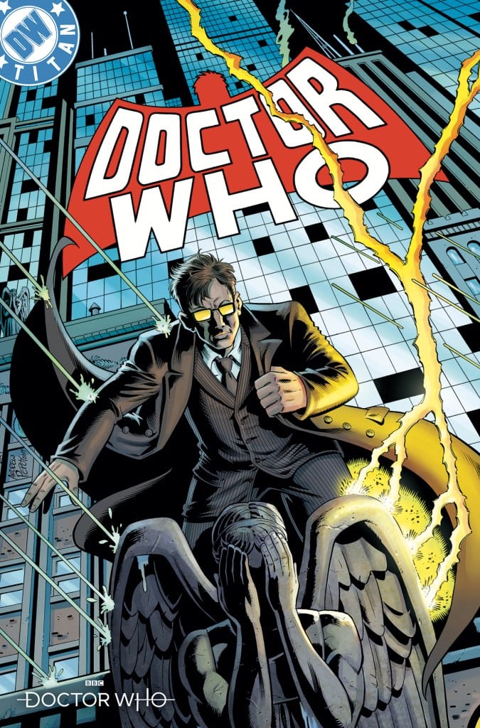
Review: DOCTOR WHO 13TH DOCTOR Year 2 #1 Now With Extra Time Lord

Doctor Who 13th Doctor #2.1
Doctor Who 13th Doctor #2.1 Credit: Titan Comics

With Doctor Who back on the television and excitement for the series still at a high, this is the best time for Titan Comics to launch their own second series of the 13th Doctor, as portrayed by Jodie Whittaker in the show. It may be a new year and a new series but all the regular cast and creators are back to bring you wild adventures in space and time.

One of the things that happens a lot in the Doctor Who T.V. series is that there are gaps in the time lines, missing elements to stories or the characters lives. This happened all too often with Matt Smith’s incarnation with episodes starting in the middle of one of his adventures or a throw away line explaining that the Doctor had been away for several years. 

Although occasionally frustrating, the outcome is that there are plenty of holes to fill for new creators wanting to revisit older stories or characters. Enter Jody Houser with the first part of a multi-Doctor story that takes place during one of arguably the best Nu-Who episodes ever.

Don’t. Even. 

BLINK

Doctor Who 13th Doctor #2.1
Doctor Who 13th Doctor #2.1 Credit: Titan Comics

Weaving a Web

In a failed attempt to take the Fam to one of the most famous music festivals on Earth, Woodstock, the TARDIS and her crew end up on the wrong side of the Atlantic. Instantly recognising the time and place, the Doctor realises they may have bigger problems than being in the wrong country. 

London in the 1960’s is not only a time and place the Doctor has been before but at this exact moment in time an earlier incarnation of the Time Lord is in the midst of a fight with one of the most dangerous foes they have ever encountered.

The current Doctor must find out why the TARDIS has brought her back to this, precise, moment otherwise it might have catastrophic effects on her own timeline.

One thing you know for certain going into this comic is that Jody Houser knows how to write the current Doctor and her companions. Not only does she capture the characters voices but she reflects the tone of the new series as helmed by Chis Chibnall. In lesser hands, trying to blend the tone of early Doctors with current incarnations, can produce an uncomfortable experience but that is not so here. Houser fits the world of 13th Doctor snugly into the world of the 10th Doctor.

Houser has hijacked the earlier story, finding a gap in Martha and the Doctor’s adventures that hasn’t been explored, and fits the new story beautifully around it. There are plenty of references to both Doctor’s adventures to keep fans of the T.V. show amused while not interfering with the main narrative. From this initial chapter the Blink story appears incidental to the story this comic is telling, although hints are this will change over the coming months.

Doctor Who 13th Doctor #2.1
Doctor Who 13th Doctor #2.1 Credit: Titan Comics

Illustrating the Doctor’s

The visual style within this comic is fun and bright. Roberta Ingranata injects the energetic excitement that both of the leads have into the artwork. It’s bold and bubbly; it’s simply impossible not to be captivated by it.

The beauty of Ingranata’s work is that she makes it easily accessible. The characters likenesses are simplified but spot on. The page layouts follow a basic structure with an easy to follow line through the panels, keeping the narrative moving forward at a steady pace. Newbies to comics can pick this up and enjoy it without having to understand the ins and outs of comic book structure which is perfect for a title like this. It needs to be accessible to fans of the T.V. show who have no interest in comics as a general rule. 

Mirroring Ingranata’s artwork is the lettering provided by Starkings and Hedricks. They create simple follow through on the pages with the placement of the speech balloons. Small, snappy balloons keeps the narrative tight which in turn reflects the style of the best 10th/13th Doctor stories. 

And the sound effects in this comic are bold bringing an element of fun to the pages. This was evident in the recent Holiday Specials where the style matched the narrative but even in this, slightly more down to earth story, the sound effects still fit. 

Bridging the gap between the darker tones of the story, it does feature the unnerving presence of the Weeping Angels after all, and the more upbeat aspects is Enrica Angiolini’s coloring. It is as if her job is to ground the outlandish moments and breathe fresh air into the dark times. 

Her palette is naturalistic, playing with the 1960’s setting to give realistic colors but with a bit of flair. She uses a lot of flat color fields overlaid with shadows to create depth and distance. Overall, Angiolini’s work gives the comic it’s detail and setting. 

Doctor Who 13th Doctor #2.1
Doctor Who 13th Doctor #2.1 Credit: Titan Comics

Conclusion

As a gimmick to draw in new readers, this story is ideal. It has the 10th Doctor, Weeping Angels, and links to one of the most popular Nu-Who stories. However, it is so much more than a gimmick. The narrative in this issue is delightfully clever and presented in an engaging way. Once the thrill of the gimmick has passed you will find yourself engrossed in this unravelling tale.

Houser and Co will hook you right in and this first issue will not be enough. It leaves you desperately wanting more; an excellent sign of a great comic. Just like the new T.V. series, the 13th Doctor’s comic adventures are going from strength to strength.  This year is going to be a spectacular year for Doctor Who, whatever medium you catch her in.

Monkeys Fighting Robots Youtube

Review: POSTAL DELIVERANCE #6 Is No Stranger To Violence

Postal Deliverance #6
Postal Deliverance #6 Credit: Top Cow

A new year and a new issue of Postal Deliverance hits the shelves. Published by Top Cow, from Image Comics, the series features tough characters in difficult situations. Outside of the Law but bound by the Rules of their own making, the Postal cast are constantly in conflict but can they manage to keep everything together or have they reached breaking point?

All is not well in Eden. Mutilated bodies hang from the trees; forced cover ups in the administration offices; old leaders itching to return; a killer on the loose.

The reluctant Mayor, Mark, is no stranger to death or violence but his limits have been reached and now it is about balancing his official responsibilities with his personal life. 

Postal Deliverance #6 Cover
Postal Deliverance #6 Credit: Top Cow

Tense Narration

Previous story lines in Postal have had a range of themes, from Family to Justice. In this latest issue Bryan Hill focuses on fear and trust, and how they are intertwined. The killer stalking the town forces reactions from the central cast and some readers may find it surprising that the majority of this issue only features the four main protagonists. 

The story is very procedural as it follows the investigation of a murder. The scenes play out in an order you would expect from a modern police show, switching from the crime scene to the coroner’s, to the investigation team. What makes it stand apart, and to a large degree much more comic book in it’s approach to storytelling, is that the conversations have more to do with the characters’ lives than they do a police investigation. 

Large elements background story, emotional drama, and world building takes place during the back and forth between characters. As with previous issues, Hill is using one narrative to tell another. The murder, and the killer it relates to, are almost background noise to the real family drama unfolding in front of the readers. The relationship between mother and son is becoming more strained, just as the threat of violence is becoming more prevalent. 

Hill clearly enjoys building complex character relationships. It’s surprising to think that the most exciting part of a comic like Postal is not the horrific body mutilation but bearing witness to the disintegration of a family. The anticipation of how certain characters will react to given circumstances fills this comic with tension and gripping drama. 

Postal Deliverance #6
Postal Deliverance #6 Credit: Top Cow

Delivering the Art

The art in this series of Postal has been much stronger and more consistent than in some of the earlier issues. This is largely due to the precise inking by Raffaele Ienco. His attention to detail in the characters and, when required, the backgrounds gives the comic a realistic appearance, highlighting the tone of each scene. However, this is only a perceived realism as Ienco is as equally talented at creating abstract images and transitions from panel to panel or page to page. 

The emotional beats of the story start with the script, flow through the lettering and are accentuated by Ienco’s layouts and compositions. A dramatic scene is brought to life by mixing medium and close up shots of the characters, giving the reader a full view of the interaction. Ienco then plays around with the backgrounds to give different emphasis to the foreground action. In one sequence, for example, the scene starts with a long shot showing two cast members confronting each other which is followed by a number of close ups, each with a differently colored background to illustrate the rage of one and the calm of the other.  

The character placement works with the speech placement, provided by Troy Peteri, to lead the reader through the comic. Together they pause at the relevant spots and protract the emotional content of the script. The visuals leave the reader in no doubt about the theme of this issue and Hill’s powerful words hammer home the point. Fear and Trust are both powerful emotions and sometimes the strength of one can overshadow the other.

Postal Deliverance #6
Postal Deliverance #6 Credit: Top Cow

Conclusion

There is, without a doubt, a violent story unfolding within the pages of Postal Deliverance and this ongoing threat has fuelled the narrative from issue 1. However, this issue is a prime example of what really matters in Hill’s story: the relationships between the central four characters. If you pick this up expecting page after page of bloody violence then you’ve not been reading this series closely enough. 

Family drama is the name of the game. It is intensely gripping and magnificently presented. This is a comic that could easily be misunderstood, especially from a description of a few words, but Postal Deliverance hasn’t wavered in it’s commitment to character or challenging artwork.  


Monkeys Fighting Robots Youtube