DC Comics’ Superman #19, written by Brian Michael Bendis, with pencils by Ivan Reis, inks by Joe Prado, Danny Miki, Julio Ferreira and Oclair Albert, colors by Alex Sinclair and lettering by Andworld Design, takes every kind of great Superman Story and says “I’ll do it all.” With the ongoing repercussions of Clark’s identity reveal, Bendis and company balance heart-to-hearts with alien brawls in a brilliant ode to the Man of Steel.
Writing
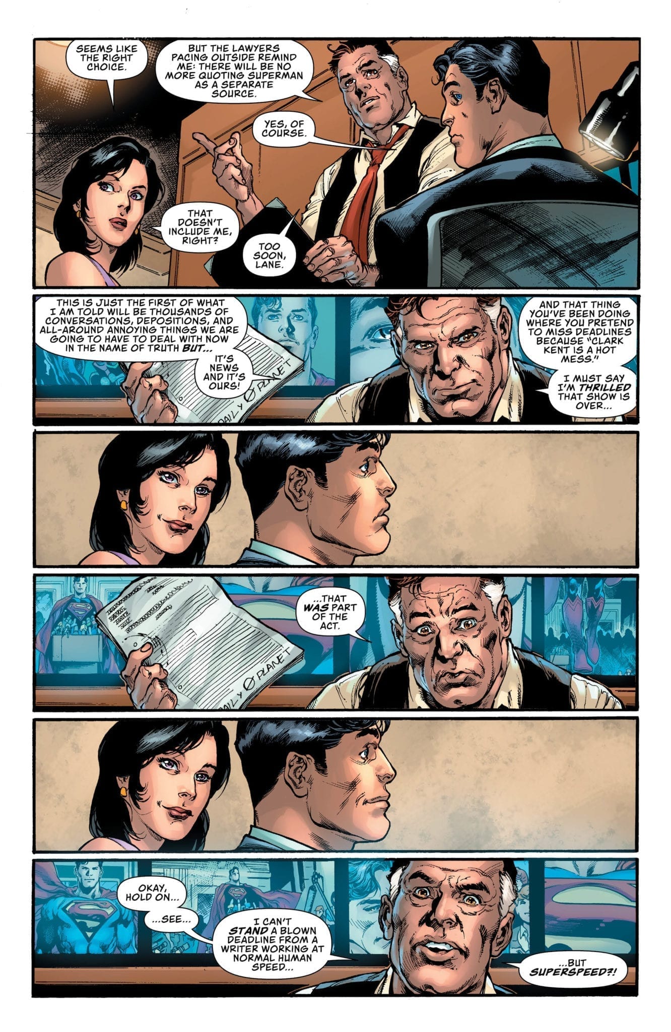
It’s tempting to say that Bendis (or DC Comics) is dragging out Clark’s big reveal. But the reasons for thinking that might be precisely what makes this series great. Where other series would skip past the nitty-gritty of what it means for a hero to tell the world who they are, Bendis attempts to deal with the fallout head-on. And while much of the issue is made up of heartfelt conversations, Bendis knows when to pull back. We hear of a statement Clark wants to make to the bullpen, though we never hear the speech itself. We see fellow heroes approach Clark, but we don’t hear what they say. Bendis knows we love these characters so much; nothing he could write would do these moments justice. And in doing so, we each get to hear a different statement, or a different word of encouragement, filling in the dots in our own way.
Art
Reis, Prado, Miki, Ferreira, and Albert pool together to give this issue its intimacy. Speaking through the smiles of the characters, or the somber looks in a sea of smiles, they remind us what Superman means to everyone. From his co-workers to the many civilians of Metropolis, the Man of Steel has a place in everyone’s heart. The team on inks and pencils makes that clear. They also gradually zoom out near the end of the issue, to prepare us for a change of pace. With cosmic clashes, zooming back in on snarling faces, the team shows us Clark can be more than heartwarming. He can be a lot of fun too.
Colors
Sinclair’s colors play a game with the reader. Winding down to darker tones, like the calm before the storm, Sinclair teases moments of grief that never arrive. It prepares the reader for the worst, only to then offer up the best. Similarly, Sinclair switches to brighter tones in happier moments and even in moments of danger. Sinclair truly knows how to use a color pallet to pull on heartstrings. It allows us to feel Clark’s triumphs and sets us on the edge of our seat for Superman’s trials.
Letters
Andworld Design’s lettering often varies in size and style. As a result, many characters are given his or her own voice, and moments are given their own unique significance. In one scene, when a group of people begins to clap for Clark, the first clapping sound effect is smaller than the ones that follow. It’s so easy to hear the real-life equivalent of this happening, and the representation of it makes the moment feel real. Many alien races are given their own style of lettering and word balloons. This variety helps to set them apart and even makes it that much more fun to read a page.
This is a Superman issue that does it all. The creative team from DC Comics shows us all the reasons we like Clark, and all the reasons we like Superman. And they remind us what makes the two so different. Pick up Superman #19 at your local comic book shop on January 22nd, 2020.
")


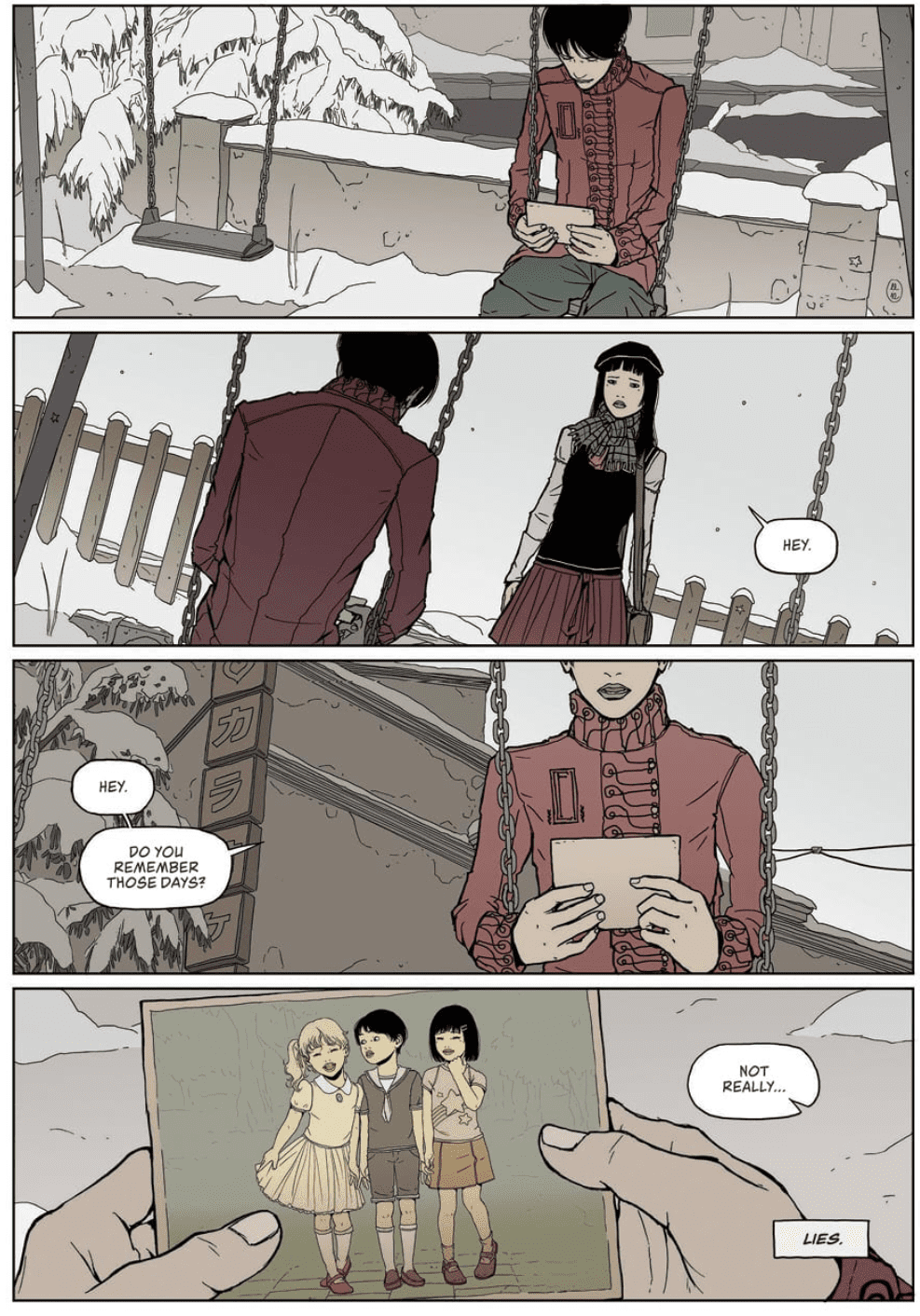
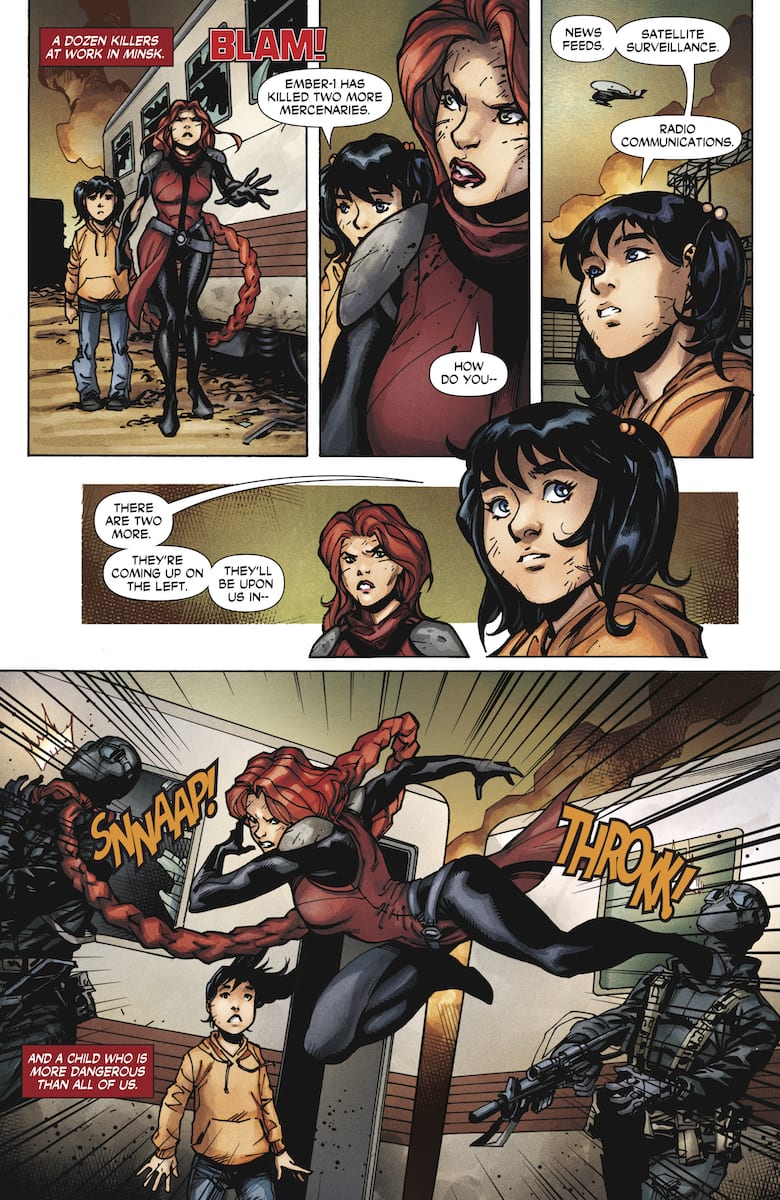 Formerly known as Angelina Alcott, Roku has broken free of her former employers, the Shadow Seven and Weaponeer. Taking a page from her old flame and rival Colin King, Roku becomes a mercenary. On her first assignment, Roku has to secure an asset to her client. The asset turns out to be an augmented child who acts as an information receiver. So Roku fights to ensure Marybeth stays out of the wrong hands. As you can see, there are parallels to
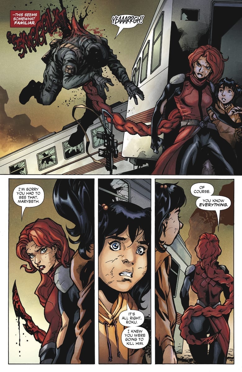 The decorative sound effects by Dave Sharpe are in fitting places with some of them acting as extensions of the characters. Red and black for Roku’s hair while guns have a signature sound to certain models. When it comes to captions and speech bubbles, they tend to scatter about. So much so, that at times it gets hard to focus because of the lack of curvature. Sometimes a few speech bubbles don’t even need to be around to make a reading path.


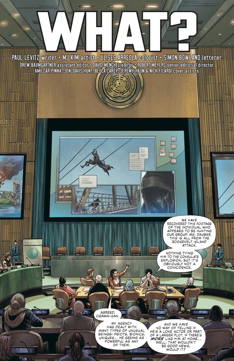 The title of this chapter perfectly encapsulates the stakes and setting “What?”. This mystery starts with UN Security Agent Talia Dauber asking for insights. Something that she doesn’t get due to the project’s classified nature. The only thing anyone gets is that it involves an AI program with no name. Accompanying this is a flashback by the Visitor about his past. Which again says nothing except where he’s from and that this secret project went wrong.
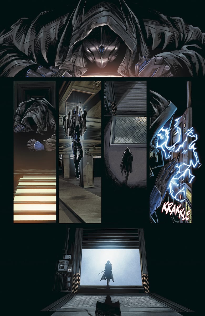 The artwork in The Visitor #2 is quite easily the series’ main selling point. MJ Kim’s penciling is quickly becoming a recognizable Valiant asset after Faith: Dreamside. Thanks to her diverse designs in character models, camera angles, and effects, the reader can more easily follow the story. All of which are accented by Ulises Arreola’s coloring. The Visitor, in particular, receives the best treatment. The bright blue color of his electrokinesis, in contrast to dark backgrounds, shows how he’s ready to reveal some big secret. What’s more, the Visitor’s flashback sequence shows how bright reds tell of danger, which comes up again near the end of the issue when it comes to the source of the Visitor’s powers. For that matter, the green circuitry in the gutters of the Visitor’s flashback displays science fiction-based origin.