Home Blog Page 357

Review: We Wish You a Monstrous Christmas in DETECTIVE COMICS #1019

Detective Comics #1019

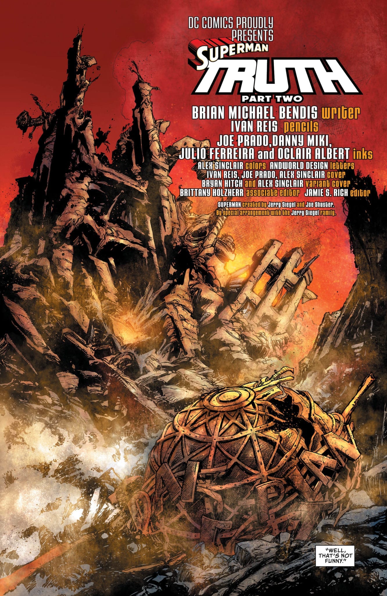
What begins as the investigation of an occult mass sacrifice—run of the mill stuff in a city like Gotham—evolves into eldritch-level horror in Detective Comics #1019, out this week from DC Comics.

After a close call with the Viking berserker, Bruce works to track down the root of the strange happenings. By the book’s end, he discovers that the brutal killings are tied to a creature that is not of this world.

DC_1019_Page 1

The Writing

Perhaps the strongest element at play in Detective Comics #1019 is the mood and atmosphere of the story. Writer Peter J. Tomasi crafts a bitterly-cold environment for the tale; a grim and frostbitten Gotham to complement the dark nature of the pagan cult pursued by Batman.

The story has plenty of gruesome and macabre ritual touches. These elements are counterbalanced by a decent amount of humor to complement, rather than clash, with the overall tone. This interplay of darker and lighter elements has been a staple of Tomasi’s writing style on the series, and remains one of the stronger points in his stories.

The narrative in Detective Comics #1019 keeps the reader’s attention from one page to the next. As the mystery deepens, the reader feels the tension heighten. Tomasi manages to keep you guessing until the end. Unfortunately, that’s also where the book’s biggest weakness lies.

The ending wraps up rather quickly, and is revealed largely through an expositive monologue by the entity that turns out to be the main antagonist. It’s a very interesting concept; however, the way it pans out feels a bit anticlimactic. The book is too content to wrap-up the story with convenient hand-waving. While most of the book is well-paced, the ending feels very rushed.

It’s possible that this was merely setup for a larger story yet to come. Tomasi weaves some heavy foreshadowing into the story, suggesting the entity may appear again at some point. As is, it’s enjoyable enough for the “festive” vibe.

DC_1019_Page 2

Detective Comics #1019 Page 3

The Artwork

Scott Godlewski’s art in Detective Comics #1019 doesn’t carry over much of the brooding atmosphere we saw in our last issue. That said, it’s still a good showing in the visual department.

Godlewski’s character designs are solid. While they’re not a standout component, the designs are coherent and expressive. The same can be said for the backgrounds and environs present in the book; they’re generally-well detailed, which helps draw in the reader.

There are some standout moments; for instance, the reveal of the entity responsible for the cult activity is a visual high-point. As a whole, though, the artwork in Detective Comics #1019 has a general sense of utility to it. From the designs to the page layout, the artist takes a very meat-and-potatoes approach to this book.

The colors by David Baron are one of the more interesting visual elements at play. The artist brings a lot of the darker, grimier, greenish tones that have become a stylistic staple of the series. It works surprisingly well as the backdrop to a frosty winter setting, especially when set against some of the warmer, more fiery tones.

DC_1019_Page 4

Final Thoughts

Detective Comics #1019 isn’t a bad issue. In fact, it’s very enjoyable until the uneven pacing and flat conclusion detract from the overall work. Not essential, but worth giving it a read if you’re a completionist.

Monkeys Fighting Robots Youtube

Review: INVISIBLE KINGDOM #9 A Reality Check In The Depths Of Space

Invisible Kingdom #9 cover detail
Invisible Kingdom #9 Credit: Dark Horse Comics

To round off the first month of the year, Dark Horse Comics releases the next chapter of their Science Fiction masterpiece Invisible Kingdom. The penultimate part of the second arc is released on 29th January and the action continues to heat up.

Space Pirates, daring escapes, and crew members pushed beyond their comfort zones. This issue has everything you could want from a space opera of this kind; including the usual kick-ass artwork and edge of the seat storytelling. Does anymore need to be said? Yes, yes there does.

Invisible Kingdom Panel Art
Invisible Kingdom #9 Credit: Dark Horse Comics

Character Building

A desperate plan gives the crew of the Sundog a glimmer of hope but what is the cost of their freedom?

As the escape plan unfolds so too does a deeper exploration of what it means to be free. G. Willow Wilson’s script is brimming with difficult questions about the roles that the cast play in the world around them. A confrontation between Grix and the recently rescued Luxx ship captain makes the reader consider the role that the Sundog captain is playing. Is she a revolutionary? Or just running scared? The audience is forced to evaluate Grix’s role in the narrative so far, just as the character herself is.

This arc as a whole has been more character driven than the previous one, with Grix becoming the main focus. She is defined more by her interactions with the other characters than she is by her actions in the story. This issue sees Grix pushed to the extremes of her emotions and her reactions move the story forward in dramatic ways.

One of the highlights of Wilson’s work is her ability to build characters in this amazing way while also making larger comments about society and the world outside the comic. Wilson’s opinions on certain subjects are clear in the narrative but it is never preachy, in fact every encounter encourages the reader to consider opposing views. The main cast have very open minds and Wilson uses this to confront topics. She pits certain characters against those who are not like minded. 

Invisible Kingdom #9
Invisible Kingdom #9 Credit: Dark Horse Comics

Artistic Wonders

Christian Ward’s art is always a joy to read and this issue is no different. To accompany the character fuelled narrative, Ward is increasing the emotional depth through his storytelling. This is most evident in two aspects of the comic.

Firstly the coloring. The contrasts between warm and cold colors mirror the relationships and the emotional states of the cast members. For example, at one point in the opening of the comic a number of Sundog crew sneak into the hold to steal some much needed supplies. The characters leave the relative safety of the brightly lit corridors and enter the cold, grey depths of the store room. The colors highlight the transition from safety to danger and is a continuing theme throughout the following pages.

The other exciting aspect of Wards work in Invisible Kingdom are his powerful layouts. His panels have thick, black borders that form a very strong shape on the page. Even with a standard panel layout, Ward’s treatment of the page gives it extra gravitas. Each panel makes a bold statement.

This is then accentuated when the layout transgresses from a normal pattern. Action sequences break the borders or distort the panels entirely. A page turn instantly changes the urgency of a situation and the reader involuntarily becomes on edge, anticipating the action.

This manipulation of the reader allows both writer and artist to control the narrative more successfully. The story beats are well placed to keep the adrenaline pumping. Issue 9 of Invisible Kingdom may be a character piece but it is an exciting one that keeps you engaged in every aspect of the storytelling.

Along with the out of the world visuals is the subtly enticing lettering by Sal Cipriano. At a quick glance there isn’t anything irregular about the lettering but when you start to read you notice the uneven speech balloon borders. Once noticed, it’s difficult not to see, and that sudden attention makes you focus on the words a lot more than you expect. 

In other comics, this could be seen as a failure on the part of the letterer, as not being noticed is usually the name of the game. But when you have the striking visuals of Christian Ward, getting the reader to give the text the attention it deserves is no mean feat. Cipriano manages to do this by giving the reader something slightly modified from what is expected.

Invisible Kingdom #9
Invisible Kingdom #9 Credit: Dark Horse Comics

Conclusion

By now Invisible Kingdom is not surprising anyone by its excellence: it is a comic that has proved itself month after month. The fact that the creators keep that level sustained each issue is impressive. 

The character of Grix is strong enough to carry the story and the greater concepts that the writer wants to raise. You can ignore the social commentary if you wish, however it is built into the fabric of the narrative and by brushing over it you miss out on deeper insights into the characters and their motivations.

It’s a safe bet that if you’ve reached issue 9 of Invisible Kingdom you know what you are going to get, but there is still a lot to offer and entice new readers. It isn’t that difficult to pick up the general gist of the comic so don’t be put off if you’ve not read any previous issues.

All in all, Invisible Kingdom is a fully rounded, modern science-fiction comic with the usual thrills and spills but also, an extra, deeper, social conscience.

Monkeys Fighting Robots Youtube

Kickstarter Review: ANUBIS: DOG OF DEATH #1

Anubis: Dog of Death #1

From writer Sindre Finnøy and artist John Barry Ballaran, Anubis: Dog of Death #1 will soon be available to support on Kickstarter

What is it about cute, small creatures with diabolic tendencies that we can’t seem to get enough of? Characters such as Stewie Griffin on Family Guy, Brain on Pinky and the Brain, and Plankton on SpongeBob SquarePants have entertained us for decades with their plans of world domination.

Enter Anubis, the ancient Egyptian God of death and the afterlife, who happens to find himself trapped in the form of a fluffy puppy.

Anubis Dog of Death Cover

Story

Anubis: Dog of Death is an action comedy series about the Egyptian god of death, doomed to an existence as a tiny purse dog in modern-day L.A.

Writer Sindre Finnøy successfully manages to craft a well structured first issue, giving us a succinct set-up to this world and its primary characters, as well as with what we can expect to come. Finnøy gives us these brief glimpses back in time, when Anubis was ANUBIS, in all his destructive glory. Those moments are used to comically juxtapose his present status, as a helpless canine who wants nothing more than to return to his former God self and bring death and destruction to the world. 

Art

John Barry Ballaran’s artwork in Anubis: Dog of Death adds to the humor and charm of the story. He’s drawn the titular character as a cute and scruffy dog, with purple fur and big eyebrows that really help makes him expressive and downright sinister. The pages taking place in Ancient Egypt are also worth noting. They are full of action and unique layouts to help showcase the calamity of war. 

Conclusion

All in all, Anubis: Dog of Death #1 is a fun, light-hearted read with a unique take on a familiar character trope. Pick it up and enjoy!

You can support the team behind Anubis: Dog of Death by donating to their Kickstarter

Anubis Page 1

Anubis Page 2

Monkeys Fighting Robots Youtube

AfterShock Comics Exclusive Preview: ANIMOSITY #26

aftershock comics comic books exclusive preview animosity #26

ANIMOSITY #26 hits your local comic book store February 18th, but thanks to AfterShock Comics, Monkeys Fighting Robots has an exclusive four-page preview for you.

About the issue:
In the land of the kings of Texas, the only thing worth more than oil — is blood.

ANIMOSITY #26 is by writer Marguerite Bennett, and artists Elton Thomasi and Rafael De Latorre, with colors by Rob Schwager, and letters by Taylor Esposito. The cover is by Rafael De Latorre with Marcelo Maiolo.

The series tells the story of a world where animals suddenly gain the ability to think and speak like humans…and they begin their revenge. Issue #26 is the second part of the “King of Texas” storyline.

Check out the ANIMOSITY #26 preview below:

aftershock comics comic books exclusive preview animosity #26

aftershock comics comic books exclusive preview animosity #26

aftershock comics comic books exclusive preview animosity #26

aftershock comics comic books exclusive preview animosity #26

aftershock comics comic books exclusive preview animosity #26

aftershock comics comic books exclusive preview animosity #26


Are you reading ANIMOSITY? Sound off in the comments with your thoughts!

Monkeys Fighting Robots Youtube

Marvel Comics Exclusive Preview: Horrors Unleashed In RAVENCROFT #1

marvel comics exclusive preview ravencroft #1

Ravencroft #1 hits your local comic book store January 29th, but thanks to Marvel Comics, Monkeys Fighting Robots has an exclusive five-page preview for you.

About the issue:
RAVENCROFT REOPENED! After the hellish horrors of ABSOLUTE CARNAGE, the Ravencroft Institute has received a much-needed facelift and is open for business with a new staff, including JOHN JAMESON, looking to atone for the part he played in ABSOLUTE CARNAGE. But will Ravencroft return the mentally unstable villains of the Marvel Universe to upstanding citizens and give John the redemption he’s looking for, or will they fall prey to the hospital’s seemingly sinister nature?


Ravencroft #1 is by writer Frank Tieri and artist Angel Unzueta, with colors by Rachelle Rosenberg and Dono Sanchez-Almara, and letters by Joe Sabino. The main cover is by Kyle Hotz and Dan Brown.

Check out the Ravencroft #1 preview below:

marvel comics exclusive preview ravencroft #1

marvel comics exclusive preview ravencroft #1

marvel comics exclusive preview ravencroft #1

marvel comics exclusive preview ravencroft #1

marvel comics exclusive preview ravencroft #1

marvel comics exclusive preview ravencroft #1

marvel comics exclusive preview ravencroft #1


Are you excited for Ravencroft? Sound off in the comments!

Monkeys Fighting Robots Youtube

I CAN SELL YOU A BODY #2 – Love, Money and Dead Bodies Reanimated

Denny stoops to new lows as he drags others into his final 48 hours of life while enacting an asinine plan in IDW’s, I CAN SELL YOU A BODY #2, in a morgue near you.

A team up in I Can Sell You A Body? Sadly, no.
Interior Art and Colors by George Kambadais. Letters by Ryan Ferrier

Don’t be caught dead not keeping up with I Can Sell You A Body, check out our review for the first issue, or pick it up from your local comic shop.

I CAN SELL YOU A BODY STORY

Writer Ryan Ferrier quickly sets the stage for the future issues of I Can Sell You A Body with a quick visit to Vatican City. It isn’t a long stay, yet Ferrier uses these pages to set up more antagonists for the unlucky Denny. Tonally this scene is akin to the whole issue. But, it feels as if it shouldn’t be. I Can Sell You A Body #2 reads like a jokebook with constant jokes. At times this comedy hits perfectly, yet in others, it would bode well to have a few serious moments. That’s not a dig at the tone of the book, as it wears its humor on its sleeve. Nonetheless, moments (especially Vatican City) could’ve benefited from a different demeanor.

The highlight of I Can Sell You A Body continues to be its main character, Denny Little. Throughout the little bits of history Ferrier sprinkles in, it seems the masses know and hate him. Hopefully, in the future issues (or a spin-off), Ferrier delves into these stories more. Yet, an interesting main character can only drive a story so far. Luckily, Ferrier keeps the plot remarkably interesting by diving deeper into Denny’s powers. The extent of his powers aren’t exactly shown, but we do learn Denny can raise multiple dead bodies at once. We learn this in a foolish plan that is hilarious but fails like much of the stuff in his life.

LETTERS TO THE DEAD

Ferrier continues pulling double duty by providing the lettering for I Can Sell You A Body #2. The lettering shines when it’s time for the undead and ghosts to speak. When Denny brings the bodies back to life, Ferrier makes them vastly different than others. Instead of the words being contained, they explode out, most times being bigger than the bubbles. On a more subtle note, Ferrier portrays the ghosts’ dialogue with a green border around their dialogue. It’s a small change, yet it works perfectly.

I Can Sell You A Body #2 brings in more players!
Interior Art and Colors by George Kambadais. Letters by Ryan Ferrier

LIVELY ART

George Kambadais’ art and colors retain the amazing quilty seen in the first issue while playing with lighting/shadow usage more. I Can Sell You A Body #1 had a few panels where Kambadais would focus on a face while casting them in a menacing light. Yet, in its second issue, he uses this technique in multiple instances that flow into regular moments as well. When Denny is visiting a “lover” at night, Kambadais paints the background pinkish with shadows forming about. This subtle lighting effect is gorgeous in its execution, making the world fill that more real.

The lighting/shadows aren’t the only places that Kambadais shines, as his art continues to be lively. Throughout I Can Sell You A Body #2, Denny and other characters don’t always stay inside of the panels. Instead, when the story calls for it, Kambadais breaks panels and backgrounds to make the pages pop to life while catching your eyes. While keeping the reader’s eyes by popping panels, the visual humor carries over from the first issue into the second. When Ferrier sets out to tell a joke, Kambadais follows through on the art side.

Interior Art and Colors by George Kambadais. Letters by Ryan Ferrier

CONCLUSION

I Can Sell You A Body #2 retains the comedy seen in its first issue, yet not every joke lands as desired. As hilarious as some moments are if I Can Sell You A Body took itself just a tad bit more serious the story would benefit immensely. Nonetheless, the ride throughout is a fun one that readers that love dark humor can kick back and enjoy.

Memorable Quote: “FUCK!” – Denny

Throughout this one page, Denny says, “fuck” 37 times. The page is hilarious in its simplicity and humor.

VISITING THE MORGUE

What have you thought of Denny Little’s story thus far? Let us know in the usual place.

Monkeys Fighting Robots Youtube

SUPERMAN #19: “I’ll Take a Superman Story with Everything on It”

Superman 19 from DC Comics

DC Comics’ Superman #19, written by Brian Michael Bendis, with pencils by Ivan Reis, inks by Joe Prado, Danny Miki, Julio Ferreira and Oclair Albert, colors by Alex Sinclair and lettering by Andworld Design, takes every kind of great Superman Story and says “I’ll do it all.” With the ongoing repercussions of Clark’s identity reveal, Bendis and company balance heart-to-hearts with alien brawls in a brilliant ode to the Man of Steel.

Writing

It’s tempting to say that Bendis (or DC Comics) is dragging out Clark’s big reveal. But the reasons for thinking that might be precisely what makes this series great. Where other series would skip past the nitty-gritty of what it means for a hero to tell the world who they are, Bendis attempts to deal with the fallout head-on. And while much of the issue is made up of heartfelt conversations, Bendis knows when to pull back. We hear of a statement Clark wants to make to the bullpen, though we never hear the speech itself. We see fellow heroes approach Clark, but we don’t hear what they say. Bendis knows we love these characters so much; nothing he could write would do these moments justice. And in doing so, we each get to hear a different statement, or a different word of encouragement, filling in the dots in our own way.

Superman 19 2

Art

Reis, Prado, Miki, Ferreira, and Albert pool together to give this issue its intimacy. Speaking through the smiles of the characters, or the somber looks in a sea of smiles, they remind us what Superman means to everyone. From his co-workers to the many civilians of Metropolis, the Man of Steel has a place in everyone’s heart. The team on inks and pencils makes that clear. They also gradually zoom out near the end of the issue, to prepare us for a change of pace. With cosmic clashes, zooming back in on snarling faces, the team shows us Clark can be more than heartwarming. He can be a lot of fun too.

Colors

Sinclair’s colors play a game with the reader. Winding down to darker tones, like the calm before the storm, Sinclair teases moments of grief that never arrive. It prepares the reader for the worst, only to then offer up the best. Similarly, Sinclair switches to brighter tones in happier moments and even in moments of danger. Sinclair truly knows how to use a color pallet to pull on heartstrings. It allows us to feel Clark’s triumphs and sets us on the edge of our seat for Superman’s trials.

Superman 19 3

Letters

Andworld Design’s lettering often varies in size and style. As a result, many characters are given his or her own voice, and moments are given their own unique significance. In one scene, when a group of people begins to clap for Clark, the first clapping sound effect is smaller than the ones that follow. It’s so easy to hear the real-life equivalent of this happening, and the representation of it makes the moment feel real. Many alien races are given their own style of lettering and word balloons. This variety helps to set them apart and even makes it that much more fun to read a page.


This is a Superman issue that does it all. The creative team from DC Comics shows us all the reasons we like Clark, and all the reasons we like Superman. And they remind us what makes the two so different. Pick up Superman #19 at your local comic book shop on January 22nd, 2020.

Monkeys Fighting Robots Youtube

BATMAN: CURSE OF THE WHITE KNIGHT #6 – Digging Up the Past

The past comes back to haunt the Wayne family in Batman: Curse of the White Knight #6, out his week from DC Black Label.

First Impressions

Sean Murphy dives back into the Three Musketeer-esque family history of Batman to reveal something Bruce definitely doesn’t want to hear. Batman becomes the biggest oxymoron the city has ever seen. Murphy mentioned on his twitter that he did something bold that people might not like. We’ll see how the reaction is from other readers, but I didn’t find the reveal to be earth shattering.

These are comics and nothing is permanent, so big reveals don’t do much for me anymore. The only revelation in the past decade that really made me feel anything was Jonathan Hickman with the X-Men and Moira McTaggert. No one stays dead anymore. Centuries old family history doesn’t change who Batman or Bruce Wayne are now.

Art

Murphy’s art in this series is sublime. His attention to detail is second to none. These panels look like they’d take most people months to complete, but I doubt it takes him long at all. His character designs are unique and Azrael’s mech-suit is awesomesauce. One day I hope we’ll see some of his art with some gaudy vivid colors. I doubt it, but a guy can dream.

Matt Hollingsworth is Murphy’s partner in crime. His colors are dulled, pale, and realistic. Let’s be honest, most of our world is dark and dirty. To use such bright colors in so many stories is more wishful thinking than realism. Unless there’s some type of explosion, lightning, or blinding light, there will be NO bright colors in Sean Murphy’s books. Lack of bright colors makes the shadows so much more important, and Hollingsworth is a ninja.

Letters

AndWorld Design takes care of the lettering in Batman: Curse of the White Knight. None of the sounds look the same to give different inflection to the same type of noise. Everything is easy to read, even the tiny noises from tossing keys. This issue is full of dialogue and plenty of action so AndWorld had no problem staying busy with this one.

My Two Cents

Batman: Curse of the White Knight really is a beautiful book. Each issue is meticulously drawn with so much detail in mind. Murphy is one of the most original artists in comics, there’s nothing out there quite like it. This story is a non-stop adventure from cover to cover, but it has its mystery as well. I’m reminded of Indiana Jones by the storytelling here. More is revealed the deeper and deeper they dive into history.

Flashback scenes allow Murphy to draw some stellar old outfits and classic architecture. I’m sure those are his favorite panels to draw, especially when you can see the extra detail and creativity that goes into the layout of those drawings. With the obvious references to the Three Musketeers, this is a comic you could recommend to those history and literature lovers that haven’t tested the waters of comic books.

It is always a treat to experience different creators’ takes on Batman. Elseworlds and other offshoot stories have put Batman in different locations with different challenges. Sean Murphy might have created one of the most interesting and successful alternative universes for the Dark Knight. I can’t think of any other alternate universes that have gotten this many sequels and one shots, and from what I gather, it sounds like there are more to come.

While the review was a little lackluster than what I was led to believe, I think it won’t be fully felt until next issue. We only know the information now, we don’t know how it will affect Batman, who else will find out, and how they will react. See you next month. Same Bat-Time. Same Bat-Channel.

What did you think of Batman: Curse of the White Knight #6? How do you think Batman will handle the new information? Do you think this changes anything? Let us know in the comments below.


Monkeys Fighting Robots Youtube

Review: Evil Survives Across Times in RED SONJA: AGE OF CHAOS #1

Red Sonja: Age of Chaos #1

Red Sonja: Age of Chaos #1, out this week from Dynamite Comics, is a landmark crossover for the publisher. The new book pits the titular warrior against a host of horror baddies from the Chaos! Comics imprint (now owned by Dynamite), including Purgatori, Evil Ernie, Jade, and more, for an exciting cross-dimensional rumble.

After finally vanquishing the powerful lich Kulan Gath, Sonja takes precautions to ensure he never rises again. The wizard’s evil survives through the ages, though, eventually being sought by a coterie of supernatural forces.

The Writing

Sonja herself only makes a few appearances in Red Sonja: Age of Chaos #1. Most of her time exists as a prologue to provide establishing lore for the series, which appears to take place in the present. As such, this first issue feels mostly like the lead-in to a big, epic story to come.

Despite being primarily setup, the book is far from boring. Eric Bunrham’s writing is tightly-plotted and fast-paced, without an ounce of fat. It’s true that the dialogue can be a little cloying at times. With an over-the-top cast of characters as we have here, though, it comes off as charming rather than off-putting.

Beyond the serious, high-fantasy elements, Red Sonja: Age of Chaos #1 has a fun tone, as well as a sense of humor. There is also plenty of fan service aimed at Chaos! Comics devotees, who don’t get many opportunities to see these characters in action outside of Dynamite’s current ongoing Chastity title, and Coffin Comics’ Lady Death.

Despite the high marks, Red Sonja: Age of Chaos #1 is not all perfect. The book tosses readers into the deep end, and could be alienating for new readers who aren’t already familiar with at least some of these characters. In addition, the temporal shifts can be confusing; the writer doesn’t always provide visual or textual cues to indicate when we change place. I, for one, found myself doubling-back at least once to make sure I hadn’t missed something.

Red Sonja: Age of Chaos #1 Page 2

The Artwork

Jonathan Lau’s artwork possesses an energy and edge to it reminiscent of the late-90s style. While there may not be a great deal of cohesion in the page layouts, the energy behind Lau’s drawings is sufficient to keep the reader’s interest, even without that sense of focus.

Lau’s character designs in Red Sonja: Age of Chaos #1 are meticulously detailed, and this is the arena in which the artist’s work really shines. While many of the backgrounds show an impressive level of detail, it’s very selective. The focus is always on the characters, with the regular use of closely-cropped panels accentuating that point.

Perhaps the only significant weakness in the visual department is the composition of panels. It can be difficult to parse what’s happening in some of these illustrations. At other times, Lau simply makes strange choices that don’t seem to make much sense. It can feel as if certain panel were illustrated without much thought given to presenting a coherent image.

The colors by Celeste Woods are incredibly vibrant. There’s a wide range of colors employed; however, the artist manages to keep the ethereal tones from clashing. The end result complements the classic horror vibe of Lau’s inks.

RS_AoC #1 Page 3

Final Thoughts

Red Sonja: Age of Chaos #1 is an engaging opening chapter to this crossover event. The book presents an interesting concept, propelled by capable storytelling and artwork. It’s worth picking up.

Monkeys Fighting Robots Youtube

Review: ROKU #4 Trying Too Hard to Break Away From Ninjak

Roku #4 cover

Roku #4 is the finale to a mini-series detailing the redemption of Roku, rival to Ninjak. Unfortunately, this story of a mercenary features way too many similarities to the rest of the Valiant universe. From the mercenary work of Ninjak to the redemption angle of Bloodshot.

Quick Recap

Roku #4 Strengths and weaknesses
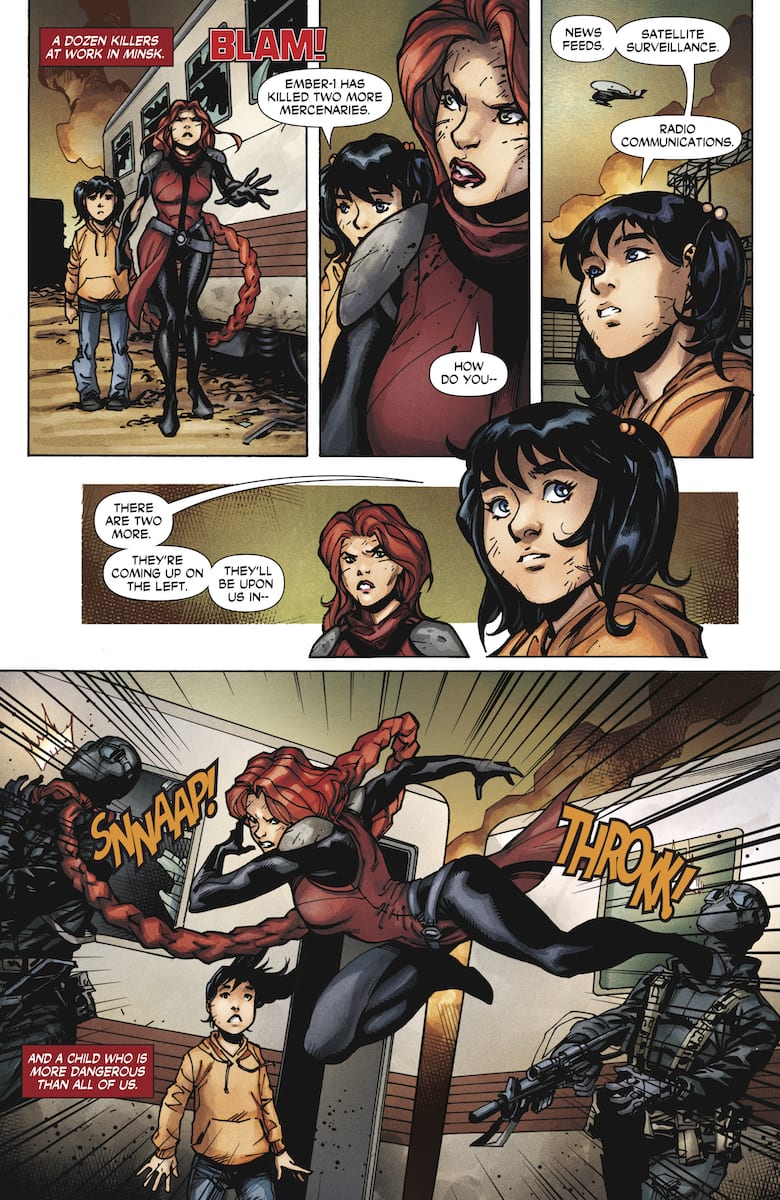
Formerly known as Angelina Alcott, Roku has broken free of her former employers, the Shadow Seven and Weaponeer. Taking a page from her old flame and rival Colin King, Roku becomes a mercenary. On her first assignment, Roku has to secure an asset to her client. The asset turns out to be an augmented child who acts as an information receiver. So Roku fights to ensure Marybeth stays out of the wrong hands. As you can see, there are parallels to Bloodshot Salvation but without any of the relatable stakes.

Roku #4 Story

The conflict of Roku #4 feels driven purely by the admittedly impressive action. Not a bad thing on its own thanks to flashy abilities, but it feels hollow. Marybeth doesn’t feel all that compelling; how can a kid who has barely been in conflict be okay with seeing death all around her? Marybeth doesn’t even seem to be much of a personality for the reader or Roku to empathize with. The only reason the series progresses at all is because of what happens to her. This is essentially the same as a video game escort mission NPC, ergo a plot element.

Roku herself makes up for Marybeth for both her newly found compassion and her quick thinking. After seeing how Roku’s journey from before changes her, it’s nice to see compassion come out of this assassin. Unfortunately the surprise ending feels on the nose when Roku speaks part of her plan out loud. So if the writing’s not that great what about the artwork?

Art

That's a whole lot of wasted black ink
Look at top panel background for reference

Ramón F. Bachs artwork shows its limitations at various points in Roku #4. While being able to draw the same character model over and over again is becoming common, his inking process shows how much he overcompensates through shading. In the right time and place, it can emphasize feelings like how menacing the Minister of Blades is. Most of the time, however, it feels like half the world is blackened in broad daylight. Yet Bachs’ art is actually some of the better artwork of the series.

What color there is by Stéphane Paitreau feels monotonous if not out of place. Had it not been for Bachs’ inking, certain areas would’ve blended in too well. The dark red smoke and setting sun against Roku’s hair, for example. Sometimes the colors exaggerate effects such as a head slamming against a wall that appears to create a small explosion. That didn’t even need to happen thanks to the panel having a slamming effect and lettering.

Lettering Goes Everywhere

Roku #4 lettering strengths and weaknesses
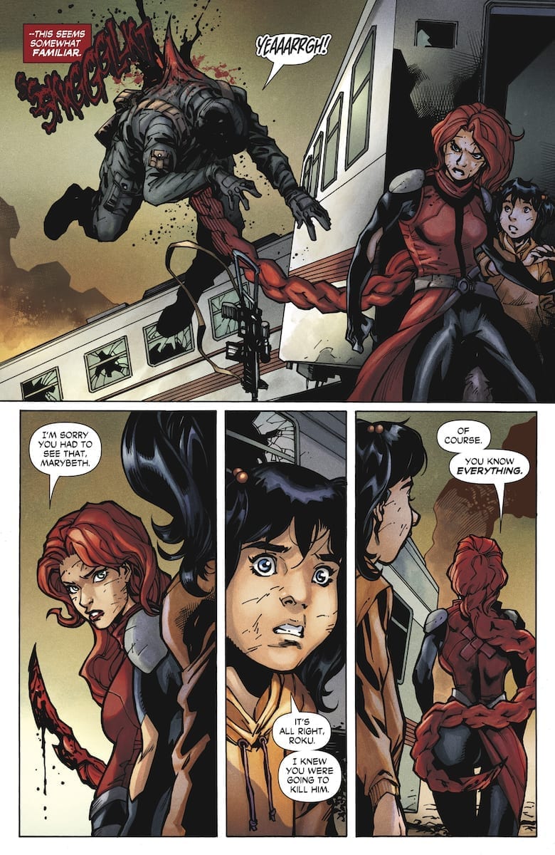
The decorative sound effects by Dave Sharpe are in fitting places with some of them acting as extensions of the characters. Red and black for Roku’s hair while guns have a signature sound to certain models. When it comes to captions and speech bubbles, they tend to scatter about. So much so, that at times it gets hard to focus because of the lack of curvature. Sometimes a few speech bubbles don’t even need to be around to make a reading path.

Roku #4 Conclusion

Roku #4 is certainly not the worst thing Valiant has ever released, but so much of its potential feels wasted. Instead of a character trying to compete with some of Valiant’s heavy hitters smartly, it’s more like Roku is using what works for them without context. The artwork perfectly reflects this, there is so much room for employment, but the people behind this are cutting corners. Despite what little character development she gets, it doesn’t seem worth getting this issue. The Ninjak ad near the back practically serves as a way of telling readers that Roku drove them back to him.

Monkeys Fighting Robots Youtube