Home Blog Page 356

USAGI YOJIMBO COLOR CLASSICS #1 – Breathes Life Into A Classic Tale

Stan Sakai’s classic Rabbit Rōnin, Miyamoto Usagi, receives the IDW Color Classics treatment in this week’s Usagi Yojimbo Color Classics #1.

Sakai’s Usagi has been around since 1984, appearing in his own titular series and many others. To catch up on the 36 years of Rabbit Rōnin adventures, take a gander at the Wikipedia page. Plus check out our review for the first issue of the newest full-color IDW series.

Art by Stan Sakai. Colors by Ronda Pattison

USAGI YOJIMBO’S CLASSIC STORY

Usagi Yojimbo Color Classics #1 (Usagi Yojimbo CC #1 from here out) is a reprint of Sakai’s classic first issue from 1986, but in color. One amazing factor of Sakai’s classic is how 30 years later the story is still relatable, giving it a timeless factor. Sakai’s story begins with Usagi dueling another who has betrayed his Lord, Mifune. Once said duel is over in a few beautiful pages, Sakai introduces the Bounty Hunter Gen as a plot device to tell Usagi’s history. In this flashback, Usagi regales Gen (and the reader) with his training to become a Samurai.

Usagi Yojimbo CC #1 reads like most Samurai tales, yet there is a certain charm that makes you love it. It may be over 30 years old, but the humor, pace, story structure, and verbiage stand the test of time. Yes, there may be a little blood (more pronounced due to color), but Usagi Yojimbo #1 retains an all-ages vibe. Yet, as an adult, you can equally enjoy every factor of the storytelling.

Usagi Yojimbo has been a creator-owned series for years with Sakai pulling triple duty as Writer, Artist, and (multiple Eisner-winning) Letterer throughout most of it. This trifecta of hands-on everything works perfectly for his tale as he knows exactly where to place dialogue bubbles. There are a few moments immensely heavy in dialogue, yet Sakai makes sure the letters never take over the art.

The past comes to life in Usagi Yojimbo #1
Art by Stan Sakai. Colors by Ronda Pattison

USAGI YOJIMBO FUNHOUSE

These new Color Classics come with extra behind-the-scenes moments and little side-stories. Usagi Yojimbo CC #1 is bundled with a one-page side story dubbed Funhouse. This singular page is done by Stan Sakai, Julie Sakai, and colorist Emi Fujii. Although it is only one page, Funhouse is adorable and would make a fun series by this team.

ART THAT TRANSCENDS TIME

Reading through Usagi Yojimbo‘s history, Sakai’s art has been constantly great while growing even better. Not much needs to be said that hasn’t been for how amazingly simple, yet beautiful his art is. But, before we move on to the big change in the classic, Usagi Yojimbo‘s opening pages are worth note. During the opening pages, Sakai pits Usagi and Gunichi in a Single Stroke Battle, a fighting method made famous in Samurai films and anime where two skilled warriors run at each other and strike once.

As overdone as this trope can sound, Sakai made it look gorgeous in its execution. Sakai keeps it silent with only a few sound effects and builds up the tension with a few pages. On the final page, Sakai shows the final effect with long rectangle pages that mirrors movies. When the defeated falls, animals watching run away in fear. These few pages are gorgeous in their cinematic likeness.

Usagi Yojimbo #1's beautiful beginning
Art by Stan Sakai. Colors by Ronda Pattison

USAGI YOJIMBO COLOR CLASSIC

The higher focus for the Color Classics is Ronda Pattison’s colors. Pattison’s name is well known to fans of famous anthropomorphic, as she worked on IDW’s TMNT. Although Usagi Yojimbo is great in its original black and white style, Pattison’s colors adds an updated feeling. After its first release 33 years ago, the lively colors Pattison adds brings the world to alluring life.

Between the lush green backdrops, to the bright colors of some of the suits, the colors perfectly blend in. In a time were coloring over classics can outrage fans by changing the overall feel, Pattison does the opposite of that. If anything, her colors bring about a rejuvenation to Sakai’s classic, which will have old fans clamoring to buy it and new fans wanting more.

Art by Stan Sakai. Colors by Ronda Pattison

THE BEGINNING OF A CLASSIC (CONCLUSION)

Sakai’s Usagi Yojimbo is a classic that has received years of praise. Meaning it’s hard not to recommend it, as it’s stood the test of time and stands tall. The difference with the Color Classics is the added color from Pattison. Her colors match the atmosphere of the anthropomorphic world perfectly. At no point do her colors seem too modern or out of place. Instead, the colors feel as if they were there since the beginning.

Fun Fact: I’ve never read Usagi Yojimbo. It has been one I’ve wanted to read as it’s at the local library. After finishing this Color Classics it’s moved up high on the read list. If you haven’t read any of the long-running stories, now’s the best time as ever.

NEW FANS, OLD FANS ALIKE

If you’re a new reader or a classic reader, we’d love to hear what you thought of the classic now in color down below.

Monkeys Fighting Robots Youtube

MIGHTY MORPHIN POWER RANGERS #47 Is Eye Candy For Its Readers

Dope Cover by Jamal Campbell

Out this week from BOOM! Studios, Mighty Morphin Power Rangers #47 brings our Ranger team back together for their first real reunion.

Having lost the fight with their ex-teammate Kiya and the other Empowered beings she’s enlisted, Zack and Trini had no choice but to return to the command center and hand over the injured Jason to Zordan’s care. With the reveal that their old team members are the Omega Rangers, and in fact NOT attending a world peace conference, Kimberly, Billy, and Tommy give them a far from warm welcome.

There’s a lot of tension in these panels. Even Tommy is livid.

Before the Rangers can talk about this situation further, Goldar’s attack on Angel Grove appears on the Viewing Globe and the six Earth Rangers leave to confront it. With all of the plot progression in “Necessary Evil,” it’s refreshing to still get a “Monster of the week” in this issue. Especially when this series hashes out solid, old school monster designs.

From fun campy monsters to some very clean panels of the Rangers, Goldar, Dayne, and Kiya, (who is now wearing the Blue Emissary’s cloak like a trophy and is admittedly rocking it)  there’s a lot to enjoy form Daniele Di Nicuolo’s art and Walter Baiamonte’s colors this issue. The artwork, colors, and the lettering by Ed Dukeshire come together BEAUTIFULLY in the Morphin sequence this issue.

Kiya rocks this look I’ll be dead honest. If she
fights the Rangers un-morphed, cloak flowing in the wind I’ll be perfectly OK with that, even though I LOVE the Omega Ranger designs.

Time and time again, Ryan Parrott proves he has a strong understanding of the deeper side of Power Rangers lore. Each issue in “Necessary Evil” expands upon the universe and concepts created from the original series. I’ve mentioned in previous reviews that this arc has felt like a send-off for Trini, Zack, and Jason. To be honest, with the inception of the Omega Rangers, and the story arc revolving solely around those three, I don’t want to see them go at this point.

BOOM! Studios’ Ranger comics have always felt like a love letter to the fans. I’ve previously described it as a “pay off” for years of devotion to the franchise. While this issue is very much an “in-between” story, setting up events to come, there’s still so much to enjoy.

This page alone is just eye candy in all honesty. Every Morphin sequence done in these comics is even more stunning than the last. The changing of the teams almost changes the entire feel of it as well.

Without going too deep into it, this issue gives a lot in just its character interactions. There’s a lot in both the dialogue and emotions presented. When Trini speaks to Zordan for the first time since she left the team, and isn’t quite sure what to say, Zordan’s trust and reassurance in her is wholesome and sincere.

It wasn’t that long ago that Zordan was angry with the Omega Rangers for taking Zedd out of the equation. This was because Zordan feels that something more powerful and terrifying will be taking Zedd’s place and the Rangers are unprepared for it. Showing that Zedd was, in fact, a “necessary evil.” (found it!) The sheer fact that Zordan is immediately forgiving of the Omegas upon learning it’s his own team and putting all his faith into their judgment speaks volumes of his trust in them, and understanding of their situation.

Things continue to heat up as we inch closer to the end of “Necessary Evil.” Recently it’s been revealed that this will also mean the finale of Saban’s Go Go Power Rangers as well, but Mighty Morphin Power Rangers will continue after. For fans of the franchise, it’s easy to get emotional with each new development as it feels like the end of a generation.

Before “Necessary Evil”, the series still felt in its early stages. We still had the Green Ranger as well as Jason, Zack, and Trini. Now that the comic has reached a redefining milestone that happened in the show, it feels like anything could change at any time.

Though this uncertainty may make us anxious, it is exciting not knowing what will happen next. With all of the good that has come from these stories, I, much like Zordan to Trini, have faith in any direction the BOOM! Studios team is ready to take with this franchise. Especially if this means we might be moving towards Power Rangers Zeo after all.

Monkeys Fighting Robots Youtube

CAPTAIN MARVEL #14 Gives Us Answers But Then More Questions.

Cover by Mark Brooks

Flying to the shelves this week from Marvel Comics, Captain Marvel #14 delves deeper into Kelly Thompson’s “The Last Avenger” story arc with our favorite half-Kree hero.

Captain Marvel #14 is a lot lighter in tone than the last two issues. This is mostly due to how much we’ve figured out at this point. With new light shed on Carol’s plan, fans can smile again knowing the good Captain has not actually gone rogue.

While Carol’s methods have been ruthless and unforgiving, her reasons have finally become clear. With this new villain mashup “Vox Supreme” puppeteering her every move, Carol has to be careful and quick thinking. Especially with the lives of countless Kree refugees at stake.

From the start, this issue follows a different pace from the previous two. We don’t jump into Carol pounding on her next Avenger target hard and fast like before. In fact, we actually start with a little humor instead.

( ͡° ͜ʖ ͡°) ( ͡° ͜ʖ ͡°) ( ͡° ͜ʖ ͡°)

Thompson seems to be slowly adjusting her readers (and potentially herself) back to a comfort zone after shocking them in issue #12 with what seemed to be Carol killing Thor. It’s an interesting way to present this to us. First, shock the fans and grab the attention of the public in general. Then slowly bring us back to her usual style and so the old fans are comfortable and the newcomers see what she’s all about.

After establishing what Carol’s working with as her plan right now, we do get back to her taking on her next target. Since we now know it’s all a ruse, it loses that dark tone, but Vox Supreme makes up for it in a few ways.

For starters, Vox’s design is just eerie overall. His method of forcing Carol into doing this is somewhat cookie-cutter for villains, but it is still effective. Especially since he’s detonated one his bombs from the start.

There’s just something about sickly neon green accenting black that just yells “EVIL”

What we now have is a story that is still very different from Thompson’s usual works but is still familiar enough to not feel completely foreign. But most importantly, is the story still interesting now that the question “is Captain Marvel going to kill all of the Avengers?” has been answered?

The honest answer is yes. While the hook was “Evil Carol” what we have now is the mystery of this new villain’s full plan. What is Vox Supreme’s goal? Why did he appear now? And why is he using Carol specifically?

Captain Marvel #14 even makes these questions more apparent. Tony and Carol are both unsure what to make of it. Carol even attempts to dig at Vox’s plans before he shuts her out completely. We haven’t been given much to work with ourselves in figuring it out, and even though she’s clearly not evil, Carol is still fighting the Avengers. This is still an active hook for the series.

Visually this comic is no slouch either. Each character shown has very defining features that stand out in their design. Thor’s monstrous upper body contrasts with Tony’s smaller physique but Tony’s overall more put together compared to Thor looking so rough. Carol, on the other hand, looks tired. Yes, the large shadows around her eyes really bring that home but more than that her expressions have this distaste to them.

This image kind of sums up the above paragraph.

The colors for this issue by Tamra Bonvillain are well decided on. Vox’s pallet reminds me of a can of Monster Energy Drink, which is both weird and cool given his overall design. The backgrounds are very immersive from the space theme inside Singularity, to the vast dry area of Northern California.

Captain Marvel #14 is lettered by VC’s Clayton Cowles who also adds to the contrast between Tony and Thor. Thor is expressed very loud and bombastic while Tony, entirely because Carol damaged his windpipe, is struggling to speak at all.

This was a necessary issue to take a break from most of the nonstop action the previous two had. It explains the situation Carol is in more while also leaving us with many more questions on where we go from here.

This story arc has been fairly welcoming to anyone who may not have kept up with Captain Marvel in recent times. I’d still recommend checking out Thompson’s entire run with the character, as well as her other works. But anyone with an interest in the story arc alone can jump right into Captain Marvel #12 with average knowledge of the Marvel Universe and go from there.

I hope to see Carol continue to take on the remaining Avengers almost as a test to see if she could. But I am more interested in knowing where the grand scheme of this tale is leading. As such I will continue to look forward to each issue and I still recommend checking this story out for anyone who hasn’t.

Monkeys Fighting Robots Youtube

FRANKENSTEIN UNDONE #1 Review: A Meditation on Shelley’s Masterpiece

Frankenstein Undone by Mike Mignola

From the pages of the Dark Horse flagship title Hellboy comes Frankenstein Undone #1. Written by Mike Mignola and Scott Allie, with art by Ben Stenbeck, colors by Brennan Wagner, and letters by Clem Robbins, this issue is a love letter to the horror classics that paved the way for the modern classics that populate the Mignolaverse. As Frankenstein’s monster ruminates over his sins, the creative team takes the opportunity to explore what it truly means to be human, even if you’re a monster.

Writing

While Mignola and Allie often rehash the events of Shelley’s novel, they also set up a conversation that’s familiar territory for these Dark Horse regulars: how can something so ostracized and despised learn to be kind? Is it possible for beauty to be born of something that has only been taught cruelty? Sound like anyone? Mignola and Allie provide yet another monster with a bleeding heart. They remind us that our judgement and persecution can lead monsters to act as they are expected to. This philosophical shouting at the heavens will surely be the bedrock of the issues to follow.

Art

Stenbeck’s art balances minimalism and detail with beautiful results. When Frankenstein’s monster stumbles upon a tragic scene, Stenbeck pulls back the details to spare us further heartbreak. Yet the details that matter remain. After a conversation over whether Frankenstein’s monster is a man, one character asks “Is any part of you not of man?” When Frankenstein points to the metal poles protruding from his neck, his finger barely extends. His reservations in making the answer clear, and the grief on his face as he does, is how Stenbeck shows the pain that comes with answering that question.


Coloring

It’s tempting to say that Wagner had an easy job for this issue. Lots of white and grey landscape, the occasional dimly lit room. But it’s the fact that this issue still seems so vibrant that speaks to Wagner’s mastery of the craft. Northern lights cast beautiful glows, changing white snow to deep purple. Sunsets ripple along the water, and bloody carnage pops in unsettling clarity. No inch of the page looks mundane. Wagner puts his mark all over the work, with stunning results.

Lettering

Robbins lettering is incredibly simple in style. All sound effects receive the same treatment, and the lettering never varies. At first glance, this approach may seem unimaginative, but Robbins knows lettering must serve the story. Robbins’ use of a set template allows this quiet comic to set its stride. Robbins graciously takes a backseat in this story, constantly parceling out dialogue into smaller chunks, making room for the art in each panel.

Frankenstein Undone #1 from Dark Horse is setting itself up to be another brilliant series in the Mignolaverse. With a creative team like this it’s hard not to instantly fall in love with their work. Pick up Frankenstein Undone #1 at your local comic book shop on January 29th!

Monkeys Fighting Robots Youtube

Review: THE ORACLE CODE Babs Doesn’t Need A Batman

The Oracle Code cover

The Oracle Code out this month, is another addition to DC Comics’ YA Graphic Novel collection, this time with an inspirational story about Barbara Gordon that might be the best book of the year.

Fans of the original Oracle get a new look at Babs; this time around, she never becomes Batgirl. Batman or Robin don’t even show up. But who really needs them in this context? Oracle has always been an important piece of DC comics as a whole, not just as a Bat-family member. Making the connections necessary to get back up after a trauma is a universal message of heroism. So much that several fans like the YouTube channel Diverting Tales think that healing mainline Barbara was stupid.

The Oracle Code Writing

She's no Batgirl
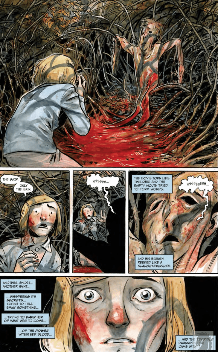
The story of Oracle Code is genuinely great stuff. It starts by showing Barbara as a hacker who values the people closest to her, like her father, Jim Gordon, and her friend. Babs is already willing to be a hero. Unfortunately, those same people she values let her down in a way that culminates in Babs’ spinal trauma. Her best friend does nothing essentially, and Gordon says the wrong things that push her away. Feeling isolated both physically and spiritually, Babs’ anger comes from a genuine place. Believing that you can’t be fixed on your own is a terrible feeling.

That’s essentially the big story here. Both Oracle Code and Gail Simone’s Batgirl are about dealing with trauma. Just the sight of guns can bring back some bad memories for both versions of Barbara. But there’s a parallel that separates the two versions of Barbara in terms of identity. “Batgirl” is an identity that Barbara keeps close throughout DC history, one that continues to evolve independently of continuity. “Oracle” however, is a symbol of Babs’ maturity, one that serves as the main arc of development. YA novelist Marieke Nijkamp drives the point home with the rest of her creative team.

The Oracle Code Art

The images decorating The Oracle Code by Manuel Preitano range from being subjective, isolating, and emotional – everything from the characters’ movements, their emotional states, to clever foreshadowing. Probably the most evocative scenes come from the stories Babs hears from a friend in the institute. Each image perfectly displays how Babs sees herself in the institute at the time of their telling. A reoccurring icon comes in puzzle pieces, something Babs has a passion for. With pieces scattered, Barbara’s character arc progresses once those pieces begin to fit together. Best of all, these icons don’t blend into the background, thanks to Jordie Bellaire’s colors.

The Oracle Code setting the moodBellaire’s coloring in The Oracle Code helps Preitano’s artwork pop by making the nonessential pieces of the story the same color. Naturally, with most of the overworld being like this, everything else feels insignificant. There are even times when Babs’ clothing blends in to evoke this feeling of fading away. The purely subjective images (like the puzzle pieces) meanwhile remain bright as signs to improve on. When the contrasts occur, they evoke feelings of hope or intensity. The most notable of which is the bright yellows that encompass those feelings. With The Oracle Code devoting so much of the pages to panels crowded with life and emotion, it takes someone like Clayton Cowles to keep the flow of dialogue going.Some very character defining visuals

Lettering

Oracle Code living up to its name Cowles’ lettering keeps the reader focused while never getting in the way of the art. The letters almost all follow a smooth path of direction. The onomatopoeias throughout the graphic novel also fit perfectly with the atmosphere of the setting. Long hallways with ghostly wails, for example, are perfect for people guessing if Babs is getting depressed or if something is going on. Everything is nothing short of perfect.

The Oracle Code: Must Have

Whether you agree with Barbara recovering from paralysis or not (especially with that phenomenon becoming real), anybody will enjoy The Oracle Code. This self-contained story details Barbara Gordon growing into a hero only she can be: a hacker who got to her lowest point but finds the strength to be who she wants to be regardless of expectations. Because in the end, who needs Batman continuity when you can solve the missing piece of the puzzle in fandom?


Do you like seeing Barbara as Oracle in a solo venture? Leave your thoughts in the comments.

Monkeys Fighting Robots Youtube

Panel Breakdown: Venom’s First Appearance By Todd McFarlane & David Michelinie

Panel Breakdown: Venom's First Appearance By Todd McFarlane & David Michelinie

Welcome to PANEL BREAKDOWN, a weekly series where we take a look at our favorite panels of a comic book. This week we are talking about the first appearance of Venom from Amazing Spider-Man #298, 299, & 300. The story was written by David Michelinie, with art by Todd McFarlane, inks by Bob McLeod, colors by Bob Sharon & Janet Jackson, and Rick Parker & Ken Lopez worked on letters.

What did you think of the first appearance of Venom? Comment below with your thoughts.

Monkeys Fighting Robots Youtube

Why You Should Read: HARROW COUNTY

Horror is one of the most versatile genres in all of fiction. From slashers to psychological thrillers, and from creature features to supernatural terrors, its umbrella of subjects reaches far and wide. This is why it’s also such a subjective medium. The opinions and tastes of horror fans differ more from person to person than arguably any other genre. This is why Cullen Bunn and Tyler Crook’s Harrow County is such a rare treat. It’s an astonishing feat of storytelling that a horror story is able to hold such mass appeal while still maintaining genuine storytelling integrity. Bunn’s implementation of the southern rural setting and backwoods horror combined with heartfelt character-work makes the series a joy to read. This, along with Tyler Crook’s engrossing watercolors and charming detail makes Harrow County one of the most easily recommendable comic series of the past decade.

Emmy Crawford had always known that her quiet home of Harrow County had its share of strange secrets. The whispers of haints in the woods and old magics at work had kept her curious, but she never quite knew how close she was to all of this mystery. That is, just before her eighteenth birthday. Now with her understanding of who she is and how powerful she can become, it is her job to defend Harrow’s residents both human and haint from the dark magics that arrive in their quaint abode.

The humanity of Cullen Bunn‘s cast in Harrow is difficult to come across in any medium. There’s a sincerity in the convictions of the main characters that makes them instantly relatable, regardless if they’re human or not. Emmy is one of the most endearing protagonists of recent memory, a character with an almost inexhaustible amount of kindness coupled with a deep internal struggle. Watching her wrestle with the characteristics her kind-hearted father instilled within her and the immense power her bloodline gives her is always riveting. Her victories are earned in the eyes of the reader, and her sacrifices are understood and emotionally compelling.

The supporting cast is also given great care in its development. Emmy’s closest friend Hattie has to struggle with her own teaching and superstitions about the “evils” of magic. The path the takes is an at times frustrating but always understandable one. The haints of Harrow County are sure to be favorites as well, from the tiny but courageous hobgoblin Priscilla to the massive and menacing, um, bull(?) in the woods (no spoilers). Even Emmy’s ever-loyal familiar the skinless boy, who never says a word, is a character that is sure to endear himself to any reader who embarks on this series. Even many of the series’ supporting antagonists have understandable views within their own treachery. The story deals with differing shades of good and bad, with Hester Beck as the representation of ultimate evil.

Another winning mark for Harrow is the development of its world and rules within its fiction. Harrow County itself appears frozen in time, with it being separated from the outside world just via isolation. This allows the quiet and charming yet haunting atmosphere to build freely. This is coupled with Cullen Bunn’s soft approach to lore and magic in the series. He doesn’t waste any time detracting from the natural progression of the plot by delving into the hard rules of Emmy’s magical abilities. Nor does he spend any time really explaining the hows and whys of Harrow’s hauntings and haints. They just “are.” The only real explanations the reader receives are ones that are necessary for understanding the characters themselves. Points such as backstories and revelations are brought in via conversation when the time is right. Even these small points of exposition are created in a naturalistic way that doesn’t detract from the story’s pace. This maintains the sense of wonder and engrossment in this neatly crafted horror-fantasy.

It is unlikely Harrow County would have either the reader reception or impeccable atmosphere it does without the iconic visual work of Tyler Crook. The mixture of quiet and quaint southern-woods and the eerieness of that same environment is captured in an art style unique to the Harrow co-creator. Crook’s watercolored textures fill the world with a softness that is warm and inviting in the sweeter moments but turns surprisingly sinister during the horror sequences. The linework is a neat mixture of excellent character design and that aforementioned mixture of “sweet & sinister” environments. As much thought as Cullen Bunn put into the cast in terms of personality, Crook put just as much in how to make them visibly relatable. Emmy is drawn to be every bit as kind and endearing as could be imagined.

The emotional range Crook demonstrates in his art with her alone of astounding. From happiness that radiates off the panel to rage or heartbreak, Crook is there to provide some of the most human art in the medium. This goes for every character, from the unusual haints to the shady lodge of witches and the terrifying Hester Beck. Crook’s range of talent comes in extra handy during the story’s creepiest and most harrowing moments. The horror in Harrow County doesn’t rely on jumps or gore, but purely on atmosphere. Crook makes this work with his murky darkness and unsettling woodland landscapes. When blood does pour however, it’s always a brutal and shocking display without ever feeling gross or over the top. Even the lettering has its own personality, often changing fonts or appearing in wavy sing-song lines. Crook’s creativity further encapsulates the wonder and charm of this series.

Cullen Bunn and Tyler Crook’s Harrow County is one of the most easily recommendable and widely enjoyable comics of the decade. The effortless mixture of fantasy and horror with character-focused storytelling makes for an endlessly compelling read. Bunn’s carefully constructed and original plot is gripping from the opening page of issue one to the final page of issue 32. Tyler Crook’s art and lettering wraps the reader in its dense atmosphere and fantastic design. With a new sequel-series just having started, now is the perfect time to grab the first volume of this spellbinding comic.


Monkeys Fighting Robots Youtube

On Reading the 1st Year of Li’l Abner: Mammy and Pappy Yokum

Mammy Yokum
"Don't worry, Salomey. I won't hang you out to dry...for long! Heh!"

The original Human Torch has his more-or-less impervious android body. Captain America has his injection of Dr. Reinstein’s — I mean, Erskine’s — super-soldier serum. The Whizzer has his blood transfusion with a mongoose — that’s right, I said “mongoose.” And, of course, the famous Blue Blaze has his exposure to an unnamed blue flame that put him into a death-like coma for 88 years, finally rising from the grave to fight crime with the aid of spooky supernatural powers. Of course!

Superhero comics of the ’30s and ’40s were full of catchy, or not-so-catchy origin stories. Unlike these masked vigilantes, though, Li’l Abner‘s origin story is pretty simple. First, Pappy Yokum met Mammy Yokum. Shortly after they were married, Li’l Abner was born. Abner ‘et up lots of po’k chops, and now he’s almost as strong as his Mammy.

Pappy and Mammy Yokum

Mammy Yokum
“Miss, ah think yo’ is missin’ paht o’ yo’ dress!”

Mammy Yokum

Pappy and Mammy Yokum act as the ethical backbone of Al Capp‘s hugely influential Li’l Abner comic strip. Whenever Abner’s spurning of Daisy Mae starts seeming sad rather than funny, Mammy’s there to either set Abner straight or trick him into realizing that he actually loves the beautiful and lovelorn Miss Scragg. This is one thing that makes Mammy Yokum such a positive role model.

Rather than forcing Abner to take Daisy Mae out on dates, Mammy repeatedly orchestrates events so that Abner has opportunities to realize that, despite his statements to the contrary, he does love Daisy Mae. As Li’l Abner ages, the titular character wises up somewhat and figures out that Daisy Mae is, although “just a girl,” a serious freakin’ catch.

In addition to being Abner’s moral compass, Mammy is a force unto herself. In just one year of publication, Mammy settles a fraud dispute, exposes graft in a local beauty contest — which she ends up winning herself — settles a multi-million-dollar adoption dispute, rescues her husband from being tortured by his ex-fiancée, and cooks approximately a googolplex of po’k chops.

Mammy Yokum
“Oh boah, Mammy! You look jes’ like a sossij!”

Pappy Yokum

Mammy can cook po’k chops but even Li’l Abner must tip his hat in deference to how quickly Pappy Yokum can get ’em all et up. Abner might derive his strong moral sense and unmatched wrasslin’ skills from his Mammy but his Pappy provides the basis for his voracious appetite.

Possibly even more important than his all-consuming love for po’k chops, though, Pappy also seems to have been the point person on the tenderhearted side of Li’l Abner’s upbringing. A romantic with a heart of gold and a bottom less stomach, Pappy is as loyal as he is simple…which is quite a bit.

Salomey
“Don’t worry Salomey. I’ll only et yo’ frenz and relayshuns!”

Salomey

No house is a home without a pet, and even though their favourite food seems to be pork chops, the Yokums’ beloved pet is, nonetheless, a very cute pig named Salomey. Salomey is for the most part a relatively peripheral character but gets his time to shine when he uses his hoof to tap out a warning to Li’l Abner. Now that’s a pig to keep around.

Heroes and Villains…

No comic — strip or book — is complete without a good villain or two. And, although none of Li’l Abner’s villains have freeze guns or octopus arms, they still manage to make life pretty difficult for the good people of Dogpatch. Check out my next article on the various fraudsters and grifters that make up the rogue’s gallery of Dogpatch, USA.

Monkeys Fighting Robots Youtube

Review: We Wish You a Monstrous Christmas in DETECTIVE COMICS #1019

Detective Comics #1019

What begins as the investigation of an occult mass sacrifice—run of the mill stuff in a city like Gotham—evolves into eldritch-level horror in Detective Comics #1019, out this week from DC Comics.

After a close call with the Viking berserker, Bruce works to track down the root of the strange happenings. By the book’s end, he discovers that the brutal killings are tied to a creature that is not of this world.

DC_1019_Page 1

The Writing

Perhaps the strongest element at play in Detective Comics #1019 is the mood and atmosphere of the story. Writer Peter J. Tomasi crafts a bitterly-cold environment for the tale; a grim and frostbitten Gotham to complement the dark nature of the pagan cult pursued by Batman.

The story has plenty of gruesome and macabre ritual touches. These elements are counterbalanced by a decent amount of humor to complement, rather than clash, with the overall tone. This interplay of darker and lighter elements has been a staple of Tomasi’s writing style on the series, and remains one of the stronger points in his stories.

The narrative in Detective Comics #1019 keeps the reader’s attention from one page to the next. As the mystery deepens, the reader feels the tension heighten. Tomasi manages to keep you guessing until the end. Unfortunately, that’s also where the book’s biggest weakness lies.

The ending wraps up rather quickly, and is revealed largely through an expositive monologue by the entity that turns out to be the main antagonist. It’s a very interesting concept; however, the way it pans out feels a bit anticlimactic. The book is too content to wrap-up the story with convenient hand-waving. While most of the book is well-paced, the ending feels very rushed.

It’s possible that this was merely setup for a larger story yet to come. Tomasi weaves some heavy foreshadowing into the story, suggesting the entity may appear again at some point. As is, it’s enjoyable enough for the “festive” vibe.

DC_1019_Page 2

Detective Comics #1019 Page 3

The Artwork

Scott Godlewski’s art in Detective Comics #1019 doesn’t carry over much of the brooding atmosphere we saw in our last issue. That said, it’s still a good showing in the visual department.

Godlewski’s character designs are solid. While they’re not a standout component, the designs are coherent and expressive. The same can be said for the backgrounds and environs present in the book; they’re generally-well detailed, which helps draw in the reader.

There are some standout moments; for instance, the reveal of the entity responsible for the cult activity is a visual high-point. As a whole, though, the artwork in Detective Comics #1019 has a general sense of utility to it. From the designs to the page layout, the artist takes a very meat-and-potatoes approach to this book.

The colors by David Baron are one of the more interesting visual elements at play. The artist brings a lot of the darker, grimier, greenish tones that have become a stylistic staple of the series. It works surprisingly well as the backdrop to a frosty winter setting, especially when set against some of the warmer, more fiery tones.

DC_1019_Page 4

Final Thoughts

Detective Comics #1019 isn’t a bad issue. In fact, it’s very enjoyable until the uneven pacing and flat conclusion detract from the overall work. Not essential, but worth giving it a read if you’re a completionist.

Monkeys Fighting Robots Youtube

Review: INVISIBLE KINGDOM #9 A Reality Check In The Depths Of Space

Invisible Kingdom #9 cover detail
Invisible Kingdom #9 Credit: Dark Horse Comics

To round off the first month of the year, Dark Horse Comics releases the next chapter of their Science Fiction masterpiece Invisible Kingdom. The penultimate part of the second arc is released on 29th January and the action continues to heat up.

Space Pirates, daring escapes, and crew members pushed beyond their comfort zones. This issue has everything you could want from a space opera of this kind; including the usual kick-ass artwork and edge of the seat storytelling. Does anymore need to be said? Yes, yes there does.

Invisible Kingdom Panel Art
Invisible Kingdom #9 Credit: Dark Horse Comics

Character Building

A desperate plan gives the crew of the Sundog a glimmer of hope but what is the cost of their freedom?

As the escape plan unfolds so too does a deeper exploration of what it means to be free. G. Willow Wilson’s script is brimming with difficult questions about the roles that the cast play in the world around them. A confrontation between Grix and the recently rescued Luxx ship captain makes the reader consider the role that the Sundog captain is playing. Is she a revolutionary? Or just running scared? The audience is forced to evaluate Grix’s role in the narrative so far, just as the character herself is.

This arc as a whole has been more character driven than the previous one, with Grix becoming the main focus. She is defined more by her interactions with the other characters than she is by her actions in the story. This issue sees Grix pushed to the extremes of her emotions and her reactions move the story forward in dramatic ways.

One of the highlights of Wilson’s work is her ability to build characters in this amazing way while also making larger comments about society and the world outside the comic. Wilson’s opinions on certain subjects are clear in the narrative but it is never preachy, in fact every encounter encourages the reader to consider opposing views. The main cast have very open minds and Wilson uses this to confront topics. She pits certain characters against those who are not like minded. 

Invisible Kingdom #9
Invisible Kingdom #9 Credit: Dark Horse Comics

Artistic Wonders

Christian Ward’s art is always a joy to read and this issue is no different. To accompany the character fuelled narrative, Ward is increasing the emotional depth through his storytelling. This is most evident in two aspects of the comic.

Firstly the coloring. The contrasts between warm and cold colors mirror the relationships and the emotional states of the cast members. For example, at one point in the opening of the comic a number of Sundog crew sneak into the hold to steal some much needed supplies. The characters leave the relative safety of the brightly lit corridors and enter the cold, grey depths of the store room. The colors highlight the transition from safety to danger and is a continuing theme throughout the following pages.

The other exciting aspect of Wards work in Invisible Kingdom are his powerful layouts. His panels have thick, black borders that form a very strong shape on the page. Even with a standard panel layout, Ward’s treatment of the page gives it extra gravitas. Each panel makes a bold statement.

This is then accentuated when the layout transgresses from a normal pattern. Action sequences break the borders or distort the panels entirely. A page turn instantly changes the urgency of a situation and the reader involuntarily becomes on edge, anticipating the action.

This manipulation of the reader allows both writer and artist to control the narrative more successfully. The story beats are well placed to keep the adrenaline pumping. Issue 9 of Invisible Kingdom may be a character piece but it is an exciting one that keeps you engaged in every aspect of the storytelling.

Along with the out of the world visuals is the subtly enticing lettering by Sal Cipriano. At a quick glance there isn’t anything irregular about the lettering but when you start to read you notice the uneven speech balloon borders. Once noticed, it’s difficult not to see, and that sudden attention makes you focus on the words a lot more than you expect. 

In other comics, this could be seen as a failure on the part of the letterer, as not being noticed is usually the name of the game. But when you have the striking visuals of Christian Ward, getting the reader to give the text the attention it deserves is no mean feat. Cipriano manages to do this by giving the reader something slightly modified from what is expected.

Invisible Kingdom #9
Invisible Kingdom #9 Credit: Dark Horse Comics

Conclusion

By now Invisible Kingdom is not surprising anyone by its excellence: it is a comic that has proved itself month after month. The fact that the creators keep that level sustained each issue is impressive. 

The character of Grix is strong enough to carry the story and the greater concepts that the writer wants to raise. You can ignore the social commentary if you wish, however it is built into the fabric of the narrative and by brushing over it you miss out on deeper insights into the characters and their motivations.

It’s a safe bet that if you’ve reached issue 9 of Invisible Kingdom you know what you are going to get, but there is still a lot to offer and entice new readers. It isn’t that difficult to pick up the general gist of the comic so don’t be put off if you’ve not read any previous issues.

All in all, Invisible Kingdom is a fully rounded, modern science-fiction comic with the usual thrills and spills but also, an extra, deeper, social conscience.

Monkeys Fighting Robots Youtube