Home Blog Page 355

Review: The Trip to Arkham Goes Wrong in THE FLASH #87

The Flash Heads to Arkham

The Rogues’ Reign has come to an end. While struggling to control their powers, The Flash Family joins with the Rogues to overthrow their leader, Captain Cold. When facing the tyrant, it’s revealed that he also had received overcharged powers from Lex Luthor. This leads to a superpowered slugfest between Barry and Snart while the others pulled Central City out of Mirror Master’s realm. 

When they get out, however, Barry begins to bear down hard on Cold, nearly killing him. Even though it was an accident, the Scarlet Speedster requests to be taken away to Arkham with Cold. How will this change affect the speedster’s life?

The Flash 87 cover

**Some Spoilers Below**

Story:

We pick up shortly after the last battle with Flash and Cold on their way to Arkham. Barry tried to talk to his oldest enemy, but Snart tells him to shove it where the sun doesn’t shine. The speedster doesn’t let up, trying to make a comparison between the two’s pasts. Cold turns this line of thinking on its head by pointing out that with Barry almost killing him, they are alike.

Meanwhile, Iris takes Wallace and Avery to Meena Dhawan at STAR Labs to try and slow them down. Meena points out that the overcharged Speedsters’ vibrational frequency is entirely out of control. This revelation gives Iris an idea to save both of them and the Flash.

The Flash 87 p1

This issue fell flat after a great set up in the last issue. The way that the last issue’s ending was set up, it implied that Barry would need to carry the burden, both physical and mental. Instead, we have it ultimately pushed aside through a deus ex machina. This could have potentially been an interesting character arc for the Flash.

Flash 87 p2

Along with the wasted potential of a great arc, we’re just left with tons of questions on why did the issue play out like this. Why are villains of Central City, which is usually portrayed in the center of the country, being transported to the coast by a special metahuman truck? How did the Flash Family not realize their vibrational frequency was off? How is our surprise guest able to fix them in the span of two pages? It’s questions like these that really bog down the enjoyment of the issue and the arc as a whole.

The only highlight is the cryptic ending for the upcoming arc. It’s shocking but also has been building towards for a while. While it is an exciting prospect, it isn’t enough to save this issue.

The Flash 87 p3

Art:

While the story was problematic, to say the least, Christian Duce’s art continues to amaze. While there isn’t much in terms of action, the detail he puts in every character is something to applaud. The conversation between Cold and Flash is full of raw emotion as they go back and forth. It will draw in many fans of not just the series but intense conversationalists as well. The story may have been the downfall of this issue, and the art makes it a beautiful story to look at.

Conclusion:

In the end, this issue was a lackluster epilogue to the Rogues’ Reign. Where the last issue set up a potential game-changer to the Flash series, it’s quickly discarded. This story should have been stretched out to two issues and allow these fantastic ideas to breathe. Instead, we have it shuffled off to make way for the next arc. The art team does a damn fine job in delivering one of the series best-looking issues. While the next arc promises to be an epic one, this issue did no favors in tying up the previous. It was just a disappointing issue of the Flash.

Monkeys Fighting Robots Youtube

Review: It’s Harvest Time in READ ONLY MEMORIES #2

What seemed like a simple missing person’s case develops into a much deeper, more arcane mystery in Read Only Memories #2, out this week from IDW Comics.

As Lexi investigates John’s disappearance, she finds herself drawn further into the Santa Cruz underworld than she anticipated. The mystery brings her into conflict with gangs and cultists, ultimately pulling her back home to the streets of Neo-San Francisco.

ROM #2 Page 3

The Writing

Like our previous issue, Read-Only Memories #2 leans gleefully into the tropes of the cyberpunk genre. That said, it digs deeply into the noir aesthetics and hard-boiled detective stories that inspired the genre’s originators. So, while it reads like a star-eyed love letter to Blade Runner, the book feels more like a contemporary of the genre mainstays. It feels like an original product, rather than a pale imitation as genre revivals often turn out to be.

At its core, the book delivers some fine storytelling. Tension build as Lexi uncovers information about The Harvest, and makes plans to crash it. The primary tension in the issue’s first half rest in the question: what the hell is The Harvest?! We get some answers by the book’s end, but each new reveal only yields more mysteries.

Read-Only Memories #2 takes most of the elements that worked in the first issue and accentuates them. We don’t get to explore as much of the world of the story as before. However, the shift away from worldbuilding ultimately allows for a richer narrative.

Part of the book’s strength lies in its characterization. Writer Sina Grace develops the relationship between Hedy and Lexi, helping shape both into more complex and interesting figures. At the same time, the writer further fleshes out the story and setting. Grace dishes out information tactfully as it becomes relevant, avoiding the dreaded infodump that can poison lesser works.

From a writing standpoint, Read-Only Memories #2 is a master class in how to embrace a genre with defined, well-treaded tropes and do something original with it. From what we’ve seen thus far, it may be one of the most compelling cyberpunk stories we’ve seen in the last decade, at least.

ROM #2 Page 4ROM #2 Page 5

The Artwork

Not wanting to be overshadowed, artist Stefano Simeone provides impressive visuals for the book. The artwork does a fantastic job of capturing the tension in Grace’s storytelling. Simeone hits the story beats perfectly, delivering images that consistently match the dialogue in emotional pitch and dynamism.

The setting of the book’s second half somewhat limits Simeone in terms of inventiveness and flair. However, he doesn’t pass up any opportunity to deliver more of those stylized, blue-and-pink-bathed urban landscapes we saw in our first issue. With Read-Only Memories #2, the creators show a commitment to make the aesthetics serve the story, rather than vise-versa.

The artwork possesses a solid noir vibe to compliment the engaging writing. Even when we’re in a setting that wouldn’t normally work with this kind of story, the artist knows how to leverage dynamic motion and preserve a sense of continuity to heighten the tension.

The colors in the book’s second half have a similar effect. While muted compared to what we’ve seen thus far, pops of color provide enough contrast to keep the visuals interesting.

Read Only Memories #2 Page 6

Final Thoughts

Read-Only Memories #2 is a fantastic second chapter. It takes us to the midpoint of the story, introduces new elements, and draws the reader deeper into the mystery. Definitely worth picking up this Wednesday.

Monkeys Fighting Robots Youtube

SABAN’S GO GO POWER RANGERS #28 Tells A Story We Didn’t Know We Wanted

Cover by Eleonora Carlini

You DON’T want to miss this on the shelves this week! From BOOM! Studios, Saban’s Go Go Power Rangers #28 takes a step away from current events to give us more Rita Repulsa back story!

Writer Ryan Parrott has delved further into Rita’s past than even the source material has dared to. The liberties he has taken with the villain far exceed expectations already. This issue gives us a look inside the dumpster, and what Rita did the whole time she was trapped inside.

The last time we even saw Rita was before “Necessary Evil” began, so it’s nice to jump back to her for this issue. And boy do we jump back to her! What Parrott has written in this issue isn’t too difficult to figure out from the beginning. Still, the impact it has is heavy.

Rita’s dialogue and facial expressions make me hear Barbara Goodson in every speech bubble she has. It’s done pretty on point.

Saban’s Go Go Power Rangers #28 is a lot more sci-fi than the previous issues, and yes the franchise is already very sci-fi at times. The issue begins with Rita being greeted by the A.I in charge of her sentence in the Dumpster. The A.I’s name is Moment. It explains to Rita that Eltarian (Eltar is Zordan’s home planet) law had called for her death sentence but Zordan intervened. What was decided on was an attempt at rehabilitation instead.

Rita is also not the only one granted this mercy. Finster, Goldar, Baboo, and Squat are also partaking. Next, we are shown, that Rita suddenly appears as a little girl in her bedroom. This little girl looks nothing like the young Rita we’ve seen in the past however so this isn’t a flashback for her. What follows after is something right out of an episode of Black Mirror, though it’s worth experiencing instead of hearing about.

My eyes are immediately drawn to that one stuffed… animal? on the far left side with the weird eyes.

Something worth noting is that the artwork in this issue is completely different from what we’re used to seeing in this series. Eduardo Francisco creates alien worlds and beings that set the stage for this issue well. At some points, you might even forget you’re even reading Power Rangers. 

Raúl Angulo’s colors really bring the weird alien vibes home. From crazy hair colors to brilliantly pascal backgrounds embedded in crazy architecture and foliage. There’s a lot to wow at in these panels.

The lettering makes the end of this issue even more impactful. It creates this timing within the panels that makes it hit the note infinitely harder than without. Ed Dukeshire had a solid understanding of how the final scenes play out and feel. Again, it’s something to be experienced.

If you showed me this page alone I definitely wouldn’t be able to guess this is from Power Rangers. It’s an aesthetic I can get behind though and I’m happy to see more creative worlds in the universe be explored.

Saban’s Go Go Power Rangers #28 is something completely different from where this series has gone before. On the surface it doesn’t add anything directly to the “Necessary Evil” story, but that may be subject to change if Rita returns to the scene. With her recent absence this issue does feel well timed, especially with all of the lore we were given when she was creating the Green Ranger, it’s good to see she hasn’t been tossed aside entirely.

The fact that Rita can go through all of what she did, and still be the “Empress of Evil” does say a lot for her character. Ten thousand years in there to be exact. That gets even more thought provoking when you realize Zedd put Rita back in the Dumpster when he arrived in the show. So who knows what will happen when she returns.

What Saban’s Go Go Power Rangers #28 does is impressive. It tells a story that we would never think to see in this series, but for how different it is, still feels right at home. The only thing I want is an answer on is how Rita remained evil through everything, which unfortunately we don’t get in this issue. Though that can be done in a later issue and, as a whole, I don’t feel there’s much to improve upon for this story.

With all of the backstory for Rita, it’s fun to think about what other future villains from Power Rangers might get the same treatment down the road. Who would you like to see explored further? I know I would love Ecliptor or Darkonda, but you let us know what you think in the comments below.

Monkeys Fighting Robots Youtube

QUANTUM & WOODY #1 Shows How To Make The Basics Funny

Quantum & Woody #1 back in action.

The worst superhero duo is back in Quantum & Woody #1, and it’s proof that you don’t need to read every piece of what came before. These dysfunctional step brothers have such a simple life; who needs to take them in a new direction?

Recap Just Because

Quantum & Woody follow two step brothers Eric Henderson and Woody Van Chelton who got superpowers through an accident involving metal wristbands. Due to the unstable nature of their powers, if they don’t clang each other’s wristbands every 24 hours, they’ll dissolve/explode. The problem is, Woody and Eric are complete opposites who can barely stand each other. Even though they became superheroes for hire, Quantum & Woody often bicker and cause more mayhem than the mad scientists they clash with. Dubbed the worst superhero team, they’re often down on their luck trying to make ends meet. To top it all off, the voice of reason in this team is their father’s consciousness occupying the body of a superpowered female goat. Comics are weird and Quantum & Woody #1 revels in that.

Quantum & Woody #1 Story Premise

Quantum & Woody #1 opener 
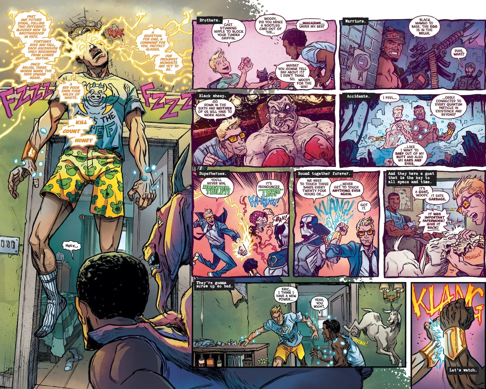
The writing of Quantum & Woody #1 is a great way to reintroduce readers to the characters (just look at our exclusive preview of the debut issue). Unlike Valiant cash cows like X-O Manowar or Bloodshot, Eric and Woody’s comedy focus offers an easy way in. They don’t have any grand ambitions or arcs, they’re just trying to get by, all the while trying to survive each other and their antics. Quantum & Woody has always been a Buddy Cop story with themes of family sticking together. This series is no different especially when this dynamic duo have to face the Kammerjäger family. Eric and Woody might not have the best chemistry like this hitman family, but they do get the job done. Especially when Quantum & Woody have a good art team behind them.

Art

Ryan Browne’s mixture of moods and camera angles assist in making Quantum & Woody #1 scenes immensely humorous. The close-ups work with exaggerated facial expressions to bring out the issue’s most hilarious scenes. But humor is just half of the art; the rest of the penciling and inking process go into keeping the reader focused. Because if the scene goes in too many directions, who will get the joke?

Most of Ruth Redmond’s coloring is somewhat muted, while the brighter coloring acts as beacons for major developments, from Woody’s fortune telling yellow sparks, to the green light of the Capitol Building entrance. Even the Kammerjäger family gets an introduction through a stove’s bright blue flame. It’s what makes the revelation about them as the issue’s villains all the more hilarious because readers are in on the joke. Finally there’s the lettering by Hassan Otsmane-Elhaou.

Lettering Highs and Low

The lettering’s main job of guiding the reader through the story is allowed to go out of direction during certain periods. This gives readers a choice on which directions to take. Because some people have a preference of following the images instead of text. Only for Hassan to subtly raise the emotional intensity. Perhaps the most obvious are the times when bold red words pop up to evoke excitement. From surprises to anger, the audience is hooked in.

Sure some people can get by with just the artwork, but this lettering style makes Quantum & Woody #1 even better.

What Are You Waiting For? Get Quantum & Woody #1!

What the headliner said! But before you do, got any thoughts? Leave them in the comments.

Monkeys Fighting Robots Youtube

Review: Willpower Versus Ultimate Control In GREEN LANTERN: BLACKSTARS #3

GREEN LANTERN: BLACKSTARS #3 main cover

GREEN LANTERN: BLACKSTARS #3, available in comic book stores on Wednesday, January 29th, concludes writer Grant Morrison’s three part miniseries, and it’s definitely one for the books. The newly created Blackstar order, made from the old universe’s Green Lanterns, is poised to assert absolute control over its beings. But Blackstar Parallax, a.k.a. Hal Jordan, dreams of a world long forgotten, one in where he’s a Green Lantern. Can he uncover the secrets of this alternate reality before free will as we know it is erased?

Story

Jon Kent, the son of Superman, a boy with pent-up angst and disappointment in his world’s “heroes,” has officially joined the Blackstars. Hal knows this puts his teammates in the sights of Superman, but believes reaching out to the boy was the only way to show him he was understood. Unfortunately, Superman sees this as an act of aggression and levels much of the Blackstar militia.

Morrison brilliantly portrays the tensions that inevitably arise between the new generation and the old guard, the restless and the unmovable. We witness Jon unleash the anger that’s been buried for a long time, while Superman attempts to reach out to him in understanding, albeit too late. Each group believes one couldn’t exist while the other was around. Unfortunately, they failed to realize that their fear of losing control over the other would ultimately lead to their destruction.

But all hope is not lost. Hal asks Belzebeth to give him more information about his dreams of another life, only to hear the faintest whisper in his ear—the voice of his old Green Lantern ring A.I. And, in a blaze of glory, the old Hal jumps into action. The former superhero ditches his Blackstar gear and encourages the Blackstars to cling to their own willpower, rejecting any Controller who would decide their destiny for them. But will rousing their forces be enough to topple Belzebeth?

Artwork

The artwork within this miniseries’s final issue captures the essence of the entire run: a blending of dystopian nightmares and hopeful new beginnings. Xermanico’s penciling and ink work, combined with Steve Oliff’s coloring, give readers a fully-realized look at the chaotic world that is this version of Earth. What’s more, the details of each character are incredibly in-depth. Readers can see their heroes in all their glory, right down to the threads of Superman’s cape. Coupled with the bright red flashes of light from the Blackstars, one will feel like they’re in the middle of the action.

Steve Wands’s lettering was well-placed throughout the book as well. It followed the action to help readers pace themselves through the fast-paced scenes.

Comic Book Covers

Main Cover

Liam Sharp’s artwork for the main cover depicts an epic clash between Hal and Belzebeth, pointing readers to the issue’s ultimate confrontation.

Variant Cover

Diego Rodriguez and Darick Robertson’s variant cover illustration features Hal and Belzebeth fighting the Justice League, showing readers the painful division that’s arisen.

Conclusion

GREEN LANTERN: BLACKSTARS #3 is a thrilling conclusion to the Blackstar saga. We’re excited to see where Morrison and team take the mythos next!

What do you think lies ahead for the Green Lantern Corps? Let us know in the comments below!

Monkeys Fighting Robots Youtube

Review: The New Ronin Wrecks The City In HAWKEYE: FREEFALL #2

HAWKEYE: FREEFALL #2 main cover artwork

HAWKEYE: FREEFALL #2 hits comic book stores on Wednesday, January 29th, continuing the sharp shooting Avenger’s solo adventure. Last issue introduced readers to a nefarious figure known as the Hood, who seems to have much of the city in his back pocket. In addition, a person running around dressed as Ronin is causing trouble, and many consider Clint to be the perpetrator. How will the hero handle these thorns in his side? The way he always does—a little luck, a little skill, and a devil-may-care attitude.

Story

Hawkeye’s been on a losing streak in terms of crime fighting. He was unable to apprehend the crime lord the Hood, and the mysterious figure committing felonies in his Ronin costume continues to evade him. In this issue, the anonymous vigilante runs through a number of cronies serving the Hood, slowly clearing them out for unknown purposes.

While “Ronin’s” going on a rampage, Clint uses some recently acquired funds to fund a gala for F.E.A.S.T., the charity run by May Parker. Writer Matthew Rosenberg purposely leaves his motives unknown, allowing readers to decide whether it be for egoistic glory or nobler purposes. This ambiguity allow us to put ourselves in Clint’s shoes.

We then learn Spider-Man has caught wind of the Ronin figure’s escapades and attempts to subdue him. But the figure proves to be too much of a trickster, outsmarting someone as capable as the arachnid hero.

Who is this masked figure? Is it just a coincidence he has similar skills to those of Clint? These answers and more are revealed in this action-packed issue.

Artwork

Otto Schmidt’s artwork for this series’s second issue is unique in its pleasing simplicity. The fluidity of the characters’ designs pairs well with varying purple shades, reminding us that this is undoubtedly a Hawkeye-focused story. What’s more, VC’s Joe Sabino’s lettering employs its own purple variations for Hawkeye’s internal dialogue and the Ronin figure’s speech, bringing greater cohesion between the illustrations and text.

Comic Covers

Main Cover

Kim Jacinto and Tamra Bonvillain’s artwork for the main cover depicts an aerial fight scene between Clint and the Ronin doppelganger. It’s a scene that prepares readers for the inevitable confrontation between these intriguing characters.

Variant Cover

Kyle Hotz and Dan Brown’s variant cover illustration chooses to present Clint and his other rival, the Hood. The sprawling red cloak from the villain covers up much of the city backdrop, perfectly representing the influence he has upon the people.

Conclusion

HAWKEYE: FREEFALL #2, on the one had, takes us further into the life of Clint as Hawkeye and his lackluster escapades. These moments help further humanize the “worst Avenger,” wooing his fans even more. On the other hand, the mystery of Ronin’s identity is intertwined throughout these events, keeping readers on the edge of their seats all the way through.

What did you think of the big Ronin reveal? Let us know in the comments below!

Monkeys Fighting Robots Youtube

Carol Choosing Her Own Resolution in CAPTAIN MARVEL: THE END #1

CAPTAIN MARVEL: THE END #1, out this Wednesday from Marvel Comics, is part of a larger series of events. Like the rest, this is the final tale of Carol Danvers. So get ready for an emotional roller coaster of a ride.

Carol is literally glowing on the cover for Captain Marvel: The End #1.

***SPOILER WARNING***

The End is the latest event in Marvel comics, featuring the final plot arc for several fan-favorite characters. And now it’s time for Captain Marvel’s final tale. Knowing Carol, and how the rest of these have gone so far, this is going to be one bittersweet tale.

Captain Marvel has always been one of those heroes to push herself harder than the rest. She’s always hoping to be better, to save more people. To be the hero that she wants to be and that the people deserve. With that sort of character, there’s little doubt that her ending is going to have as much impact as possible, with Carol going out doing what she does best.

Yeah, that sounds exactly like the Captain Marvel we know and love.

The Plot

If you’ve been a fan of the current Captain Marvel series, then odds are good that you’re going to enjoy Captain Marvel: The End. Kelly Thompson has once again stepped up to the plate, this time to write Carol’s final story.

In case it wasn’t painfully obvious, this is an emotionally powerful issue. Set in the year 2051, Carol is still fighting the good fight. But many things have changed for her – and much of it not for the better. Or more accurately, much has changed for the world, and that changed Carol.

Not the least of those changes is the physical one made to Captain Marvel. If you ever wondered what would happen to her and her powers as she got older, consider those questions officially answered. Though it may raise even more questions (because how could you not be curious for all of the details).

The jump to the future allowed for several clever moments, mainly showing Thompson’s view of what some characters have been up to, or what sort of legacy they’ve left behind. It’s fascinating, heartbreaking, and heartwarming all in one.

Finally, let’s talk about the elephant in the room. With a title such as “The End”, we kind of all know what is going to happen, even without the details. And in this case, it is very clearly telegraphed before the end (no pun intended). That’s a good thing in this case, because you’re going to need as much time as possible to emotionally prepare yourself for that blow. Even then it might not be enough. So get ready to cry. Just remember that Carol chose to go out this way, and if that isn’t the perfect ending for Carol Danvers, then we don’t know what is.

Take her advice screaming alien, you won’t regret it.

The Art

The artwork behind Captain Marvel: The End is truly striking. Carol simultaneously has changed so much, and so little, all in one. That the artists were able to portray this dichotomy is quite impressive.

The scenery and plethora of characters (some new, some cameos) is another impressive feat for this issue. So all credit to the artistic team for what they were able to bring together here. Carmen Carnero was the lead artist for this project, working alongside David Curiel for the colors, and VC’s Travis Lanham for lettering.

Together they’ve created something visually stunning to support this thrilling yet bittersweet tale. It’s the perfect combination.

Yeah, you shouldn’t have made her mad.

In Conclusion

Captain Marvel: The End may just be one of a series, but it truly did justice to Carol’s character. Her future may be slightly bleak in this version, but you’ve got to admit that there’s something really beautiful about the choice she made in the end.

Monkeys Fighting Robots Youtube

A Chaotic Beginning in FINGER GUNS #1

FINGER GUNS #1, out February 26th from Vault Comics, is a brilliant and chaotic start to a new series. And perhaps it is a strong reminder for all the reasons why teenagers should not suddenly wake up one day with powers.

What a psychedelic cover for Finger Guns #1

***SPOILER WARNING***

Finger Guns #1 is the start to an all-new series from Vault, written by Justin Richards, and drawn by artist Val Halvorson, with colors by Rebecca Nalty, and letters by Taylor Esposito.

This is a story about two teenagers and the sudden appearance of a very specific power: they can control other peoples’ emotions by pointing “finger guns” at them.

Their abilities may seem odd enough before taking into account the fact that they’re running parallel to one another. On the bright side, this is the opportunity they’ve been looking for. It’s time to change their lives and use this outlet for what it is.

The best part about the cover for Finger Guns #1 is that it’s a flip cover!

The Plot

A teenager wakes up one day to inexplicable yet incredibly useful powers. We’ve all seen that story a time or two. So it’s going to take some effort to surprise us. Yet that is exactly what Finger Guns #1 manages to do.

This is not your typical teenager getting powers story. There is no epic saga for them to go off on. There is no prophecy. No. This is just the story of two kids messing around with something that is way over their heads.

Justin Richards has introduced us to this world in a whirlwind of an issue. Wes and Sadie both have very different lives – yet it’s their powers that bring them together. While there were certain predictable elements (teenage boy gets powers and immediately uses it to mess with people) it was the fun sort of predictable, with lots of drama and fooling around.

The series starts off on a light and even slightly teasing tone, but it also proved that it isn’t afraid to get seriously dark when the time calls for it. That ability is going to take this series farther, and let it grow into something even bigger as time goes on. Just you watch.

And a casual beginning for Finger Guns #1.

The Art

Finger Guns #1 features a lot of really clever and fun artwork. Take that cover issue, for example. It’s a flip cover! That’s pretty cool, and not something you see every day. It’s also fairly symbolic in regards to our two main characters, for more than one reason.

The artwork is light and fun but full of bold colors and determined expressions. Our teenagers are full of angst – and it shows. Their emotions are raw and clear to see, as was intended. Meanwhile, the color palette is slightly off from reality, but that gives it this great twist to make the series stand out. And arguably it suits the plot itself very nicely.

Boy meets girl? Boy bumps into girl?

In Conclusion

Finger Guns #1 was a fun and chaotic introduction to this series. Wes and Sadie are not your ordinary protagonists, and it will be interesting to see how their story develops from here. This is not a series for fans to miss out on, thanks to the unique nature of it all.

Monkeys Fighting Robots Youtube

Review: DOCTOR TOMORROW #1 – A Well Illustrated Hero’s Beginning

Doctor Tomorrow #1 Cover

Doctor Tomorrow #1 is yet another attempt by Valiant to bring back older characters like The Visitor. This time around, Valiant begins to embrace a superhero staple of parallel universes. But is it enough to keep people’s interests? Let’s find out.

The original Doctor Tomorrow was created by Mark Waid and Brian Augustyn for Valiant’s Acclaim Comics universe. The character is a tribute to Golden Age superheroes and their pulp science fiction influences. Using technology from the future, Bart Simms helped fight Nazis as Doctor Tomorrow, a self-proclaimed time traveler. Unfortunately, after the war things weren’t going so great; people around Bart died and his daughter hated him. So he tries to prevent his superhero origin.

Much like the new Visitor series, the current story changes the structure for a modern audience.

Doctor Tomorrow #1 Writing

That's one way to make an entrance in Doctor Tomorrow #1

In the new series, rather than Bart getting his tech from 20 minutes into the future, he gets it from an alternate future, one where Doctor Tomorrow is a respected astrophysicist and superhero that’s on good terms with the other Valiant heroes. But even that couldn’t stop his archenemy Hadrian. As the villain’s name suggests, his collision with the heroes ends up annihilating their world. So what hope does a fifteen year old have even with his older self? Probably completing the Hero’s Journey.

Bart’s call to adventure is twofold. Like most teens, he’s trying to find what he wants to be. But with his dad busy, he’s struggling to find meaning. Most people can relate to this kind of character as Bart’s losing his motivations in life. By the time he and his friend Gretchen meet Doctor Tomorrow, things are looking up. This supernatural aid and mentor allow Bart to live his comic book fantasies. Even if it does mean the fate of the universe rests on a kid who can’t control his emotions. It’s not a bad set-up, but it’s something that’s happened so many times that Alejandro Arbona needs to add more unique factors to keep the series interesting moving forward.

Doctor Tomorrow #1 Art

Doctor Tomorrow designsJim Towe’s penciling and inking are of high quality with designs that evoke golden age flare. Bart’s costume after meeting Doctor Tomorrow probably has the most obvious homage with its trunks. More than that though, Towe’s art follows a sequence of movement, cinematic placement, and subtle expressive moments. All of these assist in making the story easy to follow and exciting enough to finish.

Diego Rodriguez’s coloring certainly brings up the excitement with just the right amount of blends and contrast. The blends help build the anticipation to the big flashy moments. Something as simple as the background of a pitch transitions to a baseball in front of the sun. Other times the blends help illustrate the states of mixed emotions like Bart’s talk with his dad.

Lettering

Clayton Cowles uses lettering as a way of exposition and foreshadowing. With proper placement, the lettering serves as a means of transitioning from the doomed timeline to the current timeline. Cowles also excels at guiding the reader through the issue with his balloon placement. As for the onomatopoeia, most of them are color coded and display the appropriate volume of their acts. The alarms going off near the end of the issue are the perfect indicator that this series could be something great.

Take a Chance With Doctor Tomorrow #1

So while the set-up to this story is very similar to what’s come before in books like Marvel’s Sentry, it has potential. At the very least, the artists working on this are good enough for the reader to pick up the series. Because with the energy and emotion going through some of the panels, it’s hard not to look away. The readers who stick around might be in for a good surprise.

Monkeys Fighting Robots Youtube

Review: The Plot Picks Up (A Bit) In WITCHFINDER: THE REIGN OF DARKNESS #3

The third issue of “Witchfinder: Reign of Darkness” brings us the best issue in this mini-series yet. Unfortunately, that isn’t saying much. While this issue reunites the reader with another fan favorite from the Hellboy universe, as well as introduces more supernatural revelations, it’s still not so good as to make the series wholly recommendable.

After consulting Panya about the Ripper case and Asquith’s suspicious connections with the Heliopic Brotherhood of Ra, the Witchfinder sneaks into the Brotherhood’s temple. But he’s completely unprepared for the informant he finds there! Meanwhile, a turn in Sarah Jewell’s undercover operation in Proserpine Home suddenly makes her search for the truth much more urgent.

Writing & Plot

“Reign of Darkness” #3 has the most engaging script thus far in the series. This is all due to the issue’s full embracing of the supernatural elements of the universe it inhabits, as well as the introduction of everyone’s favorite Victorian mummy, Panya. The sinister nature of the Whitechapel murders and their supernatural connection is teased through twist encounters and a steadily intensifying B-plot. This is all a welcome change, even if it’s over halfway through this thus-far inconsistent series. The dialogue has improved slightly as well, as most revelations are given in plot events and not walls of text. Grey still mostly explains things at his contemporaries here which still can make it a bit dull, but overall this is a more well-written issue than the previous two.

Art Direction

The unusual art choices made in “Reign of Darkness” are still here in the third issue, although much like the writing it seems to have slightly improved. The penciling remains just descript enough to identify the main human characters, and actually has the chance to shine with the reintroduction of Panya. The streets of Victorian London still look suitably foggy and gray thanks also to the colorwork. The strange “half-rendered” look still applies to the normal characters, but fortunately this is at least assisted in this issue by solid work on the supernatural characters and environments.

“Witchfinder: The Reign of Darkness” #3 is an improvement in terms of both writing and art over the prior two issues of this mini-series. The intensifying of the murder case alongside the firm introduction of the Hellboy universe‘s supernatural elements makes for a more engaging read, although it is still held back by some overwritten dialogue and strange artistic choices. Though this is a solid issue, it may not be enough the make this a part of the Hellboy universe really worth exploring.

Monkeys Fighting Robots Youtube