The worst superhero duo is back in Quantum & Woody #1, and it’s proof that you don’t need to read every piece of what came before. These dysfunctional step brothers have such a simple life; who needs to take them in a new direction?
Recap Just Because
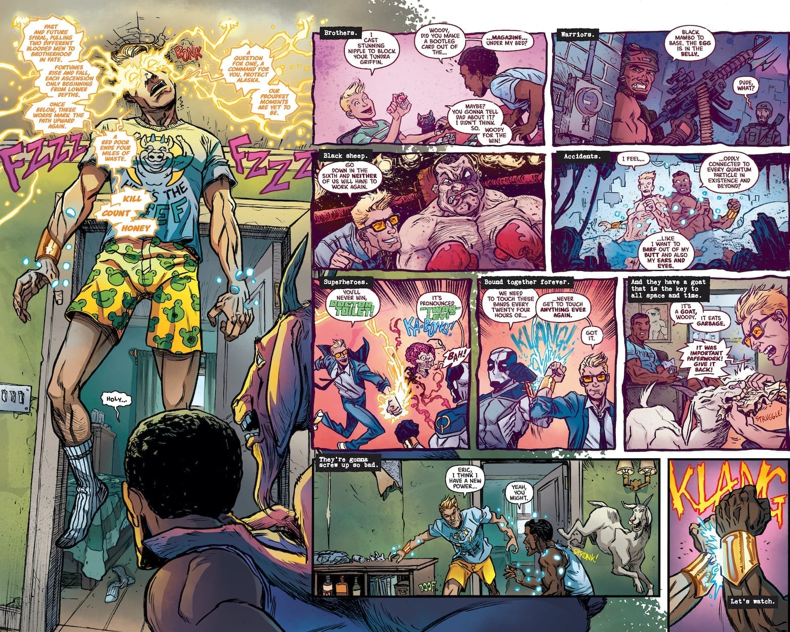
Quantum & Woody follow two step brothers Eric Henderson and Woody Van Chelton who got superpowers through an accident involving metal wristbands. Due to the unstable nature of their powers, if they don’t clang each other’s wristbands every 24 hours, they’ll dissolve/explode. The problem is, Woody and Eric are complete opposites who can barely stand each other. Even though they became superheroes for hire, Quantum & Woody often bicker and cause more mayhem than the mad scientists they clash with. Dubbed the worst superhero team, they’re often down on their luck trying to make ends meet. To top it all off, the voice of reason in this team is their father’s consciousness occupying the body of a superpowered female goat. Comics are weird and Quantum & Woody #1 revels in that.
Quantum & Woody #1 Story Premise
 The writing of Quantum & Woody #1 is a great way to reintroduce readers to the characters (just look at our exclusive preview of the debut issue). Unlike Valiant cash cows like X-O Manowar or Bloodshot, Eric and Woody’s comedy focus offers an easy way in. They don’t have any grand ambitions or arcs, they’re just trying to get by, all the while trying to survive each other and their antics. Quantum & Woody has always been a Buddy Cop story with themes of family sticking together. This series is no different especially when this dynamic duo have to face the Kammerjäger family. Eric and Woody might not have the best chemistry like this hitman family, but they do get the job done. Especially when Quantum & Woody have a good art team behind them.
Art
Ryan Browne’s mixture of moods and camera angles assist in making Quantum & Woody #1 scenes immensely humorous. The close-ups work with exaggerated facial expressions to bring out the issue’s most hilarious scenes. But humor is just half of the art; the rest of the penciling and inking process go into keeping the reader focused. Because if the scene goes in too many directions, who will get the joke?
 Most of Ruth Redmond’s coloring is somewhat muted, while the brighter coloring acts as beacons for major developments, from Woody’s fortune telling yellow sparks, to the green light of the Capitol Building entrance. Even the Kammerjäger family gets an introduction through a stove’s bright blue flame. It’s what makes the revelation about them as the issue’s villains all the more hilarious because readers are in on the joke. Finally there’s the lettering by Hassan Otsmane-Elhaou.
Lettering Highs and Low
The lettering’s main job of guiding the reader through the story is allowed to go out of direction during certain periods. This gives readers a choice on which directions to take. Because some people have a preference of following the images instead of text. Only for Hassan to subtly raise the emotional intensity. Perhaps the most obvious are the times when bold red words pop up to evoke excitement. From surprises to anger, the audience is hooked in.
Sure some people can get by with just the artwork, but this lettering style makes Quantum & Woody #1 even better.
What Are You Waiting For? Get Quantum & Woody #1!
What the headliner said! But before you do, got any thoughts? Leave them in the comments.

