Home Blog Page 358

Review: FAR SECTOR #3 Gives Voice to The Masses


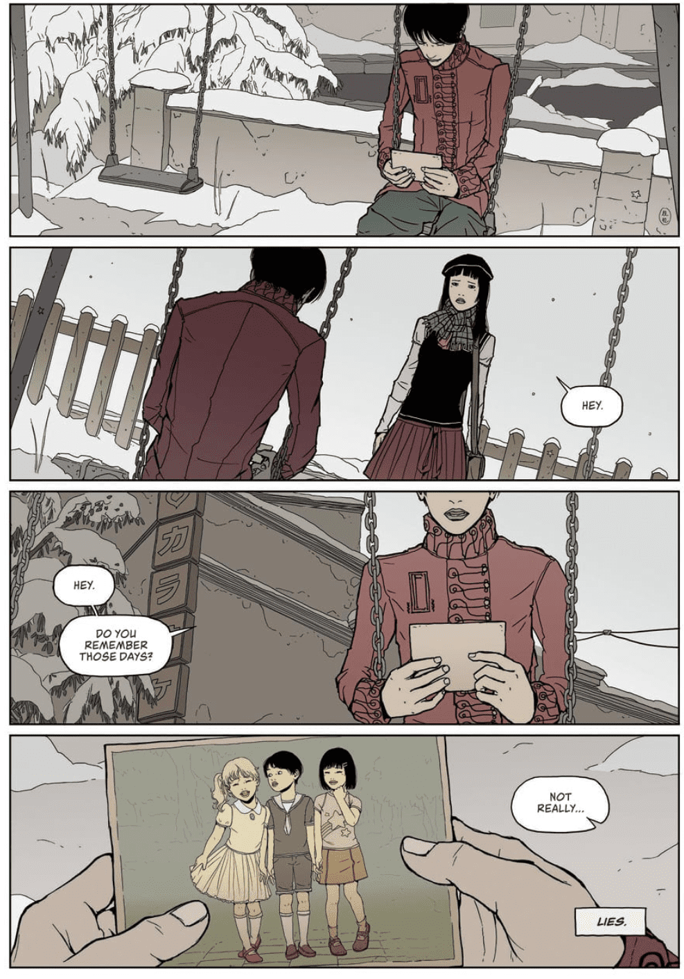
Writer N.K. Jemisin and artist Jamal Campbell bring forth their most emotionally provocative chapter thus far with the third issue of “Far Sector.” The socio-political impact of stripping the population of The City Enduring of emotion and relations between the rich and poor are delved into with considerable intensity – while also making searing parallels with our own reality’s history.

Protecting the City Enduring’s population of 20 billion aliens gets even harder when rookie Green Lantern Jo Mulein is thrust into the middle of a massive protest that’s about to get out of hand. What do the protesters want? The right to feel.

Writing & Plot

There’s an almost poetic and rhythmic sensation to the dialogue, narration, and plot progression of N.K. Jemisin‘s work on “Far Sector.” The way Green Lantern Jo Mullein interacts with those both suspect and ally comes across almost as a consistent dance of words. It rarely ever feels unnatural though, and even if it happens to it could be chalked up to all the supporting characters being aliens. Jo’s internal narration has smoothed out from the first issue‘s bombardment of exposition to a steady stream of internal observation and often internalized struggles. Sojouner is quickly turning into one of the most likable protagonists in current comics. The direction the story itself is heading has interestingly turned away from the murder mystery of the series’ debut and towards the factors that precipitated that event. This third issue displays a ruling class’ enforcement of a rule that drastically altered the lives of millions of others. The dissatisfaction of this reality is boiling to the surface. Jemisin takes this already intriguing in-story plot change and directs it towards our own reality. This is every bit a socio-political comic, and it’s pulled off damn well. From the grey areas of “how do we fix this?” to the ever-lasting struggle of populism vs the elite, “Far Sector” #3 is as fine a political challenge intertwined with great storytelling as any comic like it.

Art Direction

Jamal Campbell‘s art direction and panel layouts continue to be breathtakingly brilliant here in “Far Sector” #3. His stellar use of digital art in conjunction with a neon color palette thrives when put together with this kind of plot. It’s an aesthetic that I honestly wish I saw in more sci-fi comics. The environment is completely alien and yet also familiar and mesmerizing. The alien characters (who are humanoid) are elegant and relatable via Campbell’s own designs. The various cityscapes and different internal spaces are wondrous to behold. The panels and layouts themselves have an artistic eye to how they’re presented and how they guide the reader along. There’s always a focus on character among the fantastic visuals that still makes Campbell’s art feel intimate while still being so vast.

“Far Sector” #3 is yet another triumph of a chapter. Jemisin’s increasing focus on Jo Mullein as a character works in tandem with her increased focus on socio-political issues both in-universe and in our own world. Jamal Campbell’s art continues to be some of the absolute best in the industry today. Since the first two issues look to be getting second printing, this is a good time to put this cool as hell space opera on your pull list.

Monkeys Fighting Robots Youtube

Review: THE VISITOR #2 Frustrations in Mysteries

The Visitor #2 cover

The Visitor #2 is Valiant Entertainment’s latest attempt to bring back older titles to modern audiences. First conceived as a superhero mystery in the 90s, the title transforms into a spy series. This time around, the series revolves around a Japanese government-backed conspiracy. Like most conspiracy stories, they end up with more questions than answers.

Recap

Borrowing only structural similarities to the original Visitor series, The Visitor is a title that has been building up since the Book of Death. Upon finally revealing himself, the titular character presents himself as a saboteur targeting Japanese officials involved in an AI project. A project so secretive, officials are staking Japan’s future on it. But who is this electrokinetic Visitor, and what is his connection to this project? Especially since he’s not willing to harm even a rat. In The Visitor #2, readers only get breadcrumbs that lead nowhere.

The Visitor #2 Writing

The Visitor #2 chapter title
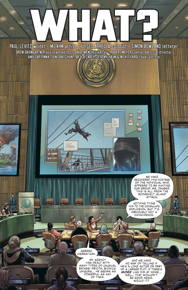
The title of this chapter perfectly encapsulates the stakes and setting “What?”. This mystery starts with UN Security Agent Talia Dauber asking for insights. Something that she doesn’t get due to the project’s classified nature. The only thing anyone gets is that it involves an AI program with no name. Accompanying this is a flashback by the Visitor about his past. Which again says nothing except where he’s from and that this secret project went wrong.

The characters barely make any progress; the most people get an attachment to are Dauber or the Visitor. Like the reader, Dauber’s frustrated by the red tape surrounding the Visitor’s motives. As for the Visitor, people only get a glimpse of his motives and where he fits into the Valiant Universe. He’s been advertised as being someone who brings great change. The series is meant to make the Visitor the hero, but it’s very hard to empathize with someone the reader can’t understand. His actions and the issue’s slow pace make him feel more like a moral yet threatening villain.

Smooth Artwork Against the Rough Writing

Probably the only good parts of this series
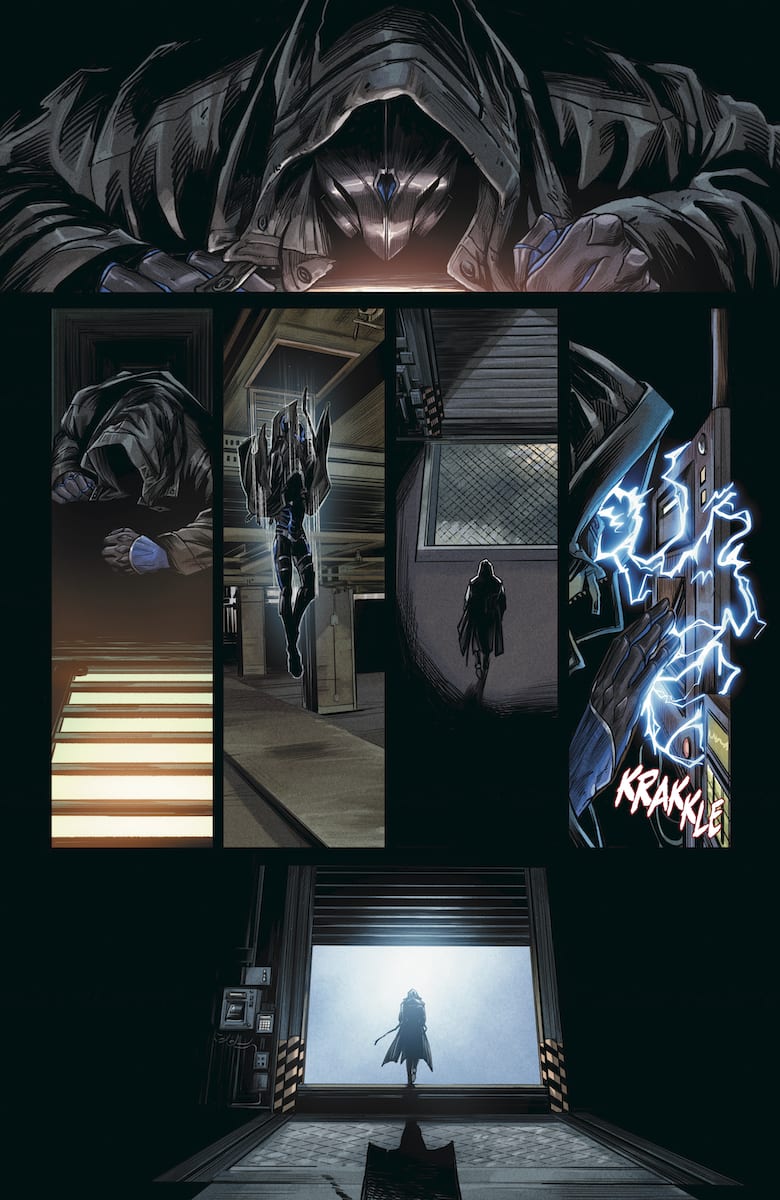
The artwork in The Visitor #2 is quite easily the series’ main selling point. MJ Kim’s penciling is quickly becoming a recognizable Valiant asset after Faith: Dreamside. Thanks to her diverse designs in character models, camera angles, and effects, the reader can more easily follow the story. All of which are accented by Ulises Arreola’s coloring. The Visitor, in particular, receives the best treatment. The bright blue color of his electrokinesis, in contrast to dark backgrounds, shows how he’s ready to reveal some big secret. What’s more, the Visitor’s flashback sequence shows how bright reds tell of danger, which comes up again near the end of the issue when it comes to the source of the Visitor’s powers. For that matter, the green circuitry in the gutters of the Visitor’s flashback displays science fiction-based origin.

Unfortunately for Simon Bowland, his lettering can get confusing unless the reader can properly trace the speech bubble and caption patterns. If that’s not enough, the sound effects he places can be very basic if not help emphasize a flaw. For example, the Visitor loudly breaks down a steel door with ease in front of a pedestrian. For someone who’s supposed to be incognito, the guy should probably exercise more caution.

Take Or Leave The Visitor #2

While The Visitor #2 is a decent place to start looking into the series, it might be best to wait it out for the trades. That way, the reader might feel more satisfied than deal with the slow pacing. It doesn’t mean you can’t try to enjoy yourself and figure out what happens behind the scenes. Mysteries are meant to be slow; you might even grow to appreciate The Visitor if you give it a chance.

Monkeys Fighting Robots Youtube

HEARTBEAT #3 – Eva Takes The Next Step Down A Spiraling Path

This Wednesday, Eva loses her innocence as she fully enters a dark world filled with secrets and actions that she cannot return from in Maria Llovet’s Heartbeat #3.

In Heartbeat #3 Eva stares back.
Interior art by Maria Llovet

*Trigger Warning* There is mention of wrist cutting as it happens in Heartbeat #3 and seems crucial to the story. So please let this serve as a warning before going in.

In case you haven’t read our reviews for the previous two issues here is Heartbeat #1, and issue two. But, if you’re caught up, pick up issue three at your local comic shop.

A SLOW AND STEADY HEARTBEAT

BOOM! Studios’ Heartbeat #3’s story continues to be told in a different manner than usual. We’ve mentioned that in the previous two reviews, yet in its third issue, it absolutely rings true. Whereas other comics have up to 20 dialogue bubbles on a double (sometimes single) page, Heartbeat #3 barely has that in its first ten pages. Instead, Maria Llovet doesn’t waste any bubble on words that needn’t be said. Anything spoken/thought furthers the plot instead of just filling space. This works in favor of Llovet’s story, giving it the chance to breathe.

At times Llovet will void the page of all dialogue/narration or keep it only to one bubble. In these scenes, she allows her art to tell the story. When Heartbeat #3 hits its crescendo, Llovet uses only a few words to help the scene hit harder. At this moment, it seems Eva has finally crossed her moral line with no sign (or way) of looking back. One thing I would take note of is the manner Donatien cuts their wrists.

During the final moments when Eva and Donatien embrace in sexual acts, Donatien slices Eva’s wrist down, but slices his side-to-side. This could mean nothing, but we know he has done this before. Meaning, he knows slicing down has a higher chance of killing then doing it to the side. This makes it seem that he does want to kill Eva. Or this could be him making a mistake. Nonetheless, this small detail seems as if it’ll play a huge part later.

Heartbeat #3 shows how lonely a swing set can be.
Interior art by Maria Llovet

A VISUAL TALE

Llovet’s art is gorgeous, with small details sticking out that seem to matter as much as the larger details. During some panels, she tends to focus on something that seems not to matter, yet it does. Some of the panels shown in Heartbeat #3 are visually striking, proving Llovet has a hell of an eye for visual composition. Although we aren’t talking about a film, Llovet’s framing for certain elements in the panels is cinematic beauty. Some could pass as stills taken from a film. Although each panel is alluring with her phenomenal art, that isn’t the only visual element she excels at.

As she’s brilliant with her pacing of Heartbeat #3 with the changing of panel sizes. This can be seen in the constant “heartbeat” of near-symmetrical rectangle panels, keeping the pages evenly paced. But, when tension builds, she places more rectangles on the pages showing an increase of speed. Other times she adds smaller square panels to show quick scenes that matter, yet shouldn’t take up space. The color palette of Heartbeat continues to mirror that of realism. During some scenes, the colors do shine bright, yet never enough to not seem real. The colors showcased throughout help sell the eerie setting without going over the vibe Llovet sets out for.

FEW, YET STRONG WORDS

Llovet’s moral breaking story was originally published in Spanish. Later on, it received translations in several different countries. BOOM! Studio’s English version is translated by Andrea Rosenberg. Nothing seems off in this translation, nor weird in word usage. AndWorld Design remains on lettering, which as with past issues, works quite well.

Interior art by Maria Llovet

MORAL DILEMMAS

Llovet’s slow-building tale has been phenomenal in all three issues. Yet, the story matter and the way Llovet tells the plot in Heartbeat makes it hard to recommend to others. I’ve said this of the other issues, yet it feels even more so in the third issue. This, due to some of the taboo factors Heartbeat #3 involves. Nevertheless, Llovet continues to show how amazing she is as a creator in every aspect.

Cover Story: Heartbeat #3’s cover is beautiful in its visuals, yet the message it brings is as great. Llovet shows Eva tangled in strings with various items caught up with her. Each of these items plays a part in the story being told. Whereas the entanglement shows how caught up Eva has become in Donatien’s world.

Memorable Quote “If you’ve sprinkled the gasoline, lit the match, and fed the flame, how can you be surprised by the explosion?” – Eva

I usually only go with a Cover Story or a Memorable Quote. Yet, this quote is amazing, and equally so is the cover.

Dear Reader

Have you been following Eva’s slow descend in Heartbeat? If so, let us know what you’ve thought so far.

Monkeys Fighting Robots Youtube

Schemes and Shenanigans Galore in FIREFLY #13

FIREFLY #13, out this Wednesday from Boom! Studios continues the surprising turn of events regarding Mal’s status. Fans can only assume that Mal is up to something, as that is a perpetual state for him.

All of the Serenity crew are keeping busy on this cover of Firefly #13.

***SPOILER WARNING***

Firefly #13 directly follows the events in Firefly: The Outlaw Ma Reynolds. So if you haven’t read that issue, you should probably make a point of it. In that issue, Mal was sent after his mother in what had to be the strangest turn of events in Firefly history.

While this may be a strange series of events, as least fans can be happy knowing that Joss Whedon’s world lives on here. All of our beloved characters are present, though sometimes one has to wonder how it’ll all lead to Serenity.

Mal is looking swanky on this alternate cover for Firefly #13.

The Plot

Firefly #13 is perhaps the most surprising issue in the series thus far. Given the events leading up to it, that probably makes a fair bit of sense. It’s simply hard to wrap our heads around the concept of Mal working on the right side of the law for a chance.

That makes us wonder what the catch is. Knowing Mal, this is some sort of long con. Because really, how could it possibly be anything but that? We’ve got to give Greg Pak credit for creating a plot that has left us both confused and curious.

One thing is certain, this is an issue full of chaos and drama. The outer worlds and moons have always been at risk of being taken advantage of. A fact that Mal is well aware of. It’s refreshing to see this fact get addressed so openly, and with so much change being made in response to their actions. That’s got to feel good.

While you probably don’t need to have read Firefly: The Outlaw Ma Reynolds to appreciate most of this issue, the ending will be easier to appreciate if you have. The implication is much stronger if you know what his mother is capable of.

Surprised by what this image implies? Be sure to check out the past few issues of Firefly to get a better understanding.

The Art

Firefly #13 features some heavily stylized and dramatic artwork. It fits the desolated feeling of the moons perfectly. And thus sets the tone for this issue. The colors are rich and vibrant, while also showing a strong understanding of shading. It gives the impression of the colors fading away, and if that isn’t an accurate description for the outer worlds, then we don’t know what is.

Lalit Kumar Sharma was the lead artist for this issue, working alongside Francesco Segala for the colors and Jim Campbell for letters. Together they brought us a fascinating example of how a series can be adapted to comics. All while still being free to make their own spin on things.

And so it begins, with somebody taking advantage of their powers in Firefly #13.

In Conclusion

Firefly #13 was not at all what we were expecting to come from this plot. But it has gone a long way in explaining what has happened. And even brought us around on a few parts of it. Only time will tell what the con and backlash will be. Because with this series, you know there’s going to be one.

Monkeys Fighting Robots Youtube

A New Twist on Family Drama In FAMILY TREE #3

FAMILY TREE #3, out this Wednesday from Image Comics is another dark addition to the series. Proving that there can be more than one interpretation to the concept of a family tree. The roots go deep in this family’s lore.

Cute or concerning? You decide.

***SPOILER WARNING***

Family Tree is a deliciously dark series, one that combines family drama with modern horror. It seems that one family cannot escape their fate, or their history, no matter how hard they try. In this instance, that means they’re dealing with a literal concept of the family tree.

This series is a joint project by Jeff Lemire, Phil Hester, Eric Gapstur, and Ryan Cody. Together they have created a truly chilling series, one with a rather unique blend of elements. So if you’ve been on the hunt for a new and different series, this one is well worth checking out.

Family Tree #3 dives headfirst into the family drama of the series. We all knew that the father was absent, and more recently learned the truth behind that whole story. But now we’re really getting to see the effect it had on the family – and the cost.

We wonder where Megan has gone?

The Plot

Jeff Lemire has written us a story worth thinking about. Family Tree #3 is chilling, but perhaps less so than the previous issues. Instead, the focus seems more focused on the family element. Okay, there are still heavy stakes floating in the air. But they felt almost secondary in this part of the story.

Seeing this side of the story was fascinating. It’s safe to say that this was not a twist that most fans would have predicted. That’s probably a good thing, and means that there will be more surprising twists and reveals for us in the future.

The storytelling style is where this issue shined. At a quick glance, it felt like we were bouncing back and forth between two dominant points. And in truth, we were. But there was a balance to be found here, as well as a purpose. This motion kept the story moving forward while holding the intrigue up in the air. It was all very nicely done.

Building the tension at the same time was another nice choice. Though one that will leave us anxious to get our hands on the next issue.

A house inside a tree? That sounds fitting for this series.

The Art

Like the rest of the series, Family Tree #3 is heavily stylized. The aesthetic of the series is made thanks to this style. It’s rough and jagged, while also giving off this organic feeling. It certainly makes the transition from human to tree much more believable.

The world depicted in this issue is interesting. Not the mundane world (that it perfectly mundane, as expected), but the secondary world hinted at. So far we’ve only had a few glimpses, but it’s enough to make readers hopeful for more information and sights in the issues to come.

We certainly don’t blame Megan for being a little bit scared and confused right now.

In Conclusion

Family Tree #3 was another thrilling read. While the tone may have changed, the feeling of intrigue has far from dissipated. It’s impossible not to be eager and curious to see what will happen to this conflicted family.

Monkeys Fighting Robots Youtube

The Epitome of Escapism in BATGIRL #43

BATGIRL #43, out this Wednesday from DC Comics, takes a surprising spin around the concept of escapism and varying realities. The minds battle creativity in this thrilling new plot arc, as Batgirl struggles to cope.

Batgirl is about to face a whole different foe in Batgirl #43.

***SPOILER WARNING***

It’s safe to say that Batgirl has been through a lot in recent issues. She had to take on the Oracle – something she never expected to have to do. Now she’s faced with a tough romantic decision, and yet even then she’s not really granted the time to think or cope.

But that’s the life of a superhero. There’s no downtime, especially not if you’re the sort to follow in Bruce Wayne’s footsteps. But no amount of training would have prepared Barbara for what she is about to face, for it is the very core of creativity.

A flashy and classy Batgirl on the alternate cover of Batgirl #43.

The Plot

Batgirl #43 begins a whole new plot arc for our wounded and weary heroine. It’s about as far as you can get from the Oracle plot, while still being a dramatic challenge for Barbara. This is a plot that ties directly back to events in the Titans, which may be quite a surprising twist for some.

Cecil Castellucci’s latest plot has quickly proven to be a creative one. It’s challenging both Batgirl and Barbara, but for completely different reasons. But that’s not the only thing that makes this plot noteworthy.

There’s something very refreshing about diving into a fantasy heavy plot after having finished one so focused on sci-fi elements. It’s a complete change of pace. Perhaps that will prove a good thing for Batgirl in the long run. It’s certainly good for her readers!

Barbara’s obsession with what is arguably a horribly written novel series (she says so herself) is extremely endearing. We’ve all done it, especially when trying to find an escape from the real world. It’s a nice touch to this story and one that ties in very nicely with the big picture.

An attack in Gotham Central Park! What a surprise, right?

The Art

Batgirl #43 was full of vibrant fantasy scenes clashing with cityscapes. It made for a visually appealing read, for more than one reason. On the one hand, we have all of the normal flash and style that goes with Batgirl. On the other hand, a fantasy world ripped right from the pages of an epic fantasy saga. It’s a charming mixture.

Cian Tormey was the lead artist for this issue, and they were responsible for a lot of the creative elements here. They designed and drew the fantasy world, as well as portrayed a Barbara too absorbed in her reading.

Meanwhile, Chris Sotomayor was the colorist, and they made this issue shine. While there’s a little bit of every color, the purple hues really added a strong sense of fantasy. The fact that they opted to have this hue indicates this infusion was effective, leaning on classic comic themes to tell a story.

Finally, Andworld Design was responsible for the lettering, and they did an excellent job here. Barbara spent a lot of this issue thinking and debating with herself, yet the words are perfectly balanced on the pages.

There’s definitely something strange going on here…

In Conclusion

Batgirl #43 was a diverting read, which is a bit ironic, given how distracted Barbara herself became. There were some fun parallels drawn, making this a fantastic start to a whole new plot arc. It’ll be interesting to see how far this plot is pushed, and what the cost will be.

Monkeys Fighting Robots Youtube

The Lore of the Janes In LUMBERJANES #70

LUMBERJANES #70, out this Wednesday from Boom! Studios provides a glimpse into the past and the origin of the Lumberjanes themselves. It’s an enchanting tale, through and through. And is perfect for fans of the series.

What a sweet photo on the cover of Lumberjanes #70!

***SPOILER WARNING***

The Lumberjanes are at it again. It seems like even the most normal of circumstances result in some sort of discovery for these campers. But that is simply the Lumberjane way. A fact that we now seem to know, as we dive into the origin of the camp itself.

One comment in Lumberjanes #70 did get us thinking. April mentioned that summer was almost over…which leaves us wondering. What will happen to the series when the summer finishes? Will that be the end? Or will there be another jump in time? Here’s hoping the series isn’t due for a conclusion anytime soon.

The alternate cover for Lumberjanes #70 is perhaps one of the most striking thus far.

The Plot

Shannon Watters and Kat Leyh have teamed up to write this whimsical introduction to the past in Lumberjanes #70. It’s a delightful issue with lots of parallels being drawn. Oh, and maybe a few shockingly dangerous invasive plants.

This series has always had so much charm to it, and it feels like that sentiment grows with each and every issue. Learning more about Jane – the original Lumberjane has only helped to enhance that feeling. Though it’s not something many fans had thought to ask about until this point.

As per usual, a normal outing has turned towards something supernatural. The invasive plants that Rosie was teaching our campers about are something…more. That’s almost an expected twist at this point. But it is a fun one! And it allows for some much needed action and drama along the way.

The conclusion of this issue hints at an adventure of epic proportions. Not only will our usual Roanoke cabin be involved, but Rosie and Abigail as well. That’s a good enough reason to already be looking forward to Lumberjanes #71.

Rosie is probably not prepared for the round of 20 questions she’s about to receive.

The Art

Lumberjanes #70 is full of fun and endearing artwork. In short, it’s so perfectly Lumberjanes that it’s painful. The addition of Rosie and Abigail is a nice tough, as these two add some variety (mostly in height) to the mix.

Kanesha C. Bryant and Julia Madrigal were the lead artists for this issue, working alongside Maarta Laiho for colors, and Aubrey Aiese for lettering. This plot was fun and interesting, but the artwork is what really brought it all to life.

The character expressions are probably the biggest highlight of this issue. Their emotions ranged from curiosity to concern, then to jubilation and back again. The colors would have to be the second-best part of this issue, as they’re just so rich and fun for the eyes.

Behold! The very first Jane (of the Lumberjanes, that is).

In Conclusion

Lumberjanes #70 was a fascinating issue, one that balanced the present and the past in perfect proportions. It’s so refreshing to finally learn about the origin of the camp, even if that is something we never took into question previously.

Monkeys Fighting Robots Youtube

A Dramatic Conclusion In ONCE & FUTURE #6

ONCE & FUTURE #6, out this Wednesday from Boom! Studios concludes this dramatic retelling and twisted tale of King Arthur. This is a tale perfect for those who always felt that the story should be just a bit more sinister.

A dramatic cover for the conclusion of a dark and chilling series.

***SPOILER WARNING***

It’s hard to believe that the conclusion to Once & Future is already here. Then again, they told us from the start that this would only be six issues long. But man were those six issues pleasantly dark and worth reading!

There’s no doubt that it was the creative team behind this project that made it what it was. Kieron Gillen (writer), Dan Mora (artist), Tamra Bonvillain (colorist), and Ed Dukeshire (letterer) are an absolute dream team, and we can only hope to see more from this team in the future.

The sass and family dysfunction is strong on this page.

The Plot

Once & Future #6 was a conclusion that more series should aspire to. It delivered on all of the promises made while leaving enough room for a return – should the creative team feel so inclined. It was dramatic and foreboding, while also letting loose all that building tension.

Kieron Gillen’s writing was intense and at times broody, but it was the perfect note for this conclusion. Duncan’s story is far from over – but we were left at a point where we’re okay with leaving his journey unknown.

The major plot twist over the course of this issue was quite clever. We won’t go into detail, as it’s one of those moments better seen firsthand. But it was the perfect solution for how to put the legend back to sleep, so to speak.

Perhaps the most surprising part of this issue was just how much raw emotion was infused into the pages. You could really see Duncan overcoming it all, while his grandmother’s pain and mother’s uncertainty were clear as day. Their emotions felt real – they read as real. That made them feel more human, in the end.

Looking back on it, this wrap up made complete sense. It wasn’t predictable – and yet it very much felt like the conclusion we’ve been building to this whole time. It did justice to the previous issues of the series. And it lived up to the expectations of the fans.

What a beautiful scene for what is sure to be a dangerous task ahead.

The Art

Unsurprisingly, the artwork behind Once & Future #6 was as stunning as the plot was dark. This was a series unafraid of diving into rich details, or lush settings in order to tell its haunting tale. It worked quite effectively.

There were two worlds portrayed in this issue. The mundane, and the otherworldly. The two merged together in such striking ways. The details and colors were vibrant and eye-catching, all while portraying a legend better left alone. There’s something so very evocative about that combination.

There are many highlights that could be listed for this issue. But the truth of the matter is that everything here works best as one cohesive unit. Yes, the scenery is stunning, the monsters terrifying, and Duncan’s emotions distinct. But together? That’s where the magic happens.

Enter the Galahad and his oh so disturbed mother.

In Conclusion

Once & Future #6 was the conclusion that the fans deserved. It perfectly wrapped up Duncan’s quest, while leaving the door open for more. There’s a fine balance to be found there, but while there is hope to be found, there is no desperation in sight.

This darker retelling of King Arthur was fascinating. It’s refreshing to see a legend take such a morbid twist, especially considering how many retellings have been popping up all over the place this year. This one will continue to stand out among the rest.

Monkeys Fighting Robots Youtube

It’s Time For Some Honesty In WASTED SPACE #13

WASTED SPACE #13, out this Wednesday from Vault Comics, split up the conflicted team in order to force some soul searching from specific members. This is literally an emotional issue, full of debate and turmoil.

Things are not looking good for Billy on this cover of Wasted Space #13.

***SPOILER WARNING***

Wasted Space has been a quirky and shocking series right from the get go. So at a certain point, fans have just started to expect strange and exciting twists and turns. So it is impressive that they still manage to surprise readers each and every time.

This series is a space odyssey that is as inane as it is entertaining. It’s a series perfect for those searching for something completely different and out of this world – literally. It’s brutal and irreverent and absolutely refuses to pull punches. But all of that makes it so worth the read.

There is honesty, and then there’s brutal emotional honesty. The latter becomes a relevant factor in Wasted Space #13, as our characters are pushed to their limits once again. But this time this around, there’s not a quick and easy solution.

One of the more vibrant credit pages out there; we’re digging the colors.

The Plot

Wasted Space #13 is an emotional hammer of a read. It’s powerful and rips the characters apart, forcing them to face anything and everything they’ve been hiding from. That’s what makes it so shocking – and interesting.

The characters in this series are far from perfect. That’s a fact that Michael Moreci has made clear time and time again. If they had been, the revelations in this issue wouldn’t have been so compelling. So what Billy goes through here – and what Billy learns – is so full of impact. It’s enough to make one stop and think.

This issue was a fast-paced one, thanks in part to the fact that the group has been split into two. While Billy is off being tortured by emotion sucking vampires (perhaps literally), everyone else is off fighting a science fiction battle worth writing about. It makes for a nice balance – the intense and the entertaining. The emotionally brutal with the action.

There’s one running joke throughout this issue (series, actually) that was so hilarious. It really helped to even out all of the tension, giving us a much needed breather here and there. Plus, it was just plain funny. And it got funnier each time it came up.

A temple that demands people to work towards being happy…yeah this is going to go great for Billy.

The Art

The artwork inside Wasted Space #13 is vibrant and full to the brim of interesting events and moments to look at. Naturally, the battle scenes, in particular, are especially busy – and entertaining. But that isn’t to say that Billy’s scenes aren’t visually striking. In fact, the portrayal of his reactions is a highlight of this issue, and with good reason.

Hayden Sherman was the lead artist for this issue, working alongside Jason Wordie for the colors, and Jim Campbell for letters. They did a brilliant job, and it’s nice to think that they had a lot of fun illustrating some of these scenes. Because they sure were fun to read and look at.

Woah, Billy. Was not expecting that from you!

In Conclusion

Wasted Space #13 was another satisfying read in this dramatic yet slightly insane space adventure. Nothing ever goes the way we expect, and that makes the series such an exciting read. The conclusion of this issue is enough to leave readers looking forward to seeing what will happen next.

Monkeys Fighting Robots Youtube

Review: The Horrors Of President And Country Revealed In THE MASK: I PLEDGE ALLEGIANCE TO THE MASK #4

main cover artwork

The final presidential vote is tallied in THE MASK: I PLEDGE ALLEGIANCE TO THE MASK #4, available in comic book stores on Wednesday, January 22nd. Abner Mead, the slimy politician who bonded with Big Head three issues ago, is the newly elected President of the United States of America. But who’s in control: Big Head, or Mead? Either way, the people must live with a leader hell-bent on upending the very foundations of our society.

Story

The news of Big Head/Mead’s inauguration is making its rounds across the country. Vast swaths of people are either elated or horrified—those in the middle are few and far between. But unbeknownst to any group is the internal monologue occurring between the two “Presidents.” It’s here we learn that Big Head is looking to become even more radical during his administration, and Mead may not be the right man for his job.

Pushing Mead to the wayside, Big Head attends to his inaugural duties with the pomp and frills of King George from Hamilton. The people see what kind of person they’ve elected, and if they had any doubts, his first speech makes his intentions quite clear.

Christopher Cantwell’s writing echoes an all-too familiar sense of dread many feel in the political climate of the past few years. It’s an anxiety that’s never quite abated, despite attempts to rationalize what direction our country has moved in. In a hauntingly beautiful move, Cantwell casts these fears onto the insane Big Head.

But there is a resistance forming in response to the despot. Previous wearers of the Mask, including Mayor Kathy Matthews and Detective Mitch Kellaway, are experiencing some weird visions about The Mask. They know his days are numbered and will do anything to bring an end to his reign.

Artwork

Patric Reynolds’s artwork for this issue completes the masterpiece that is this issue. Combined with the coloring talents of Lee Loughridge, this book magically blends the realistic depictions of Inauguration Day in Washington D.C. with the cartoony Big Head. The style reflects the surprising circumstances that all too often infect our political landscape.

What drives home the issue’s message, however, is Nate Piekos’s lettering. In the midst of the traditional ceremony, readers are treated to Big Head’s off-kilter speech, represented by the slanted fonts. We know this being is a disruption in the system, but not to what extent.

Comic Book Covers

Main Cover

Reynolds’s main cover gives readers a clear message: the world is full of The Mask. Each person represented is fully embodied version of the anti-hero.

Variant Cover

Duncan Fegredo’s variant cover artwork gives readers a close look at Big Head in classic, thieving form.

Conclusion

THE MASK: I PLEDGE ALLEGIANCE TO THE MASK #4 wraps up this story beautifully. There’s just enough closure, but leaves enough mystery to wonder where the iconic characters will end up.

Do you think there’s a potential for a spin-off from this series? Let us know in the comments below!

Monkeys Fighting Robots Youtube