An ancient elite class of men, the chosen few, only the best of the best had the honor to be called a Samurai in medieval Japan. They made up the ruling class of the military and later rose to be the highest class in the Japanese hierarchy. These Samurai warriors were equipped with a range of weapons such as spears and guns, bows and arrows, but their main weapon and symbol was the sword. There are five main streams of the samurai sword, namely Katana, Wakizashi, Tanto, Nodachi and Tachi swords.
Katana
The most iconic and well known of all the Samurai swords; the katana is distinguished by its long blade and handle that is made to accommodate two hands and strike from a large distance. It has a curved, slender, single-edged blade with a circular or squared guard. The katana has a set of dimensions that separate it from other samurai swords. A traditional katana will measure 3 to 4 feet in total length, with the hilt taking up one-fourth of the total and a characteristic curvature of more or less than 1 inch.
Wakizashi
The Wakizashi is similar to the katana but shorter in length. The average Wakizashi is about 50 cm long and was usually worn together with the katana by the Samurai of feudal Japan. When worn together the pair of swords was called daishō, which translates to “large and small”. This sword acted like a side weapon and was worn by the Samurai at all times.
Tanto
The Tanto, although not technically qualifying in the category of swords, is the traditional Japanese dagger. It can have a single or double edge. It acts like a Wakizashi and is worn at all times. The main purpose of a Tanto is to be used as a stabbing instrument but having a pretty sharp edge, it can be used to slice and cut. The Tanto has become more ornate over the years and towards the end of the Samurai era, they were mostly used as decorative pieces, and still are mostly used in decorations to this date.
Nodachi
Nodachi approximately translates to “field sword” or “great sword”. They are larger and longer than a typical katana. They were typically used as weapons for foot soldiers and were effective against cavalry and open field encounters. They are not very effective in close range or constricted space.
Tachi
The sword is the predecessor to the Katana; the Tachi is a Japanese sword that is more curved and longer than a katana. Having an average length of 75 cm. It was primarily made for Samurais on horseback where they needed more length and curvature to effectively charge on foot soldiers.
While all of these are types of the bladed weapons used by the noble Japanese warriors, each and every one has its unique characteristics and uses. It would be unfair to ignore all the different types of swords, just to popularize one over the others. A wider approach is needed to recognize the skill and genius of the Japanese Samurai and craftsman.
Written by internet personalities Jason Inman and Ashley Victoria Robinson, with artwork by Ben Matsuya, colors by Mara Jayne Carpenter (volume one), and letters by Taylor Esposito, Jupiter Jet is the story of Jacqueline “Jacky” Johnson, a sixteen-year-old girl who rides the sky on an experimental jet pack that she discovered in her dead father’s workshop and does what any other teenage girl would do – steal from the rich and give to the poor while keeping her neighborhood safe!
Now, the creative team (with new colorist Elizabeth Kramer!) is back with a second Jupiter Jet adventure, taking the character and story to new heights in a mold that hearkens back to the golden age of comic books.
Story
Jupiter Jet and The Forgotten Radiotells the story of a girl confronting what it is to be a young woman while saving her planet from a dangerous interplanetary threat.
Jupiter Jetis clearly written by people with a great love for comic books. The duo of Jason Inman and Ashley Victoria Robinson manage to craft a wholly enjoyable superhero adventure, while tugging on just the right amount of nostalgia strings. It’s a truly fun throwback to pulp science fiction heroes like The Rocketeer and Buck Rogers.
There’s a lot of love put into the character development. The first adventure follows Jacky as a relative newcomer to the whole heroics thing. She’s still learning how to use her jet pack, and is even a little clumsy. The first part of the second volume picks up after the exciting twist of a conclusion where Jupiter Jet Volume One left off. The writing feels much more mature than in the previous story, which seems to be intentional, as the titular hero has grown as well since we last saw her. But that’s not to say this book isn’t filled with fun, adventure, and even more surprises, because it most definitely is.
Art
Ben Matsuya has also shown considerable growth in his artwork from Jupiter Jet Volume 1 to Volume 2. The first volume is packed with character expressions akin to a Disney animation. In Jupiter Jet and the Forgotten Radio, the style is more modern and conservative.
Meanwhile, the first volume features vibrant colors by Mara Jayne Carpenter, while the sequel’s colors by Elizabeth Kramer are noticeably muted. This shift in style is an intriguing choice, as if Matsuya and Kramer are taking the readers on a journey through the various eras of the comic book medium.
The lettering by Taylor Esposito is everything you’d expect in a classic sci-fi comic book. Specific words are in bold, or in a larger size, making it all too easy to get a sense of the characters’ inflections in their dialogue.
Conclusion
Jupiter Jet is an absolute fun ride, with endearing characters, and a story that is filled with humor, heroism, adventure, and exciting twists.
Catch up with the adventure of Jupiter Jet by purchasing the first volume on Amazon or comiXology. Then, you can get a copy of Jupiter Jet and the Forgotten Radio by supporting the Kickstarter campaign.
Twist and turns are one thing but I See You offers so many that you may lose count while watching. This isn’t a case where the twists are wildly illogical, but plenty of them leave things open for discussion once the credits roll. Even the marketing for the film is a twist because I See You is by no means a horror film, but rather a high tensed thriller revolving around a divided family. So many things in the trailer are misleading and it just makes the film that much more shocking as you watch everything unfold.
Directed by Adam Randall, I See You stars Jon Tenney, Libe Barer, Owen Teague, Judah Lewis, and Helen Hunt. After a series of strange disappearances in a small town, a detective on the case and his family find themselves at the center of it all. That brief summary of my own is all I want to disclose because saying more might give some big elements away. The film was written by Devon Graye and he gets a little carried away with the narrative contortions but I See You is still very impressive.
Helen Hunt as Jackie Harper in I SEE YOU
The performances in this film are great from everyone involved, Tenney and Teague are the two standouts. In order to avoid giving away too much, we will not go into detail on what exactly made them shine from the rest, but these two deliver in several ways. Hunt does her best in her role, but her character becomes irrelevant in the grand scheme of things once the narrative is flipped. The acting alone will keep viewers glued to the screen, and throughout all the many twists and turns the characters keep you interested.
As mentioned above, the writing relies heavily on twist after twist once the intensity picks up towards the end of the film. I See You centers on the Harper’s, a family slowly being torn apart by the recent infidelity of Jackie Harper (Hunt). Greg (Tenney), her husband, is a detective working on the case of missing people and the case makes its way into his home own home. Take from that what you will but this is a film that is more effective the less you know going in. Character development isn’t really here for everyone, but I’d say the characters that matter the most are explored enough throughout. The script is a mix of cliches, twists, and more twists that you can’t see coming. There’s a point in the film where it shifts and rewinds the entire story to fill in a new perspective that gets introduced. That narrative switch can drag a bit, but it makes the final act much more fulfilling.
John Tenney as Greg Harper in I SEE YOU
Randall’s directs the film very well, the interior panning of the house creates a chilling sense that the Harper’s aren’t alone right from the beginning. This is only his second outing after directing iBoy for Netflix. Randall’s camerawork here makes the demise of a privileged family with secrets very satisfying. The cinematography by Philipp Blaubach is an amazing compliment to Randall’s direction and it is very rich. Randall creates a sense of foul play early on and meticulously builds the tension up to an ending that you definitely won’t see coming. Adding to that, I See You has a memorable score that amplifies the film with each new revelation. It complements the film very well and honestly, makes certain scenes more dramatic than they should have been.
While this is a solid thriller overall, I See You loses a little steam when you realize that amongst all these twists are several plot holes that just can’t be ignored. Many will also argue that the film feels like it cheats a bit with the way it plays out. In other words, I See You has a lot working for it because of the way it is edited. A lot of the film is told out of order, so that explains why it is impossible to guess what will happen. Despite that and some near awful dialogue, the performances, story progression, score, direction, and tense atmosphere make I See You worth checking out.
The death of Alfred Pennyworth is an event likely to haunt the comics landscape for years to come. For instance, Detective Comics Annual #3, out this week from DC Comics, offers another story centered on the loss of Bruce Wayne’s beloved father figure. This time, though, the focus is less on Bruce’s reaction to Alfred’s death. Instead, the issue centers on the events of Alfred’s life prior the Batman’s birth.
Bruce’s evening takes an unexpected twist when he finds a woman named Marigold Sinclair resting in his chair. Explaining that she was Alfred’s former partner in British Intelligence, Sinclair asks Bruce to help her settle an old score against another former ally who defected to the Soviets.
The Writing
Detective Comics Annual #3 offers two Batman stories. The book’s first tale, Who Dares, Wins, begins with a flashback delving into Alfred’s past as a spy for MI-6. From there, the book jumps to the present. We see Bruce recruited to complete an old mission—a score Alfred never settled—for which Bruce can finally provide resolution and, in the process, perhaps find closure over his own loss.
Who Dares, Wins isn’t a bad read, but it generally feels like the weaker of the two stories. First, I’m not entirely convinced by Marigold’s motivation; why, after all this time, track down a Soviet double-agent, decades after the Cold War’s end? It’s understood that this was a specifically sensitive case for Alfred. However, writer Peter J. Tomasi doesn’t fully connect the dots as to why tracking down this spy is the best means of honoring the man. As a result, the emotional crux simply doesn’t resonate.
The main story in Detective Comics Annual #3 feels flat overall. Batman’s foe doesn’t really provide much of a challenge, and while Tomasi goes for a bit of poignancy at the end, it doesn’t really land because we aren’t very invested in Sinclair’s mission. There’s not much dynamism to the story that can capture the reader’s interest.
The second story, The Week, is a quieter and more pensive narrative. It’s told through the frame of a letter from Alfred to Marigold sent at the beginning of Bruce’s career as Batman. Although it’s a brief vignette, it ultimately feels like the stronger of the two stories in Detective Comics Annual #3.
We see the emotional toll that Bruce’s decision to become Batman takes on Alfred. The story also underscores just how vital to Batman’s operations Alfred is, and always has been. By the story’s end, the reader feels Alfred’s absence in a way that Who Dares, Wins didn’t fully convey.
The Artwork
Sumit Kumar provides artwork for Who Dares, Wins. Kumar’s visuals provide a sense of elegance to the work with well-detailed designs and backgrounds fleshing out the world seen in Detective Comics Annual #3.
Kumar’s illustrations accentuate the dynamics of the story, lending it more weight and tension. There’s a cinematic feel to the compositions, with lots of interesting approaches to framing the action. It’s actiony, yet poised and refined, as a good spy thriller should be.
The colors by Romulo Fajardo Jr. complement Kumar’s work well. The artist embraces a diverse range of colors; the tones themselves are varied, but key themes provide cohesion to the book.
Eduardo Risso supplies both inks and colors for The Week, and goes in a completely different direction. Risso embraces a rougher, more stylized, aesthetic; there are points at which it almost resembles traced or rotoscoped animation. It’s an interesting approach, and one that may not appeal to all readers. I, however, find the style rather intriguing and pleasing to the eye.
Risso bathes his pages of Detective Comics Annual #3 in unnatural, almost psychedelic hues. Each page is dominated by a different color: lime, cool greenish-blue, pinkish-purples, etc. Again, while maybe not for every reader, the style works alongside Risso’s illustrations.
Final Thoughts
Detective Comics Annual #3 doesn’t quite stick the landing as a tribute to the late Mr. Pennyworth. It’s not a bad read, though, and could be worth picking up if the premise strikes your fancy.
Writer Stephanie Phillips returns with artist Dean Kotz in the third issue of historical-thriller “The Butcher of Paris.” This issue features more of the tight pacing and succinct dialogue in both the investigative and political discussions, while also ending on an intense cliffhanger that makes the wait for issue four murder in its own right.
Pieces of Dr. Marcel Petiot’s past are slowly exposed-revealing harrowing events and actions that peer into the mind of a madman. As the detectives begin an intense interrogation with the killer’s wife, the Nazi occupation progresses-and the fate of Paris is determined.
Writing & Plot
Stephanie Phillips’ scripts on “Butcher of Paris” are a consistent blend of crime procedural, political discussion and thriller. This trend continues here in stellar fashion. There’s a neat transition from an intriguing flashback to an interrogation sequence, and from there to a ballroom discussion of the Nazi’s waning power against the allies. It’s wildly impressive how no plot point ever seems out of place. The story’s direction remains clear and suspenseful, with the threat of Nazi occupation playing partial focus to the serial killer plot. Much of this tight plotting is due to Phillips’ ear for great dialogue. It manages to be both intelligent and naturalistic, even when wide swaths of words are being thrown around. This is a necessity in a story like this dealing with a cast of detectives and military officers, and also because there is no overhead narration. Every bit of storytelling is done through the art and the discussions between characters. What’s more, this issue ends with a brilliant (if not completely original) final scene that will drive tons of momentum into the next issue.
Art Direction
Speaking of art, Dean Kotz returns to lend his signature vision to “The Butcher of Paris,” and its a signature that just seems perfect for this kind of story. Again, there’s a sort of European graphic novel approach to his pencils that grounds it in reality while also elevating it artistically. Human characters are distinctly designed for familiarity. Facial expressions are carefully drawn, especially in the more subtle moments where every detail counts. The environment of 1940’s Paris is a mixture of realistically beautiful and appropriately haunting in the darker moments. The colors by Jason Wordie add unique hues to the atmosphere of the so-called “City of Lights.” There’s a sort of oxidization and rust aesthetic brought to the panels that somehow works with the tone of the story. Once again, this is a fantastic looking book with a completely appropriate style.
“The Butcher of Paris” #3 is yet another intelligent and entertaining chapter in this comic mini-series. Stephanie Phillips’ script is yet again full of intrigue both political and procedural. Dean Kotz and Jason Wordie’s artistic vision brings the city of Paris to a menacing life in this historical thriller. This is without a doubt one of the most engaging comic series currently running, and a must-read for any fans of this blend of genres.
Written by Tom Taylor, with art by Bruno Redondo, colors by Adriano Lucas, and letters by Wes Abbott, Suicide Squad #2 takes confusing turns in the best way. This creative team brings the Squad back to its espionage roots by giving us half a story. Proving they can do fun with the best of them, the creative team goes dark and treacherous now. Somehow, it’s still a blast.
Writing
Taylor knows how to tell a story. Holding his cards close to the chest, readers get the impression that this story of backdoor dealings is happening between the panels. In the gutters and in between pages, whispers and nods are exchanged. We only see what they want us to see. But the Suicide Squad, after all, is meant to be an undercover government group, so Taylor’s approach is magnificently fitting. It allows the reader to feel like they are a part of the story, piecing together what’s really going on.
Art
Redondo’s art plays a huge role in initiating this shift in tone. Early in the issue, someone’s head blows up in the team’s face. While this might seem like a dark turn, there was plenty of blood and gore in the previous issue. Exploding bodies played for laughs. But it’s Floyd Lawton (Deadshot) who tips us off that this is something else. Redondo draws him with his face covered in specks of blood, pupils like pin pricks. It takes a lot to rattle Floyd, but the opening moments of this issue do, so we know we’re in for hell!
Coloring
Lucas’ colors fight the change of tone with dazzling results. The violence is still accompanied by neon yellows and bright purples and reds. We still get the impression that these scenes would fit comfortably in a Tarantino flick. But the tug-of-war that goes on between writer and colorist here is beautiful. It makes it so that the “we’re getting serious now” chapter doesn’t take itself too seriously. The undiluted fun doesn’t stop just because the stakes are ramped up for the Squad. No somber cloud insists on making note of the maturation of the plot. It’s still going to be a joyride.
Lettering
If we were to draw sides, with who’s been designated the “fun” team and who’s been designated the “let’s get serious” team, Abbott firmly stakes his claim on the fun side. From the first bloodied title page, to the last deafening sound effect, Abbott goes big. And because Abbott has so much fun on the page, even with simple datelines, his pulling back becomes noticeable. In the final moments of the issue, the speech bubbles are drawn small. The silence around the characters feels unending. And so the weight of the events of the issue are given room to be driven home for the reader.
It’s hard not to go on and on about this issue. It’s just freaking brilliant, with a creative team that actively works to balance each other’s approaches. There is so much to love. Hopefully, we’ll be seeing a lot more of this run and this creative team. If we are, rest assured, the Squad is in good hands. Pick up Suicide Squad #2 today at a local comic shop near you.
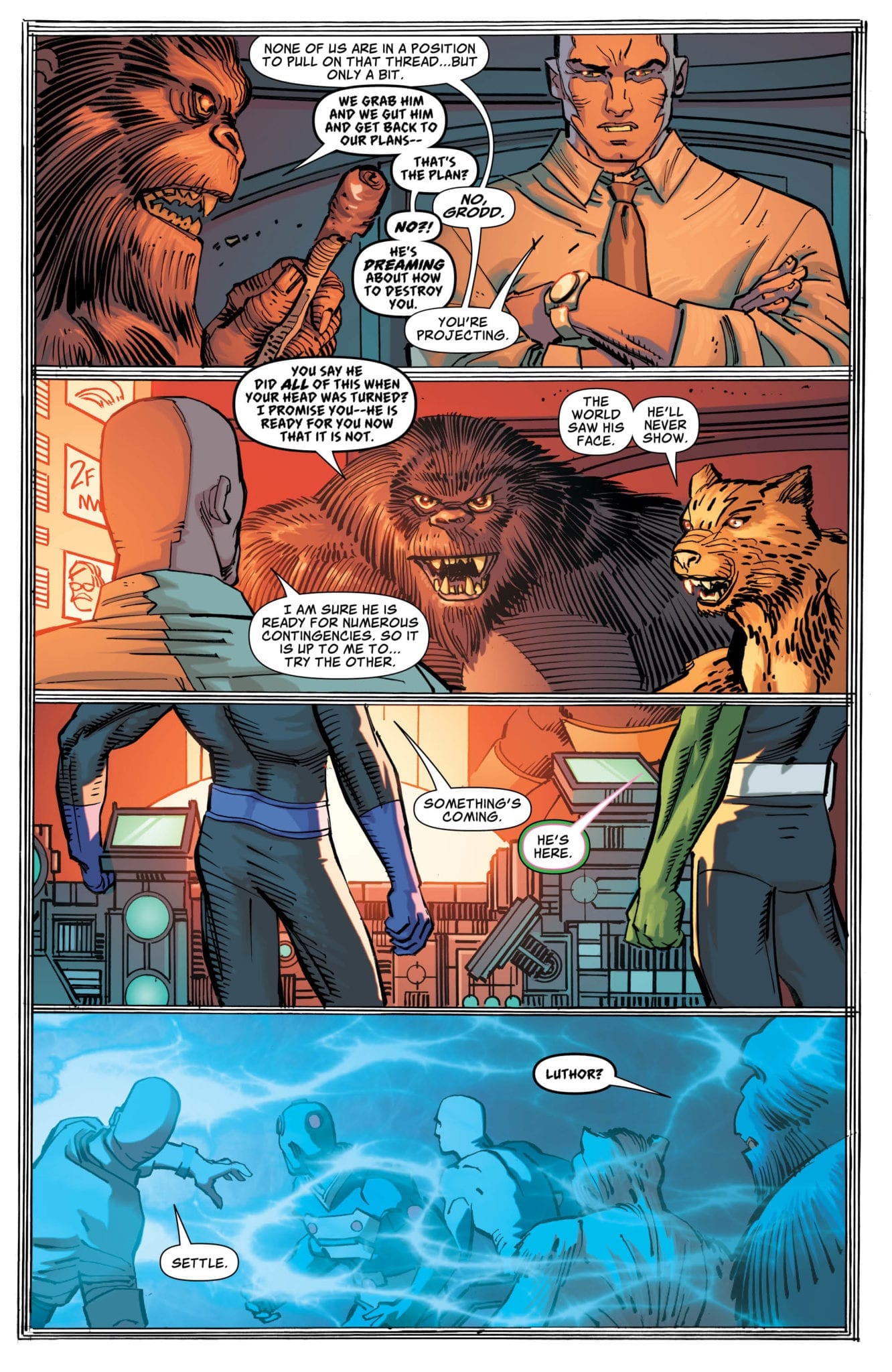
Action Comics #1019, written by Brian Michael Bendis, with pencils by John Romita Jr, inks by Klaus Janson, colors by Brad Anderson, and letters by David Sharpe, spins its wheels but goes nowhere. While previous issues of Bendis’ Action Comics/Superman run would tread water in promise of more to come, in this issue the promise feels empty. While other issues have tackled the fallout of Superman’s recent reveal, or the crisis that lead him there, this issue runs in place.
Writing
Part of the struggle Bendis seems to be having in this issue is finding a unique voice for some of his characters. As the Legion of Doom sit around, discussing next steps, one gets the impression that this sounds more like Bendis talking to himself. Perhaps the series is waiting for DC to catch up to recent changes, but if it is an editorial mandate to slow down, the creative flow of this series is suffering. The characters twiddle their thumbs, almost literally. With yet another issue promising all hell will break loose soon, one begins to lose hope.
Art
Romita Jr and Janson’s work suffers similarly to Bendis’. Many of the characters not only sound alike, but look remarkably similar too. Faces are rarely very differentiated, to the point that a cheetah and a gorilla never looked so alike. Despite this, Romita Jr and Janson’s approach allows readers to appreciate the form of a comic in a unique way. Choosing stylistic renderings over realism, the team allows us to see their art as drawings. They want us to notice the form and the details.
Coloring
Anderson’s coloring continues its theme of blues and reds. Anderson adds to his palette with an interesting inclusion: purple. Seems like a no-brainer, but purple being the new color-code for Lex Luthor gives this shift deeper meaning. It’s thanks to Anderson that we get much of the ambiance of this issue. The darker tones and constant shadows give us the sense that a storm is brewing.
Lettering
Sharpe’s letters also take a bit of a decline in this issue. While Sharpe certainly varies his use of lettering styles, the styles often seem at odds with what is going on on the page. A collection of sound effects in a fight between Grodd and Superman seem so out of place they almost seem like editorial mistakes. And when a role call is given for the members of the Legion of Doom, their names are shown each in a different style. The coloring and even the crisp outline makes it feel like it’s been cut out of a magazine and taped onto the page.
While much of what this creative team has been doing on this run has been phenomenal, this issue was a swing and a miss. The plot refuses to go anywhere and the stylistic choices are starting to feel tired and worn out. Though I hope for a good follow up in the continuation of the saga, you could skip this one without much of a problem. Pick up Action Comics #1019 today at a comic shop near you.
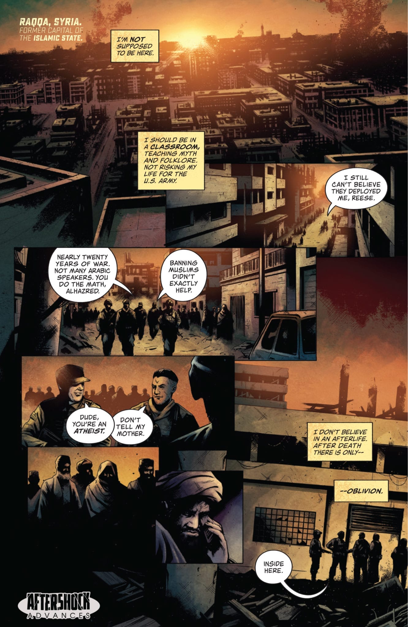
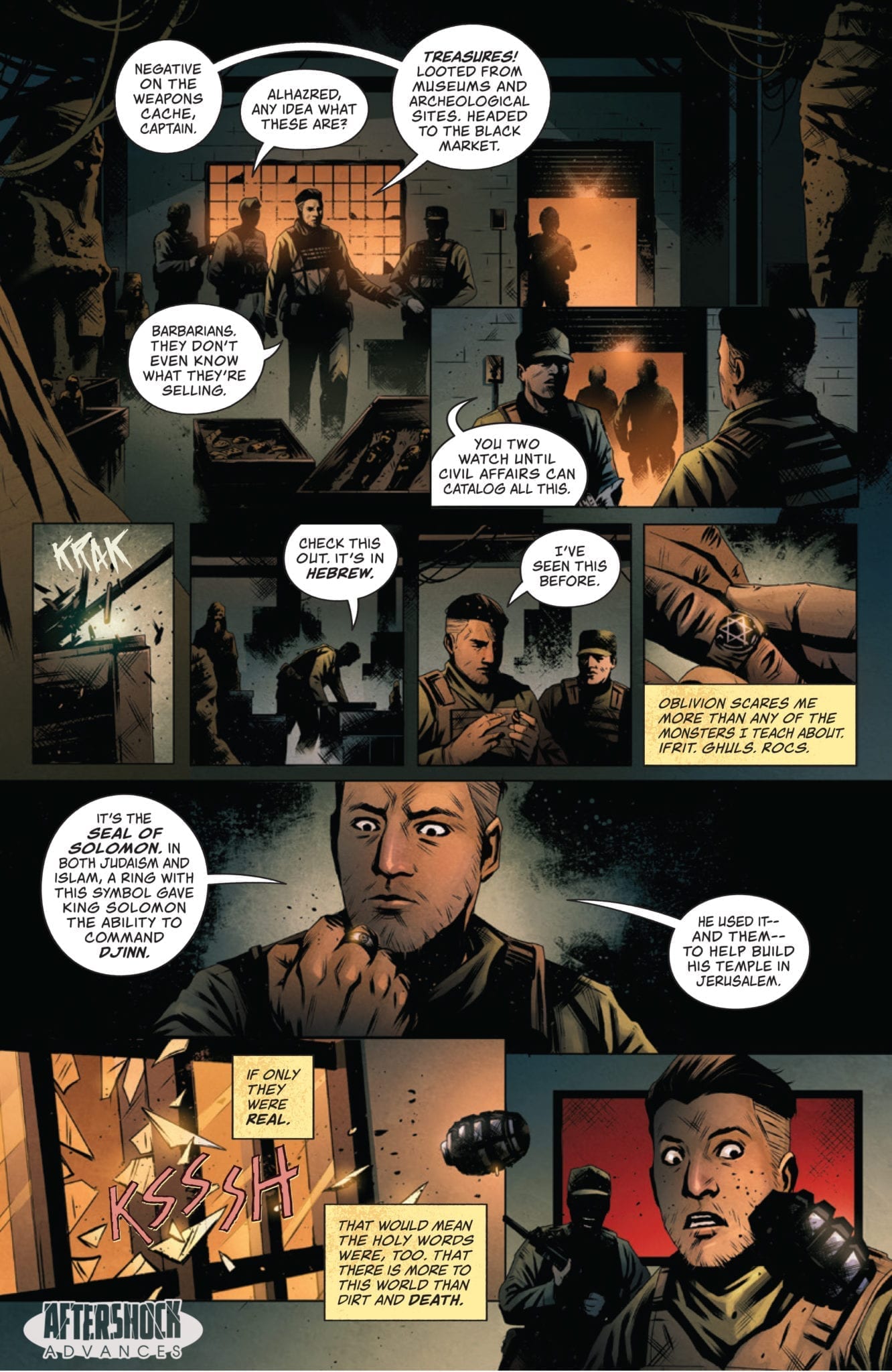
GODKILLERS #1 hits your local comic book store February 19th, but thanks to AfterShock Comics, Monkeys Fighting Robots has an exclusive four-page preview for you.
About the issue: Abdul Alhazred is an Arab-American folklore professor turned soldier whose fear of death stems from uncertainty about the existence of an afterlife. Then he joins THE GODKILLERS, a special forces unit tasked with fighting insurgents who use mythological creatures as weapons of mass destruction. Now that he knows the supernatural exists, he’ll have to decide which is worse—death or the nightmarish monsters he thought were mere legends.
GODKILLERS #1 is by writer Mark Sable and artist Maan House, with colors by Hernan Cabrera, and letters by Thomas Mauer. The main cover is by Jeremy Haun with Nick Filardi.
Check out the GODKILLERS #1 preview below:
Disclaimer: This advance preview features US forces in Syria and depicts an attack on US service members.
What’s your favorite title from AfterShock? Sound off in the comments!
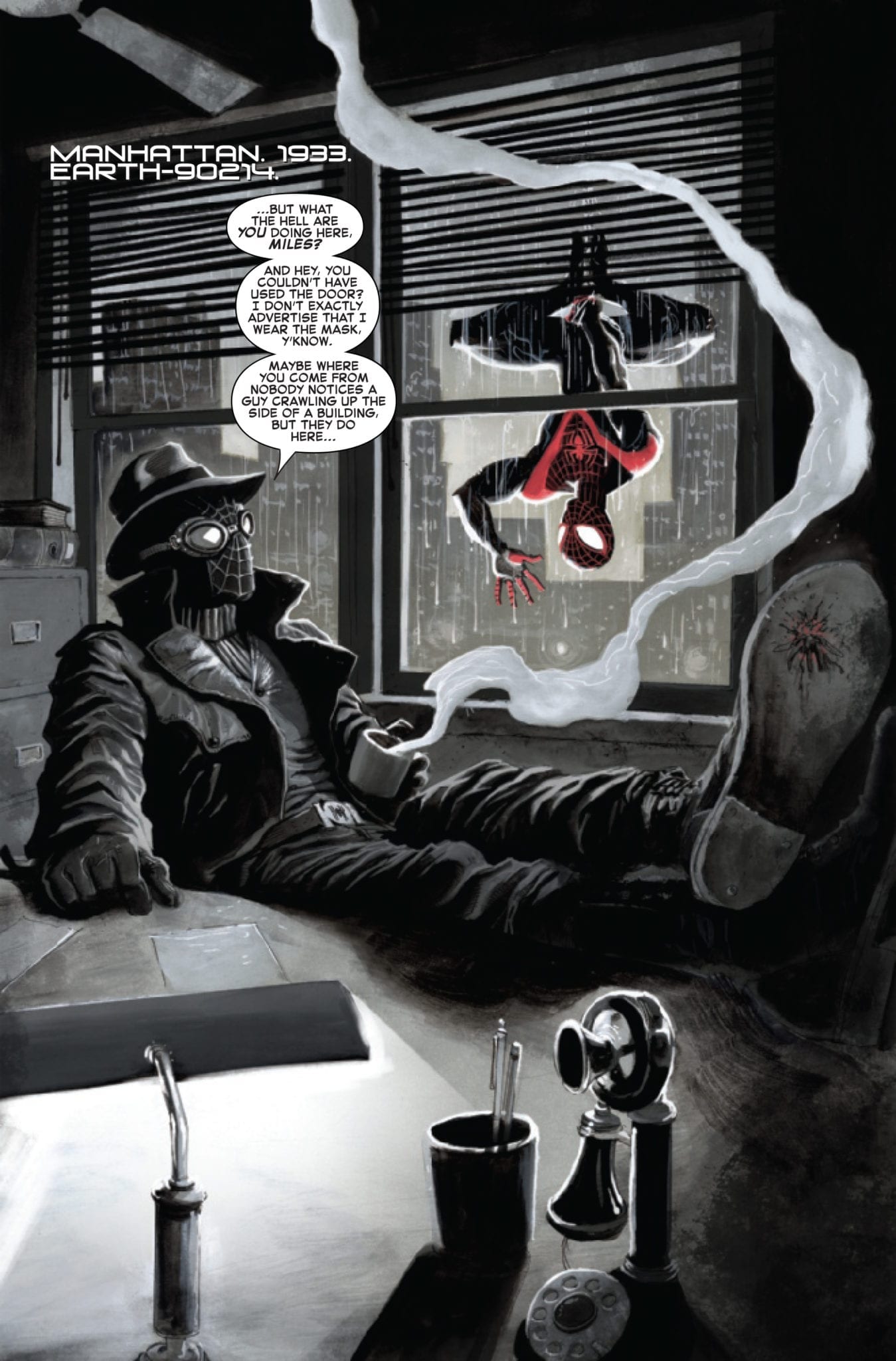
Spider-Verse #5 hits your local comic book store February 5th, but thanks to Marvel Comics, Monkeys Fighting Robots has an exclusive four-page preview for you.
About the issue: SPIDER-MAN NOIR, DEAD NO MOIR?!
Miles continues his journey to save the web of life and comes face to face with Spider-Man Noir! But, wait…isn’t he dead?!
Spider-Verse #5 is by writer Christos Gage and artist Juan Ferreyra, with letters by Joe Sabino. Dave Rapoza created the cover.
The series follows Spider-Man Miles Morales as he traverses the Spider-Verse, interacting with different spider-people along the way. In this issue, Miles comes across the Spider-Man of Earth-90214, aka Spider-Man Noir, a character thought dead.
You can see in the preview that Ferreyra was the perfect artist for this story, as his inking and color pallette excellently recall the tone of classic noir films.
Spider-Man Noir was a featured character in 2018’s Into the Spider-Verse film, as voiced by the incomparable Nic Cage, and quickly became a fan favorite (though he was already a favorite to comics readers for years prior).
Check out the Spider-Verse #5 preview below:
Are you reading Spider-Verse? Sound off in the comments below!
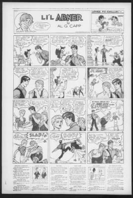
The baddies in Li’l Abner may not have super-powers, but they sure can be a nuisance. Much like their contemporary comicbook super-villains, though, some of Li’l Abner’s villains prove to be more of a nuisance than others. From Marryin’ Sam, the lovable grifter, to Baron Slinkovitch, the rat-faced conman out to bilk Aunt Bessie out of her millions, several levels of dastardliness are covered in the first year of Li’l Abner’s publication.
Always looking for a quick buck…
Li’l Abner’s Villains: Marryin’ Sam and Other Lovable Grifters
The least offensive of Dogpatch’s villains is likely Marryin’ Sam. The absent-minded grifter, always after a free meal and a quick buck, performed the first marriage ceremony between Li’l Abner and Daisy Mae. Unfortunately for Daisy Mae, Sam had long since lost his marryin’ license. A relieved Li’l Abner survived another 20 years as a bachelor, but love — and Daisy Mae — eventually had their way when Abner and Daisy Mae finally got hitched in the ’50s.
Other notably lovable grifters include Fishface and Hollowhead, who kidnap Pappy Yokum in an attempt to get rich quick by ransoming Pappy for four whole dollars! Never to be out-grifted, though, Marryin’ Sam worms his way into the story, outmaneuvering the two other scoundrels, and securing the fortune for himself.
In one of my favourite story-lines, the three villains above conspire to rig a beauty contest only to be foiled by Mammy Yokum, who ends up winning the contest herself.
Daisy Mae’s Suitors
Daisy Mae’s myriad spurned suitors make up a slightly more conniving layer of Dogpatch’s seamy underbelly. Whether it’s Abijah Gooch or Hannibal Hoops, the non-Yokum male constituents of Dogpatch just don’t seem to know how to treat a lady.
Li’l Abner’s famous distaste for “girls” notwithstanding, he or Mammy Yokum always makes sure that no one treats Daisy too roughly … or too well. One particular episode that had me, and probably several readers, laughing out loud involved the lovelorn Hannibal Hoops trying to discredit Li’l Abner, his perceived romantic competition for Daisy Mae’s affections.
Dressed as the ghost of Daisy Mae’s learned cousin Judge Scragg, who — being a ghost — is supposed to be omniscient, Hoops tells Daisy Mae an unprinted but, the reader is assured, horrible secret about her true love Li’l Abner.
“Shecks, Sol, only I get to treat Daisy Mae like dirt!”
Lucky for Daisy Mae, Mammy appears and clears the air. Mammy tricks the “ghost” into saying that he remembers kissing Mammy long ago. This exposes the ghost as a fraud. There was no kiss. Mammy, rather adorably, states that the only man she has ever kissed is Pappy. Awwwwww … Mammy socks the ghost, tears off its mask, and exposes Hannibal Hoops for the fraudster he is.
Li’l Abner’s Cousin Solomon also finds out how complicated it can be to interact with Daisy Mae when he gets walloped by both her and Li’l Abner for sounding “like he meant it” when, mimicking his charming cousin, he tells Daisy Mae to get lost.
Li’l Abner’s Villains: The Sadistic Ex
“Pappy, I hate you so much that I jumped out of one comic and into this one to get my revenge!!!”“Wait. Why were they frying eggs…?”
Sadism has no place in Dogpatch, so Nellie Noggins, Pappy Yokum’s ex-fiancée who he left at the altar, occupies the next level of villainy on this list.
Although her torture methods are somewhat pedestrian — she eats pork chops in front of Pappy and then has a dog lick molasses off of his feet (some people’s idea of a fun Friday night) — it’s her motives that make her a villain.
She might call herself Nellie Noggins in this story, but faithful Li’l Abner readers should recognize Ms. Noggins as Granny Groggins, from Capp’s ill-fated Washable Jones comic strip. Washable Jones was a two-line supplemental strip at the bottom of Li’l Abner‘s four-line Sunday strip. Noggins, as gigantic and monstrous as Pappy is diminutive and cute, never got over the pain of being left at the altar for Mammy, the superior po’k chop cooker.
Li’l Abner’s Villains: The Scraggs
Although this story-line eventually resolves peacefully, the feuding Scraggs from Skunk Hollow, especially Lem Scragg, take their blood feud with the Yokums quite seriously. After the Scraggs take over their cousin Daisy Mae’s house, Abner eventually finds himself motivated to toss the invading Scraggs out on their ears. No surprise; Mammy and Li’l Abner solve the dispute with a left, a right, and a threat of further violence. Sure, the good guys used a little intimidation and corporal punishment, but at least no one had to use a shootin’ iron.
Li’l Abner’s Villains: Professional Con-Artists
The most reprehensible constituents on this list are two con-artists without any redeeming merits, Baron Slinkovitch and Cynthia Astorbux. The dastardly Baron Slinkovitch of Skurvia tries to lure Abner’s beloved Aunt Bessie into a sham marriage so that he can steal her fortune — Skurvian law dictates that all property previously belonging to the wife becomes her husband’s after marriage.
Abner manages to out Slinkovitch as the villain he is by, first, forcibly shaving off Slinkovitch’s lustrous beard, and then tricking him into losing his temper and revealing his plan in front of Aunt Bessie … oldest trick in the book.
Cynthia Astorbux occupies the same level of immorality. Seeking her niece’s vast $10-million fortune, she faces off against her sister Agatha, attempting to influence her niece’s decision by getting on her niece’s friend Abner’s good side. Abner, lovable doofus that he is, goes for Cynthia’s act hook, line, and sinker. Luckily, young Mary-Ann Astorbux is no fool. Eventually convincing Abner that Cynthia is not the tenderhearted damsel she represents herself as, Mary-Ann and Abner escape the clutches of her greedy aunts. They escape to Dogpatch where Mammy, once more, sets all aright.
Mammy convinces the judge in charge of the dispute to set Mary-Ann’s money aside in a trust fund that neither of her aunts can touch. When only Agatha, who finally sees the light and realizes that taking care of her darling niece is its own reward, agrees to Mammy’s terms, all becomes well.
One wonders what the hell this judge is getting paid for, but there we are.
Y’all Come Back Now, Ya’ Hear?
That about does it for my articles on the first year of Li’l Abner‘s publication. Following decades of publication saw the introductions of popular characters and properties like Joe Btfsplk, Fearless Fosdick, and, of course, the lovable Shmoos.
That Capp could be accused of oversimplification goes without saying. And, like many of his contemporaries, Capp frequently came down on what many would call the wrong side of history, but his loving pastiche of southern culture provides more than just stereotype and prejudice. Whether Capp’s pastiche is accurate or not is open to interpretation, but none can deny its charm or Capp’s obvious devotion to his subject.


")