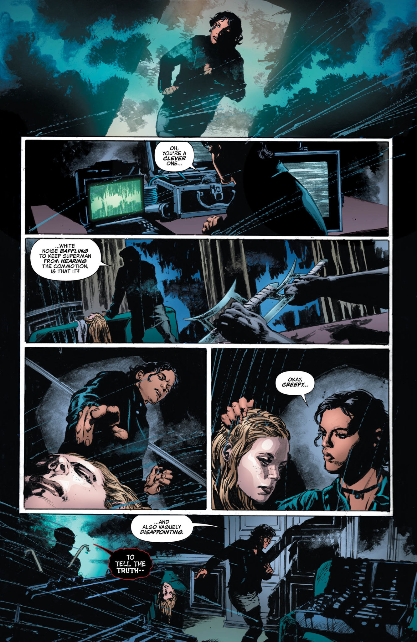
The second-to-last arc of Si Spurrier and an incredibly talented team of artists’ run on The Dreaming comes to an end with issue #18. This wondrous arc ends in an emotional and poetic chapter that wraps up not only one of the most pressing plots in The Dreaming itself, but builds on a Sandman story some thirty-years in the making.
Rose Walker was a vortex, once. And as a vortex, she draws dreams to herself…and she is drawn to them. And it’s a good thing, too, because Dora, Matthew, and Abel are in well over their heads in the waking world—a world that is slowly destroying itself, as Wan’s plans for the collective unconscious of humanity have come to pass!
Writing & Plot
Writer Si Spurrier has had the unenviable job of continuing the story of the world Neil Gaiman created in Sandman over thirty years ago. Fortunately, Spurrier has been up for the task. His work on The Dreaming has successfully recaptured the wonder of Gaiman’s universe and character while barely featuring the Dream Lord himself. The real wonder of The Sandman Universe is the variety of characters that inhabit it, and Spurrier writes them all new and old with all the intelligence and charm as could be desired. The return of Rose Walker from the classic “Doll’s House” storyline from Sandman is an absolute treat for classic fans and a wondrous end to a plot point here in The Dreaming. The story in this issue is presented through a considerable amount of internal narration from Rose herself. In true Sandman and Spurrier fashion however, it’s an entrancing joy to read. The prose is poetic and enrapturing even at its most dense. The only possible slight against this issue is that if for any reason a person who hasn’t read Sandman picks this up (fat chance), they’re going to be a bit lost at some of these revelations. Outside of that, this remains a fantastically written piece of comic storytelling.
Art Direction
While it is disappointing not having the phenomenal Bilquis Evely on art again for this chapter of her and Spurrier’s run, Marguerite Sauvage does a stellar job in her stead. Her pencils faithfully capture the myriad characters and unique visions of the Dreaming’s cast while also bringing a grounded reality through. This reality is besieged by Wan’s accidental destruction of fiction, and so the dead expressions on the many human characters create a perfectly somber mood when needed. The colors may be the real champion here, as the palette shifts from the muted grey of a dying society to explosions of unexpected color. Panels and shots run a gamut of color choices that intensify the wonder of this altering universe. Sauvage’s visual flair fits in extraordinarily well on The Dreaming #18.
Thus, the time of Si Spurrier and a host of wildly talented co-creators tenure on The Dreaming nears its end with issue #18. This is a beautiful and poetic chapter of chaos and emotion that ends some stories, but leaves others open the final two issues of Spurrier and Co.’s run. The script is eloquent and nostalgic, while the art is stunning to examine. This has been one of the best runs to watch happen over the past couple years, and so it will be an intriguing wonder to watch the future of this story come to a close. Be sure to grab this chapter on 2/5!
DARK AGNES #1, out this Wednesday from Marvel Comics, dives headfirst into the tale of Agnes – a woman who resists the norm with blood and violence in spectacular fashion. This miniseries is bloodthirsty and bold in the most refreshing of ways.
Agnes is looking ready for a fight on this cover of Dark Agnes #1.
***SPOILER WARNING***
If you’re looking at this series and asking yourself whether or not you recognize the determined young woman on the cover: the answer is yes. That is the only and Agnes, aka Dark Agnes, aka Agnes de Chastillon. She’s made an appearance before, in the Marvel universe. But this time around she’s getting her own miniseries, and she’s going to make the most of it.
By most of it, we, of course, mean causing as much bloodshed and mayhem as possible. All in the name of freedom – and revenge. For nobody can hold a grudge like Dark Agnes, and she’ll make everyone who hurt her – and her mentor- pay.
Of course, she made her way onto a wanted poster!
The Plot
There is something so liberating and enjoyable about reading Dark Agnes’ tale. Perhaps it’s because she herself doesn’t seem to care much for societal norms or expectations. Regardless of the source, Becky Cloonan channeled that emotion well in Dark Agnes #1.
This series starts off with a bang, though thankfully not literally. Dark Agnes may have a bad reputation by some, but that does not mean she’ll leave her friends to hang. Or to be beheaded, as the case may be.
Dark Agnes #1 balances out the daring escapades of this brave woman with flashes of backstory. Thus it’s an easily approachable series, even to those that don’t know her by name or sight. This single issue quickly got everyone to the same page and made it clear what she has gone through – and what she hopes to accomplish.
There are some interesting hints strewn about this issue, which may or may not become relevant later. One thing is certain, Agnes is feeling very bitter about her past, as she’s inclined to rant about it with little provocation (but again, that served a literary purpose in this instance).
And let’s start Dark Agnes #1 off with an execution…or will we?
The Art
Dark Agnes #1 is full of brilliant artwork, all while thematically matching the time period. Agnes herself is a shining beacon, thanks to her short red hair and feisty expressions. It’s no surprise that she stands out – both against the crowd and to our eyes.
If there’s one thing this issue excelled in, it’s showing the gore and violence of the time, and how much Dark Agnes seems to be actively seeking it out. Her reactions to it all are the beginning of a tale we all know so well and yet can’t resist reading along once again.
Luca Pizzari was the lead artist for this issue, working alongside Jay David Ramos for the colors, and DC’s Travis Lanham for the letters. Each artist worked exceptionally hard to match the aesthetic of the series and time period. A fact that is most evident on the title page – the font choice and color palette make it truly look like a poster from the past.
We’re loving the sass from the first few pages of Dark Agnes #1
In Conclusion
Dark Agnes #1 was an entertaining and thrilling introduction to this new miniseries. It’s always refreshing to see an interesting character like her grab the limelight, if even for a time. There’s no doubt that she’s going to all sorts of mischief and mayhem during her run.
NOMEN OMEN #5, out this Wednesday from Image Comics, continues the dark and twisted tale, raising the stakes while increasing intrigue for all. This is a world in which the lore of old is on a collision course with the modern world.
Enter a mysterious new immortal in Nomen Omen #5.
***SPOILER WARNING***
From the start, it was clear that Rebecca was not your typical girl. Even the readers of this series, who don’t yet know the full backstory, can tell that much. Her story and path have been rapidly unwinding in this series, as she comes across deities and legends that she never really believed in. Arguably, she still doesn’t believe. But there’s time yet.
Nomen Omen #5 picks up that story, while also providing a surprising perspective to the mix. This is an issue worth reading, for those fans more curious about the other side of Rebecca’s story. That is to say, the creatures working in opposition to her health, by all appearances.
Rebecca’s awakening is getting ever closer if this cover is anything to go by.
The Plot
Nomen Omen #5 is a chilling read, with lots of weighted implications about Rebecca, her past, and her future. What makes this issue all the more alarming is the glimpse into the immortals that have filled these pages.
Any illusion to their humanity must be shed while reading this issue. Marco B. Bucci wrote this revelation with so much poise, and yet there’s a brutal sense to their being and nature. It’s a fascinating balance and one that does justice to the series itself.
There was one fairly shocking element in this issue, as the creative team pulled a real-life tragedy onto the pages. That does tend to increase the impact of a story – that is a given. But will this help to ground the characters, or alienate them further, thanks to their reactions?
This issue is one that’s going to raise a lot of questions for the readers. We’re officially at the third way marking point, and that means it’s time to the ante to be raised once again – as appears to be the case, thanks to this dramatic issue conclusion. But what will happen next? What does this make Rebecca, and how much of her future has been altered because of these choices? (Not that she had a whole slew of choices, to begin with).
A photographic alternate cover for Nomen Omen #5 makes for a refreshing change.
The Art
All of Nomen Omen has featured stunning artwork, and Nomen Omen #5 is no exception. In fact, this issue may be the most colorful of the bunch, thanks to the perspective change – remember, Becca is color blind, with the exception of seeing magic. That brilliant decision is still here, but to a lesser extent, as Becca’s tale takes up on half of this issue.
Jacopo Camagni provided both the lines and the color, and they created something stark and wondrous here. It’s always interesting to see how an artist will represent an origin story for someone immortal. Camagni went for a blend of classic and new, which is actually quite appropriate for this series. His characters were beautiful and stunning – being immortal and all that, but they were also very clearly something other.
Fabio Amelia was the letterer for this issue, and their work is another element worth talking about. While sometimes the more stylized script is difficult to decipher, that seems to suit the mystery of this series, and thus likely done with intention.
A sneak peek at what is to come in Nomen Omen #6.
In Conclusion
Nomen Omen #5 was a striking issue, one that brings with it endless change. Becca may not have received all of the answers she’s seeking. But there’s little doubt that she’s well on her way to finding them – and making a few dramatic changes in the process.
DC Comics’ Lois Lane #8, written by Greg Rucka, with art by Mike Perkins, colors by Gabe Eltaeb and letters by Simon Bowland, gets right to the point this week. After the cliffhanger of the last issue, we get to see Lois and Renee fend for themselves. With the Man of Steel in the wings, we are constantly reminded by this creative team that Lois is no damsel in distress. She’s the Woman of Steel.
Writing
Rucka’s plot seems to be slowly coming to ahead. However, Rucka is more interested in the interpersonal conflict or systemic injustices than supervillains. Our introduction to a supervillain in this issue is brief and ultimately anticlimactic, but the anticlimax of it all is what cements our love for Lois. Not only does she defend herself, but she also takes everything in stride. Nothing can rattle her. And despite Superman’s many offers for help, we get the impression he’s someone who is almost twiddling his thumbs. Stepping in at the last moment of each crisis to see Lois and Renee have dealt with it, only to be politely told by his wife to go away. She has it in the bag.
Art
Perkins’ art continues to create the neo-noir atmosphere that this series has lived in. Perkin’s art brings emotion and confident body language to Lois and Renee. While they seem concentrated and sometimes concerned in the midst of chaos, their almost immediate ease once danger has passed speaks to their competence. Lois smiles as the cops investigate, as Renee sleeps in an armchair. When Superman arrives, Lois doesn’t clamber to him but instead gives him a quick kiss and sends him home. Their body language shows their faith in themselves and helps us to have confidence in them too.
Coloring
Eltaeb’s coloring continues to set a brooding tone. The cool palette, using lots of blues and purples, gives each scene a dark feel. But when the police or Superman arrive, the palette becomes warmer. It opens itself up and feels less closed off. It’s the darkness that reminds us that Renee and Lois are on their own. It doesn’t speak to the danger, as we already know they know what they’re doing. But it gives us a sense that they are setting out into the dark to find the truth. Undaunted, as only they would be.
Lettering
Bowland’s lettering is simple and to the point. It varies rarely, but when it does, it does so to significant effect. The supervillain who has arrived on the scene in the opening chapter speaks in a different style than when she was undercover. It makes her feel otherworldly in a way that gives the character some clout. Bowland’s placement of the word balloons help show the kind of relationship Lois and Renee have. Placed far apart, it makes it feel as though there are long pauses between lines. But these characters are already so comfortable with each other the silence doesn’t irk them.
The creative team once again gives the Woman of Steel the treatment she deserves. Without talking down to her or being heavy-handed about her independence as so often is the case with her character, we get to see Lois as she truly is. The badass who knows what she’s doing can protect herself, and would more likely like Superman to show up to kiss him on the cheek than to be saved by him. This is the Lois Lane that you call in for help, not the one doing the calling. Pick up the next great chapter in this series, Lois Lane #8, at your local comic book shop on February 5th!
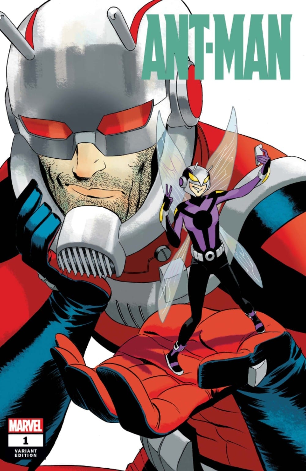
Ant-Man #1 (of 5) hits your local comic book shop this week from Marvel Comics, and he’s got his daughter as a partner thanks to Zeb Wells, Dylan Burnett, Mike Spicer, and VC’s Corey Petit. Will this father and daughter team steal everyone’s heart, or would it be better if everyone avoided this picnic?
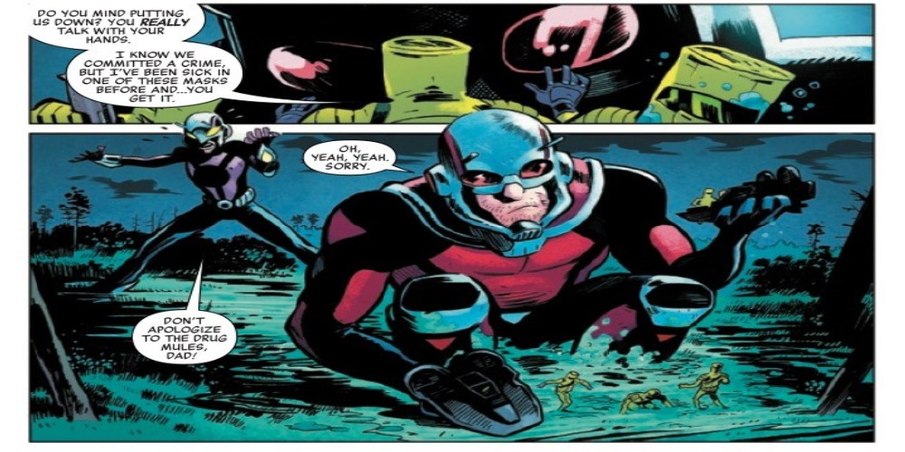
Scott Lang is back and doing better than ever! Er, at least according to him, but his daughter, Stinger, and the anthill he’s living in say otherwise. Desperate to raise his daughter’s opinion of him, Scott takes a job from local beekeepers only to uncover a global conspiracy that could topple the world order!
Writing
Scott is not in the best place as this series starts off. He’s shown to be quick to name drop his Avengers teammates, glory hunting, and is living in an anthill. Even Cassie seems to be not willing to give him any breaks throughout the issue. It seems like the series is setting up Scott finding a way to prove himself to Cassie, accepting the fact she is now a hero herself, and help to get him out of this rut he is currently in.
Zeb Wells is channeling the comedic side of his writing portfolio. Lots of good humor helps to drive the issue, and you would expect nothing less from a former writer of Robot Chicken. Still, there is a good natural progression in the issue as Scott goes from taking a simple job to make ends meet to finding himself in a fight for his life in a very short amount of time.
Artwork
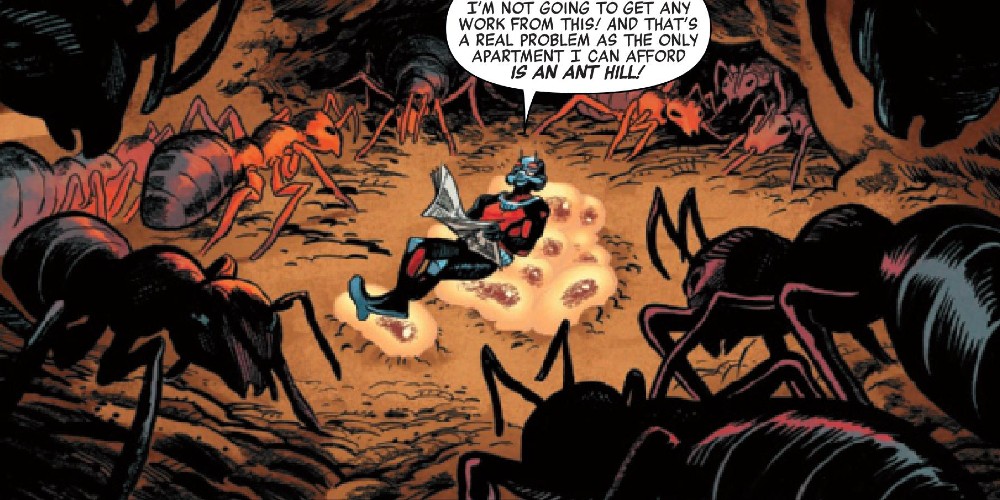
The artwork by Dylan Burnett offers a great overall look for the book. The insects look impressive, and the fight scenes are powerful thanks to his work. Unfortunately, many of the facial features drawn in the comic are distracting and unnatural, to say the least.
With color work by Mike Spicer, the book employs a lot of shading elements to it. This allows for some visual interactions between the insects and Ant-Man. It also helps to offer some great effects with Ant-Man’s ability to change sizes in an instance.
The lettering by VC’s Cory Petit serves as a driving force in the issue. Through different borders for dialogue boxes, it is much easier to distinguish the various translations associated with each of the insects Scott interactions with. It also helps to add to the comedy of the issue.
Conclusion
Ant-Man #1 is afun issue and once again shows how entertaining Scott Lang as Ant-Man can be as a character. Though it’s only a mini-series, hopefully, it will lead Ant-Man to a better place than when he started. Lord knows he can’t get any lower.*
*The Editing Staff apologizes for this bad pun. The Writer has been ordered to sit in the corner and think about what they have done.
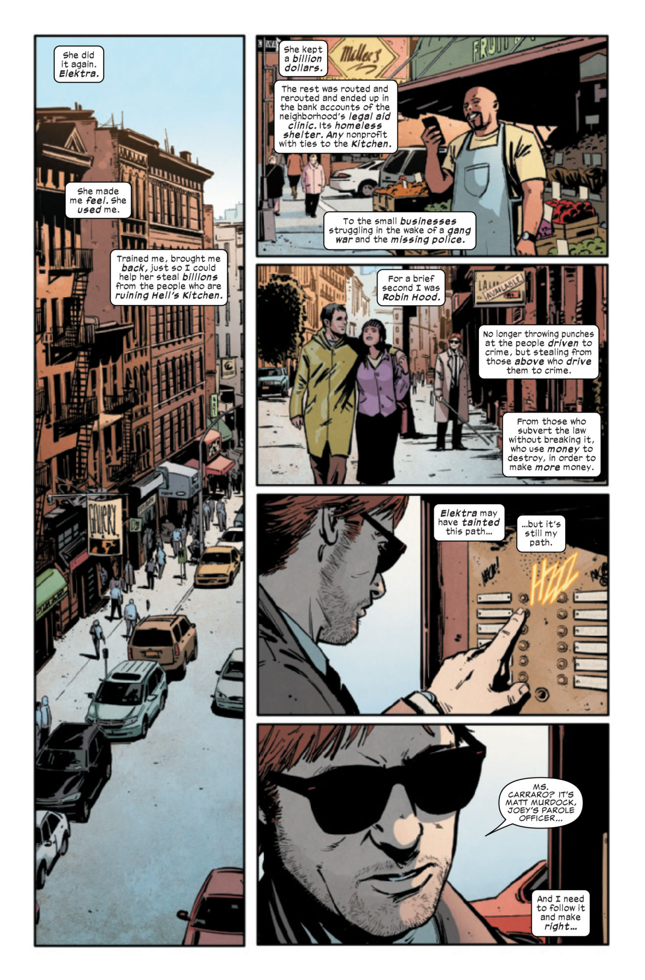
DAREDEVIL #17, available in comic book stores on Wednesday, February 5th, brings another fight to Matt Murdock’s doorstep. But this isn’t a physical battle; Matt’s abandoned his old ways (allegedly) and is seeking to deal with the root of Hell’s Kitchen corruption, rather than the symptoms. This means he’ll have to refrain from beating up poor criminals and using less violent methods to take power from the ruling elite.
Matt’s claimed to have given up his violent ways, only to engage in them shortly thereafter. Will he live up to his word this time?
Story
In DAREDEVIL #16, Matt and Elektra stole billions of dollars from the Storwyns, a corrupt family business who’s been systematically destroying Hell’s Kitchen. Though Elektra kept a billion for herself, she sent the rest of the money to nonprofits, clinics, and small businesses throughout Hell’s Kitchen. Her motives weren’t entirely pure, but this act helped Matt believe he could fight for the city without using violence.
Before staging his next heist against the Stormwyns, Matt pays a visit to Ms. Carraro, the mother of the man he accidentally killed at the beginning of this series’s arc. He offers her some of the money acquired as recompense, but she declines it. What’s more, she claims she knows it was him who murdered her son.
In this moment Matt begins to feel the guilt of his life as Daredevil surround his soul. Yet in an unexpected turn of events, Carraro forgives him. And just like that the waves of guilt begin a slow process of washing away, further solidifying his commitment to a less violent campaign against the forces of evil in their city.
Writer Chip Zdarsky does an excellent job of portraying class struggle in the poorer sections of large cities. Using this fictional version of Hell’s Kitchen, he captures what it looks like when a few corrupt individuals hold all of the power—and what it looks like when that same power is given back to the people.
Artwork
The illustrations with this issue gives readers an effective take on live in a neighborhood like Hell’s Kitchen. Jorge Fornés’s penciling and ink work, along with Nolan Woodard’s coloring, captures the highs, lows, and general lifestyles of the city’s citizens. Readers get to see the fine architecture of rooms owned by the elite class, the sketchy bars used for meetings of the competing mobs—even the meager conditions of poor families like the Carraro’s.
In addition, VC’s Clayton Cowles’s lettering makes it easy for readers to tell both who’s speaking and whether or not their dialogue is internal. However, it would have been good to see more variance in style here.
Comic Cover
Main Cover
Julian Totino Tedesco’s cover artwork features Matt in his classic black ninja outfit, reflecting his continued commitment to staying away from the Daredevil label.
Conclusion
DAREDEVIL #17 takes readers on a journey into Matt’s consciousness; more so than ever in this run. We see him deal with guilt in a way few humans could possible manage, inspiring those of us who are unnecessarily hard on themselves.
Do you think Matt’s new method of crime fighting will stick this time? Let us know in the comments below!
The threat of intergalactic war builds in JUSTICE LEAGUE ODYSSEY #18. Available in stores on Wednesday, February 5th, the issue brings all of our dispersed heroes together for the fight of their lives against the forces of Darkseid. With Orion and a new hero named Gamma backing her up, Jessica Cruz faces off against Xotar, one of the newly christened New Gods. But despite this being’s incredible power, the foe she dreads the most isn’t a foe at all—it’s a lost friend.
Story
Cruz and the other League members on this mission have found themselves in dire straights. They’ve managed to convince the Eskaton creature to follow them to Darkseid, but even that might not be enough, especially when fighting a version of Cyborg completely controlled by the villain.
Dan Abnett’s writing captures the fully embodied emotions of Cruz. We feel her despair and sorrow—and yet, a glimmer of hope shines through as she calls out to what’s left of Cyborg. Whether her call is all in vain remains to be seen, but it’s inspiring seeing a realistic character face darkness while keeping the faith.
However, the Eskaton awakes at an inopportune moment and disrupts the battle. And it’s ready to “greet” the New Gods.
The Eskaton easily disposes of Xotar and attempts to destroy the Darkseid-controlled Cyborg. Fortunately, Cruz reminds the creature of it’s agreement to refrain from destroying anything else so that the League could take it to the overlord. Acknowledging the terms, the beast miraculously retreats into the Mother Box.
We see Cruz attempt to reach out to Cyborg in this moment of reprieve, but to no avail. The former League member reports back to Darkseid, leaving the team more vulnerable than ever. But seeing the Green Lantern’s heroism is a site to behold.
Artwork
Cliff Richards’s penciling and ink work, along with Rain Beredo’s coloring, reflects the unending chaotic events in the issue’s narrative—and it’s enthralling. Readers are treated to extravagant bursts of energy via warm hues, which clash with the cool colors of the Old Gods’ unearthly beams of negative power. Yet despite these clashing colors, the forms of more solid figures are highly detailed, right down to the intricate lines of the Mother Box.
The lettering work from Andworld Design features a wide variety of font styles and dialogue box designs, which helps give each character their own flavor.
Comic Covers
Main Cover
José Ladrönn’s main cover artwork places the viewer behind a menacing depiction of Darkseid. The grayscale background and flashes of bloodlike reds make it clear the villain is planning something horrible.
Variant Cover
Skan’s variant cover features the major players in this issue: Cyborg, Cruz, and Darkseid. Each is locked in battle, representing the conflict at the Edge of the Known Universe.
Conclusion
JUSTICE LEAGUE ODYSSEY #18 moves the pieces in this game ever closer to their final destination: Darkseid. This exciting narrative gets better with every issue; we’re ready to see what challenges the mighty villain prepares for our heroes.
Are you ready to see Darkseid gain power again? Let us know in the comments below!
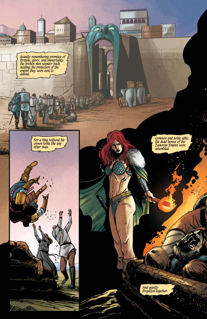
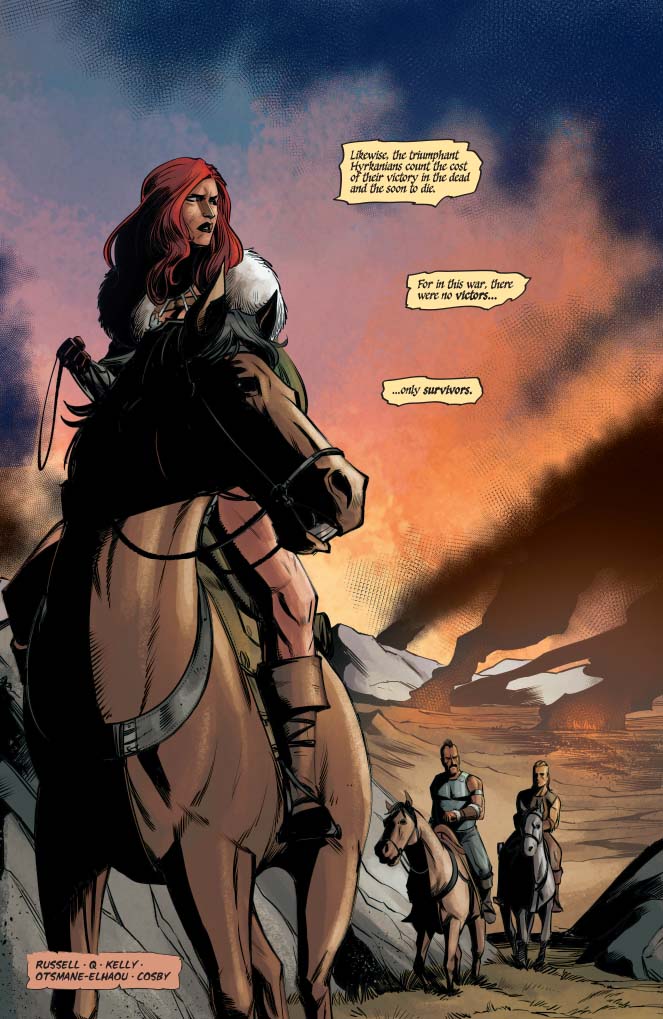
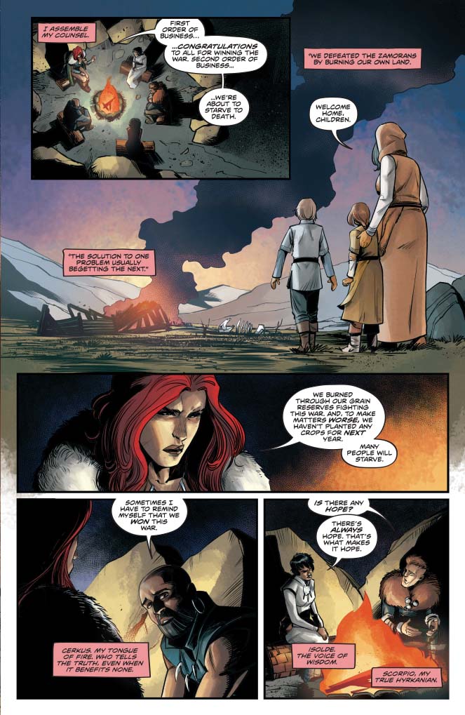
Dragan is dead. With the Zamoran forces defeated and chased from Hyrkania, one might think Sonja and her people could take the opportunity to relax and celebrate in Red Sonja #13, out this week from Dynamite Comics. Just because the fighting is finished, though, doesn’t mean things get easier.
With food and other supplies perilously low, Sonja sets out on a mission to the one place she should never return: Khitai.
The Writing
Despite the Hyrkanian victory, Red Sonja #13 opens with a quiet and somber vibe. A meditation on Dragan’s fate occupies the first several pages of the book. Writer Mark Russell notes that, while he may have once been the most powerful man in the world, Dragan is now just another corpse on a battlefield.
The effect of the mood is compounded by the gloom among Sonja’s council. We see the Hyrkanians dealing with the aftermath of their victory over the Zamorans, regarding it not a triumph, but simply a mutual waste of life. Despite the victory, their population is decimated, and their land, food, and other resources are exhausted, making the situation more desperate than ever.
Red Sonja #13 serves as a necessary transition point to pivot into a new arc. Much of the issue reestablishes the story and lays the groundwork for several potential conflicts. It takes on a somewhat expository role, catching the reader up on the current situation. So, while the book wouldn’t be super-engaging as a jumping-on point, it carries a lot of narrative momentum.
We see tension build as Russell lays out the interpersonal dynamics that define conflicts to come. The relations between Sonja and the King of Khitai, and those between Isolde and her Hyrkanian charges, form potential bases of this new arc. At the same time, we get some setup for the upcoming new series Killing Red Sonja, which focuses on Prince Cyril’s vendetta against the titular character.
Overall, Red Sonja #13 provides an excellent foundation for this new arc. It promises the same kind of complex and engaging storytelling we’ve come to expect from Russell. This new story should please fans of the series.
The Artwork
Bob Q provided artwork for a few issues in our first story arc, including the masterful issues Red Sonja #7 and Red Sonja #9. While not as stylized as Mirko Colak’s work, Q’s illustrations really shine in terms of their sharpness and detail.
Bob Q takes pains to meticulously illustrate minor background elements and scenery. This helps draw the reader deeper into the world of the book. There doesn’t seem to be as much purpose behind the page layout. However, the work still flows nicely and hits the story beats well enough. Plus, there are some impressive, dynamic illustrations throughout.
At the same time, he doesn’t skimp on the character designs, which are fluid and emotive. One can clearly read the emotion conveyed in a character’s eyes and facial expression, running the gamut from rage to determination to fear. Some of the gore can be a bit overly-cartoonish, but it doesn’t clash with the tone of the larger work.
Dearbhla Kelly is on colors for Red Sonja #13, bringing more of the earthy tones employed throughout the run. The style works well alongside Q’s more angular, detailed illustrations. It seems that the level of detail in the inks presents more opportunity for Kelly to explore a wider range of tones without sacrificing definition.
Final Thoughts
Red Sonja #13 offers a succinct and engrossing first chapter for this new arc. This book continues to be one of the most exciting ongoing series currently on the market. We’re excited to see where the creative team takes us next.
“We’re not their heroes anymore,” says a defeated Bruce Wayne in DC Comics’ Justice League #39. At the climax of writer Scott Snyder’s epic conflict between justice and doom, the good guys lose. The villains didn’t cheat to win the war. They simply encouraged the world to live selfishly and, in doing so, preyed on humanity’s base nature. By giving regular people such a crucial role in this outcome, Snyder paints a grim portrait of modern society.
Martian Manhunter tries to rally in the face of impending defeat.
Early in the issue, J’onn J’onzz telepathically connects with everyone on Earth and delivers one last emphatic speech. He tells everyone to live collectively, rather than individually. “If we banded together, we could overcome our nature, our flaws, and be more than we were designed to be,” says J’onzz. He says that love and hope can help us become the best versions of ourselves. He then ends the speech with an emphatic rallying cry:
“Together, we are more. Together, we are heroes….Now, if you will join us, we will upend faith together, upend destiny, upend everything and rise higher! So please, will you join us? Will you?”
Justice League #39 explores whether people would side with good or evil.
Unfortunately, J’onzz’s plea fails. The doom symbol, that had disappeared during J’onzz’ monologue, reforms in the sky. The heroes are heartbroken. Superman doesn’t understand what’s happening, and a despondent Batman tells him the devastating truth: humanity has officially sided with doom. When Perpetua, the “big bad” who has dominated this war, basks in the heroes’ defeat and explains why they lost, Snyder adds even more meta flavor into the story.
Perpetua demands humanity to destroy their “false heroes” and give in to their primitive nature. When people align with doom instead of justice, they do exactly what she wants. She knew, at the end of the day, that people would embrace the worst part(s) of themselves. If people willingly choose to do the wrong thing on such a massive scale, what hope do superheroes have? Snyder suggests that such a devolution leaves heroes powerless. Most damningly, Perpetua tells the heroes, “This world no longer has any place for you.”
Next, Perpetua reboots reality and removes superheroes from the equation. In this new world, the age of heroes is over. J’onzz, standing on the moon, looks at the Earth, which has been branded with the doom signal. Here, the fallen heroes regroup. They’re wearing plain black suits, which are a far cry from their iconic colorful costumes. This loss of color accentuates the heroes’ hopelessness, as noted by Diana’s observation that they don’t belong on Earth anymore.
Of course, even in the face of defeat, Clark Kent tries to go down swinging. He maintains his hope and valiantly takes flight, only to come back down to the surface. Kent refuses to believe that this is the end. But some of his teammates aren’t so sure. Diana points out that humanity was too scared to stand up to Perpetua, and Arthur Curry wonders if the Justice League needs a reboot of its own. “Things rise and fall with the tides,” says Arthur. “This moment, maybe it’s not ours.” It seems clear that, whatever happens next, the heroes will have to make some drastic changes in order to defeat doom.
As compelling as the literal plot of this comic is, there’s a lot to dig into beneath the surface. We live in a world that can feel like it’s swaying toward the darkness that leads to the heroes’ downfall in Snyder’s story. He contributes this defeat to the lack of faith humanity has in the battle of good versus evil. He also points to the “fear, anger and disillusionment” that have been perpetuated by constant divisions at every level of society. These dynamics ring true because it can be so easy to feel hopeless in a world with corrupt politics and a litany of other sociopolitical issues.
Typically, that’s where superheroes come in. Characters like Superman give us ideals to strive toward. They represent the best versions of ourselves and the hope that, in the end, good will triumph over evil. Snyder grounds this fantastical story with realistic reflections on society, and, by the end of the issue, we’re left feeling like superheroes don’t work the way they used to; they can’t always save us from ourselves.
But that’s the point. We can’t always depend on a Superman-like savior to fix all of our problems. We have to do it ourselves. Snyder shows that people, in the context of this story, side with doom and, by extension, the worst parts of human nature. But there will always be people who fight for what’s right, who defy the darkness in an attempt to give the world the light it needs. No one person can save the world, but, as J’onzz says, uniting together with love and hope can help us reach even higher. Ultimately, the real purpose of a superhero is a balance of both truths: we can use these symbols of hope, courage, and justice to strive for a better tomorrow, and we also have to be our own heroes by working together to save the world ourselves.
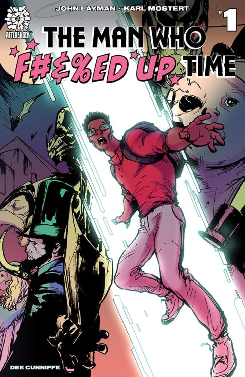
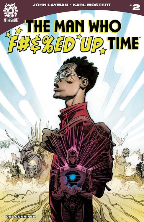
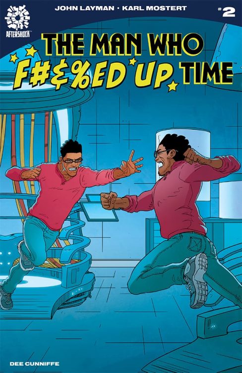
The Man Who F#%&ED Up Time #1 hits your local comic book shop this week (February 5) and thanks to AfterShock Comics, Monkeys Fighting Robots has an exclusive interview with the artist of the series, Karl Mostert.
About the first issue: Sean Bennett is just your everyday, ordinary lab worker in a high-tech lab with a proto-type time machine. And, yeah, he’s got the same temptations any of us would have about going back in time, just a bit, to correct mistakes of the past and right old wrongs. So, when he meets a version of himself from the future who encourages him to do just that, Sean takes the temporal plunge. Only…can you guess what happens next? Did you read the book title? Yup. All of TIME is f#%&ed up now, and it’s up to Sean to cor-rect it-or else!
Presenting a time-twisted sci-fi action-comedy, a butterfly effect noir, by multiple Eis-ner-winning writer John Layman (Chew, ELEANOR & THE EGRET) and talented new-comer Karl Mostert. Order it today…before time runs out!
The FOC for issue two is coming up next week, so make sure to contact your favorite comic book shop, and add it to your pull list.
Karl Mostert Q&A
Comics are a collaborative medium. How was your experience working with John Layman?
MOSTERT:We hit it off almost immediately. He contacted and friended me on social media and started chatting about the work and was helpful all the way, still is. My experience working with him on this story is truly an enriching one.
So, you get a script from John, what’s your first step after reading it? Your first reaction?
MOSTERT:This book specifically… “How in the seven hells am I going to do that?”
How do you make a comic feel like it’s taking place in a fully fleshed out world? Especially as the timeline starts getting more and more complicated?
MOSTERT:I’m not gonna lie, I e-mailed Mike and John a couple of times in the beginning and said, “I’m lost. I don’t know what’s going on.” To which they replied, “That’s the point.” I am a firm believer in backgrounds being super important to each and every panel and that they flesh out the world the characters inhabit in any story. I do fiddle with that rule of mine now and then, but mostly it’s understanding what’s going on in the background and keeping it constant. Also, telling stories of my own in the background with the art, besides the actual story, helps with fleshing out worlds for me.
Do you have a favorite character from TMWFUT? How about a favorite scene?
MOSTERT:Future Cops or Time Police or whatever they’re called. I love them. The scene where they burn a…I don’t know if I’m allowed to say.
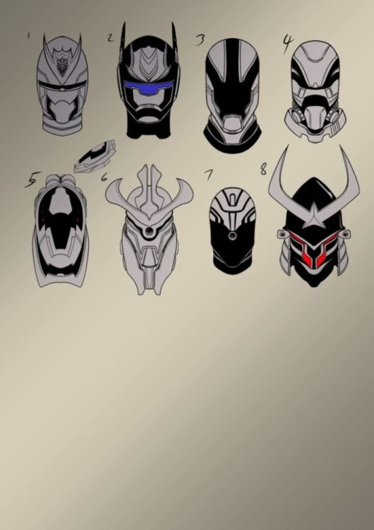
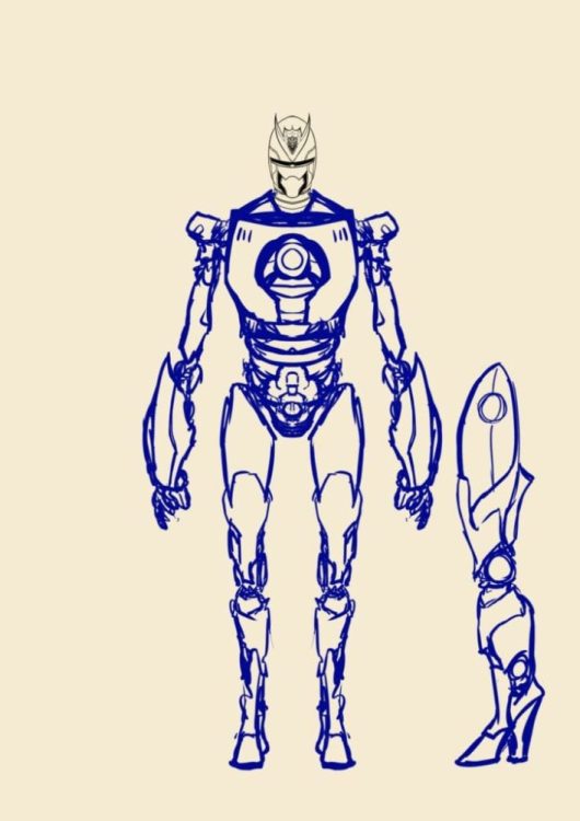
Can you talk a bit about your approach to character design, and how specifically you went about designing the characters in TMWFUT?
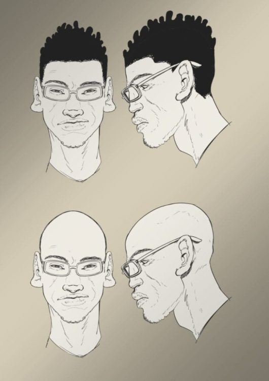
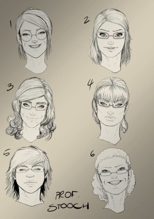
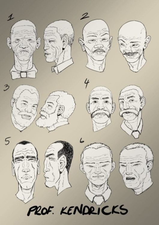
MOSTERT:I think the normal people here were normal run-of-the-mill type designing, getting a certain look for a person’s face right after understanding what they’re about…the other things that John made me design…I remember reading in an interview that John said when we meet face to face one day, I would punch him in the face. That’s probably true. To be specific, I take a lot of references and mash them together is the best way to explain it.
What other forms of media would you say have influenced your style?
MOSTERT:Definitely video games, lots and lots of video games
What are your favorite eras of comic book art? Golden age, silver age, bronze age, or contemporary?
MOSTERT:Ooh, I don’t think I have a favorite, I could pick from all the different eras a couple of artists that I find I enjoy most, I could give two who are my absolute favorites, Frank Quitely and Moebius.
The aesthetic of the future is usually dominated by dystopian visuals. It seems like visions of the future either fall into Mad Max or Blade Runner, retro-futurism, or cyberpunk. How do you create an original vision of a future where time travel has mashed everything together?
MOSTERT:To be brutally honest, I think you’ve just answered the question yourself. This is a totally new take on a future landscape of mashed up things, and the more things get out of control for Sean, the more mashed up it gets. It’s a bit of a headache keeping things in order in my mind.
Making periods of time visually distinct seems like a challenge. How did you go about letting readers know visually that the characters were now in a different time period? Or that the Sean on the page was a Sean from a different timeline?
MOSTERT:Luckily for me, John wrote these things into the script, and chatted with me in detail about what he wants—I try my best to follow what it is he wants. Thankfully, everything I did so far worked for him. I think for the readers, you will definitely know that Sean’s gone to a different time. There aren’t subtle hints; there are massive Blue Whale-sized clues.
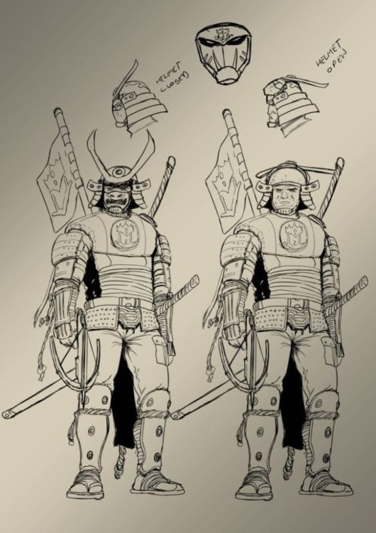
There seems to be some inspiration from RoboCop in the Time Police Sean runs into at the end of the first issue. What was it like designing time cops, and how did you make them distinct from future police/time law enforcement in other media?
MOSTERT:Definitely some Robocop in there, the Eighties version not the newer one. But I think I made them with the mindset that their looks can be deceiving. They don’t look tough, but they seriously are quite deadly.
What’s your favorite Sci-Fi or Sci-Fi inspired world? Favorite time travel story?
MOSTERT:Sci-fi it would have to be Blade Runner, both the original and the sequel. As for time travel, I think Edge of Tomorrow was superb.
Do you have a favorite AfterShock title?
MOSTERT:ANIMOSITY is something I really like the look of.
Can you pinpoint the moment you knew you wanted to be a comic book artist?
MOSTERT:Ooh, no. Been fascinated by comics and art for my entire life.
Who were your major influences along the way?
MOSTERT:Joe Mad used to be one of the favorites, but as I started looking at Frank Quitely’s art, that’s stuck for years now. The man can do no wrong.
Do you have a mentor?
MOSTERT:Not that they know it, but Quitely and Moebius influence my work quite a lot.
A movie that should have been a comic first but wasn’t.
MOSTERT:Big Trouble in Little China.
A comic that should have become a movie but didn’t.
MOSTERT:Trencher.
Do you listen to music while drawing? And if you do, who do you listen to?
MOSTERT:I don’t, unfortunately. I do, however, listen to British game shows.
Best moment of your career that has happened so far…
MOSTERT:As a South African artist, to get noticed by people in America where comics are huge and have them like my work was HUGE!!
Best moment of your career that is yet to come?
MOSTERT:Winning an award for my art. 😊
What did you think of the interview, and The Man Who F#%&ED Up Time? Comment below with your thoughts.