Home Blog Page 349

The Irredeemable Ant-Man: Who Is The Worst Ant-Man?

The Irredeemable Ant-Man Eric O'Grady

The Irredeemable Ant-Man, who deserves that title the most? OG Ant-Man Hank Pym, who created Ultron and punched his wife. The reformed thief Scott Lang who stole the suit in the first place. Or how about the namesake of this article Eric O’Grady? I mean the guy is a lying scumbag who sleeps around. That’s what we’re here to find out from the gutters.

Irredeemable Ant-Man #1

Are you sure Hank doesn't have dissociative identity disorder?Hank Pym’s legacy as Ant-Man has a lot more cons than it does pros. Sure he’s one of the founding members of the Avengers, but he’s got some mental problems. Recent comics have diagnosed him with bipolar disorder. Which, if medical research implies, seems to be the mixed type. Unfortunately it’s backed by his suicide contemplation way back in the original West Coast Avengers comics. Not to mention how his guise of Yellowjacket shows signs of mania and depression.

Because of this condition, Hank has done some very questionable things. As Yellowjacket, he kidnapped Janet Van Dyne before marrying her and created killer robots. One of those robots’ minds is based on Hank’s. Ultron takes all of the worst aspects of Hank into him as one of the Avenger’s worst enemies. It’s why the Ant-Man movies lean more into humor but with the more relatable Scott Lang. Even the comics Hank Pym doesn’t seem like The Irredeemable Ant-Man, just a guy who needs therapy.

The Not-So-Irredeemable Ant-Man

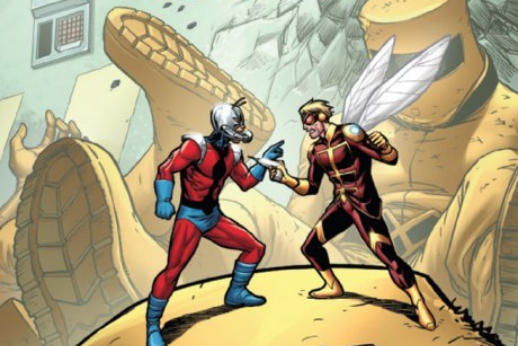
Scott Lang is a former electrician and thief trying to support his daughter, Cassie. While Scott did steal the Ant-Man suit, it was out of good intentions. He was trying to save a doctor who could operate on his daughter. Hank even lets Scott keep the suit. Afterward, Scott does whatever he can to lawfully get by. He’s a pretty regular guy who hops jobs. A few times, he even starts his own business in electronics or security. The only time Scott slips from this is when Cassie is at stake like in Secret Empire. So despite all of his faults and bad luck, Scott’s anything but The Irredeemable Ant-Man.

The Name Maker

Eric O’Grady is a total scumbag of a human being. He’s not evil, but he’s barely even close to being good. Man, where should people even begin when it comes to this guy? Starting small, all Eric does is try to get by at life as easily as possible. The only reason he joined SHIELD was that he thought college was boring. But Eric messes that up and gets his friend killed. So he steals the prototype Ant-Man suit his friend was killed in and proceeded to sleep with that friend’s girlfriend. It only gets worse.

Eric goes out as Ant-Man fumbling about and wanting to get famous as a superhero. Yet his only heroic moments happen by accident. Even then, rather than do the moral thing, Eric prefers to elevate himself. For example, he stops a robbery but prefers to pawn off the goods rather than return them. Probably the most despicable comes from how Eric uses the suit to stalk, peep, and convince women to date him. That includes when he’s in a relationship. But even then, Eric is a man-child who still tries his hardest to be good when he has the chance. Unfortunately, after a heroic sacrifice just gets him more scorn, he goes back to crime as Black Ant. Okay this is technically an android that took his identity, but he’s still most likely The Irredeemable Ant-Man

Irredeemable Ant-Man and One-Time Wasp
Hold up; guys were not done.

Late Entry!

Ultimate Ant-Man is The Irredeemable Ant-ManSorry guys seems I forgot a contender. This time it’s the Ultimate Universe Hank Pym. Unlike the mainline Hank or Eric, this man is an abusive sociopath. While the primary Hank hit Janet in frustration (in what was supposed to be an accident), this one tried to murder her. All over his insecurities surrounding Janet’s friendship with Captain America. First, he sprays Janet with insecticide and then proceeds to try and smother her in ants. Sure he felt terrible, afterward, but it doesn’t change his inner rage. When the Wasp is devoured in the reviled series Ultimatum, Hank returns the favor to her murderer in gruesome fashion. Well, it looks like The Irredeemable Ant-Man has a solid contender.

And The Irredeemable Ant-Man Is…

All things in consideration, deciding who is The Irredeemable Ant-Man is tough. Except for Scott, he’s a pretty decent guy even before Paul Rudd’s portrayal. The mainline Hank can at least let the worst things about himself come from mental illness. But Eric and Ultimate Hank are bad in some of their own corners. Eric never regrets any of his actions unless they inconvenience him. Yet he still dares to call out some of the worst supervillains on their actions. Ultimate Hank meanwhile is quite clearly insane, sure he takes medication and makes a heroic sacrifice at the end of his life, but no one will ever or even should forgive him. Eric meanwhile does make a truly noble sacrifice only for his efforts to be undone by a doppelganger.

Objectively speaking, Ultimate Hank Pym is clearly The Irredeemable Ant-Man. From attempted murder to aggravated murder, the crimes register as Level VIII in crime severity. Sorry, Eric, but it looks like you lose your title, we still like to laugh at you though.

What do you think? Comment below with your thoughts.

Monkeys Fighting Robots Youtube

AfterShock Exclusive Preview: DARK ARK: AFTER THE FLOOD #3

AfterShock Exclusive Preview: DARK ARK: AFTER THE FLOOD #3

Dark Ark: After The Flood #3 hits your local comic book store on February 26, but thanks to AfterShock Comics, Monkeys Fighting Robots has an exclusive four-page preview for you.

The book is written by Cullen Bunn, with art by Jesus Hervas, Juancho! ‘s colors, Dave Sharpe is the letterer, Juan Doe worked on the cover, John J. Hill designed the logo, Charles Pritchett worked production, and Mike Marts is the editor.

About Dark Ark: After The Flood #3:
Khalee struggles to control the monsters that have come to the new world. She struggles to fulfill the wishes of her demonic masters. She struggles to keep her family together. And she struggles to hold onto her own humanity. And among these struggles, one of her father’s old enemies rises to torment her.

From writer Cullen Bunn (UNHOLY GRAIL, BROTHERS DRACUL, WITCH HAMMER, Deadpool, Venom) and artist Juan Doe (ANIMOSITY: THE RISE, AMERICAN MONSTER, WORLD READER) comes an even more sinister tale of biblical proportions!

Are you reading Dark Ark: After The Flood? Comment below with your thoughts on the series.

Check out the preview below.


AfterShock Comics launched in 2015, and is described as a “hybrid comic book company combining the creative edge of an independent comic book publisher with the strengths and experience of a traditional powerhouse.” The publisher won the New Publisher of the Year Diamond Gem Award in 2017.

Monkeys Fighting Robots Youtube

Exclusive Preview: DAREDEVIL #18 Is On The Hunt

Exclusive Preview: DAREDEVIL #18 The Owl Takes Flight

Daredevil #18 hist you local comic book shop on February 19, but thanks to Marvel Comics, Monkeys Fighting Robots has an exclusive four-page preview for you.

The book is written by Chip Zdarsky, with art by Jorge Fornés, Nolan Woodard dropped some color on the page, and you are reading Clayton Cowles’s letters. Julian Totino Tedesco worked on the cover featured below.

About Daredevil #18:
TARGET: DAREDEVIL!
The war in Hell’s Kitchen builds as Owl takes his stab at Wilson Fisk, formerly the Kingpin of Crime – now Mayor of New York! Matt must come to terms with what Daredevil truly means. And he better do it soon, as a new and deadly foe makes a decisive return…

Are you reading Zdarsky’s run on Daredevil? Comment below with your thoughts.

“Writer Chip Zdarsky does an excellent job of portraying class struggle in the poorer sections of large cities. Using this fictional version of Hell’s Kitchen, he captures what it looks like when a few corrupt individuals hold all of the power—and what it looks like when that same power is given back to the people.” – Corey Patterson talking about Daredevil #17.

Stan Lee, artist Bill Everett, and Jack Kirby created Daredevil, with his first appearance in Daredevil #1, April 1964.

Monkeys Fighting Robots Youtube

GWEN STACY #1 Fills A 47-Year-Old Void In Our Friendly Neighborhood Hearts

Wonderful Cover by Adam Hughes

Dropping this week from Marvel Comics, we have a brand new series as Gwen Stacy #1 takes us WAY back to the past!

Gwen Stacy #1 shows us exactly what it wants to be right from the start. Do you miss the old Gwen Stacy? You’re in luck! This Limited Series is dedicated entirely to giving us more Gwen!

Gwen Stacy #1 takes us back to Gwen’s school years at Standard High. The book starts us off with classic high school story trends from the blockhead-jock to the quiet weird nerd. The opening pages of this comic bring home the time and themes it was aiming for.

Great first page for the issue. Takes us right into the setting with two familiar faces.

For those who are familiar with Gwen from the past, there’s a lot to be excited about in a story like this. For someone like me who started reading comics only a couple years ago, there’s actually still a lot to be excited about.

There are a good number of people who started their interest in Gwen Stacy with the introduction of Spider-Gwen, now known as Ghost-Spider. It was the same for me even. I always knew who Gwen Stacy was, as her death is probably among the most well known in comics (With Thomas and Martha Wayne likely being the most well known) and liked what I had known about her character from other media.

While Spider-Gwen is what really drew me into the character, who is admittedly very different from the Gwen of old, this series gives me, and others like me, an opportunity to really get to know Gwen for the first time. With it taking place before she was even introduced in Amazing Spider-Man #31 , it makes for an excellent place to start reading about Gwen Stacy and the life she lived.

Gwen Stacy #1 does a solid job of bringing a new reader into Gwen’s life, without spending too much time on it. From the first couple of pages, we learn that Gwen is smart, beautiful, and best of all, fierce!

Not exactly a pie to the face but man if this slapstick humor doesn’t get me every time.

Christos Gage brings us right into Gwen’s world, going through what seems like a daily routine for her, introducing the reader to multiple characters that depending on your history with Spider-Man and comics, in general, may seem very familiar. What follows is a thrilling set up to what is potentially the plot for the remaining issues.

Previous Spider-Man artist Todd Nauck draws Gwen’s world to life. What he’s put together feels Archie-like and suits the setting and theme of the story. Coupled with Rachelle Rosenberg’s colors, this bustling 1960’s setting is bursting with life and vibrant panels.

VC’s Joe Caramagna handles the lettering which reads fluently, and aides in the execution of a few jokes within the comic that would be lesser without. Overall the dialogue in this issue is fun and easy to get into.

My favorite part of Gwen Stacy #1 is easily the “Gabbing with Gwen” at the end of the issue. Editor Nick Lowe discusses the inception of this comic and the passion put into it that will leave any reader moved and more than interested in following this to the end.

Gwen Stacy #1 is off to a great start with all the contents of this issue being a celebration of the character. Looking forward to more Gwen, and diving deeper into this interesting teenage-mystery-drama direction the story is taking.

Monkeys Fighting Robots Youtube

Review: TALES FROM HARROW COUNTY #3 – One Ought Not Meddle in Goblin Affairs


The sequel series to the phenomenal comic story Harrow County sees its third chapter in “Tales From Harrow County: Death’s Choir” #3. This issue is much more simple in its scope, but still offers plenty of its trademark eerie atmosphere and charming humor to keep fans engaged.

“Still under suspicion by the townsfolk she has sworn to protect, Bernice continues to track down the source of the ghostly song that raises the dead. But just as she gets closer to the truth, she must contend with a new threat: a vicious banshee called forth by the choir.”

Writing & Plot

“Tales From Harrow County” #3 is simpler in terms of plot than the previous issues. Writer Cullen Bunn focuses entirely on the cause of the choir and the rising dead rather than any of the interpersonal relationships that have been investigated in the prior two issues. That being said, this is still a tight and exciting issue in terms of story and dialogue. It’s also quite funny, as the inclusion of Priscilla’s family of hobgoblins makes for one of the most laughable scenes in all of Harrow County. This doesn’t detract from the horror though. This issue is a steady build of backwoods suspense and mystery as Hattie comes closer to the source of the choir. There are lengthy sequences with little to no dialogue as the mystery is quietly investigated and rooted out. The ending is sure to make the wait for this mini-series’ finale a major test of patience.

Art Direction

All the praise that has been said for Naomi Franquiz‘s work on Tales From Harrow County” can be repeated once again for her work on issue #3. The woodland and small-town detail really wrap the reader in this world’s backwoods-supernatural environment. This touch is especially needed in this issue, as it is much more focused on the hauntings and activities of the County haints. Sequences where Franquiz has full command of the storytelling in dialogue-free panels are blessed with her deep colors and shadows. The character detail is once again superb, draping characters in doubt, fear, and melancholy amidst the uncertain times the cast lives in. The artistic vision of Priscilla and her hobgoblin family is a clever one, even if it’s based on co-creator Tyler Crook’s original drawings. They walk the perfect line between ugly and adorable, while also being expressive and relatable in a unique manner. Franquiz may pull from Crook’s art in the original series, but she manages to bring her own style into the visual storytelling of this comic series.

Series co-creator Tyler Crook‘s creative hand returns to letter “Death’s Choir,” and it’s an artistic touch that would be sorely missed had be not returned. The normal dialogue lettering has a somewhat Golden Age lettering aesthetic to match the era the story takes place in. Once again as well, the lettering for non-human characters’ dialogue is delivered in a distinct way for each haint. Priscilla and her family’s words for example are presented in a wavy, vaguely musical manner that sells the rhythmic difference in the hobgoblins’ spoken words.

“Tales From Harrow County: Death’s Choir” #3 is a simple but engaging and climactic chapter in this sequel mini-series. Cullen Bunn hones in on the source of Harrow’s newest problem and how Hattie may approach fixing it with what limited help she has. The combination of suspense and humor is brought to life by Naomi Franquiz’s consistently character-centric and atmospheric visual style that keeps the Harrow County aesthetic alive and well. If you were a fan if the first series, then be sure to keep pick this series up when issue #3 hits shelves on 2/12!

Monkeys Fighting Robots Youtube

Review: IRON MAN 2020 #2 Shows The Robots Making Their Move

Iron Man 2020

With the new leader revealed, the Robot Rebellion stages a heist in Iron Man 2020 #2 thanks to Dan Slott, Christos Gage, Pete Woods, and VC’s Joe Caramagna. Does the scheme go off without a hitch or is this plan destined to fail?

Summary

“The Rebel Compliance” All is well. The Robot Rebellion has been dealt with. Humanity is perfectly safe. You may all thank Arno Stark, the Iron Man of 2020. Don’t you feel better now? Machine Man is NOT coming to kill you and everyone you love.

Iron Man 2020

Writing

The area of grey in the way they operate between Arno Stark and Mark-1 becomes apparent in this issue. Despite how Mark-1 is leading the Robot Revolution, which has been shown to be willing to have a disregard for human life, Arno at times seems more villainous. He is shown to have a disregard for the parents he cloned back to life (hinting he has created countermeasures if needed against them) and reprograms Jocasta, a former Avenger into a mindless servant. This is wrong and it makes it hard to accept he is the new Iron Man when he is willing to do whatever it takes to get results.

Dan Slott and Christos Gape do make sure to insert a bit of humor now and then to detract from how these robots are gathering with the intent to destroy all of humanity. Special shoutout to former Fantastic Four helper H.E.R.B.I.E. who is shown to be willing to drop a bad pun if necessary during a battle. Still, the issue gives off the vibe Arno may conquer the Robot Rebellion sooner than later. Unless of course, Mark-1 has an ace up his sleeve.

Iron Man 2020

Artwork

With Pete Woods once again handling both art and color, this book is at a very high level of quality. The holographic effect work helps to nail the futurist and inhuman look in the headquarters of the Robot Rebellion. Also, the way Jocasta is drawn after being presented as reprogrammed and under Arno’s control showcases a sense of peace, as if helping to show its better for her to be under his control. This just adds more evidence to the idea Arno Stark is not a good guy.

The lettering by VC’s Joe Caramanga is key to showing the emotional state of a lot of the characters. As many of the individuals shown in the comic are robots and lack facial expression, it’s up to proper lettering to illustrate the distress and excitement the robots are giving off.

Iron Man 2020

Conclusion

Iron Man 2020 #2 has the robots on the move already but it leaves one to ask where will they go next? This is only the second issue of this 18 issue event and it already seems like the rebellion may be winding down. Hopefully, things will expand more in Machine Man 2020 #1 but for now, it feels like this event is on borrowed time.

Monkeys Fighting Robots Youtube

Review: BANG! #1 is James Bond but Much, Much Weirder

Bang #1 Dark Horse Comics

One of the most notable things about Daniel Craig’s tenure as James Bond is the linear storytelling aspect of the films. While other Bond flicks would call back to each other (the recurring villain of Blofeld being the prime example), the stories were mostly one-off adventures. Stringing then along into one tale, took some serious plot examinations. You’d have to explain a lot of inconsistent plot elements, the biggest of which being: why does this one character keep entirely changing his appearance? Enter Dark Horse’s latest spy thriller, BANG!

BANG! uses James Bond lore as a plot device, stringing together a series of seemingly inconsistent adventures all about one appearance-altering, forever-young superspy. That spy is THOMAS CORD. Cord is an agent of MI-X, the hyper secret British Intelligence Community tasked with taking down Goldmaze, a cult turned globe-spanning spy ring. Goldmaze believes that the reality around them is fictional, and is willing to commit acts of terror and crime worldwide to discover the truth. Can Thomas Cord defeat Goldmaze while at the same time discovering the truth behind his own memories that seem to belong to someone else? What does speculative fiction writer PHILLIP VERVE have to do with the Goldmaze conspiracy? And most importantly, should you pick up the first issue of this weird spy thriller?


THE STORY

If you’re a massive fan of the James Bond franchise, as writer Matt Kindt clearly is, then you should absolutely add BANG! to your pull list. Kindt writes the trippy, conspiracy-ridden world of Thomas Cord to be action-packed and mysterious, breaking down all the best parts of the film franchise and reassembling them into a well-paced, meta sci-fi action-adventure. This book was just plain exciting to read, dragging nowhere and asking interesting questions that will keep the pages flying through your hands. Not every comic can pull off a title that’s just a loud onomatopoeia, but BANG! makes it look easy.

If there’s one piece of the pilot that could’ve been a bit better, it’s the main character. Thomas Cord begins the story questioning who he is, wrestling with memories that aren’t his and starting to doubt the reality around him. Of course, that’s a thrilling conflict to have in a story, but it requires a character that’s at least a little defined. It was hard to empathize with Cord’s struggle when we know so little about him. This said, there are plenty of other characters to carry the pilot to its explosive conclusion, including a writer who (may?) hop between realities and a brilliant Goldmaze double-agent, so it’s easy to forgive a protagonist who’s not 100% engaging.

THE ART & COLORING

Even if you’re not a James Bond fan, you should pick this book up just for the team of artist Wilfredo Torres and colorist Nayoung Kim. Their imagery is psychedelic and fluid, like watching a John Wick fight scene on LSD. But don’t think that what they’re doing is just set dressing, some cool colors on an otherwise ordinary spy plot. Their work shakes the reader out of their own reality, making them question (in a good way!) what they’re looking at. In Torres and Kim’s art, we see the ideal way to build a great mystery in comics; they keep the reader’s focus on what really matters to get the plot details in, but throw in enough strangeness to point to larger secrets. If you’re a comic creator, pick up this book as a great lesson in the craft.

And in case you are the aforementioned James Bond devotee, don’t think that the art in this book will let you down. Torres and Kim have used the same tie-dye patterns that made the old James Bond posters so fun and woven them on top of a story that’s equally as mind-melting.  If you ever find yourself thinking of modern spy-fiction as a little too grim and gritty, let this book change your mind.

THE LETTERING

If we haven’t already convinced you, BANG! is kind of a head trip of a story. So, it’s important to have elements of the book ground you in what you’re reading. The lion’s share of that burden goes to letterer Nate Piekos. Piekos’s letters are clear and simple, a welcome contrast to the weird imagery swirling around it. At the same time, Piekos does an exemplary job of letting those images breathe, giving his speech bubbles positions that allow the viewer to be untroubled by the text, even on especially wordy pages.

OVERALL THOUGHTS

BANG! #1 is an excellent pilot to what might be one of the best non-cape comics this year. It isn’t afraid to ask big questions or let the reader be in a place of not understanding for a while. With snappy pacing and artwork that will completely remove you from the real world, BANG! #1 is a smart buy for fans of weird fiction, artists like Mike Allred and Tradd Moore, and of course, the James Bond franchise. If that sounds like you, pick up a copy on February 19th, then let us know your thoughts by following us on Twitter. We’ll be back to talk about Issue #2, so be sure to keep your eye on Monkeys Fighting Robots.

Monkeys Fighting Robots Youtube

GOTHAM CITY MONSTERS #6 Settles for the Status Quo

Gotham City Monsters #6 Cover

Gotham City Monsters #6, written by Steve Orlando, with art by Amancay Nahuelpan, colors by Trish Mulvihill and letters by Tom Napolitano, is the end to a series with great potential. At times, this series promised to be something more than your average monster comic. It developed complicated stakes and suggested there would be reverberating consequences. But, as the series came to its conclusion, it settled for less. Spoilers will follow!

Writing

Orlando’s plot, despite the necessary monster fight of the last issue, was complex up until this point. The villain of the story, Lord Melmoth, claimed to be saving the Multiverse through his bloody actions. While he may have seemed like he was crazy, his mention of a blue voice in a previous issue, belonging to Dr. Manhattan, suggested he knew more than the other characters. The tension between his evil deeds and the greater good, was swept to the wayside for the finale.

The few moments that seemed to create any lasting influence from this series were quickly cut short. When Killer Croc seemed to betray the group, it was explained away as him pretending. When Melmoth is defeated and imprisoned, the Multiverse suddenly no longer seems to be in danger. So while much of Orlando’s plot in the previous issues suggested a complex ending, the ending was actually anything but. And perhaps Orlando should allow the reader to decide if it’s “A Fitting End,” rather than stating that on the final page.

Art

Nahuelpan’s art certainly counterbalances some of the struggles of the writing. With gory detail, Nahuelpan depicts monster fights. And though much of the comic is centered around bloody splash pages, Nahuelpan winds down the action beautifully. Instead of teeth flying through the air, we get characters set against a sunset in an empty graveyard. And as we return to Monstertown, each moment begins quietly in such a way that makes us feel like we have returned home. From silhouettes to wet mops, Nahuelpan focuses on the details in these final scenes. It brings us back to the basics and helps uncomplicate the ending.

Coloring

Mulvihill’s coloring strikes an interesting balance. While some moments seem uneven, with bright reds looking out of place in the context, other moments are given great subtlety. The final moments of the comic are where Mulvihill truly finds her pace. The somber yet cozy atmosphere of Monstertown is given its weight through Mulvihill’s work. The sunsets and shadows create a kind of dark warmth that continues through the final pages. It’s like receiving a nice send-off as the series comes to a close.

Lettering

Napolitano goes all-out with this final issue. It seems like every word balloon or sound effect is written in a completely new way. Each sound is given a different treatment and therefore sounds different in the reader’s mind. Though at times, the results are a little distracting, finding it hard to keep track of what each font means in terms of sound, it still creates a brilliant visual soundscape. And regardless of effect, the lettering does a lot to make the comic feel fun.


Ultimately, this series had more potential than it cashed in on. The complexity of the stakes and the promise of lasting implications were abandoned. It certainly makes for an entertaining read. The only problem is, it seemed like it had the power to be more than just entertaining. Pick up your copy of Gotham City Monsters #6, February 12th, at a comic book shop near you!

Monkeys Fighting Robots Youtube

ALL THIS TOO SHALL PASS Explores Superheroes In A World Bent On Its Own Destruction

kickstarter comic all this too shall pass

All This Too Shall Pass is a new comic on Kickstarter that asks the question, “What does it mean to save the world in an era of climate change?”

The campaign launched today (2/12) from writer Mark O. Stack. Art on the comic is being handled by a series of cartoonists: Brett Marcus Cook, Cait Zellers, Ravi Teixeira, and Beth Barnett.

O. Stack calls the series “an exploration of a world where superheroes struggle with what it means to save a world that seems bent on its own destruction and how we might be able to find hope in spite of it all.” The story is told in a series of vignettes in different time periods, with each vignette handled by a different artist.

This is O. Stack’s second Kickstarter campaign, having successfully funded and fulfilled his first one last year. All This Too Shall Pass is currently seeking to raise $5,300 for production, and shipping (you can see a full funding breakdown on the campaign page).

The campaign offers a plethora of rewards for backers, including digital and physical copies of the comic, as well as additional comics and graphic novellas. There is also a $75 reward tier that will get three backers drawn into the comic for a cameo appearance.

Take a look at some pages from All This Too Shall Pass below:

kickstarter comic all this too shall pass“Not just a meditation on the feelings of despair or hopelessness that one might feel in this current climate crisis, All This Too Shall Pass is looking to offer readers an earnest expression of what hope in the face of this insurmountable fight might look like.”

kickstarter comic all this too shall pass

kickstarter comic all this too shall pass

You can learn more about the project
and back the campaign by clicking here.

Monkeys Fighting Robots Youtube

HAWKMAN #21 Gives the Villain Center Stage to Wreak Havoc

Hawkman #21 Cover

Hawkman #21, written by Robert Venditti, with pencils by Fernando Pasarin, inks by Oclair Albert and Wade Von Grawbadger, colors by Jeromy Cox and letters by Rob Leigh, continues the quest of our swashbuckling space heroes. Giving Sky Tyrant the center stage, the creative team provides us with a villain with the luck of a hero. More than just a leftover from Year of the Villain, this series takes the implications of that event seriously. With the stakes reaching a fever pitch, the story entertains and looks to be doing that for many more issues.

Writing

Venditti provides an interesting plot, that acts out almost like a series of object quests. With the cast of characters growing steadily, with Hawkwoman, Adam Strange, and the Atom joining the ranks, Venditti creates a team dynamic naturally. Without forcing instant connections, and adding in well-earned laughs, the team comes together to save Hawkman from himself. And though villains are often set up to fail, Sky Tyrant is of a different breed. Coming from Earth 3, where the roles of villains and heroes are swapped, Sky Tyrant is used to winning. And Venditti doesn’t shy away from giving this villain some power.

Art

Pasarin, Albert, and Grawbadger’s art creates a thematic symmetry throughout the issue. We see many page layouts set up so that characters like Adam Strange or the Atom alternate with Hawkman. Even though he’s wreaking havoc as Sky Tyrant, we get the impression that the characters are moving towards him. They are trying to get closer to him to keep him safe, even though that’s putting themselves in danger. It’s their placement on the page in relation to Sky Tyrant that shows us their empathy for Hawkman.

Coloring

Cox’s coloring often varies and a lot, but always for meaningful reasons. At one point, the alien planet is bright, almost neon, yet a page later the same landscape is dull greens and browns. Similarly, Cox colors characters like Adam Strange and Hawkwoman brightly. Yet when we see Sky Tyrant, he’s dull and grey. It’s a visual representation of the sickness coursing through Hawkman’s veins. As the issue progresses, the planet looks more and more mundane and earthly, until Sky Tyrant leaves. The Year of the Villain is not just affecting the infected, but everyone and everything touched by the infected.

Lettering

Leigh provides a minimalist approach to the lettering that still creates a lot of fun. Instead of covering every page with wildly different styles of lettering, Leigh gives most lines the same treatment. Only Sky Tyrant stands out as having a different voice. And while many of the sound effects appear different, they are given similar colors to create an overarching style. The sound of rumbling shakes. The sounds made by Atom growing back to normal size grow alongside him. It’s a fun lettering style that manages never to be a distraction.


This issue takes on the repercussions of something like DC Comics’ Year of the Villain. Instead of quickly tying up loose ends, we see Sky Tyrant and Hawkman duke it out for control. This series continues to be a pleasure to read, and surely will for many more issues. Pick up Hawkman #21 on February 12th at a comic book shop near you!

Monkeys Fighting Robots Youtube