Home Blog Page 269

SAVAGE DRAGON #251: Rolling With The Punches

Savage Dragon #251 cover

Savage Dragon #251 is a fresh new start for this 30-year-old series by Erik Larsen. Joining Larsen for this week’s release are letterer Ferran Delgado and colorists Nikos Koutsis and Mike Toris.

Recap

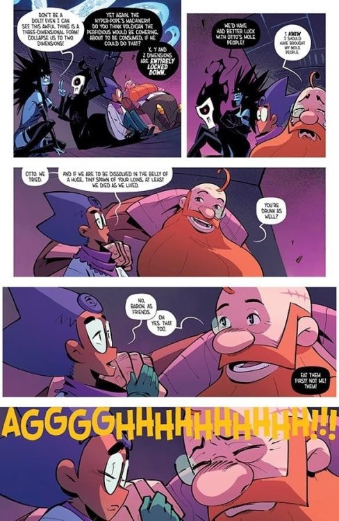
Prior to Savage Dragon #251, Malcolm Dragon is dealing with the COVID pandemic as well as supervillains. But nothing could prepare Malcolm for a visit from an alternate version of his dead father.

Savage Dragon #251 Hijinks

Savage Dragon #251 follows the classic Larsen formula of absurd superhero hijinks that anybody can jump into. The alternate classic Savage Dragon, Paul, is learning to deal with filling in for the late hero. Despite having the general outline of tropes and elements of the original dragon-like supporting characters and villains, he makes it clear he’s not exactly the same. Paul has experiences entirely unlike the original Dragon; for example, Malcolm does not exist in his world. Yet despite how shaky this introduction is, by the end, it looks like fitting in won’t be too big a deal. Malcolm and his half-sister Angel accept that Paul’s the least weird thing in their lives. Especially with the uncertainty of then pandemic.

Art

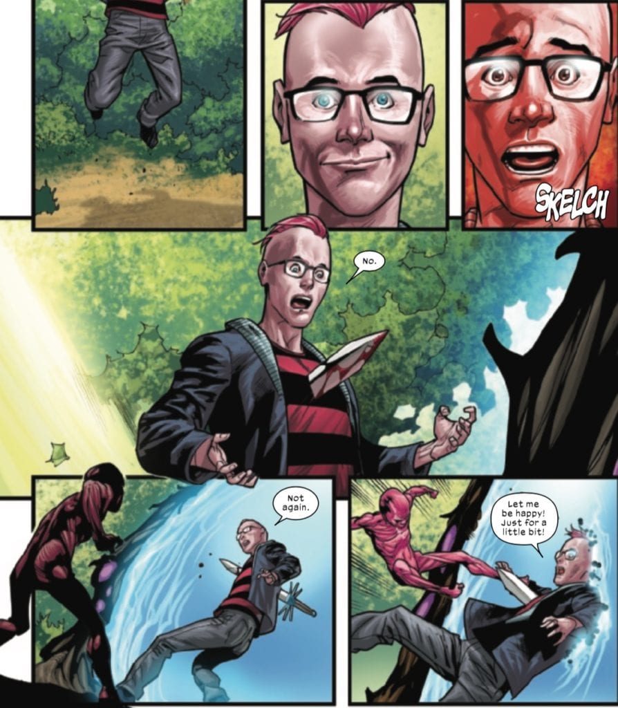
Larsen continues to provide the pencils and inks for the character designs in Savage Dragon #251. Paul Dragon’s distinctly different head fin attests to how he’s not necessarily the same character. All while keeping the panel work to fit in with situations. One page has 15 panels depicting a conversation between Malcolm and Paul that doesn’t feel overwhelming. It’s just a back-and-forth attempt to find even ground. One that suddenly erupts into a brawl that it’s almost funny with how it comes out of nowhere.

The coloring is shared between Toris doing the flats and Koutsis doing the decorative details. Toris’ simple colors that often have gradients provide a great canvas for Koutsis to fill in highlights like lighting against shadow. Each of these techniques perfectly complements Larsen’s designs, making the inks look much bolder as a result.

Delgado’s lettering is professional in how his word balloons stay within the panels to focus on the task at hand. That is until they need to reach out to complementary panels. Other times they color code like in Malcolm’s conversation with Maxine to display playful emotions. And then, there are the wordmarks that have creative uses in how they present actions. Almost none of them come out completely the same, this prevents the action in Savage Dragon #251 from feeling dull.

Enjoy Savage Dragon #251

Savage Dragon #251 continues what makes it so enjoyable. Sure it has some of the standard superhero tropes like alternate universes, but it’s mostly for laughs. The new character practically serves as someone just entering this part of Savage Dragon, along with the new readers. Because who cares about continuity if you can still have a good time?

What do you all think? Is this new development worth the time? Leave your thoughts in the comment section below.

Monkeys Fighting Robots Youtube

RAI #6: World Building + Character Arc = Junction Point

Rai #6 Cover

Rai #6 is the start of a new arc for the cyborg ronin releasing this week by Valiant Entertainment team of Dan Abnett, Juan José Ryp, Andrew Dalhouse, and Dave Sharpe.

Recap

Following cyborg brothers, Rai and Raijin, they are on a quest to eliminate their AI creator’s backups. Rai’s activities from previous storylines, however, give him a divisive reputation. To some, he’s a hero doing what’s necessary; to others, he single-mindedly ignores the smaller problems.

Rai #6 Story

Rai #6 focuses mostly on the title character’s divisive in-universe reputation. It’s something Abnett makes use of since the beginning of Fallen World. The positronic legionnaires that Rai and Raijin encounter looks to Rai as their savior. For his efforts in liberating them from Father, they live in peace with humans, something Rai tries to do earlier but encounters difficulty. Yet a more difficult challenge comes from Rai’s task to eliminate Father. Not that it seems impossible, Rai proves himself highly capable in the opening action sequence. It’s how continues to display tunnel vision in his quest; practically ignoring the pleas of the legionnaires. That is until Raijin’s own plea gets the brother’s into a cliffhanger.

Art

Rai #6 features the realistically rough pencils and ink from José Ryp. The scenes in the rain alone feel like they have weight. As the raindrops fall, the weight of them in comparison to the bold inks of the lead legionnaire Tekus really tell the important elements of this arc. It’s also why the shifting colors from uniform blues, greens, and reds of the setting and legionnaires against the chaotic colors of wild hybrid mutants feel so artistic. Especially when half of the panels on one page get a red accent to highlight the bloodshed. The act is a full display of orderly civilization against an uncompromising nature. It’s also why Rai’s first appearance in the issue with his illusory duplication and clean, bright glow feel godly.

Sharpe displays the practicality of juggling multiple series in Rai #6. Each word balloon is contained within their panels unless they directly lead to the next, never getting in the way of the action. Occasionally there are moments of higher emotion; shouting in rejoice is higher and orderly while spitting out a bug is chaotic. The Caption boxes meanwhile always change to fit the coloring of the backgrounds so that they never blend in. Wordmarks, in the meantime, are extensions of character natures. Repeating footsteps match the legionnaires while growling matches the hybrid mutants.

Rai #6 Is Only A Beginning

Rai #6 can serve as a new place to jump into as this new arc builds up to what hopefully becomes a good character arc even if it is only to see a bigger world where Rai isn’t just a cyborg Yojimbo. With such a creative team behind him, there are no insignificant points.

Monkeys Fighting Robots Youtube

Review: HELLFIGHTER QUIN #4 Brings The Smackdown

Hellfighter Quin #4, Ilhan cover

HELLFIGHTER QUIN #4, available from Mad Cave Studios on August 12th, follows Quin, Shard, and Deadeye as they enter the arena against Invictus and his allies…plus one big kaiju. Jay Sandlin’s story pulls no punches (literally) in an issue that’s almost wall-to-wall super-powered action.

Cover Art

Atagun Ilhan’s cover lays the foundation for the big reveal in this issue. Who is the Doomseer? You’ll find out at the end, but in the meantime, the cover projects an excellent sense of mystery and foreboding. Doomseer looms as a spectral menace that haunts Quin’s team fighting through the tournament, and that juxtaposition is perfect in more ways than one.

Writing

Sandlin’s story is the highlight of this issue. When putting a comic script together, it’s not enough to write, “And now they fight.” The action is typically a collaboration between writer and artist to choreograph action that looks cool and also continues the story through the action.

Here, Sandlin furthers the potential for romance between Quin and Shard in between the punches, and the conclusion of the fight plays right in the Overseer’s hands. You get the distinct impression that the fight’s outcome was part of a greater plan that makes the story significantly more layered.

Pencils/Inks

Ilhan shows some improvement in technique over prior issues (see our review of issue #2 here). In particular, the scenery and backgrounds are eye-catching in detail and really set the stage for an ancient Colosseum-style battle. Also, the action sequences, which take up a majority of this issue, are full of life and energy. Ilhan is demonstrating a strong command of kinetic action in the panel layouts and composition.

Hellfighter Quin #4, art sample

That said, the anatomy and renderings of the characters is a weak point in this issue. Faces are ill-defined to the point of looking distorted or misshapen. When an issue is so heavily dependent on the wow factor of the action sequences, the anatomy of the characters moving through the fight has to be tight. Ilhan’s art is improving over prior issues, but at its current level, it’s distracting enough to detract from the story.

Coloring

Maria Santaolalla’s coloring work has a lot more room to shine in this issue. The brightness of the airy Colosseum, the sparkling waterfalls, Quin’s blazing attacks – just to name a few – stand out to add pop to the story. Santaolalla’s colors are significantly improved over the muddled shadows so strongly present in issue #2, and they amp up the energy prevalent in Ilhan’s artwork.

Hellfighter Quin #4, coloring sample

Lettering

Justin Birch’s lettering is a prime example of organic integration. The word bubbles are placed well and keep the reader’s eye moving briskly through the pages, but what stands out is the use of coloring on the sound effects. Birch chose to add color and shading to the sound effects to match a visual focal point if the panel in which it’s placed. It’s a nice touch that makes the sound feel more integrated to the action taking place.

Conclusion

HELLFIGHTER QUIN #4, available from Mad Cave Studios on August 12th, is a bright, energetic, action-packed issue with a twist reveal at the end. The art team is showing significant improvements over the previous issues, and the writing is top-notch — lots of promise for what’s to come.

Monkeys Fighting Robots Youtube

The War Against Rationality Continues In LUDOCRATS #4

Despite what the cover of Ludocrats #4, there is no free pen.

LUDOCRATS #4, available this Wednesday from Image Comics, continues this quirky and obscenely chaotic tale. Providing readers and creatives alike a break from the stability that comes with common sense and rules of nature.

spoilers ahead

Ludocrats #4 is every bit as chaotic as it’s predecessors, if not more so. The series has taken some odd twists and turns along the way, but in a refreshingly honest way, the series has also refused to explain many of those very twists.

Instead, the series simply…exists. It’s a work (and world) of chaos, one that abhors logic and rules, as those sorts of things are simply too dull for the Ludocrats. It’s in their very name.

You’ll note that the cover of this issue promises a free pen. It also points out that said free pen isn’t actually included with the comic. This is a perfect peek into the chaos that lies within these pages. However, it’s far more kid-friendly than many of the images (and implications) within.

A new mystery to tackle in Ludocrats #4.

The Writing

Ludocrats #4 is the comic book equivalent of an insane roller coaster. Don’t skip over the insane part in that description. This is a series that defies description and logic, but it does provide for quite the break from the real world.

Written by Kieron Gillen and Jim Rossignol, this series isn’t afraid to take risks. In fact, risk-taking is kind of the name of the game. It’s quirky and zany, and not afraid to show it’s freak flag. The pandemonium in these pages knows no bounds.

As with the last issue, this one is set to yank a variety of reactions from the readers. Confusion, amusement, curiosity, horror, and alarm all go rather nicely with the Ludocrats. Sometimes all at once. Actually, it’s a bit more often than sometimes. It’s pretty clear that the intent is to leave the readers in a similar state; a jumble of colors and emotions.

There’s a strong running joke throughout this issue in particular, one that seemed to get funnier as time went on. It perfectly encompassed the personality of all the characters, while setting up for the explosive finale.

Now would be a good time to run.

The Art

Take a look at the cover for Ludocrats #4. That cover is probably the best summary one could hope to find for this series. That applies to both the plot and the artwork. It’s fun and bubbly while also being bright and unafraid to let it’s characters be free. Sometimes literally.

There are a few scenes worth highlighting in this issue. Mainly the one that comes from the first set of circumstances, our heroes (?) come across. It’s a fun little twist that added (or took away) extra depth to the series.

Jeff Stokely is the lead artist for this project, so give him credit for all of those crazy scenes. Even (perhaps especially) the ones that make you want to look away. This is a series that wouldn’t have been nearly as effective if not for the artwork involved, especially in regards to character design (which does carry the series from one event to the next).

Tamra Bonvillain is the one behind the colors, as you can clearly tell at just a glance. The colors are bold and bright, which is actually pretty perfect for this series. The world of the Ludocrats is bright and full of life, and sometimes death.

Clayton Cowles provided the lettering, showing off all the quirks and insanity that this oft-overlooked artform can provide. It’s ideal for this series for more than one reason—all while (almost) adding a sense of structure to the world.

Drunk, or friends? Why not both?

Conclusion

Ludocrats #4 is every bit as crazy and chaotic as it’s forefathers, if not more so. The series is getting close to the end, and this is the issue that is set up for that explosive moment, which might end up being more literal than not.

It’s been a fun and sometimes silly ride thus far, with the characters forcing their way through this world with a refreshing amount of boldness (and lack of shame). It’s undoubtedly one of the most unique series out there.

Monkeys Fighting Robots Youtube

FIREFLY #19: How To Create Enemies And Lose Friends

The cover of Firefly #19 shows a few fan favorites, once again in jail.

FIREFLY #19, available now from Boom! Studios continues the story of Sheriff Malcolm Reynolds. Once the captain of Serenity, now the Sheriff of a small moon in desperate need of help. It’s not a position fans ever expected to see this character in, that’s for sure.

spoilers ahead

Once upon a time, Malcolm Reynolds ran a crew, all as loyal as can be. Well, they were mostly loyal. Now that crew has been spread throughout the stars, and Mal has taken up a new job in life. It’s perhaps the least likely job ever for this particular character.

He’s now the sheriff of a moon, and he’s doing his best to resist those higher up in the food chain, though this time he’s doing it from the inside. Is this where the series would have eventually ended up, had Firefly never been canceled? It’s hard to know.

It’s obvious that the series has taken a stronger focus onto Malcolm Reynolds. It felt like a temporary move at first, but with each issue, that sensation seems to be drifting away. All while leaving fans missing their favorite (and noticeably absent) characters.

Where are Walsh, Zoe, Shepherd Book, River, and Simon? While the series has told fans were Kaylee, Jayne, and Inara are, the rest of the crew seem to have disappeared from the universe altogether. It’s quite a depressing thought.

Zoe is front and center on this variant cover for Firefly #19.

The Writing

Firefly #19 is one of those issues that will leave fans scratching their heads. Just what exactly is Mal up to? Are we still seeing the symptoms of a longer game, or has our favorite captain finally lost his way?

Greg Pak is still at the helm of this project, providing a look at what must be an alternative version of the world and characters we’ve come to love. Set after the events of Serenity, many changes have been formed here are there.

At first, it was tempting to try and guess how this plot would wrap back around upon itself, how it would bring the crew back together and make them stronger than ever. That temptation has decreased over the last few issues.

There’s still this sense of lingering curiosity, but the hope is dwindling. It’s hard not to miss beloved characters, especially after all this time (and all of the changes they’ve faced).

On the bright side, this series hasn’t been afraid to take risks. There have been plenty of those, especially in terms of character development. This has forced fans to take a step back from their assumptions and expectations, and simply enjoy the show.

The Bandit King strikes again!

The Art

One of the biggest highlights of Firefly #19 is, without a doubt, the artwork found within its pages. The series has taken on a heavily stylized look, but it’s something that suits the aesthetic of the world quite nicely.

Lalit Kumar Sharma is the leading artist for this issue. He’s the one responsible for all the character designs – both for new characters and for the changes made to old characters. All while providing a rough universe for them to reside in. Throw in more than one action sequence, and this issue has a visually compelling base to work with.

Francesco Segala provided the colors, taking Sharma’s work to a whole new level. It truly does read as a Western set in space, with the colors of both genres merging in unique (but pleasing) ways. The starry backdrops are a treasure and make the series worth checking out.

Jim Campbell is the artist responsible for the lettering, and as always, he did a brilliant job here. Carefully placed letters lead from one panel to the next, telling their own story along the way.

He does, indeed, have a good point.

Conclusion

Firefly #19 may be carrying on in a world many have come to love, yet it also feels so different from that original series. It has truly evolved with time, turning into something unique to the comic book industry.

Monkeys Fighting Robots Youtube

A Shocking Revelation In SPIDER-WOMAN #3

Spider-Woman #3 is about to send Jessica Drew on a whole new adventure.

SPIDER-WOMAN #3, available this Wednesday from Marvel Comics, throws Jessica Drew back into the fray. Her latest series has given her more than ever to contend with, including a brand new suit.

spoilers ahead

Jessica Drew, aka Spider-Woman, is back with her own series, and the stakes have never been so high. At least, not so high and so personal. She’s been backed into a corner, and we all know how well that is going to go over.

Spider-Woman #3 continues the latest adventure for Jessica Drew. Sometimes is horribly wrong with her – and now she’s on a race against time (and her body) in order to set things right. This has brought about its own challenges, as one might expect.

Even with these complications, it has been a delight to see Jessica Drew nabbing her own series once again. While the occasional appearance in events and other series (mostly Captain Marvel), has been nice, this feels so much more real.

The darkness before the storm?

The Writing

This latest Jessica Drew series has already been so full of twists and turns – and it’s only a few issues in. Don’t worry, Spider-Woman #3 has no intention of breaking that streak. Written by Karla Pacheco, this is an issue full of action and more than a few climactic moments.

This series is simultaneously portraying Jessica at her best and at her worst. She’s fighting to stay alive for the people she loves, all while struggling against something out of her control. It’s a fine balance, but oddly enough, it all just makes her character feel more human.

A human who has all the right in the world to be feeling extremely angry at the moment. She’s been put through hell and back. Sure, it may all have been done for good reasons, but that hardly changes the fact, now does it?

This issue is full of that anger, to an almost satisfying level. Yet even that isn’t enough to stop the revelations heading Jessica’s way. Which naturally results in a bit of a cliffhanger for the next issue. Who’s placing bets of Jessica starting another fight?

Running parallel to Jessica’s scenes are some moments that are, quite frankly, hilarious. Roger and Gerry are a hilarious pair, though admittedly, Roger is hard-pressed to keep up with that child. It’s a moment of fresh air, before diving back into this tense adventure.

To be fair, she’s got a good reason to be angry.

The Art

Spider-Woman #3 features some bold artwork, as it should. Jessica Drew’s story is dark and complex. The artwork supports that, all while providing an issue full of action, and even a chuckle-worthy moment or two.

Pere Perez was in charge of this issue, providing a broad range of scenes, emotions, and events. Everything from Jessica’s battles, to her emotional (read: extremely angry and ticked off) reactions, as well as everything in between. The contrast between certain scenes was impossible to avoid, and did an excellent job of highlighting her emotional/mental state, and how inaccurate her assumptions are.

Frank D’Armata provided the colors for this issue, bringing the art to life in a bold way. Literally. The colors are vibrant, with only one exception. It was clever to have the scene portraying other characters appear a bit more muted, almost like a flashback. It made it stand out, all while hinting at more.

VC’s Travis Lanham did the lettering, and it was so satisfying here. Thanks to his work, you can really feel it when Jessica lets loose on an enemy. There’s a real sense of impact, not to mention that at times one can almost hear her anger seeping off the pages.

She looks so alive, ironic since she’s fighting to stay alive.

Conclusion

Spider-Woman #3 threw some serious curveballs our way, and while it did leave a bit of a cliffhanger, it’s an experience worth reading. Her journey is full of anger, and rightly so. Yet all of that leaves us wondering: how’s she going to react to this latest twist?

Monkeys Fighting Robots Youtube

How Things Just Went From Bad To Worse In ONCE & FUTURE #10

The enemy refuses to stay down on this cover of Once & Future #10.

ONCE & FUTURE #10, available Wednesday from Boom! Studios continue Duncan’s journey as he learns to fight things that go bump in the night. Unfortunately, things look like they’re going to get worse before they get better.

spoilers ahead

Duncan has only been a hunter for a short period of time. Yet in that time, he’s already faced a king of legend and lived to tell the tale about it. Now he’s about to come up against another legend of old. What are the odds that he’ll get lucky twice?

Once & Future #10 brings fans back to a world of quests, lore, and violence. Only, in this case, the legends are not as magnanimous as they would have had us believe. No, they’re much darker, having had plenty of time to become warped and twisted.

The panic that comes with trying to get somewhere in time.

The Writing

The tale of one family’s battles against creatures of lore continues in Once & Future #10. Written by Kieron Gillen, this issue is tense and absolutely full of battles to stay alive. And to save the day, of course.

Once & Future #10 doesn’t hesitate to throw readers into an anxiety-inducing scene. It makes sense, given the last issue ended in a bit of a cliffhanger. Though the suspense seems to go up a few octaves before the revelation fully hit home.

The tension seemed to grow with each passing page until connections were finally forged. That’s when it became clear how bad things were. Oddly enough, it was almost a relief, since at least now we know. The unknown is always worse, as evidenced by what readers will experience here.

The series of events leading up to the action was tense, making that climactic moment feel larger than life. Or perhaps not, since there really isn’t a struggle larger than the one to stay alive. It’s a tone that was played to perfection here, all while once again setting up for something more.

The constant throwbacks to lore and legends have been a delight, especially towards the end of this particular issue. Once again, pointing towards the fact that this is not a problem that is going to be easily pushed aside.

A real-life moment within the comic book world!

The Art

Once & Future #10 is full of bold colors, dramatic fights, and even more terrifying creatures. In short, it’s entirely at home with the rest of this series. Dan Mora (art), Tamra Bonvillain (colors), and Ed Dukeshire (letters) have worked together to bring this issue to life, and it was well worth the effort.

The juxtaposition between the build-up scenes cannot be ignored. On the one hand, there’s Duncan’s panic expressions and actions to get somewhere and fast. Then there’s Gran, enjoying a rare evening off. It set the tone for what was to come.

What followed was every bit as daunting as one could expect, after such a build-up. It was a monster of legendary proportions – literally. Yet the artistic team was up for the task, portraying unexpected twists in the action.

The colors went a long way in setting the otherworldly feel to this issue, as with the rest of the series. One can see how magic and legend could seep back into the world when it’s full of such brilliant hues.

There’s more than one way to travel, apparently.

Conclusion

There are times when the wait between issues is simply unbearable. That is going to be the case now, following Once & Future #10. The cliffhanger alone will be enough to leave readers eager to see how Duncan and his Gran are going to get out of this mess.

Monkeys Fighting Robots Youtube

Review: EMPYRE: X-MEN #4 – An Anticlimactic (Though Heartfelt) End

On August 19, Marvel Comics releases the final issue of its Empyre tie-in series, Empyre: X-Men #4. Writer Jonathan Hickman returns to the series with pencilers Jorge Molina & Lucas Werneck (also doing inks), inker Adriano Di Benedetto, colorists Nolan Woodard and Rachelle Rosenberg, and letterer VC’s Clayton Cowles.

spoilers ahead

Writing

In a series with rotating creative teams that has seen its share of escalating action, this issue brings the series to a close with a lot of jokes and maybe a few tears, but it is quite anticlimactic.

Readers discover the Scarlet Witch’s fate and a plan she set in motion with Doctor Strange to end the Genoshan zombie threat that comes as a bit of a deus ex machina. At the same time, Beast commits intellectual property theft again, Hordeculture.

One of the more touching parts of this issue is when the zombie Explodey Boy comes face to face with his (fully) resurrected Krakoan counterpart. The two have a very heartfelt conversation and catch up before zombie Explodey Boy sacrifices himself to end the Cotati threat by blowing up inside of the giant Cotati creature, causing all the Cotati to die Phantom Menace style. Likewise, as noted earlier, the zombie threat (from the actual zombies and Magik the “zombie queen”) also ends with ease.

Many readers may walk away wondering what the point of this story tie-in was, other than merely piggybacking on the main Empyre event for a chance to sell more comics. Perhaps the Hordeculture plot will pay dividends down the road, but there is no confrontation between the X-Men and Scarlet Witch, so while I initially believed this story might tie into the underlying Scarlet Witch/Pretender plot thread from the X-books, that doesn’t seem to be the case. But given the ease with which the big bad of Empyre, the Cotati, are dispatched, one still finds this series, as a whole, a bit vacuous. As Explodey Boy tells his zombie, this was “some kinda interesting stuff wrapped in a bunch of other not-so-interesting nonsense.”

Art & Colors

The art team (and there is very literally A TEAM working on this issue) continues to give the series a consistent look, even if the writing sometimes feels like “and then another random thing happens, and then another random thing happens, and then another random thing happens, etc.” The art has been one of the strongest parts of this series.

One sequence that the art team creates to significant effect involves a flashback to Beast’s work with Opal on Krakoa.

The use of black and white to indicate a flashback as we read Beast’s internal monologue plays well in this issue. It communicates Beast’s memory without relying on overly clunky exposition.

It was also refreshing to see the series return to the series-opening sequence, where Wanda was confronted by the horde of zombies and screamed in terror. While her final scream might have made readers believe she was overwhelmed by the zombie horde (although most likely not, given her presence in Strange Academy), we are reminded here what a badass she is.

Wanda is no damsel in distress. She’s a powerful witch, and the art team does a fantastic job portraying her as the confident super being that she is, while still conveying in other places that she is a person carrying deep regret over her past actions.

Lettering

As has been the case for the whole series, Cowles’s letters are great, and there are several really clever dialogue moments. As mentioned before, the interactions between Explodey Boy and his zombie are priceless, particularly a comment that might as well be a comment on X-Men continuity and storytelling over the past decade.

Another great humorous moment, in an issue with a lot of them, comes at the beginning of the issue when Wanda and Doctor Strange are looking for the materials to undo Wanda’s mistake. When the two of them go to Asgard to get a branch from the World Tree, the Asgardians suffer from a bit of deceit.

Cowles’s does an excellent job playing up the humorous effect here with his lettering. Magical bastards indeed!

Conclusion

Judged as a whole, this series is fine enough of a tie-in, even if the plot did feel randomly strung together at times, and ultimately, a bit pointless. Each issue ended with a cliffhanger whose role was acknowledged although to necessarily substantially built upon by the next creative team, who added their share of random escalation until the final issue when everything ended a bit anticlimactically. As a fun, crazy comic book story, it probably works. As a must-read for either Empyre or the overarching X-titles narrative(s), not so much. Perhaps Hickman and company will address Scarlet Witch’s tampering with Genosha when she finally faces a reckoning with Krakoa, but we’ll have to wait and see.

What did you think of Empyre: X-Men #4? What did you think of the series as a whole? Tell us in the comments below!

Monkeys Fighting Robots Youtube

Review: X-FORCE #11 – Krakoa Gets Attacked…Again.

On August 12, Marvel Comics released X-Force #11. Exploring some of the fallout from his Wolverine series, writer Benjamin Percy is joined by artist Bazaldua, colorist Guru-eFX, and letterer VC’s Joe Caramagna.

spoilers ahead

Writing

One advantage of having the same writer writing multiple titles is the ease with which they can cross-pollinate between those titles. Picking up on the events from Wolverine #3, the issue opens with an autopsy of the Russian supersoldiers Wolverine and the Marauders encountered in that issue, only to discover these supersoldiers are far deadlier than they first appeared, with a violent twist on the Russian Nesting Doll. Meanwhile, Colossus struggles with his reluctance to become an active combatant again, all while showing that deep down, he’s still a hero.

Also, while the X of Swords event isn’t supposed to drop until the Fall, this title appears to plant some seeds leading up to the event as readers learn that the latest attack on Krakoa is an attempt to retrieve “the Sword of Cerebro.” And, of course, in what has become an X-Force tradition, Quentire Quire gets gruesomely killed, although not before we find out he’s sleeping with one of the Cuckoos (wonder how that’s going to go over with Cable?).

For those who might’ve been expecting a fight between Colossus and Omega Red, you might be disappointed. Dustin Weaver and Edgar Delgado’s cover is well-drawn but doesn’t quite reflect the contents inside. However, given that the X-books, mainly Percy’s, are focusing on an escalating conflict between Russia and Krakoa, and it is hinted at that the mutant nation might’ve been betrayed from within, the cover may foreshadow a potential future conflict between Colossus and Omega Red.

Art & Colors

The art team does a good job highlighting the menace of the Russian supersoldiers. Bazaldua and Guru-eFX’s depiction of even the dead soldiers makes them look more menacing than they appeared in Wolverine #3.

Russian supersoldier in X-Force #11.
Russian supersoldiers in Wolverine #3.

The art and coloring make their body armor, and even their (dead) faces appear more menacing than they did in Wolverine.

One great collaboration on the art team happens when Kid-Omega is killed. The scene is set up wonderfully, with Quentin’s contentment being established only to have it violently interrupted.

There are several things that work about this sequence, not the least of which is the clever means by which Quentin’s death furthers the plot, since the Russian agents can’t get through the Krakoan gates, and so couldn’t escape with the sword. Killing Quentin and pushing him through, however, accomplishes just that.

In terms of its execution, seeing Quentin’s contentment give way to shock in the splash of red (along with the stabbing sound effect) conveys the gruesomeness of the situation, while still being able to be played for laughs…albeit very dark laughs.

Lettering

Caramagna’s letters are on point in this issue. Very early on, his letters help establish the impending danger facing Krakoa in this issue, in a scene that’s quite Alien-esque.

That movement from the silence of the dead to the chest-bursting Russian supersoldiers creates a very palpable “oh shit!” moment that sets the tone for the entire issue. And you couldn’t get that without “SKELCH.”

One area that was a little unclear was the purpose of the prose sections in this issue. Typically, these sections serve to provide plot details that aren’t shown (which isn’t necessarily a good strategy) or to flesh out a character’s own private thoughts or to show the reader some sort of communique. In this issue, the prose sections are partial chapters of a novel or memoir. Who is speaking is a bit unclear, but hopefully, Percy and company flesh this out and make it understandable in future issues.

Conclusion

X-Force #11 catches Krakoa with its pants down as they suffer a biological attack from Russia, and it appears to establish another piece of what I’m sure is part of the lead up to X of Swords. Percy and company establish a challenging enemy for X-Force, continuing to escalate the conflict with Russia, which will probably eventually involve Colossus getting involved, despite his protests to the contrary.

What did you think of X-Force #11? Is it laying the foundation for X of Swords? Will Kid-Omega ever NOT die in an X-Force issue? Tell us what you think in the comments below!

Monkeys Fighting Robots Youtube

Review: MARAUDERS #11 – Kate’s Fate Revealed!

The fate of Kate Pryde is finally revealed in Marauders #11, released by Marvel Comics on August 12! Writer Gerry Duggan, artist, Stefano Caselli, colorist Edgar Delgado, and letterer VC’s Cory Petit bring readers another issue of what is easily one of the strongest X-titles currently being published.

spoilers ahead

Writing

This issue begins with a tender moment, with Nightcrawler writing a letter Kate while she’s “away” in order to keep her in the loop of all the goings-on around Krakoa. The X-Men then hold a ceremony for Kate, and a sense of sadness hangs over the book. That sadness quickly turns to anger, however, when Lockheed returns, and Emma Frost discovers that Sebastian Shaw betrayed Kate. Rather than take this discovery to the Quiet Council, Emma keeps it to herself, setting up a future (and probably ongoing?) conflict in the series moving forward.

Finally, the moment readers have waited for finally happens…Kate returns! The mystery of how to resurrect her is uncovered, and hopefully, this will move the narrative one step closer to revealing why she can’t go through the Krakoan gates.

Again, this is a solid title, with a well-paced story, and a lot of good character moments and interactions. Readers will have to wait for the fallout of Kate’s murder by one of her fellow mutants and Hellfire members, as well as for the significance of the B-plot involving Storm and one of the agents of the X-Desk.

Art & Colors

The art team crafted a gorgeous issue filled with some beautiful and poignant imagery. One image that particularly stands out comes at the beginning of the book, with Kate’s body being shown.

There has been a sadness hanging over this book, and a general sense of uncertainty hanging over the X-titles, ever since Kate’s death. This image drives that home, particularly given reader knowledge of the circumstances of her death.

Given the themes of life and death in this issue, it is only fitting that the next image to highlight comes from Kate’s rebirth, beautifully colored by Delgado.

Caselli and Delgado complement each other very well here, with the fetal imagery and ambient lighting working in tandem to show us Kate’s fetal state before she can phase through the egg.

Again, thematically, it is beautiful that this issue is bookended by the themes of death and rebirth, subjects that the art team can skillfully convey.

Lettering

In an issue full of some tender moments, one of those moments is used as a framing device to begin the issue: Kurt’s letter to Kate. Kurt’s words establish the tone for the entire book as sad but hopeful. Petit’s letters are well-done here as he overlays the images with Kurt’s letter to his dear friend. Particularly worth of note is how the lettering provides a nice touch to the image of Kate’s dead body (noted above) by simply stating, “when we meet again.”

It’s a heartfelt sequence, and Petit does a beautiful job working in tandem with the art team to add a nice verbal flourish. In an issue mourning the death of a teammate and friend, all of Petit’s letters operate that way, not overwhelming the scene but appropriately accentuating the scene when needed.

Conclusion

It’s good to have Kate back, and moving forward; it will be interesting to see how the conflict with Sebastian Shaw will play out. Will he eventually meet the same fate as Sabretooth, exiled below the surface of Krakoa for his crimes? Or will Kate and Emma be able to put him under their thumb? And has a new relationship with the X-Desk opened up future avenues for cooperation, or is there a conflict being foreshadowed with the U.S. government?

What did you think of Marauders #11? Tell us in the comments below!

Monkeys Fighting Robots Youtube