Home Blog Page 270

Review: EMPYRE: X-MEN #3 – Things Keep Escalating…

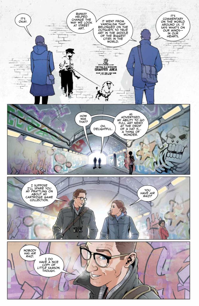
On August 12, Marvel Comics released Empyre: X-Men #3. With rotating writing and artist on each issue (I’m guessing to accommodate the weekly releases), writers Vita Ayala, Zeb Wells, and Ed Brisson are joined by artist Andrea Broccardo continue this tie-in tale to Marvel’s larger Empyre event. They are joined by mainstays of the series Nolan Woodard on colors and VC’s Clayton Cowles doing letters.

spoilers ahead

Writing

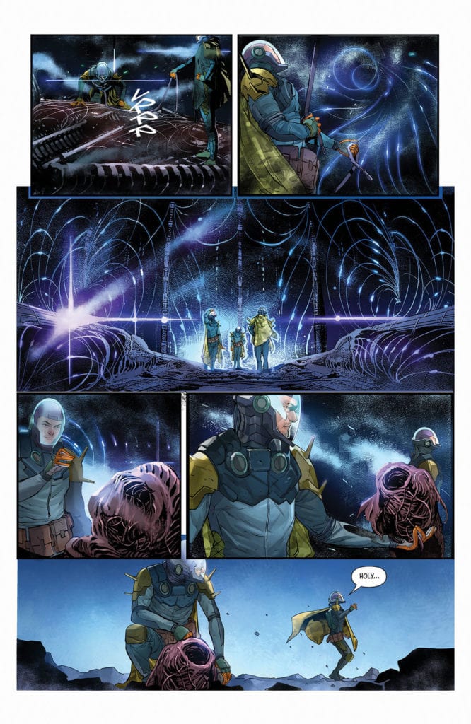
Empyre: X-Men #3 is a messy issue. A fun and action-packed issue, but a messy issue. At times, it’s a bit difficult to keep track of all of its moving parts. The issue moves back and forth between the action on Genosha and characters on Krakoa, with a few characters, like Hordeculture’s Opal, being teleported to Krakoa, and somehow returning to Genosha off-panel.

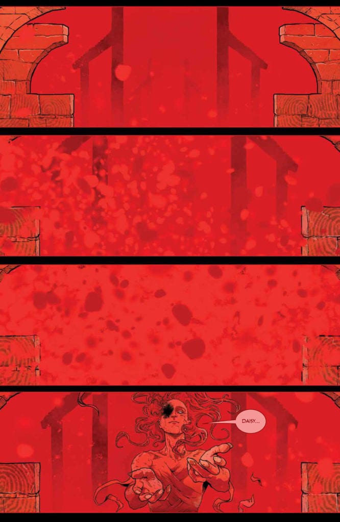
Highlights include Magik’s discovery of the staff Scarlet Witch used when she attempted to resurrect the dead Genoshans, although still no sign of the witch herself. Upon grabbing the staff, however, Magik is overwhelmed by its power, becoming “the Zombie Queen of New Genosha,” whatever that may mean. We’ll see what this development means in the final issue.

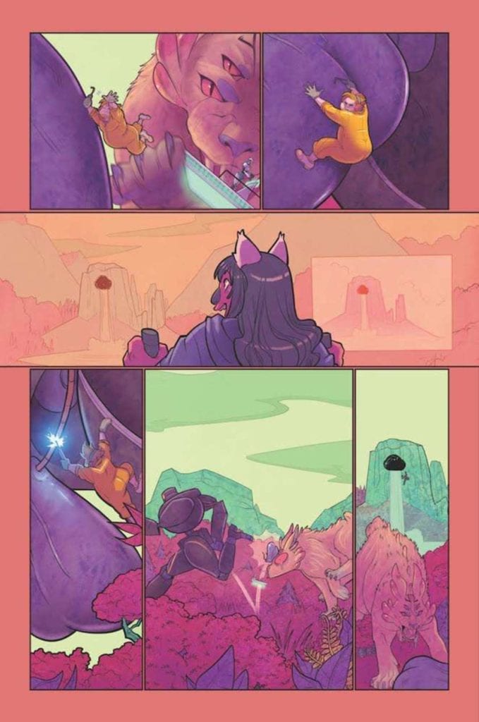
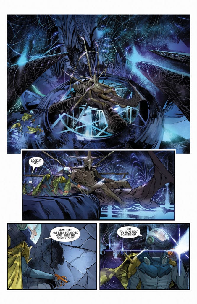
Meanwhile, the Cotati threat escalates even further, with the seedpod giving birth to a monstrous creature, which one of the dismembered Cotati indicates will lead to the deaths of everyone on Genosha.

This series keeps exponentially growing (albeit messily) in scale, and the final writing team will have its hands full tying up all the loose ends while hopefully giving readers insight into the Scarlet Witch’s whereabouts.

Art & Colors

It’s worth noting here that Eduard Petrovich’s cover doesn’t quite reveal the actual contents of the issue. While I appreciate the partitioning of the cover between the Cotati, the X-Men, and the Genoshan zombies, Cyclops, Polaris, Magneto, and Colossus don’t appear anywhere in this issue.

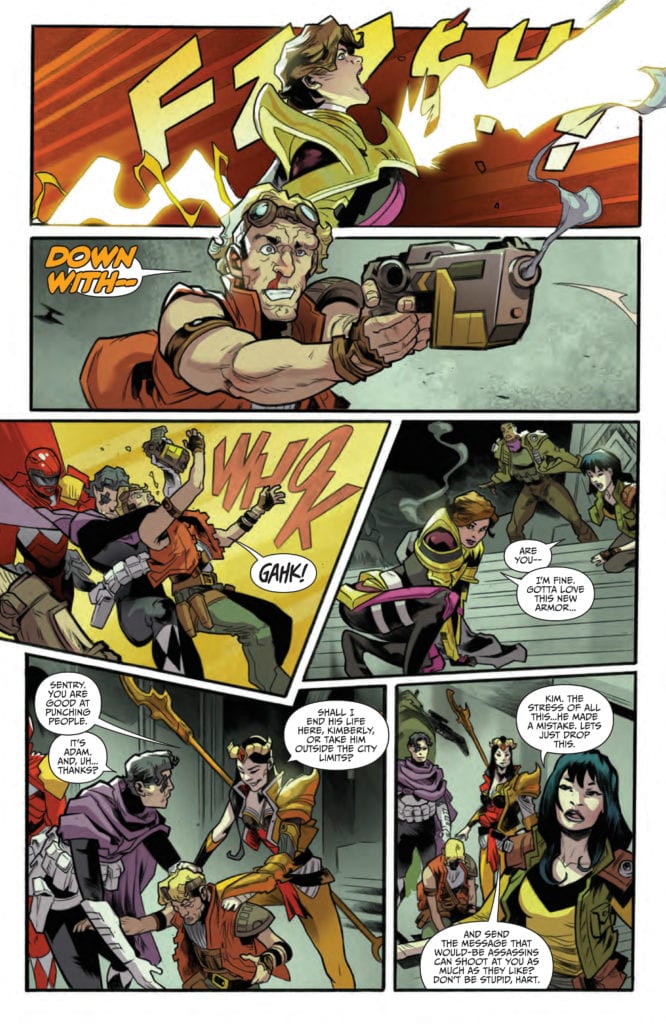
Inside the issue, Broccardo is able to jump right into this event, with the change in artist barely being registered (this is a credit to the artists across the three issues). One of the standout panels from Broccardo includes her full page of Nightcrawler jumping into action.

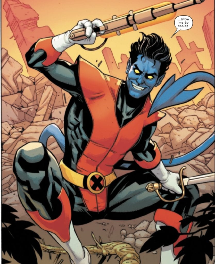
It’s always nice seeing the elf charge into battle with a smile on his face and a sword in his hand! We don’t get quite enough of fun Kurt jumping around in the X-titles.

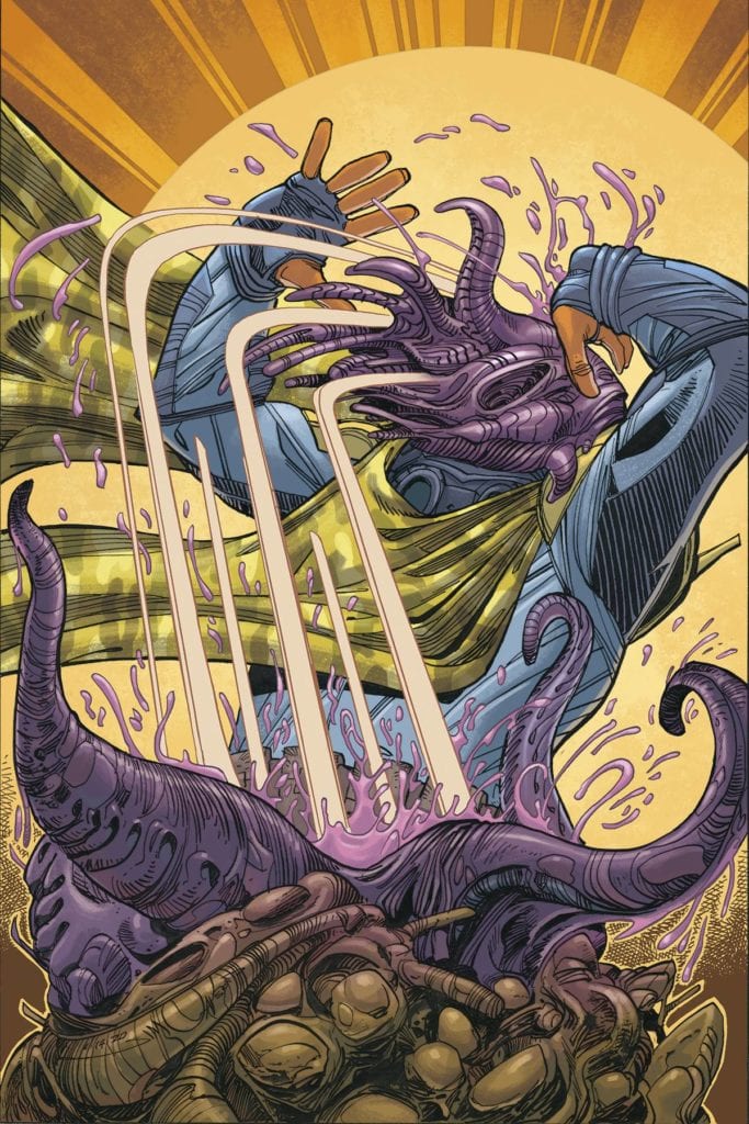
Another great panel includes one of the Cuckoos (it doesn’t specify exactly which one), who gets cut off from her sisters and is about to be killed by the zombies. Resurrection may be a reality on Krakoa, but the writers and artists do a decent job in this panel, reminding the readers that one ought not to think that resurrection is without its cost.

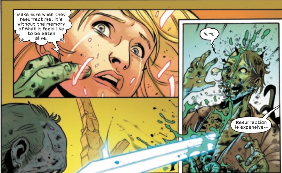
Although Magik saves her, the tears on her face and her request to be brought back without the memory of being eaten reminds us that there can still be traumatic consequences to the characters even with resurrection.

Of course, Woodard’s colors have been constant throughout this series, helping in part to keep the look consistent even with rotating artists. Woodard’s shifting yellow-green, and brown-orange-red hues have been consistent throughout, accentuating the plant-based Cotati and the plant-based Krakoan weapons while also providing a nice contrast to the viscera and rot of the zombies.

Lettering

Cowles’s lettering remains steady in this issue, and he’s certainly given plenty to do. THIS panel alone gives him a fair share of dialogue and sound effects to put in.
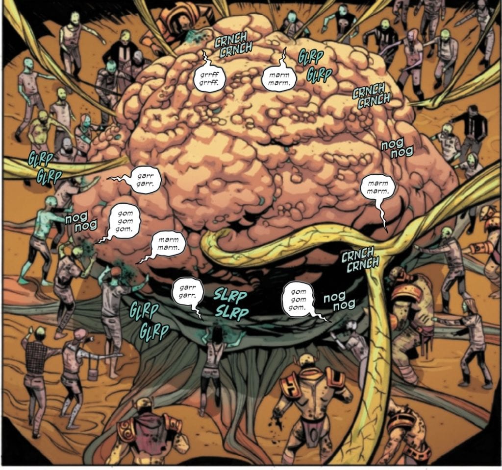
*Nog Nog* indeed.

There was one place in the lettering (and in the art) that may bring some confusion. In a transition from a panel featuring Angel to one featuring Multiple Man, you’d be forgiven for thinking that the letterer, the artist, or both mixed up characters’ locations and dialogue.

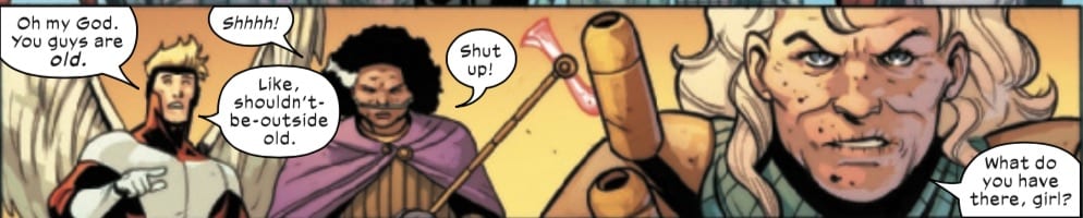
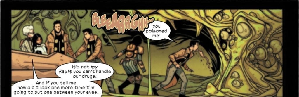
You’d be forgiven for thinking that the dialogue between Jamie and Warren got mixed up here since Hordeculture chastises Jamie for calling them old, but the last person to call them old was Warren. Also, the panel before Jamie throwing up is of Warren throwing up. Initially, I thought a mistake had been made in terms of the art or the lettering, but the effect is probably meant to mirror the similar effects of getting over Hordeculture’s pheromones (nausea, calling them old, etc.). And yes, Jamie had been dosed in issue #2, so it makes sense that he’d be having the same symptoms as Warren, even though the previous issue highlighted Warren’s susceptibility to the pheromones.

Conclusion

Overall, this was a fine third issue, filled with action that at times can be a bit confusing to follow. We will see this week if issue #4’s writing team resolve the escalating conflict with the Cotati, the zombies, and the fate of the Scarlet Witch.

What did you think of Empyre: X-Men #3? Tell us in the comments below!

Monkeys Fighting Robots Youtube

Review: STEALTH #4 Is The Action Movie Rental You’ve Been Waiting For

Stealth #4, Howard cover

STEALTH #4, available from Image Comics on August 12th, follows all the players – Tony, Stealth, and Dead Hand – as they converge towards the final showdown. Mike Costa’s story leans heavily into the action movies of the ’80s and ’90s to bring you a chapter that’s violent, tense, and surprisingly humorous.

Cover Art

Jason Howard’s cover is a beautiful blend of action in pulp. The henchman is getting ready to blast away when you see the reflection of Stealth bearing down via a pool of blood. The cover plays up and on the violence of the issue well, but the angle of the reflection is off, so it was a little distracting.

Writing

Costa’s story picks up right after the events of issue #3 (you can read our review here). Tony is searching for Stealth. Stealth is cornered in an old safe house. And Dead Hand is killing anyone who gets in his way.

Costa does a great job weaving the three-character threads towards convergence. Tony uncovers the clues to Stealth’s plan if you can call it that. Stealth is racing to uncover the tools he needs to defeat Dead Hand before he loses his memories. Dead Hand throws grenades and kills rival gang leaders to consolidate power and bring down Stealth in a very public way.

Different from the previous issue, this entry had a few dark humor jokes that caught me off guard. The jokes made the issue more fun to read, and it gave off a distinctly RoboCop (1987) vibe in their absurdity. Excellent work overall by Costa.

Stealth #4, writing sample

Pencils/Inks

Nate Bellegarde lays down a no-nonsense style to the art for this issue. All the panel angles are straight on without coming off as flat. The character renderings have a grounded and realistic quality to them, and the action is – in a word – cinematic.

At the risk of sounding redundant, this entire issue reminds me heavily of the better action movies of the ’80s and ’90s. The exploding house looks straight out of a Lethal Weapon (1987) film. Maybe the creative team has a thing for movies released in 1987.

One panel, in particular, caught my eye for its freeze-frame effect I don’t believe I’ve ever seen before. A henchman shoots a gangster in the head, but rather than projecting the typical splatter from the shot; you see the gangsters face bulge out from the bullet’s exit point at the precise moment before the bullet comes out. It’s a panel that’s equal parts disturbing and fascinating to see—really cinematic art here by Bellegarde.

Coloring

Tamra Bonvillain’s color work is gorgeous in this issue. Rather than muting all the panels to keep it sober and gritty, the colors are almost cheery in their brightness. That cheeriness helps to elevate the absurdity of the violence and infuse the book with a bit of grindhouse ambiance.

Stealth #4, coloring sample

Lettering

Sal Cipriano’s lettering does well for maximizing every square inch of space. For an action movie-esque issue, there’s quite a lot of dialog going on. Surprisingly, the high volume of word balloons never got in the way of the high-quality art, and it kept the pace moving nicely.

Conclusion

STEALTH #4, available from Image Comics on August 12th, reads like one of the better action movies of the last few decades. The story is action-packed with a few surprising jolts of humor to make the issue thoroughly entertaining. The art is colorful and cinematic, and this issue would serve as an excellent pitch for a film or streaming adaptation.

Monkeys Fighting Robots Youtube

How Red Seeps Into the World In RED MOTHER #7

The red is getting ever closer in Red Mother #7.

RED MOTHER #7, available this Wednesday from Boom! Studios, continues Daisy’s journey, following the aftermath of that horrible night. This dark series is a puzzle waiting to be solved by the readers.

***SPOILER WARNING***

spoilers ahead

Red Mother is a series following Daisy McDonough and the events that follow the worst night of her life. Ever since the attack, nothing has been the same. Her life feels haunted. By the loss of her boyfriend, the damage to her eye, and haunted by a mysterious red figure.

The Red Mother is a psychological horror series through and through. Realistically, it is not a series for the faint of heart or those that have trouble seeing the damage that occurs around the face. That is the sort of imagery prevalent within these pages.

Daisy is looking mighty haunted on this alternate cover of Red Mother #7.

The Writing

No matter how far Daisy runs, she cannot get away from what is haunting her. Or is it hunting? She’s made it to another continent, and yet the red is still there, right at the corner of her vision.

Jeremy Haun has continued his thrilling and terrifying tale in Red Mother #7. Daisy’s journey is feeling increasingly claustrophobic, as the supernatural following her gets ever closer. The sense of foreboding is on point in this issue, as are many other subtle elements.

All of which weave together to create a dark and concerning tale. Even the moments of brightness cannot chase away the dark or in this case, the red. It almost feels like the moments of happiness in Daisy’s life as put in place to remind readers of everything that can (and will) be lost when it all goes awry.

There are a lot of elements to appreciate in this issue. The commentary on street art, the subtle clues dropped here and there, as well as the significant revelations. None of it should be ignored, as it’s all building up to something. The question is, what?

A world of red is waiting to invade.

The Art

The artwork behind Red Mother #7 is every bit as haunting as the story it supports. Though in an exceedingly more deceptive manner. Danny Luckert has been the lead artist for this project, working alongside Ed Dukeshire for lettering.

There are panels where the world looks almost normal, only to flip towards the red spectrum. It’s a twist that fans of the Purple Man will easily recognize – and that makes it no less terrifying. In fact, the opposite could easily be argued for.

The artwork on these pages subverts all expectations, turning bright colors into moments of pure horror. The twist leaves a strong sense of anxiety, proving how effectively it manipulates the reader’s emotions.

All of this is coupled with a sense of light, which the series isn’t afraid to play with. Dark shadows are bouncing all over the backdrop, while light dances over the hands of leading characters. Is this just a moment of playfulness, or a hint towards something much darker?

Likewise, the lettering for this issue is so carefully crafted. There’s a real sense of impact, subtle cues that spring from the placement of the words. It’s subtle, yet it also carries the readers along in this twisted tale.

A timely conversation about street art.

Conclusion

Red Mother #7 is a complex issue, providing ample opportunities for concern while building up for something so much bigger. Like the calm before the storm, things are about to get a whole lot more complicated in Daisy’s life. That is a message telegraphed very clearly in this issue.

Monkeys Fighting Robots Youtube

POWER RANGERS: DRAKKON NEW DAWN #1 – Recovery Scars

Power Rangers: Drakkon New Dawn #1 Cover

Power Rangers: Drakkon New Dawn #1 is the beginning of a spin-off to Boom! Studios’ main Power Rangers series. The story written by Anthony Burch, with artwork by Simone Ragazzoni, colors by Raúl Angulo, and lettering by Ed Dukeshire, focuses on the World of the Coinless trying to recover after the Shattered Grid crossover event.

Power Rangers: Drakkon New Dawn #1 Story

Power Rangers: Drakkon New Dawn Alternative CoverBurch stepping out of his partnership with John Carpenter and the horror genre pens Power Rangers: Drakkon New Dawn #1. Continuing off of Power Rangers: Ranger Slayer, a post-upgrade Kim is trying to lead a rebuilding of her reality’s society. But things are not easy as old wounds in both of Coinless and Power Sentries are manifesting every other day. All of which reflects in the company Kim keeps. Some include her former ranger teammates who know her brainwashing into the Ranger Slayer and old enemies like Scorpina, whose condescending attitude makes it hard to be in the same room with. Yet it’s the struggle to find tolerance that makes the rebuilding efforts worthwhile. Because not all of who went against Drakkon or joined him are purely good and evil, respectively, some of the Sentries only wanted to protect those they could under Drakkon’s rule.

So Kim takes it upon herself to dismantle any remains of Drakkon’s influence, starting with a prison. Years of trauma continue to haunt this place, especially in the prisoners. One prisoner, in particular, serves as what kickstarts the story as a reminder of Drakkon’s aftermath. Drakkon may be gone, but he leaves behind a nasty surprise that may push Kim and friends to the brink.

Art

Ragazzoni gives a distinctive look to the world of Power Rangers: Drakkon New Dawn #1 in terms of character design. Most characters not in Ranger suits look worn out and ready to break. It’s a display of the amount of trauma that still resides in the World of the Coinless. However, the Ranger suits are more or less masks to hide their exhaustion. It’s merely a means of keeping themselves together in a world where these suits are the marks of Drakkon’s influence. No one displays that better than the Prisoner Ranger whose crudely put together design demonstrates his place in a terrible surprise from Drakkon.

Angulo’s coloring in Power Rangers: Darkkon New Dawn #1 shows a grim bleakness throughout the issue. While the brighter colors do appear throughout the issue, the muted atmosphere and flat colorizations hold the brightness back. In fact, when color with more luster appears later, it’s not life returning to a barren world, it’s a harbinger of destruction.

Every detail in the artwork

Dukeshire provides lettering that is uniform, never straying from the panels. Some of the fonts even get a stylization to coincide with the emotional states that characters are in. A boat of rage is often with an orange font word. Caption boxes stand out enough for readers to follow them without getting in the way of the images. But what really stands out are the wordmarks that possess details that are drawn for this very occasion. They are not extremely bright, and the flat colorization belies their impact as they jump between panels.


Get Started With Power Rangers: Drakkon New Dawn #1

Power Rangers: Drakkon New Dawn #1 begins an exciting spin-off series that displays how an already bleak setting can get even worse. Yet the creative team is going to make this series something fans will never forget.

What do you all think? Is it time to move on from Ranger Slayer and Drakkon? Or do you want to give this series a try? Leave your thoughts in the comment section below.

Monkeys Fighting Robots Youtube

Review: VOYAGE TO THE STARS #1 Brings The Podcast’s Hilarity To Comics

VOYAGE TO THE STARS #1 hits stores on Wednesday, August 19th, bringing one of the most beloved sci-fi podcasts to comic books. Readers get up close and personal with a less than polished team of space travelers who happen to be the sole survivors of Earth’s recent destruction. But rather than giving up hope, they’ve decided to search the universe for answers and find a way to destroy the “Nothing” that took their home.

Story

The story opens up with brief yet detailed recap of the protagonists’ current predicament, which is told through the characters’ interactions. This narrative technique is particularly effective in two ways: first, it relays key information pertinent to the story, and second, it gives readers an immediate look into each character’s personality.

From the conceited Tucker Lentz to the rational Elsa Rankfort, each individual offers a dynamic that makes the greater whole that much better. This is exemplified even further when the group finds a mysterious “guide” who is supposedly the last hope of the universe. Watching Tucker bemoan the fact that someone else is more important in this quest is priceless.

Ryan Copple and James Asmus’s writing is both hilarious and thought-provoking. We were thrilled getting to probe the mysterious of the Nothing while enjoying a laugh along the way.

Artwork

The illustrations were a beauty to behold in this issue. Connie Daidone’s penciling and ink work crafted characters full of life, using a mix of flowing and sharp lines to showcase their movements and expressions. Reggie Graham’s coloring makes these images shine through the use of brilliant blues and purples in the midst of outer space. In addition, Andworld Design’s Justin Birch’s lettering engages readers with font styles that vary depending on the importance of each word, whether they be names of characters or notable “features” of the team’s mech robot.

Conclusion

VOYAGE TO THE STARS #1 took us out of this world. We’re excited to continue reading about the crew’s journey in future issues.

What was your favorite part of this issue? Let us know in the comments below!

Monkeys Fighting Robots Youtube

Review: Is ALIEN: THE ORIGINAL SCREENPLAY The First And Best Version?

Alien:The Original Screenplay #2 Credit: Dark Horse Comics

How do you follow something like Alien: The Illustrated Story? It is seen by a number of people, including Frank Miller, as the best adaptation of a movie in comic book form. The transition from cinema to comic is perfect, adapting a dynamic visual movie into superb static storytelling. Some of the horror and suspense is lost in Archie Goodwin and Walter Simonson’s version but they more than make up for this with the striking visuals and character interaction.

With Alien: The Original Screenplay readers get a completely new take on an old classic. This is nothing new and has been happening in cinema since the 1970s, although it was the popularity of video in the 1980’s that allowed the ‘Director’s Cut’ to feed fan’s the world over. Movies like Blade Runner and Aliens have undergone the Director’s Cut treatment and in each case they add to and fix some of the original release’s narrative problems. However, just because you can do something doesn’t mean you should. Remember the Donnie Darko extended edition? The newer version includes elements that belittles the intelligence of the audience and removes the ambiguity of the story that made the film so interesting in the first place.

When it comes to comic adaptations, revisiting original scripts to create new takes on fan favourites is becoming a bit of a trend. BOOM! Studios recently released Planet of The Apes Visionaries, a graphic novel based on the original Rod Serling script. The book was a success and a big hit with the fans of the franchise.

In Alien: The Original Screenplay, published by Dark Horse Comics, writer Cristiano Seixas and artist Guilherme Balbi return to the very beginning to adapt Dan O’Bannon’s first script. Long before Ridley Scott and H R Giger infected the movie with their singular vision, this version contains designs based on O’Bannon’s original descriptions. The question is, does this comic provide fascinating new insights into the movie, narrative, and Alien franchise? Or is it a case of flogging a dead face-hugger?

Alien:The Original Screenplay #1 Credit: Dark Horse Comics

Original’s

Issue 1 of Alien: The Original Screenplay was released on 5 August and the second issue is due out on 2 September. Earlier this year it was announced that the publishing rights for both Alien and the closely linked Predator franchises were moving to Marvel, which means this will most likely be Dark Horses final foray into these worlds. If you take that into account along with fan expectation then there is a lot riding on this series.

The first issue’s opening is instantly familiar. In the depths of space, the crew of a cargo ship awake, drowsy and out of sorts. Although the scene is very similar it is also markedly different in a number of ways. The first, noted in the very first panel, is the title of the ship: The Snark. Instantly a different tone is set then when the movie introduces the Nostromo. Maybe the word snark used to conjure up images of mythical and elusive creatures but today, it is more likely to invoke hilarity. It becomes very difficult to take the sequence seriously because, in the back of your mind, you’re thinking about the word Snark. This less than serious tone is enhanced by the introduction of the first crew member: the cat. The series begins with what appear to be jokes.

Readers will know that the cat played a major part in the movie and the cryogenic pods popping open to reveal the sprawled feline is a cute, funny moment that contrasts against the dark, brooding technology that surrounds it. I mention this only because it illustrates how the tone throughout the opening issue is different from the movie, and what you might expect. The crew all appear similar in age, with their uniforms invoking more of a military vibe than the working class miners in Ridley Scott’s vision. The design and layout of the cryogenic pods feeds this assumption because they are more reminiscent of Aliens, the War Movie sequel, then they are the visually exciting starfish shaped design from Alien.

Alien:The Original Screenplay
Alien:The Original Screenplay #1 Credit: Dark Horse Comics

Character Flow

As the story progresses you will find yourself trying to reconcile the characters in the story to the ones from the movie. Motives and reactions will throw you off as you expect one character to act in a particular way but doesn’t. It is the curse of dealing with such a familiar story. Every little difference in behaviour or design is instantly noticeable and as a result very distracting. From the naming of the crew to the design of the spaceships, Seixas and Balbi have a difficult job keeping the reader’s attention.

Even moments that haven’t changed from this original script to the finished product can be distracting. This is most notable with the speech itself. When there is a line of dialogue that is familiar it stands out on the page almost as if letterer Michael Heisler has written it in a different font. Which is unfair to Heisler whose lettering work is wonderful throughout. He brings the speech to life by placing the balloons around the panels to illustrate pauses or fast conversations. The sound effect work is especially effective and there is a clear distinction between the mechanical world of the Snark and the organic world of the Alien.

The biggest problem with this version of events is the crew themselves. Ripley wasn’t Ripley until Sigourney Weaver stepped into the boiler suit with her attitude and determination. Ash is only Ash because Ian Holm was so believable as an emotionally disturbed synthetic. The crew of the Snark are too similar in nature. There is an element of playfulness between them and also a tension that is generated from people working in such close confides, however two issues in and there aren’t any clear personalities. Broussard is brash and impatient as he enters the alien pyramid but then so are his crew mates waiting at ground level.

Alien:The Original Screenplay #1
Alien:The Original Screenplay #1 Credit: Dark Horse Comics

Mid Review Turnaround

So far I’ve been pretty harsh about Alien: The Original Screenplay but it’s not all bad, in fact it’s fair to say there is a massive amount of ‘good’ to be garnered from this comic. In order to do that, however, there is one thing that you have to do: forget that this is the Alien story you know and love. Put that to the back of your mind and bury it deep because that’s the only way you are going to enjoy reading this comic.

This is a spaceship you don’t recognise with a crew you don’t know. These aren’t the Captain, the heroine, or the victim that you are accustomed to. Instead it’s a collection of new people to get to know, thrown into a situation that is familiar but then, isn’t most situations in the Aliens franchise?

There is enough of a difference in these opening two issues to distance the story from the movie. The design work helps because it is quite radically different in a number of places. The derelict spacecraft lays in the dust storm like a stranded starfish, with large spikes protruding from it. The Pilot is all extended bone, looking more like the creatures from Pitch Black or a deformed Nemesis the Warlock.

There is no-way to hide what is coming in the narrative but Balbi is able to distract the reader just enough with his artwork to retain some mystery and tension. The switch with the Alien eggs from the derelict to a large pyramid adds a new dimension reminiscent of a short story called Aliens: Advent/Terminus which also features a pyramid and a young bunch of cocky explorers.

There is a wonderful contrast between the Snark interiors and the desolate hostile rock they land on. Candice Han’s colors play a large part in this. Cold blues cover the smooth, clean interiors where technology reigns. This is juxtaposed against the mucky yellows and oranges of the dust storm raging all around them. The contrast is best illustrated in the panels where the Snark sits in the centre of the storm so that you can see the two worlds battling it out for dominance on the page. It is visually very powerful and striking.

Alien:The Original Screenplay
Alien:The Original Screenplay #2 Credit: Dark Horse Comics

Conclusion

Alien: The Original Screenplay is a difficult comic to get a grip of. On the one hand it’s a visually stunning piece of work with great storytelling that favours atmosphere over character. What the cast lack in personality is made up for with impressive design work and expanded vistas.

On the other hand, it can’t escape from it’s legacy and the narrative flow is shattered by the constant comparisons to the original movie. Every difference becomes scrutinised, for better or worse, and even the recognisable moments stand out on the page like a beacon for the fans. The worst part about this constant comparison is that this version will never live up to the brilliance of Ridley Scott’s vision. The Alien designs will never be as visually impressive as H R Giger’s horrifying nightmares.

In the end, your enjoyment of this is going to come down to how well you disengage it from what you already know. If you’re not an Alien fan and haven’t, for some reason, seen the movie then you will get so much more out of this series. This is also true if, as a fan, you can distance this from what you know. However, if you go into this expecting some new insights into the franchise you love, you are going to be disappointed. The biggest takeaway from this is that the script didn’t make the movie the phenomenal experience that it is. A number of the themes and narrative elements so important to the Alien story are missing and the crew just aren’t as likeable as Dallas and Co.

Monkeys Fighting Robots Youtube

INTERVIEW: Writer & Director Nicole Brending’s Dollhouse Is Funny And Thought-Provoking

Writer and director Nicole Brending’s new film Dollhouse: The Eradication of Female Subjectivity from American Popular Culture is a provocative, thought-provoking film with a punk rock attitude that pulls no punches and delivers satirical brilliance using dolls, a lot of imagination, and creative filmmaking.

Dollhouse is a film that centers around Junie Spoons, a young woman who rockets to superstardom on the back of her entertainment talent. Junie’s rise and fall and everything in between comes to life via dolls, doll-sized sets, and spot-on voice acting. Junie is a stand-in for superstars like Britney Spears or Whitney Houston, who, at one point or another, succumbed to the enormous pressures of fame. Dollhouse is a throwback to the 80s and 90s era of indie filmmaking that eschewed the status quo to tell a familiar tale in a wickedly impactful way.

PopAxiom spoke with Nicole about her road to making movies and the power of dolls over people.

Storyteller

Nicole Brending is a working-class woman who loved telling stories in every way possible, but it didn’t start with filmmaking. “It developed into filmmaking. I was always drawing pictures to tell stories. I think I was a visual artist first. That slowly grew into a lot of performance as a kid. I did professional theatre when I was a child from about the age of nine to sixteen. I went to an arts high school for creative writing.”

“After college,” Nicole says, “I was producing plays and performances. I wanted to do some video and incorporate that into one of the performances.”

Nicole first contacted a small production team, but they wanted too much money. “I took a production class and figured it out on my own. As soon as I learned video and editing, I never went back to performance. I fell in love. It was a culmination of all the things that I love and want to bring together.”

Nicole loved many facets of creating art, and filmmaking was a natural place for her to land. “Filmmaking is always evolving towards incorporating all of the arts.”

dollhouse-nicole brending-film

About Dollhouse

Modern audiences are not ready for Dollhouse, but they need to watch it. The film is deceptively powerful in covering the rise and fall of a pop superstar and the lecherous world that rises around such fame. But it wasn’t always this way. “I had another idea around the time Black Swan came out. I had this idea for a psycho-drama, set in the pop world with a Britney Spears-type character and the psycho-drama of being her.”

Nicole explains, “How freaky fame is and the paranoia it must create. The way people are never sincere and you never know what’s going on. It’s a battle to figure out what’s real and what’s not.”

Putting that battle on display is Dollhouse. However, the road to becoming a working filmmaker is twisted, uphill, and full of jagged rocks. “I was trying to get work as a director, but it was impossible. There’s a lot against a first-time filmmaker, especially a woman trying to make dark content.”

The idea for Dollhouse was percolating, and the struggle to make films was real. “I’d worked with puppets in the past, and I had brainstorm one day ‘Why don’t I make a puppet movie?’”

After connecting the idea for Dollhouse with its visual representation, the work flowed. “The story just started to meld with the puppets and grew up out of that. It wasn’t initially as satirical as it ended up being.”

Nicole’s Dollhouse is getting plenty of attention from audiences. “I think one of the things that people recognize in the film is that it’s familiar; it’s how we treat women regularly.”

Making Dollhouse

Working with puppets comes with its own set of challenges. “It took about nine months to shoot, but that also includes the building of things. I would do a build for 10 minutes of the script, shoot that, take it down, then do another 10 minutes. The builds took a couple of weeks and the puppets a couple of days to a week, depending on how sophisticated they are.”

“I did a lot of stuff on my own,” Nicole says. It doesn’t get more indie than Dollhouse, and while a part of that is “… budget reasons, but also because I come from a performance background, so I can get very specific about what the voices sound like.”

Filmmaking is a collaborative process, and each part of Dollhouse sums up to a fantastic whole. The score is a wonderful collaboration between Nicole and a long-time friend. “I worked with Jean-Olivier Bégin for 12 or 13 years now. He did the first score I ever had on a movie, and I was his first score. So we lost our scoring virginity together. It was on a doll movie.”

Nicole elaborates, “I was going to Columbia, and there was a school just up the street called the Manhattan School of Music. The Manhattan school asked Columbia film school if they could get some films for their scoring class. So I submitted this doll movie that I just made. It’s a really sweet lesbian love story, forbidden love kind of thing. J-O [Jean-Olivier] fought for it. He said, ‘Nobody else gets this movie.’”

The first of many collaborations was a success for Nicole and Jean. “The movie did well. J-O won a student Emmy for the score, and it went to a bunch of festivals and won a bunch of best short film prizes. We had a great start to our collaboration.”

A decade, plus a few years later, Nicole adds, “J-O’s done all my films, and so, we have this system. He does the scoring, but he and I also write songs together. Usually, the way it goes is that I write the lyrics and sing them very poorly. I email them to him, and he does some magic, gets professionals to sing it, then sends it back to me sounding awesome.”

Nicole gets “… writing credit for that, but he’s a brilliant composer. I can say to him, ‘I want this to sound like Ramstein or Top 40 whatever.’ We went through the early 00s to now to look at the progression of Britney’s music, for example, and tried to make a progression for Junie as well.”

dollhouse-nicole brending-movie

Biting Comedy

Dollhouse is raunchy, provocative, and thought-provoking. Could Nicole have made the same movie with actors instead of puppets? “No. Hell no. There’s no way. That was one thing about the puppets. Once I decided to use puppets, it gave me a lot of liberties. I could engage with the truth of things and be honest, but also palatable.”

Nicole explains the effect the dolls have on viewers. “It’s a lot easier to see the dolls because you can laugh. There’s no better way to take the edge off of the brutal reality.”

Dollhouse is funny but also a punch to the gut. It’s a story that doesn’t hold back on what it wants to say while still being hilariously poignant. Nicole thinks there’s a movement that believes comedy should be “… a way for people to avoid reality or avoid the truth. I disagree with that. I think comedy is the best way to engage people in the truth of things.”

dollhouse-nicole brending-film

Wrapping Up

Two of Nicole’s influences include John Waters and Todd Haynes, both avant-garde filmmakers with something to say and a bold way of saying it. Who are some others? “I would be remiss not to mention Trey Parker and Matt Stone. I think Jonathan Swift is somehow speaking through me. I like to think so. Also, Aaron McGruder, who created The Boondocks, I admire that, folks like that. Dorothy Parker and so many women who also speak to me.”

What stories would Nicole love to get a chance at putting on film? “I’ve always wanted to do a “Confederacy of Dunces,” which has never been made into a movie. I’d love to do Fatal Attraction but from the female point of view.”

Dollhouse: The Eradication of Female Subjectivity from American Popular Culture is available on Amazon, Vudu, Fandango, Vimeo on Demand, and Indemand. So, what’s coming next from writer, director, actor, singer Nicole Brending? “I’ve always got more projects. I’ve got a couple of features that I’m going to try and bring out this fall. I’ve got some TV projects that I’m working on. I have one thing I’m pitching, with puppets, about the end of the world.”

Is Dollhouse on your watch-list?

Thanks to Nicole Brending and Rock Salt Releasing
for making this interview possible.

Want to read more interviews? CLICK HERE.

Monkeys Fighting Robots Youtube

Review: BUFFY THE VAMPIRE SLAYER: WILLOW #2 — Simply Dreaming

Out now, Buffy the Vampire Slayer: Willow #2, subtitled “Belong,” follows the trend of the main Buffy series with a dream sequence. Written by Mariko Tamaki, illustrated by Natacha Bustos, colored by Eleanora Bruni, and lettered by Jodi Wynne, the issue slowly builds with dark symbolism.

In the creative industries, many seasoned professionals advise against ever using dream sequences in any medium. To those pedants, dream sequences are a cheat way of revealing exposition. They also believe the sequences are too esoteric, ruin any sense of realism, and are boring. The list goes on. These are the “rules” of storytelling. But in the Buffyverse, rules are made to be broken.

Fortunately, the supernatural world of Buffy does permit the natural mysticism of the dream. Yet it’s the skill of the writing which elevates the dream sequence from cliché device into poetry in motion.

Dream River

Willow #2 begins with Willow dreaming of a Scooby meeting at the Sunnydale High library. She and Xander argue about a movie, and then Xander transforms into a crow. Dream-Xander breaks the fantasy by calling what it is.

Further down the rabbit hole, the waking world of Abhainn is just as mysterious and surreal for Willow. Real crows follow her, and a conversation with a witch named Aelara gets interrupted by perfect pink roses. By the end of the issue, Willow surmises that Abhainn is a town full of witches. It’s basically one giant coven.

The surreal symbolism of crows and roses matches the spellbound atmosphere of Abhainn. Willow’s point of view further grounds the place, and Dream-Xander breaking the spell. Ultimately, it’s how cannily Willow’s quirky dialogue and thoughts are portrayed, which make this book successful. Willow’s reactions to her new world make the esoteric feel familiar.

Willow's in dreamland
Willow dreams of a Scooby meeting.

The dream sequence and symbols aren’t necessarily so challenging to unpack, either. For one, Abhainn means “river” in Irish, and rivers often symbolize a liminal space. In Willow’s case, Abhainn lies between reality and subconscious, city and wilderness, magic, and pragmatism.

Crows and Roses

Crows, in Celtic myth, occupy these liminal spaces and have the ability to go between magical realms and earthly dimensions. They also represent transformation and change.

As we all know, roses signify romantic love. But the pink rose, such as Willow finds, according to the language of flowers, speaks of a “lesser affection.”

Part of the magic in this sort of storytelling lies in how the writing and art create a sensory experience. On the second-to-last page, for example, Willow has joined a bonfire party Aelara invited her to. In the full-page scene, bright reflections of flame and red spots swirl around various stages of Willow dancing. She begins in the upper corner of the page and ends with a sweaty, smiling close-up.

The image is near psychedelic, evoking warmth, ecstasy, and comfort. It’s an example of expert collaboration between colorist and illustrator who balance the subtle and the romantic.

Bonfire

After all, this bonfire is a sensual scene meant to convey Willow’s new sense of belonging in Abhainn and her feelings for Aelara. Willow’s close-up is her reacting to Aelara addressing her. The entire time, Willow wears the pink rose she found earlier in the book, perhaps indicating that she still holds a torch for her ex Rose as well as her burgeoning relationship with Aelara.

It’s up to us to interpret these familiar symbols. Willow’s dream might be trying to tell her of Xander’s transformation in the BtVS “Ring of Fire” continuity. Maybe the crows signal Willow’s transformation. Perhaps the pink rose relates to Willow’s ex or a new friendship blooming between her and Aelara.

However, tension and mystery must go somewhere now. Forty-eight pages of suspense over two issues needs now to become more. Willow’s wandering and loss-of-self have built to a natural breaking point. Fortunately, we’re in the hands of Tamaki and Co. Their use of a dream sequence and familiar symbolism prove we’re only visitors in their brilliant world.

Monkeys Fighting Robots Youtube

Review: NINJAS & ROBOTS #1 Is A Diamond In The Rough

Ninjas & Robots #1, Klaus cover

NINJAS & ROBOTS #1, out this week from Keenspot Entertainment, follows the ninja, Yuki, as she’s forced to endure the trials that will restore her lost memory and reveal her path to the Light. Writer/Artist Erik Klaus and Artist Katy Amacker have constructed a post-apocalyptic fable brimming with ninjas, robots, prophecies, intrigue, and a fair bit of wit.

Cover Art

Klaus’ cover matches the internal pages perfectly. The lines are rough-to-blotchy, the anatomy is stylistically exaggerated, and the overall aesthetic has a graffiti tag vibe to it. But you can’t help but see that cover and think, “Oh, this is going to be interesting.”

Ninjas & Robots #1, Klaus cover

Writing

Klaus’ story is the type of indie comic a reviewer hopes to find. It’s rough, make no mistake, but there’s a spark of pure imagination and genuine fun. Yuki, the main character, is a ninja who awakens trapped in an unknown location. She has no memory of who she is (except for her name), where she is, or what her purpose is. With the help of a talking crow and a flying, teleporting android, she’s put on the path to reclaim her memories and fulfill her mission.

Klaus fills in some of the blank spots with well-constructed flashbacks and conversations between side characters to give the story a broader scope than the setting implies. For a 24-page comic, there’s quite a lot of story to unpack, and that maybe it’s biggest flaw – too much, too soon, all at once. If Klaus can slow down the data dump in subsequent issues, this will be a memorable indie run.

Pencils/Inks

Klaus’ art is equally rough to match the story, but the crudeness gives the comic a certain charm. The ink work is sketchbook in style with thick lines, and the anatomy of the characters is over-the-top, but it all fits together in a very stylistic way. I found myself being reminded of the art style from Aaron McGruder’s Boondocks comic strip but less clean, which incidentally gives this book a slightly urban flair.

By contrast, Klaus takes special care not to be crude with the characters’ facial expressions, particularly the eyes. In other words, the lines and detail are there when it counts for the characters to convey emotion, focus, and intent.

Ninjas & Robots #1, Klaus cover

Coloring

Amacker’s coloring work is the glue that holds the art of this issue together. It’s precise and pristine. When most of the characters are loosely rendered in a sketchbook style, Amacker keeps all the colors tightly in the lines to give the art a surprising level of pop. Plus, Amacker’s shading technique is on point, giving the anatomy of every character depth and weight.

Lettering

The lettering is solid throughout the book. As mentioned earlier, you get a lot of information thrown at you, and it’s no small feat to keep the lettering clean while aligning with the rough art. The lettering looks like it matches the art style, which is precisely what it should do. The one area that didn’t quite work was the occasional use of bright white for onomatopoeias. It tended to get lost in the background.

Conclusion

NINJAS & ROBOTS #1, available from Keenspot Entertainment, is imaginative, fun, and chock full of energy. There are gobs of potential with some fine-tuning. I’m looking forward to the next issue.

Monkeys Fighting Robots Youtube

AfterShock Preview: Come Solve A Mystery In MISKATONIC This November

Miskatonic #1, Haun, Filardi cover

AfterShock Comics has release information and a preview for their Lovecraft-inspired detective comic, MISKATONIC, available for retailers on November 11th. Written by Mark Sable and drawn by Giorgio Pontrelli, MISKATONIC invites the reader to visit the town of Miskatonic Valley during the 1920’s as a series of bombings targets its residents.

Says AfterShock of the new series: “These horrors reach a breaking point when the brilliant, hard-nosed investigator Miranda Keller is sent to stop the bombings.” You can check out some preview images for the first issue and read the full press release below.

Are you an H.P. Lovecraft fan? Does a detective comic, inspired by the famous horror writer, get you excited for this new series? Let us know what you think in the Comments section, and please share this post on social media using the links below.

MISKATONIC #1 / $4.99 / 32 pages / Color / On sale NOVEMBER 11th

Writer: Mark Sable

Artist: Giorgio Pontrelli

Colorist: Pippa Bowland

Letterer: Thomas Mauer

Main Cover: Jeremy Haun w/ Nick Filardi

Incentive Cover: Tyler Crook

Miskatonic Valley holds many mysteries – cultists worshipping old gods, a doctor deadset on resurrecting the recently deceased, a house overrun by rats in the walls – but none more recent than a series of bombings targeting the Valley’s elite.

These horrors reach a breaking point when the brilliant, hard-nosed investigator Miranda Keller is sent to stop the bombings. To J. Edgar Hoover, there can be no other explanation than those responsible for similar actions during the Red Scare of the 1920s…but when Miranda digs too deep, she uncovers an unimaginable occult conspiracy, one that may cost Miranda her job – and her sanity.

From writer Mark Sable (GODKILLERS, Graveyard of Empires) and artist Giorgio Pontrelli (Dylan Dog), MISKATONIC is a mix of historical crime fiction and Lovecraftian-horror that dives deep into the American nightmare.

MARK SABLE ON WHAT THE BOOK IS ABOUT AND WHY HE IS EXCITED FOR IT TO BE RELEASED:

“MISKATONIC a 1920s horror/crime book that’s H.P. Lovecraft meets James Ellroy.  

It’s the story of Miranda Keller, one of the first female agents in what would eventually become The Bureau of Investigation, and Tom Malone, one of the few protagonists to survive H.P. Lovecraft’s fiction.  They’re sent by J. Edgar Hoover to the Miskatonic Valley – the setting of many of Lovecraft’s stories – to investigate a series of bombings.  At first the terror seems be to the work of radicals, immigrants and other “undesirables” that Hoover wants rounded up, just as he did after a similar series of real life bombings ten years earlier when he conducted the infamous “Palmer Raids”.  In reality, it’s a white supremacist occult conspiracy, and can only be stopped by the very people that Hoover detests.

It takes what’s thrilling about famous Lovecraft stories such as “The Shadow Over Innsmouth”, “Herbert West: Re-Animator” and “The Dunwich Horror” (among others) but reworks them so that the characters that Lovecraft had issues with – like women – are center stage.  


At its heart though, it’s a kind of reverse X-files.  Miranda is the highly capable but skeptical FBI agent, while Tom is the true believing ex-cop, traumatized by his contact with the supernatural.

I’m a huge Lovecraft fan that wants to celebrate what’s great about his cosmic horror while turning some of his backwards thinking on its head. I’m also a history buff and a fan of crime fiction, and it’s a chance to tell a noirish tale set against the backdrop of the Red Scare.  There are a lot of parallels between Lovecraft and Hoover’s period and today – a country coming out of a pandemic, about to fall into the a depression and a federal government obsessed with demonizing anyone it deems subversive or alien. It’s a way to explore forgotten history and let the reader draw some parallels with some of the real life horrors we’re dealing with today.

And most of all, Artist Giorgio Pontrelli is master of blending crime and horror and he brings our characters to vivid life…even the dead (and undead) ones.”

MARK SABLE ON SOME OF HIS INSPIRATIONS BEHIND CREATING THE BOOK:

“-H.P. Lovecraft’s work, for sure.  Since I first read them when I was younger, I was obsessed with trying to find a way to link his stories in a single tale.  He created one of, if not the first, shared universes but few writers have explored it as such.

-I’ve also been inspired by some of the work deconstructing Lovecraft – Lovecraft Country (the book – the TV show wasn’t out when I started this), Alan Moore’s Providence and Neonomicon, and Victor LaValle’s The Ballad of Black Tom.

-My first contact with Lovecraft was through Call of Cthulhu, the classic role-playing game, second only in longevity and popularity to Dungeons and Dragons.  I’ve run a weekly table top RPG game (often with other comic creators) for years and that was a huge inspiration.  Aside from the horror, there’s a certain improvisation that goes into being a Dungeon Master/Game Master (or “Keeper of Secrets” in Cthulhu) that lends itself well to comics, which is such a collaborative medium.

-I was also inspired by the work of crime authors like James Ellroy and Don Winslow, who tell fictional crime stories set against the backdrop of historical events – 1940s/50s LA for Ellroy’s LA Confidential, 60s assassination conspiracies in Ellroy’s American Tabloid and the Mexican Drug war in Winslow’s Cartel books.

-That meant like them, I drew from history itself.  J. Edgar Hoover rose to power after the anarchist bombing of Attorney General Mitchell Palmer led to the so-called “Palmer Raids’, where Hoover over-reached and rounded up tens of thousands of suspected radicals, many of them immigrants who found themselves deported.    When he took over the Bureau of Investigation, he got rid of the few female agents, one of whom wound up committed into a mental institution.  That was often the fate of Lovecraft’s characters, so I saw away to turn someone they’d see as a victim into a hero (albeit a flawed one, in traditional noir style).”

MARK SABLE ON IF THE BOOK WAS MADE INTO A FILM OR TV SHOW, WHO HE WOULD WANT TO STAR IN IT:

“Felicity Jones would make a GREAT Miranda.  She’s proved she can be an edgy action hero in Rogue One and a brilliant legal mind as Ruth Bader Ginsburg in On the Basis of Sex.  I could also see Hayley Atwell, who stole the show in Captain America and had an all-too brief run in Agent Carter.  And Charlize Theron can do ANYTHING.  All three of them deserve a star-making part worthy of their abilities.


I’d love to see Tom Hardy as Tom Malone…as much as I love The Dark Knight Rises and Dunkirk, it would be fun to see him without a mask again.  If Charlize was cast as Miranda, it would be the Furiosa/Mad Max reunion we’ve all been waiting for.”

MARK SABLE ON (3) REASONS WHY READERS SHOULD ADD THIS TITLE TO THEIR PULL LIST:

“1) You’re a fan of horror.  If you’re a Lovecraft fan you’ll be rewarded with Easter Eggs and see his work in a new light.  If you haven’t been exposed to his work…MISKATONIC was designed to be super-accessible and scary as hell as.

2) You love crime, especially noir period that shed light on the darker aspects of American history.  pieces like only Ed Brubaker seems to be doing anymore.

3) You want to see a kick-ass heroine as part of a reverse X-Files duo, and see who are more dangerous villains – entities from beyond space and time or J. Edgar Hoover and a cabal of America’s corrupt power-brokers”

Monkeys Fighting Robots Youtube