Home Blog Page 224

Outlaws And Heroes In THE MAGNIFICENT MS. MARVEL #16

THE MAGNIFICENT MS. MARVEL #16, available today from Marvel Comics is a tale that goes hand and hand with Champions #2. The effects of Outlawed are still going strong, with Kamala’s Law gaining more traction and power.

So it begins; C.R.A.D.L.E. is making aggressive uses of the power granted to it (The Magnificent Ms. Marvel #16).

The events of The Magnificent Ms. Marvel #16 are deeply ingrained in the events of Outlawed and Champions. Kamala’s entire world has been rocked, first with her injury, next with the creation of a law using her name, and now all of this.

When you put it in that light, everything that has occurred, and will occur, is deeply personal to Ms. Marvel. After all, it’s her mild-mannered alter ego whose name is being used to create all of this change — change that she does not agree with.

It makes for a complex and raw read, as Kamala tries to find a way through this, while staying true to herself. Yet if there is anybody that can do it, it is Kamala Khan.

It’s almost a relief to see a lawyer speaking up here (The Magnificent Ms. Marvel #16).

The Writing

The Magnificent Ms. Marvel #16 is a powerful read, much like the previous issue was (as well as Champions #2, also out today). Written by Saladin Ahmed, this is an issue that tackles both sides.

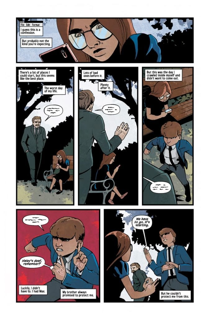
Amazingly, Kamala’s struggle is still relatable, despite how it sometimes feels larger than life. It just goes to show how personable her character is, and how close to home some of these events truly are. All of which was surely designed with intent.

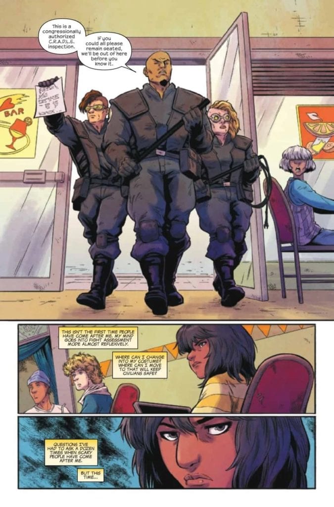
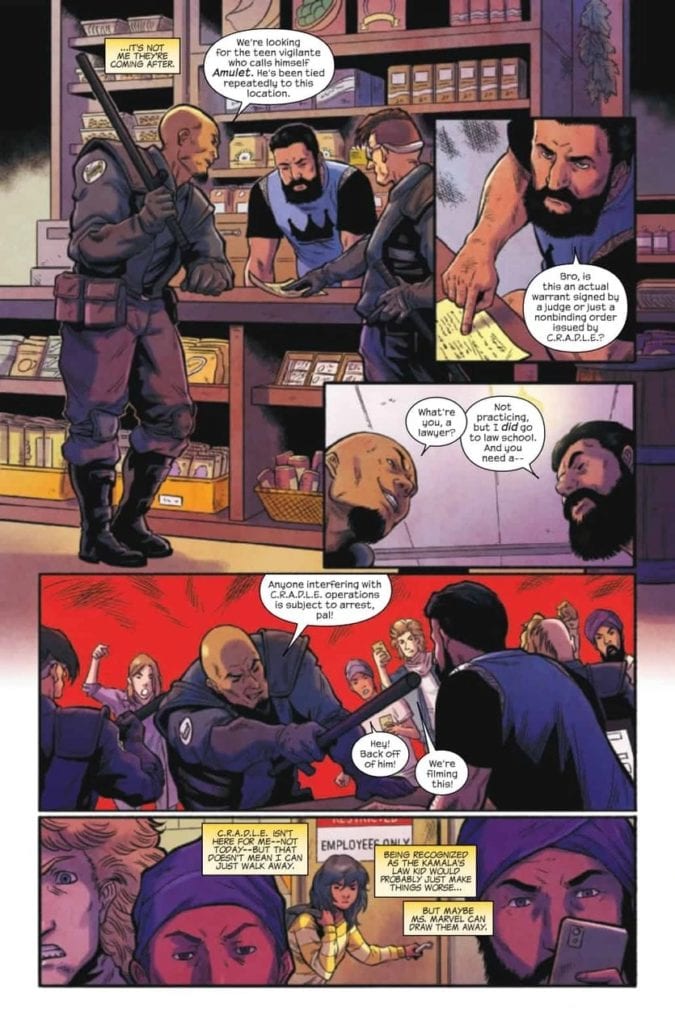
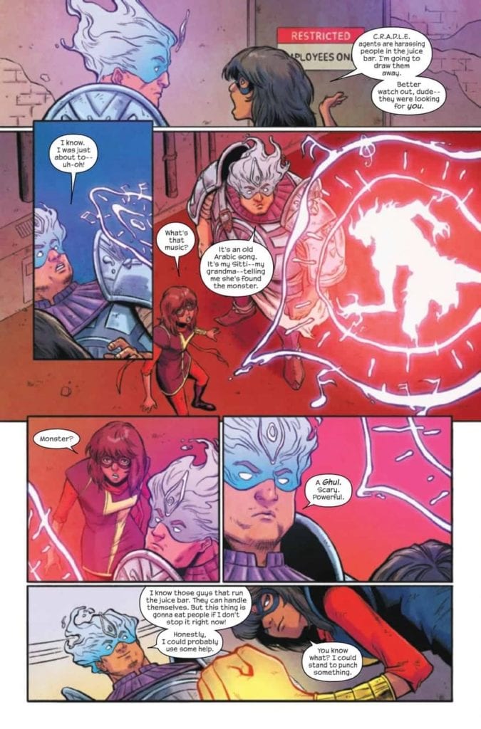
While Kamala invariably ends up dealing with C.R.A.D.L.E. and their actions, this issue also sticks true to her core as well. There are family problems to be balanced and dealt with, not to mention her friends and their reactions to what has happened.

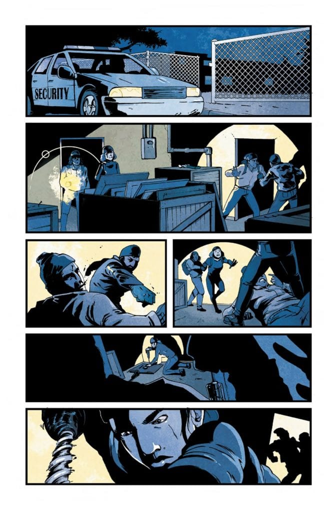
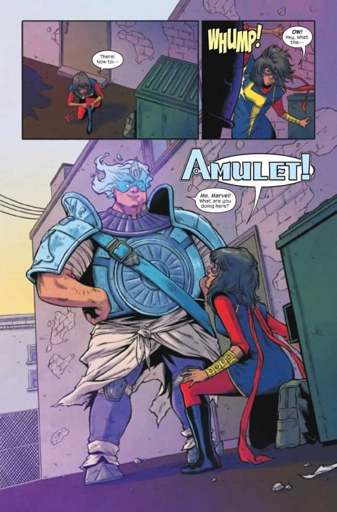
It makes the issue feel so very…human. Especially when balanced out with a quick moment of humor, and plenty of action (thanks to Amulet for that bit). All of which really was just setting the scene for a cliffhanger of an ending.

Amulet is back on the scene! (The Magnificent Ms. Marvel #16)

The Art

The artwork within The Magnificent Ms. Marvel #16 feels like coming home, in many ways. Yet it also portrays several scenes that have never come across her pages before. It makes for an exciting visual affair.

Minkyu Jung was the lead artist here and is responsible for portraying everything from the massive moments and fights to the little details. The creature Kamala fought looks like something from a legend, and with good reason. Meanwhile, there is plenty of nuances to be found in the expressions and reactions of each and every character shown.

The colors were provided by Ian Herring, who did a fantastic job. A bold use of color really allowed certain scenes to pop, while more muted tones set the scene in other ways. It made for a starkly contrasted issue, yet one that worked well.

VC’s Joe Caramagna’s lettering is absolutely superb in The Magnificent Ms. Marvel #16. You can practically hear the crunches, the sighs, and the turmoil, and that is thanks largely in part to the placement and orientation provided by Caramagna.

A new adventure awaits Ms. Marvel, it would seem. (The Magnificent Ms. Marvel #16)

Conclusion

The Magnificent Ms. Marvel #16 is an intense and complicated read. Kamala is naturally going through a lot right now, and yet she’s still keeping up the good fight. This issue is made all the better by another appearance from Amulet, and a few other surprises along the way.

Monkeys Fighting Robots Youtube

INTERVIEW: Catching up With COPRA And Michel Fiffe

Copra

Michel Fiffe’s COPRA recently saw a run of single issues published by Images Comics, something that deviated from the original run’s self-published process. But now, as Copra gets ready to begin the epic ‘Ochizon Saga’, the book is returning to its self-published roots (via Fiffe’s Etsy) and also to it’s original ‘legacy’ numbering, with the simultaneous release of issues #38 and #39. With all that looming, Michel was cool enough to chat with us about this momentous occasion and also share an exclusive image too! Read on and make sure you read and support Copra!


Monkeys Fighting Robots: Ok, so why two issues at once?
Michel Fiffe: Beats just getting one comic in your mailbox! Also saves on shipping costs.
MFR: Speaking of the issues, they are the start of something pretty big for the Copra crew. Give our readers a hint of what’s in store in issues #38 & #39.
Fiffe: It’s the climax of the larger story that I’ve been working towards for years. Imagine the horror and absurdity of humans holding their own against alien demi-gods. Big action, deep characters, and everything in between.
MFR: So these two issues are going back to self-published. What made you make this decision to have Image Comics publish only the collections? Did the pandemic and the chaos comics distribution go through have any bearing on your decision? 
Fiffe: It had some bearing, yeah. I didn’t like being at the complete mercy of several institutions. Not my style, not when I can normally get these comics to readers quicker than anyone else. I wanted more control.
MFR: Did it have any effect on the storyline itself?
Fiffe: Zero percent. Even when I stopped self-publishing and went to Image, the story continued seamlessly.
MFR: A lot of creators took the self-published route in 2020. Whether it was through Etsy, Kickstarter, Patreon, etc. Why do you think so many creators found success taking this route?Copra
Fiffe: Maybe it’s because we have a direct line to the folks who actually read and enjoy our work? If you don’t mind the paperwork, cut the middleman out!
MFR: So what was the process for these issues? What’s the path from conception to publishing on these single issues? 
Fiffe: What starts as scribbles on a scrap sheet of paper and ends up as a comic is beyond me… but I’ve tried to map it all out. There’s a “How To” segment of essays going over every detail over at my Patreon. It’s a lot to chew on.
MFR: What do you hope readers get out of this more direct publishing? 
Fiffe: A direct engagement with me, which is an aspect I’ve always enjoyed as both creator and a reader. Plus, you’ll get the stories almost as soon as they leave my drafting table.
MFR: What sort of schedule can fans expect now for Copra going forward?
Fiffe: I’m juggling a few other projects now, so the COPRA schedule will remain unpredictable but consistent. I’m far from done with the series.
MFR: Where can comic fans find your work these days?
Fiffe: Get to the socials, and look me up and I’ll be yakking about what I’m working on. 
MFR: And what’s ahead for you in 2021? What are your hopes, plans and expectations for the new year? 
Fiffe: Non-stop activity. More comics, more art, more COPRA.Copra


Monkeys Fighting Robots Youtube

Review: MISKATONIC #1 Where The FBI Face Lovecraftian Horrors

AfterShock Exclusive Preview: MISKATONIC #1

With Lovecraft Country making news, both positive and negative, on the internet it will come as no surprise that H.P. Lovecraft’s work is the inspiration behind AfterShcok Comics‘ new title Miskatonic. The television series is set in the 1950’s with a real world location which was the influence for many of Lovecraft’s stories, whereas Mark Sable and Giorgio Pontrelli’s comic mostly has a fictional setting but is comprised of real events and features prominent historical characters.

The story opens with the bombing of a ‘blue blood’ in Innsmouth, in the Miskatonic Valley, which allows newly appointed director of the FBI, J Edgar Hoover, the opportunity to reassign Agent Miranda Keller. Agent Keller is a dedicated worker with an impressive record but she does not fit into Hoover’s vision for the future of the Bureau, a “muscular extension of American Justice. Or as Miranda put’s it, “masculine”.

Miskatonic #1, preview p7
Miskatonic #1 Credit: AfterShock Comics

Real World Interactions

Miskatonic is a mystery story steeped in American history, visual and textual. One of the exciting things about the range of comics that AfterShock have been putting out is the obvious passion of the creators. Several of the titles have links to real world events which result in hours lost down internet rabbit holes researching the background to the story. And just as Stephanie Phillips’ Descendent had me reading around government conspiracies and the Lindbergh Baby, Miskatonic had me Googling “Plain Words” and anarchistic bombers. My search history will need to be expunged.

The merging of historical facts and creative plot is seamless to the point that it is believable that Agent Keller was a real person and her treatment by the infamous Hoover is a recreation of real events. It’s not until approximately a third of the way in that anything unnatural rears its head by which point Sable and Pontrelli have totally absorbed you into their world. The Lovecraftian locations are so commonplace these days that you forget they aren’t real places and Pontrelli draws the 1920’s Massachusetts’ townships as if from direct reference. The setting has the substance of reality and this is enhanced by the color work by Pippa Bowman.

The shift from the grey and washed out greens of Washington DC to the dusty Ochre of Innsmouth is subtle but symbolises a shift in tone. This is heightened by the contrast between Agent Keller and her surroundings. Bowman dresses Keller in salmon colored clothes from the moment she reaches Innsmouth. From the respectable dress suit to the bed clothes that she wears, Agent Keller stands out from the background in every panel she’s in. This contrast reaffirms many of the themes inherent in the comic. The difference between the City, or a cultured locale, and the country; the conspiratorial nature of Truth against implied reality; and even natural versus supernatural. A simple application of color draws the reader’s attention to these aspects of the narrative as they play out in the plot.

Miskatonic
Miskatonic #1 Credit: AfterShock Comics

Drawing from History

Pontrelli’s fine line work combined with his detailed backgrounds creates both an absorbing page of story and an historically accurate setting. As a reader you become immersed in the narrative and the setting equally, with each aspect feeding the reading of the other. There is a definable tension on the page between the interloper, Keller, and the locals and locale. Tom Malone, the agent in Innsmouth, acts as a link between the two worlds but Sable introduces just as much tension in his relationship with Keller, thereby forming an atmosphere of unease on every page.

Subtleties in the script are brought out through Thomas Mauer’s lettering with his occasional, yet impactful, use of boldface. Elements of the characters are accentuated through the speech and the patterns that Mauer creates. It all flows so effortlessly across the page you barely notice it but the nudges are there, informing your subconscious and allowing you to have a fully rounded experience. If nothing else, the combination of inked lines, color, and letters are satisfying to read, making this a worthwhile comic before even attempting to pick apart the narrative.

Miskatonic
Miskatonic #1 Credit: AfterShock Comics

Conclusion

As an introduction to a series, Miskatonic is superb. It effortlessly melds Lovecraftian Law with historical events to create a costume drama that is as representative of our modern era’s desperate conspiracy theories as it is the fear mongering of the early 1920’s. The uneasy political backdrops of both times worm their way into Sable’s story creating a narrative tension reflected through the visual aspects of the page.

The comic is intriguing, fascinating, and opens up a world of truths, half truths, and fictions that you will be desperate to pick apart. In today’s comic industry it is not enough to provide ten minutes of entertainment, there has to be an acknowledgement of the wider world in which the comic is situated. Whether it is science-fiction, biographical, or superhero in nature, nothing exists in a vacuum. Miskatonic is very aware of itself, it’s setting, and the fictional elements it is layering over historical fact. As long as the comic can retain this commitment to a para-textual narrative, Miskatonic will be a title worth following through to the end.

Monkeys Fighting Robots Youtube

Review: SONIC THE HEDGEHOG #34 Is Surprisingly Slow

Sonic The Hedgehog

Sonic The Hedgehog #34 out this week from IDW Publishing is slowly moving the plot forward with the new arc. With Rogue’s crew on one side and Sonic and Tails on the other, both teams continue their mission to help repair Omega. The issue is brought together thanks to Evan Stanely (writer and artist), Reggie Graham (colorwork), and Shawn Lee (lettering).

Summary

It’s off to the races with Cream, Cheese, Amy, and Rouge! They have to keep up their winning streak or surrender Cheese to Clutch’s evil… clutches!

Sonic The Hedgehog

Writing

With the story split between the two teams (and Shadow doing his own sleuthing), you’d think there would be more twice the action. Instead, more time is spent moving the plot forward than having fight scenes. This seems odd considering Shadow was overpowered in the previous issue by an unknown assailant and there was a good chance the fight could have continued. Still, it is a new arc so it’s not all gonna be explosions and chase scenes.

Writer Evan Stanely does take the time to showcase Shadow’s efforts to get to the bottom of what is going on in the resort and discovers Clutch is evil. Really? The shady guy who was shown in a room full of covered furniture with dim lighting who was trying to manipulate Rogue can’t be trusted? How shocking. Seriously though, there is a lack of subtlety here, but hopefully, more about Clutch and his plan will be revealed in the next issue.

Sonic The Hedgehog

Artwork

With Evan Stanely providing story and artwork, many moments resonate astonishingly well in this issue. One of the best occurs with a montage showcasing Cheese advancing through the races as Shadow continues his investigation. The side by side comparison of these frames acts as a montage moving the story forward and showing a passage of time in just a few frames on the same page.

The colorwork by Reggie Graham continues to highlight the difference between each of the settings. From the bright colors used in the resort to the hushed tones used in the Clutch’s secret room, the use of color helps the reader understand they have moved to a different setting without being told directly. Also, it helps the newly introduced character to stand out more.

Sonic The Hedgehog

The lettering work by Shawn Lee provides the right auditory aspects to the story. From the Chao races to the sound effects as Sonic kicks some garbage, the important actions are labeled with the right amount of sound for the situation. Also, the use of the word “Scuff” to show someone getting pushed was amusing.

Conclusion

Sonic The Hedgehog #34 is still early in its new arc but does manage to be entertaining thanks to the art. The action will increase moving forward judging by the cliffhanger at the end of the issue. For now, fans can enjoy some more lighthearted moments before Sonic and his friends find themselves having to face off against some army of rampaging robots somewhere down the line.

Monkeys Fighting Robots Youtube

Review: REDFORK & The Horror Brought To Impoverished Hills

The best horror is most effective when it focuses its energies on the stories of the characters and victims within the story first, and the scares second. This is why Redfork, a 6-issue mini-series from writer Alex Paknadel and artist Nil Vendrell and published by TKO Studios, is one of the most frightening and outstanding horror comics published in recent memory. This is a comic that empathizes with the near-inescapable living nightmare of people living in poverty conditions and forced by higher forces both societal and, in here at least, supernatural, to give up their very bodies to just be able to survive. With colors by Giulia Brusco and letters from Ryan Ferrier, Redfork is a story about the lives of people just trying to get by, all while being seduced and betrayed by powers that could care less.

“Ex-con Noah McGlade returns to his coal-mining hometown to find it blighted by opioid abuse and economic decline. But there’s something even darker draining the very life from this town, and as Noah digs deeper he unearths a dormant horror that threatens to consume what little he has left to live for.”

Writing & Plot

While writer Alex Paknadel does craft a seriously frightening supernatural horror experience with Redfork, the reason it turns out to be so effective is because of the attention paid to the human characters within the story. Noah’s introduction makes him the sort of person your average member of society would avoid or scorn; he’s a convict with a past inclination for violence and drug abuse. Hell, almost everyone in the town of Redfork is stuck to some harmful vice that allows them to temporarily escape the pain of having no money and no way out. Paknadel does an incredible job of writing a town full of people with no hope that are just trying to get by. They are all written with sympathy, and not the sneer of superiority that many would cast upon these people if they passed them in the street. This is a book that is very aware not only of the torment of cyclical poverty but also of the very people that take advantage of those who have no means of surviving without those who prey upon their labor. Mining is one of the most dangerous and parasitic professions in the history of industry, sending hundreds of people to their deaths with little more than a shrug in response from their employers. Paknadell does not shy away from the cruel indifference shown by the wealthy company owner of the Redfork mine, and her ability to see the people in this town as little more than means to an end.

The very reality that Redfork represents is already its own brand of horror by itself. This is why fact that the comic’s supernatural element is so unnerving is also so impressive. There are two villains in this story, an earthly one and an unnatural one. Both of them torment the population of Redfork in different ways; the first keeps them in the only lifestyle they can afford to know while barely hiding her disdain for them, while the second offers them miraculous wonders and appears to actively care for them as human beings. Before they’ve realized it however, their lives are torn asunder by something they could scarcely understand. This sort of meta-commentary makes what was already a politically-charged horror and turns it into one of the most effective political metaphors I’ve ever seen in a comic. The commentary on our own political system never comes off as preachy, rather like a poetic series of interpretable observations from the characters in the story. The presentation of the story itself is delivered with piano wire-like tension and impeccable pacing, keeping the reader strung along with a combination of fantastic character writing and an increasingly eerie tale of terror. This script is a tasty gore-soaked casserole of body-horror, character-drama, and societal commentary all delivered with a skill seldom seen in any medium.

Art Direction

Carrying the tension and atmosphere of Redfork is the stellar visual approach of artist Nil Vendrell. He, along with colorist Giulia Brusco, craft a visual storytelling experience that drops bloody breadcrumbs of horror while maintaining a simultaneous focus on the plight of the people living in Redfork. Vendrell continually builds curiosity and tension from page to page by showing only small glimpses and flashes of the growing threat in this small forgotten town, presenting the major scares like the best classic horror films. Vendrell understands the need to create a focus on the cast of people and their condition just as well as Paknadel does, and so just as much effort foes into the directing and panel layouts of Noah’s experiences with the other people in his hometown. There’s a visual sense of alienation and bleak hopelessness that is telegraphed in the framing of characters, and this effect rolls right into the direction of the horror atmosphere when the scary stuff starts dropping. The phenomenal pacing in this story pays off in a huge way with the late-stage reveals after so much meticulous plotting. A common issue among horror stories is that once the big bad is revealed all the tension sot of fizzles out. Luckily that’s not so with Redfork; this story stays intense and frightening from start to finish.

Giulia Brusco creates a hazy, coal dust-covered color experience for this comic that oozes with an unnerving atmosphere. There’s a constant darkness in every panel as if the color palette was tossed down a mineshaft and brought back up for use. These dark and drab tones are so prevalent that the sudden bits of fleshy gore and otherworldly lights punctuate the pages with shock and urgency. There’s a rather symbolic use of daylight and nighttime in here as well, but getting into that would be getting into some spoiler territory. The letters from Ryan Ferrier use a sharp, angular font that I’ve noticed becoming more common in horror comics. It’s a great choice that is well-executed, with Ferrier using tonal changes and effects that stay in the speech balloons rather than taking up space within the panel. The visual work on this horror story is a spectacular display of atmospheric and character-oriented storytelling.

Redfork is one of the most effective comics I’ve read this year. Not only is it a superb horror story, but it’s a thoughtful and empathetic examination of the lives of the impoverished working class and how they are taken advantage of by predators both supernatural and very real. Alex Paknadel constructs his most brilliant script yet, weaving a terrifying and intimate tale of terror and woe. The art of penciller Nil Vendril and colorist Giulia Brusco composes a blackened environment that sets the story’s taut pacing while offering stellar character-focused visual narrative-work. Redfork is without a doubt one of the best horror comics I’ve gotten to read, so please head over to TKO Studios and grab yourself a copy.


Monkeys Fighting Robots Youtube

Review: FATMAN Offers Bizarre Take On Santa Claus

Fatman is as ridiculous as its synopsis indicates, but commits to its narrative in hopes that the audience will take it seriously. Santa Claus is not as Jolly as rumors claimed, he is an alcoholic who just angered the wrong child this Christmas. Fatman might find itself on the yearly holiday season must watch list, but for all the wrong reasons because the film is so absurd. A new guilty pleasure has arrived and it’s offering one of the most unique takes on this legendary holiday icon. 

There’s an instant feeling of intrigue when you take Santa and alter him from the kid-friendly persona many are familiar with. The red suit is gone, random outbursts of joy cease to exist, and the task of gifting children around the world can be life-threatening. Fatman intends to be a dark comedy, but most of its jokes fall flat, or just aren’t very funny. The humor in this comes from the narrative, which is over the top insanity. Directed and written by Eshom and Ian Nelms, the film stars Mel Gibson, Walton Goggins, Marianne Baptiste, and Chance Hurstfield. Fatman follows Santa who must battle an assassin sent to kill him after a 12-year-old boy received a lump of coal in his stocking. 

Mel Gibson as Santa in Fatman

Billy (Hurstfield) is 12, spoiled, rich, and still is not satisfied because Santa has gifted him with a lump of coal this year. He terrorizes his household while his father travels the world with his girlfriends. Gibson stars as Santa, but he is unpleasant, void of joy, and doesn’t want to be alive it seems. No one in Fatman seems to acknowledge that he is the man that annually breaks into everyone’s house to leave gifts. After receiving a lump of coal, Billy hires a hitman played by Goggins to takeout the drunk Santa. The hitman agrees without hesitation because he has been miserable for years since Santa never gave him the gift he always wanted. The Nelms brothers do an awful job with these characters because audiences will not care for a single person in this film.

Fatman comes off like it was just made out of boredom, but this take on Santa is quite refreshing. The film’s comedic moments come from how awful it gets, and it even incorporates action elements, which felt out of place at times. There is no sense of development for anyone, Santa is still an angry boomer by the end, and Billy is still spoiled rotten. The Nelms brothers do a great job showing off how aging children can affect Santa with their bad behaviors. This is causing a decline in Santa’s business, so military assistance is requested. Also, despite having minimal likable characters, there is Ruth (Baptiste), who is Mrs. Claus and she is the only person worth caring for.

Walton Goggins as Skinny Man in Fatman

Everyone delivers as far as performances are concerned in this absurd outing. Gibson is great as a miserable Santa and Goggins eats up every scene as the hitman. He comes off intimidating to every character he interacts with and delivers his lines in a menacing voice. Hurstfield makes Billy as unlikable as possible, so if that’s what the filmmakers wanted then he was fantastic. He captures Billy’s disdain for Santa and wonderfully demonstrates how twisted this child can be. Baptiste is amazing as Ruth, she will have viewers wishing they had a friend or spouse like her around. Despite everyone being so naughty, she is always there to brighten the mood and Baptiste does a great job as Mrs. Claus.

The direction in this film is adequate, but Fatman is oddly paced at times. It drags on with these hollow characters, but you’ll find yourself wanting to see how this film wraps because of the solid performances. The cinematography assists the gritty vibe Fatman gives off from start to finish. It will be interesting to see what happens to this film overtime because it could become a guilty pleasure for many to watch around this time of year. However, there is little chance this grows to cult status or anything close because as a film, it is bad to the bone.

Mel Gibson as Santa Claus in Fatman

At its core, Fatman is about a disgruntled grownup searching for Santa’s address while Santa tries to save his business. It is an over the top, half baked film that has little to offer anyone that watches it. A holiday film that exists just to exercise a fresh take but will leave no lasting impact. Fatman has a special place on the list of Holiday films, and that is at the very bottom. 

Monkeys Fighting Robots Youtube

How The Times Have Changed in DRYAD #7

A dynamic cover for Dryad #7, one that hints to the past and the future.

DRYAD #7, available December 2 from ONI Press, brings with it even more changes for one family — and the reasons why they have stuck together for so long. This is a world full of magic and technology, and there are bound to be some cracks in the merger.

A dynamic cover for Dryad #7, one that hints to the past and the future.

Once upon a time, the Glass family had known a peaceful and relatively quiet life out in what was, essentially, the middle of nowhere. Now they’ve been picked up and dropped off into the middle of a bustling city — and a growing conflict.

Each issue has steadily reviewed and taken apart everything this family had known, or rather, believed to be true. The family, the world, everything. It’s all changing, with very few exceptions. That is the setting for which Dryad #7 takes off.

The Writing

Dryad #7 is a rich and complex issue, from the very first page, right up until the conclusion. Kurtis Wiebe has clearly put in so much effort into this story, and yet there are countless questions still waiting to be answered.

This entire series has been genre-breaking on more than one level. First, it combined science fiction and fantasy elements into one world. Now, there’s a strong infusion of family drama, and just a dash of spy thrillers on top of everything else.

It makes for a fascinating world, if nothing else. While the wait for the next issue, and hopefully more answers, is likely to feel long, at least there are details worth pouring over from this issue. Such as the family history, the implications made, and the city itself.

All things considered, Dryad #7 is an issue that sits heavy. That was likely intentional, given everything that was revealed or hinted at. Still, it’s difficult to predict what the fallout will be, given the various directions and forms that can be taken.

The Art

Dryad #7 is a striking issue, that much is certain. The characters are still a strong highlight to the series, but there are so many more details to enjoy as well. The vibrant backdrops, the blending of organic and tech, the magic, all of it.

Justin Barcelo is the lead artist, and it is through Bacelo’s work that the past and present collide. The flashbacks are especially noteworthy here, being both dramatic and shockingly…endearing. Something that will make more sense when context is provided. that’s a promise.

Francesco Segala’s colors are to die for. The strong use of blue and green hues on some pages really do set the scene and the tone. It’s a color palette that lends well both to technology, and to magic. Meanwhile, the reds, pinks, and purples of the other dominant pages speak to emotional turmoil and family drama.

Jim Campbell letters the issue, and it is here where many nuances appear. The upheaval of the twins, their bond, the feel of motion and impact, all of it comes out through the lettering.

Conclusion

Dryad #7 is a moving issue, there is no argument in that. It is a fascinating issue, that answers questions in one hand, and raises more with the other. With each page it feels like the tale is getting more complex, and possibly much darker as well. Only time will tell how the Glass family fares from all of this.

Monkeys Fighting Robots Youtube

The Vessel Is Being Readied In RED MOTHER #10

RED MOTHER #10, available tomorrow from BOOM! Studios, is changing Daisy’s life — again. Her life has been far from easy these past several issues, and it looks like her story isn’t quite over yet.

***SPOILER WARNING***

spoilers ahead

The psychological thriller continues in Red Mother #10. Daisy McDonough’s entire life was turned upside down on one fateful night. She lost her eye and her boyfriend all in one fell swoop. While she still doesn’t have answers from that night, there was a moment where it seemed like her life was on the upswing again.

Something dark and twisted has made its way into Daisy’s life — something that anybody from the outside could have easily warned her was an illusion — and it seems unlikely that whatever it is would be willing to let go so easily.

This entire series has been full of suspenseful moments and graphic horror, all of which combine to heighten the tale — and the concern for one targeted woman.

Things are about to be set in motion in Red Mother #10.

The Writing

In many ways, Red Mother #10 reads completely differently from the rest of the series. Don’t be mistaken — it is still haunting and disturbing. It simply feels like much of the horror is out in the open, which actually makes it more terrifying, rather than less.

Jeremy Haun did a fantastic job of building up the suspense in this issue. Even the most seemingly normal and benign moments seemed like they were liable to tip the scale at any moment. It was…alarming.

As were many other changes throughout this issue, for that matter. Yes, Daisy is still fighting. If anything, she’s gotten better on that front. But there are many other elements that have gotten darker. Some of them make sense, even without explanation. While others feel like they’re setting up for some sort of dramatic reveal. Granted, that probably isn’t a reveal that Daisy is going to enjoy all that much.

This issue officially flips the series. Before it had felt like a combination of horror and suspense. Now it’s firmly in the world of horror, and the creature hidden by the darkness doesn’t feel so compelled to hide anymore.

Who do you think he’s talking to?

The Art

As dark as the plot gets within Red Mother #10, the artwork is there every step of the way. It’s bold, creepy, and admittedly even gory at times. All of which is thematically appropriate, given everything that is happening.

In fact, there are a few scenes that will make you stop cold. Take the cover (also by Haun!), for example. That is a break from the norm – and yet that simple (yet disturbing) image of an eyeball speaks volumes about what is about to happen. Especially to those who have been following along.

Danny Luckert is the lead artist for this entire series, providing both the lines and the colors. His characters are nuanced, being capable of great pain, and deception. Meanwhile, the colors are dominated by bold hues, such as the bloody impression left by a specific shade of red.

Ed Dukeshire is the letterer, and this is another area in which the artwork shines. The sound of breaking can practically be felt — jumping straight from the pages and into the reader’s nervous system. It adds to the book’s alarming nature in the best of ways.

It all fades to red…

Conclusion

Red Mother #10 is in all likelihood setting the scene for a dark confrontation. Perhaps the final confrontation. That part may be more difficult to predict, yet it is going to make for a fascinating read nonetheless.

Monkeys Fighting Robots Youtube

How Dustin Leads In STRANGER THINGS: SCIENCE CAMP #3

STRANGER THINGS: SCIENCE CAMP #3, available November 25th from Dark Horse, brings fans back to the solo story of Dustin, and how he was totally the cool kid at Science Camp — all while something sinister is happening in the background, of course.

If there’s one thing that Stranger Things: Science Camp has managed to prove, it is that Dustin is actually quite a personable and likable character. In fact, if you put him in a room (or camp) full of like-minded kids, odds are good that he’ll be liked by most of them.

Ironically, this also explains how he came back from camp with a girlfriend — even if most of his friends thought she was imaginary at first. The tale is also going a long way in showing off the skills (and determination) that Dustin learned from his time in Stranger Things.

Stranger Things: Science Camp #3 is the second-to-last issue of the series, and that means the adventure is about to get a whole lot more dramatic. The strange figure lurking in the shadows is going to become a problem again, and one can only hope that the case of the missing counselors will come up as well.

The Writing

Stranger Things: Science Camp #3 is the perfect balance of charming and spooky. In short, it feels just like a Stranger Things story should. Written by Jody Houser, the series first started off feeling almost casual and fun. But it has quickly taken on a darker edge.

It almost makes readers wonder why Dustin didn’t bring up this story to his friends when he got back home. Especially given the role he’s presumably going to play in the resolution (Dustin has learned better than to sit back and watch as horrors unfold). Perhaps he didn’t want to brag, or didn’t believe his friends would think the tale true? After all, they thought his girlfriend was fake for a few minutes there.

Either way, the events that are unfolding in this tale are quickly becoming more interesting with time. Anybody feel confident enough to begin making guesses on who the mysterious stranger is? With only one issue left, we’re almost at the big reveal.

Dustin’s character is every bit as endearing as always, while some of the secondary characters (girlfriend included) are getting a bit more fleshed out. Finally! Fans get to learn just a little bit more about her. It does raise the question, will we be seeing her again in future seasons of the show?

The Art

Stranger Things: Science Camp #3 could be an advertisement for an 80s camp — it is that spot on. Every little detail looks like it came straight from the decade the series is set in, and that in itself is an impressive feat. Throw in the camp elements, and you’ve got something else entirely.

Edgar Salazar (pencils) and Keith Champagne (inks) worked hard together to bring that vision to life, that much is clear. The cabins, clothes, and every other little detail really do read as a blend of the time and location, while the characters look exactly as they did in the show (with a few stylistic changes, of course).

Marissa Louise’s colors bring it all together, colors that could happily read as being from the 80s, or from a camp that is having trouble keeping up with the times. Except for the scenes portraying the horror elements, of course — those are appropriately swathed in dark colors.

The lettering for this issue was provided by Nate Piekos, and it is yet another example of work well done. The screams and sound effects feel real, while the story carefully unfolds around Dustin and the camp.

Conclusion

Stranger Things: Science Camp #3 continued Dustin’s solo story. Showing how much he has grown and learned, thanks to his friends (and the circumstances he’s already gone through). It hints strongly towards the young man Dustin will one day become. While also having a bit of fun and drama along the way.

Monkeys Fighting Robots Youtube

PANTOMIME #1 Offers A Special Reading Experience

Pantomime #1, out now from Mad Cave Studios, is the first issue of a crime miniseries about a group of deaf teens who get in over their heads when they foolishly steal from the wrong person.

Writing

Christopher Sebela gives us a beautiful, engaging story from start to finish. The story’s pace never feels dragged out. Everything flows naturally and elegantly. Sebela throws the reader right into the action with two silent pages, which essentially tell us what this miniseries is about. The heist sequences are thrilling and well-thought-out. The ending surprises the reader and keeps them guessing what will happen next to this loveable group of kids. Each main character has their own voice, strengths & weaknesses, and the thing they excel at. It was also a great, realistic touch to see how these kids slowly get addicted to the adrenaline boosts these heists give them. The characters Sebela created together with the artists are so believable and three-dimensional; the reader can’t help but feel a genuine, strong connection to them. Art

David Stoll‘s fantastic art and the story fit like a glove. The characters are instantly recognizable. Each character has their own head shape, their own unique features. The panels’ backgrounds can be too empty at times, but it still works here because Stoll chooses to focus more on the acting, which looks great. The reader can understand very quickly how the characters feel at each moment. The art looks realistic, but it still manages to come off as stylish and unique. But most importantly, the way Stoll overcomes the challenge of showing the characters speaking in sign language without splitting the pages into too many panels is simply brilliant. He draws the movements in a way that isn’t distracting or confusing to the reader. With his incredible work on this first issue, Stoll leaves the reader amazed and wanting more.

Coloring

The coloring by Dearbhla Kelly pairs swimmingly with Stoll’s art. Kelly captures Haley’s (the main character and narrator) point of view brilliantly. When she wants the reader to feel sad for Haley, Kelly uses dark and cold colors to set the grim mood. But, when she wants the reader to fall in love with the special needs academy and the new dynamics between those funky kids, Kelly uses bright and warm color tones, which allow the reader to take a look at the world through Haley’s eyes. It makes us feel exactly how Haley feels while she’s narrating the story. More specifically, there is a double-page spread where Haley tells the reader about each group member and their backstory. To distinguish each character, Kelly colors the panels in a monochromatic palette, and the specific character is colored in different, contrasting colors. It’s a smart choice that effectively smoothes out the reading experience.

Lettering

Justin Birch cleverly chooses a font with both uppercase and lowercase letters, making Pantomime #1 feel a lot more modern and fresh. Birch carefully places his balloons and caption boxes in an order that is easy to follow. He also usually makes the spoken dialogue indecipherable, which puts the reader in the same shoes as the deaf kids. It helps us understand their inner world a bit more. His choice to pull the balloon tails all the way to the kids’ hands when they speak in sign language works well here and never confuses the reader.

Conclusion

You can tell this comic is close to the hearts of everyone involved. Each creator, in almost perfect harmony, beautifully complements and compliments the various elements of this comic. Pantomime #1 is a perfect example of why representation matters—a perfect example of how it can make for one of the most unique reading experiences of 2020.
Highly recommended to anyone interested in viewing the world through a fresh, different lens.

Monkeys Fighting Robots Youtube