Home Blog Page 177

The Battle Rages On In THE LAST WITCH #3

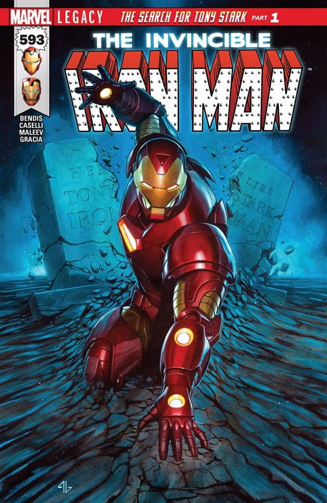
THE LAST WITCH #3, available Wednesday from BOOM! Box continues the tale of one budding witch – and the many battles that lay in her path. Right before our eyes, Saoirse is turning into something new.

The next battle is nearly here.

It’s hard to believe how quickly everything has changed for little Saoirse. Just two issues ago she was a young girl – one who found herself in the middle of a horror story. Now, we’re in the process of watching her turn into something so much more.

The Last Witch #3 brings us back to Saoirse, her brother, and her grandmother. Her world may have narrowed in some ways, but it looks like there is much for her to gain. Assuming she can survive the battles ahead.

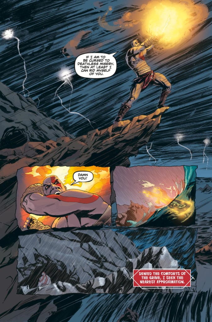
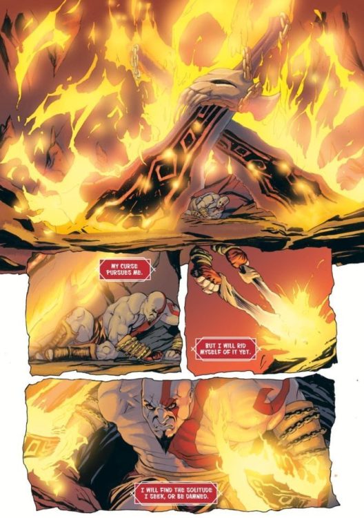
After all, she is now on a path where she must battle the surviving witches. Her great-aunts, as the case may be. Given how Black Annis treated her upon arrival, it’s safe to assume that the rest of her family won’t react kindly to her appearance.

A memory, and a showing of what is to come.

The Writing

While there are many things that have changed, there are likewise many elements that feel the same in The Last Witch #3. You can still see much of the subtlety in Conor McCreery’s writing, even if the scale is steadily increasing.

Saoirse’s bond with her family is still very much a necessary and grounding element of this story. Without it, there’s this impression that she could have ended up just like all the other witches that are so dreadfully whispered about.

It’s difficult to infuse something so carefully such as that, without it becoming overpowering. But that balance has been struck here. It is a nice counter to the brutal battle that Saoirse willingly walks into.

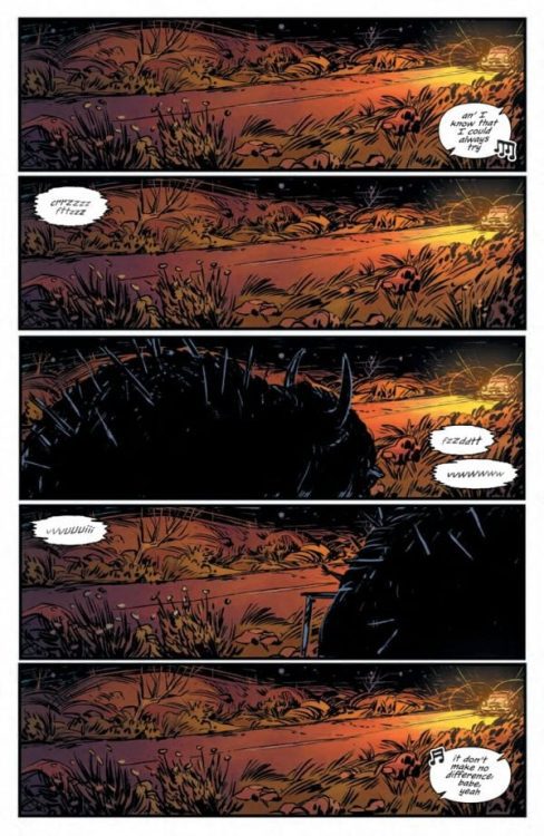
On that note, the battle itself is really quite clever, showcasing all of the reasons why it had to be fought – as well as all of the reasons why it had to be Saoirse. Every move and decision seems to reinforce that she’s the woman that can – and will – set things right.

What makes this whole situation all the more intriguing is, despite that feeling, there really is no guarantee for how this will fall out. Already we’ve been reminded of the corrupting nature of magic itself, and thus the risks that Saoirse takes on a daily basis.

A plan has been made, but what next?

The Art

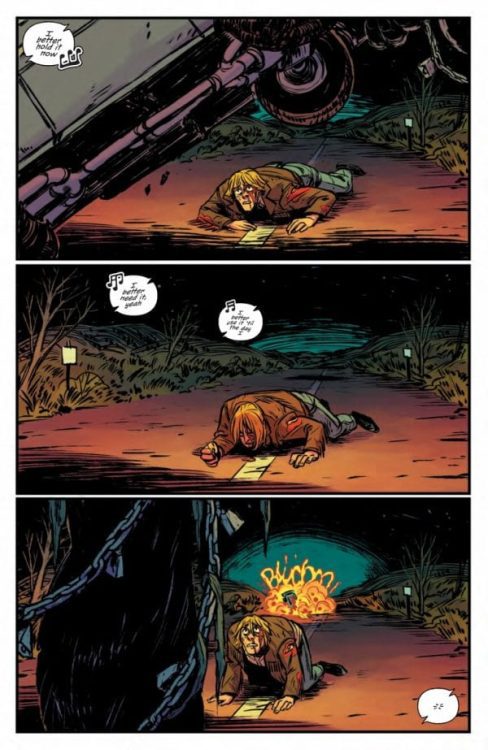
The artwork inside The Last Witch #3 is truly a sight to behold. It’s not just the major moments that stand out (though there certainly is that), but the smaller moments as well. The moments where Saoirse has never felt so human. It ties in strongly with the theme of the series.

V.V. Glass is one of the best visual storytellers I’ve seen in recent times. There are many small details that bring the story to life, from the way Saoirse interacts with her family (they really do look and feel related – and their care for one another shows), to the grim determination on her face during battle.

Natalia Nesterenko’s colors further bring that world to light. While the colors have been stunning up to this point, there is always something so iconic about the juxtaposition between water and fire. Thus, this issue, with a battle between a fire and water witch, was always meant to be spectacular.

Jim Campbell really nailed the humanizing elements of this series. You can practically feel Saoirse’s hesitation – her fear about leaving her little brother behind. Yet the lettering also grasps the grander scale, portraying the strength of the wind and water that is at play.

To be fair, she does have an excellent point.

Conclusion

The Last Witch #3 has somehow found a way to continue to up the ante – and our expectations. This series may feel larger than life at times, but in many ways, it is still very much the story of a young village girl trying to do right by her family.

Monkeys Fighting Robots Youtube

Review: A Dangerous Family Reunion In TEENAGE MUTANT NINJA TURTLES: JENNIKA II #5

TEENAGE MUTANT NINJA TURTLES: JENNIKA II #5, available in comic book stores on Wednesday, March 10th, offers readers the reunion they were waiting for. Lucia Rosetti, widow of the deceased mob boss Antoni Rosetti, has enlisted the help of Jennika to connect her with her non-mutant son. Originally, the ninja was only able to deliver messages, but there might be an opportunity for a family meeting in this issue. What could go wrong?

Story

The issue opens with a tense discussion between Jennika and Raphael in the Turtle’s home base. The latter is opposed to former’s involvement with a mob connection, but she jumps into an argument immediately.

The reader knows Jennika chose to help Lucia due to her felt responsibility for her child’s well-being. We remember the recent reveal that the ninja herself murdered Antoni while working for the Shredder. She later opens up to Alopex in a heartfelt conversion, showing readers what a vulnerable friendship looks like.

Jennika spends most of the issue tackling the challenges we saw in the previous story—delivering messages from Lucia to her son Junior. What changes in this issue, however, is an unexpected party waiting at the house. And, ironically, they might spur on the reunion between the mother and son.

However, readers will remember that Lucia revealed much of her nefarious last issue. Will Jennika uncover the truth before it’s too late? Writer Ronda Pattison does a brilliant job of guiding us through the narrative with just the right pacing, revealing some of the answers we were waiting for.

Artwork

Jodi Nishijima’s penciling and ink work, alongside Pattison’s coloring, brought the characters within this issue to life. Jennika’s bright yellow headband stands out against the bland backgrounds throughout Mutant Town and the Rosetti’s home. This distinction helps readers sense that Jennika is facing off against the forces of both locales. We also like how Shawn Lee’s lettering used a similar color to Turtles’ dojo for the ninja’s internal dialogue boxes, giving us a sense of where her true heart resides.

Conclusion

TEENAGE MUTANT NINJA TURTLES: JENNIKA II #5 takes this story to the next level. The stakes are high for Jennika and the young Junior, so we’re anticipating a huge event next issue.

Do you think Jennika will discover Lucia’s true motivation? Let us know in the comments below!

Monkeys Fighting Robots Youtube

Review: GOD OF WAR: FALLEN GOD #1 – Can We Run From Our Destiny?

GOD OF WAR: FALLEN GOD #1 hits stores on Wednesday, March 10th, giving fans a look at Kratos’s life between the events of God of War III and God of War (2018). The demigod is more than tired of dealing with the divine powers sitting atop Olympus, opting for a much quieter locale. But readers will find that Kratos must learn an important lesson—Destiny does not meet us on our own terms. And the past we try to escape has a way of catching up with us.

Story

Fresh out of the battles in (detailed in God of War lll), Kratos decides it’s time to bury his past as the “Ghost of Sparta.” His Blades of Chaos serve as the perfect representation of that from which he is fleeing, so he throws them into the ocean.

Unfortunately for Kratos, the past isn’t that easy to get rid of. Somehow, the Blades find him. Readers will see that no matter where Kratos runs, his past is there to greet him.

Chris Roberson’s narrative uses the Blades as the perfect metaphor for both the protagonist’s past and destiny. Their chains represent the past that anchors us to the world, while their reach shows how our purpose guides us forward. But the writer adds in one more step to help Kratos along the way; a mysterious guide who leaves the warrior cryptic messages about his future. Where will this all lead?

Artwork

The illustrations in this issue look as if they’re taken straight out of a God of War video games; the transition of Kratos into this comic book former is seamless. Tony Parker’s penciling and ink work provides highly detailed illustrations of Kratos, showcasing his raging emotions. This is complemented beautifully by Dan Jackson’s coloring, which provides harsh reds and yellows to represent the demigod’s constant rage. And Jimmy Betancourt of Comiccraft’s lettering meshes well with these colors using beautiful red word boxes for Kratos’s inner thoughts.

Conclusion

GOD OF WAR: FALLEN GOD #1 sets up an intriguing new chapter in Kratos’s life. We’re excited to see where this series takes us next.

Who do you think the mysterious figure is? Let us know in the comments below!

Monkeys Fighting Robots Youtube

10-Page Preview: THE DOWN RIVER PEOPLE By Adam Smith and Matthew Fox

THE DOWN RIVER PEOPLE

THE DOWN RIVER PEOPLE hits your local comic book shop on May 26, but thanks to BOOM! Studios!, Monkeys Fighting Robots has an exclusive 10-page page preview for our readers.

The original graphic novel is by writer Adam Smith and artist Matthew Fox, the creative team of the Eisner and Harvey Award-nominated Long Walk to Valhalla.

About THE DOWN RIVER PEOPLE:
Myers Carpenter is a bootlegger who just inherited his family’s bar, The Flatbed. Unsure of whether or not he wants to keep the famous speakeasy, Myers is forced to find a new booze supplier when he burns his bridges at his longtime source in Mississippi. The only option he can turn to is his estranged mother, now running a fishing lodge for the wealthy, and a half-sister he knew nothing about.

As Myers becomes more entangled in the lives of his newfound family, he begins to learn the secrets of the fishing lodge and the sinister cult thriving just under the surface of wealth and opulence.

Enjoy the 10-page preview below.

Monkeys Fighting Robots Youtube

Review: PROCTOR VALLEY ROAD #1 – Demons In The Desert

From comics auteur and legend Grant Morrison and Alex Child, along with artists Naomi Franquiz and Tamra Bonvillain, comes a time capsule of a horror story in Proctor Valley Road #1. This story uses familiar tropes and devices to weave a unique and entertaining opening chapter, full of cultural conflict and fun, scary sequences. With a clever script and stellar story-fitting visuals, this is a promising start to what could go on to be a wonderfully entertaining and witty horror romp through 1970 California.

“August, Rylee, Cora & Jennie have organized a “Spook Tour” with their classmates on the most haunted, demon-infested stretch of road in America to fund attending the concert of their dreams. When their visit turns deadly, these four friends race to rescue the missing students… before the town tears them limb from limb.”

Writing & Plot

In all the years that Morrison has been gracing the comics medium with his vision, it’s rare that we’ve ever gotten a pure horror experience out of him. Sure some of his work on Animal Man, The Invisibles, and Swamp Thing reached into the realms of horror, typically of the existential or cosmic variety. His Image series The Nameless is probably the most outright horror experience we’ve gotten from the Scottish legend, but even then, it’s more conceptual. Proctor Valley Road #1 is a first for the comics icon, as this is a classic all-American traditional scary campfire tale brand of horror story. With the help of writer Child, the pair construct a setting and group of characters that feel real in a time and space that we all know about in both history and pop culture. The turbulence of Vietnam-era late 60’s/early 70’s America is the backdrop for this comic, and the experiences of the characters ground this story in something tangible. I’ve said before in my other horror comic reviews that the best examples of the genre know how to plant their stories firmly in a realistic situation with believable characters, therefore upping the stakes of the terror the cast experiences. The other big element that grounds both the characters and the audience in the story is the fact that the main cast are all teenagers and young adults, and they are written as such. They all have different personalities, none of which feels like a cliché, and they have difficulty grappling with the reality of their world – as teenagers often do. There’s an air of arrogance and self-imposed invulnerability to a few of the leads. It’s what makes this comic very reminiscent of stories like The Monster Squad or The Goonies, which obviously inspired this book. The other societal elements made by this time period, such as notions of patriotism, racism, and draft-dodging, make their presences known but don’t weigh heavily on the minds of the cast. The horror and slice of life bits trade focus with enough frequency that the comic is able to build its world and characters to a point where everything feels real, while the looming supernatural threat leers in the background. This is a superbly well-written comic, and I can’t wait to see where the story goes next.

Art Direction

Proctor Valley Road #1 is graced by the talents of Franquiz on pencils, which I have previously praised for her work on Tales From Harrow County. In this comic, much like that other outstanding horror series, Franquiz’s soft lines, thoughtful details, and varied designs bring this world to life in fitting fashion for the story being told here. Franquiz designs this middle-of-nowhere Californian desert town in the late ’60s with an eye that makes the setting feel tangible and reminds the reader that this was indeed a real-time and place. Her character designs are highly varied in terms of facial animations and even body types, the latter of which is not often seen in comics even now. If this comic were to have all of its dialogue stripped away, we would still have a good idea of each character’s personality just based on how they are animated. The small bits of horror and monster design we get here are also inventive and spooky and teased to the point that makes me want more and more in the next issue. The colors from Tamra Bonvillain are very deep and moody, and they sell this visual aesthetic that is reminiscent of classic 60’s and 70’s horror films. Every panel has a sort of sunset and dust-cast overtone to all of its many shades, and it genuinely looks like that period of film cinematography. The letters from Jim Campbell are a neat, contemporary font that is fitting and easy to read, with really solid effect lettering as well. This is a comic with a visual style perfectly in tune with the story that is being presented.

Proctor Valley Road #1 is a grounded first chapter in this horror comic that feels awfully familiar but still presents enough intrigue and depth to itself to be interesting and fun. Morrison and Child’s script is insightful and intelligent, taking advantage of the place and time the story is set in while very slowly tackling the supernatural terror lurking in the background. Franquiz and Bonvillain’s visuals are pitch-perfect, offering stellar character art and rich, dark tones that are perfect for this desert-set horror story. Be sure to grab this opening issue when it hits stands on March 10!

Monkeys Fighting Robots Youtube

Review: SWEET TOOTH: THE RETURN #5 – The Countdown to the End

Creator Jeff Lemire and colorist Jose Villarrubia return with the second-to-last chapter of their sequel mini-series in Sweet Tooth: The Return: #5. This issue uncovers the endgame plan of our scum of a villain while also setting the path and emotional stakes for the main cast, making us root and fear for them in equal distressing amounts. With poignant writing and once again charmingly perfect visuals, this issue may be the best in this excellent mini-series thus far.

“The clock is tick-tick-ticking down. Soon all the nasty hybrid beasts that roam the Earth will get sick and die. And it’s all thanks to our beloved Father and his incredible science virus! He’s doing it for all of you because Father loves you very much, and soon you and all his other very good, special friends will get to walk upon the desiccated corpses of the villainous creatures that took our home from us! What a joyous time that will be! What’s that? Oh my! It’s almost time! Let’s pack our bags, brush our teeth, and remember to never lie to Father! Because lying is what a hybrid would do, and you’re much better than one of them, right?”

Writing & Plot

Lemire’s writing here in Sweet Tooth: the Return #5 offers more of his trademark “less is more” dialogue style combined with his ability to deliver exposition in a way that is still entertaining. This issue focuses on sharpening each character’s motivations and raising the stakes for everyone involved, both hero and villain, before setting off on the series finale. As usual, the best parts of this book are the moments of quiet introspection and one-on-one character conversation between “The Boy” and other characters. This time around, it’s him and our favorite elephant hybrid Earl. There’s something so endlessly charming about how Lemire presents The Boy/Gus’s dialogue, and therefore much of his personality, that every time he’s speaking on the panel I can’t help but love the character. His ever-present optimism and caring for others never comes across as corny or naïve, but rather the exact thing both the other characters and we as readers need to hear. Lemire has always had a perfect ear for naturalistic dialogue and matching dialogue styles differently among a wide range of characters. Even the villainous Father’s monologue about his evil master plan doesn’t bog down the story. There are no wasted words or narration, as every exchange in this comic has weight and is a pleasure to read.

Art Direction

Lemire’s signature art style once again graces the pages of Sweet Tooth: The Return #5, and once again, I wouldn’t have it any other way. The emotion that he can draw into every character despite his simplistic and rough-hewn visual style will never cease to amaze me. His panel direction is often contemplative and thoughtfully paced, in a manner that can only be achieved by someone matching their art to their own words. Hell, if I didn’t love Dean Ormston so much I’d say that Lemire should be the one drawing Black Hammer as well as writing it (he could do it too). The charming detail of Lemire’s pencils is filled with color by Jose Villarrubia, who has brilliantly offered his work in this world ever since the original comic. His watercolor-esque tones give every surface a variety of shades, and his work gets really interesting when reality and the world of dreams and visions get blurred. This is a visually perfect comic for the story, with an eclectic style that probably isn’t for everyone but has an endless amount of charm for those who can appreciate it.

Sweet Tooth: The Return #5 is a climactic chapter that sets up this story’s end by endearing us to the main cast even more than we thought possible just before this story reaches its final issue. Lemire’s signature style of storytelling gives us a comic laden with information that manages to be entertaining to read and is dotted by truly heartfelt character moments and a brutal cliffhanger. His ever-charming visuals, with the help of colorist Jose Villarrubia, set the perfect storytelling tone and style for this book and are absolutely perfect for what is being told here. Be sure to grab this second-to-last issue of this excellent mini-series on March 9!


Monkeys Fighting Robots Youtube

THE UNTHINKABLES #1: We’re Higher Than The Suicide Squad

The Unthinkables #1 Cover

The Unthinkables #1 is the beginning of Unlikely Heroes Studios‘ newest series. After its digital release on January 6, 2021, the series’ physical edition is also available on Unlikely Heroes Studios’ website. Writer Paul Hanley crafted this black comedy, supervillain draft ensemble in a tribute to UH Studios’ late co-founder Zack Dolan. Penciler and co-inker Ian Richardson, co-inker Julien Hugonnard-Bert, colorist Simon Gough, and letterer Thomas Mauer bring Hanley’s vision to life. Kate Colors and Matt Krotzer respectively contribute additional colors and letters to the book.

Whichever format one chooses, buyers will not be disappointed. The book will make readers laugh with its odd comedy and gasp at its perilous plot. From start to finish, this book is a lot of fun.

The Unthinkables #1: Meta Dramedy

In this new series, Hanley shares his tribute to Dolan by hitting similar beats to the late co-founder’s series Super!. Over-the-top characters decorate The Unthinkables #1 from the first page to the last. Seeing a Superman pastiche get to say clichés with his super breath in space is a bizarre, fitting parallel to Super!.

The Superman pastiche’s surprising death adds some unexpected gravity to the story and meta-commentary. The silence on the page after this development is deafening, as it signals the hero’s death better than any narration ever could. It wouldn’t be an exaggeration to compare this scene to UH Studios’ reaction to Dolan’s death in 2019.

The Unthinkables #1 driving character
In ‘The Unthinkables #1, The Suicide Squad meets The Boys in a wild mash-up.

With all of the good guys down and defeated, the Earth’s government takes a page out of the Suicide Squad’s playbook and recruits supervillains instead. This mission is filled with desperation, as each recruitment is more visibly dangerous than the last. If this stress is what UH felt after Dolan’s death, it shows. The company’s experience facing this tragedy echoes the story, where the UN tries to get a giant fish kaiju under control.

Most recruits, like the drunken poster child Riotgirl, are nothing the UN can’t handle; then there’s the team’s lead tactician, Bloody Mary. As an experienced ex-KGB spy that evaded counterintelligence for decades, she’s always a step ahead. She takes out a UN sniper as if she was fully anticipating his actions. With all the action coming off-screen, Bloody Mary is the most uneasy supervillain to be around, as she makes the reader feel like something bad is about to happen. With the blatant similarity to the Suicide Squad, you can’t help but think that this situation will get worse before it gets better.

The Art Is A Riot!

The pages of The Unthinkables #1 feature art by a team that’s giving it their all. Richardson, as the penciler and co-inker, gives each character a design to match their distinct personalities. The White Devil’s costume change from his cowboy-like attire to his origami style costume is a huge display of showmanship. In juxtaposition with his earlier cuff trick, this shift shows off his sneaky mind and his wacky capabilities.

Look at Riotgirl; at first glance, she looks like a rebellious schoolgirl. But this appearance is deceiving, as her psionic abilities make her a powerhouse on a team that’s full of people with remarkable powers.

The Unthinkables #1 cover girl
Riotgirl’s red hair makes her stand out every time she’s on the page.

Hugonnard-Bert’s influence as a co-inker is clear, as the fact the talking characters have bolder outlines demonstrates their importance to the narrative in each scene.

The colors by Gough give each of these characteristics enough room to stand out, too. Riotgirl’s red hair naturally draws the reader’s eye, and the accessories on her uniform, like the four-leaf clover and Scottish flag buttons, serve as ways for readers to identify her.

Finally, the lettering by Mauer and Krotzer gives every voice a reverberating feel. The screeching sound effects of White Devil’s origami pterodactyl stunt feels sudden and unexpected. Meanwhile, every conversation has a pulpy touch in how it is presented. A UN officer getting kicked in the crotch by Riotgirl before he finishes making fun of her name makes the reader chuckle. These are just a few ways that the lettering adds to the story.

The Unthinkables #1 Earns Its Name

The Unthinkables #1 is a hilarious action-comedy that’s flying under the radar. The book’s worst downside is that readers will have to wait awhile for the next issue. For now, readers can find the first volume on digital platforms like the company’s store, Comixology, DriveThru Comics, and Global Comix, and the physical copy is also available.


What do you all think? Is this the start of something that will keep your interests?

Monkeys Fighting Robots Youtube

Review: RORSCHACH #6 Shows the Raw and Beautiful Mess of Life

Rorschach King DC Comics

There’s a comfort to be found in a well told story. When you know you’re in the hands of a creator who knows their craft, you can relax. You know they’ll hit all the right beats, you know their conclusion will be satisfying. But there’s a safety in those stories too. We don’t read those stories on the edge of our seats. It’s only when stories go off the reservation that our hearts rise to our throats. We nervously worry, because with big risks can come big disappointments. Or big payoffs. Writer Tom King, artist Jorge Fornes, colorist Dave Stewart, and letterer Clayton Cowles’ Rorschach #6 is a risky story, and it’s damn beautiful.

Writing

King’s script isn’t full of splashy comic book mayhem. It’s just a simple letter correspondence between The Kid and Rorschach. Laura, The Kid, is a 19 year old girl. She writes to Wil Myerson, an aging comic book writer who has been revealed to be this title’s Rorschach, to talk to him about his work. It’s easy to forget that King wrote Laura’s letters. They’re awkward, clunky, and full of angst. When Myerson responds, he does so in the polished tone of a professional writer.

But as the correspondence goes on, each writer begins to influence the other. Laura stumbles through heartfelt summaries of her life and Myerson philosophizes about his time on earth. But soon, Laura is philosophizing and Myerson is confessing his many disappointments in himself. It’s a stunning script, full of relatable lines that feel so organic to the characters. After this issue, we can finally understand this mysterious duo. And it’s hard not to see ourselves in them, despite their many misdeeds.

Rorschach King DC Comics

Art

Fornes teaches us why these two have such a strong connection. His depictions of Laura mirror his depictions of Myerson, and vice versa. These are truly kindred spirits. When Laura talks about a time she was sitting in a church and she had a vision, Fornes leaves us with one final panel of her looking up at the vision with a smile on her face. So, when Myerson recounts a similar story, Fornes repeats this. We see Myerson as a little boy, looking up at the monster he’s imagining, with a gentle smile. But the two face each other. Laura is looking off of her page into the next and Myerson faces the page that came before. It’s as though Laura and Myerson are looking at each other, through the panels that are between them. These aren’t two separate moments, but one that they’re sharing, across space and time.

Rorschach King DC Comics

Coloring

There’s a kind of color coding Stewart uses in this issue. He presents scenes featuring different characters in particular hues. Laura’s memories are yellow. Myerson’s memories are red. The modern day scenes are often shown in a blue or purple hue. When Laura and Myerson finally meet, the scene settles into a bright orange. We see how these two are affecting each other’s whole world. Myerson’s outlook is being brightened by Laura, and she’s beginning to understand the bloody undertones of life. And in the final page, the blank card stock between the last scene and the back cover, Stewart does something subtle but brilliant. The page looks like it’s stained by blood. But it’s old blood that landed unevenly. So, the page is covered in the deep reds and pale yellows of dried blood. It’s one final reminder of where Laura and Myerson’s story is headed.

Lettering

It’s through Cowles’ alignment of captions on the page that so much of each letter’s tone is conveyed. When Laura first writes a letter to Myerson, the captions are scattered about. She seems sheepish and maybe a little panicked. And when Myerson responds, it’s just a little bit tidier. He seems to be laid back in his response, just as are eyes can almost lazily scan the page and take it all in.

When Laura responds, the captions all line up on one side of the page. It’s professional, careful, and it’s suddenly aware of the fact that Myerson is actually going to read it. This goes on throughout the issue. There are moments where captions overlap each other, like Laura or Myerson are itching to communicate that next line, and there are captions that have huge gaps between them, like they feel pained by the fact that they have to say goodbye. Cowles sets the roadmap for Laura and Myerson’s relationship and seamlessly shows us how the two grow together.

Rorschach King DC Comics


There’s so much to say about DC Comics’ Rorschach #6. It’s a script that feels real and true to life. This creative team isn’t playing by the rules anymore. They’re going to tell a story that might scare us. It’s not a story that’s full of heroes and villains. It’s a story that’s dominated by human beings, in all their dangerous glory. We come to see and even understand where even the most extreme characters are coming from. Pick up Rorschach #6, out from DC Comics, at a comic shop near you! It’s a must read!


Monkeys Fighting Robots Youtube

Back To Basics: How Iron Man Comics Bring Out Nostalgia’s Problems

Iron Man, the Back to Basics problem

Going back to basics has always been an entertainment franchise’s go to method of reigniting interest. Unfortunately, this method of soft reboots is starting to show its flaws in recent Iron Man comics. By highlighting Tony Stark’s roots from the 60s, readers see how repeating past successes can be very limiting. Because characters like Iron Man only become popular after a number of developments.

The Man in the Iron

This run spurs a lot of going back to basics moments
This run is going back to basics without context.

Let’s look at Iron Man. It should be no secret that everyone finds this character familiar. This is, in no small part, thanks to the MCU movies with Robert Downey Jr. The problem is, starting in 2012, the comic franchise becomes full of hits and misses. So far, the only exception is the Christopher Cantwell series which bills itself as back to basics. After a rough start, the fourth issue and onwards got great review scores. It seems to have something to do with Cantwell’s commentary on the back to basics trope.

The Problem With Iron Man

Going back to basics has always been about driving up interest with nostalgia. The problem with applying this to the comic book Iron Man is that despite his popularity, he wasn’t designed to be a very likable character.

In an interview with Stan Lee for the Iron Man movie release on DVD, he admits he created Tony Stark as someone people would love to hate. Iron Man is a playboy billionaire who profits by selling weapons. Unlike Bruce Wayne, who serves as a masquerade for Batman to help people, Iron Man is just Tony’s way of securing his assets from government powers like SHIELD. No one’s going to use Stark technology without his consent or royalties.

Time To Stop Playing Karaoke

Did Stark sculpt the muscles?
Some of the suits look terrible.

Going back to basics might be a good idea for entertainment after so much absurdity, but it doesn’t work on characters like Iron Man. Because at his most basic, Tony Stark is a caricature of corporate profiteers. The guy builds more million dollar flying suits than he knows what to do with. In all honesty, with real billionaires regularly making the news, Tony the eccentric rich guy is irrelevant.

Billed as Back to Basics
Can’t get anymore basic than sales gimmicks.

Which is why Cantwell’s series goes out of its way to change course by the fourth issue. After acknowledging his self-pity and ego amid a mid-life crisis, Tony regains his confidence after seeing his friends, like Rhodey, in danger. When dealing with somebody as powerful and intelligent as Avengers enemy Korvac, it brings out a favorable Iron Man trait. Tony Stark has always been a futurist, which is something that drives him both as a scientist and as a tactician. It’s what allows him to stay ahead of opponents, even the ones he acknowledges are smarter than him… like one of his own suits.

Don’t Look Back Shellhead!

Going back to basics might work for characters and franchises that get too absurd for their own good. For characters like Iron Man… not so much. The Iron Man comics hit their highs by dealing with Cold War themes that eventually fade away. Besides, does anyone really want to see a recovering alcoholic going through addiction all over again? I certainly don’t.


What do you all think? Did Cantwell plan for this tackling of soft reboots, or was this just a quick realization?

Monkeys Fighting Robots Youtube

Review: NOCTERRA #1 – A Dystopia Introduction Done Right

Nocterra #1 Cover

Nocterra #1 out now from Image Comics is an exciting introduction to the insane new dystopia that the series is set that still leaves much to uncover.

Nocterra #1 Coloring Example

Scott Snyder does a brilliant job of introducing the reader to a new world in Nocterra #1. The issue begins with a flashback to when the entire world was bathed in everlasting darkness. We then get to see the present day, ten years later, where we are introduced to our main character, Val Riggs, who transports people between outposts in this nightmarish dystopia. Through the use of captions, Val introduces us to the monsters that live in this new world and explains many of the significant changes that have occurred since the darkness began. Snyder’s choice to reveal all of this information so early in the issue prevents the reader from being so confused that they can’t enjoy the story, but it also doesn’t reveal so much that the world is devoid of mystery. For example, we have yet to find out what caused the world to become dark and have yet to see every type of monster that inhabits this new world. There’s plenty of this dystopia left to explore, and this first issue does an incredible job of exciting the readers for what lies ahead.

Nocterra #1 Lettering Example

Tony S. Daniel’s art style fits perfectly with a comic book such as Nocterra #1. His forms are so dynamic that they bring action scenes to an entirely new level. Other techniques such as dramatic angles and overlapping panel borders also help to immerse the reader into the issue and make for some captivating action sequences. Daniel also fills the issue with stunning character designs. The monsters are genuinely creepy and make you look forward to the other versions of them you will get to see down the line. The series’s main character clearly has a striking costume, but it is also worth noting the other fashion of background characters. Each is wearing something cool and unique, such as one character wearing a squid over his head, and this attention to the styles of background characters helps cement the cool dystopian aesthetic of the series.

Nocterra #1‘s coloring is unique because the world is entirely devoid of natural light except for in a few flashbacks. Tomeu Morey does a spectacular job of portraying this, whether through harsh lighting in poorly lit rooms or a golden hue given off by a well-lit outpost. We also get to experience some gorgeous lighting during scenes outside of civilization, where the only light comes from flares or lights strung on a truck. The red of the flare’s light and the truck’s blue result in an exciting color combination that you don’t often get to see, and I look forward to scenes like this in future issues.

Nocterra #1 Art Example

AndWorld Design utilizes some classic lettering techniques in Nocterra #1 that fit phenomenally with the story and art. Whether that be by a caption overlapping a panel’s border to make it stand out or dialogue stretching past the edges of a speech bubble to show a character is in anguish, AndWorld Design knows how to tailor lettering to fit the story. There is also a character whose speech bubbles have an inverted color scheme, which beautifully compliments his design.

Nocterra #1 is a splendid introduction to an exciting new dystopia with so much left to be uncovered. The issue provided some thrilling action and set up an epic journey to follow.

Monkeys Fighting Robots Youtube