

DC Comics’ Rorschach #1 has nothing to prove. Sure, it’s a comic based around one of the most pivotal characters in the formation of modern comics, but Rorschach #1 seems blissfully unaware of its own hurdles. It’s not a comic trying to measure up to Watchmen — hell, it barely feels like it exists in the same universe at times — but instead, it bravely does its own thing. Writer Tom King, artist Jorge Fornes, colorist Dave Stewart, and letterer Clayton Cowles present a comic that feels fresh and refuses to live in its parent series’ shadow.
Writing
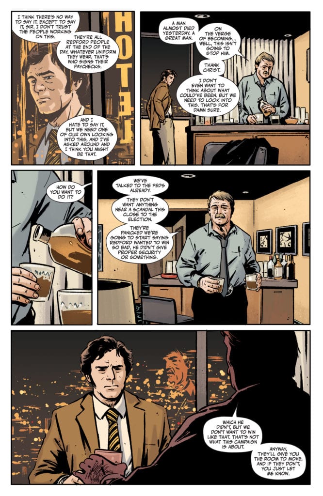
King is typically a pretty minimalist writer. In some series, like Batman, he can have as little as a dozen words in a given issue. Yet, DC Comics’ Rorschach #1 is pretty text-heavy. At times, when minimalist writers dabble in text-heavy scripts, they lose all sense of subtext. They begin explaining everything that is happening, instead of just showing. But King uses this wordier issue to create a different tone. King creates the conversational back and forth of people trying to put together pieces that just aren’t there. It reads like Pulp Fiction. Characters, afraid silence will make them look unsure of themselves, fill every pause with their grasping at straws. It’s a new style for King, but one that he executes well. It’s fascinating to see an accomplished writer experimenting.
Art
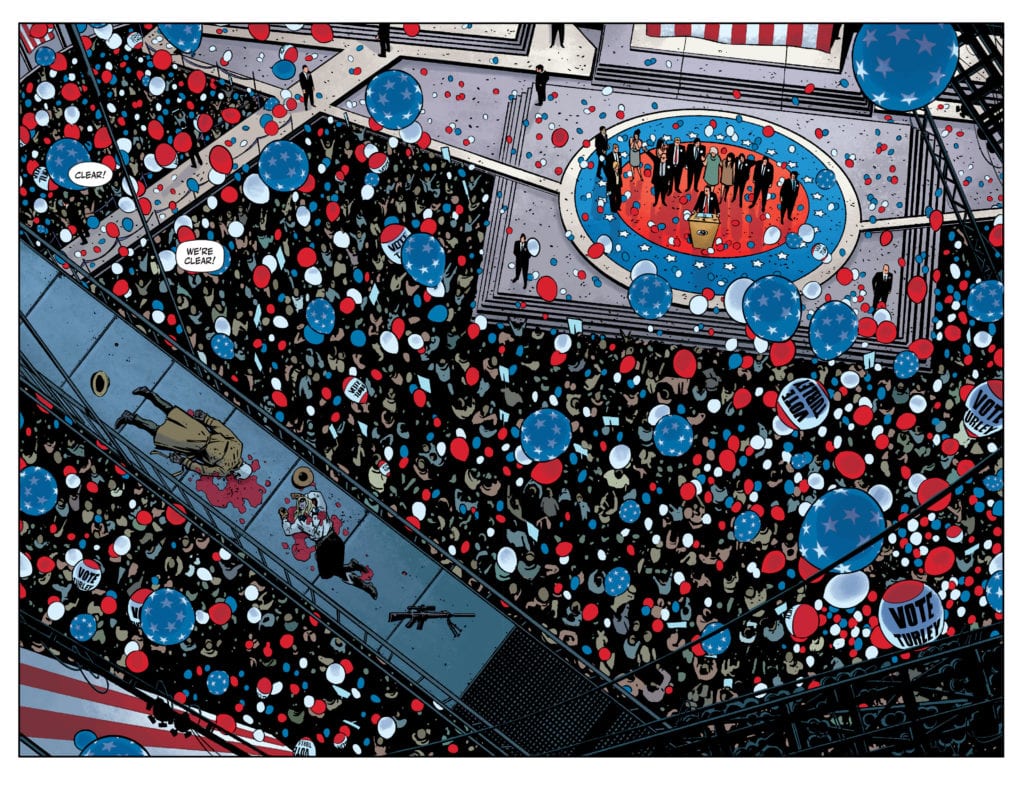
Fornes is constantly splitting up panels in Rorschach #1. Panels that exist in the same moment, have a gutter running through the middle, turning one into two. At times, Fornes does this to keep us in that moment for just a second longer. Someone in a hospital finds out they’re dying, and the corner of the page split off from the rest of the panel gives us a moment to let that sink in. But other times, Fornes is just splitting up the scene. Captions sometimes even run over the gutter, making it clear there’s no real passage of time.
One could say this is decorative, that Fornes is doing it because it looks good on the page (which it does.) But ultimately, it has the feeling of fragmenting the details. As the cops try and piece together what happened, Fornes gives us the feeling that they’re not getting the full picture. Even the things they think they know are just snippets of the whole. At the end of Rorschach #1, we get several images laid out over a page, but they interrupt one another. An image of Will Myerson is connected by diagonal panels, but across the opposite diagonal, we see images of a Rorschach mask. Fornes obscures the whole so that we aren’t left with answers, but with a feeling that the answers aren’t everything. Instead, we have to look again and see what we notice this time.
Coloring
Stewart’s color palette is gloriously all over the place. We get the autumnal orange glow of scenes of the gunmen preparing. Their lives feel like something out of a western movie. They live by the seat of their pants and exist in a golden era. And the security crew cleaning up the mess first hear about the threat in a room that looks purple and dark. As the lead detective sits out on his bed, thinking about the case, the sky in the background is a brilliant mix of purple and orange. It seems like he’s stuck between worlds. He’s caught between Turley and Rorschach, and he’s being pulled in both directions. But maybe he’s neither extreme. He just exists in the hazy orange-purple middle.
Lettering
When possible, Cowles allows his captions or dialogue to straddle the gutters on the page. This makes moments feel as though they exist outside of time. When talking about the background of the gunmen, or ruminating over their motivations, Cowles’ lettering turns two panels into one moment. By establishing this tone, Cowles makes it so that when the characters are piecing things together, it feels like one thought. But on the last page, we get some answers to the questions that have been bugging us. And in 15 panels, not once does the lettering cross the panel boundary. So Cowles leaves us with a fragmented page, a bunch of confirmed details but no way to put them together. It’s a brilliant way to up the mystery factor and underlines how incomplete the answers to these questions feel.
Rorschach #1, from DC Comics’ Black Label, is a comic that probably does have a lot to prove. It’s a step back into a universe that changed comics forever. But this creative team, instead of wasting time sweating under the hot lamps of “what fans will think,” just tells their story. It’s a story that feels fresh and only tangentially related to Watchmen so far, but it looks to be diving deeper into Watchmen lore without over-complicating the matter. Rorschach #1 is a promising start to a new series with mystery baked into every page. Pick it up from your local comic book shop, out from DC Comics, on the 13th of October!