

Nocterra #1 out now from Image Comics is an exciting introduction to the insane new dystopia that the series is set that still leaves much to uncover.
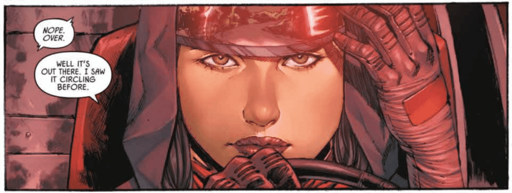
Scott Snyder does a brilliant job of introducing the reader to a new world in Nocterra #1. The issue begins with a flashback to when the entire world was bathed in everlasting darkness. We then get to see the present day, ten years later, where we are introduced to our main character, Val Riggs, who transports people between outposts in this nightmarish dystopia. Through the use of captions, Val introduces us to the monsters that live in this new world and explains many of the significant changes that have occurred since the darkness began. Snyder’s choice to reveal all of this information so early in the issue prevents the reader from being so confused that they can’t enjoy the story, but it also doesn’t reveal so much that the world is devoid of mystery. For example, we have yet to find out what caused the world to become dark and have yet to see every type of monster that inhabits this new world. There’s plenty of this dystopia left to explore, and this first issue does an incredible job of exciting the readers for what lies ahead.
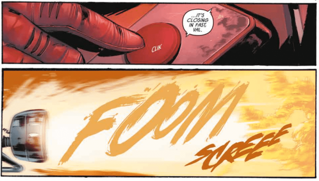
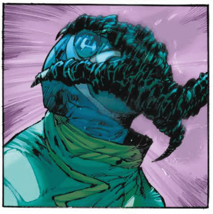
Tony S. Daniel’s art style fits perfectly with a comic book such as Nocterra #1. His forms are so dynamic that they bring action scenes to an entirely new level. Other techniques such as dramatic angles and overlapping panel borders also help to immerse the reader into the issue and make for some captivating action sequences. Daniel also fills the issue with stunning character designs. The monsters are genuinely creepy and make you look forward to the other versions of them you will get to see down the line. The series’s main character clearly has a striking costume, but it is also worth noting the other fashion of background characters. Each is wearing something cool and unique, such as one character wearing a squid over his head, and this attention to the styles of background characters helps cement the cool dystopian aesthetic of the series.
Nocterra #1‘s coloring is unique because the world is entirely devoid of natural light except for in a few flashbacks. Tomeu Morey does a spectacular job of portraying this, whether through harsh lighting in poorly lit rooms or a golden hue given off by a well-lit outpost. We also get to experience some gorgeous lighting during scenes outside of civilization, where the only light comes from flares or lights strung on a truck. The red of the flare’s light and the truck’s blue result in an exciting color combination that you don’t often get to see, and I look forward to scenes like this in future issues.
AndWorld Design utilizes some classic lettering techniques in Nocterra #1 that fit phenomenally with the story and art. Whether that be by a caption overlapping a panel’s border to make it stand out or dialogue stretching past the edges of a speech bubble to show a character is in anguish, AndWorld Design knows how to tailor lettering to fit the story. There is also a character whose speech bubbles have an inverted color scheme, which beautifully compliments his design.
Nocterra #1 is a splendid introduction to an exciting new dystopia with so much left to be uncovered. The issue provided some thrilling action and set up an epic journey to follow.