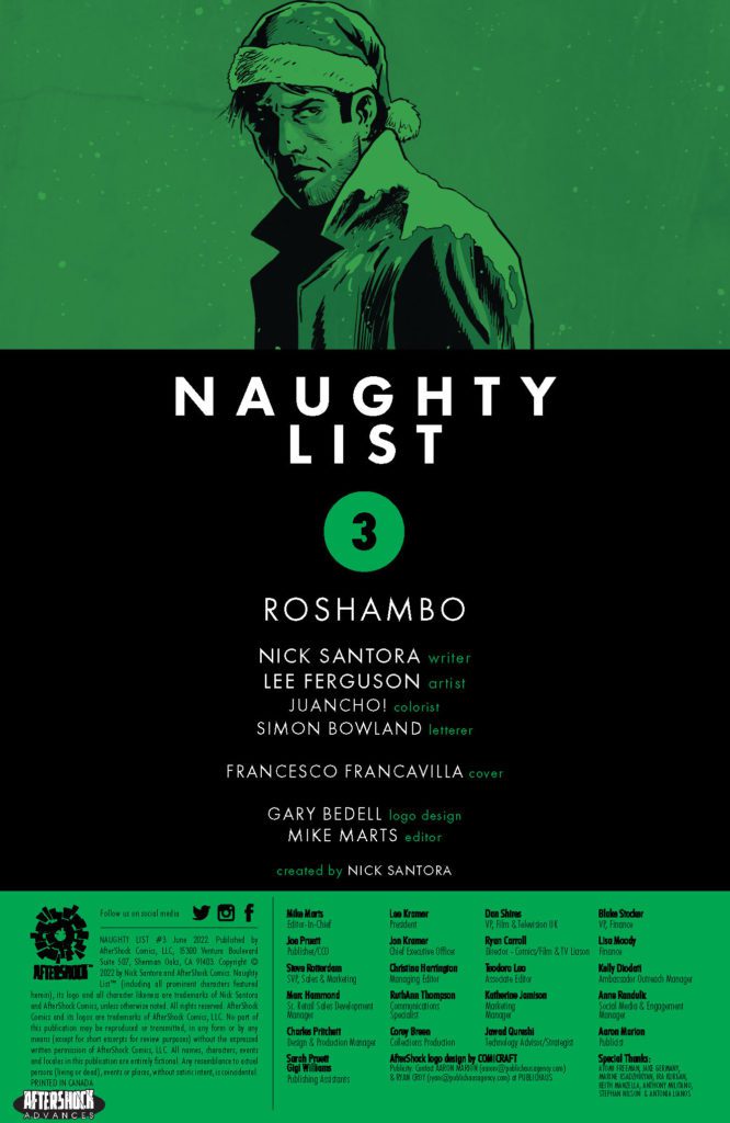

New from Rebellion, the publisher behind 2000AD, comes Battle Action: a hardcover, one-shot war comic born out of the history of British comics. More than a homage to the bygone days of action comics, this new special is entirely written by Garth Ennis. It features some of the most extraordinary artistic talents currently in the business. This anthology comic features characters that were created decades ago but will be brand new to a lot of the readers.
Full of violence, cunning, and meta-fiction, Battle Action has an unsurprising surface level, but the undertones, and one story in particular, will definitely be more than you might be expecting.
A Little Bit of History
There are very few genres within comics that manage to maintain consistent popularity, the superhero genre being an exception. Horror drifts in and out of fashion, and genres such as romance died out, with the few attempts to rekindle the flame barely making a mark in the mainstream. However, all genres have a following within the small press, and whatever you are into, you can find graphic storytelling to fit your needs. However, in British shops, War comics have always held a spot on the shelf. From the early 1960s, with the publication of Commando War Stories In Pictures, war comics have proven to be popular, and a range of titles have come and gone over the decades. However, Commando is still being published to this day.
Another tradition in British comics are weekly anthologies, from those aimed at younger readers, such as the Beano and the Dandy, to more adult and famous titles such as 2000AD. The war comics were no different, with titles such as Warlord telling the adventures of numerous characters week after week. Battle Picture Weekly first appeared in March 1975 and contained stories set mainly during the first and second world wars, with Pat Mills and Joe Colquhoun’s Charley’s War proving to be one of the most enduring and, in Ennis’ opinion, finest comic strips of all time.
In 1977, Battle merged with another title, Action, to form Battle Action. Action was another anthology title but contained a wider range of genres and inspiration. The superb Hook Jaw was introduced within the pages of Action along with BlackJack and Kids Rule OK! Action was born in the era of punk rock and the aura of anarchism sweeping Britain in the mid-1970s. It was not accepted by polite society and managed to ruffle all the wrong feathers leading to some self-censorship and a final merging with Battle.
Ennis is no stranger to war stories or writing politically charged, based in reality, comic strips. His first story was set on the streets of Belfast during the height of the Irish Troubles. He then went on to re-invent the Unknown Soldier for DC-Vertigo before writing Weird War Tales and War Stories for DC. Next, he wrote Phantom Eagle for Marvel and more War Stories for Avatar Press before writing a collection of various war-based adventures for Titan Publishers and Aftershock Comics, which brings us to the new Battle Action special from Rebellion.
Opening Shots
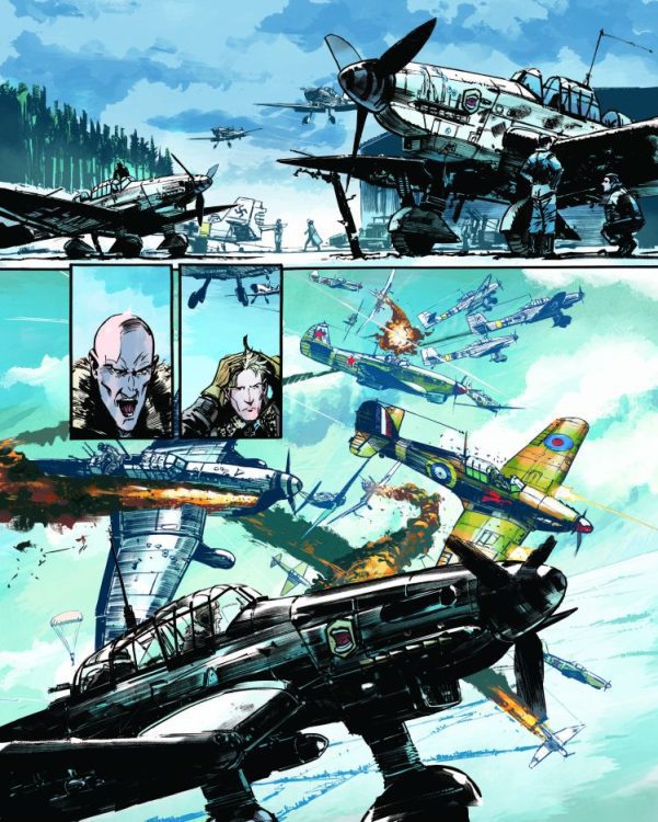
Battle Action contains seven short stories featuring characters who appeared in the original run. The opening story, Johnny Red, is bright and bold with intricate ink work from Keith Burns. Jason Wordie’s colors reflect the coldness of the conflict and the deception inherent in the narrative. There is realism to the visuals, but Wordie plays with the environment to create emotional context. Rob Steen squeezes the conversation-heavy dialogue into the landscape, enforcing the visual style that is both 1970s nostalgic while also being very modern comic storytelling. The wide, thin panels suit the aviation action, and the fine lines of the aircraft easily slice through the panel borders creating the grander scale of the aerial conflict.
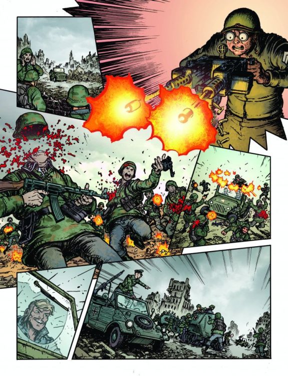
Rob Steen’s typewriter-style font in the caption boxes emphasizes the documentary storytelling style in The Sarge. The strip reads like a soldier’s letter from the front, and this is used to great effect in the script and the visual design. P J Holden’s artwork is extremely detailed and has a heightened dramatic flair as if it represents an over-the-top representation of the actual events. Again, it is the exaggeration of memory, the focus on specific details at the cost of surrounding elements. The decision to print this strip in stark black and white refers back to the original comics and to the single-mindedness of memory recall. It is very ‘matter of fact,’ which is essential in this story.
Chris Burnham’s work on Crazy Keller is much more comical and expressionistic. There is a ludicrous element to the tale being told, which is reflected in the artwork, with its floating heads and blend of classic children’s comic language and over-the-top performances from the characters. Burnham draws humorous faces and exaggerated gestures, creating visual punchlines not always backed up by the script. Crazy Keller is Ennis writing a War story set in a Loony Tunes cartoon, and it is full of cheek and charm.
The Difficult Middle Section
There is no escaping the Dirty Harry inspiration behind Dredger, but John Higgins’ masterful artwork will entirely occupy your journey through the twelve-page story. Complex layouts contain superb compositions and clever storytelling that almost negates the need for Rob Steen’s lettering. Sally Jane Hurst’s colors create tension on the page, instantly drawing the reader’s focus to specific panels, complicating the layouts but always benefiting the reading experience. Out of this anthology, Dredger is the most visually exciting, even if some of the narrative elements feel familiar in niggling ways rather than the nostalgic references that feature in all of the other stories.
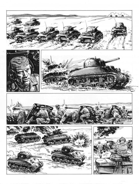
Hellman V Glory Rider is a little too similar to the Johnny Red story, only with tanks. For some reason, the narrative lacks a hook unless tanks shooting tanks is all you look for in a story. Unfortunately, a touching moment between the heroes of each comic strip (for this is two classic comics merged into one) isn’t enough to make this story shine or even stand out against the other strips on offer. Mike Dorey’s artwork is reminiscent of 1970s war comics and wouldn’t seem out of place in the pages of Warlord or Commando, but it is overshadowed by the stories that precede and follow it. One of the downsides of anthologies is that good stories can fade into the background when placed alongside brilliance, and this is Hellman V Glory Rider’s unfortunate fate.
Politics and Social Commentary
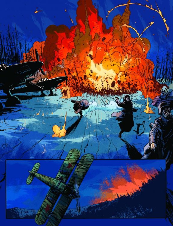
I’ll return to Kids Rule O.K., and instead skip to the final story, Nina Petrova and the Angels of Death, with Patrick Goddard’s artwork and Jason Wordie’s colors. The narrative follows a group of Russian bombers on a night raid and the triumph and tragedy that follows. This strip allows Ennis to touch on slightly different themes than the other stories, and the emotional impact of the action is more sincere. The story highlights the lack of strong female characters in the genre but demonstrates that nothing needs to be lost because of gender. Goddard’s fine line details bring the characters and aircraft to life, while Wordie’s colors make the pages stand out. The cold darkness of the night creates an imposing atmosphere which Wordie uses to his advantage to instill moments of shock or excitement in the narrative. The destruction is more visible within this story because of the contrasting color palette used; bright reds of flame leap out of the cold blues of the night.
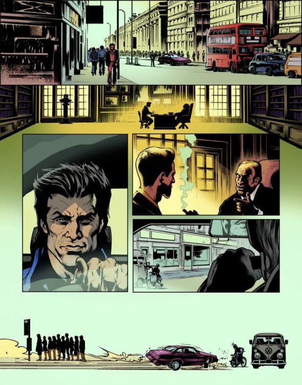
The penultimate story in this anthology is perhaps the most exciting and interesting. It is definitely the story that stands out the most and takes a different approach to the nostalgia inherent throughout this entire comic. Kids Rule O.K. has an infamous past and is often cited as the story that caused the downfall of the Action title in the 1970s. In this new tale, Ennis and Kevin O’Neill decide to mix two styles and two narratives to capture the theme of the original comic strip but also the reaction to violence within British Comics at the time. By intercutting the comic strip with full-page splashes of conversation, minus any visible characters, Ennis is able to openly discuss the comics’ form and history in a way that seems natural and fitting for this anthology. The twelve-page story looks and reads like it was taken straight from the pages of Crisis, the comic where Ennis’ first story was published and references the 1980s and 1990s as much as it does the 1970s. This story, more than any in this anthology, is about the history of British comics and the general public’s perception of publishers, distributors, and creatives involved. Kids Rule O.K. is the most abstract of the comic strips, and some of the subject matter, for example, police brutality, is especially hard-hitting, being as relevant today as it was when the original strip first appeared. Kevin O’Neill’s artwork is perfect for this kind of story, and the banality of ‘reality’ heightens the excessiveness of the comic strip. Something is unsettling in Kids Rule O.K., and it’s not just the mindless violence perpetrated by the central character and the police response. It is a reflection of a different time that is unfortunately still relevant today.
Conclusion
Anthologies have always been a part of British Comics, and war stories have always found a place within the pages of these comics. Battle Action is a wonderful celebration of the genre and the perfect homage to the creators who made British Comics so popular. Ennis has an obvious love for this genre and understands why these characters were popular at the time, but the real genius is that he has made them relevant today without turning them into parody.
There are some clear standouts in this comic, as there are with all anthologies, and there are no real duds. The most impressive story is the Kevin O’Neill illustrated Kids Rule O.K., which seamlessly mixes nostalgia and social commentary to tell a tale of historical relevance. It is an essay about British Comics and the uphill struggle they face against a society that doesn’t understand or accept them.
Battle Action is an exciting read and more thought-provoking than you’d expect.


")