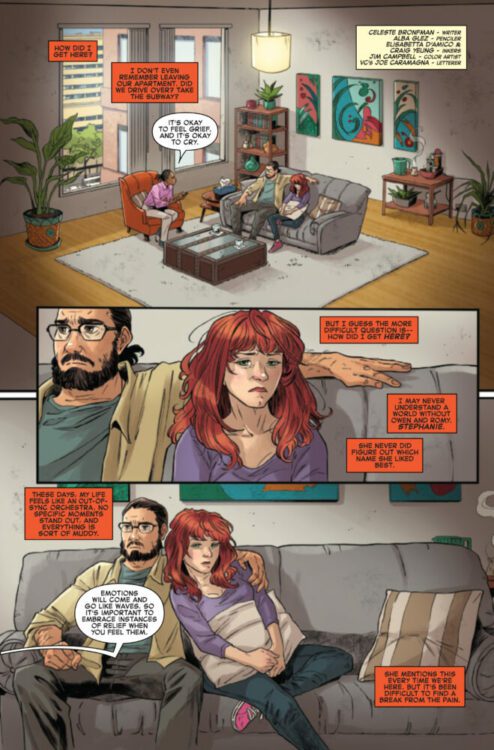
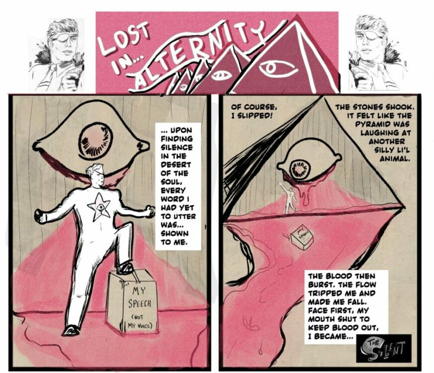
The premise is simple: read one comic every day for the entire year. It seems like a simple task but there is no way that I read 365 comics last year, even if you count the individual issues in collections. So, this year, I am committing myself to this reading challenge, in the hope that I can broaden my reading habits and fully engage with my favorite hobby again.
When it comes to monsters, comics have their fair share. There are, 1) the obvious monsters: the mutated violent creatures that attack the intergalactic and fantasy heroes, 2) the classics: such as vampires, zombies, and Frankenstein’s creatures, 3) the misunderstood: again including the adaptations of Frankenstein but also including those from Big Girls (Image Comics) and, of course, the Thing from the Fantastic Four, and 4) the villainous monsters — the evil people that exist for the superheroes to fight (will Lex Luthor, Norman Osborne, and Wilson Fisk please stand up?).
But, the worst kind of monster associated with comics is the disgraced creator. More and more over recent years, stories, allegations, and criminal proceedings have ended many creators’ careers and tainted the comic industry. When engaged in a project like this one, where a large majority of the reading comes from older material, it becomes difficult to navigate the uneven terrain and avoid the forbidden zones populated with disgraced or triggering creators and comics. Earlier in the year, I spent a week re-reading X-Men titles only to discover that a large section of my collection contained, for want of a better word, problematic writers. There are some websites that don’t even review comics from whole publishers because of their brazen associations with people and groups that appear to stand against one of the central modern comic mantras of ‘Comics are for everyone’.
Most people don’t want to cause unnecessary discomfort by discussing triggering topics or creators. And most definitely don’t want to be seen promoting the work of creators or publishers whose reputation and practices are questionable or even illegal. However, when the focus of an article, such as this, is less about advertising or recommendations and more about the dissection and the discussion of comics as social and cultural history, it is difficult to avoid some creators work.
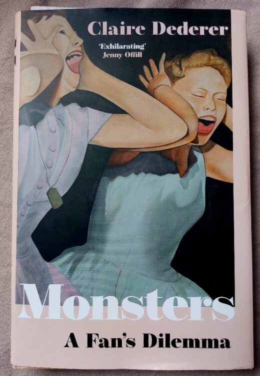
In her book Monsters: A Fan’s Dilemma, Claire Dederer examines her own journey of interacting with artistic works by problematic creators. Although it doesn’t touch on any comic book creators or publishers specifically, the questions that are raised and discussions that she leads are relevant to the comic industry and its fan base. Is it acceptable to write about and promote the work of Frank Miller, an outspoken man whose opinions and work has caused offense to numerous people, so much so that he was removed from the quest list of the UK comic convention Thought Bubble in 2021? And what about Warren Ellis? A writer of some outstanding, influential work, but also someone who has taken advantage of a large group of women over the years, grooming them in online chat rooms and at conventions. Although he is not currently producing any work, how should people interact with his past work? Roc Upchurch was arrested for domestic abuse, pretty much ending his comic career. It also had knock-on effects for the comic he was working on at the time, which led to further complications with the writer Kurtis Wiebe and the publisher of Rat Queens, Image Comics. Is the mere mention of his name a step too far, or is it possible to examine his work and even engage with new work, if it was to emerge, without condoning his previous actions?
This is a rough sea to navigate, but reading Dederer’s book provides a fascinating and balanced view of the subject. I already have strong views on the connection between Art and Artist, believing that work can, and should, stand on its own two feet without needing to be propped up by the creator — in comics more so than other visual arts. However, this view has been formed over years of studying historical art and culture. It’s easier to discuss the works of a deceased artist than it is someone alive who has perpetrated heinous acts.
I raised this topic briefly in my X-Men week and cleverly sidestepped the issue to focus on different comics. However, I was forced to think about this subject again in Week 30 because of the comics I mindlessly pulled together to read. An exciting proposition of reading comics published through a single publisher, in this case AfterShock Comics, was slightly marred as I realized that one of the titles, one of my favorite titles, was written by Warren Ellis. Do I just ignore it? Replace it with a different title? That would be the easiest option. But, I have other comics I want to read, created by “monsters” as Dederer would name them. The works are important to the history of the British and the American comic industry. They can be classed as works of art along the lines of Rosemary’s Baby by Roman Polanski or Thriller by Michael Jackson, and they are fan favorites or have cultural significance, like JK Rowling’s Harry Potter books. To ignore them does a disservice to the history and study of comics but that does not mean that we have to endorse the creators or condone their actions.
But I started Week 30 with something a bit lighter, something fun and entertaining. It was the start of my read through the AfterShock Comics titles that I own. AfterShock, as a publisher, have put out some of the best titles in the last 10 years, and have had a very good social media presence that was warm, friendly and personal. So, it seems a little unfortunate that this week leads into my examination of controversies.
Credit: AfterShock Comics
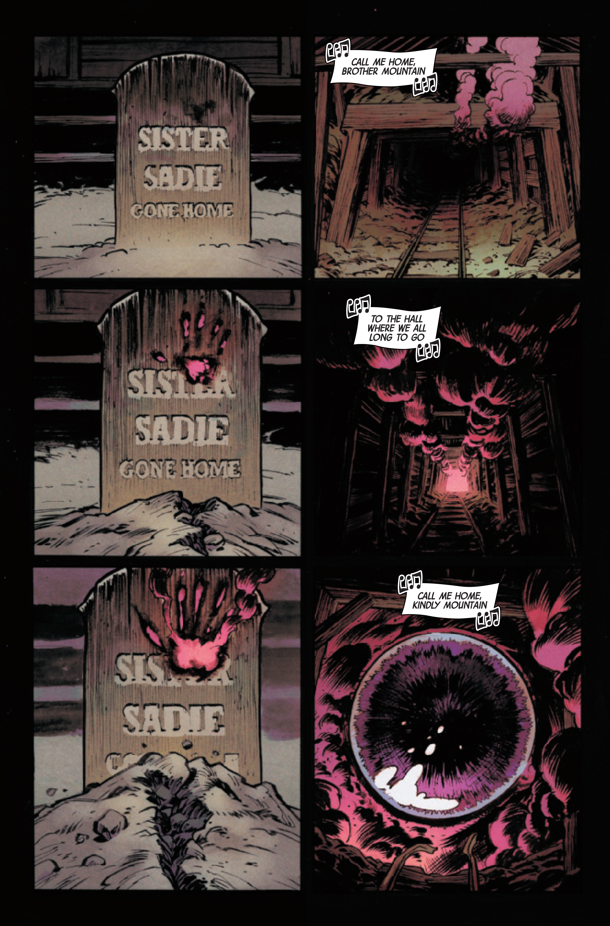
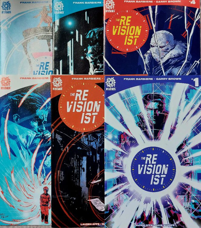
Comic Number 203 to 205: The Revisionist #1-6 (that’s actually 2 comics a day)
Written by Frank Barbiere and illustrated by Garry Brown, The Revisionist is a twisty-turny time travel story that falls somewhere between Time Cop and Millennium (the movie, not the television series). In the first issue, the reader is introduced to Martin Monroe, who is fully engrossed in his personal mission: killing time travelers in the past to save the future. Barbiere throws the reader into the thick of the action with a sequence straight out of 2000AD. It is an unspecified science fiction-esq setting mixed with violence and high stakes.
After that initial onslaught, however, the story slows down and becomes a journey of self discovery for the central character. His story starts at his lowest point, as a prison rat, squealing on the other inmates to impress the parole board, and one particular prison guard. The conflict between characters is expertly illustrated by Brown who concentrates on facial expressions and the characters postures in order to capture the level of threat and violence. There is a real physicality to the characters and the difference between Monroe and the prison bullies is clearly visible.
Where this comic really stands out is with the color provided by Lauren Affe. There are sequences where the art takes an abstract turn, where Monroe is speaking to his father through a form of telepathy. During these moments the coloring shifts dramatically to an unworldly color palette, making the experience as uncomfortable for the reader as it is for Monroe.
Affe’s effect on the emotional aspects of the plot doesn’t end there, however. She contrasts color themes on opposite pages so that there is a visible divide between the separate scenes. She also alters the background coloring to highlight specific foreground action. The reality of the scene is replaced with emotional signifiers. This is most apparent during fight sequences but also plays a part when focusing on memories, such as on the first page of issue 3 where Monroe is remembering a childhood birthday. The scene is about the relationship he has with his father and there are virtually no background details, only a faded mustard color. This color becomes a motif for Monroe’s memories and begins to bleed into the rest of his life as it spirals out of control.
As the story progresses, it becomes more and more complicated. A new set of bandaged characters enter the mix like an army of Invisible Men who speak a language no-one understands. The more that Monroe “fixes” the past the more time begins to unravel. The only constant is the violence that follows Monroe back and forwards through time.
Despite the complexity, Barbiere keeps a tight hold on the reins of the narrative and it never contradicts itself, except where it is meant to. Brown and Affe’s artwork keeps the momentum of the narrative moving. The layouts and color palettes are designed for an easy reading experience so that the reader’s concentration is on the story aspects.
The influences for this comic are clear and visible within the pages. This is a combination of a Philip K Dick story, with 1980s movie action, and 1990s television storytelling, all filtered through the hands of comic aficionados. The plot is a mix of ideas that can be found in a number of different places, novels, films, other comics, but the tight scripting and the exceptional artwork sells this comic. The Revisionist is a joy to read.
Credit: AfterShock Comics
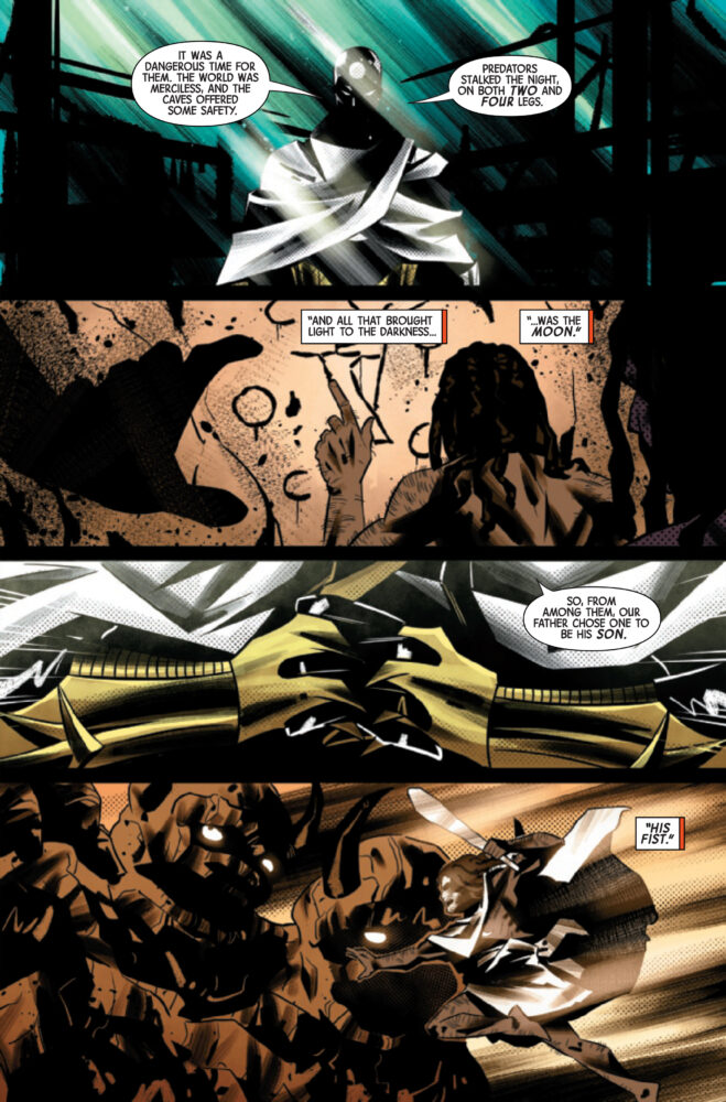
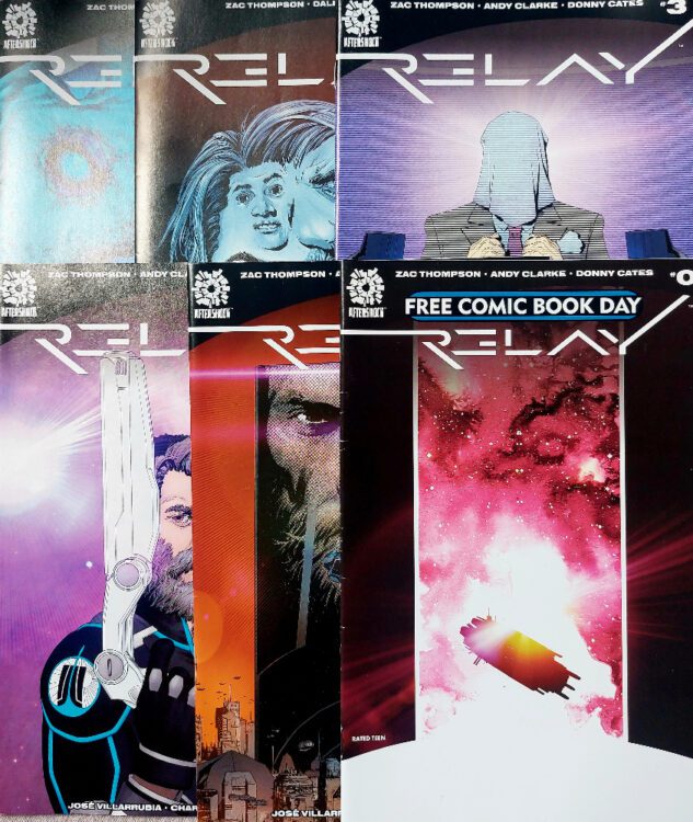
Comic Number 206: Relay #0 – 5
Relay is another high concept science fiction mini-series that draws its inspiration from sources outside of comics. The central concept bears an uncanny resemblance to Stanley Kubrick and Arthur C. Clarke’s 2001: A Space Oddity. In fact, it’s almost as if writer Zac Thompson asked himself “What would happen if the human race went looking for the creators of the monolith?” As an idea, it is very engaging and, after the 0 issue, the examination of a world shaped in the shadow of a monolith and the need by some to find meaning to their life, is a very fascinating concept. Thompson makes his central protagonists curious about the world, like the reader is after opening the comic. This allows the narrative to explore elements of the world, giving the reader insights into the landscape and the people. As the protagonist is shaped by his experiences, the reader is led through the philosophies of the creators.
I enjoyed this series when it originally came out and make time to re-read it every so often. There is a suddenness to the end which makes it less than satisfying. It definitely leaves you wanting more. However, the first issue, the Free Comic Book Day 0 issue, is a magnificent comic by itself. Obviously, it sets up the 5 issue series, but the story this single issue tells is compelling and thought provoking. It questions the birth of religions and hints at the consequences of those belief systems. It has a lot to say for such a short comic.
Credit: AfterShock Comics
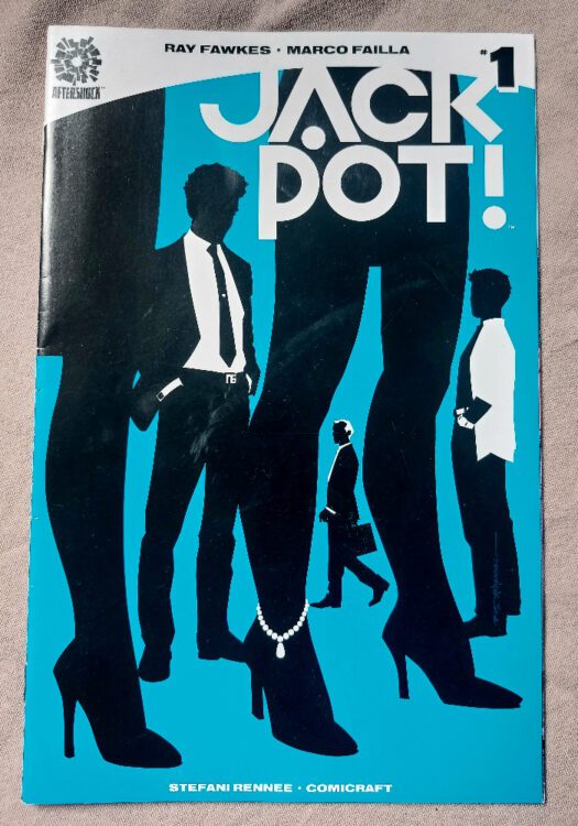
Comic Number 207: Jackpot #1
With a minor tweak and the removal of the final page, Jackpot #1 would be the perfect, one shot, heist comic. The set-up is simple and the plot unfolds at exactly the right pacing to keep the reader on the edge of their seat. There are a couple of tongue in cheek references to the heist genre and Ray Fawkes is clearly enjoying stirring his sense of humor into the mix. Together with the bold, clean lined artwork by Marco Failla, Jackpot is a cinematic piece of entertainment.
Ray Fawkes has, over the years, produced some challenging comic work. The titles where he works as both artist and writer, such as Intersect and In The Flood, play with the concepts of narrative and visual storytelling. There is no compromise to his vision and his experimentation produces stunning results. But he also knows how to maneuver around mainstream comics, bringing his experimentation to a wider audience. In comics like Jackpot, Fawkes initially produces an experience that is easy to access for readers. He adapts his style to the constraints of mainstream storytelling and acknowledges the popular culture he draws from, such as the Ocean’s 11 film series.
I was lucky enough to see him on a panel a few years ago and his excitement and consideration when discussing a single panel in a comic layout highlighted his attention to detail. He came across as motivated and elevated by the process of creating comics, even mainstream titles. And this positivity shines through in his work. You can’t go wrong with a Ray Fawkes comic.
Credit: AfterShock Comics
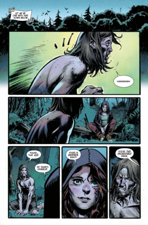
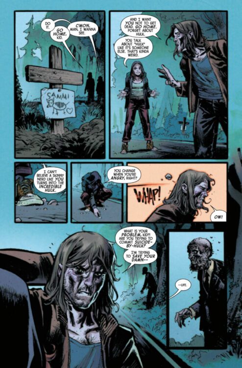
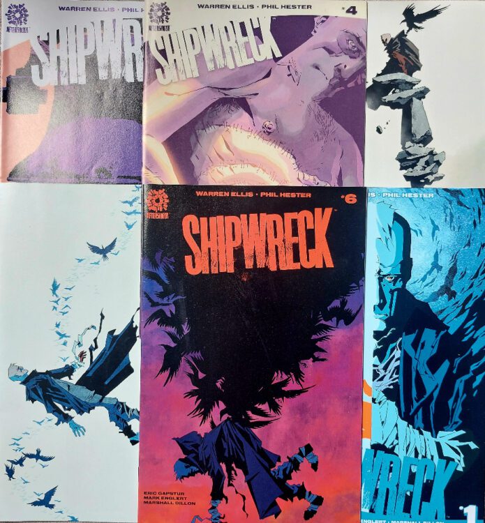
Comic Number 208: Shipwreck #1-6 (part 1)
There are a lot of really good AfterShock comics still to read. Stronghold, one of the best examinations of the superhero genre since Watchmen (yes, I said it) and Undone by Blood, one of my favorite comics of all time. However, it is difficult for me to skip past Shipwreck for a number of reasons.
Firstly: it was one of the first AfterShock comics I bought, and it impressed upon me the aims of the publisher. Here was a publisher committed to producing great stories and even better comics. They seem to give their creators freedom to experiment with their craft and do not conform to a house style. In 2016, when the first issue came out, this was a fresh and exciting publisher filling a gap that Image appeared to be losing at the time.
Secondly: The artwork, which I will talk about in a minute
Thirdly: At the time, I was a fan of Warren Ellis’ work. He had worked on a number of titles that I enjoyed. He wrote and created Lazarus Churchyard in the early 1990s which was one of my favorites from the anthology title Blast! More recently he worked on Moon Knight with Declan Shalvey, Trees with Jason Howard, and the start of The Batman’s Grave mini-series for DC.
I am going to discuss Shipwreck in two parts. I will look at the comic itself before discussing the writer in relation to his work.
The story’s protagonist, Dr Jonathan Shipwright, finds himself marooned on a new Earth after his experimental dimension hopping spaceship crashes on re-entry. The people he meets make little sense to him and the landscape less so. He is lost, searching for a way home but plagued by secrets that are revealed over the course of the six issues. The central character is complex, with the narrative often implying he knows less than he does and the reader is stranded in the topsy-turvy world desperately trying to find their feet.
The plot is superbly structured across the six issues and is definitely a title you should binge read. There are philosophical discussions about the nature of existence, the purpose of life, and the place of humanity in the world. But it is also a journey of self discovery as Dr Shipwright starts the series running from his life.
The narrative is excellent, however the artwork is better. Phil Hester’s pencils and Eric Gapstur’s inks produce heavy outlines and solid black shadows which gives the comic a distinctive look. Everything on the page serves a purpose and the layouts are extremely satisfying to read. The interchangeable panel sizes, often overlapping or bleeding to the edge of the page with no border, opens up the world and draws the reader in. The figure work is bold and over exaggerated, creating perfect on page acting for the characters. Facial expressions and posturing make this a highly emotive comic. The violence is unsettling and there are moments of grotesque beauty.
Mark Englert holds nothing back with the colors. There is such a variety to the color palette and there are shades I don’t think I have ever seen in a comic before. Englert creates an unknown world through his use of bold, flat colors fields. There is very little subtlety but this works magnificently with the tone of the narrative and the heavy black ink work.
From a purely visual perspective, Shipwreck is one of the best comics released in the last 10 years.
However…
Credit: AfterShock Comics
Comic Number 209: Shipwreck #1-6 (part 2)
There is an elephant in the room. Shipwreck is one of my favorite comics, as I’ve explained above, and it is something of a standard setter for AfterShock comics and indie/creator-owned comics in general of that time. However, you will not find anyone discussing it because of the writer’s behavior in his personal life.
In 2020, Ellis was accused of sexual coercion and manipulation by several women, and this led to a large group of women detailing an unsettling pattern of behavior. For information about the accusations and the reaction by the community, I recommend visiting the website SoManyOfUs.com. The outcome of the incident was that Ellis removed himself (or was possibly removed) from his ongoing comic productions and all of the titles he was working on ceased. The final issues of The Batman’s Grave were released as the issues had already been completed by that point but that was the end of his comic career to date.
Warren Ellis has not been convicted of a crime, but his actions have made it impossible for him to work in the mainstream comics industry. When it was, prematurely, announced that he was going to continue working on his crime comic Fell, the negative backlash forced Image Comics to release a statement confirming they would not be publishing the comic. The problem this creates for people studying, reviewing, and writing about comics is, how do you handle the back catalog of a problematic writer, like Ellis? He has worked on a vast array of comics, for most of the big publishers, and some of his work are classed as seminal comics work, or at least they were.
In her book Monsters: A Fan’s Dilemma, Claire Dederer asks the question “Can I love the art but hate the artist?” before explaining that, in the modern world, an artist’s behavior can become a stain that affects the audience’s view of the artwork retrospectively.
“The Stain — spreading, creeping, wine-dark, inevitable — is biography’s aftermath. The person does the crime and it’s the work that gets stained. It’s what we, the audience, are left to contend with.” (Dederer)
The simple solution is to ignore the work — pretend it doesn’t exist. In some instances this is easy to do. If the work has had no impact on the culture it is a part of then dismissing it from the discussion is the obvious answer. But more often than not, the artwork has already made its mark. Shipwreck, for example, may not be a historically groundbreaking comic, but it was fairly important to the rise of AfterShock Comics’ place in the market. Not only were they able to sell the comic on the reputation of the writer (who at that point was highly respected and influential), but the comic demonstrated the freedoms that the creators were given and the types of comic the publisher wished to be known for.
There is also another study potential. By re-examining the comic today, we could get a new insight into the character and the creator, just as Shakespearean plays are re-examined when new information is discovered about the playwright’s life. The text hasn’t changed but our perception of it will have.
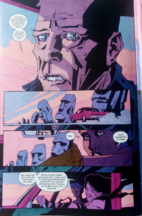
Take the central character of Shipwreck, Dr Jonathan Shipwright, as an example. In the comic he is an intelligent man, one who is respected and admired by his peers. He has created something unique and sought after by others. He is also running away from his life, trying to leave behind the world for reasons that aren’t clear. In issue five, when Shipwright is asked why he developed a machine to help him escape his home, he replies, “I’m weak and I’m easily led and I’m scared of everything and everyone. I’m a coward. So I built something to help me run away.” In reply, Nina says, “Wow. You’re actually kind of creepy.”
In retrospect, the conversation here could be applied to Ellis’ own actions and engagement with them. He knows that he has behaved badly and not treated people with respect but the stance of “I’m weak” is his way of excusing his actions. He acknowledges that the protagonist, in this case a narrative representation of the writer, would come across as creepy to others but he is still the hero of the work, the misunderstood character just trying to find a place in the world. In issue six, he states, “I’ve been shown murders. Burials. Things that made no sense. Except here. They were the right decisions for here.” Again, this can be seen as an admission of guilt but with a caveat. The mistake wasn’t what was done, but the circumstances under which it occurred.
If you read Shipwreck knowing the accusations aimed at Ellis, the six-part story takes on a different life. It becomes a shielded confession and search for absolution. Dederer’s “stain” infects Shipwreck and gives it a more disturbing undertone. A fascinating journey of self discovery becomes an admittance of guilt but not an acceptance of it.
From a visual point of view, this is still one of the best comics in the last 10 years, and we can’t dismiss the artist’s work because of the writer’s actions. However, our understanding and reading of the comic will be forever stained and that stain changes our perception of the narrative.
For the next seven comics, I am going to look at some more controversial creators’ work and comics that themselves caused a stir when they were released. This means that there may be some triggering aspects to the comics discussed or material that some readers may find objectionable. Therefore I would recommend skipping the next installment if you want to avoid such discussions, but, please come back in a week or so, where I will discuss some more wholesome material.