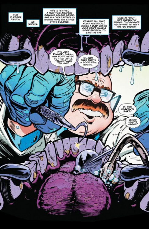
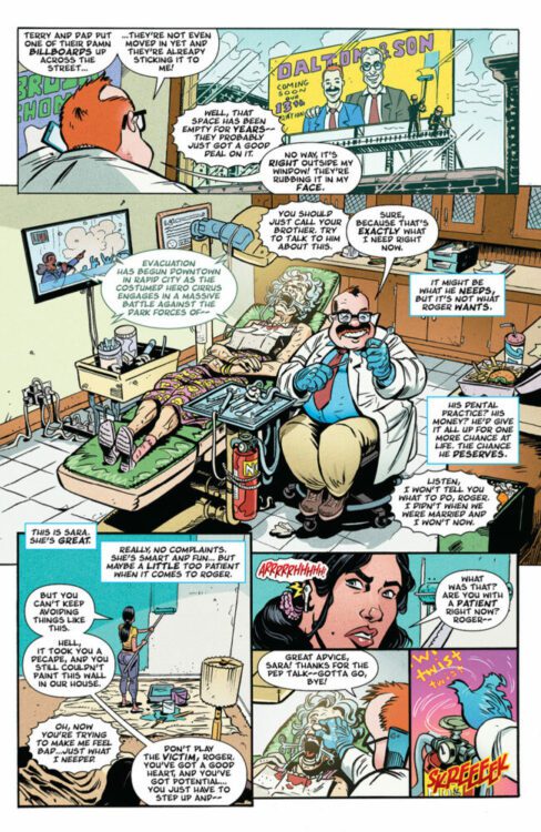
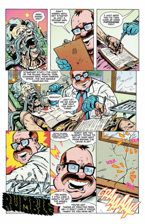
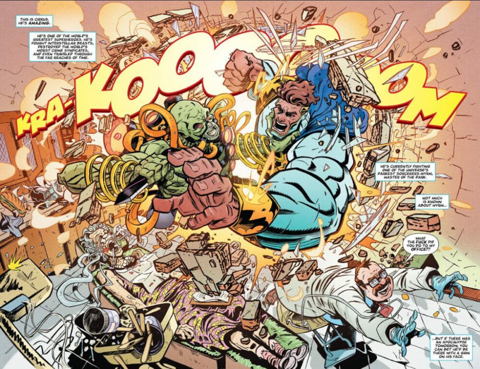
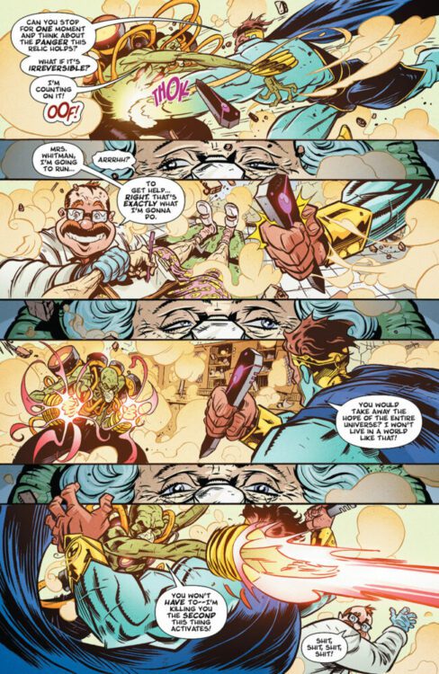
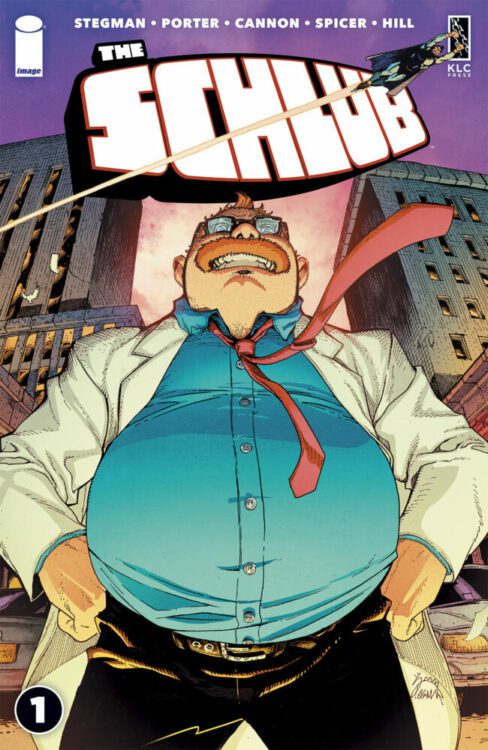
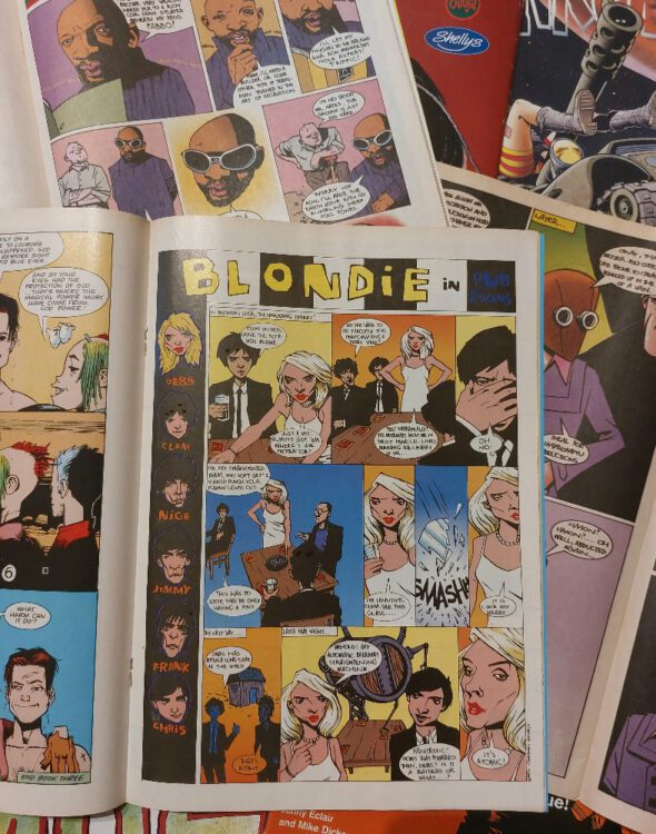
THE SCHLUB #1 hits your local comic book store on August 23 from Image Comics. The ongoing series is written by Ryan Stegman and Kenny Porter, with art by Tyrell Cannon, Mike Spicer drops the colors, and you will read John J. Hill’s letter work. Check out my full review below.
About the series: The Schlub follows failing dentist Roger Dalton who blames the world for his problems… up until he is body-swapped with the world’s greatest superhero. Can Roger save Earth and finally prove to his family he’s not a loser? Or are we all doomed?
The premise is simple: read one comic every day for the entire year. It seems like a simple task but there is no way that I read 365 comics last year, even if you count the individual issues in collections. So, this year, I am committing myself to this reading challenge, in the hope that I can broaden my reading habits and fully engage with my favorite hobby again.
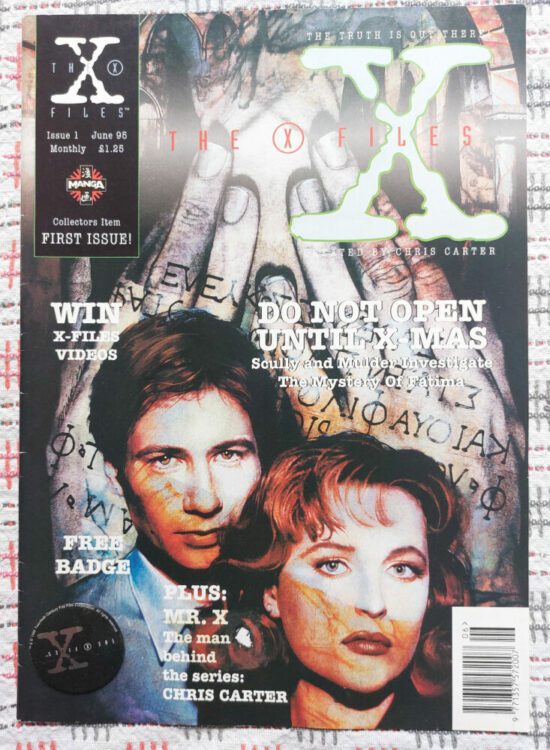
“Mulder…It’s a flying saucer! I don’t believe it!” – Dana Scully in Not to be opened until X-Mas, from issue 1 of The X-Files
Looking back, it’s amazing how much Dana Scully sees early on, and yet writers play her as a skeptic for so long. The X-Files comic series is worse than the television show in that respect. At least in the show, Scully was always just around the corner or unconscious when the craziness happened so she could write it off as Mulder’s flight of fancy or overactive imagination. In the comic, they chuck flying saucers and cannibal priests at her all day long.
After reading Tank Girl last week, I had my box of older British comics out, and sitting on top was The X-Files, also published over here by Manga Publishing Ltd. The comic strips are reprints of the Topps Comics Production comics published in North America. Just like the television show there was a delay between the America publication and the UK release. The comics had a 6 month delay, the television show about 12 months (depending how you watched it).
The X-Files was a revolutionary show, or at least it felt like it at the time. It was a series that drew a massive audience, and in the UK it became one of the top-watched shows, even beating The Simpsons in the ratings (the first video releases had some shops doing midnight openings and they sold 250,000 in the first week of release). The first and second seasons were amazing with some fascinating ideas and brilliant character work, especially for the quest characters who only popped up now and then. Actors Gillian Anderson and David Duchovny were superb individually, but even better together. Re-watching it now with my son (10 episodes in) and I forgot how kick-ass Scully was.
But what about the comics?
The X-Files #1 (UK Edition) Credit: Manga Publishing Ltd
The majority of the comics I own were written by Stefan Petrucha. I am not familiar with any of his other work, so I can’t tell you how The X-Files fits his style. The artist, on the other hand, is a lot more familiar: Charlie Adlard, who we all know best from his impressive run on Warheads from Marvel, right?
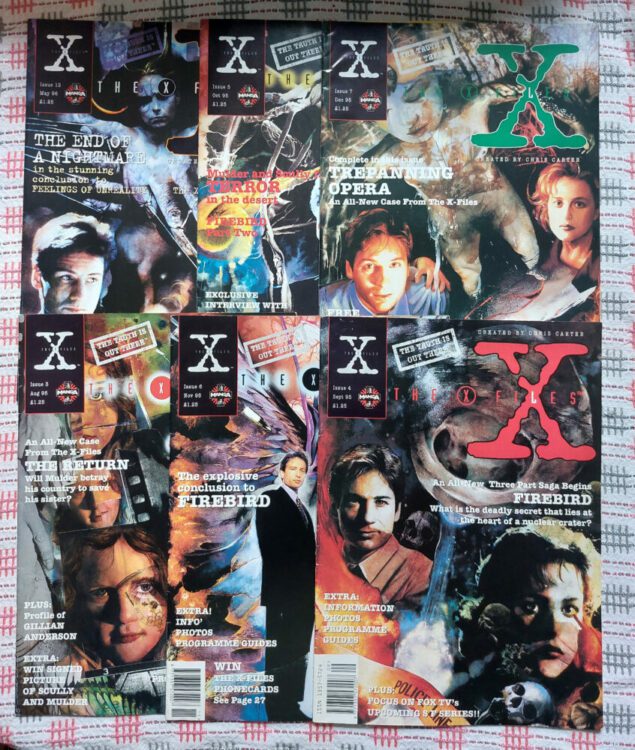
In 1995, X-Files #1 came out, and — if you watched the show — how could you resist it? The front cover for the debut issue, produced by Miran Kim, captures everything that the show represented. It’s dark and moody, mysterious and alluring, and tempts the reader with everything a specialist magazine should have. Plus a badge.
The Manga Publishing Ltd X-Files title was a proper fan magazine with creator/cast interviews, episode guides, and news about shows or films related to the series. The majority of the pages were taken up with the comic strip which, as one reader points out in the letters page of issue 3, “seems to be well handled both in art and script.” High praise indeed. But Peter from Cheshire is not wrong: Petrucha’s scripts are perfect X-File adventures for the comics. He brings the lore building and the myth making of the series to his stories which are more over the top than those seen in the early couple of seasons of the show (and that is saying something). And yet, they don’t reach a ridiculous level that would put fans off.
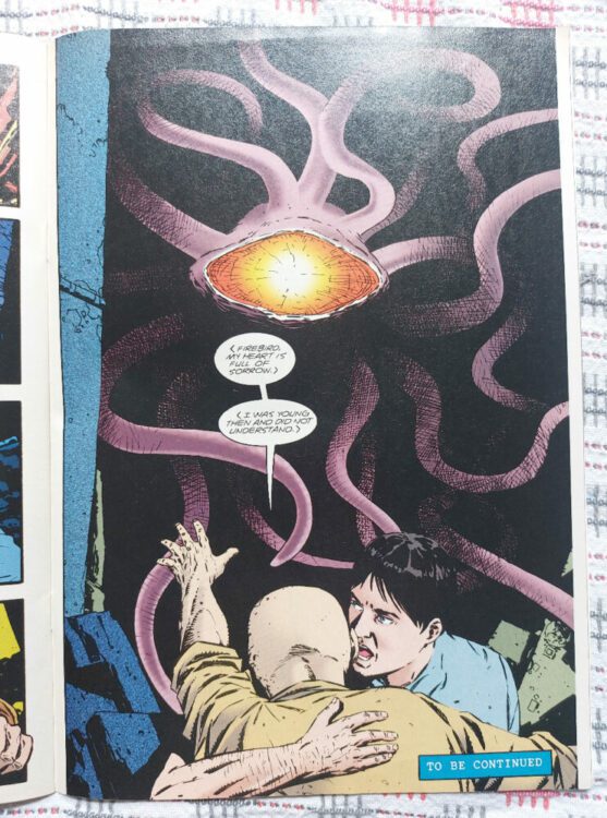
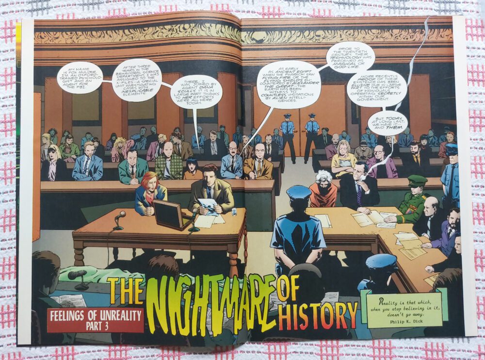
The aliens and visions are more elaborate in the comics than in the show, because the nature of the format allows the fantastical to be bigger and easier to interact with. Special effects, especially CGI, have a problem with the interaction of live-action characters and created environments, creatures, or even other characters. Comics do not have that problem. Hence the Cthulhu-esq creature in the three-part story “Firebird”. All those tentacles and the brightly burning single eye disintegrating everything it looks at would be difficult to do realistically on television but Adlard brings it to life with a believable flair.
Is that a Cthulhu I see before me?
It seems that a lot of the stuff I read brings me back to adaptation; maybe that’s the nature of comics in general because it is such a trans-media format. Almost from the beginning, comic strips have been branching out into other media and adapting stories from every source possible. It’s not really surprising that many of the great comics have links to other media productions. Obviously, with The X-Files, the television show came first, but there wasn’t much of a gap between the airing of season one and the release of issue one. Dave Hughes, writer for The X-Files magazine, doesn’t see the title as a “mere comic book adaptation.” Instead, he highlights that they “are all original stories reflecting the more intelligent and uncharacteristic devices used in the show that inspires them” (from The Uncanny X-Men article in issue 13). But I feel that is the purpose of all adaptation. With this statement, Hughes is dismissing direct adaptations, which is a disservice to some great comics, such as the 1985 adaptation of Dune published by Marvel. It also undermines a project by Topps to publish direct adaptations of the television episode. Starting with an issue zero taster in 1996, Topps published a run of nine issues before fizzling out.
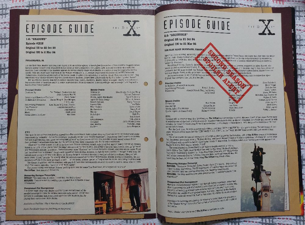
Episode Guides as featured in The X-Files magazine
As Hughes pointed out, however, the writers focused on elements of the show beyond the story and characters. The visual tone and manipulative storytelling of the television series are strong features of the comic. Adlard has a gritty style that perfectly suited the tales Petrucha was telling and, despite some fan grumbles, the inconsistency in the character likenesses do not hamper any of the narratives. In the Hughes article from issue 13, Petrucha is quoted as saying “If people can’t get over the likeness problem, they aren’t really comic readers – they’d rather have a virtual photostory. [..] I’ve seen plenty of great licensed stuff where the likenesses are pretty inaccurate – the Cam Kennedy Star Wars stuff, for instance – but where the artwork is just stunning.” Hear, hear, I say.
There is an obsession with accuracy and fidelity in comic book adaptations, and character likenesses is a part of that. It’s interesting to see that this is not a new conversation, and that it was being discussed 30 years ago in relation to this comic series. But, as Petrucha alludes to, the ability to perfectly render an actor’s face does not make for great comic book storytelling. Adlard’s artwork, however, does make for perfect storytelling. He manages to breathe life into the heavy worded scripts, packed with exposition and journal/report style narration, and brings a dynamism to the page that isn’t easy to do with this type of script.
Interior art by Charlie Adlard from Issue 12 of The X-Files
This week I’ve read issues #1 to 12, and I still have a further eight to read from my collection (the series ran for over 40 issues originally). However, these first 12 make a wonderful collection, because the final story, “Feelings of Unreality”, is a three-parter that brings the previous nine issues to a conclusion, sort of. The 12 issues work like a television series with a beginning, middle, and end, featuring standalone stories, but also elements of the wider picture. They showcase the talents of the writer and the artists, and add a worthwhile entry into the X-Files saga.
I guess the question is, are The X-Files comics worth reading today? If you are a fan of the series, or a fan of the alien/government conspiracy genre, then they are definitely worth getting your hands on. There is a specific mood throughout the stories that might not appeal to some, but Scully and Mulder are as engaging on the page as they are on the screen. It’s just harder to hide the unknown when it’s so big and bombastic, but I guess Scully suffered some kind of amnesia around this point in time…
…the truth is out there!
Collection of covers by Miran Kim
That’s comics #223 to 229 covered, with a bunch to spare. I seem to have forgotten the format I was following for these posts but I’ll try harder next week.
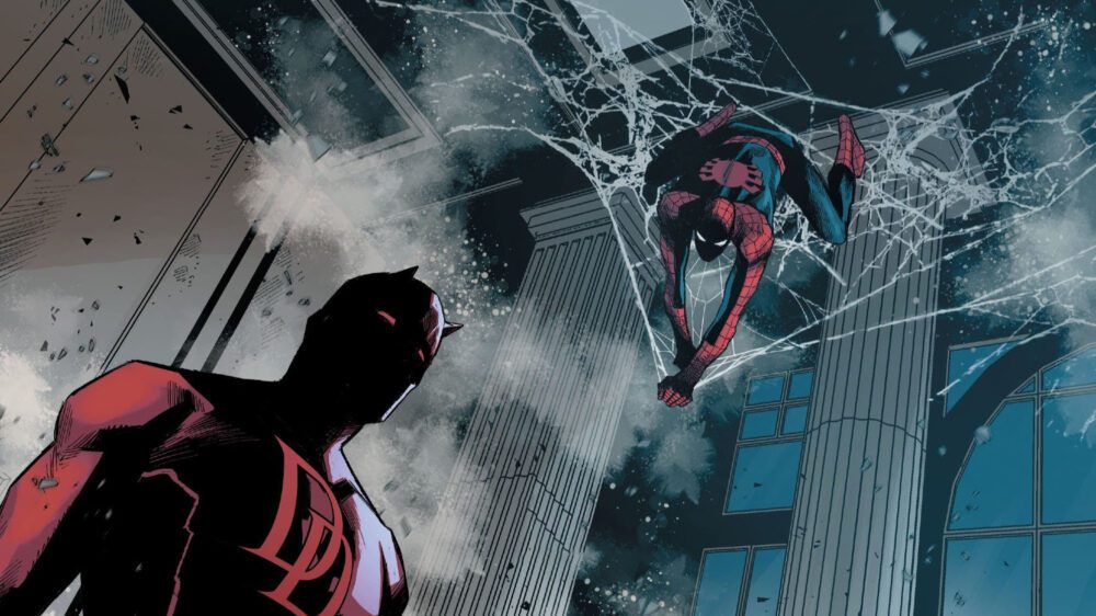
Daredevil has been Marvel’s best series for the last four years, ever since writer Chip Zdarsky and artist Marco Checchetto took the helm.
Zdarsky and Checchetto — along with colorist Matthew Wilson, letterer Clayton Cowles, and a handful of guest artists — crafted an epic tale that mostly remained self-contained, which is a rarity in modern, long-running superhero comics. The only exceptions were a two-issue tie-in with King in Black, and Devil’s Reign, an event which essentially served as a bridge between the two volumes of this team’s run. This largely standalone nature did a lot to cement Daredevil as Marvel’s strongest title; it allowed readers to focus in on the story without having to worry about what was happening in a dozen other series. However, that strength would carry little weight if the story being told wasn’t as compelling as it is, and that starts and ends with a fundamental understanding of these characters.
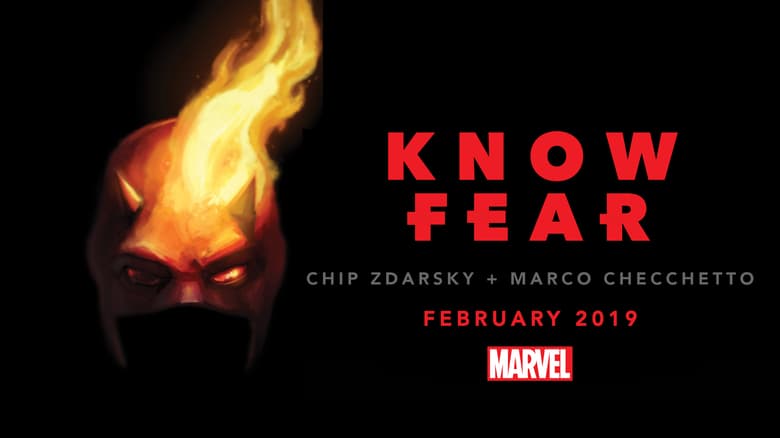
Marvel’s original teaser image from the series announcement.
Matt Murdock is a walking contradiction. He’s a lawyer who moonlights as a vigilante, a peacekeeper who relies on violence, and a Catholic who dresses as the Devil. Zdarsky leans heavily into these contradictions throughout his nearly 60-issue run, ultimately creating a complex character study about a man trying to untangle himself. He masterfully weaves in threads from previous Daredevil runs, adding to those stories while stitching in new threads of his own.
During their run, Zdarsky and Checchetto introduce the Stromwyn siblings, a couple of rich assholes who use their wealth to manipulate politics, economics — and whatever else they want — to their own benefit. The Stromwyns are a persistent presence throughout Daredevil, becoming a thorn in the sides of both the Man Without Fear and his archnemesis, Wilson Fisk. They also add a disturbingly realistic layer to this superhero story; Matt and his supporting cast become champions of social justice, literally fighting against the establishment and the socioeconomic turmoil it causes in a way that we desperately need in the real world.
But good comics are a balancing act, and there’s plenty of traditional superhero fun to be had here as well. This Daredevil run may be an intricate character study and an allegory for real-life strife, but you get plenty of fights with ninjas and other superpowered beings in equal measure. Spider-Man makes a few separate appearances, and every time he does, it’s a standout moment. Zdarsky and Checchetto are able to do ballet on the tightrope and tell a story as action-packed and thrilling as it is thought-provoking.
Before wrapping up this rant, I have to gush a bit more about Marco Checchetto. I’ll cop to having only a vague familiarity with his previous work, but in the last four years, Checchetto has not only become one of my favorite Daredevil artists, but also one of my favorite Spider-Man artists, and one of my favorite artists period. His action sequences are engaging, and the way he draws characters carries the series’ weight and emotion. His Kingpin is menacing and his Elektra is drop-dead gorgeous. Actually, everything about Checchetto’s Elektra is instantly iconic, from the way he draws her hair to his design for her own Daredevil costume. I look forward to whatever he draws next, and here’s hoping it’s a Spider-Man book.
This has already gone on a bit longer than intended. I never planned to go into every detail and story arc from this Daredevil run — hell, I only barely touched on Elektra and the massive role she played in the overall story. I simply wanted to sing the praises of this comic now that it’s over and say a “thank you” to Zdarsky, Checchetto, and their collaborators. Hopefully I accomplished that, and maybe inspired someone to pick up the series if they haven’t yet.
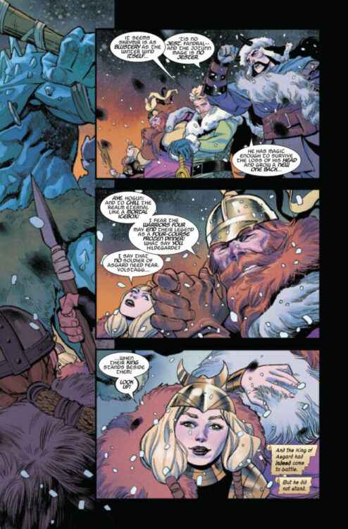
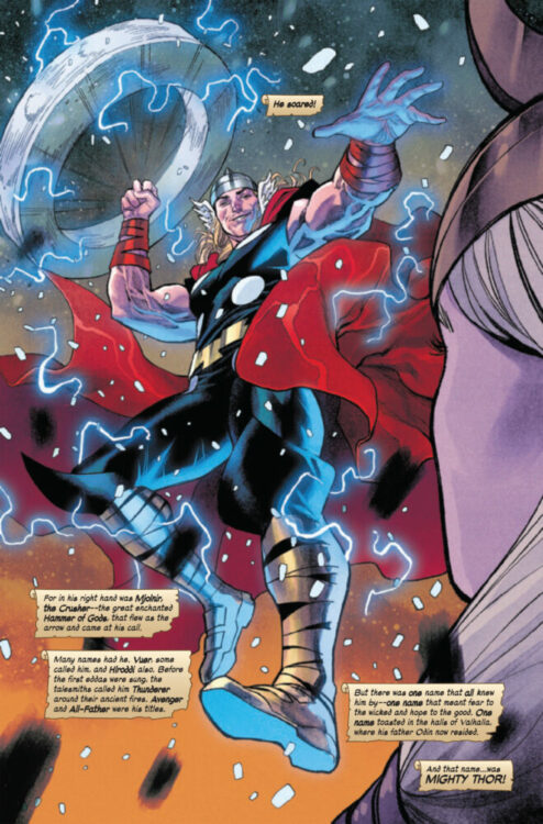
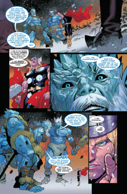
THE IMMORTAL THOR #1 hits your local comic book store on August 23rd, but thanks to Marvel Comics, Monkeys Fighting Robots has an exclusive six-page preview for you!
About the issue: AL EWING, MARTÍN CÓCCOLO & ALEX ROSS GIVE THE GOD OF THUNDER THE “IMMORTAL” TREATMENT!
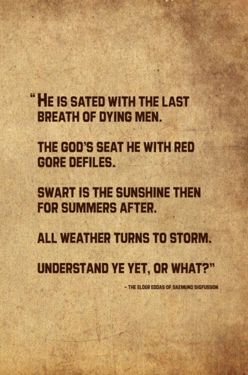
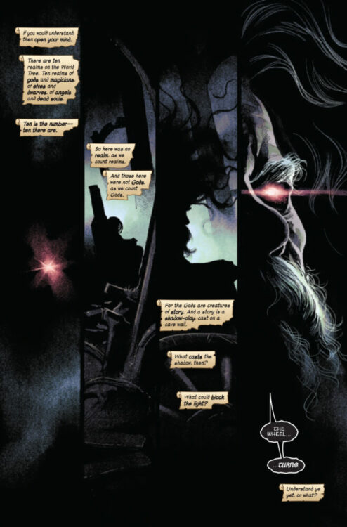
In Norse myths, they called him Thunderer. Vuer has he been called, and Hloriddi. The Gods know him as Asgard’s King, keeper of Mjolnir, hero of the tales. When injustice grips the Earth and ancient powers bring down the sky, he fights for those who cannot – and when the tale is done, we will know what that cost him. This is the story of THE IMMORTAL THOR.
PLUS: A bonus page written by Jonathan Hickman – WHO ARE THE G.O.D.S.?
The issue is by writer Al Ewing and artist Martín Cóccolo, with colors by Matthew Wilson, and letters by Joe Sabino. The main cover is by Alex Ross, who also did the covers for Ewing’s Immortal Hulk series.
Ewing is giving the God of Thunder the “Immortal” treatment following a 50-issue run on Immortal Hulk that wrapped up in 2021.
“Putting [Immortal] on a book I’m writing is a promise to the reader, and to myself,” Ewing told Polygon when the book was announced. “I was the one who pitched the title — not editorial, not anyone else — and it was basically a self-challenge. Can I do a book like that again? Can I do my end of it better this time? I have to try, because the alternative is just lie down and let the grass grow where I fell.
I want to take another swing at that ball, and this time, I don’t just want to knock it into the outfield, I want to hit it right out of the park and stroll calmly around the bases. I want to write something that goes as far and as hard and as powerful as the other book did, to give a similar experience to the people who supported that book and supported me through it and took something deep out of it, but with the benefit of experience.”
In the same article, Ewing states that “if IMMORTAL HULK was the Old Testament, IMMORTAL THOR is the New Testament.”
Check out our IMMORTAL THOR #1 preview below:
Are you picking up THE IMMORTAL THOR when it launches next week? Sound off in the comments!
From writer Kelly Thompson (Captain Marvel; Black Cloak) and artist Mattia De Iulis, comes the beginning of a dimensional-breaking monster story in The Cull #1. Featuring letters by Hassan Otsmane-Elhaou, this opening chapter introduces our main cast and their relationships while teasing something much bigger – literally – to come.
“Something is Killing the Children horror vibes mix with The Goonies-style adventure as five friends set off to shoot a short film on a forbidden rock near their home the summer before they all go their separate ways. But that’s not really why they’re there. One of them has lied. And that lie will change their lives forever.”
Writing & Plot
Kelly Thompson focuses on building her cast of characters and teasing this story’s genre elements with The Cull #1. This group of five friends living close to a rocky beach comes together to make a short film before their new adult lives take them all to different places. In the process, they come upon some sort of alternate dimension – where the core plot and potentially monstrous side-effects come into play. It is admittedly a little tricky to review a chapter that focuses almost entirely on character establishment. Thompson is clearly set on introducing readers to her cast, showing us their interpersonal relationships, and the lives they lead at home. Each person is loaded with their own baggage, from familial abuse to grieving a loss. This works to the comic’s benefit, as each character feels fleshed out by the end of the issue. Naturalistic conversations or one-off windows into each person’s life are paced out in a way that lets each scene stick with the reader. In a moment of brilliance, we don’t get the main protagonists’ motivations until the final page, when the genre breach has been discovered and it’s too late to turn back. The slight hints planted at the beginning of the comic regarding this story’s monsters will have to be enough to keep readers wanting to see some sci-fi horror action interested if the character work isn’t enough. Altogether, Thompson pens a stellar character-focused script that sets readers up for the monster mayhem to come.
Art Direction
Artist Mattia De Iulis is on hand to bring the visual experience of The Cull #1 to life, and he does so in stellar fashion. His eye for detail in both character design and environments is fantastic, and his sequential direction is sharp and well-paced. Each cast member has a unique sense of style and set of features that match their personality. Facial expressions are drawn with an incredible sense of animation, making these characters feel more and more human with each scene. While we don’t get much of the horror/sci-fi aspect in this opening chapter, what we do get is gorgeous and uniquely imposing. Iulis’s fine pencils create a high-production, photorealistic art style seen more often in mainstream comics (see his work at Marvel for more examples). That being said, he still clearly has a defined style outside of just that hi-fidelity approach. This staggering amount of fidelity is matched by his atmospheric color work. Almost every panel is created in a low-light scenario, since this issue takes place in the early hours of the morning. Most of the color is provided by lighting from phone screens, candles, or even a sort of loose RGB-inspired tone. The use of soft, warm tones easily brings readers into the nervous quietness this opening issue uses. When we aren’t indoors, the ocean mist and early morning fog continue to create a sense of setting. As for Iluis’s sequential direction, he utilizes the visual aspect of comic storytelling with meticulous structure. Most pages are made up of four landscape-style panels all stacked on top of each other. As this comic is a window into these characters’ lives, these largely silent panels do all the work of getting readers familiar with the cast using minimal dialogue. There is a sort of cinematic quality that these wide panels create, which makes sense given that the comic is partially about these characters making a short film. Overall, the visual work here is outstanding.
Verdict
The Cull #1 is a deeply intriguing first issue. Kelly Thompson focuses on building the backstories and personal struggles of this group of young adults ahead of the big sci-fi genre twist we know is coming in future issues. Mattia De Iulis’s visual work is a brilliant blend of stylized photo-realism and pseudo-cinematic sequential direction that perfectly creates the tone and pacing for this opening chapter. Be sure to grab this debut issue when it hits shelves on August 17th!
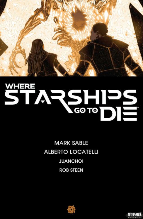
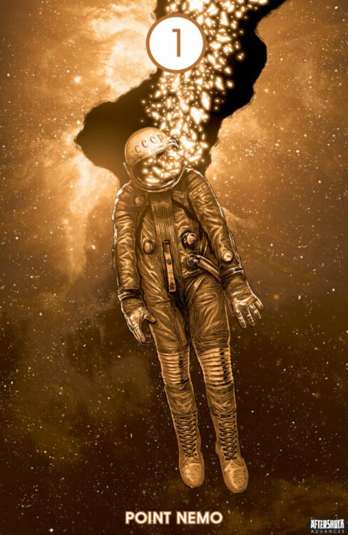
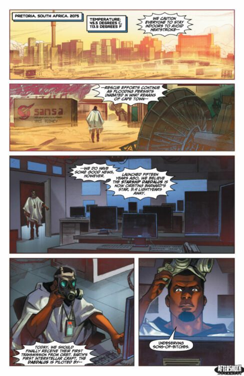
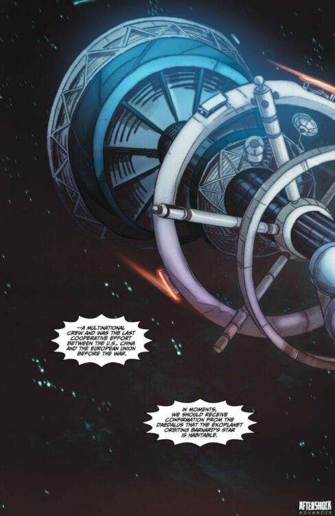
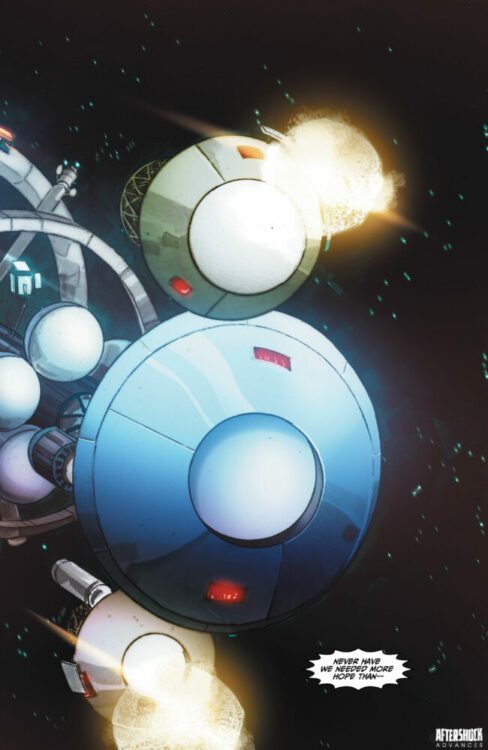
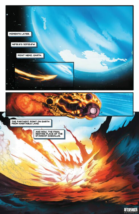
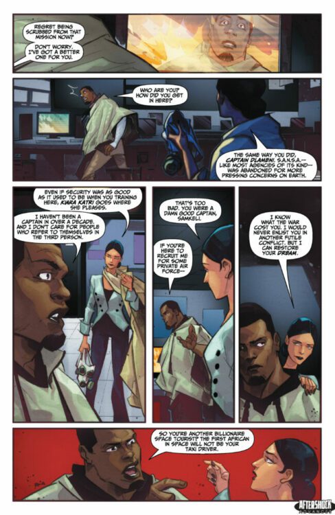
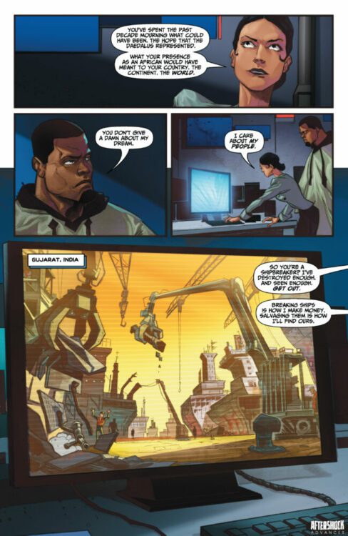
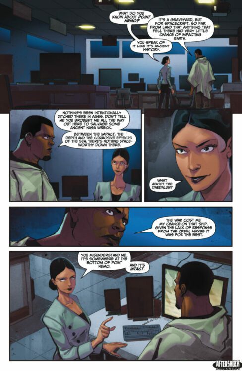
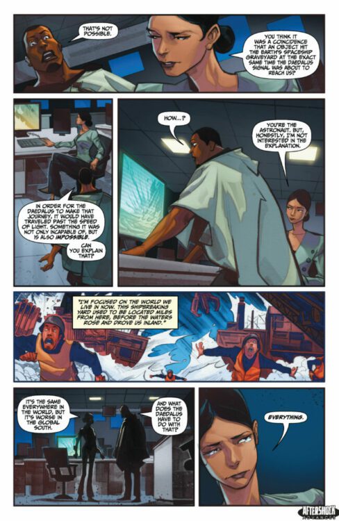
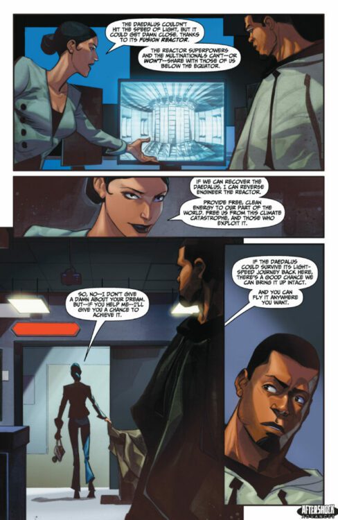
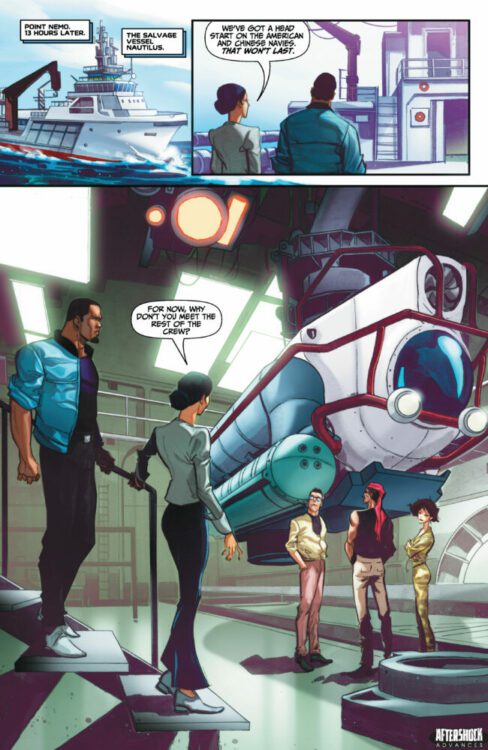
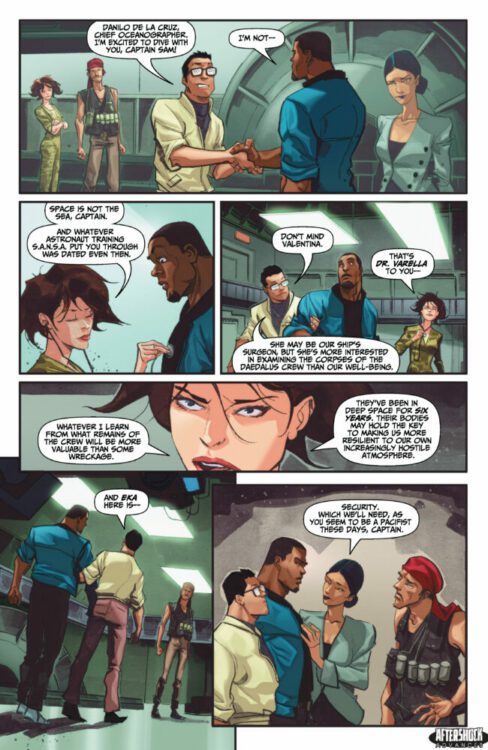
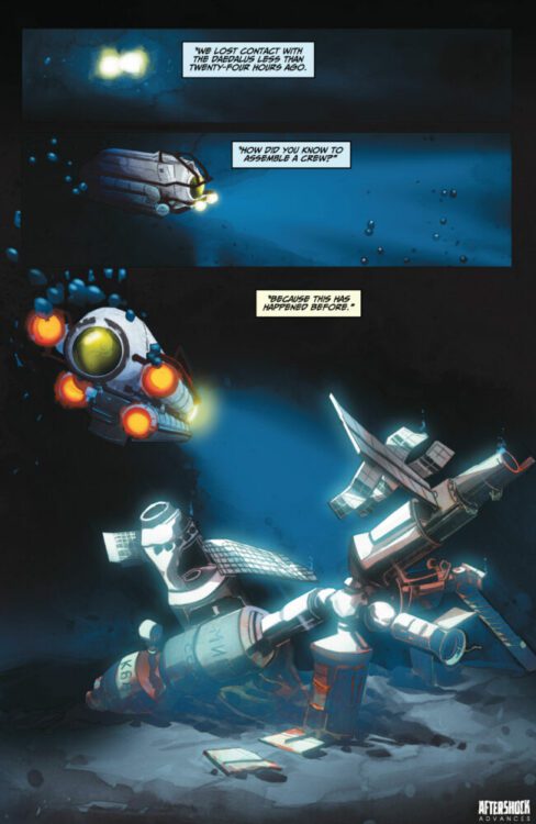
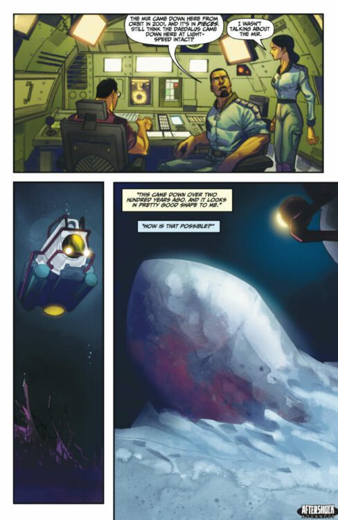
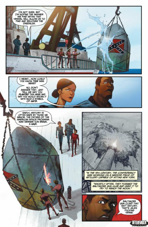
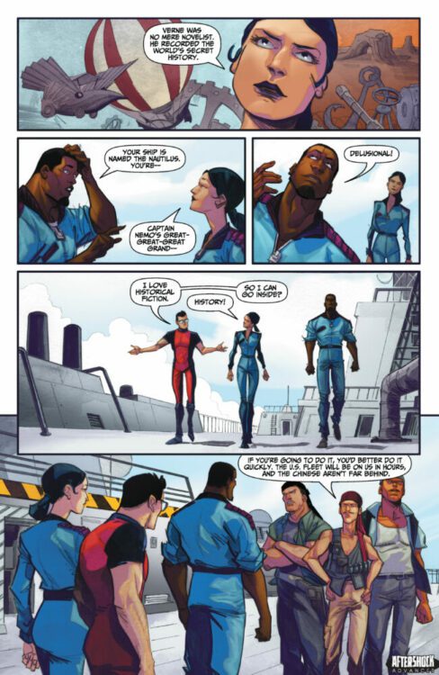
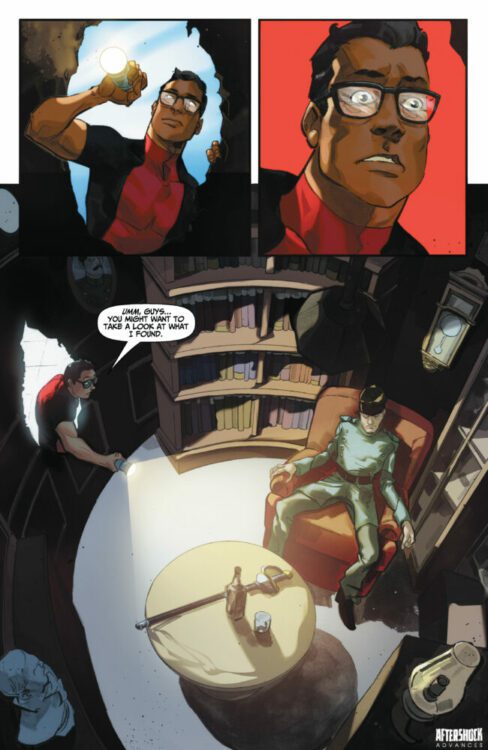
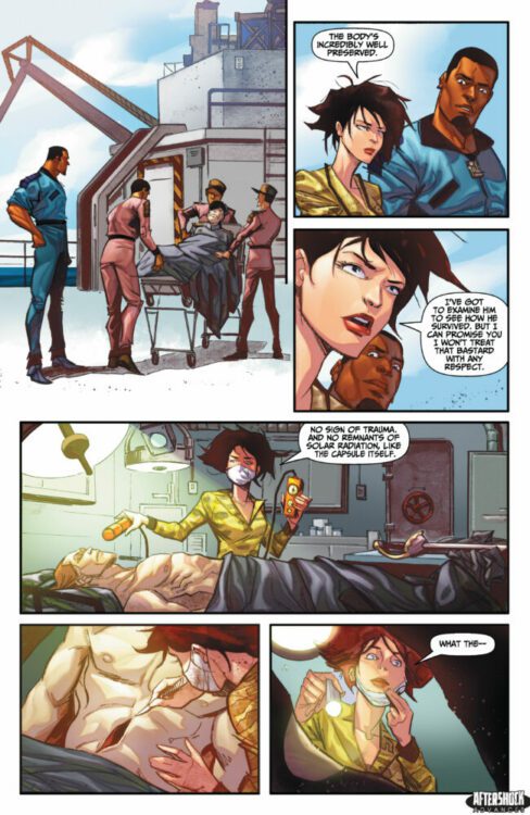
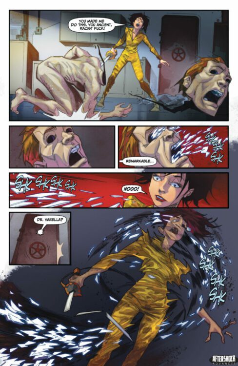
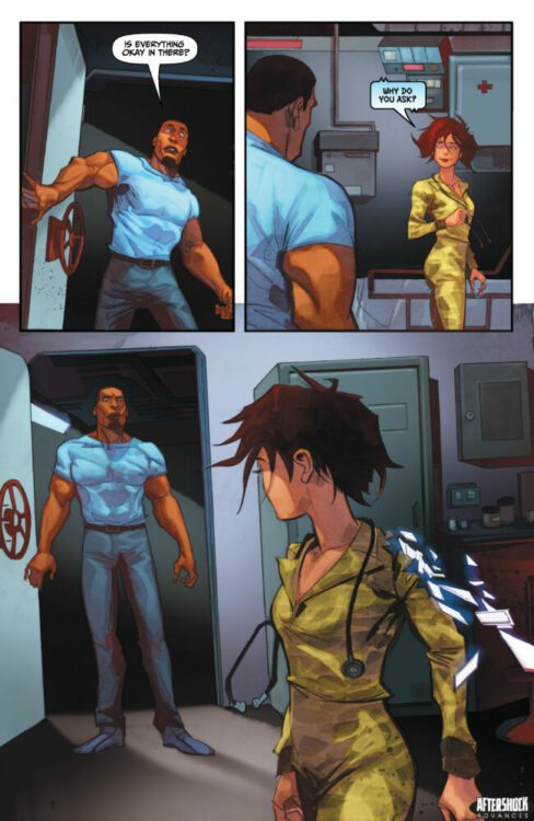
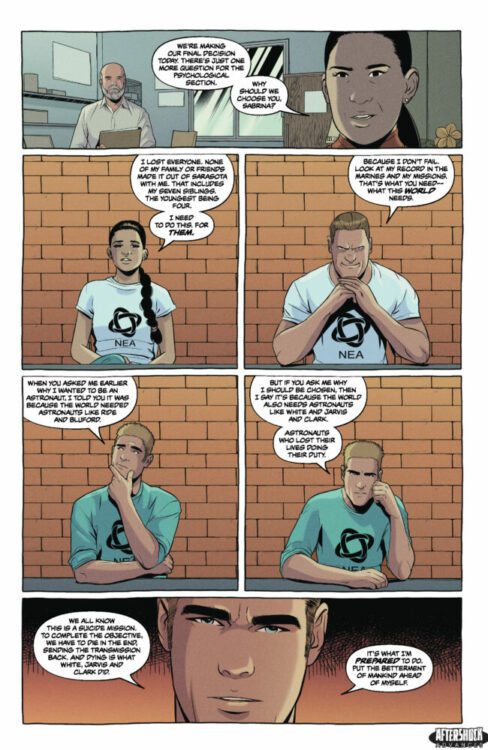
WHERE STARSHIPS GO TO DIE hits your local comic book store August 30th, but thanks to AfterShock Comics, Monkeys Fighting Robots has an exclusive twenty-page preview for you.
About the trade paperback: Point Nemo – the farthest oceanic point on earth from any landmass. A spacecraft graveyard where rockets and satellites can be safely ditched on the ocean floor. In a near future ravaged by climate change, an African astronaut teams with an Indian shipping magnate to mount a dangerous salvage mission to recover the wreck of humanity’s first interstellar starship. But what they find is beyond their worst nightmares.
Mark Sable (MISKATONIC, WAR ON TERROR: GODKILLERS) and Alberto Locatelli (The Believers, Cinque) bring you a sci-fi horror tale that will make you rethink the space race.
This 128-page volume contains the entire series, issues #1-5.
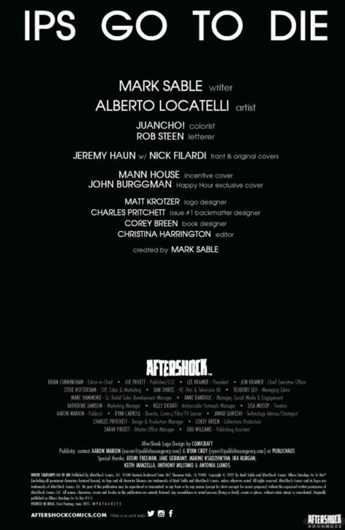
The series is by writer Mark Sable and artist Alberto Locatelli, with colors by Juancho!, and letters by Rob Steen. The cover is by Jeremy Haun and Nick Filardi.
Check out our WHERE STARSHIPS GO TO DIE preview below:
Are you picking up AfterShock Comics’ WHERE STARSHIPS GO TO DIE when it comes out in trade paperback? Sound off in the comments!
The premise is simple: read one comic every day for the entire year. It seems like a simple task but there is no way that I read 365 comics last year, even if you count the individual issues in collections. So, this year, I am committing myself to this reading challenge, in the hope that I can broaden my reading habits and fully engage with my favorite hobby again.
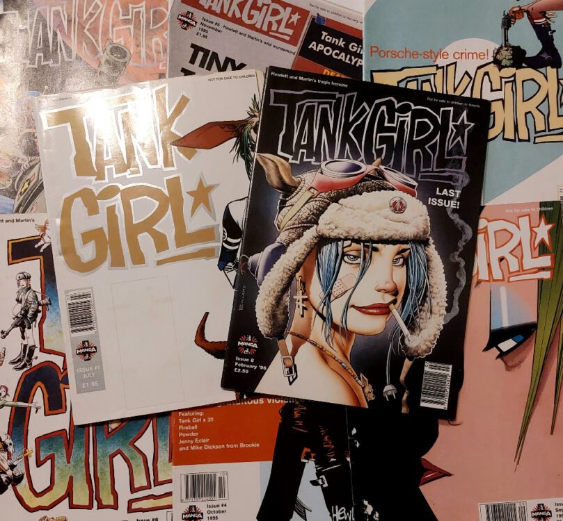
After the last couple of intensive weeks of reading, writing, and research, I wanted a nice, easy read for this week. A sort of palette cleanser, as it were. Also, something that would help me catch up on the writing side of this project, because I’ve started to slip behind. So, I picked up Manga Publishing Ltd’s eight-issue 1995 UK magazine Tank Girl.
Eight issues of comic and music mayhem with the ultra-violent, post-feminist icon at the lead: easy reading, right?
Tank Girl Magazine published by Manga Publishing Ltd
Tank Girl has a long history dating back to 1988, and first appeared in the UK comics magazine Deadline. From the very beginning, the creation by Alan Martin and Jamie Hewlett had strong ties with UK music journalism and popular culture as a whole. The comic strip lambasted British television celebrities, politicians, and anyone who might be recognizable to savvy readers. The content of those early strips was violent, sexual, crude, and — most of all — anarchic. Tank Girl was punk rock in comic form. There is no coincidence that the image of Tank Girl riding around in her favorite armored vehicle appeared less than two years after the British Prime minister Margaret Thatcher was photographed in a tank. The tone of the comic strip was a clear reaction to the conservative politics of the time. Unlike the PM, Tank Girl appealed to the disenchanted youth of the country, anarchists, and creative freethinkers.
From day one, Tank Girl and her creators had something to say about politics, religion, pop culture, and graphic storytelling.
Unfortunately, the Tank Girl movie seemed to end the growing popularity of the character, and the comic fell by the wayside until 2007 (also Hewlett wandered off to create Gorillaz with Damon Albarn).
The Manga Publishing Tank Girl title started in 1995 and ran until January 1996. Not a long run, but it did produce a wonderful mix of indie music journalism, lad mag style articles, and absurdist comics. The Tank Girl main strip were reprints of the DC Vertigo title Tank Girl: The Odyssey and Tank Girl: Apocalypse, and were joined by the regular back-up strip Fireball by Ian Carney, Roger Langridge, and Steve Whitaker (based on an earlier Hewlett strip for Deadline magazine). Additional comic extras were in the form of Milk and Cheese (dairy products gone bad), extra Tank Girl by a collection of writers and artist, and a one-page musical gag by Jonathan ‘insert funny name here’ Edwards. These one pagers still make me laugh and groan in equal measure.
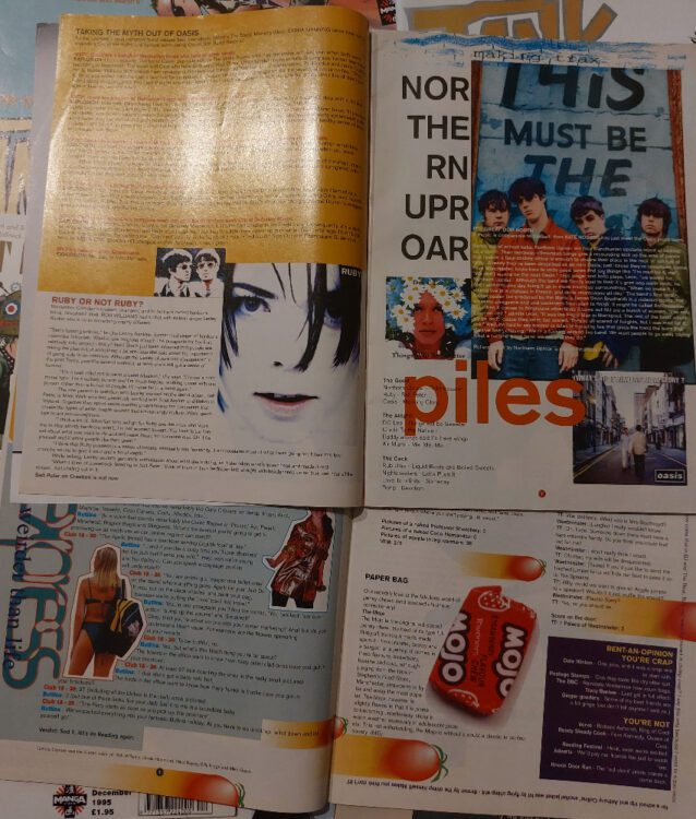
Journalism in the Tank Girl magazine
The magazine was of its time, at least as far as the text elements go. Underhand insults barely disguised as jokes featured in the Tomato Express opening pages, and any excuse to mention sex and drugs seemed to be the impetus behind most of the other sections. Although, the band interviews and small album/single reviews do seem to explain a lot about my burgeoning taste in the mid 1990s. Many of the band names have probably been forgotten by most people in the UK, and I doubt they made it across the big pond, however, I still listen to the likes of Ruby, Inspiral Carpets, and Red Snapper.
I’m not sure the jokes about Jimmy Savile and the questionnaire to see if you would make a good Michael Jackson would play as well in today’s market. But pushing the boundaries was the name of the game, and this magazine definitely did this back in 1995.
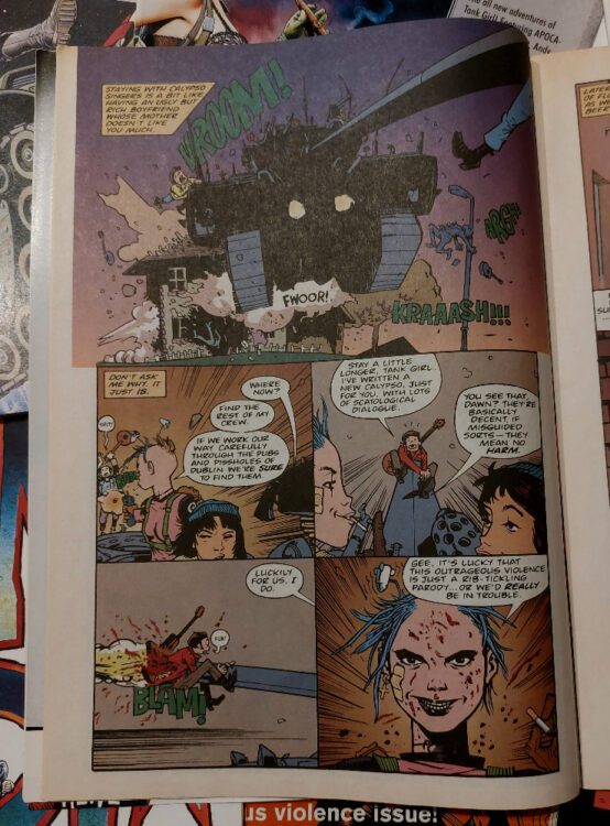
The central element of the magazine was, obviously, the Tank Girl comic strips, especially The Odyssey and Apocalypse. The Odyssey was written by Peter Milligan and illustrated by Jamie Hewlett. The comic was a superb melding of classical literature, the modern novel, and post-feminist grandstanding. It is “structured by manipulating a continuous parallel between contemporaneity and antiquity,” explains Thomas A Vogler in his essay James Joyce Meets Tank Girl for the European Joyce Studies (Vol 15) in 2003. He goes on to comment on the script, noting that it contains “levels of diction that exhibit a Joycean range, from the esoteric, archaic, and polysyllabic […] to the scatological and obscene.” This is because Milligan has a firm grasp on the influences for the story — James Joyce’s Ulysses and Homer’s Odyssey — as well as the original comic strips written by Alan Martin. He is not afraid to mix the highbrow and the lowbrow, demanding the reader is proficient in both worlds to understand the references.
Tank Girl: The Odyssey interior artwork
Vogler says that the story is a push back against media exploitation, something that he infers is damaging the comics purity after the release of the 1995 film adaptation. However, I think that he has under-sold the movie and is quick to dismiss it. The Tank Girl movie was not a financial success and does contain some questionable elements, however, it reached the audience it was aimed at and has become something of a cult classic. Rachel Talalay directed a sincere movie that pulled out the heart of the Tank Girl comic strips, while playing down some of the more excessive elements. And Lori Petty was perfectly cast as the lead.
The Odyssey creates a narrative world for Tank Girl to exist in, while maintaining the absurdist elements of the original 1980s strips. The blatant post-feminist views expressed in earlier strips is also a major part of Milligan’s narrative with the central character flaunting her freedoms and not allowing gendered stereotypes dictate her actions. She embraces both masculine and feminine traits, ideologies, and actions.
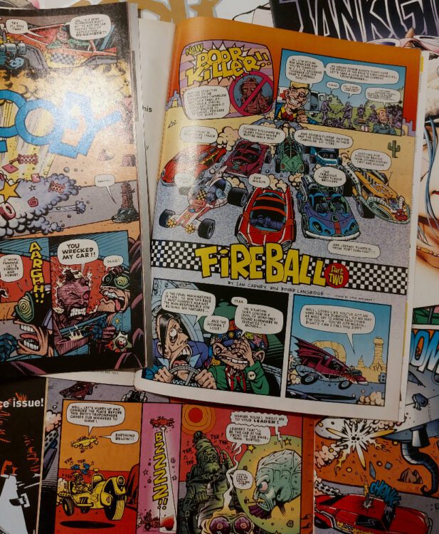
Fireball back-up strip
The clever witticisms and pop culture satire that makes the often vulgar Tank Girl strip so appealing, even today, isn’t reflected as well in the back-up strip Fireball. Carney and Langridge’s Cannonball-esq death race of a comic is, on occasions, a car crash of a comedy. Jokes that may have appealed nearly 30 years ago are awkward in a re-read, and some were even uncomfortable at the time. The artwork captures the adult Wacky Races feel that the narrative is aiming for, but a number of the gags don’t land, and the final part rolls to an unsatisfactory end despite the explosive finale. There are sections of the comic worth reading, and it’s not the groaning mess of some of the text sections in the magazine, but it hasn’t stood the test of time like the Tank Girl stories.
Special note, at this point, should go to Jonathan ‘It’s about time I got another mention’ Edwards. His one-page music gag strips and, in the final two issues, the flawed secret service agent comic Simon Creem are excellent little comics that bring joy to the world. Edwards is able to turn a groaning dad joke into a clever play on words mixed with musical references and wonderfully angular artwork, His caricatures are instantly recognizable while still being uniquely his own style. The magazine would have benefited from the inclusion of more of his work.
Interior artwork by Jonathan Edwards
All in all, I have enjoyed this trip down memory lane, discovering where some of my musical influences came from, and getting my fingers grubby on a Tank Girl comic strip. I think that covers off comics 217 to 223, with one left over as a spare.
I got to sit down with writer Jack Mulqueen to talk about his latest Kickstarter project, NIGHTLIFE NOIR. NIGHTLIFE NOIR is a dark satire unraveling the twisted and ironic fates of the global nightclubbing elite.
Check out more about this brilliant project here, and what Jack is up to with Prodigious Digits here!
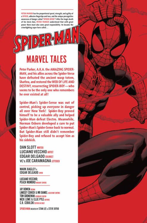
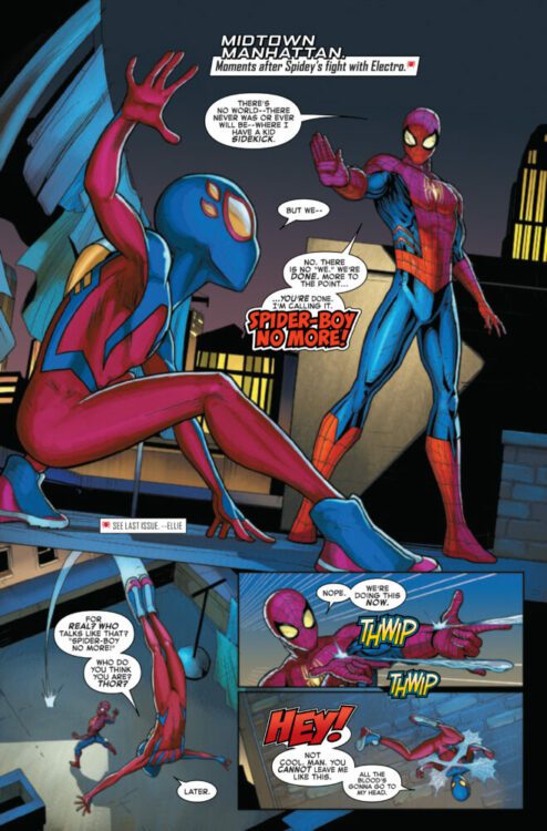
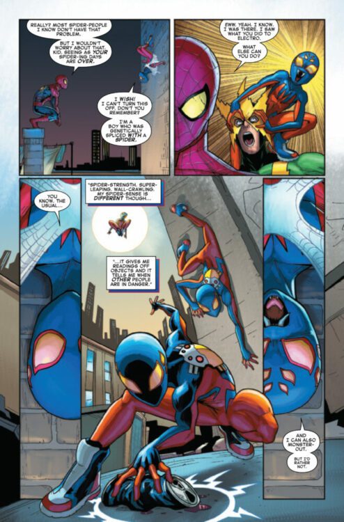
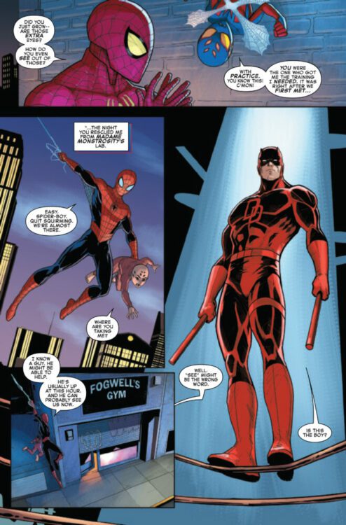
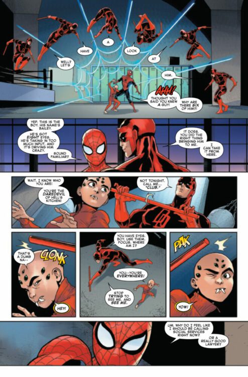
SPIDER-MAN #11 hits your local comic book store on August 16th, but thanks to Marvel Comics, Monkeys Fighting Robots has an exclusive four-page preview for you!
About the issue: (RE)INTRODUCING – SPIDER-BOY!
The battle to save the Spider-Verse may be over- but spinning out of the restored Web of Life and Destiny returns the spectacular SPIDER-BOY- Peter Parker’s stupendous sidekick! Wait- that can’t be right – who IS this Spider-Boy- and what is his connection to the Amazing Spider-Man?!
The issue is by writer Dan Slott and artist Luciano Vecchio, with colors by Edgar Delgado, and letters by Joe Caramagna. The main cover is by Mark Bagley and Edgar Delgado.
Check out our SPIDER-MAN #11 preview below:
Are you reading Marvel’s adjective-less SPIDER-MAN? Sound off in the comments!
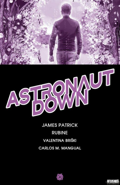
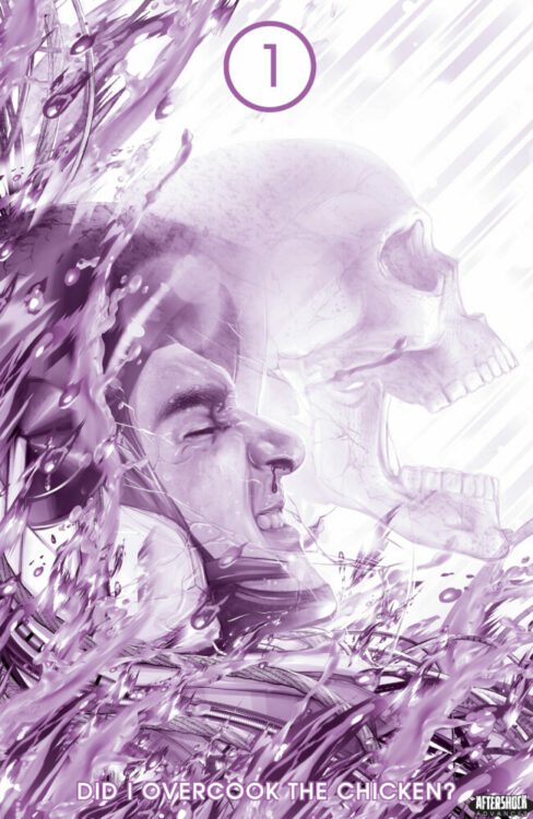
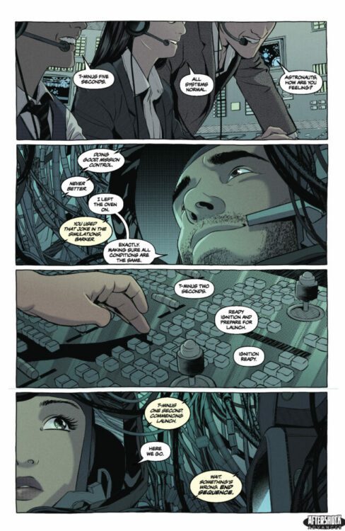
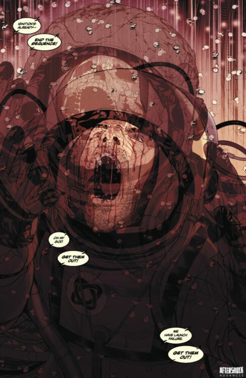
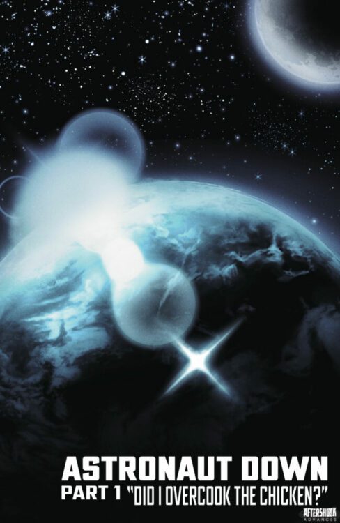
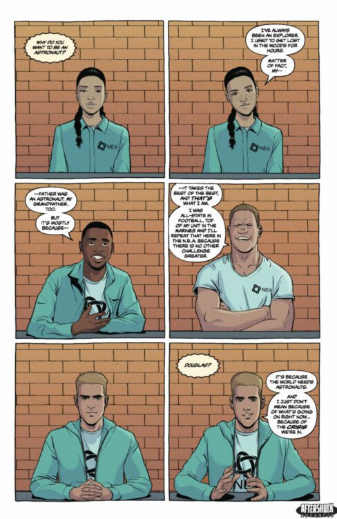
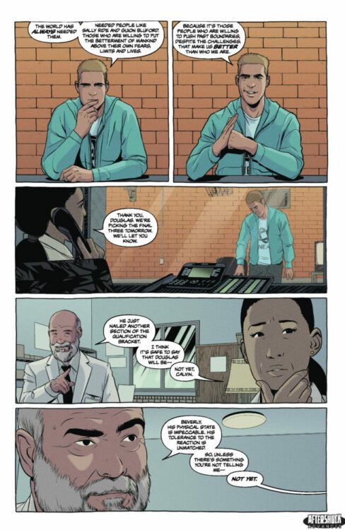
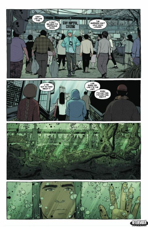
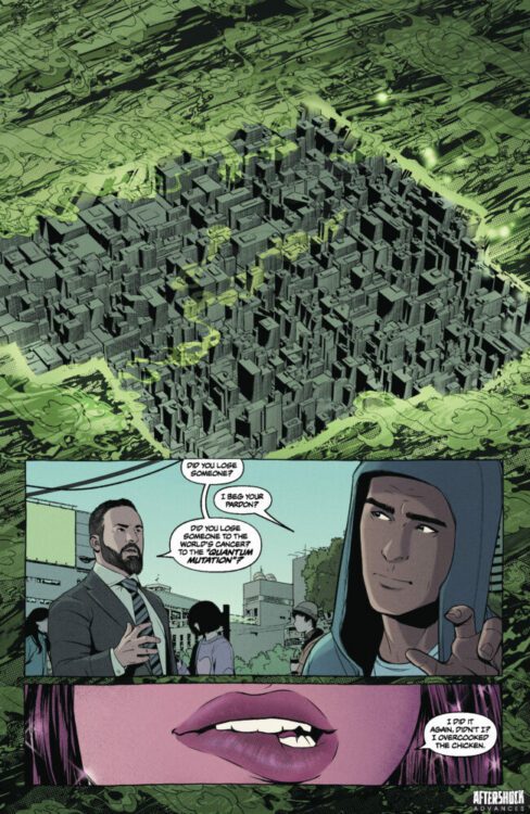
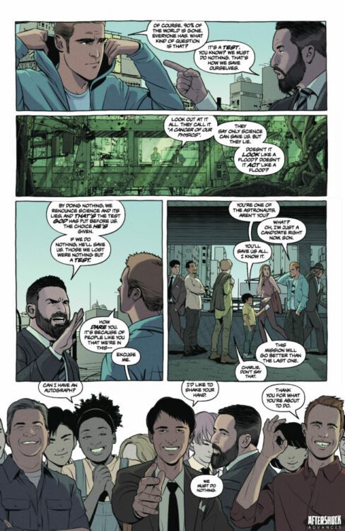
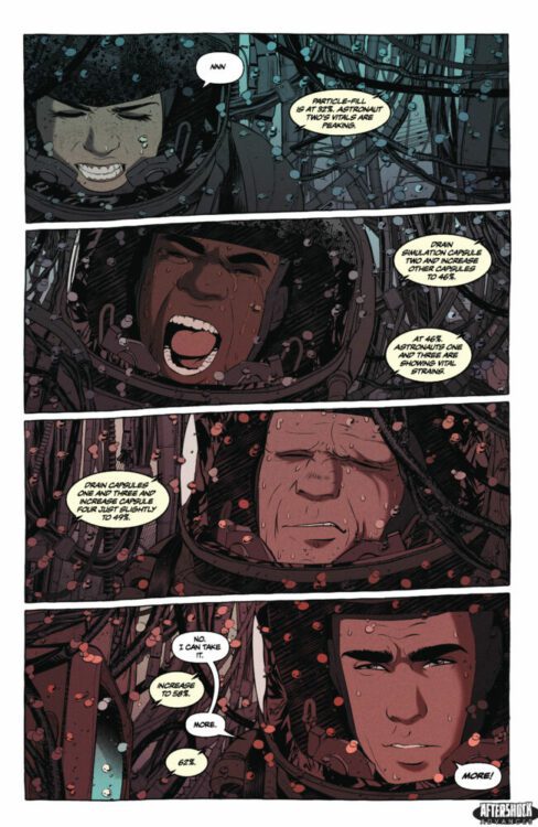
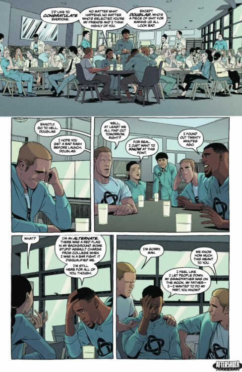
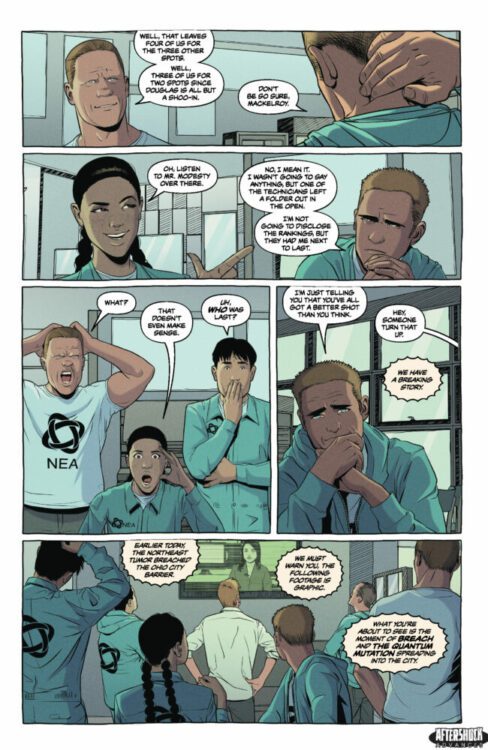
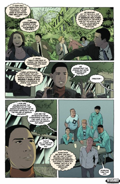
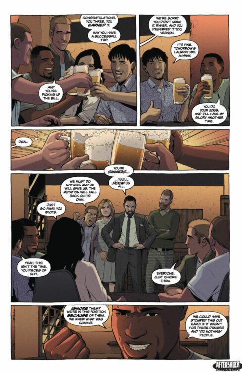
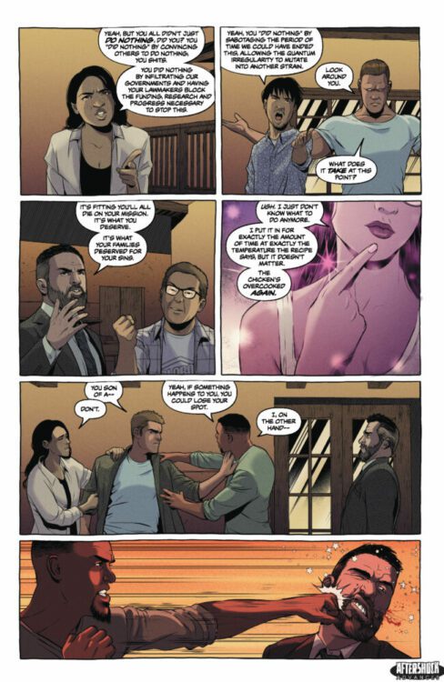
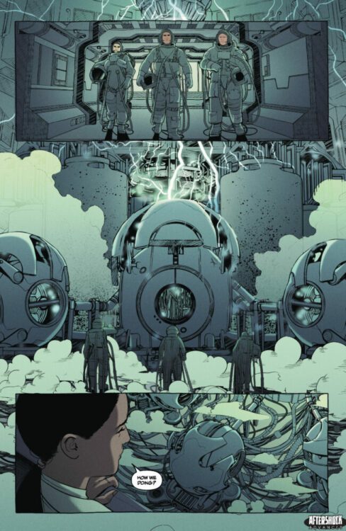
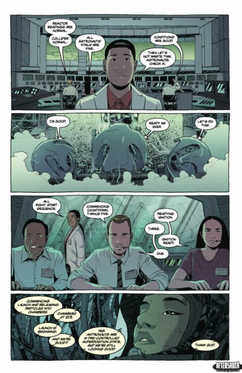
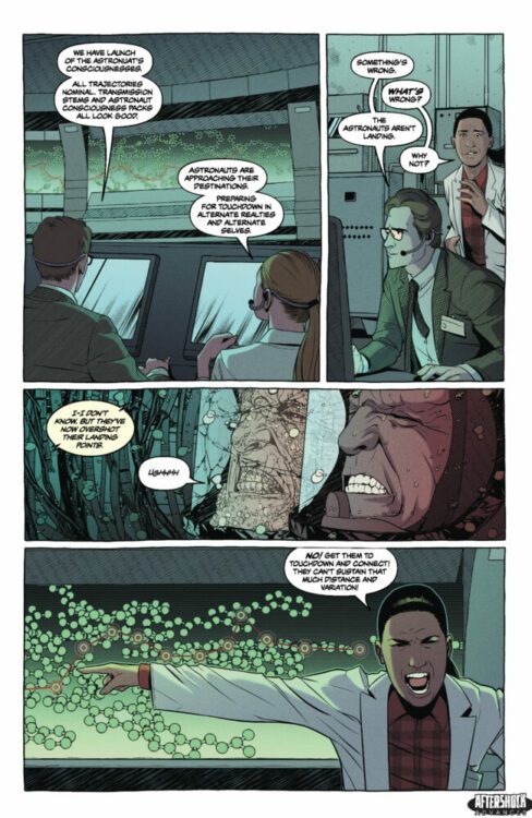
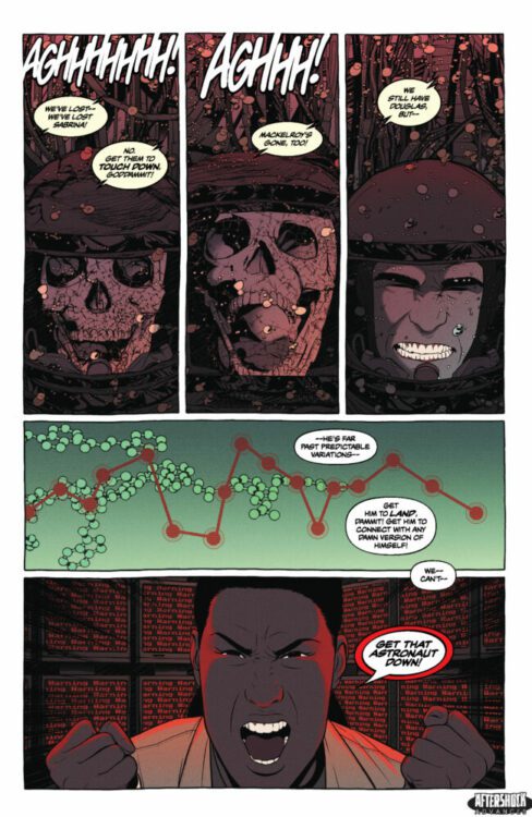
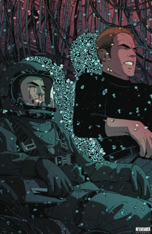
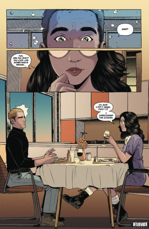
ASTRONAUT DOWN hits your local comic book store August 28th, but thanks to AfterShock Comics, Monkeys Fighting Robots has an exclusive twenty one-page preview for you.
About the trade paperback: Douglas Spitzer wants to be one of the “astronauts” selected for the crucial Mission Politzer. And just like astronauts like Buzz Aldrin and Sally Ride, Douglas is brave, adaptable, and self-sacrificing. He’s one of the program’s best candidates.
But if he qualifies, Douglas won’t be traveling through space; he’ll be launched into alternate realities on a desperate mission to save Earth from a horrific crisis that has our world on the brink of extinction. Unfortunately, it’s a mission where everything will go wrong, where Douglas’s training and very humanity will be put to the test, and where a deep-seeded secret could sabotage everything.
Writer James Patrick (KAIJU SCORE, CAMPISI: THE DRAGON INCIDENT) and artist Rubine (SEARCH FOR HU) lead us on a perilous undertaking to save the planet from total destruction!
This 128-page volume contains the entire series, issues #1-5.
The series is by writer James Patrick and artist Rubine, with colors by Valentina Briški, and letters by Carlos M. Mangual. The cover is by Rubine.
Check out our ASTRONAUT DOWN preview below:
Are you picking up the trade paperback of ASTRONAUT DOWN from AfterShock Comics? Did you read the single issues? Sound off in the comments!