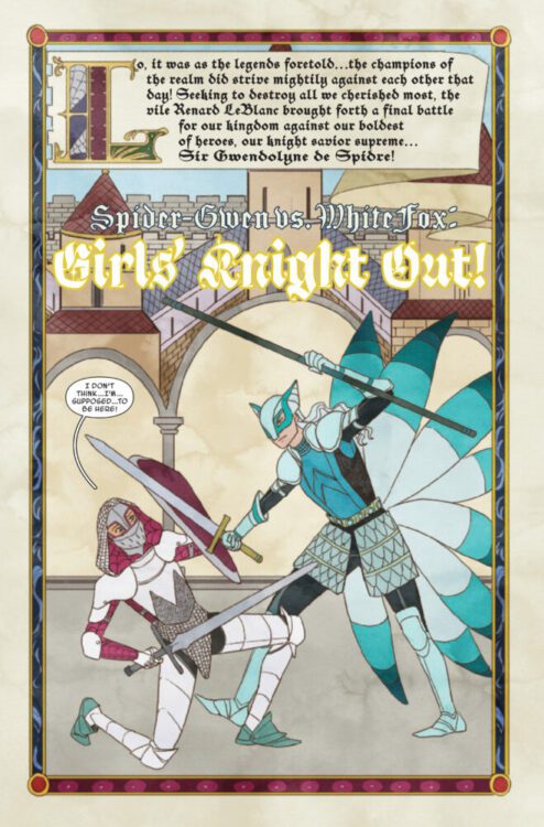
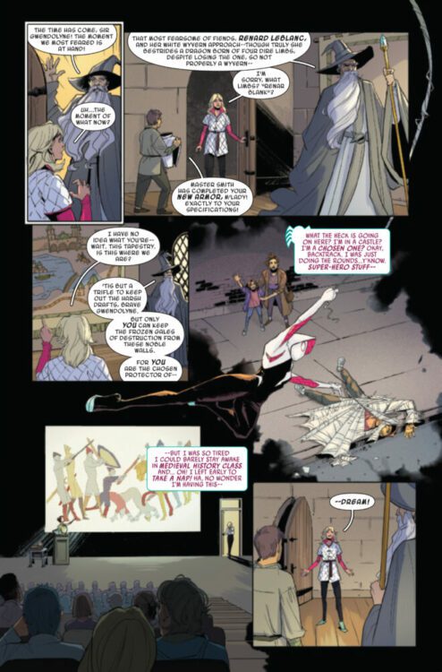
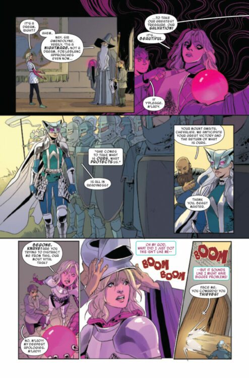
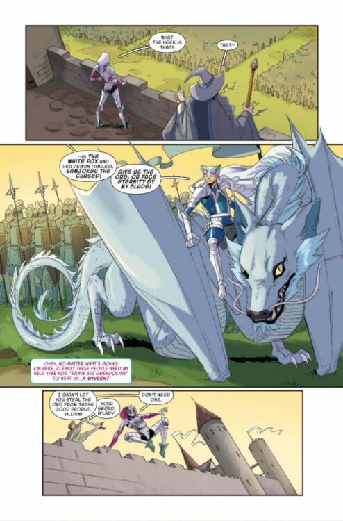
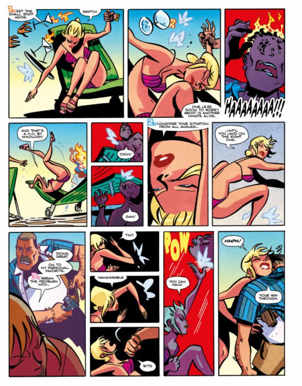
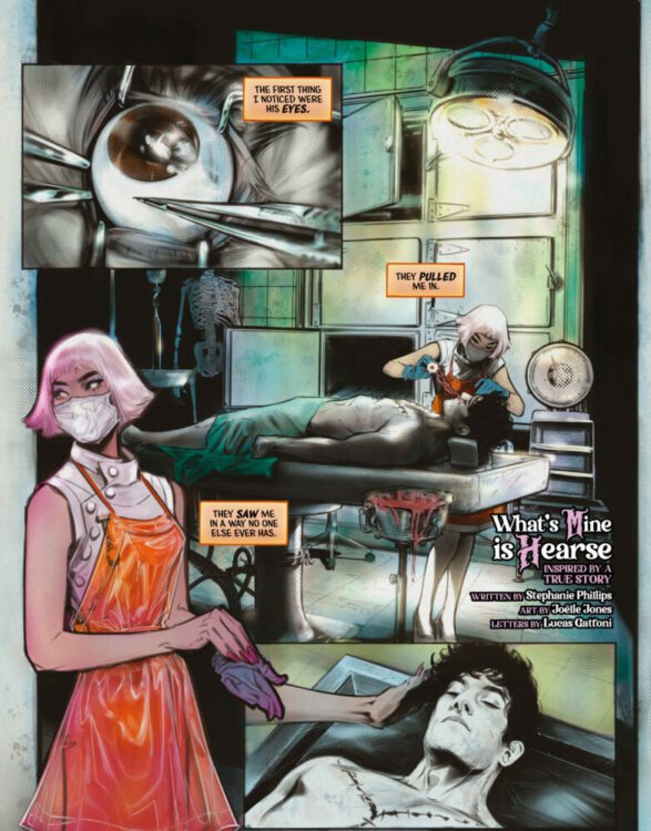
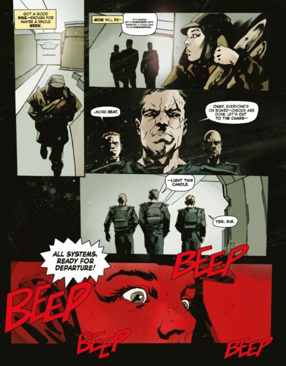
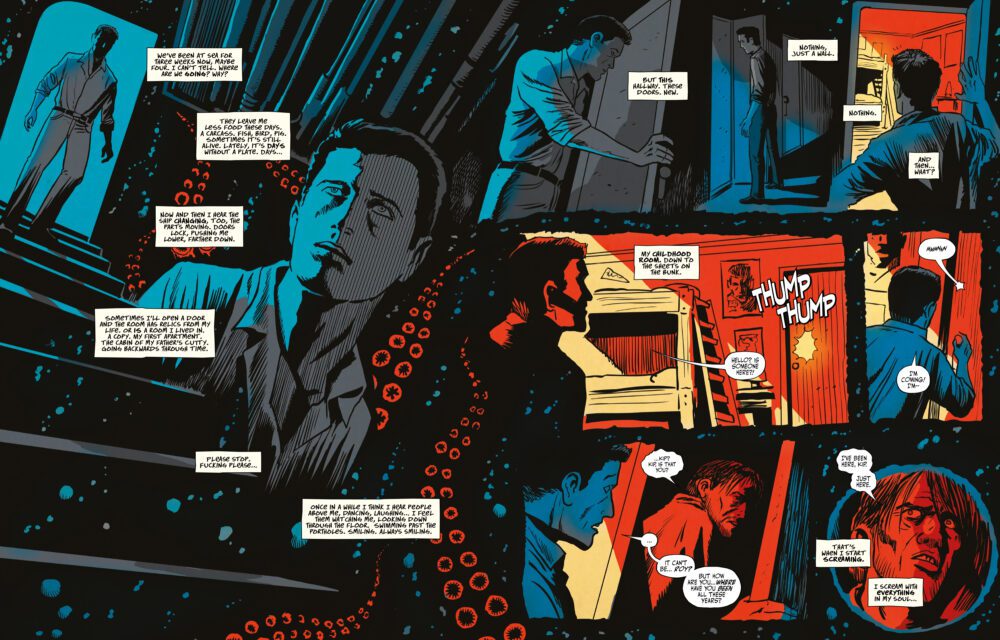
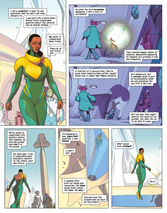
With the takeover of Mr. Sinister in Sins of Sinister #1, life for mutants has been rough. This week sees the release of Storm and the brotherhood of mutants #1, which follows Storm and her gang on a quest to save mutants. Life for the mutants has been altered, Arrako is gone, but Storm fights on with a rag-tag group of survivors. Dangerous alliances are formed, lives are lost, and Sinister is still a cocky jerk. This issue is written by Al Ewing, the regular writer on X-Men Red. Paco Medina on pencils, Jay David Ramos on colors, and Ariana Maher on letters are joining him on this journey.
WRITING
Storm and the brotherhood of mutants #1 is kind of a big issue because it is the first comic released after the alpha issue. Al Ewing had to reel readers and give them faith in the event. With this issue, we get the introduction of some new characters, Ironfire, and some older characters who have changed their appearance, like Cable. This issue takes place ten years in the future, so things are altered. We don’t know everything that has happened between the present and the last ten years, but Ewing does fill in some gaps. What works best for Ewing on this issue is the voice he gives everyone. The characters feel genuine, like Mystique still being a conniving mutant out for herself. The introduction of Ironfire is a welcome addition. Ewing uses him to fill the tough guy role in the group, and he comes off as Storm’s right-hand man. We know very little about him, but he is an interesting character. Ewing uses this issue to set us up for what is coming next, but by the end of the issue, you’ll have to question what that is. Storm and the brotherhood ofmutants #1 is a good issue to move the event forward. With the way the issue ended, anything is possible for the next.
ART
Paco Medina handles the pencils for this issue. Few artists in the industry can draw a book as flawlessly as Medina does for this book. Everything from the action panels to the smirk on Mystique after she gets attacked looks excellent. On one page, as Ironfire and Mystique tussle, Medina sets the panels slightly slanted. This is used to surprise the reader, much like the action on the page. Medina gives us big pages of battles, like Sugar Man attacking our heroes or a fight with some Chimeras. Everything about the pencils in this issue seems well thought out and plotted. Medina knocks the pencils out of the park on this book.
The colors by Jay David Ramos play just as important a role as the pencils. Ramos has to bring what Medina lays down on the page to life with colors. The colors compliment Medina’s style and allow those images to stand out and pop. Whether it’s using darker backgrounds to show how dark the world has become or bright blue as the team teleports. Ramos makes sure to make mutant powers vibrant as they are being used. When Ironfire unleashes his bolts from his arm during an attack. Ramos uses a stunning reddish-orange color as they fly toward the reader.
Ariana Maher does the letters. Word balloons are placed well and never interfere with the images on the page. Maher places them high enough and out of the way, but they are easy to read as your eyes can slide to each word bubble. I would have liked more sound effects when powers are used, but Maher gives us a nice “CKRAANK” as Storm uses her powers. Maher does a fine job with the lettering and gets better every time she takes on an issue.
CONCLUSION
Storm and the brotherhood of mutants #1 is a good introductory issue to the series. Al Ewing played to his strengths and gave each character a good voice and personality. The pencils and art couldn’t have been better than what we saw in this book. Storm and thebrotherhood of mutants #1 is available at a comic shop near you!
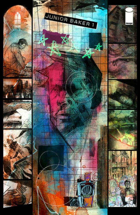
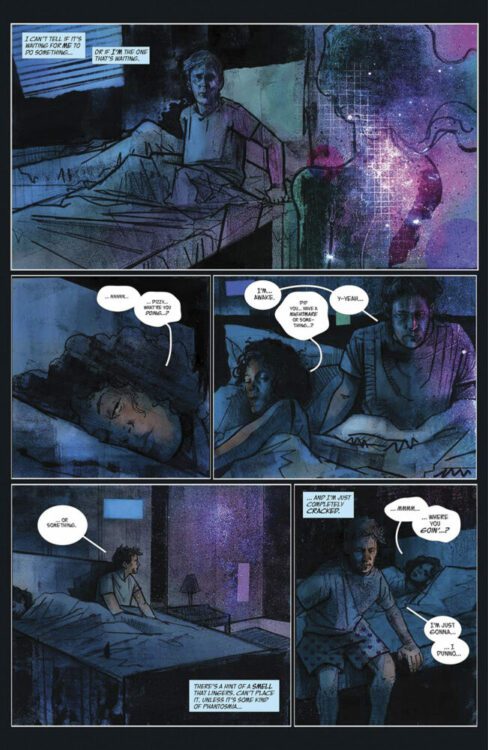
From industry mega-talents writer Jeff Lemire (Sweet Tooth, Gideon Falls) and artist Gabriel Hernandez Walta (Vision, Sentient) comes a horror story about 18-wheeling down a desolate, monster-filled road in Phantom Road #1. Featuring colors by Jordie Bellaire and letting from Steve Wands, Phantom Road is a great concept that starts off exceptionally well, this new series published by Image Comics promises another great experience full of terror from the publisher. With a tight, tense script and atmospheric visuals, this is a great start to this new horror series.
“Dom is a long-haul truck driver attempting to stay ahead of his tragic past. When he stops one night to assist Birdie, who has been in a massive car crash, they pull an artifact from the wreckage that throws their lives into fifth gear. Suddenly, a typical midnight run has become a frantic journey through a surreal world where Dom and Birdie find themselves the quarry of strange and impossible monsters.”
Writing & Plot
Over the course of his career, Jeff Lemire has steadily built himself up as one of the comics medium’s premier horror writers, and this trend continues with Phantom Road #1. Lemire has always had a knack for pulling unique horror scenarios out of a hat, and this opening issue contains one of his most intriguing premises yet. The basic concept – driving an 18-wheeler hauling a weird artifact in a parallel dimension’s highway while being chased by monsters – is stupidly enticing. As insane as the core premise may sound, Lemire manages to ground it via his sharp characterization. We get just enough of Dom and his backstory to make him relatable and feel like a real human being. His somber mannerisms and speech make his reality as a lonesome trucker with a bit of trauma feel palpable. Throwing a person that feels so real into such a genre twist makes the story all the more exciting. Being an as well, Lemire knows how to let the visual work do the talking. There are plenty of wordless panels where character expression, environment, or the reveal of some ugly monster does all the work with no words needed. Lemire’s dialogue sensibilities feel very natural and make the readers feel more at home with the characters we meet – as well as let their reactions to the change of setting feel more real. This first issue is a textbook example on how to open a great horror story.
Art Direction
Phantom Road #1 is graced by the distinct, nuanced visual direction of Gabriel Hernandez Walta. Walta’s thin pencils and detailed inks go on to create memorable character design, genuinely unnerving monsters, and a setting that feels real and lived in. His subtle approach works perfectly with Lemire’s lack of dialogue in many places, as Walta takes advantage of the comics medium’s visual storytelling with stellar sequential direction and distinct artistic touches. There’s a great recurring image that he uses where Dom’s reflection can be seen in the windshield of his truck as he drives. Dom is literally reflecting on himself as he reflects on his past while driving down the highway, living the often very lonely life of a truck driver. Walta nails the subtle simplicity of regular existence in truck stops and diners before pivoting to the horror elements. This opening issue is pretty light on actual monsters and horrific reveals, but like all great horror, it’s about quality over quantity. The opening monster reveal is shocking and memorable enough to stay in readers’ minds long after they close the book while keeping true terror fanatics excitedly awaiting what else Walta has cooking.
Veteran color artist Jordie Bellaire creates a hazy, dust-filled atmosphere that captures the feeling of driving on a desert highway. This effect also manages to capture that sense of isolation felt by Dom as he travels. This alters though when he runs into Birdie, as Bellaire lets up on the haze to capture the jolt of weirdness that takes us into the monster-filled new reality. The hazy effect becomes grayer and more fog like, resembling the visual atmosphere of Silent Hill in a way. I focus on Bellaire’s use of dust, as it alters the color approach to every surface in the comic. The color palette tends to veer closer to the darker, more saturated ends of each tone, making for a rich but grounded visual experience in every panel. The lettering from Steve Wands is a mixture of legible and dynamic dialogue lettering and subtle yet standout SFX work that punctuates every scene. Overall, the artistic storytelling in this opening issue is a stellar representation of how to tell a character-centric horror story.
Verdict
Phantom Road #1 is a thoughtful and unique new horror chapter from two of the industry’s most acclaimed creators. Lemire’s script gets the reader affiliated with Dom with careful characterization before dunking us into the genre twist, all while leaving plenty of space for the visuals to do the storytelling. The art by Gabriel H. Walta and Jordie Bellaire is atmospheric and detailed, providing an engrossing setting and unnerving creatures to keep readers glued to the book from beginning to end. Be sure to grab this debut issue when it hits shelves on March 1st!
The premise is simple: read one comic every day for the entire year. It seems like a simple task but there is no way that I read 365 comics last year, even if you count the individual issues in collections. So, this year, I am committing myself to this reading challenge, in the hope that I can broaden my reading habits and fully engage with my favorite hobby again.
Get the Danny Elfman soundtrack on and the face prosthetics ready because it’s Dick Tracy week.
Starting as a newspaper strip in 1931, Dick Tracy, created by Chester Gould, soon became a success with spin-off radio shows, movie serials, comic books, and a plethora of merchandise. The tough detective fought a range of crimes with the same no-nonsense adherence to justice, even if his methods were occasionally brutal and single minded. The strip represented Gould’s beliefs and was a reflection of his own tough stance on crime. It employed real police procedures and a few science fiction elements that were only just ahead of their time.
The 1930’s was a fairly steady time for Dick Tracy as Gould built up his world and packed it with interesting supporting characters. Most of the criminals came and went, nothing more than fuel to move the story forward, and not many of them were particularly memorable. But then came the 1940’s and Gould introduced a series of villains who could match any superheroes rogues gallery while still maintaining an element of realism. The grotesques, as they came to be known, were characters whose physical appearance reflected their internal criminal intentions. The comic strip shot from being a good police soap opera to a magnificent crime adventure.
For most of this week I will be reading from volumes 7 and 8 of IDW’s The Complete Dick Tracy. IDW published a series of treasury books that reprinted all of Gould’s original comic strips from 1931 up to 1977 when he retired from the strip. With volume 7, I am starting at the beginning of the rise in quality and adventure.
A Tragic Accident leads to a new villain’s introduction
Comic Number 36: July 13, 1941 to September 16, 1941
Not all Dick Tracy stories start with a crime, but there is usually a crime just around the corner. In this instance, the narrative picks up with Tracy on his way to the hospital for a check-up, but the journey is interrupted by a runaway tram. The trolley car, out of control, takes a bend too fast and crashes into a building. Upon investigation, Tracy and Pat discover that the driver has been shot.
And so begins the story of Littleface Finney. Like a number of the criminals in a Dick Tracy strip, Littleface doesn’t have much of a backstory, and it’s the present day that matters most. When the reader is first introduced to Littleface, he is shown reprimanding member’s of his gang. In a cruel punishment, which turns to ironic justice for the crime boss, Littleface sets one of his gang members on fire. What follows is a classic hide and seek story, a format that Chester Gould employed time and time again. What makes the format exciting is Gould’s imagination and ingenuity. In this storyline, Tracy is left dangling from a high rise building only to be rescued by a circus performer. Meanwhile Littleface is trapped by a cab driver and plunged into a river. He escapes upon being rescued, crashes another car, hides in a meat packing truck, and almost dies from frostbite. It’s a short but thrilling ride and demonstrates Gould’s ability to make a routine chase into something exciting and special.
The Mole watches in horror as his hideout begins to flood
Comic Number 37: November 15, 1941 to December 24, 1941
Deep underground, hidden like a Fantastic Four villain, lives the Mole. He hides criminals on the run and takes all of their money. He has very few scruples, however, he really hates backstabbers, as petty crook Duke discovers when he tries to make a run for it early in this story.
The Mole is a classic Gould villain with features and habits that are more animalistic than human. But while the brute force of evil is at work below the streets, Tracy is above ground demonstrating another aspect of Gould’s superb storytelling techniques: police procedures. While it is easy to remember the violence inherent in the Dick Tracy strips, especially in these early stories, there is also clear attention given to police investigation. After the strangled body of Duke has been found, the police force are shown taking fingerprints, analyzing samples of mud, and cross referencing data bases. Dick Tracy is a real investigator and Gould enjoys this aspect of the storytelling as much as the criminal activities and the violence.
This story arc also demonstrates another of Gould’s strengths: his rendering of weather and environmental elements. Halfway through the story, there is a snow storm which in turn leads to the flooding of Mole’s underground lair. Gould captures the biting, wind chilled snow storm beautifully, creating an environmental contrast between the warm interiors and the freezing exteriors. He also gives the flood water such energy that it becomes a force of nature and a real danger, at first for Mole and then for Tracy.
Despite only having a small number of panels to play with each day, Gould is able to create encompassing environments that set the scene visually and atmospherically. Throughout the years his draftsmanship often overtakes his storytelling to become the most compelling aspect of his work.
Cold Hearted Killer, BB Eyes notices he is being spied on
Comic Number 38: February 3, 1942 to April 18, 1942
The saga of BB Eyes is a story in two acts. Act one is a revenge driven tale where the villainous gangster kidnaps and attempts to kill Dick Tracy and Debby Thorndike, a socialite BB blames for the death of his brother. When the murder attempt goes south, BB returns to his gang of illegal tire thieves.
The first act is packed with comedic moments, something lacking from the previous stories I’ve read this week. Gould peppered his scripts with humor and comic relief, especially with some of the supporting characters, so it’s not a surprise to find it here. Tracy’s contempt for the socialite Thorndike is brilliantly witty, but it also allows for some growth in the character as the detective and the club owner have to struggle together to survive. It’s a proper odd couple moment.
As we move into the second act the humor falls away as the viciousness of BB Eyes takes center stage. He kills a policeman as a warning to Tracy and risks the lives of his gang just to get a little payback. He is cruel and heartless, just like the type of criminal that would feature in the newspapers where this strip first appeared. Due to the collective nature of these books, a lot of the paratext associated with the strips is lost. We don’t know what was front page news the day that BB Eyes’ demise was published, however the IDW collections do contain several fascinating essays that touch upon both Gould’s life and the society surrounding the stories publications.
Super Spy Pruneface makes a mistake
Comic Number 39: November 1, 1942 to February 3, 1943
The introduction of Boche, better known as Pruneface, demonstrates Gould’s love of the grotesque but it also shows how the creator had his finger on the societal pulse. By the end of 1942, the Second World War had been raging for over 3 years, and American Comics were doing their part to spread anti-Axis propaganda. Pruneface, and his immediate superior Number 20, were agents of the Axis powers and embedded in America to sabotage the war effort. But neither of them had reckoned with the daring American people.
There is a patriotic feel to this story arc, and everyone pulls together to capture and fight the enemy on home soil. But, at the same time, there is an affiliation with the villain. As readers, we don’t agree with their actions, but we enjoy their character as much as the straitlaced Tracy and his police pals. In one of the opening essays to Volume 8, Max Allan Collins notes that ‘the character designs [..] are so striking, so compelling, that our conscienceless eyes fall in love with them.’ Comic fans love a good villain; in fact the most popular superhero comics rely on their great rogues gallery for their popularity. And Dick Tracy has one of the best rogues galleries in comic history.
88 Keyes watches his murderous plan unfold
Comic Number 40: April 15, 1943 to July 12, 1943
Dick Tracy once more removes himself from the hospital and stops for a steak on the way home. Unbeknownst to him, within that very building a murder is being planned, and so begins the story of 88 Keyes.
I have a soft spot for this villain because of Mandy Patinkin’s portrayal of him in the 1990 movie where he’s not so villainous and more of a man out of his depth. He tries his best to impress both the father figure in Big Boy, and the beautiful woman Breathless Mahoney.
The 1943 story, however, is more violent, nasty, and moralistically dubious. It also contains some racist caricatures that are difficult to overlook. As Marc Singer has noted, ‘Comics rely upon visually codified representations in which characters are continually reduced to their appearances’ (from his article ‘Black Sins’ and White Masks’, published in African American Review Vol 36 No 1). This reductionism has often created images and characters that are unacceptable by later generations. There are several examples of it in Gould’s comic strip throughout the early years and, unfortunately, the example in this story does make this arc problematic. A number of essays have been devoted to racial representation in comics, and Marc Singer’s article is a good place to start.
Another problematic element of this story is the way in which Tracy heartlessly, and matter-of-factly, dispenses with the villain. He finds out where 88 Keyes is hiding and without negotiation, riddles the hiding spot with bullets from a machine gun. Afterwards, as Tracy explains to Pat how he knew where 88 Keyes was hiding, he says that the pianist wasn’t going to come peacefully but in the previous days strip, that isn’t illustrated. There is just the cold hearted, brutal murder. Maybe the following story, and the treatment Tracy receives in the hands of Mrs Pruneface, is a recompense for the detective’s actions here.
All in all, the problems with this story arc manage to overshadow the story itself. If you were only exposed to this continuity you would be left with a poor impression of Gould’s ongoing strip.
Big City Blues. Book one of the Dick Tracy trilogy published by Disney in 1990
Comic Number 41: True Hearts and Tommy Guns (issues 1 and 2)
In 1990 Disney issued a three-part miniseries called True Hearts and Tommy Guns to tie in with the release of Warren Beatty’s movie adaptation. The series was drawn by Kyle Baker and is, without question, one of the most visually exciting versions of Dick Tracy you are likely to see. The artwork across the three issues is sublime. It is modernist in approach and draws on the grittiness of the original comic strip and merges this with the visual flair of the movie.
Issues one and two, Big City Blues and Vs The Underworld, are two of the comics I have read the most over the years. It is part origin story, part prequel, and includes all of the villains I have been reading this week, plus a whole bunch more, including Flattop, Big Boy, and Lips Manlis. All of the characters from the film are here along with some of Gould’s other greatest villains, such as the Mole.
Even if you ignore the actual narrative and aren’t a fan of Dick Tracy, or crime comics in general, you will still get a kick out of the art in this miniseries.
Have I used the word ‘Outstanding’ yet?
The Complete Dick Tracy Volume 8 Credit: IDW Publishing
Okay, I will probably start a discussion with my final “comic” choice this week. In fact, some may argue that it’s not a comic at all. However, there are Comic Books, which are what most people read and are dominated by superheroes in the American Market; there are comic strips, which appear largely in newspapers and online; then there are Comics, a medium that is transcending the printed page and starting to become something more. Since the first comic characters, there has been multimedia tie-ins and merchandising. It is not something new that Marvel has created with their Marvel Cinematic Universe. In fact Dick Tracy has had radio serials and movie serials since 1934, starting less than 3 years after the strip first appeared. Therefore, my final ‘reading’ this week is..
Dick Tracy Movie Poster looking like the panel of a comic
Comic (movie) Number 42: Dick Tracy (Beatty, 1990)
“But a film isn’t a comic!” I hear you cry. And I agree with you, however, the Dick Tracy movie is arguably the best comic book movie ever made. It is one of the few movie adaptations that takes on the structures and constraints of the comic strip to create something that is as close to a comic as possible, but on film. All of the DC and Marvel films attempt to translate the source material to a new medium, but Warren Beatty wanted to adapt the visual nature of the comic strip for the screen, not just re-interpret the characters in a new medium. Producing something that looked and felt like a comic was Beatty’s intention from day one, and the final product is a masterpiece of media adaptation.
Michael Cohen wrote about Beatty’s version of Dick Tracy in the book Film and Comics. He noted that the movie was “the most meticulous effort to capture the aesthetic of a comic in a live-action film.” Beatty used static cameras to create the sense of a ‘panel’ within the film. The mise-en-scene involved creating an overall scene setting shot followed by distinctive empty backgrounds and limited props to focus primarily on the characters. This is a technique that comic artists use all of the time and is a contrast to the usual approach to mainstream film making. Drew Morton explained that “Beatty and his production team graphically remediated the iconographic minimalism of Gould’s compositions and the limited color palette the writer/artist was bound to” (taken from his 2017 book Panel to the Screen : Style, American Film, and Comic Books During the Blockbuster Era). The use of reductive yet instantly recognizable scenery had become commonplace in the comic strip but was actually something new in Cinema and this avantgarde approach led to the mixed reactions that the movie’s release received.
The film has no pretensions of reality, it is aiming to be a comic book movie in the truest sense, even down to the framing of the shots and the reproduction of color. It is an example of hyper-realism, something even most superhero films try to avoid, and it adapts the language and aesthetics of comic strips more so than 99% of other ‘comic book’ films.
The Complete Dick Tracy Volume 7 Credit: IDW Publishing
There is so much to discover in comic strips, and in the space of two years, Chester Gould’s Dick Tracy has a lot to offer its readers, but also historians and those wishing to study comics. Excitement and adventure sit side by side with social propaganda and questionable representations. Morality is at the heart of much of Gould’s work or, as Linda A Mooney and Carla-Marie Fewell put in their essay Crime in one long-lived Comic Strip, “The continued theme of the cartoonist, Chester Gould, was a ‘morality play’ i.e. the triumph of good over evil.”
I would recommend the collected editions from IDW Publishing if you want to learn more about Dick Tracy, because not only do they include the uninterrupted run of strips, but they also contain some wonderful essays about the creator and his creation. The books, however, are not easy to come by.
Coulton Waugh describes the work of Gould best in his book The Comics: “There is a gruesome intimacy here which is perhaps only possible in such a frank medium as these innocent-looking little funny sheets.”
And when all is said and done, in the worlds of Dick Tracy and his creator, Chester Gould, Crime does not pay.
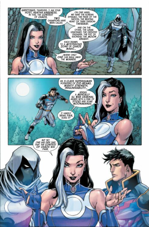
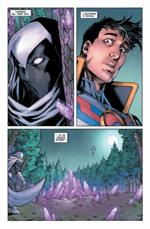
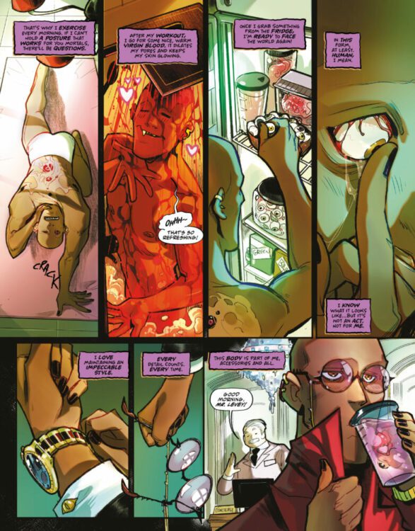
SPIDER-MAN #5 hits your local comic book store on February 15th, but thanks to Marvel Comics, Monkeys Fighting Robots has an exclusive four-page preview for you!
About the issue: “The End of the Spider-Verse” continues! See a new side of Peter Parker and the Spider-mythos! Shathra and her forces work towards the extinction of Arachnida sapiens.
PLUS! This issue includes a special super heroic back-up storyfeaturing Spider-Man and Photon celebrating Black History Month!
The issue is by writer Dan Slott and penciller Mark Bagley, with inks by John Dell, colors by Edgar Delgado, letters by Joe Caramagna. The main cover is by Bagley and Delgado.
Check out the SPIDER-MAN #5 preview below:
And a page from the Black History Month backup story by Justin A. Reynolds, Julian Shaw, GURU-eFX, & Joe Caramagna:
Are you reading SPIDER-MAN? Sound off in the comments!
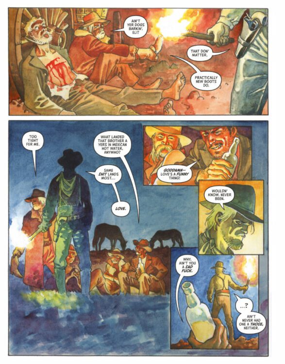
ALL NIGHT & EVERY DAY hits your local comic book store February 15th, but thanks to AfterShock Comics, Monkeys Fighting Robots has an exclusive six-page preview for you.
About the issue: It’s time to party! While celebrating is the last thing grief-stricken introvert Michaela wants to do, her friends drag her out for the night and end up trapping her in a hellish curse: a party that never ends, with no way to escape…not even by dying!
Now she must navigate the labyrinth of the legendary Banquet Hideous all on her own and learn its terrible secrets before she is consumed forever!
The 48-page prestige format one-shot will retail for $7.99, and is by writer Ray Fawkes and artist Andrea Frittella, with colors by Sara Colella, and letters by Matt Krotzer. The main cover is by Fritella, and the incentive variant is by Fawkes.
Check out our ALL NIGHT & EVERY DAY preview below:
Are you picking up ALL NIGHT & EVERY DAY? Sound off in the comments!
EDGEWORLD #7 hits the internet February 14th, but thanks to ComiXology Originals, Monkeys Fighting Robots has an exclusive five-page preview for you.
About the series: On the edge of known space, on the backwater, frontier planet of Pala, magistrate Killian Jess, and native Palan Cheela fight to protect a planet, and people, the rest of the galaxy has forgotten. Battling military occupation, alien invasions, otherworldly infestations, drug running, gang violence, black market traders, and the disastrous, ecological aftermath of a brutal, planet-wide war, they must learn to work together and collect any allies they can from the castoffs, misfits, and aliens occupying Pala, in order to save the world they love.
About EDGEWORLD #7: Things come to a head between Cheela and Killian when a mysterious gunslinger comes to town. But is everything as it seems in this apparently open and shut case?
EDGEWORLD is by writer Chuck Austen and artist Patrick Olliffe, with colors by Lee Loughridge, and letters by Jodi Wynne. The main cover is by Olliffe and Loughridge.
The series is billed as a “far-future noir” perfect for fans of Saga.
Check out the EDGEWORLD #7 preview below:
Are you reading EDGEWORLD? Sound off in the comments!
Marvel Comics sent us the Immoral X-Men #2 connecting variant cover by Todd Nauck this morning. This will connect to variants for Nightcrawlers #2 and Storm & the Brotherhood of Mutants #2, all the Year 100 installments of Sins of Sinister. The female in green is a future Hope Summers. The book hits your local comic shop on March 15. Are you excited about Sins of Sinister?
From acclaimed artist Tyler Crook (Harrow County) comes a new horror series about generational trauma, loss, and a big magic sword in The Lonesome Hunters Vol. 1. Published by Dark Horse Comics, these first four issues create a great opening arc that gets readers into the heads and emotional states of the protagonists while also throwing us into the lore of this world of ancient weapons and old magic. With thoughtful writing and expectedly outstanding art, this opening volume is a must-read for fans of Harrow County and books like it.
“An old and out-of-practice monster hunter in hiding crosses paths with a young girl that forces him to confront these chaotic creatures. As the beasts invade their tenement, they set off on a supernatural road trip to stop these ancient evils in a story that explores the ways that youth informs adulthood and how early traumas can haunt us in old age.”
Writing & Plot
Tyler Crook returns to the realm of magic-tinged and character-focused horror with the opening volume of The Lonesome Hunters. Our story focuses on an old and in-hiding monster hunter named Howard. After the deaths of his whole family and everyone he knows as a boy, Howard runs away with an ancient sword that was given to him by his father – a sword that in turn grants Howard a very long life. Now as an old man, he runs into a girl having her own trouble with magical objects, and the old hunter is forced out of retirement to face his demons anew. While the fantasy/horror material is up front and strong in this comic, all the genre trappings take a back seat to the human characterization of the two leads. Howard led a troubled childhood trying to live up to his father’s expectations as a monster hunter. As a old man, he is still emotionally crippled by his trauma and experiences as a boy. Lupe, the young girl he befriends, has lost almost everyone in her family and feels a desperation for people she cares about to, well, not suddenly die on her. The emotional weight of the pair’s past and how they relate to each other carries the book forward as they clash against dark forces. There’s a lightheartedness to The Lonesome Hunters as well; one of my favorite scenes involves Lupe describing an 80’s mecha anime to Harold and the old hunter is absolutely engrossed. There are moments of fun and genuine sweetness that lift the overall tone of the book where it’s appropriate while also making this duo feel more human. Crook’s dialogue sensibilities are solid, with naturalistic delivery but with just enough stylization to make the words interesting and memorable. Crook proves himself every bit the writer that he is the artist with this first volume of his new horror series.
Art Direction
Most people familiar with Tyler Crook’s work will be expecting his unique brand of visual storytelling, and that is exactly what they’ll get with The Lonesome Hunters Vol. 1. The Harrow County artist utilizes his signature spooky atmosphere blended with his detailed character art to make an original lighthearted horror tone that will feel familiar to returning readers of his work. Crook’s soft, thick lines and detailed animations make his characters feel alive and easy to relate to. Crook excels at displaying emotion across all of his characters, making his work feel all the more organic. His background settings feel lived in with an eye for detail that makes the world feel real – and makes the magic elements stick out that much more. Crook’s colors are just as interesting as his pencils, with his sepia-tinged watercolor approach setting a murky tone for the entire volume. Those familiar with his work in Harrow County know exactly what they’ll be walking into here, but with a more urban-tinged and rust-colored aesthetic compared to Harrow’s backwoods greenery. His careful sequential direction carries the story forward at a brisk but steady pace, relying on mostly larger panels that switch between character close-ups and moments of action. Crook’s lettering is as brilliant as ever as well. His dialogue balloons showcase his solid font and structuring that captures a speaker’s tone very well. However, it’s his SFX work that is especially wonderful. Crook blends his lettering into the art itself, making the effects actually a part of the visual experience. It’s outstanding work, and another shininis g example of Crook’s stellar artistic style.
Verdict
The Lonesome Hunters Vol. 1 is a great opening salvo of issues that starts off Tyler Crook’s new original horror series. His writing here brings the fantastical magic/horror in spades, but keeps a clear focus on the deep humanity of the two lead characters. His visual work is as stellar as ever, with great facial animations and a gloomy aesthetic that pulls the reader into the tone of every issue. Be sure to grab this opening volume from your Local comic shop or a bookstore near you!
The upcoming graphic novel by writer Ed Brubaker, artist Sean Phillips, and colorist Jacob Phillips, is aptly named. Night Fever feels just like a fever dream. As you get lost in the story, you find yourself wondering, “What’s happening, exactly?”
Writing
But to simply say that Night Fever is like a fever dream would be reductive. In Brubaker’s afterword, he also describes it as a primal scream. We follow a bookseller in France named Jonathan Webb. Unable to sleep after he’s been reminded of an old nightmare he used to have, he eventually begins wandering the streets. Brubaker makes it immediately clear that we can’t trust Webb’s narrations. He’s on the brink of delirium and he’s making choices that seem to fly in the face of reason.
But before we even get to Webb’s stumble through France, Brubaker tells us everything we need to know about him as a character. As he stares at the ceiling, we begin to wonder whether it’s actually the nightmare that’s keeping him awake — as his narrations want to assure us — or if it’s his sense of inadequacy. Brubaker says more through implications, half-truths, and silences in his script than he does through what’s actually written. In Night Fever‘s script, less is more. That’s not to say that there aren’t moments of nail-biting action. But even when the chaos strikes, Brubaker finds moments to focus us in on intimate character moments too.
Art
While less is more might be true for much of the writing, Sean Phillips’ art pulls in the opposite direction. Instead of the nuanced expressions we’re used to seeing on Phillips’ characters, we get faces that are so exaggerated that they almost seem comical at times. It’s the kind of thing you’d think you’d only see in the works of someone like the brilliant Kevin Maguire. But with these cartoonish grimaces and scowls, Phillips connects us to the primal scream aspect of this story. At times, the body language almost makes these characters look like cavemen, squaring each other up in some primitive face-off. Yet, when things get truly emotional, that’s when Phillips takes his foot off the gas. It’s the lack of emotion on Webb’s face that often makes us feel the most for him. It’s his subtle smile that has us worrying. Phillips’ work on Night Fever is balanced and beautiful.
Coloring
Jacob Phillips quite fantastically throws realism out the window, for the most part. We get a few scenes that feel like they’re set in a simply lit atmosphere. We see the browns, reds, and blues of normal life. But most scenes are cast in hues of blue, purple, red, or yellow. When Webb goes to a bar to drink with others from his conference, you can tell he has a lot of anger bubbling just beneath the surface. Phillips paints the scene in stunning reds and yellows, mimicking the color scheme of the nightmare he depicts earlier in the book. When the moment passes, Webb returns to his room of melancholic blue. With every page, Phillips makes you feel what’s happening more than anything else. He covers each page in such vivid colors, only using realism to make certain scenes feel lifeless and dull in comparison to the beautiful chaos of the rest of the book.
A panel, as shared in Brubaker’s newsletter “From the Desk of Ed Brubaker”
Conclusion
Night Fever is like a drug-fueled trip through the streets of France, but it’s also so much more. It’s Nihilistic and hopeful, primitive and sophisticated, mysterious and obvious all at once. Sometimes it feels like a stumble through the dark, other times it feels like a scream into a pillow. This creative team puts everything on the page. Image Comics’ Night Feveris out June 14th, 2023. After reading it, you may never sleep again — but it’s worth it.
Welcome to Self-Published Spotlight, a regular interview column where I will be highlighting self-published comics and the creators and small print publishers who make them.
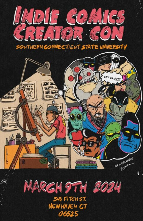
Cartoonist Mahdi Khene recently made a big splash with his Bootleg Spider-Man ‘zine. After getting featured on the Cartoonist Kayfabe YouTube channel, this self-published ‘zine swung its way toward incredible demand and high prices. And rightfully so, as Bootleg Spider-Man was a fantastic bit of comics. But Khene is no one-hit wonder, and his self-published black-and-white comic, Steel Streets is his real masterwork. A knowing homage to Teenage Mutant Ninja Turtles, outlaw black and white comics and 80s exploitation and genre films like Robocop, Steel Streets is a must-read. The insanely prolific and busy artist took some time to answer some questions about his work, process and just comics in general. So sit back, read the interview, and then hit up Khene to grab some of his books (but good luck grabbing a copy of Bootleg Spider-Man!).
Cartoonist Mahdi Khene
Monkeys Fighting Robots: Mahdi, thanks for talking to us! So my first question to everyone is always how they got into comics. What’s your comic book origin? DO you remember your first comic? Mahdi Khene: My pleasure! The preverbal origin story eh? I think I must have gotten introduced to comics as a kid through books like Asterix et Obelix, Lucky Luke, Corto Maltese, etc. I’m from Algeria originally, so the Bandes Dessinees were more accessible to my family and me than what folks were reading in the states. When I was around 3 we moved to New York. Rather quickly after that, I discovered Dragon Ball Z, Spider-Man and all the Marvel comics. The McFarlane & JRJR runs definitely left their mark.
MFR: Do you still read current comics? What books do you read these days? MK:Growing up I phased in and out of comics. I was making music, painting, making collages… So, about a year and a half ago, when I started getting back into it again, I decided to brush up on my reading! So I don’t know about current comics but I’m definitely playing catch up. For example, even though I grew up with TMNT I had no idea it had been a comic! Imagine discovering Eastman & Laird’s Teenage Mutant Ninja Turtles at 30… I’m embarrassed!
MFR: It’s never too late to discover TMNT! So when do you decide to create your own comics?
MK:I’ve always drawn since I can remember. All sorts of characters and little one-page stories… I loved the idea of a whole narrative in one picture. I remember in my 20s I had done a series of portraits where each face represented a different neighborhood in NYC. What I’d do is hang out in the neighborhood for a while and then come home and just paint a face that came to mind. Some kind of condensed, internal, sequential art. So the craft was never too far away. Right before comics, I was pursuing a music career! It was going pretty well, I had jobs lined up, residencies, etc. but then the big C happened. Covid sorta took all the gigs away, so like a lot of people I was kinda left to my own device. Then one night after binge-watching Smallville for maybe the 100th time in my life I thought, “Hey, why don’t I make up a superhero.” And that’s how the Zuperhero Universe was born. Comics gave me the artistic outlet that I needed. I fell head over heels!
MFR: Amazing “Somebody save me indeed” haha. Steel Streets is your main book, which I adore! Can you tell our readers what it’s about
MK:Thank you! Steel Streets is my homage to the comics of the 80s, the black and white boom, the gritty nature, the Ninja Turtles… It’s my tribute to the indie comics world. It’s about an amnesiac Ninja, who while seeking revenge for the death of his father is tangled up in a covert readiness project that mutates him and sets him on a collision course. I very much wanted to continue the spoofing nature of TMNT. They spoofed Frank, so I thought I’d do the same. Master Stick & Master Splinter? Master Plank! The Hand & The Foot? The Head! It’s all in good fun.
MFR: Yeah, Teenage Mutant Ninja Turtles is the first inspiration I can see in Steel Streets, but as a Robocop superfan I see some of Officer Murphy in the main character’s design. Am I right on this? And what other books, films or media have informed Steel Streets?
MK:Haha! Yes absolutely. I think when I opened the 80s pop culture floodgates a lot of different things started coming at me. It’s New York City. I want people to read the characters with thick New York accents. I want there to be synths playing in the action sequences. I even made a fake movie poster where I had Marisa Tomei & Danny DeVito in starring roles. So yeah, spot on!
MFR: From following you on social media, I know you are very prolific and bang out work at an amazing pace. I also know your day job, like mine, is in an extremely busy industry. How do you find time to create so much work with so much quality? MK: Yes… yes… the service industry! I’ve always loved it. I’ve been working in service for over a decade now, waiting, bartending, security, you name it! For me, it’s one of those jobs that lets my mind wander. My cafe job had really great hours that let me basically have a whole day of drawing after my shift. As for finding the time, I mean… it’s all about the hustle. I’d draw on my lunch break, before work, after work (during work…shhh don’t tell my boss!) My goal was always to do art full time so I didn’t stop. I saw a Todd McFarlane interview once where he said you had to do a page a day. So that’s what I did and still try to do.
MFR: What’s your creative process like? Analog or digital? Like how do you create an issue of Steel Streets from start to finish?
MK: It really depends on the day. I’m not a purist by any means so I use whatever tools I have at my disposal. It’s not uncommon for an issue of Steel Streets to have a mix of digital and analog pages mixed throughout. I’m lucky that my style doesn’t change with a different medium so it usually goes unnoticed. For the most part, it has to do with what I’m ABLE to do. I’ll have my iPad with me on days I work at the day job to bang out a panel, but on a day off when I’m at the studio I do enjoy ink on paper. Lately, I’ve been fusing the two where I’ll blue line the pencils digitally, print it out, and then ink traditionally. It’s all good to me.
MFR: I also love all the fake ads and dates you give the issues and ads. Was this fun aspect of the book always part of the plan? And how do you come up with those ideas?
MK: Ha! I like ‘em too. They’re a lotta fun to make. Well, that’s a tradition that comes from the first series I did, “Zuperhero Comics Presents…” Essentially I pretended that Zuperhero Comics (My publishing house) had been around since the 50s. So some books are dated 1952, some are 1965. I was just imagining an alternate world where Zuperhero Comics was pumping out books alongside Marvel & DC. That’s why that comic book is called “Zuperhero Comics Presents…” while the individual issues are called “Black & Red” or “The Adventures Of Zalool”, as if those were individual titles released by Zuperhero Comics. It gets a little Meta. As for the content of the ads… I’m just trying to make people around me laugh.
MFR: So Bootleg Spider-Man was the first thing I read from you. That ‘zine has caused quite a stir. Can you tell us how this big swing got started? Why a bootleg book? MK:I was at Baltimore Comic Con doing a Spider-Man commission. Folks kept telling me they liked my take on Spidey, that I made him look creepy… uncanny… So that kinda launched me into a Spider-Man reading binge where I reread a bunch of Ditko, Romita, & Mcfarlane. Then one day I posted a photo on the Cartoonist Kayfabe Ringside Seats Facebook group with a caption that read “What I wouldn’t give to do a Black & White Spider-Man issue.” Someone commented that I should do a bootleg. That idea never occurred to me before! Then I thought…” Wait a second… I CAN just make a black-and-white Spider-Man issue!”. So I did.
The SOLD-OUT Bootleg Spider-Man!
MFR: What’s the response been like for you because I have seen it listed for sale at some outrageous prices. How did you feel when all that awesomeness started happening? MK:Getting my own Cartoonist Kayfabe episode was a real honor. Felt like I won an award. To get so many eyes on the bootleg was amazing… but then to have those people stick around and enjoy my other work was surreal. It launched me to another level in my cartoonist career and obviously, I’m enjoying every second!
MFR: As a reader, I know what fun a bootleg book is to read and see, but as a creator what does the bootleg concept do for you? MK:It’s fun! It’s a parody. I don’t think I’d do a serious bootleg. It’s a fun way to tribute characters that I love and make them do insane things. I’m all for it. I think it’s the only way to push the envelope a little bit. It’s cathartic in a way.
MFR: Besides Steel Streets, what else are you working on? MK:Steel Streets is definitely my main squeeze right now but I have all sorts of little projects running around. There’s a fun underground comic I’m doing called “Full Power” & and a retro sci-fi kinda thing called The Country Gentleman And of course, Light Wood Magazine might get a second issue… All in due time!
MFR: Finally, where can readers find you and your work? MK:You can find me on Instagram, Facebook, and Patreon under @mahdikhene. And all my books atwww.zuperherocomics.com.