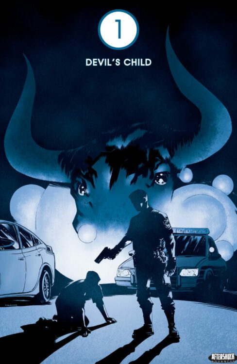
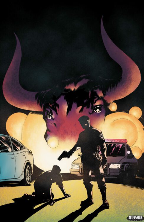
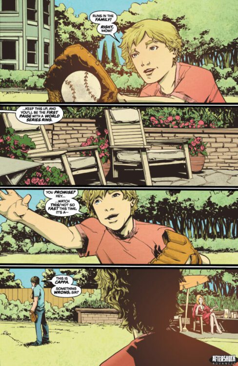
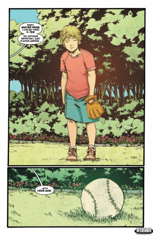
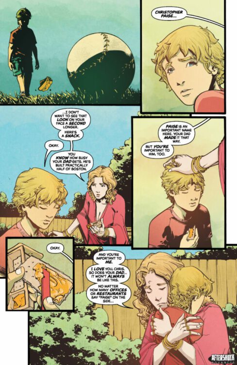
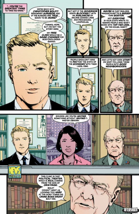
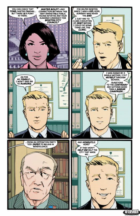
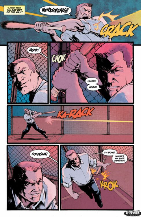
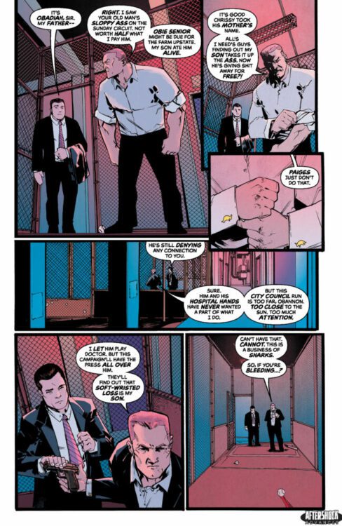
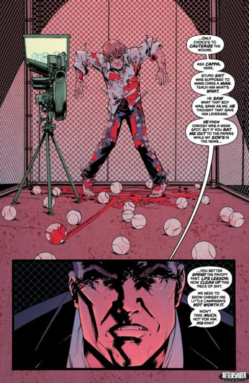
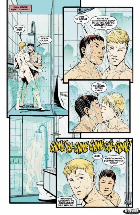
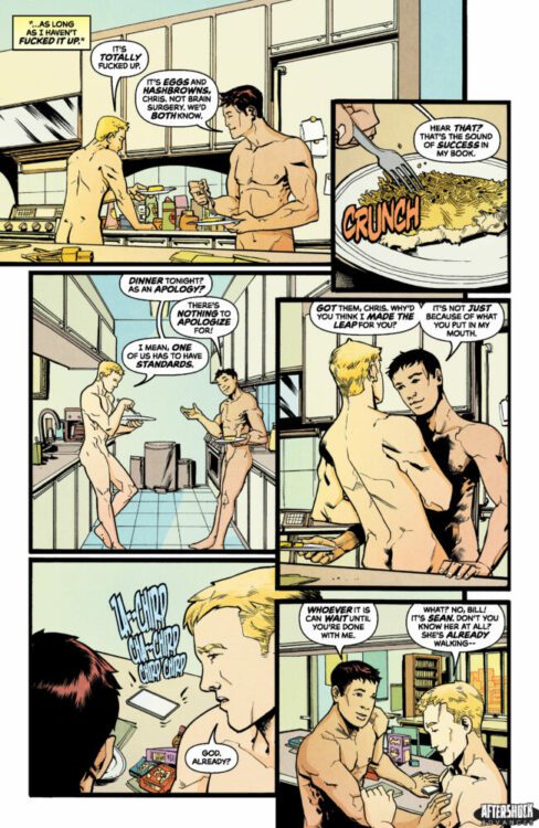
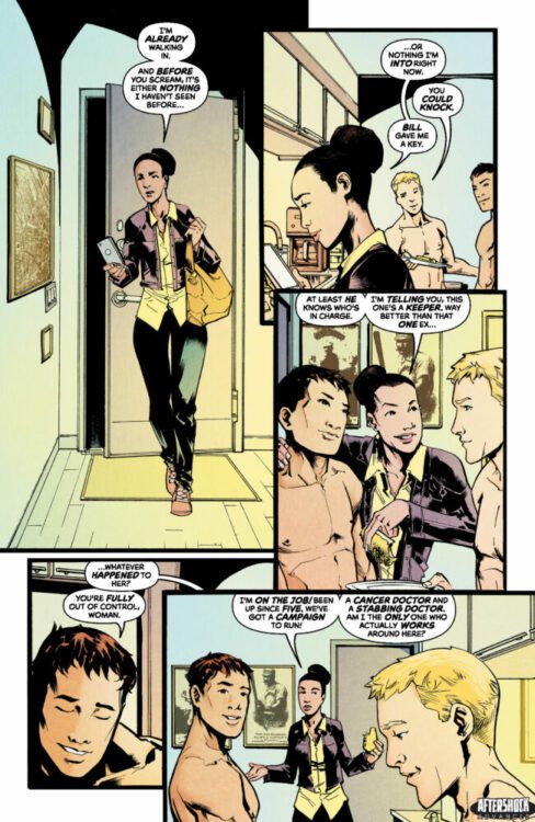
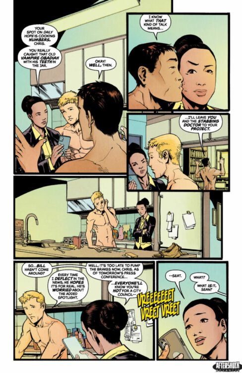
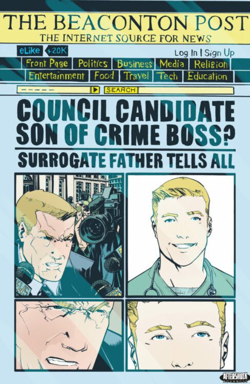
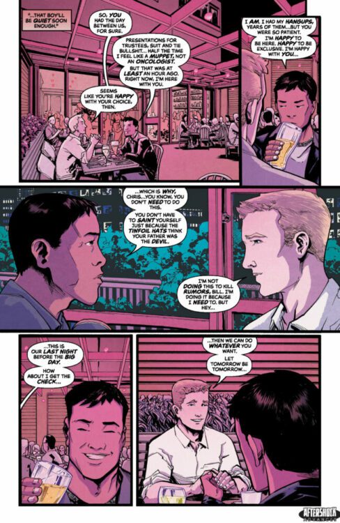
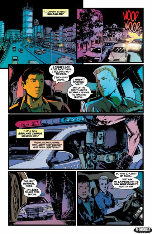
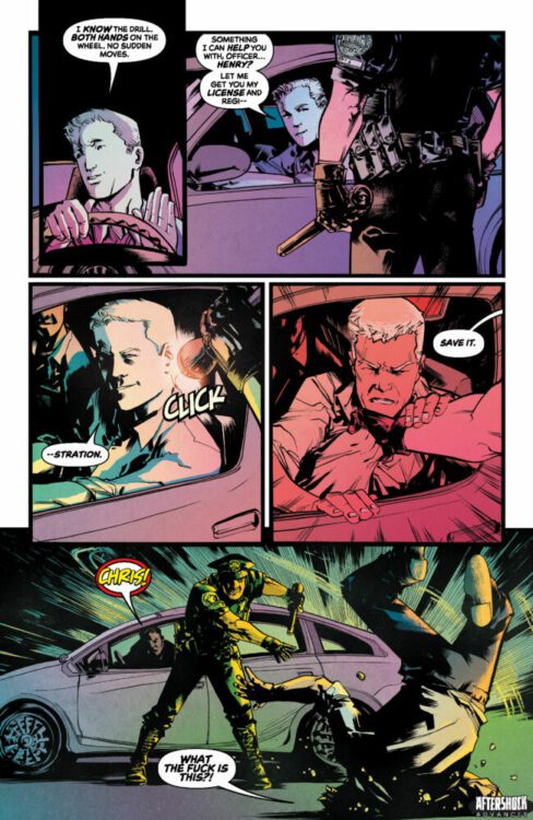
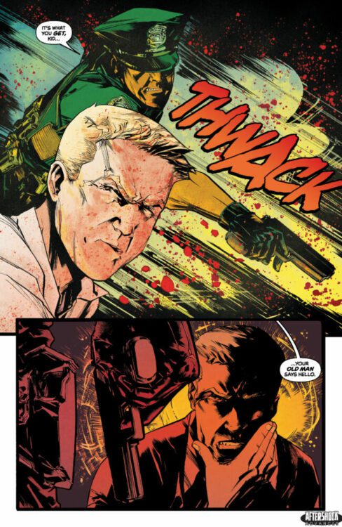
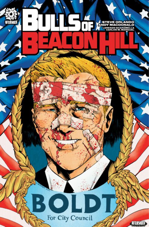
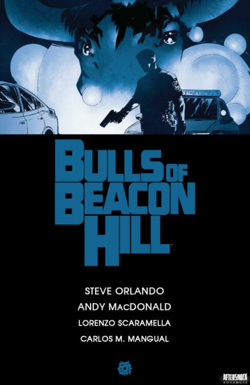
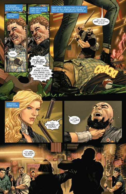
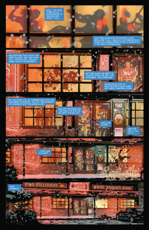
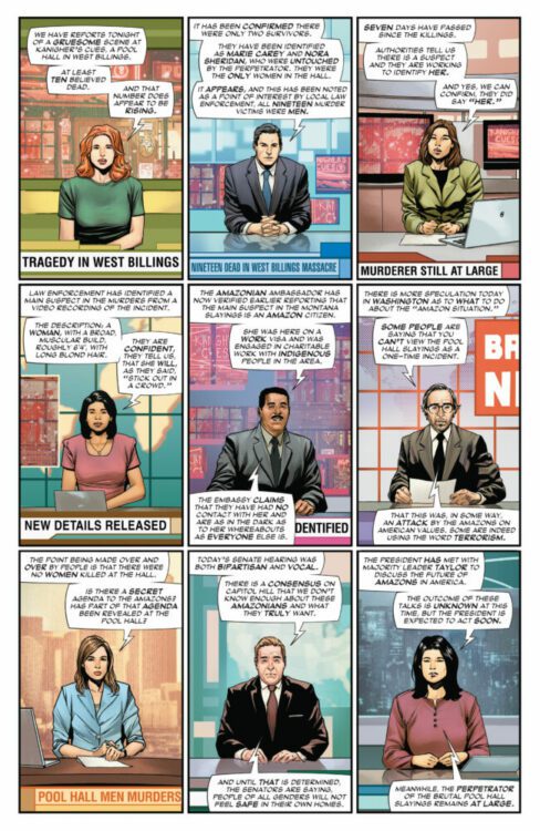
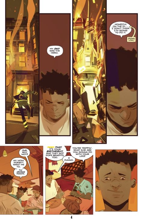
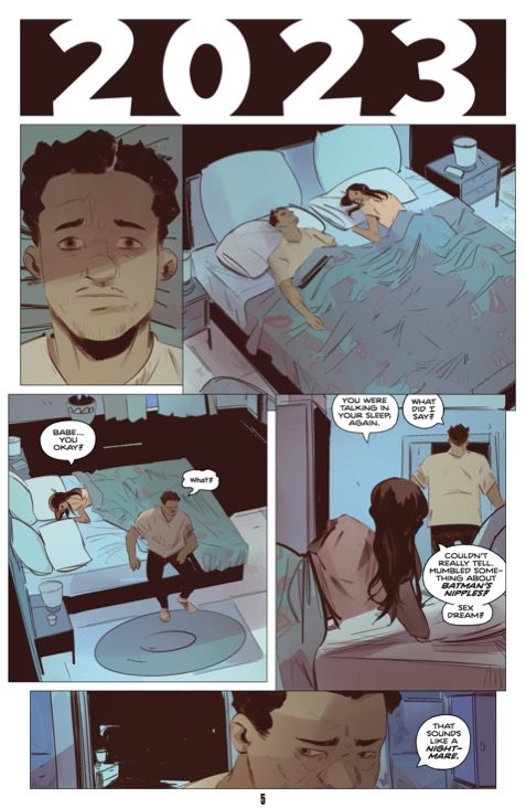
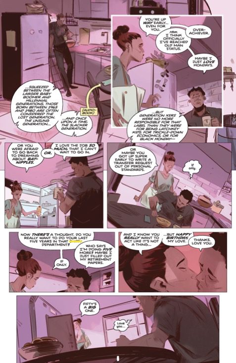
BULLS OF BEACON HILL hits your local comic book store September 27th, but thanks to AfterShock Comics, Monkeys Fighting Robots has an exclusive twenty two-page preview for you.
About the trade paperback: REVENGE IS A FAMILY THING.
Doctor Christopher Boldt has everything he ever wanted: A successful career as a surgeon, a supportive and loving boyfriend, and an overload of hype on his rumored run for Boston City Council. But there’s one problem – it’s all held up by a lie. For years, Chris has been hiding in plain sight, desperate not to be connected to his father, Orin Paige, one of Boston’s most notorious gangsters.
Until now, Chris has been able to live with the secret. And Chris’s father has been just as happy to deny any connection to his queer son, who he sees as a liability in the mob world. Now, Chris’s political aspirations have put father and son on a collision course. A collision course bathed in blood.
From Eisner and GLAAD Award-Nominated writer Steve Orlando (Extreme Carnage, Midnighter, Darkhold, KILL A MAN, SEARCH FOR HU) and artist Andy MacDonald (Rogue Planet, Loki, MY DATE WITH MONSTERS, I BREATHED A BODY), comes a story of family secrets and violent retribution.
This collection contains the entire series, issues #1-5.
The series is by writer Steve Orlando and artist Andy MacDonald, with colors by Lorenzo Scaramella, and letters by Carlos M. Mangual. The cover is by MacDonald and Scaramella.
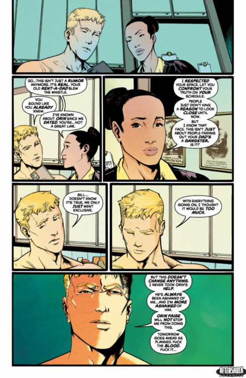
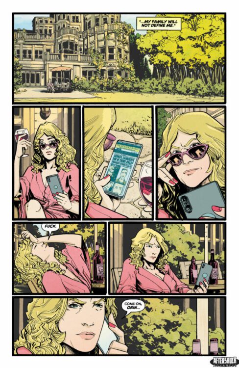
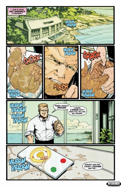
Check out our BULLS OF BEACON HILL preview below:
Are you picking up AfterShock’s collection of BULLS OF BEACON HILL? Sound off in the comments!
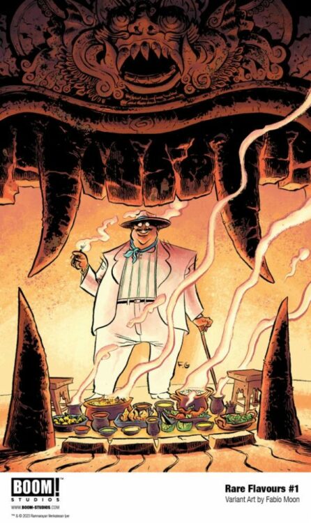
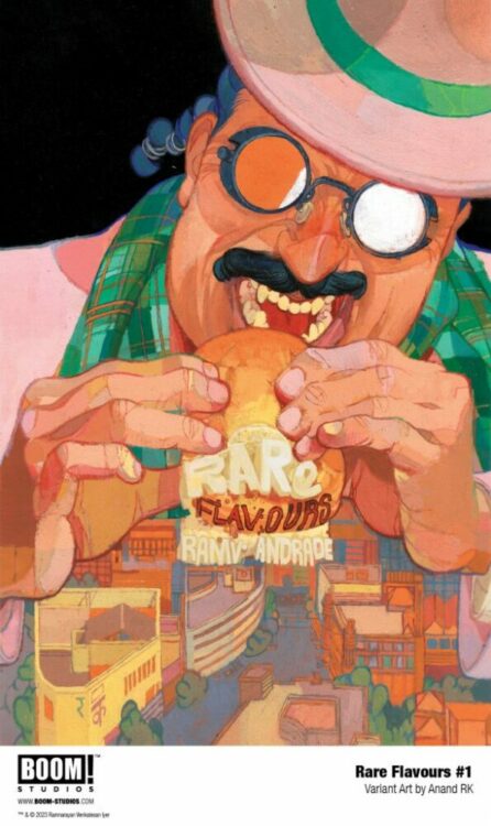
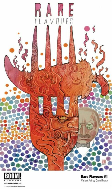
From the creative team behind The Many Deaths of Laila Starr, writer Ram V and artist Filipe Andrade team up once again for a dazzling and clever tale about a food-loving demon in Rare Flavours #1. Featuring letters by Andworld Design, this first issue offers a delightful premise lifted high by a thoughtful script and beautifully crafted visuals.
“Discover the tantalizing tale of Rubin Baksh, a demonic Rakshasa with a down-to-earth dream of becoming the next Anthony Bourdain. To achieve his vision, Rubin enlists Mo, a filmmaker who has seen better days, to document the world-renowned cuisine of India and the people behind such glorious food. But little does Mo know that there’s more to Rubin than meets the eye, and the mortals play a darker role in the show than they were prepared for…”
Writing & Plot
Ram V once again treats readers with an original take on aspects of Indian culture with his script for Rare Flavours #1. Here, we are introduced to an ancient demon known as a Rakshasa named Rubin. Rubin loves food and the variety of flavors in our modern world. This, coupled with his growing boredom with eternity, motivates him to want to make a documentary about food. The fact that some of his favorite flavors happen to be the people who make the food is just a minor detail. Ram V’s introduction and writing approach to Rubin makes the old demon instantly likeable – even if we obviously can’t trust him. Ram’s dialogue flows wonderfully and is full of human charm, despite the hidden monstrousness of the protagonist. The real mark of beauty in this issue is the recipe sequence. There’s a large component of the comic that is about the origin of someone’s specific recipe for Masala Chai. Ram’s narrative writing for this, and for the rest of the book’s overhead narration, is a near-poetic dream to read through. Ram has always had a voice for intimate detail in his scripts, and Rare Flavours that that voice to new heights.
Art Direction
Felipe Andrade’s signature art style is the perfect vessel through which to experience Rare Flavours #1. His rough, thin penciling is the perfect approach that will not appeal to the widest audience. It’s that sort of indie/Vertigo aesthetic that works for this kind of book specifically – but would never work in a mainstream superhero comic (or vice versa, for that matter). Andrade’s character designs are all completely unique with each person (or demon) having a distinct individual appearance. A signature element of Andrade’s work that was also apparent in Laila Starr is how much life is in every panel. He always paints the crowds of Inda’s bustling urban streets with a sort of energetic wonder, creating noise with his bright hues. However, his sequences on the quiet countryside or in a single empty room are just as full. The detail of his backgrounds – from vineyards and rolling hills to cluttered bookshelves and countertops – contribute to the tone and aesthetic of the comic by making the whole experience feel alive. The lettering from Andworld Design is just as much a part of the artistic experience as Andrade’s pencils & colors. The textured, hand-drawn dialogue and narrative text makes the reading experience feel distinctly intimate. The SFX letters both pop and blend into the artistic experience as a whole, highlighting the sounds of interactions without overtaking the page. Overall, this is an incredible visual feast that breathes a unique life into this story.
Verdict
Rare Flavours #1 is a magnificent start to this new series from an acclaimed creative team. Ram V’s script is clever, deceptive, and poetically beautiful. The visuals from Filipe Andrade are a brilliant examination of life with a beautiful eye for detail and sequential direction. This is a phenomenal debut issue, so be sure to grab it on September 20th!
CAPTAIN AMERICA #1 hits your local comic book shop today from Marvel Comics. The book is written by J. Michael Straczynski, with art by Jesus Saiz, Matt Hollingsworth drops the colors, and you will read Joe Caramagna’s letterwork.
CAPTAIN AMERICA #1 is an interesting read with heavy world-building from Straczynski, exposing a new side of Steve Rogers to the reader. Saiz’s artwork felt stiff, but I will hold-off judgment until the second issue when Cap and Spidey are swinging through the city. Check out my full review below.
About the series: WHAT FUTURE AWAITS THE MAN OUT OF TIME? Decades ago, Steve Rogers changed the world forever. Now, powerful and insidious forces are assembling to ensure he never does it again. Past, present, and future collide as the man out of time reckons with an existential threat determined to set the world on a darker path at any cost…
WONDER WOMAN #1 hits your local comic book shop today from DC Comics. The first issue is well crafted and feels like a summer blockbuster espionage film, and it has me excited for the rest of the series. The book is written by Tom King, with art by Daniel Sampere, Tomeu Morey drops the colors, and you will read Clayton Cowles’s letter work. King feels right at home with the Washington, DC setting and the Tom Clancy vibes. Sampere’s art is clean and majestic, which fits the character of Wonder Woman perfectly. Check out my full review and a five-page preview below
About the series: THE AMAZON WARRIOR IS NOW A WANTED OUTLAW! A NEW ERA FOR THE AMAZON WARRIOR BEGINS, FROM THE SUPERSTAR TEAM OF TOM KING AND DANIEL SAMPERE! After a mysterious Amazonian is accused of mass murder, Congress passes the Amazon Safety Act, barring all Amazons from U.S. soil. To carry out their plans, the government starts a task force, the Amazon Extradition Entity (A.X.E.), to remove those who don’t comply, by any means necessary. Now, in her search for the truth behind the killing, Wonder Woman finds herself an outlaw in the world she once swore to protect!
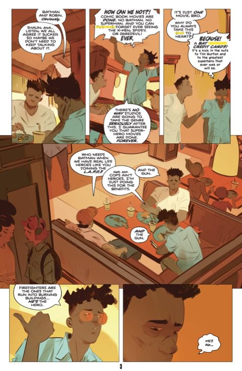
MIDLIFE (OR HOW TO HERO AT FIFTY) #1 from Image Comics hits your local comic book shop on October 11. I was blown away by how much this book spoke to me. The comic is written by Brian Buccellato, with art by Stefano Simeone, and you will read Hassan Otsmane-Elhaou’s letter work. Check out my review and a five-page preview below.
About the series: RUBEN KWAN is a 50-year-old firefighter who’s been afraid of fire his whole life. Instead of running into burning buildings, he pushes papers, living in the shadow of his father—who died a hero on the job. After 25 years in the LAFD, he’s firmly in the middle of an unremarkable life…until his new wife gets pregnant, and a random act of courage reveals that Ruben is FIREPROOF!
Marvel’s First Family — the Fantastic Four — ushered in the “Marvel Age” of comics. They had ties all the way back to the publisher’s first superpowered beings, the android Jim Hammond (AKA the Human Torch) and Namor the Submariner, bridging a gap of over 20 years. But they were also new in so many ways. Unlike the idyllic Justice League, they were constantly bickering. They were the first superhero team to seem entirely human in their interactions. They didn’t always get along but they were family.
There’s been a dozen or so runs of the Fantastic Four, spanning over 700 issues. Plenty of those runs have gotten lots of attention — yet some are never even mentioned despite being downright brilliant in their execution. This tension between the old and new, this pull between the roots of Marvel and the frontlines of new discovery, has always been a defining factor of the Four and any new creative team has had to grapple with this balance. While many would say that a return to the old ways of doing things is always what makes for good FF material — John Byrne’s legendary run, for instance, begins with an arc called “Back to Basics” — I’d argue that the most game-changing creators took the biggest liberties (including Byrne). From Lee and Kirby to Hickman and Eaglesham, no writer/artist team was effectively memorable without being willing to switch some things around.
But making changes isn’t the only thing that makes for a good Fantastic Four run. The changes only mattered, they only left any kind of mark, if they were tied to the heart of the story and if they got us emotionally invested in the human inside each character. Every pitfall and misstep comes about when a creative team thinks nostalgia or novelty are enough reason for a reader to be invested, without the emotional substance to back it up.
But let’s get specific. I’d like to talk about some of the Fantastic Four runs that stuck with me and tell you what made them so darn memorable.
(Quick note on this article: My reading did not include extra-canonical Fantastic Four stories like Life Story, 1234, or Full Circle. I stayed mostly within the main title, except for any extra reading required to give me more context.)
Lee/Kirby: Big Universe — Little People
There’s an inherent tension to Stan Lee and Jack Kirby’s creations. They seem to hate each other half the time, yet they’d die for one another. Their struggles go from the hysterical to the deadly serious in the space of only a couple of panels. But one of the biggest juxtapositions Lee and Kirby play with is the idea of these little people in a huge universe.
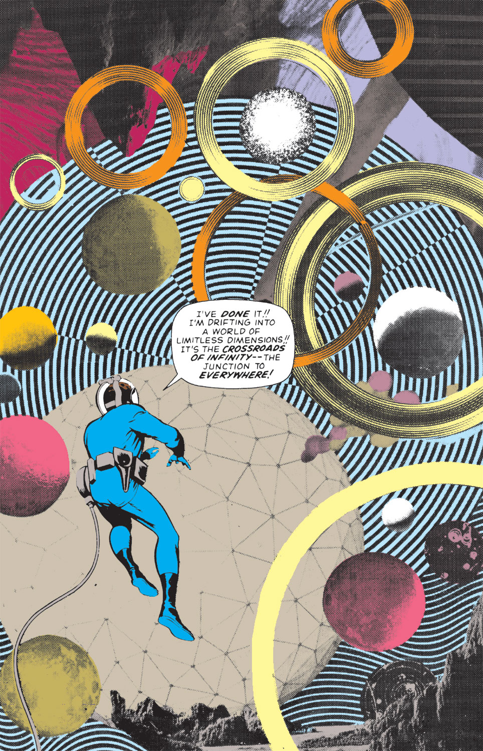
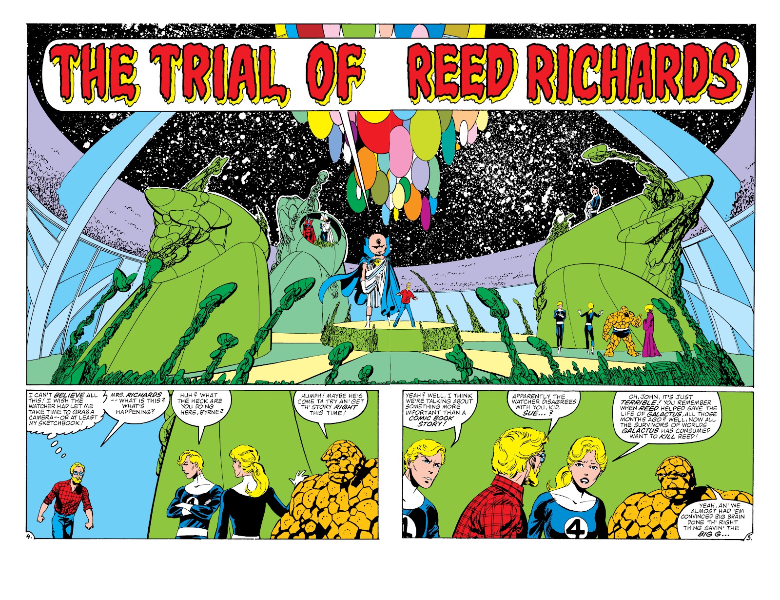
The Fantastic Four are often at the mercy of forces and powers beyond their own. Even their conception as a team is characterized by nature being greater than they could have expected: the cosmic rays their rocket flies through are more powerful than even the brilliant Reed Richards had prepared for. At other times, they’re often seen standing before giant beings, like the Watcher or Galactus, who operate on levels beyond human intellect. Their most interesting issues see them thrown into whole new planes of reality like the Micro-verse and the Negative Zone. And it’s in the Negative Zone that we get a single image that summarizes the whole mission statement of Lee and Kirby’s creation.
In Fantastic Four #51, we get a full page of Reed Richards, drifting through the vast expanse of the Negative Zone. Kirby, through a collage of images, creates a startling, colorful, and mysterious cosmos. Reed, baffled by what he sees, calls it “the crossroads of infinity — the junction to everywhere!” He’s a little man in a big, scary, yet beautiful universe. He’s going where no man has ever been before, discovering things he can barely describe. And yet, by the next issue, he’s back to keeping Ben and Johnny from tearing each other’s heads off over petty pranks and name-calling. Lee and Kirby know that it’s the individual characters and their personalities that makes this series work. The big otherworldly concepts are only interesting if we’re seeing it through their eyes.
John Byrne: The Brilliant “Back to Basics” Con
Writer and artist John Byrne understood that it was the characters that drove this story forward. And while he titled his first arc “Back to Basics” that was all really just one brilliant con. He immediately began changing things. The first villain that the Four face in Byrne’s run might be a familiar face — the dastardly alchemist Diablo — but he’s evolved so much since we last saw him. He has become upgraded both in his bitterness and his power. And that’s just the first of many big changes. Ben Grimm, the ever-loving blue-eyed Thing, leaves the team and is replaced by Jennifer Walters, AKA She-Hulk. The Invisible Girl becomes a twisted version of herself — the evil Malice — and her first act after regaining control is to change her moniker to that of the Invisible Woman. Franklin instantaneously grows up into an adult and then is reverted to a child once more. The list goes on…
But every change is rooted in the development of each character. Byrne makes us question whether Ben really wants to be cured of being the Thing or whether it’s his own insecurities that make him feel he deserves to live as a monster. Byrne ties Sue’s change into Malice and subsequent transformation into the Invisible Woman to her bitter struggle with feeling like she’s ignored and unappreciated simply because she’s seen as a girl. Even when the team goes into places like the ever-mysterious Negative Zone, we’re focused more on how these new discoveries are changing them as people than we are the discoveries themselves. Byrne’s whole run changes everything. When he says he’s going “Back to Basics,” what he really means is he’s cutting right to the intimate and personal dynamics that make this series so great.
Interlude: Too Many to Count — The Ever-Changing Four
There have been so many brilliant runs on the Fantastic Four that if I wrote a deep-dive into each, I’d really never finish writing. So let’s knock out a few in a paragraph each before we get to Hickman and Eaglesham’s mammoth of a series:
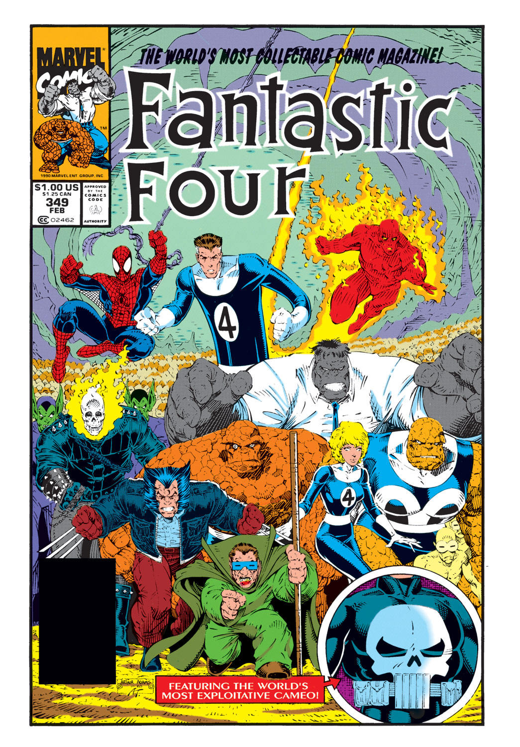
Walter Simonson’s run is so much fun. Ben Grimm and Sharon Ventura (the She-Thing) are the emotional core of this series. They bring so much humanity and intimacy to Simonson’s larger-than-life premises. But Simonson also plays with satire, deliberately omitting moments of down-to-earthedness in favor of the flashy, splashy, writing that comics fans think they want. This satire culminated in the brilliant “New Fantastic Four” issues which had Wolverine, Spider-Man, Ghost Rider, and the Hulk take over for the team and boasted “the World’s Most Exploitative Cameo.” Simonson was writing as much about the medium of comics itself as he was the characters.
Tom DeFalco and Paul Ryan had a five year run on the series that was as 90’s as it gets. Sue switched out her classic uniform for one that showed more cleavage, Ben Grimm carried a giant gun around with him, and there were jackets, vests, and pockets galore. But for all its 90’s kitsch, DeFalco and Ryan also proved that they were longtime fans of the group. They tied together loose threads from old runs and made sense of odd choices by previous creative teams. One particular development with Johnny and Alicia makes so much sense for the characters that it becomes hard to believe it wasn’t planned all along. That’s what DeFalco and Ryan did. They mined the Four’s history for opportunities to tell stories that just made sense.
Mark Waid and Mike Wieringo are also one of the teams people discuss most when recommending the Fantastic Four to people. There’s a simplicity to this run that makes it a brilliant starting place for new readers. And while there are plenty of amazing developments — Doctor Doom becomes a Satanic Sorcerer, the Fantastic Four fight a living equation, and they even meet God — it’s the small moments that truly shine. In the midst of incredible circumstances, it’s when things get personal that you’ll feel the tears welling up in your eyes.
J. Michael Straczynski and Michael McKone begin a Fantastic Four run that seems to be woefully ignored. It really is one of my favorite interpretations of the team. Straczynski understands these characters on a level that few do and McKone’s art is epic yet entirely intimate at the same time. This run takes us all the way back to the beginning — which isn’t rare for runs on Fantastic Four, nearly every team takes a crack at retelling the famous origin story — but this is the first time it really feels earned and like it brings something new to the table. Truly an unforgettable run!
Mark Millar and Bryan Hitch waste no time in bringing their own brand into the mix. They are unabashedly their own style and it is a ton of fun. The major themes we see at play are the tension between brand new worlds and old flames. There is literally another earth that features — called Nu Earth — but it’s the ties the architects of this new planet have to the Four that create the stakes. Millar and Hitch do a lot of worldbuilding — no pun intended — but it’s the relationship dynamics that’ll get you hooked.
Hickman: The Universe is Your Oyster
A lot of people refer to Jonathan Hickman’s run on Fantastic Four — which kicked off with artist Dale Eaglesham — as the “best run.” It gets a whole lot of hype for some reason… and that reason is because it is the best run.
As much as the contrarian in me wanted to poke holes in what Hickman was doing, I couldn’t help but fall in love with this amazing take on Marvel’s First Family. In many ways, Hickman goes really, really big. He introduces the Council of Reeds, which expands our story into the multiverse, and then invents the Future Foundation, which splits the title into two books and takes its characters all throughout the galaxy. But, just like Lee and Kirby, Hickman also goes small. The things that drive Reed Richards’ tireless hunger for discovery are his memories of his father and his desire to be enough. The Future Foundation is populated by geniuses who are also children, excitedly making sense of the world around them.
There’s even a stunning moment where one of our characters comes face to face with a major villain. What they’re met with isn’t the dastardly monologue they were expecting. Instead, the villain quietly explains how tired they are and how they wish this could all just be over. Hickman’s culmination to this series (and his culmination to his Avengers and New Avengers books) takes place in the unbeatable Secret Wars from 2015. His every creative choice seems to be rooted in a character’s deep-seated desire for something. You could call this run an exploration of the Marvel Universe or a study of the soul of Reed Richards — both are accurate.
It’s Not Over Yet
While Hickman is probably the pinnacle of Fantastic Four comics, there have been plenty of wonderful runs since. James Robinson and Leonard Kirk’s “Fall of the Fantastic Four” arc (which actually takes place between Hickman’s run and Secret Wars) uses time jumps and rifts in the team to amazing effect, Dan Slott and Sara Pichelli’s tenure dove into what it meant for this group to really be a family, and Ryan North and Iban Coello have begun a story where scientific order struggles to make sense of the chaotic world around us.
The Fantastic Four are at the very heart of the Marvel Universe. They’re a group that has endured for over 60 years and through more than 700 issues. Every creative team brings something new to the Four, but all of the best runs understand that even the most incredible ideas only work when they’re tied to who these characters are at their core.
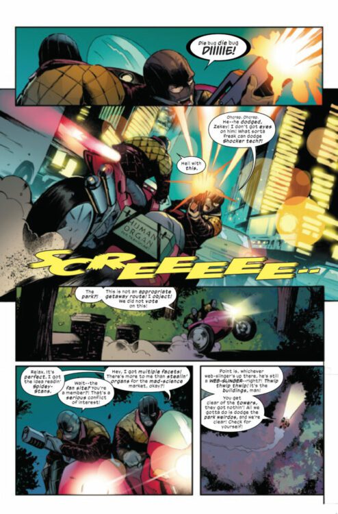
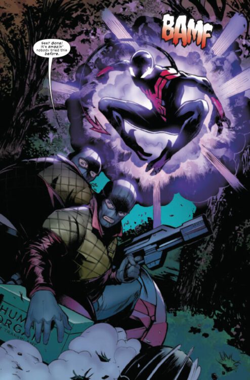
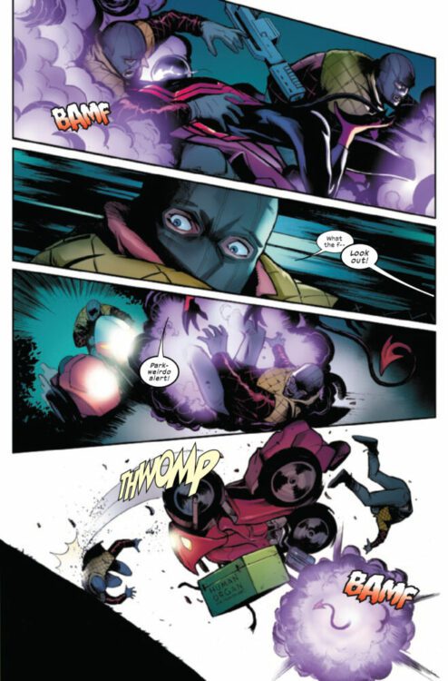
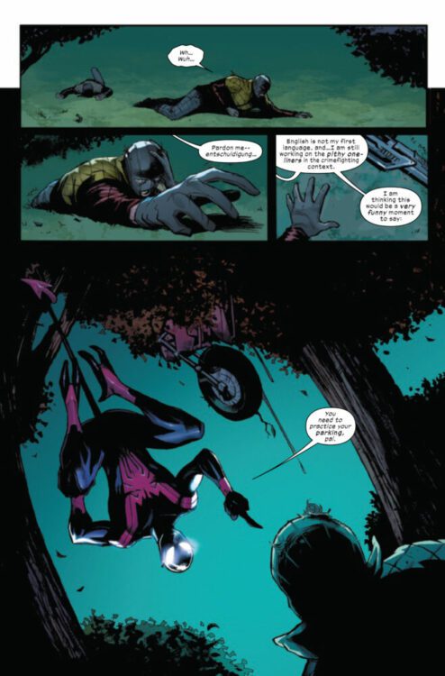
UNCANNY SPIDER-MAN #1 hits your local comic book store on September 20th, but thanks to Marvel Comics, Monkeys Fighting Robots has an exclusive four-page preview for you!
About the issue: THE NIGHTCRAWLING WALL-CRAWLER!
On the darkest of days, he is the spark in the shadows! After the devastating events of the Hellfire Gala, Kurt Wagner is on the run – and having the time of his life?! Swashbuckling about NYC in disguise, the Uncanny Wallcrawler sets aside his mutant angst and dedicates himself to the hero’s life: saving civilians, hanging with fellow wallcrawlers, battling baddies, and hunting down the best pizza on the planet. But he can’t ignore the mutant plight forever… Si Spurrier and Lee Garbett launch a joyful, sexy series that will shake Nightcrawler to his foundations – and have a hell of a good time doing it!
The issue is by writer Si Spurrier and artist Lee Garbett, with colors by Matt Milla, and letters by Joe Caramagna. The main cover is by Tony Daniel and Sonia Oback.
Check out our UNCANNY SPIDER-MAN #1 preview below:
Are you picking up UNCANNY SPIDER-MAN next week? Sound off in the comments!
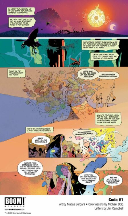
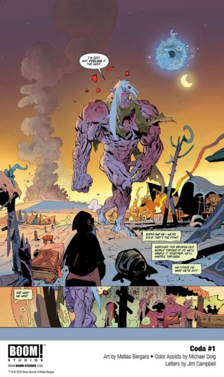
From the acclaimed creative duo of writer Si Spurrier and artist Matias Bergara (John Constantine: Hellblazer; Step by Bloody Step) comes the next saga in their brilliant post-apocalyptic fantasy tale with Coda #1. Featuring lettering by Jim Campbell, this first chapter to their follow-up mini-series puts familiar faces in a series of increasingly complex conundrums – from mobs backed by religious propaganda to gnomes with firearms. With a dense, deeply clever script and staggering visual work, this sequel-series is off to a phenomenal start.
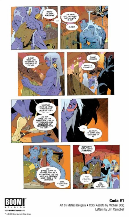
“In this brand new adventure in the apocalyptic fantasy world of Coda, the despondent bard Hum finds a slice of tranquility with his wife, the Urken named Serka, in an ever-darkening, magic-less apocalypse – or so it seems. Prophecies of paradise and the return of magic? Hum is skeptical, while Serka faces difficult moral decisions on the road, with winter quickly approaching…”
Writing & Plot
Si Spurrier drops readers new and old head first back into the world he and Bergara created in Coda #1. Taking place some years after the original series ended, Hum and Serka are living their lives keeping to their ways – with Hum preferring a quiet life away from others, Serka needing to take trips as a warrior in service of others. Naturally, things get complicated, and the pair are exposed to new, rising elements in a reality that is still reeling from the events of the last series. Spurrier does a great job setting this issue up for both newcomers and fans of the original series. The events of the last story are referenced from time to time, but there’s never a point where a newcomer may feel lost. Spurrier focuses his efforts on the here and now of this sequel series, and with the problems that have started to crop up. As with most of Spurrier’s work, much of this comic’s reading experience is tied to overhead narration that digs out the thoughts of the main character. The grumpy, sharp delivery in these boxes fits Hum’s personality very well, while also feeling like it’s the writer speaking to the audience. These blurbs do make the read more on the dense side, but they add tremendous personality to the script. Spurrier’s clever humor always lands with a mix of absurdity and the unexpected. Hum and Serka’s two very different experiences each have their own weirdness and increasing complications – complications that closely align with elements of our own world. Spurrier’s sometimes hilarious and sometimes deeply insightful dialogue gives all of his characters distinct personality while adding thematic weight to the story. Overall, this follow-up series is off to a brilliant start in terms of its unique storytelling sensibilities.
Art Direction
Few artists have as unmistakable an approach as Matias Bergara in the pages of Coda #1. His art is always amazing to witness, but what he does in Coda is pure comics magic. Bergara’s character designs for this world are a motley mix of shapes, sizes, and fantastical uniform. Hum’s now-iconic cloak, hat, and staff offset his grizzled appearance. His wife Serka is drawn with a Conan-like frame that can change into a twisted mass of berserker muscle. Every being, from gun-toting gnomes to the simple peasantry, make up an equal part of this menagerie of utterly unique fantasy. Bergara’s sequential direction carries the pacing perfectly, with an ever-shifting approach to panels based on what is happening in the plot. His colors are the stunning exclamation point to the visual experience that will draw readers to the pages with their vivid variety. Every panel is a collage of shades and contrasting tones, perfecting the collage-like numerousness of this world’s cast of beings. The lettering from Jim Campbell is just as clever as the rest of the book’s work. He fades and minimizes his fonts to capture the tone and volume of each character as they speak – especially useful for Hum since he mutters so much. Overall, the visual experience for Coda is a beautiful show of unique comics talent.
Verdict
Coda #1 is a phenomenal start to this sequel mini-series. Si Spurrier’s writing may be a bit dense for some, but its clever humor and poignant messaging make his script a hyper-engaging joy to read. Matias Bergara’s visual direction is singular and stunning, with a creative approach to character design and color art that will pull readers right into this world of strange fantasy. Be sure to grab this opening issue when it hits shelves on September 13th!
With Where the Body Was, Ed Brubaker and Sean Phillips have done it again. I mean really, this is starting to get old. Could they please just come out with one project that isn’t amazing? No, they’re too consistent in their ability to deliver a near-perfect comic. Yet they’re also so versatile in their style and tone. Where the Body Was is totally unlike anything they’ve ever done. And what’s even more brilliant is that it pretends to be just like their past works, sneaking up on you with its quiet discussion of memories and old wounds.
Writing
Brubaker frames this comic as a murder mystery and makes you think that’s all there is to it. We follow the residents of Pelican Road in the Summer of ’84. Based on the title — Where the Body Was — we know there’s going to be a dead body that shows up at some point, and that there’s going to be some question of how it got there. Brubaker knows that we’re going into his book with this preconception. The book then jumps around in time and between narrators with a looseness that almost makes it feel unplanned and disjointed. “How in the world is he going to pull this all together?” you find yourself wondering. But then there’s the conclusion. Like the rest of the story, it’s not flashy or mind-blowing. In fact, it’s beautifully simple.
That’s because this book doesn’t rely solely on the intrigue factor. It really isn’t a murder mystery, when it comes down to it. It’s not about the interlocking secrets all the characters are keeping from each other. It’s about the human hearts that beat in the chests of these complicated individuals. Brubaker lets the tropes of crime comics and whodunnits fall to the wayside in favor of diving into the intimate details of each character’s soul. By the time you’re finished reading, you’ll feel like you’ve met a new set of friends. Even with their sinister sides and their glaring imperfections, Brubaker writes his cast in a way that makes them hard not to love.
Art
There’s a wonderful chaos to Sean Phillips’ art. You feel so much movement is happening on the page. Primarily, this happens because Phillips flips the placement of his characters panel by panel. In one panel, Tommy is standing to the right of Karina’s father, listening to his questions. A couple of panels later it’s Karina’s father who’s on the right and Tommy who’s on the left. At first this would seem like this has to do with who speaks first in each panel — you generally want that person to be on the left. But this even happens in panels where no one is speaking or only a single character talks. Elsewhere, we see multiple point-of-view shots in a single page. The most effective use of this is when we see the titular dead body from one character’s perspective, but then the next panel seems to be from the angle of the body looking up through lifeless eyes at the shocked face of the person who found it. Because this is a book with many narrators piecing together what happened, it makes sense that Phillips’ pages look like a collage of different viewpoints. We’re constantly shifting perspective both in the writing and in the art.
Jacob Phillips’ coloring is — as always — outstanding. There’s just so much mood to everything he does. At one point, a character recounts old memories that make him feel various emotions. When he talks about his father’s unceremonious death, the panel glows with red anger. When he discusses his upbringing and old memories that feel distant and stale, the page yellows as if from years of wear and tear. When he talks about a fantasy he used to have where he felt cool and on top of the world, the panel is a soft blue. The whole comic is drenched with feeling. But it’s also just beautiful. The speckled look of Phillips’ pages, the textured unevenness of his brushstrokes and the vibrancy of his juxtapositions make every page feel rich and inviting.
Lettering
There’s a ton of variety to Sean Phillips’ letters, but none of them feel flashy or distracting. It’s the kind of thing where you don’t even realize the information he’s communicating with his subtle differentiations, yet you’re taking it all in on a subliminal level. It’s really simple things like the change of a font, or even the change of casing, that lets you know that we’re seeing things from another perspective now. Then there are the things he does to add a little touch of life to each panel. When a character hides behind a menu because she’s afraid of being seen, it doesn’t just cover her face but overlaps her word balloon a little too. When another character sits in traffic, the “HNNK HNNK” noise of a car behind him frames the whole scene. The sound is everywhere. Phillips works so particularly in his lettering to add to what you’re reading without you even realizing it’s happening.
Conclusion
Where the Body Was is a book that exists in its own class and genre. It rises above the simple tropes of murder mysteries to bring us more than just intrigue. You’ll laugh, cry, and love with these deeply human characters. Brubaker, Phillips, and Phillips have outdone themselves yet again. Their work has never been so paradoxically raw and thought out. All at once it feels like something that has been years in the making and like something created in a moment of uninhibited passionate creativity. It’s truly something to behold. Where the Body Was will be released by Image Comics on December 5th. Don’t miss it!
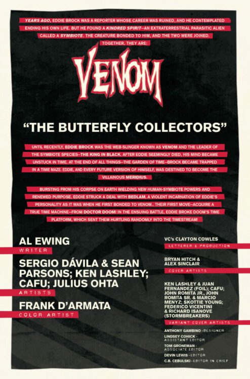
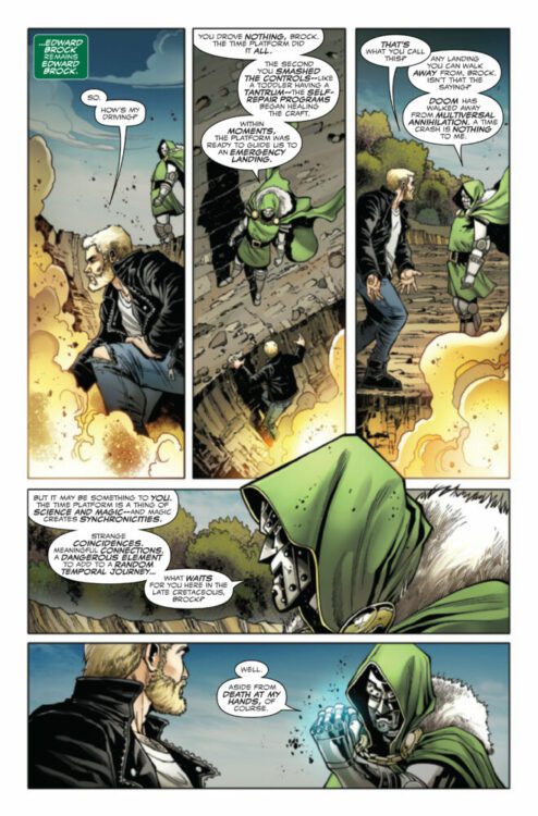
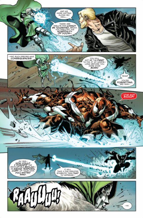
VENOM #25 hits your local comic book store on September 13th, but thanks to Marvel Comics, Monkeys Fighting Robots has an exclusive five-page preview for you!
About the issue: A TIME OF DOOM! SPECIAL OVER-SIZED ANNIVERSARY ISSUE!
Eddie Brock needed access to Doctor Doom’s time platform – and in getting to it, got more than he ever bargained for, battling the most notorious super villain in the Marvel Universe through time itself! Luckily, Eddie’s well versed in navigating the timestream thanks to his recent adventures. He’s poised to take his conflict with Meridius to its frenetic and fist-filled finish – if he survives DOOM! PLUS! Eddie’s battle with Doom will land him, briefly, in a very unexpected place…MIDTOWN HIGH SCHOOL! But what, or who, could he find there?
The oversized anniversary issue is written by Al Ewing, with art by Sergio Dávila & Sean Parsons, Ken Lashley, CAFU, and Julius Ohta. The colors are by Frank D’Armata, the letters are by Clayton Cowles, and the main cover is by Bryan Hitch and Alex Sinclair.