Mark Russell’s work on this series only grows more engrossing with time. It’s a powerhouse run thus far, and Red Sonja #7, out this week from Dynamite Entertainment, may well be the best issue yet.
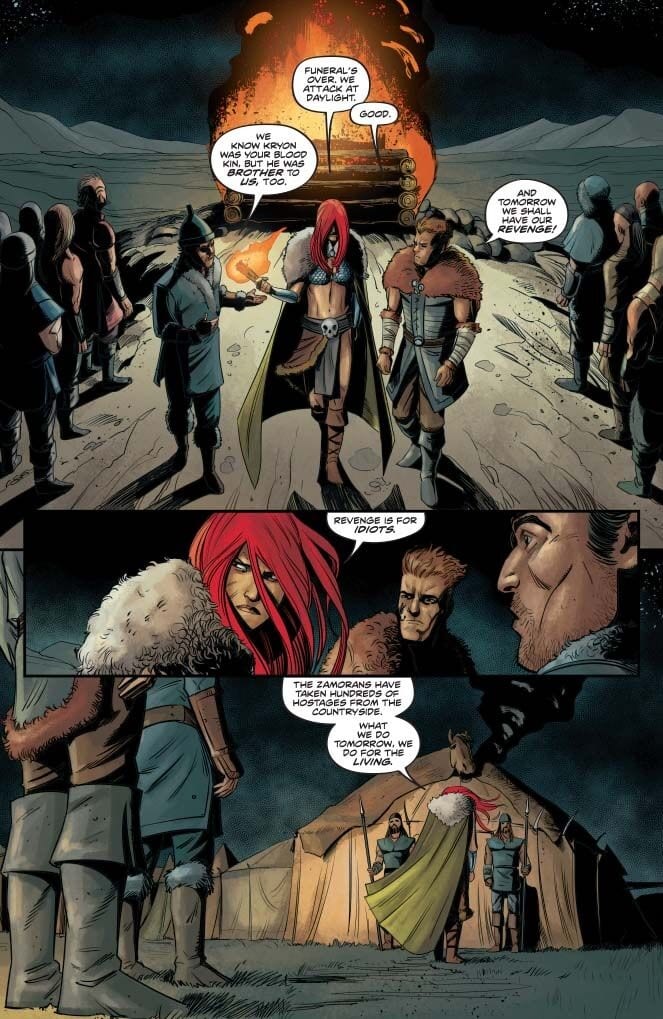
Sonja finds herself alone after losing Kryon, her last remaining family member, in our last issue. As she demonstrates, though, Sonja’s not one to give in to despair. Instead, she decides to finally mount an attack on Dragan in an attempt to rescue the surviving Hyrkanian prisoners.
The Writing
With Red Sonja #7, Mark Russell delivers an engrossing story. There’s plenty of action contained in these concise, yet thoroughly-engaging pages. Beyond the surface, though, the narrative is crammed full of interesting and incredibly-compelling thematic elements to unpack.
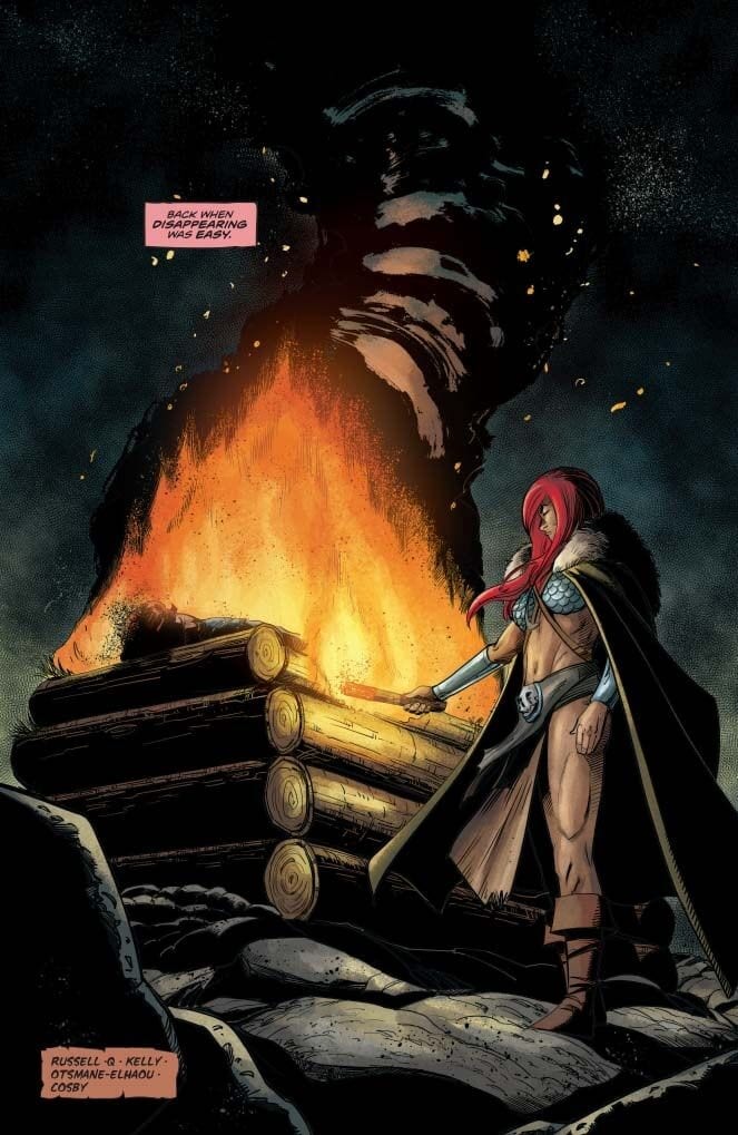
The book opens to Sonja reflecting on her childhood memories of Kryon, weaving grass shields as a childhood prank (an element that will come up again later). From here, we jump to Kryon’s funeral. Sonja wants to make one thing clear, though: despite her grief, revenge is not her aim. Rather, the primary focus is rescuing as many of her people as she can from Dragan’s sadism.
Sonja’s resolve is tested, though, when she has Dragan in her sights. Here, she’s forced to make a choice between seeking revenge and helping the living. The option she ultimately chooses says a great deal about her core character.
The highlight of Red Sonja #7—perhaps one of the most striking moments of the series thus far—comes toward the book’s end. Sonja’s advisor Cerkus delivers a monologue that is a surprisingly poignant critique of blind nationalism and empire. “Nations and empires are not a cult of personality,” he says, “but a symptom of humanity’s common psychosis. The need to find our worth in power.” It’s incredibly-well written, especially when cast alongside the action on the page. Dragan’s own guards foreshadow this theme earlier in the book, pondering Dragan’s circuitous motivation.
It’s intelligent and thought-provoking, without losing momentum. In Red Sonja #7, Russell proves himself to be a masterful storyteller.
The Artwork
Bob Q takes over art duties from Mirko Colak beginning with Red Sonja #7. His work is eye-catching right from the first page, opening on a pastoral scene of young Sonja and Kryon, before hard-cutting to the latter’s funeral. He does a great job of capturing mood, really embellishing the emotional pitch of these sequences.
The illustrations really shine, though, once we delve into the more action-packed pages in the book’s middle. The work is dynamic, constantly shifting perspective to reflect the chaos of battle. He employs some very deliberately-placed repetition, though, which works to nice effect.
While Colak’s work on the series’ first arc was very good overall, the artist did have some issues conveying expression. Bob Q, however, manages to provide some incredibly expressive and lively work. You feel the emotion on the page; the resolve, grief, and terror in characters’ faces comes across very clearly.
Final Thoughts
Red Sonja #7 is excellent from start to finish. This issue cements the current run of Red Sonja among the very best comics of 2019. Get it this week at your local comic book shop.
Gwenpool is back and she’s fighting for her series – and her life – in GWENPOOL STRIKES BACK #1, hitting your local comic shop on August 14 from Marvel Comics. In her usual fourth wall breaking ways, Gwen is very aware of the cost of losing the readers favor.
Gwenpool is back, and she’s fighting dirty to stay relevant.
***SPOILER WARNING***
Fans of Gwenpool are likely thrilled to hear that she’s gotten another series to her name. Granted, it’s only a five issue series, but we’ll take what we can get. New readers will potentially get a kick out of this series as well, though they may not appreciate all of the references made.
As per usual, Gwen is painfully aware of her status in the comic book world, courtesy of her limited abilities. This also means that she’s aware of what will happen if she stops appearing in comics. It’s more or less a death sentence for her, due to being fully ported into this realm.
Gwenpool Strikes Back #1 gives Gwen the chance she needs. A literal and figurative fight for relevancy in a world where comic books saturate the market. But if anybody can do what nobody else is trying, it’s Gwenpool.
Gasp! An internal monologue!
Leah Williams picked up where Christopher Hastings left off – with Gwen fighting to find a way to save her series (and her life). Williams perfectly captured all of the quirks that make Gwenpool so unique, while also acknowledging Gwen’s other appearances in team-ups (West Coast Avengers).
This issue is a lot of fun and a lot of fourth-wall breaking. It’s silly, it’s a little bit insane, and it’s full of referential humor. And let’s not forget that it’s got plenty of Gwen and her desperation to become something more.
Time for our little shark friend to explain everything.
Gwen has given up on trying to become a beloved character through normal means. It’s time to fight dirty. And that means getting some new powers of her own. Her ability to jump through comics is amazing – but as she noted within these pages, it’s frequently retconned in teams, thus reducing her chances. And Gwen needs all of the chance she can get.
Gwen’s attempts are clearly going to wrap up other Marvel characters in the process. As you can clearly tell from this cover, Spider-Man has already been pulled into her first attempt. And the cover for the next issue hints at the Fantastic Four being her next target.
Dancing makes all explanations better, right?
This series is already proving to stick true to the humor that made so many fall in love with Gwenpool and all of her antics. She’s steadily embracing what makes her different, and thus making her a few steps further from being the hero she originally wanted to be. But that’s okay.
That is…quite a photo Gwen.
The new artistic team is forging a new path with Gwenpool Strikes Back #1. Our leading lady and her abilities are still clear, but there’s more detail than previously seen in her series. Her edges are sharper, and more similar to her original appearance on Earth 616.
David Baldeon, Jesus Aburtov, and Joe Caramagna are the artists behind this issue. And it’s safe to say that they had fun working on this issue. Gwen’s antics are always somewhat comical, but in this instance, they’re further heightened by the brilliant artwork provided.
Some panels are more standout than others, but that was clearly done with intent. Such as that one page spread focused entirely on Gwen’s high school photograph. Yeesh. That’s pure Gwen right there.
In the next issue, nobody is safe.
Gwenpool Strikes Back #1 has already proven that this series will be everything fans could have hoped for – and then some. It takes the situation that Gwen is in seriously, and brings the fight for her character to a level not normally seen. That does make the series somewhat bittersweet, but it’s balanced out with the quirky humor and insane antics.
Marvel Comics’ Absolute Carnage: Separation Anxiety #1 (on sale August 14) is the most terrifying, unsettling comic you’ll read this year.
Sadie finds herself trapped in a genuine nightmare.
The War of the Realms was fantastic and, of course, frost giants are quite scary. But with this tie-in, writer Clay McCleod Chapman grabs you and increasingly shakes you to the core.
Absolute Carnage: Separation Anxiety #1
Writer: Clay McCleod Chapman
Artist: Brian Level
Color Artist: Jordan Boyd
Letterer: VC’s Travis Lanham
Family Matters
When the story opens by focusing on a dysfunctional family that’s otherwise ordinary, cynical readers might think, “These characters don’t matter; where are the symbiotes?” But McCleod Chapman succeeds where a number of tie-ins fall short because he makes these (mostly) ordinary people dynamic characters. Sadie and her family have the misfortune of coming into contact with a symbiote reminiscent of Venom. In many ways, though, the subsequent infection is a secondary plot. McCleod Chapman focuses his energy on Sadie’s family that’s rapidly fracturing.
For readers who grew up in broken homes, this story will deeply resonate. But everyone can appreciate the power of Sadie’s heartbreak because we all know someone whose experienced a toxic upbringing. From the first page to the finale, the reader roots for Sadie because she’s an innocent little girl in a remarkably challenging situation before the symbiote even arrives. She deserves so much better than the anguish she experiences on a daily basis.
One of the scariest parts of Separation Anxiety, like any good demonic possession movie, is the balance between the ordinary and the macabre. In this case, it comes in the contrast between the monstrous symbiote and Sadie’s stereotypical parents. For every time that the symbiote-infected parents try to infect Sadie and her brother Billy, they talk about how much they want to be together again. In the context of a family that’s about to irrevocably fall apart, this dichotomy is gripping. McCleod Chapman weaves Sadie’s wish to have a happy family throughout the story and the results are devastating. There are no happy endings here, which makes Separation Anxiety feel ironically realistic; any other ending would have felt forced and phony.
Texas Chainsaw Vibes
In the original Texas Chainsaw Massacre, the dinner scene is physically and emotionally uncomfortable to watch. In an issue packed with stunning visuals and horrifying plot elements, a similar sequence of events in Separation Anxiety deserves to be recognized because it’s hard to stomach.
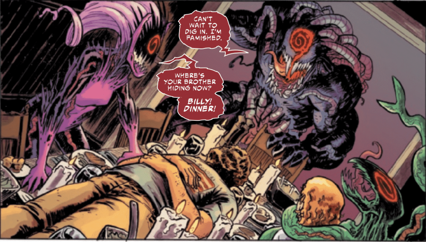
This scene also showcases some of the best artwork in the comic. On their own, the story beats are gruesome. Sadie’s symbiote-infected mom kills a neighbor, who innocently checks on the family when he hears screams. Later, after the parents chase Sadie and her brother for a while, Sadie stumbles into her mom, who has prepared dinner for the family. But the main course is the dead neighbor himself. The reveal feels like it’s ripped right out of a horror movie.
Level contrasts some normal dinner food (rolls, meat and vegetables) with the neighbor’s charred body. His face looks like that of a zombie or even a mummy but he’s only been dead for a few hours. The choice to show such a rapid decomposition makes Sadie’s infected mom seem even more powerful because she’s the one who killed the guy. Most disturbingly, the mom is in her human form but her dead smile, combined with letterer VC’s Travis Lantham red speech bubble, makes it clear that Sadie’s mom is long gone. Altogether, it’s a chilling sight.
In one of the more shocking reveals, Sadie’s mom shows her daughter what’s for dinner.McCleod Chapman and artist Brian Level don’t leave anything to the imagination. They show the parents and the newly-infected Billy dining on the neighbor’s corpse. Here, the perspective shifts; the reader sees the body from a new angle that hides its eyes and teeth. As a result, the corpse looks even more mummified and it’s even more disturbing to see Sadie’s dad practically drooling over the body. The small artistic touch of having lit candles surround it makes the scene feel like a gruesome ceremony.
Sadie’s family prepares to dine on the neighbor’s corpse.
As if that wasn’t ghastly enough, the creative team continues to ratchet up the horror. The symbiote-infected family holds Sadie captive while they say grace before the horrid meal. The trio prays to Knull, the god of the symbiotes, before Level shows them munching away on the neighbor’s flesh. Level zooms in on these shots and color artist Jordan Boyd’s usage of browns and oranges shows the body’s decomposition. The image of Sadie, who’s trapped by the symbiote tentacles, crying out of wide-open eyes, drives home the scene’s frightening tone. In an uncomfortable combination, the monsters ravenously pick away at the body while they hold a typical weekday dinner discussion. (The dad asks his son, “Anything exciting happen at school today, bud?”) Throughout the issue, the creative team masterfully inverts the reader’s expectations at every turn and that’s particularly evident in this scene.
More than any other panel, this shot feels like a callback to the “Texas Chainsaw Massacre” dinner scene.
Tie-in comics for major events usually don’t fall in the “can’t miss” category. Most of the time, they don’t feature significant characters or meaningfully progress the overall story. Two of those statements might apply to Absolute Carnage: Separation Anxiety. You won’t see Spider-Man or Venom here and the event is just starting to unfold. But anyone thinks about skipping this issue would miss the best horror comic of the year. If you’re a fan of Marvel or if you like scary stories, read Separation Anxiety. Just don’t do it before bed because it’ll make it impossible to fall asleep.
What’d you think of Absolute Carnage: Separation Anxiety #1? Do you want to see more tie-ins like this?
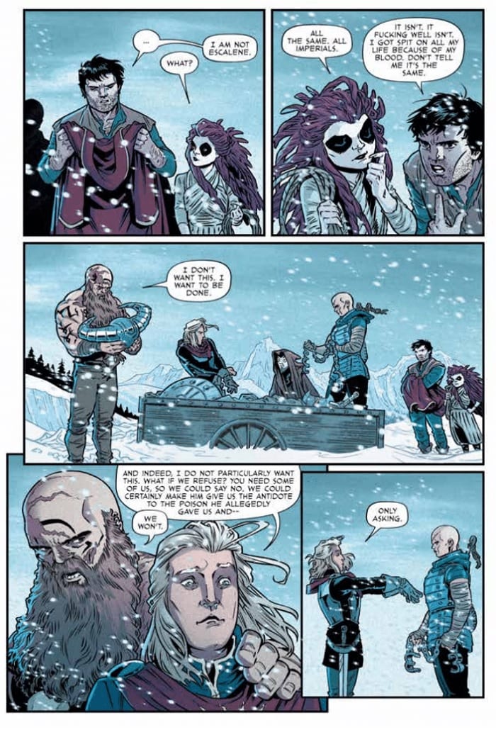
In Reaver #2, out this week from Image Comics, our merry band is deep in hostile territory, and are forced to set up camp due to the driving snows. They have a plan for how to travel safely without attracting unwanted attention. However, a simple fact that they don’t understand about Rael society makes that plan largely moot.
The Writing
While the first issue was largely exposition and setup, it feels much more like we’re in the story proper here. With Reaver #2, writer Justin Jordan engages readers by eschewing the backstory and introductions that occupied much of the first book. Instead, he keeps the reader’s attention focused on the action within the story.
We also get to learn a little more about the world itself in this issue. While our first chapter featured a lot of expository worldbuilding and backstory, it comes across more organically within the context of the story here. We learn a bit more about the Rael, for instance, through context within the narrative, not necessarily through exposition.
There is more action in Reaver #2, particularly in the book’s second half. The protagonists never really feel like they’re in danger, but it’s engaging and compelling nonetheless. There is some character development as well. It’s subtle, but several members of our party seem to show a greater sense depth and complexity compared to what was on display in our first issue.
That said, the sticking point here is the chemistry between characters. It’s clear that they don’t particularly like or care about one another beyond their utility as a party member. That said, characters—even ones who don’t like each other—still need to have some emotional reaction to one another. Here, it’s primarily kept to either mild annoyance or indifference. This complaint doesn’t apply universally to all the characters’ interactions, though, and it’s not nearly enough to be a major problem. In all, the writing improves over the first issue in just about every area.
The Artwork
One of artist Rebekah Isaacs’s greatest assets in our first book was the rich level of detail with which she brought the story to life. With Reaver #2, much of the issue takes place against the backdrop of a snow-covered environment. As a result, the artwork doesn’t get as much time to shine as before.
Fortunately, her character designs are quality work, allowing for expressive visual storytelling. We see the cockiness or fear in individuals’ eyes and body languages, making them feel like more rounded, fleshed-out characters. The images flow well, hitting the story beats and providing legible and engaging action sequences. It’s a very utilitarian, meat-and-potatoes style of illustration. While the style Isaacs employs in Reaver #2 doesn’t take a lot of chances, it does its job well.
Again, given the snowy environs, colorist Alex Guimarães doesn’t have as much opportunity to explore his palette. When the chance presents itself, though, Guimarães is more than happy to take it, cutting through with eye-catching and bold colors that break up the somber whites and blues.
Final Thoughts
It didn’t introduce the story, but Reaver #2 sets a positive trajectory for the new series, helping it stand out from the fantasy-by-way-of-Suicide-Squad setup. Find it this week at your local comic book shop.
Joseph Hellar’s satirical novel Catch-22 is regarded as a literary classic and one of the best war novels ever published. It is also a sprawling piece of work that is difficult to adapt. Hulu has attempted to adapt the novel to the small screen with a number of talented people attached to the series.
Catch-22 focuses on the 256th US Army Air Squadron based in Italy in 1944. One of the bombardiers, John Yossarian (Christopher Abbott), is desperate to get out of the war, especially when Colonel Cathcart (Kyle Chandler) keeps rising the mission quota. As the war progresses Yossarian loses more and more friends, which put a strain on his mental state.
Catch-22 was told in a non-linear fashion where it jumped to and from different events. The writers of the season, Luke Davies and David Michôd, set out to tell the story in a more traditional, linear fashion. It goes from Yossarian and his fellow crewmen training to Yossarian having a mental breakdown by the end. As a straighten version of Catch-22 the series works, especially for people who are unfamiliar with the novel.
Due to the series going for a linear style it does straighten out the character arc for Yossarian. At the beginning of the series, he is a selfish asshole who looked for any way out of the war with a ‘to hell with anyone else’ attitude. By the end, Yossarian becomes a more sympathetic character because of the mental stress he was placed under. He did have a level of morality to him as exhibited when he casts a caring eye over an Italian teen (Viola Pizzetti) and being repulsed by Aarfy’s (Rafi Gavron) actions in Episode Five. Events early on in the series come back to bite Yossarian on the ass later on. Abbott perfectly plays the selfish asshole and the man cracking under the pressure.
Catch-22 was famously a satire on the US military and bureaucracy. The series keeps this in tack and due to the involvement of George Clooney and his creative partner Grant Heslov they ensured the series had a Coen Brothers-esque style to it. There were hilarious verbal exchanges from the outset like when Cleverly (Pico Alexander) gave advice to a superior officer, Scheisskopf (Clooney) advise on how to conduct the military parades. Throughout the series, there are satirical swipes against the military that could be applied to today like Milo’s (Daniel David Stewart) war profiteering and Cathcart takes pride in the destruction of Italian cities. It is a show that embraces absurdities like when one character gets a big promotion just because it’s quicker than to correct a mistake and Yossarian getting punished with a bravery medal.
The series also has somber moments because of the death and loss. Catch-22 builds on the friendships Yossarian has made during the series. They felt genuine, especially Yossarian’s friendship with Nately (Austin Stowell), so it hurts all the more when someone dies. It contributes to Yossarian’s eventual breakdown because all the people he knows either die or are sent away, leaving him trapped in an endless loop of bombing missions. It is a show that is willing to show or at least alludes to darker aspects of war. Catch-22 is able to walk the fine line of comedy and tragedy without being tonally jagging. At times Catch-22 shows that comedy and tragedy are able to merge, like at the end of episode three where the airmen play around with a German fighter and the sixth episode starting as a comedy before going into heavier territory.
Catch-22 does have an excellent cast who perfectly played their characters. Stewart as Milo was a great find to play the wheeling-dealing Milo, who ends up operating a trade network across Europe and North Africa. Chandler and Kevin J. O’Conner made for effective villains, one a colonel who is looking for his own glory, so plays with the lives of his men and his deputy who is a clever but weaselly man. Clooney had been effective at playing buffoonish yet vindictive commander who rapidly rises through the ranks. The whole show is an indictment of the American officer core who get the rewards whilst their men pay for it.
Paramount Television and Hulu clearly spent a lot of money on the show. As well as having a casting of talented actors the show was filmed on location in Italy, where it got to show off the beauty of the Italian countryside. There was also a great deal of care for the military gear, especially the CGI for the bombing missions as planes have to go through a barrage of flak.
Catch-22 was considered an unfilmable novel, but the team who made the miniseries gave it a damn good try and were able to make an effective and entertaining
Jamie Jones’ The Baboon: The Mustelid Menace is now available to the public following its successful Kickstarter campaign, and it’s the perfect, action-packed comic for fans of Saturday morning adventure cartoons like Johnny Quest.
The graphic novel is written and illustrated entirely by Jones, whose previous work includes Kicking Ice, A Constant Distraction, and his own anthology comic The Whisper. The Baboon is Jones’ first comic as a full blown cartoonist.
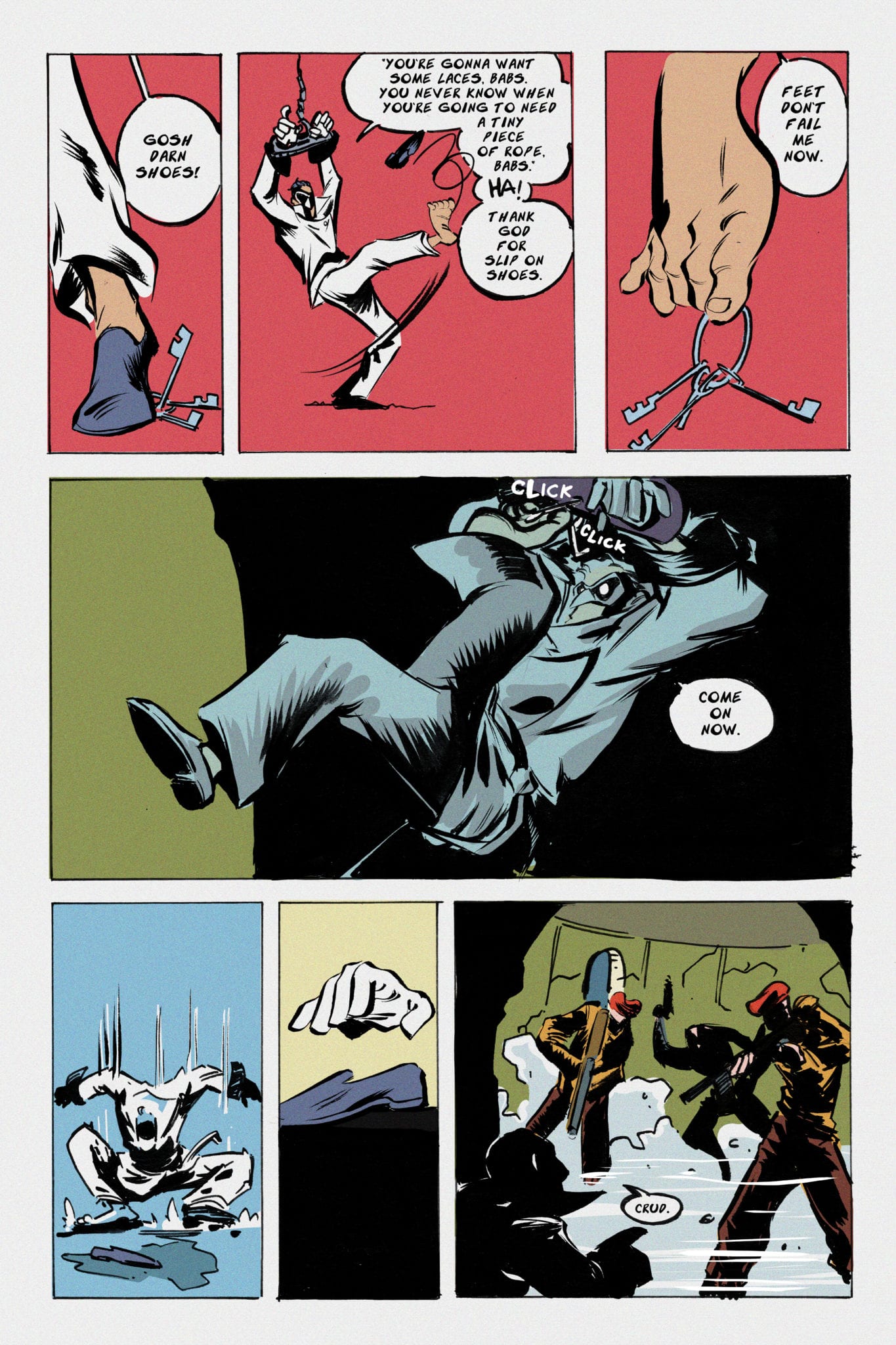
Barton Marlow is the Baboon, a swashbuckling adventurer “who will stop at nothing to defend the world from the greatest evils known to man.” In “The Mustelid Menace”, Babs and his crew travel to a dark and dangerous castle to retrieve the mysterious Jackal formula from the nefarious Professor Weezal.
Jones created The Baboon as an homage to classic Hanna-Barbera adventure cartoons, and he 100% captures the spirit of those shows in this comic. You can almost hear the booming voice of a narrator as you’re reading: “Will the Baboon make it out of Castle Mustelid in one piece? What plans does Professor Weezal have with the Jackal formula? Find out next week, same time, same channel!” But then you’re overjoyed because you don’t have to wait until next week; you just have to turn the page.
This is a FUN comic. It’s got the snap, crackle, and pop of a sugary cereal that you should be eating while you read it. It’s got enough action, excitement, and humor to fill your tank and keep you reading; you’ll knock this bad boy out in a single sitting and immediately start it over again.
Jones’ art is The Baboon’s greatest strength. His cartoony style is big and exaggerated. It’s got tons of energy and motion that really helps sell the action sequences. The colors are vibrant and striking; Jones uses a lot of solid colors and switches them up often for emphasis. There’s a unique and special quality to the art. The cartoonist definitely wears his influences on his sleeve (Jones is a big fan of Eric Powell, and you can see that in this work), but at the same time it looks like nothing else on the market.
A card-carrying cartoonist can tell a story with his or her art alone. You should be able to take the dialogue and still follow the story and feel what the artist wants you to feel. Jones has already mastered that skill. The setting perfectly establishes the tone and atmosphere by itself. Castle Mustelid is a dark and gloomy place where danger lurks around every corner. Turn to any page and you feel that in your gut. It generates this feeling of suspense. Then, Jones delivers the emotion in the characters’ faces. You feel what they feel: the excitement, the fear, and the love.
And on that note, if the art is the number one reason to pick up The Baboon, then the characters are number two. The story is a pretty simple and straightforward adventure, but it has a ton of heart and soul courtesy of this cast. The Baboon crew feels like a real family. Their love for one another is palpable, but they also bicker and argue in a relatable way. Their relationship feels authentic. Each one of them has their own voice and personality, but perhaps the standout crew member, other than the Baboon himself, is Babs’ sidekick Monkey Bones. The young boy’s sense of wonder and enthusiasm is so earnest that you immediately connect with him as a reader. Chances are, if you’re seeking out self-published adventure comics, you’ll see yourself in Monkey Bones. He’s a reminder of why we love comics and adventure stories in the first place. Plus, come on, “Monkey Bones” is a pretty badass codename for a preteen sidekick.
Jamie Jones came out swinging with his first full comic as a cartoonist. The Baboon: The Mustelid Menace is an all-around good time that you can enjoy on your own or share with your kids, and we don’t get too many of those all-ages comics these days. Cartoonist Kayfabe co-host and X-Men: Grand Design writer/artist Ed Piskor says Jones has “got [cartooning] figured it out already” — see why for yourself.
For eight days in South Florida, in the middle of the hottest period of the year, festival promotors Igor Shteyrenberg and Marc Ferman find a way to pack Savor Cinema in Ft. Lauderdale for their Popcorn Frights Horror Film Festival. I’m not saying the air conditioning, and cold drinks are the reason, but it helps. The real reason this festival is bigger and better than ever, now in its fifth year, is due to the selection of great independent horror films.
In total, 27 films, from five minutes long to hours long, play throughout the festival. Like an old, mighty oak with the hanging corpse of a witch, the festival first digs deep roots and over five years, those roots have grown down into the limestone foundation of Florida. To nurture those roots, the festival features a series of short films in a program called Homegrown. Each of the filmmakers calls Florida home, and the block of screen time is dedicated to their talents. And boy, does Florida have some incredible filmmakers.
What did Florida have to offer this year?
Call For A Good Time
Talk about doing a lot with a little. The entire film takes place in a bathroom stall with one terrified pothead and a human (presumably) covered in black oatmeal (?). Great sound, editing, and acting bring it all together into one terrifying little package.
Always Listening
A growing paranoia stems from the reality of our modern world. Our phones, TVs, cars, even some refrigerators have voice activation, which means that they’re “always listening.” It’s creepy. And this movie says, “Oh yeah, what if it’s even worse than we think?”
Fever
Amy Hoerler (The Last Movie Star) stars in this film about a girl lying sick in bed and her sweet mother trying to make her feel better. However, there’s more to this fever, as the girl explains. But typical of adults, they don’t believe until it’s too late.
The Final Girl Returns
A driver races away from an unseen horrific act of violence. He tries to get help, but the scene is clean. Day after day, the driver picks up a “Final Girl” who survived some unseen horror film. However, even the final girl sees her last day. Is The Driver the killer? Perhaps. Are they trapped in a loop of horror movie tropes? Seems like it. Does a dude with a machete and wearing a deer skull mask face off against a guy with a samurai sword? F yes.
Valerio’s Day Out
Art house horror at its finest, or is it a misunderstood documentary? It’s a collection of footage, one set of a jaguar at a zoo, the other of news clips about an escaped jaguar. Slickly edited, the unsettling yet somehow cute voice of the jaguar narrates what happened the day the powerful creature was free to be itself. It’s a night of murder worthy of any slasher film.
A Doll For Edgar
In the era of pop culture, dolls are a figurehead, unlike any other. From Funko Pop to Annabelle, we love little versions of ourselves. In this film by Anthony Dones, Edgar’s step-dad doesn’t like the little human under his care called Edgar. The little boy just wants to play with his Spider-Man doll but gets a macabre gift from his step-father instead. However, the dad’s plans to torment Edgar with this new doll don’t turn out as planned.
The Limits
A masked rider named Caden goes on a deadly mission to rescue a woman in a post-apocalyptic world. Like watching an unknown player demolishing a level, Caden makes his way down a road of torches while tearing through minions. Reaching the limits of the path, Caden faces a dangerous nemesis, a sci-fi cult, orbital strikes, and finds the girl, but there’s a twist and a turn. The Limits feature some impressive action and gorgeous scenery on a shoe-string budget.
The Spirit #1
The film begins moving backward through a hallway and the message: “There’s a ghost in this hallway. Can you see it?” From the quiet, ominous start we meet three characters staying in a vacation home somewhere in the New England area. The lone woman in the bunch warns of the ghost in the hallway. An investigation of the house begins and doesn’t end well when finally see that mysterious hallway ghost.
Lois Lane #2 from DC Comics showcases the lead character’s brilliant journalistic prowess, and proves she can hold her own in a world filled with superheroes and mysteries.
As big as a DC staple as Lois Lane is, she has hardly had her journalism side in the forefront of her character in any stand-alone series, or when featured in others. If/when she is around others, they dampen her abilities, or just have her as “Superman’s Girlfriend.” Much like the 1958’s Superman’s Girlfriend, Lois Lane, which had Lois using her skill to a degree but never for a long winded story, or how DC would place her constantly in Superman’s shadow and have her rely on the Man of Steel. Luckily that has changed with DC’s Lois Lane (2019), by writer Greg Rucka, artist Mike Perkins, colorist Paul Mounts, and lettere Simon Bowland.
We open our second issue with multiple talk shows blasting Lois, not on her comments in the previous issues, but on more scandalous matters: her relationship between Clark and Superman. Because what is news now other than entertainment and drama? Greg Rucka brings this up often in Lois Lane with passerby’s constantly calling her “slut” and the like while in earshot of Superman. This happened in the previous issue but is brought up again. The nice farm boy that he calls himself, Clark asks Lois just how she deals with the constant bombardment of her being a woman and what others say. Easily: she tunes it out.
Through the issue, we join Lois as she dives deeper into the mysteries of the previous installment with the ‘suicide’ of Mariska. As Lois’ muscle woman, and backup is Renee Montoya (The Question). One of the best parts aside from the slow burn of a plot is Lois’ interaction between her and her own cast of side characters. With appearances from Perry White, who constantly fixes her grammar (a great call back to the days of yore), and her interactions with The Question. When Lois and The Question are together it makes you question why they have never teamed up before! It just makes perfect sense and they play off of each other perfectly.
When Rucka writes Lois and Clark together, it feels different than any other comic recently has portrayed. With the duo acting like an adult couple (even though they are ‘separate’) and talking through their problems, our just how they respect each other while believing greatly in another. This is one of the best representations of the duo seen in years making them seem more human and not just forced together because that’s how it’s supposed to be. The investigative vibes from Rucka’s plot and dialogue wouldn’t flow if it wasn’t for the art courtesy of Mike Perkins and colors of Paul Mounts.
Perkins art has a great noir vibe throughout that feels gritty and grimy, but when there are moments of clarity the pencils come off quite lively. With the backgrounds mattering a great deal in some panels and pages Perkins paints a clear picture of what’s going on, while also hiding some moments. This sense of clarity flows into the few fight scenes looking fluid and easy to follow, but when characters faces become the focus in some panels and dialogue moments we lose said clarity. In some cases the faces look as if they were drawn correctly but then photo scanned on itself and shifted to the side, or their eyes and features are small compared to the whole face.
These faces happen enough that they stand out compared to other aspects of the art which otherwise is married perfectly to the story. In a few instances the shadows on some characters faces seem off which cases this awkwardness to occur. Thus bringing us to our next point: Mounts colors.
A fair amount of Lois Lane #2 is during the day or in an enclosed location, so to match this we have dull and muted colors that work perfectly. The few times during the day when bright and sunny you can feel the beautiful weather as if you were in the page yourself. Mount does great work with helping set the mood with one rainy moment in Moscow running supreme, but in some occasions the shadows and coloring seem off on the faces.
Lois Lane #2 is a great continuation of the first issue with a fantastic look at Lois’ investigative ways, while showcasing how great of a character she is with her own side characters. Rucka helps Lois step out of Superman’s heavy shadow while emphasizing the best aspects of her character. Only falling short on some panels were faces are the focus. Lois Lane #2 shows how a character who in history has just been an armpiece can hold her own in a world filled with superheroes and mysteries.
If you aren’t reading Lois Lane, you need to be. And the Jimmy Olsen comic! Both Superman side characters have great maxi-series going on! Like the Man of Steel, get in your Supermobile and head over to your favorite Comic Shop!
Memorable Quote:“In addition to being a reporter — and currently our profession is as popular as Darksied — I’m a scheming harridan bent on seducing Superman.” – Lois Lane. Damn Lois, spitting some hard hitting facts huh?
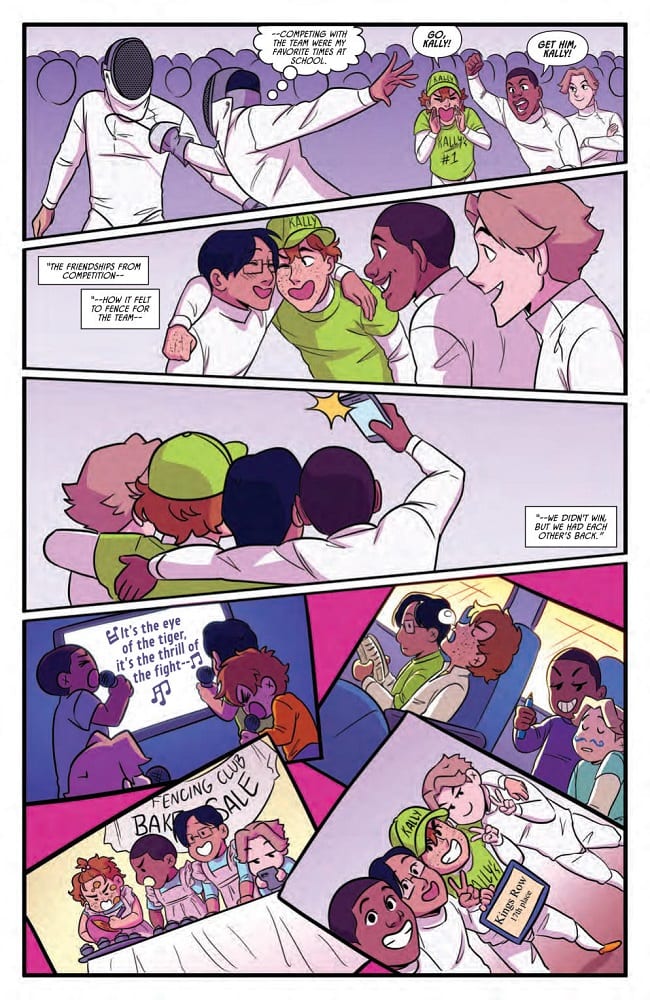
The initial run of Manga inspired, teenage sports drama Fence comes to a conclusion in volume 3 released by BOOM! Studios this week. Collecting the final four issues of the 12 issue run, Volume 3 reaches an epic climax where everything is on the line for Nicholas, the central character.
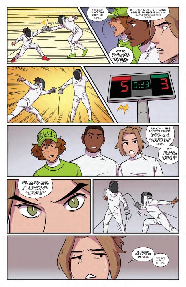
Originally released at the later end of last year, Fence issues 9-12 continues, and in some way concludes, the story of Nicholas and Seiji’s rivalry as they fight to get into the Kings Row Fencing Team. For Seiji it is an easy walk into the final three but for Nicholas he has to battle every step. As the momentum of the story picks up pace, and with tensions running high, a showdown between the two rivals becomes the central point of the story, and this final collection.
Fence was originally planned as a 12 issue run and the story comes to a satisfactory conclusion in this volume however, there are plenty of narrative threads and budding relationships still to be explored. It is therefore not surprising that C.S. Pacat has announced that this is not the end of Fence. There is a Young Adult novel in the works and the potential for the series to continue as a run of graphic novels.
Fence Volume 3 Cover Credit: BOOM! Studios
Bringing Fence Full Circle
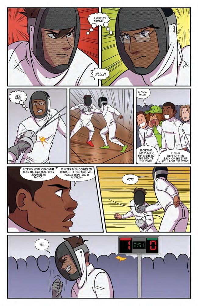
Despite the potential for continuation, Pacat treats these final few issues as if the series is coming to an end. She winds up the story reflecting back on the very first issue. The rivalry between Nicholas and Seiji, the backbone for the entire run, reaches its zenith in these pages and the reader is treated to an epic confrontation.
However, the story wasn’t about Nicholas winning and being the ‘champion of the world’, just like Rocky in the original movie, Fence is a story about striving to be the best that an individual can be. It is about realising what is important and building friendships/relationships along the way. Pacat shows that Nicholas has worked up from nothing to fence with some of the best fencers in the world and she makes sure that his triumph is illustrated in the story.
By the end of this volume the reader can see just how far Nicholas, and in some respects Seiji, have come from their 2 dimensional beginnings in issue 1. They started as stereotypes and have grown as characters to be a complex mix of emotions and experiences. This form of storytelling is central to sports dramas, especially the widely popular Manga Sports series, and it is therefore no surprise that Fence has garnered a following.
Pacat has created a beautiful coming of age drama. The sport allows the drama to be drawn out, giving the characters a reason to fight or support each other. Budding relationships spring out of their shared problems but hearts are also broken. Fence focuses on the two central characters but Pacat has populated the comic with a large array of characters for the readers to fall in love with. If you want readers to come back month after month, give them someone to relate to, to follow. Pacat definitely understands this and fills her story with a diverse cast so that there will always be someone for the reader to identify with.
Fence Volume 3 Credit: BOOM! Studios
Artistic Tension
To reflect the mix of high drama and schoolboy shenanigans, Johanna the Mad draws inspiration from Sports Manga art styles. There is a frivolity to some of the panels and pages which lightens the mood after tense fencing bouts. Johanna the Mad uses neat, simple line work which often gives the characters a newspaper comic strip look allowing the relaxed humour of the new friends to shine through. However, she is also able to turn this around so that the minimalistic style heightens the drama of a fencing match or argument between characters.
A lack of background detail, mixed with the all-white fencing uniforms, hones the storytelling and focuses the reader’s attention on one specific moment. Background characters become faceless sketches as the emphasis is drawn towards the cast members that Pacat and Johanna the Mad want you to focus on.
Johanna the Mad has a wonderful talent of switching between the simplified, comical figure work and more detailed, emotional acting for the characters. This makes the narrative skip along at a comfortable pace, breaking up the moments with humour and allowing the reader to share in every aspect of these characters lives. The comic is about the growing relationships between the fencers and the art work represents all aspects of these relationships: the conflicts and the camaraderie.
Fence Volume 3 Credit: BOOM! Studios
Due to the nature of the artwork, the coloring exists manly for emotional emphasis. Joana Lafuente uses block background colours, simplifying the panels and drawing attention directly to the foreground so as not to detract away from the narrative punches. What becomes clear in this collection is that Lafuente is skilled at expressing emotion and character via signifying colors and a minimalistic use of these colors. The constant changing colours from one panel to the next highlights the difference between the characters and their emotional states at any given point. The inked lines lead the narrative action but the colors express the emotional experiences.
Jim Campbell does a wonderful job with the lettering, taking a lot of exposition and making it almost invisible over the art work. One of unique elements of this comic is the use of thought balloons, a technique that is sorely lacking from comics today, having mostly been replaced by caption boxes. Nicholas is a very thoughtful character, constantly doubting himself and overthinking situations and Campbell illustrates this with the thought balloons that surround the fencer.
Fence Volume 3 Credit: BOOM! Studios
The End?
Fence is enjoyable and has been an entertaining read from day one. It allows itself to be high drama and juvenile humour but makes no judgement on either, accepting that many states of being are allowed at the same time. The characters Pacat has created are growing into adults and they are riddled with all the emotions and insecurities that all teenagers the world over have to contend with. Fence says that it is okay to have these conflicting feelings and helps the reader to work through them with the characters.
The depiction of Fencing has been a joy to read, especially as it has acted as a reflection of the character’s development and not just an excuse for sporting action sequences. This third volume is a perfect end to the first part of the story and a wonderful springboard for future stories. It is also a very easy book to pick up and read, even if you haven’t read any of the previous volumes. There is an instant connection made between the central characters and the reader so that you immediately feel at home no matter where in the story you start.
Obviously, Fence is aimed more towards the teen market. The coming of age story-line is more often identifiable for a younger audience. However, it is also a lot of fun and the artwork is impressive. This comic would suit fans of sport comics in general, especially those who enjoy Manga, but it is also fun escapism for anyone who wants to indulge themselves in some high school drama.
Fence Volume 3 feels like a conclusion in some ways but also a starting point. There is a definite sense that this is merely the End of the Beginning.
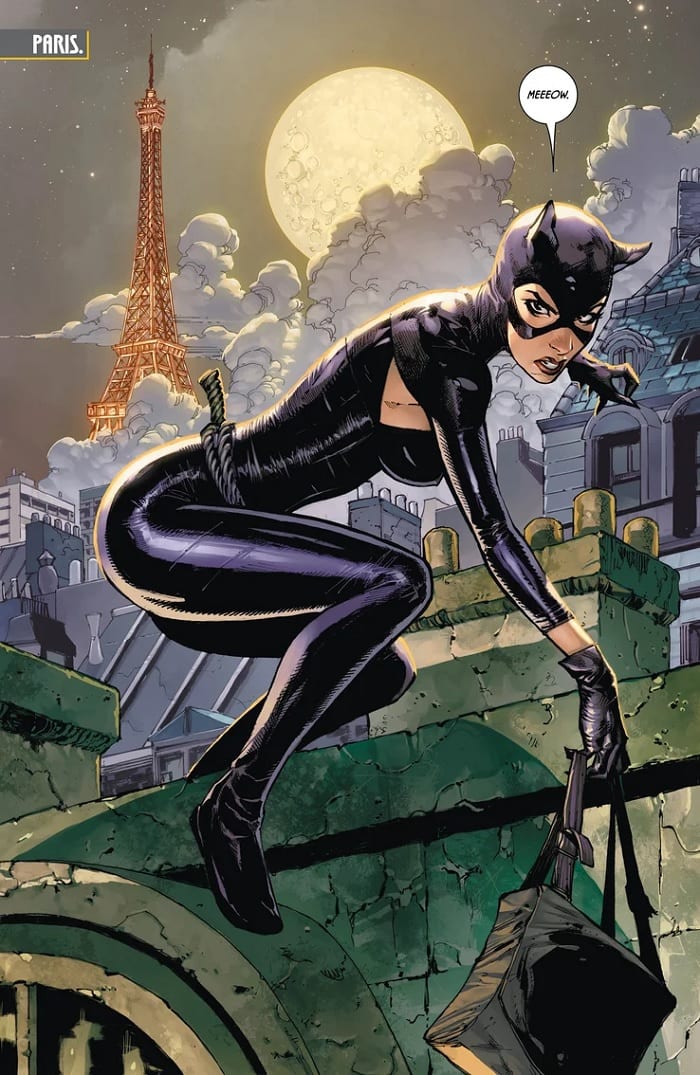
Gotham remains “The City of Bane” in Batman #76. The streets are firmly under the mastermind’s control, thanks to the political cover provided by the Luthor administration.
Gotham Girl patrols the city limits, ensuring all superheroes stay out, while Thomas Wayne rounds up the villains within who resist Bane’s control. Meanwhile, Catwoman is in Paris and working as an art thief-for-hire, nursing a battered and unconscious Bruce Wayne.
The Writing
Bruce Wayne is out of the picture. Bane commands Gotham, enslaving the villains and exiling the heroes. Writer Tom King gleefully dashes even the momentary glimpses of hope again the wall, as if to say, “No. There is no hope.”
Gotham Girl easily overpowers Captain Atom, taunting him while beating him senseless. She demonstrates just how much of a formidable—and dangerous—force she’s become. For his part, Captain Atom bemoans the exchange of justice for security and stability. “Gotham’s peaceful. That’s all they care about,” he says. “Not who’s running it or how. Not the bad being done in there.”
Inadequacy and failure are dominant themes here. We see multiple characters confront their own weaknesses when presented with the situation at hand. Kite Man, Captain Atom, even Damian Wayne…all find themselves grasping for something to cling to, whether that manifests as incredulity, despair, or stubborn frustration. Ultimately, though, they are all forced to reckon with their own complete powerlessness and inability to act in Batman #76. It’s an interesting avenue to explore from a character perspective, though King comes close to overplaying his hand in conducting this theme. This is most apparent with Kite Man’s narrative; King offers a glimmer of hope, only to make the twist of the knife that much more punishing.
It is, for lack for a better term…a bummer. That’s not to say it isn’t damned compelling, though.
Our story approaches the nadir of the narrative with Batman #76. We’ve seen Bruce Wayne battle back and overcome the odds time and again, but those odds are stacked heavily against him here. It’s difficult to imagine what King has in store, but given his take on the story thus far, one has to imagine there are a few more twists coming.
The Artwork
Tony S. Daniel is back on art duties for Batman #76, aided by inks courtesy of Sandu Florea. Following on our last issue, Daniel turns in more quality work here, right from page one. The book opens on an impressive full-page illustration of Selina, before immediately cutting to the showdown between Gotham Girl and Captain Atom. The work conveys the tension of the story well, providing dynamic action and that flows nicely from panel to panel.
He doesn’t delve deep into experimental techniques or abstraction. That said, he employs repetition with variation at multiple points in the book, each successive panel focusing in on the subject to heighten the tension. It’s an effect that can easily become cloying and obnoxious if used improperly. Here, though, the trick works nicely.
Daniel and King have great chemistry as a creative team. The artist expertly nails the story beats in Batman #76, forming a full and cohesive final product.
As with our last issue, Tomeu Morey’s colors are vibrant and eye-catching. They’re warm, but have an edge of grit to them, which works well tonally for the book.
Final Thoughts
Batman #76 is another quality entry in the City of Bane arc. The tension continues to build for the conclusion of King’s epic run on the series. Pick it up now at your local comic book shop.