

In Reaver #2, out this week from Image Comics, our merry band is deep in hostile territory, and are forced to set up camp due to the driving snows. They have a plan for how to travel safely without attracting unwanted attention. However, a simple fact that they don’t understand about Rael society makes that plan largely moot.
The Writing
While the first issue was largely exposition and setup, it feels much more like we’re in the story proper here. With Reaver #2, writer Justin Jordan engages readers by eschewing the backstory and introductions that occupied much of the first book. Instead, he keeps the reader’s attention focused on the action within the story.
We also get to learn a little more about the world itself in this issue. While our first chapter featured a lot of expository worldbuilding and backstory, it comes across more organically within the context of the story here. We learn a bit more about the Rael, for instance, through context within the narrative, not necessarily through exposition.
There is more action in Reaver #2, particularly in the book’s second half. The protagonists never really feel like they’re in danger, but it’s engaging and compelling nonetheless. There is some character development as well. It’s subtle, but several members of our party seem to show a greater sense depth and complexity compared to what was on display in our first issue.
That said, the sticking point here is the chemistry between characters. It’s clear that they don’t particularly like or care about one another beyond their utility as a party member. That said, characters—even ones who don’t like each other—still need to have some emotional reaction to one another. Here, it’s primarily kept to either mild annoyance or indifference. This complaint doesn’t apply universally to all the characters’ interactions, though, and it’s not nearly enough to be a major problem. In all, the writing improves over the first issue in just about every area.


The Artwork
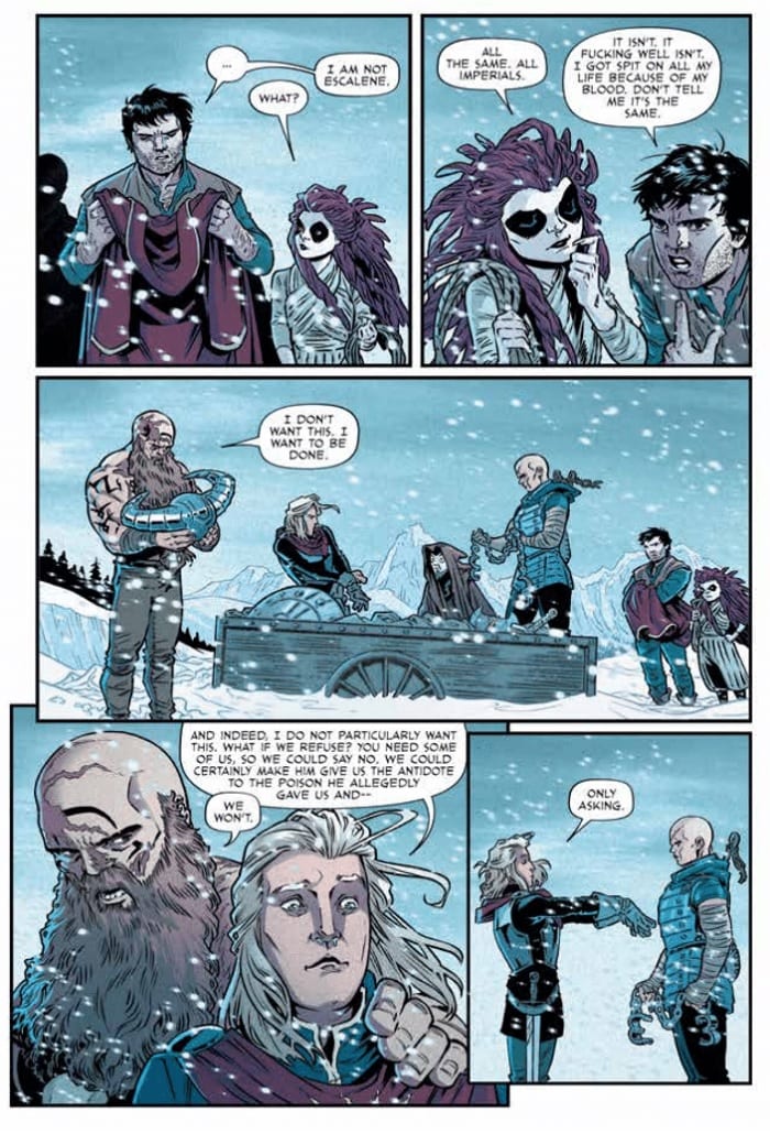
One of artist Rebekah Isaacs’s greatest assets in our first book was the rich level of detail with which she brought the story to life. With Reaver #2, much of the issue takes place against the backdrop of a snow-covered environment. As a result, the artwork doesn’t get as much time to shine as before.
Fortunately, her character designs are quality work, allowing for expressive visual storytelling. We see the cockiness or fear in individuals’ eyes and body languages, making them feel like more rounded, fleshed-out characters. The images flow well, hitting the story beats and providing legible and engaging action sequences. It’s a very utilitarian, meat-and-potatoes style of illustration. While the style Isaacs employs in Reaver #2 doesn’t take a lot of chances, it does its job well.
Again, given the snowy environs, colorist Alex Guimarães doesn’t have as much opportunity to explore his palette. When the chance presents itself, though, Guimarães is more than happy to take it, cutting through with eye-catching and bold colors that break up the somber whites and blues.
Final Thoughts
It didn’t introduce the story, but Reaver #2 sets a positive trajectory for the new series, helping it stand out from the fantasy-by-way-of-Suicide-Squad setup. Find it this week at your local comic book shop.