Home Blog Page 367

Review: Cold-Blooded Murder in DETECTIVE COMICS #1018

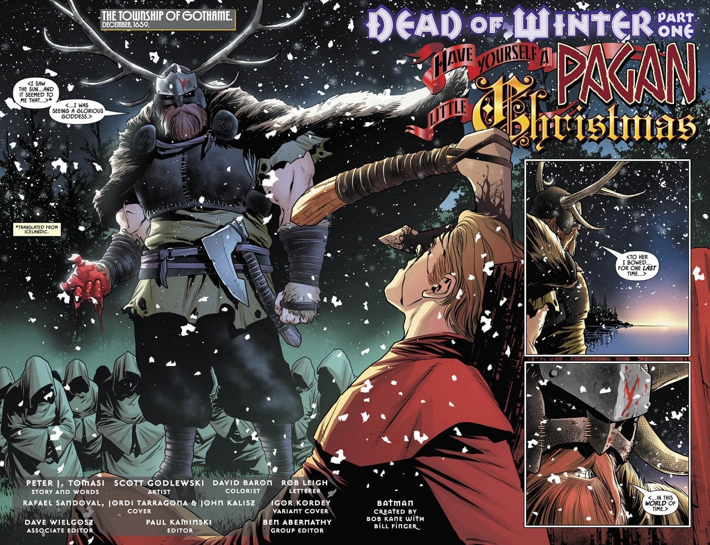
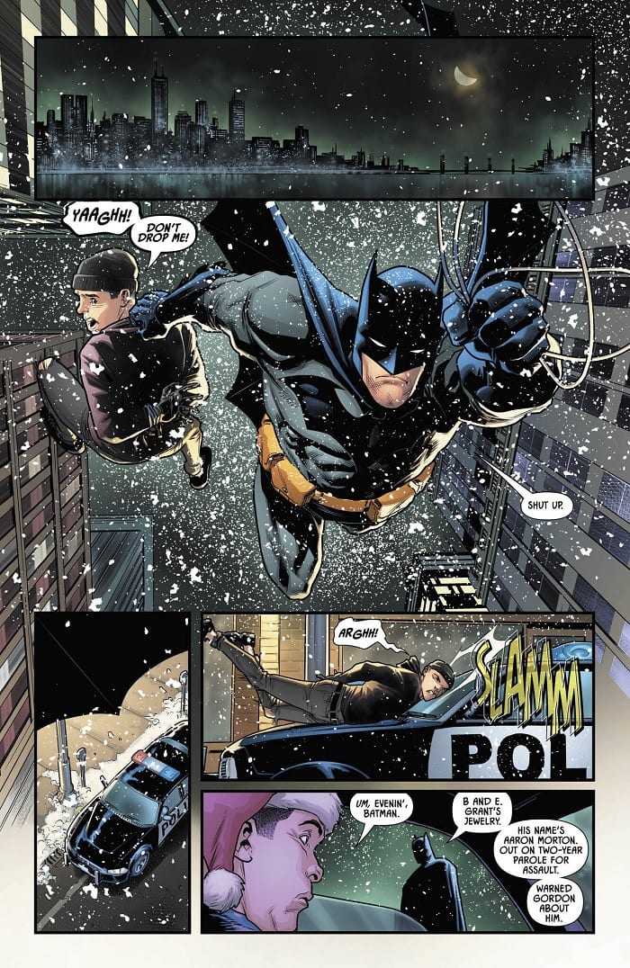
The holidays arrive in Gotham in Detective Comics #1018, out this week from DC Comics. But despite the festivities, the discovery of a brutal, ritualistic mass murder means the city is set to have anything but a silent night.

It’s up to Batman to crack the case before the next sacrifice takes place. However, the explanation may be even stranger than the crime.

Page #1

The Writing

The story’s setup catches the reader from the first page. The book seems to introduce us several hundred years before the modern day, suggesting Gotham was once just a tiny, pre-Christian viking outpost. This prologue serves to provide flavor for a story, though it’s significance doesn’t become clear until the book’s end.

Detective Comics #1018 is a well-paced story, keeping the reader locked into the action on the page. Truth be told, this may be some of Tomasi’s best work yet on the series. It’s especially a treat for readers who more enjoy the “detective” aspect of Batman’s persona, rather than the superheroics.

The tone and premise are reminiscent of the classic Batman graphic novel The Long Halloween in some regards. The storytelling here is less action-centric, with Tomasi opting instead for more of a stripped-down sleuth narrative. We see Batman is called to the scene of a macabre multiple homicide, but each twist in the story just raises more questions, heightening the tension and mystery.

This seems to be the first Detective Comics story to take place following the events of Batman #77. Bruce is alone in Wayne Manor, isolated as the snow falls. Although it’s not a dominant theme, we see Bruce wrestle with his loss and trauma, which lends pathos and added dimension to the story. It’s especially prescient that Detective Comics #1018 takes place during the holidays. This allows Tomasi to really highlight Bruce’s loneliness.

Page #2

Page #3

The Artwork

Artist Scott Godlewski provides illustrations for Detective Comics #1018. By and large, the artist does a great job of capturing the tone of story. Godlewski conveys the frosty, wintery atmosphere of the setting well, grounding us in the season. The level of detail employed in the backgrounds serves this effect, too, making the reader feel transported to Gotham.

One of the most notable elements at play is the expressiveness of the character designs. Godlewski leans slightly into a cartoonish style, but in doing so, lends the work a much more expressive feel.

The book has a sense of aesthetic cohesion, with the snow falling throughout, while the use of similar visual motifs in terms of layout helps as well. The visuals mesh well with the tone of the writing, giving the book a darker and shadowy, yet nonetheless vibrant look. Detective Comics #1018 is a visually-striking book, all things considered.

Of course, the colors from David Baron help to sell the immersion and dynamism. As usual, Baron’s work is on-point, with a dominant greenish hue contrasting against icy blues and stony grays. It’s moody and tone-appropriate.

Page #4

Final Thoughts

Detective Comics #1018 is a winner. It’s compelling and interesting visual storytelling with a notably darker edge to the narrative. This issue is definitely worth picking up.

Monkeys Fighting Robots Youtube

Exclusive Preview: QUANTUM & WOODY #1

Exclusive Preview: QUANTUM & WOODY #1

Quantum & Woody #1 hit your local comic book store on January 29, but thanks to Valiant Entertainment, Monkeys Fighting Robots has an exclusive four-page preview.

Quantum & Woody #1 is written by Christopher Hastings, with pencils & inks by Ryan Browne, Ruth Redmond handles colors, and you will read Hassan Otsmane-Elhaou letters.

The lines of sight used on page three are very well done, Browne talked with us about his philosophy as a visual storyteller and creating excitement with camera angles.

“I’m always aware of how shot selection affects the emotion/mood of the given panel. Simple stuff like a shot from below a figure makes them more imposing and a shot looking down on a character makes them look small and meek. Extreme close-ups to increase the intensity, tilted camera angles create a more dynamic and uneasy feeling for the viewer, and wide establishing shots are good to have at least once per page so the reader remembers where everyone is in relation to one another. I think about film a lot more than I think about comics with my storytelling and I think that shows,” said Browne.

About the issue:
Quantum & Woody — the worst superhero duo in the world — are Earth’s LAST hope against stopping a coalition of mad scientists from destroying the planet!

Quantum & Woody #1 has an FOC (final order cutoff) of January 6, so if you like what you see, bug your local comic book shop.

Monkeys Fighting Robots Youtube

Exclusive Marvel Comics Preview: AMAZING SPIDER-MAN #37

Exclusive Marvel Comics Preview: AMAZING SPIDER-MAN #37

Amazing Spider-Man #37 doesn’t hit your local comic book store until January 8, but thanks to Marvel Comics, Monkeys Fighting Robots has an exclusive three page-preview for you.

About the issue:
There are too many problems in New York City, and Spidey can’t be in four places at once– unless he CAN?! Peter’s life is as complicated as ever, but can science be the answer? It’s a new year, and the buildup to “Last Remains” and much more starts here.

Amazing Spider-Man #37 is written by Nick Spencer, with art by Ryan Ottley, Cliff Rathburn is the inker, Nathan Fairbairn worked on colors, and you will read Joe Caramagna’s letters. Ottley and Fairbairn created the cover, and Anthony Gambino was the designer on the issue.

Stan Lee and Steve Ditko created Spider-Man.

Monkeys Fighting Robots Youtube

Review: HAWKEYE: FREEFALL #1 Hits the Mark

Hawkeye: Freefall #1

Somebody’s wearing Clint’s clothes in Hawkeye: Freefall #1, out this week from Marvel Comics. No, not his hawkeye costume; rather, someone’s lurking in the New York underbelly in his old Ronin outfit. The titular archer has his hands full with trying to clear his name and save the day in this engaging new title.

Page 2

The Writing

The writing by Matthew Rosenberg is snappy and well-paced throughout Hawkeye: Freefall #1. We have Clint serving as a narrator to externalize his own internal monologue throughout the book. While this could easily grow dull and exposition-heavy, Rosenberg manages to avoid those pitfalls and keep the reader’s attention.

The book manages to engage the reader with a fun tone and well-pointed dialogue. Clint is likable and fresh, narrating the book with sarcasm and personable wit. Even for those who aren’t regular readers of the character, this book offers plenty of charm to win one over.

From a thematic standpoint, there is some light social commentary about wealth polarization and its relationship to criminal justice in Hawkeye: Freefall #1. The theme is well-keeled, delivering Rosenberg’s point while never feeling too heavy-handed. It’s always nice to see these themes appear, and specifically, to see them handled well.

Although this is a Hawkeye book, a few other familiar heroes turn up, too. While their presence doesn’t add too much to the story, they provide some good banter and back-and-forth with Clint. As the series progresses, it will be interesting to see how this group dynamic plays out.

Overall, Rosenberg’s work is very engaging. The final pages of the book provide enough of a hook to keep readers coming back for the next issue.

Page 3

Page 4The Artwork

Artist Otto Schmidt’s character designs in Hawkeye: Freefall #1 are sleek. They are simultaneously refined, yet just a little sketchy. The angular designs can make the work feel a little stiff at some points, but overall, the style works well alongside the action.

Speaking of dynamism, the page payouts vary widely throughout the book. It hits the story beats effectively, but can be a bit overwhelming at times. There are some points at which it’s not immediately clear where the artist want to focus the reader’s eye.

Schmidt is very selective about the level of detail employed in the book. The backgrounds feel more fleshed-out and grounded in the slower, quieter moments. He lets the environment fall away, though, during the more kinetic action sequences. The viewer’s attention is focused primarily on the characters, which works well for a story that tends to be so character-driven.

That said, many of the backgrounds throughout Hawkeye: Freefall #1 tend to be on the duller side. We have lots of gradient colors, with little actual scenery. While the coloring is admittedly skilled, it’s not the most exciting presentation. While it may sound a little contradictory regarding the above comments about the art feeling overwhelming at times, it would be nice to get a little more detail in the world of the book.

Page 5

Final Thoughts

Hawkeye: Freefall #1 is an intriguing new series. Fans of the character and newcomers alike should both find plenty here worth reading.

Monkeys Fighting Robots Youtube

Review: THE FLASH #85 Sees Preparation for the Battle against Cold

The Flash slows down to build characters

The Rogues have won. As the Legion of Doom has begun their assault on the world, newly empowered Rogues have taken Central City. The Flash Family is overcharged after the Death of the Speed Force arc, rendering them useless. Despite the valiant efforts of Commander Cold, most resistance has been crushed by Snart’s rule. This control continues for months until a surprising ally steps forward.

Led by Golden Glider, the other members of the Rogues have freed the Flash and his sidekicks. They now hide and prepare to defeat the frozen tyrant. Will Central City return to normal?

The Flash 85 cover

**Some Spoilers Below**

Story: 

As the grip of “King” Cold tightens, the Rogues continue to train the speedsters. With their powers out control, Kid Flash and Avery Rely on the training and power dampening collars to keep them under control. Barry, on the other hand, has been struggling to maintain control without it. Golden Glider comes out to talk to him, explaining how the Rogues have been in the same shoes as him.

 After a brief ice skating lesson, which helps understand how the speed force can be controlled, the teams come up with a new plan. To change the City back to normal, the speedsters and Rogues have to get the last pieces of Mirror Master’s Mirror.

The Flash 85 p1

So while this has some action, the highlight of this issue is the humanization of the Rogues. The Villainous team has always been fan favorites to their blue-collared, more grounded view on the world. When they joined the Legion of Doom, I was worried they threw away this outlook. But this issue proves that it continues to be their defining trait. By the end of this issue, readers will see more connections between the villains and Flash than ever, learning to cherish them more.

The only problem I have with this issue is that Captain Cold has wholly left his character behind. With the other villains, they have these moments of redemption that allow readers to connect to them and hope they become heroes. In this arc, Cold has done nothing to make us root for his change. It’s a bad sign when the man who set his family home on fire gets more sympathy than Leonard Snart. There’s no doubt that he’ll change back before the end, but right now, he’s insufferable.

The Flash 85 p2

Art:

Christian Duce continues to bring his best work to the Flash series. Every page is an imaginative and sometimes epic feast for the eyes. With every character design and every cool action piece, Duce gives us more grounded, emotional moments. One of the best looking moments doesn’t come from an action sequence but with the ice skating lesson between Flash and Golden Glider. It’s very smooth and emotional for the pair, and you can tell through not just the dialogue but the illustrations. Luis Guerrero takes this great work even further with masterful, vibrant colorwork. Together, these two continue to deliver the best looking arc the Flash series has had.

Flash 85 p3

Conclusion:

Overall, this issue does a fantastic job of setting up the final conflict against Cold. Not just in terms of action, but also giving us a slower chapter to attach to the characters. The Flash Series has always been known to have a more grounded set of villains, but by the end of this issue, you will hope they can get out of this fight on the right side of the law. As the weeks countdown for the end of this arc, it’s clear that this will go down as one of the more memorable issues in the current arc. With a promise of an action-packed battle to come, go pick up this issue today and see the preparations take place.


Monkeys Fighting Robots Youtube

Review: The Reign of Beasts in THE BUTCHER OF PARIS #2

“The Butcher of Paris” #2 is a more quiet and contemplative chapter than its predecessor. However, the successfully confident prose of writer Stephanie Phillips works in tandem with a consistently great art team to create another engrossing comic issue.

In Nazi occupied Paris, the death toll mounts, but the killer’s motive and whereabouts remain unknown. The investigation uncovers a name–a doctor, whose skill and expertise match that of the meticulous crimes. But is this doctor the sadistic killer operating in the shadows, or just another victim of the Gestapo?

Writing/Plot

Phillips approaches this issue with more of an investigative script than the first. There are discoveries, speculations and conversations abound here. This admittedly makes for a less exciting issue than the first. However, the dialogue among these characters is written with an immense attention to detail and character that this is still a highly engaging read. This is a chapter with the genre additions of crime procedural and political thriller tossed in. Different groups, namely the Gestapo and the French detective, have their own motives for stopping this serial killer. The struggle of a city under the occupation of a hostile force while also having to deal with a monstrous murderer is never lost. The tension feels like a pressure cooker with too many items on boil – and this is meant in the best way possible.

Art Direction

Once again artist Dean Kotz is on hand to deliver is easily identifiable atmospheric penciling to “Butcher of Paris.” His character drawings are distinct from one another and the facial expressions of individuals are believably natural. The beauty of comic art like this is how tonally perfect it is. It’s reminiscent of a French graphic novel of sorts in its artistic personality. An element that assists this is the washed watercolors of Jason Wordie that give the world life. The art makes for distinctly memorable sequences, such as a conversation in a morgue and the lush interior of a French cabaret. The art team does stellar work bringing this historical horror to life.

“The Butcher of Paris” #2 is a stirring issue that takes its time to increase the tension of the overall plot. Stephanie Phillips’ script is filled with fascinating and naturalistic conversations. Kotz and Wordie’s art brings a unique, almost European graphic novel style and atmosphere to the story that works brilliantly. The atmosphere continues to feel oppressive as the whereabouts of this monstrous butcher becomes more unclear. If you were a fan of the first, be sure to come back for this follow up at your local comic shop on 1/8.


Monkeys Fighting Robots Youtube

LOIS LANE #7, Another Brilliant Chapter in the LOIS LANE Series

Lois Lane #7, written by Greg Rucka, art by Mike Perkins, colors by Gabe Eltaeb and letters by Simon Bowland, is just another chapter in the awesomeness that is Lois Lane. Following the quiet and tempered previous issue, this issue sets up big things in small ways. Never overstepping their mark, this creative team holds back just enough to keep us wanting more.

Writing

Rucka manages to set a tone in the first panel of anything he’s writing. Where other dynamics feel forced, Lois Lane establishes a rapport among characters that shouldn’t work. Yet it does. Lois and the Question don’t seem to have significant ties beyond this series, but their chemistry works. But best of all, Ruck shows us how Lois sees Clark. Their quiet intensity and why they work so well is never clearer than in these pages. And while this issue ends on a cliffhanger, Rucka’s windup has been so gradual; the cliche feels earned.

Art

The art by Perkins feels like something out of a hardboiled detective story. A fitting tone for the woman behind the Planet’s great successes. But as mysterious as Perkins’ work may feel, it is also curiously personal. Rarely overdoing the action, Perkins continually comes back to the characters’ faces. The action is secondary to how it affects Lois or Renee. He is forever interested in the human element. He wants to give this story a face, even if The Question doesn’t have one…

Coloring

The colors by Eltaeb are downright manipulative, in the best way. Eltaeb establishes a lot of the dangerous scenes in bleak colors. When a peeping cameraman is found on a rooftop taking pictures of Lois, the scene is set at night. It’s blues and greys and whites that make each scene have an edge. But then Eltaeb lulls us into a sense of security. Lois’ room is bright; the colors are warm. It makes it twice as jarring when we realize that Lois and Renee might not be as safe as we’d hope.

Lettering

Bowland’s lettering is simple and to the point. It serves its purpose and doesn’t tend to push boundaries by being experimental. The clear and concise format that Bowland takes mirrors Lois’ no-nonsense attitude.

Lois Lane #7 is everything that you would want from a comic like this. The characters are familiar yet mysterious; the events have quiet builds to loud crescendos. This creative team is at their best, and the story their telling is full of intrigue. Pick up Lois Lane #7 at a local comic shop near you!

Monkeys Fighting Robots Youtube

ODD TALES FROM THE CURIO SHOP is a Fun Throwback to Indie Horror Comics

ODD TALES FROM THE CURIO SHOP is a Fun Throwback to Indie Horror Comics

My Kickstarter binge is at Mach 5 as of late. I participated in the recent Monkeys Fighting Robots fundraiser because, of course, I did. Another one I gave some money to and just recently got in the mail was Odd Tales From the Curio Shop from Rocket Ink Studios. The story focuses on the Shopkeeper, portrayed by Brian O’Halloran, who brought Dante to life in Kevin Smith’s Clerks, as well as Mallrats, Clerks 2, and the recent Clerks reboot.

The black & white graphic novel is written in the style of the old EC Comics like Tales From the Crypt and The Vault of Horror with O’Halloran drawn as the Shopkeeper. You, as the reader, are looking through the wares at his curio shop. Each time “you” motion towards an object, the Shopkeeper provides its back story.

(He wasn’t even–You know what? No. I’m not doing it.)

There are six stories with a prologue/introduction and an epilogue. Each tale either has a moral attached to it (think “Monkey’s Paw”) or has a twist at the end in true horror comic fashion. The stories range from that of a ghostly janitor to a graphic tale regarding the Spanish Inquisition. The Shopkeeper provides the prologue and epilogue to each, and a good time is had by all.

Story list:

“Shopkeeper’s Introductions”

Written/Penciled by Tony Miello

Inked by Mikey Babinski


“Family Connections”

Written by Bruce Gerlach

Penciled by Bill Maus

Inked by Mikey Babinski


“Unconditional”

Written by Kasey Pierce

Penciled/Inked by Jay Jacot


“The Box”

Written by Tony Miello

Penciled/Inked by John Marroquin


“The Birdhouse”

Written by Dan Daugherty

Penciled by Bruce Gerlach

Inked by Mike Babinski


“The Black Friar”

Written by Gary Reed

Penciled by Tony Miello

Inked by Mike Babinski


“Big Spoon”

Written by Dirk Manning

Penciled by Tony Miello

Inked by Mike Babinski


“Epilogue”

Written by Dirk Manning

Penciled by Tony Miello

Inked by Mikey Babinski

There are some issues with the book. There are typos, there are odd quotation marks in some of the word balloons, and a couple of the storylines fall a little flat. That being said, it’s a great read in the spirit of genuinely independent comic books. These are creators who are building on their craft and have produced something they can use to showcase their talent.

Hands down, the best art in the book belongs to Bill Maus & “Family Connections.” All the artists included in this edition are talented, but Maus has the combination of clean lines and a unique appearance that should have him working on a Big 2 book. Story-wise my favorite is “Unconditional” by Kasey Pierce, which takes a couple of reasonably familiar tropes, but makes them horrifying as a new tale.

(Someone should hire Bill Maus right now.)

Odd Tales from the Curio Shop is worth the money I paid for it, the measuring stick for art. I’ve read better comics, but for a Kickstarter project from a small publisher, it’s a fun read and worth the time. Plus, any time creativity and art can be funded and supported by the public, everyone wins.

Have you read Odd Tales from the Curio Shop? If so, let us know what you thought in the comments below!

Monkeys Fighting Robots Youtube

ACTION COMICS #1018 Treads Water to Set Up Big Things for Superman

Superman on cover of Action Comics

Action Comics #1018, written by Brian Michael Bendis, with pencils by John Romita Jr, inks by Klaus Janson, colors by Brad Anderson, and letters by David Sharpe, slows down the pace in order to set up big things in the coming months for Superman. While the issue itself is somewhat lackluster, you can be sure the next issues won’t be.

Writing

Bendis doesn’t offer up many “aha” moments in this chapter of his run with Superman. We see the origin of the Red Cloud. Ultimately, the answers are a little less interesting than the mystery. Though we get a glimpse at why Red Cloud has some anger issues, it happens at the expense of the believability of many of the other characters in her origin. Elsewhere, we see the Man of Steel prepping for the big reveal that happened in the latest Superman. And finally, we get another glimpse at the fight between justice and doom. Perhaps it’s DC that’s dragging their heels to get to the climax of their Year of the Villain, not ready to end their arc.

Art

The art by Romita Jr. and Janson delves into a “looser” style in this issue. We see the art that both of these artists have become known for. The etchings on the sides of faces, the lamp posts that look like quick sketches. The art becomes more noticeable with this style. We are more aware that these are drawings. This can have a dual effect. At times we are marveling at the beauty of the rendition of a character; at other times, it feels we’ve been drawn out of the story.

While much of Romita Jr. and Janson’s work leads to marveling, a few moments are noticeably confusing. When the Legion of Doom headquarters hovers over Superman, we lose all sense of perspective and size. Some fights scenes feel too cluttered to stand out. But in the end, Romita Jr. and Janson are making us keenly aware of the actual format that we are intaking this story. We get to admire these comics like we’re reading comics for the first time.

Coloring

Anderson’s coloring follows his themes in previous issues. We see reds and blues dominating a lot of the pages. Previously, I’d mentioned it felt like Superman was off his center, and Anderson’s coloring was showing his sense of identity was leaking out. Now that we’ve seen what happened in the latest Superman, the colors in the latter half of this issue have a more contained feel. It creates a sense of safety, as each color is bordered in completely. But with the final page, we see reds and blues streaking all over the place. The time of safety has passed.

Lettering

Sharpe gives this issue its pacing. During Red Cloud’s origin story, Sharpe’s placement of the speech bubbles provides us with a sense of fear and panic in everyone’s voices. We see people trying to interrupt each other, yet everyone is still speaking loud enough to be heard. Sharpe shows this by stacking the speech bubbles on top of one another while never overlapping. It’s also in the lettering we see Clark coming to terms with his recent decision. He speaks calmly and succinctly, even when met by panicked smaller bites in response.

Action Comics #1018 is an entertaining issue, but it acts more as a placeholder than anything else. It seems as though the creative team pulled back a little here as a wind up for the coming event. It’s worth the read, especially to know what might be coming in the near future. Pick up Action Comics #1018 at a local comic shop near you!

Monkeys Fighting Robots Youtube

JOKER/HARLEY: CRIMINAL SANITY #2- The Hunt is On

Ouch

Joker leaves another crime scene for Harley and the police to ponder over in Joker/Harley: Criminal Sanity #2, out this week from DC Black Label.

Cover
Cover

Creative Team

Kami Garcia writes this beautifully paced and haunting story, and presents it in a way almost opposite of anything similar. Generally when dealing with flashbacks to tell a story, the flashbacks will be done in black and white or a different style. This story uses color for the past and black and white for the present.

Mico Suayan is handling the black and white pages, and Mike Mayhew is drawing the colored flashbacks. Jason Badower is assisting as well, I’m assuming he’s the inker since the book does not specify.

Richard Starkings is the letterer and while there is not much action in this issue, the lettering is easy on the eyes. Any noises are small and slight to show the eerie silence and to highlight those footsteps approaching behind you.

Variant
Clown boy

Story

This could very well be my favorite book from the black label so far. Turning the Joker into a more realistic serial killer comparable to shows like Dexter and Hannibal, almost makes the Joker more terrifying. His desire for spectacle and attention usually steers him into the grasp of Batman over and over again, but just imagine if he wasn’t trying to get caught. Just imagine if the Joker was a predator camouflaged into society with everyone else.

With his intelligence and ability to out maneuver the Batman, a sneaky and stalking Joker sounds like someone who could go around killing for years and years without leaving one single shred of evidence that he didn’t want you to find.

I absolutely LOVE this book, and I don’t feel that way about many other books right now. Immortal Hulk, DIE, Saga (whenever it finally comes back), Gideon Falls, and anything Black Hammer are among my favorites, but I can’t get enough of everything in this book.

Ouch
What’s the time?

Comparisons

People have always been fascinated by the minds of serial killers and how they could possibly do the things that they do. I believe the fanaticism increased exponentially when the show Dexter came around. I have a Dexter portrait tattoo on my right rib-cage, just so you know where I’m coming from. Before that I don’t remember any other shows or movies that told the story from the killer’s point of view.

Dexter gave us stories of sociopathic killers playing games with each other and crime scenes that felt more like artwork. Then came Hannibal with some of the best tableau crime scenes I’ve ever seen. Joker/Harley: Criminal Sanity taps into that same methodical, artistic type of murderer that loves being admired.

Harley even teaches classes just like Will did in Hannibal. Hannibal was one of my favorite TV shows ever made so every comparison between the two is the highest of praises. I believe Hannibal suffered from being on Fridays at 9 pm when most people are going out and having fun. I still haven’t even watched the 3rd season because I don’t want it to really be over.

fatty candles
I’m melting

Hot for Killers?

If you love watching serial killer documentaries, Dexter, Hannibal, YOU on Netflix, this book is perfection for you. At first I wasn’t thrilled about all these new Joker stories coming out around the movie, but they have all been completely original in their own ways and extremely entertaining. Harleen, Joker: Killer Smile, and now Criminal Sanity are all stand alone stories that don’t feel like a DC money grab at any point, which is what I was afraid of.

These are all great stories with phenomenal artwork in each of them. I will admit I also hated that most of the Black Label books were magazine size. Now I’m thinking about thanking them for giving us larger pages to enjoy such beautiful work.

What did you thin of Joker/Harley: Criminal Sanity #2? Do you know of any similar movies or TV shows that may have preceded Dexter? Let us know in the comments below.

Monkeys Fighting Robots Youtube