Home Blog Page 363

A New Wave of Violence and Danger in LUCY CLAIRE: REDEMPTION #2

LUCY CLAIRE: REDEMPTION #2 out this Wednesday from Image Comics has upped the ante on the werewolf attacks. This bloody tale is full of past loss and regret and is already proving to be an emotionally compelling read.

Lucy Claire is not a woman to be intimidated, if this cover of Lucy Claire: Redemption #2 is anything to go by.

***SPOILER WARNING***

When you picture a werewolf hunter, what comes to mind? Odds are pretty good that you’re picturing anything and anyone besides Lucy Claire. She’s a retired and disgraced hunter, one who has let her past drown her since.

But time waits for no man (or woman). So when the werewolves are back in town, there isn’t enough time for Lucy Claire to get herself back to her top mode of fighting. No, there’s too much threat in the air for that.

Green werewolves…that’s new!

The Plot

Lucy Claire: Redemption #2 is an impressive feat of storytelling. Written by John Upchurch, this issue is surprisingly complex. It deals with emotional trauma in an intense yet respectful manner. And all while building the tension due to the rising danger.

There’s no doubt that Lucy Claire was born and bred to kill werewolves. The last issue made that much clear. But now we’re getting a better understanding of what that took – and how far she’s fallen since then.

Saying she’s fallen is putting it too simply. The emotional toll on Lucy Claire is a heavy one. The pain and trauma she’s still working through are evident on these pages – it’s inescapable and goes so far as to explain her behavior.

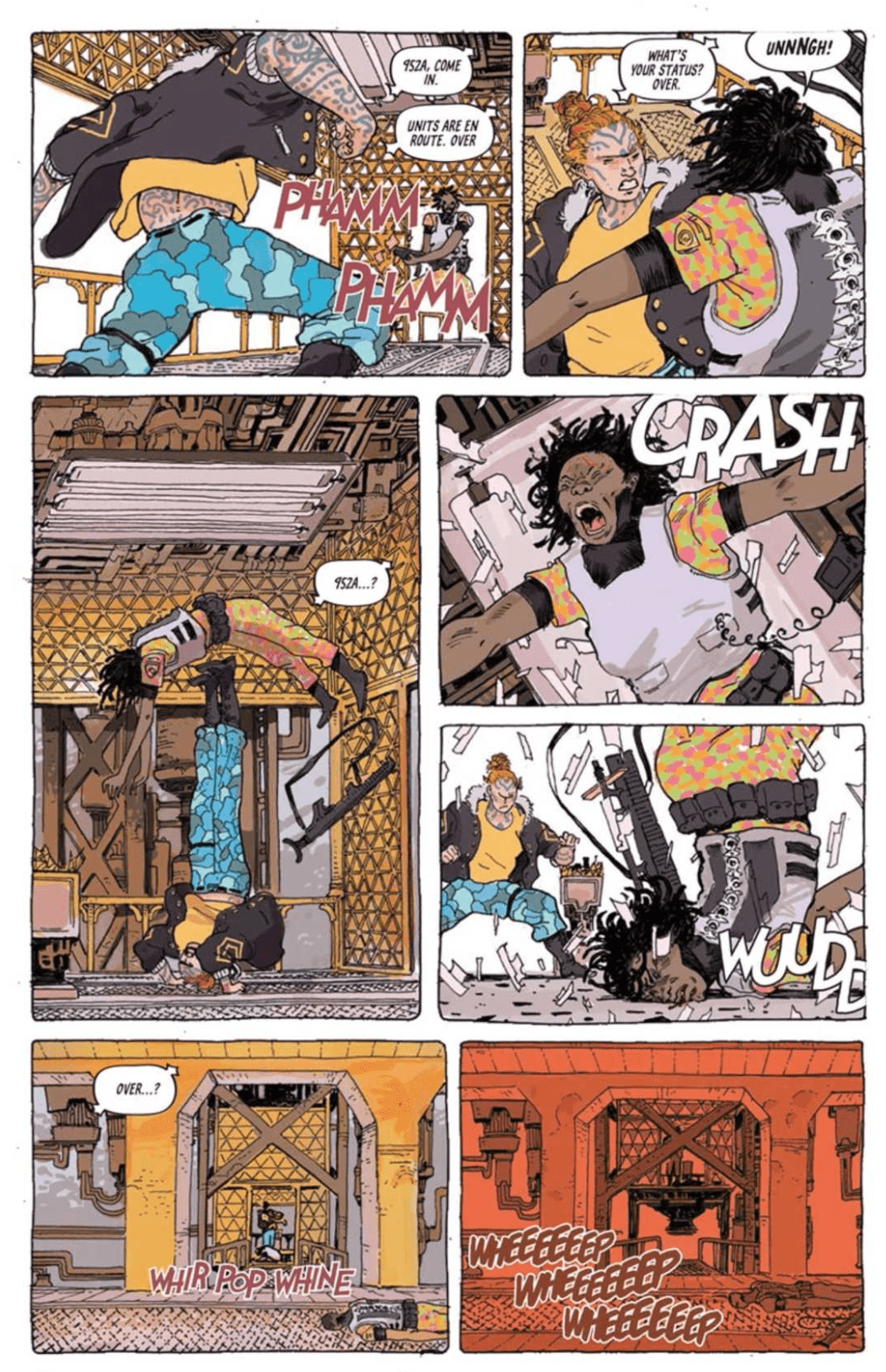
Lucy Claire: Redemption #2 showcased the true danger of the werewolves. As it turns out, they’re a much more complicated threat than one would imagine – which is saying something. They’re raw and brutal, and that’s really only the beginning of what is to come.

To balance out the intensity and emotional impact of this issue, there are a few lighter moments woven throughout. Most of these pertain to character interactions. But it’s also nice to see Lucy being more human and balanced.

The Art

Lucy Claire: Redemption #2 as is full of brilliant artwork as it is plot. An impressive feat, especially considering that John Upchurch provided all of the artwork as well. Yes, that’s right. Everything from the lines, to the coloring and lettering, was provided by a single person. No wonder the whole piece looks so cohesive!

The style in Lucy Claire is not to be ignored. The characters feel so alive, with their facial expressions showing even the tiniest of detail. Then there are the backgrounds, which are detailed and yet stylized – a perfect blend and backdrop, all things considered.

Then there are the werewolves. They’re delightfully threatening, though in this issue they’re also significantly altered. It may be surprising to see a bunch of green beasts running around, but it also felt oddly at home on these pages.

It’s probably worth mentioning that the fighting it brutal and efficient. There is flash and gore – of course, there is. But it’s also well planned, and carefully portrayed. The fights are not pages and pages long but instead fit nicely inside several pages –showing how a brutal battle tends to likewise be over quickly.

In Conclusion

Lucy Claire: Redemption #2 was an intense continuation of the series. The ante has officially been upped, with the werewolves gaining more threat with each passing moment. Meanwhile, Lucy is still clearly on a rocky road, and it’s probably safe to assume that this will cause her more trouble along the way.

Monkeys Fighting Robots Youtube

RISING SUN #1: A New Journey Begins

RISING SUN #1 is the first in a new series from IDW, launching this Wednesday. Dive into a world full of monsters, dragons, heroes, and conflict. This series starts off strong, full of brilliant artwork and internal conflicts.

A dramatic cover for a brand new series! Welcome to the world, Rising Sun #1

***SPOILER WARNING***

Rising Sun #1 begins a new epic series from IDW. Set in Japan during the 12th century, this series follows several heroes from different clans. It may seem odd to see so many clans working together – and there’s no doubt that some would rather do anything but.

But there’s a greater danger on the horizon forcing their hands. Dragons and monsters have started rising up all over Japan. With the death toll steadily rising, our heroes are short on time for finding the cause and solution.

The first page of Rising Sun #1 and…well…that can’t be good!

The Plot

Ron Marz and David Rodriguez wasted no time in throwing us into the action in Rising Sun #1. Right off the bat, we’re shown all of our heroes battling it out against a stunning (but undoubtedly fierce and dangerous) blue dragon.

From there it doesn’t take long for readers to get a solid understanding of the gravity of the situation. What at first appeared to be a fairly straight forward plot quickly proved to be complex and carefully thought out.

This is the danger of men and monsters. There’s plenty of interactions and strife between the characters, and it goes without saying that they’re all in grave danger. The monsters are iconic, jumping straight from legend. But the real question is; why now? Why are they attacking now, and what can be done to stop them?

This was a fast-paced read – the sort that you will quickly burn through before realizing you’ve run out of pages. Some of our characters have already made their personalities clear, while others leave us wondering where they’ll fall in the grand scheme of things.

At least backup appears to be on the way in Rising Sun #1.

The Art

There’s no doubt that the artwork in Rising Sun #1 stole the show. The pages are bright and dramatic, proving to be the perfect blend of traditional art and comic book style. Our characters are dynamic and distinct, while the creatures they face are gigantic in scale yet no less stunning.

Martin Coccolo was the lead artist for this project, with Katrina Mae Hao providing the colors and Deron Bennett doing the lettering. Together they made this world come alive. The line art set the scene, while the colors took this entire issue above and beyond. It made for a memorable introduction for a series, one that fans will eagerly return to.

At least now we can see what was doing all of that damage in Rising Sun #1.

In Conclusion

Rising Sun #1 was an intense and creative read. In many ways, it was the perfect blend of styles and subjects. The fast-paced introduction was enough to catch out interest, and hopefully, the following issues will lean on the mystery and suspense, while slowly feeding us more of the truth.

Monkeys Fighting Robots Youtube

Review: The New Starbrand Is Revealed In AVENGERS #29

War Widow Armor

The long-awaited revelation of the new Starbrand’s identity arrives in AVENGERS #29, hitting comic book stores on Wednesday, January 15th. After the Avengers sped into space to track down the new Starbrand, the Heralds of Galactus launched an attack on the heroes. They’ve claimed the Starbrand must die for the good of the universe. But the Avengers protect life at all costs; will they be able to take down beings like the Silver Surfer and Terrax in order to do so?

Story

The Avengers lineup are a force to be reckoned with on any day. But with each half of the group separated by light-years, their odds of victory may be in question. Readers are first brought to one end of the The Ravenstarr Maximum Security Galaxy as Black Widow, Ghostrider, Blade, and Boy-Thing find themselves facing a number of intimidating prisoners and a very angry Silver Surfer. Fortunately, the newly dubbed “War Widow” came prepared.

Despite pleas to the Herald’s better nature, he attempts to subdue the heroes, and the results aren’t great. Widow’s fighting prowess and armor unfortunately fail to do any damage against a being with cosmic abilities. But a surprise team-up between Boy-Thing and Blade levels the playing field, at least for a while.

The incredible resourceful of this Avengers’ team never ceases to amaze us.

On the other end of the prison galaxy, Captain America, She-Hulk, and Captain Marvel fight off their own batch of prisoners, as well as the Herald known as Terrax. This half of the team barely manages to hold their own, but a bright flash from a nearby star halts the action on both sides: the new Starbrand has been revealed.

Writer Jason Aaron leads readers through epic fight scenes and close-calls throughout the story, ultimately arriving at the pinnacle reveal of the Starbrand’s identity. The build up is scripted extremely well, hyping us up little by little with each panel.

Artwork

This issue gives readers the beautiful illustrations one would expect of an epic space battle. Ed McGuinness, Mark Morales, and Paco Medina’s penciling and ink work are fantastic, particularly when it comes to the star of much of this issue: War Widow. Her iron battle armor is sleek and cool, much like the hero herself. Jason Keith’s coloring provides varying shades of black and red to give it a distinct look, differentiating it enough from the War Machine armor of James Rhodes. In scenes like these, VC’s Cory Petit’s lettering follows the action seamlessly.

Comic Covers

Main Cover

McGuinness and Keith’s artwork for this issue’s main cover features the full Avengers line-up in space, honing in on their battle setting.

Marvels X Variant Cover

Ema Lupacchino and Rachelle Rosenberg’s variant cover shows us illustrations of one of comic book fans favorite couples: Black Panther and Storm. This Marvels X variant gives us a look at other heroes who are also fighting for justice.

Conclusion

AVENGERS #29 is a thrilling addition to this Starbrand Reborn saga, amping up the action just enough before the big reveal. We’re excited to see what happens next with the newly christened Starbrand.

What did you think of this issue’s big revelation? Let us know in the comments below!

Monkeys Fighting Robots Youtube

Review: RUINS OF RAVENCROFT: SABRETOOTH #1 Pays Homage To B-Movie Horror

Ruins of Ravencroft #1 Cover

It’s not Halloween season, but we can still get our fix for scary stories though Marvel Comics’ Ruins of Ravencroft: Sabretooth #1 (on sale January 15.) Writer Frank Tieri borrows from the winning formula of his Absolute Carnage tie-in and applies it to a fresh set of characters. Here, he also adds new layers to that successful model. This self-contained story leaves the reader feeling satisfied while it plants seeds for the series’ next chapter.

Writer: Frank Tieri

Artist (modern day): Angel Unzueta

Artist (flashback): Guillermo Sanna

Colorist: Rachelle Rosenberg

Letterer: VC’s Travis Lantham

Absolute Carnage drew widespread praise because it masterfully combined the horror and superhero genres. To capitalize on this success, Marvel is producing more stories in the same vein and Tieri has been tasked with spearheading several centered around Ravencroft. Focusing on the mysterious institute further establishes the comic’s connection to Donny Cates’ event series because it was also featured there. But Tieri’s script reads like a horror movie, helping the series feel like an organic spin-off.

From the first page, Tieri satirizes tropes of the very story he’s about to tell: a mad scientist experiments, hoping to make monsters. Artist Angel Unzueta shows sketches of Frankenstein in a Ravencroft laboratory, and Misty Knight quips that she expects someone to shout “It’s alive!” The tongue-in-cheek beginning draws us in because it shows that Tieri isn’t taking this issue too seriously. Even when he includes other clichés, like a foreboding door and a monster mash, they work because Tieri is giving us a fun B-movie set in the Marvel Universe.

Ruins of Ravencroft Sabretooth #1 Black Knight
Tieri suggests that plenty of heroes have been confined within Ravencroft’s walls.

The first few pages lead us to believe the issue will focus on Reed Richards, Misty Knight, Wilson Fisk and John Jameson, a motley crew who decides to explore the haunting facility. Instead, most of the story features flashbacks to Ravencroft’s beginnings. Here, the horror aspects shine. Tieri’s script and artist Guillermo Sanna’s visuals combine to deliver delightful jump scares. When Sabretooth threatens a doctor, Logan, a surprising patient in Ravencroft, jumps into the panel and onto Sabretooth’s back before stabbing him in the throat. A few delayed reveals, like one character’s transformation into a werewolf elevate the consistent sense of dread that permeates the issue.

Ruins of Ravencroft Sabretooth #1 Wolverine
In Ruins of Ravencroft: Sabretooth #1, the sight of a helpless Wolverine is chilling

Likewise, Sanna builds the suspense while Sabretooth talks to an unseen patient. When we see it’s Wolverine, the sight of a lobotomized Logan is unsettling. Sanna uses vacant eyes and a slack mouth to depict Logan, who lies helpless in the confines of a straitjacket. Seeing the powerful hero in such a vulnerable state further establishes the hopeless mood of the scene.

Ruins of Ravencroft is a series of one-shots and, to an extent, that’s a shame. With this issue Tieri leaves us wanting more and it’s likely the next chapter will be its own individual story. But that’s the mark of a successful comic book and, at the end of the day, it’s why we keep reading them every week. Tieri’s script would work just as well as a goofy horror movie while the art team helps deliver some effective scares. With Ruins of Ravencroft: Sabretooth #1, Marvel continues to fuse horror and superhero stories and we can’t wait to see what other secrets are hidden in the spooky institute.

What did you think of Ruins of Ravencroft: Sabretooth #1? Where do you hope to see the seris go from here?

Monkeys Fighting Robots Youtube

Review: An Old Romance Blooms And A New Threat Emerges in AQUAMAN #56

On Wednesday, January 15th, AQUAMAN #56 hits comic book stores with a new creative team and a new direction. Kyle Higgins has taken up the reigns of the written narrative, drawing from Arthur Curry and Mera’s recently rekindled romance to steer this ship toward different challenges. The two Atlanteans now know their love can survive the toughest challenges, and they’re ready to take on the world.

Story

A new day has dawned for our favorite aquatic heroes. Now that the threat of Black Manta is past, Arthur and Mera can plan their future together in peace. We get a look at their engagement party and see that two of the Justice League’s most famous members took the time to celebrate with their friends.

Watching the ultra serious Batman interact in social situations is priceless, and seeing Wonder Woman show Arthur and Mera how much they care about them is heartwarming. But when one of the couple’s friends brings up the subject of children, the two decide they’re in need of some fresh air.

Unfortunately, their break is short-lived when news of an attack on civilians reaches them. They soon discover the Trench has resurfaced (literally and figuratively) and appears to be waging war on the surface world.

Higgins’s writing in this issue gives readers an up close look at the chaos revolving around the lives of superheroes. Even after saving the world from Black Manta and countless threats, Arthur and Mera are still unable to allow room for their personal relationship. In this way, we see that these larger-than-life characters have real human emotions anyone can connect with.

Artwork

Aaron Lopresti’s penciling, combined with Matt Ryan’s ink work, present highly detailed depictions of our heroes in classic form; it’s as if they were plucked from a comic book from the 80’s and placed into our modern context. But don’t let the nostalgia fool you. There’s a clear modernity to Romulo Fajardo Jr.’s coloring and shading that gives this issue just the right amount of darker tones. This includes Clayton Cowles’s lettering work as well, which employs a strategic use of placement to allow the dialogue balloons to follow the action.

Comic Book Covers

Main Cover

Brad Walker, Andrew Hennessy, and Gabe Eltaeb’s main cover artwork features Arthur and Mera locked in an epic battle with the Trench. They appear to be straining to hold off the threat, making us wonder if they’ll be strong enough to stop the coming challenge.

Variant Cover

Skan’s variant cover illustration features the ocean prince surveying the creatures within the ocean depths, reminding us of what continually inspires the hero.

Conclusion

AQUAMAN #56 is a fresh start to the series, moving away from the more mythological foes toward an eminent threat from the past. The break seems a bit sharp from DeConnick’s storytelling, but it’s almost an inevitability when writers change.

Do you like the new direction of this series? Let us know in the comments below!

Monkeys Fighting Robots Youtube

Meet the Yokums: Al Capp – On Reading the First Year of Li’l Abner

Al Capp
"Whaffo' are you writin' 'bout me?"
Al Capp
“Smeee!”

As both a character and as a brand, Li’l Abner is a standout. Al Capp’s best-known creation hit the newsstands in August of 1934 and enjoyed 43 years of ongoing publication. Sensibilities in the ’30s were significantly different than those of today. The use of stereotypes and caricature were commonplace, especially in comic strips and on the pages of pulp magazines. Nowadays, Capp’s representation of simple southern folk living complicated southern lives might be met with hostility by some. After all, what right did Al Capp, a New Yorker born in Connecticut, have to parody life in the south?

Right or wrong, readers devoured Capp’s tales of life in Dogpatch, USA. In its heyday, Li’l Abner boasted a readership that numbered in the millions, and, after reading the first year, I can safely say that, anachronistic political incorrectness aside, I understand why.

Meet the Yokums: Great Grandaddy Yokum – Al Capp

Li’l Abner vs. Streetcar

Before diving into Dogpatch, the pastoral southern paradise that is home to the Yokum family, the uninitiated should probably learn a few things about Li’l Abner‘s creator, Al Capp, born Alfred G. Caplin. Capp led a full and controversial life peppered with staggering wins and losses. Creating Li’l Abner, a one-of-a-kind comic-strip franchise that spawned several successful adaptations including two major motion pictures, was probably Capp’s biggest win. His biggest loss, an event which changed his life forever, happened at nine years old when a streetcar ran over Capp’s left leg.

To prevent the spread of gangrene, doctors amputated Capp’s leg well above his knee. Though the young Connecticuter survived and eventually learned to walk using a prosthetic wooden leg, the prosthesis was unreliable and very difficult to master. Continual discomfort and periodic breakdowns of his prosthesis made Capp’s life difficult, but the underlying embarrassment about his injury caused Capp significant stress as well.

Al Capp
“They give good oo-mox.”

Al Capp, Celebrity at Large

A hardy individual, though, Capp proved that tenacity, talent, and a bit of luck can go a long way. Capp made his name not only as one of the last celebrity cartoonists but also as a TV-and-radio personality who frequently appeared on The Tonight Show, so much in fact that Capp appeared on shows hosted by Steve Allen, Jack Paar, and Johnny Carson!

Li’l Abner, Political Pundit

Although in the early years Capp used Li’l Abner as a means to lampoon stuffed-shirt conservatives, whether from the north or the south, as the character and Capp aged Li’l Abner developed a decidedly more conservative tone.

Campus Cartoon
“Don’t tread on my ink, man…”

Capp came down on what many would consider the wrong side of history on a number of landmark political issues, including in his support for the war in Vietnam. Where many other artists and intellectuals protested the war, Capp protested the protestors, taking issue with what he considered un-American actions of anti-war demonstrators and hippies. One such jab was Capp’s insertion of the student group SWINE (Students Wildly Indignant about Nearly Everything) into Li’l Abner, a parody of the very real Youth International Party (YIP) and Students for a Democratic Society (SDS).

Not Quite Enough Southern Charm

Claims of sexual misconduct by a variety of women, including Goldie Hawn and Grace Kelly, act as reprehensible low-points in this entertainer’s full and astonishing life. One wonders what Li’l Abner or Mammy Yokum would’ve had to say about Capp allegedly exposing himself to four female University of Alabama students in 1971 or his being charged with indecent exposure, attempted adultery, and sodomy by a University of Wisconsin-Eau Claire student in 1972.

Al Capp
That is a terrifying baby.

Meet the Yokums: Li’l Abner’s Al Capp

Rather than go into too much detail on these and other parts of Capp’s life, I’ll refer interested readers to Capp’s comic-strip “autobiography.” One of the best bits of bonus material in IDW‘s collection Al Capp’s Li’l Abner, The Complete Dailies and Color Sundays Volume One: 1934–1936 is Capp’s sequential art autobiography, written as if Li’l Abner is writing, drawing, and inking the strip instead.

Capp’s autobiographical strip covers pivotal moments in the cartoonist’s life, including the amputation of his leg, his recovery from his amputation, meeting his wife, the birth of his children, and his struggle and eventual success in his professional life.

Though this account is romanticized, it acts as a good indication of what Capp saw as the formative moments of his life, and, though it glosses over some ugly moments in true Capp fashion the moral of the story is that you can’t keep a good man down.

Meet the Yokums: Next Up, The Yokums

Now that the uninitiated have some idea of what Li’l Abner‘s creator was all about, it’s time to get on with introducing Capp’s creations, the constituents of Dogpatch. Check out my article on Li’l Abner‘s titular character and the rest of the Yokum family.

Monkeys Fighting Robots Youtube

Review: Wringing Out The Good Magic In TALES FROM HARROW COUNTY: DEATH’S CHOIR #2

The sequel to one of the best horror comics of the decade receives a stellar second issue in “Tales From Harrow County” #2. Cullen Bunn’s brilliant senses of plot, pacing, and dialogue are met with Naomi Franquiz’s perfect watercolor art to create a series that fits in perfectly with its predecessor.

As the specter of World War II haunts Harrow County, specters of a more literal sort begin to invade. When a ghostly song begins to call forth the spirits of the long buried, Bernice must work to save the place she calls home, even if some residents may reject her help.

Writing & Plot

Cullen Bunn‘s excellent ability to progress the plot via the characters is as strong as ever in “Tales From Harrow County” #2. The central plot surrounding the ghosts and the spectral singing is brought to life solely through how Hattie discovers it. The mystery is still at large of course, as Bunn never shows his hand. The combination of backwoods horror and intimate character issues is what made the original Harrow County such a fantastic series, and this is a continuation of that style. Socio-political issues are handled with professional brilliance and subtlety as well. The notion of bringing Harrow’s backwoods magic up against Christian Fundamentalism in this era has always been an intriguing one, so watching it happen is just as fascinating – and frustrating – as one might imagine. This, alongside Hattie’s romantic relationship and the goings-on of WWII make this a tense and consistently gripping read even without the horror elements. Once again, Cullen Bunn flexes his talents in endless degrees.

Art Direction

Once again Naomi Franquiz flexes her artistic talents in her second issue of “Tales From Harrow County.” It’s astonishing how much her art replicates Tyler Crook‘s from the original Harrow County while still being very much her own work. The watercolor work still creates the often swampy and other-worldly atmosphere of this horror series. The pencils have a softness on the human and better haint characters that give them friendly relatability. Don’t let that fool you though; Franquiz can still draw one hell of a monster. The superb artwork is supported by series co-creator Tyler Crook’s distinctive lettering, giving different people and specters their own fonts that somehow perfectly encapsulate how they would sound. The visual side of Harrow County continues to look stunning and original thanks to this fantastic art direction.

“Tales From Harrow County: Death’s Choir” #2 is an eerie and endearing follow-up to a spectacular first issue in this sequel series. Cullen Bunn has lost none of his touch with the world of Harrow County and continues to cleverly add new issues both supernatural and social. Naomi Franquiz manages to perfectly emulate the work of Tyler Crook while still maintaining her own artistic touch. So far, “Tales From Harrow County” is proving to be every bit as stellar a series as its predecessor.

Monkeys Fighting Robots Youtube

Review: THE WAR OF THE WORLDS – The Worst Adaptation Possible

H. G. Wells’ The War of the Worlds is considered one of the author’s best works, and it set the standard for alien invasion stories. Under the stewardship of Peter Harness and Craig Viveiros, the BBC adaptation takes the story back to a period setting.

The year is 1905: Britain rules the waves, and the sun will never set on the Empire. This image gets shattered when aliens from Mars invade the planet. Two people who get caught up in the invasion are George (Rafe Spall) and Amy (Eleanor Tomlinson), an educated couple living in sin. They set out to survive the invasion and the aftermath.

The War of the Worlds is a great story, and it shows with the number of times it has been adapted. Some of the most famous were Orson Welles’ radio adaptation in 1938, the ‘50s adaptation, and the Steven Spielberg/Tom Cruise in the 2000s, and 1996’s Independence Day was War of the Worlds in all but name. The BBC mini-series was the first adaptation to be set in England and moving the story to the early 20thcentury. I was personally excited about this mini-series because I thought it would be more loyal to the source material. These hopes were sadly misplaced.

The War of the Worlds was a short novel: it’s less than 200 pages long, and most of the characters were nameless, so changes were bound to happen. The series does keep some of the key sequences, like the main character sending his wife to his brother for safety, the attempt to cross the English Channel, and the main character getting trapped in a building. But for the most part, this version of The War of the Worlds was its own story.

This version of War of the Worlds was wasted potential. The creators took a fast-paced novel and made it into a slow slog. The series started slowly due to the need to establish its characters before the invasion. Still, the first episode spent more than half its run time looking at how George and Amy became ostracized due to their living situation. The series only picks up during the final quarter of the first episode when the Tripods attack Woking and most of the second episode, which was focused on the actual invasion.

The creators of the series made a really strange choice with how they structured the show. The series flipped back and forth from two different timelines. Half the story was set during the alien invasion; the other half took place many years later in a post-apocalyptic version of London. This extinguished any tension in the story because we know that Amy survives the invasion. The first episode did end up with a seemingly effective twist where Amy goes to the Admiralty building in London in the hope that she can meet up with George. But the twist was ruined when it revealed what happened – so it ended up making no sense. It was like two different writers worked on the script, but they didn’t consult each other.

The series could have easily used this template – the first episode would have looked at the aliens arriving and the response from the government, scientists, and locals, the second would have been about the actual war, and the third could have looked at the aftermath of the invasion and how humanity would rebuild. It’s a simple three-act structure. The creatives could have had fun with the concept by showing how people in Edwardian England could have reacted to and interpreted these events and added a twist to the alien-invasion and post-apocalyptic genres.

The series had some weak special effects. Being a British TV production, the special effects were never graduated to be the best, although His Dark Materials and the latest seasons of Doctor Who have had excellent production values. The CGI for the Tripods were passable, but the rest of the CGI looked like Doctor Who during the early years of the modern series. The CGI backdrops of a destroyed London were particularly notable because they were so poor.

The War of Worlds should have been a slam-dunk considering the source materials and the potential of the historical setting. Instead, the BBC has provided one of the worst adaptations of a great novel.

Monkeys Fighting Robots Youtube

The Apple Doesn’t Fall Far From The Tree in TARTARUS #1

The science-fiction tale of a daughter paying for her mother’s sins bursts elegantly to comic shelves February 12th in Image Comics’ newest series, TARTARUS #1.

The badassery of Surka in Tartarus #1
Interior art by Jack T. Cole, letters by Jim Campbell.

As Tartarus #1 debuts in February, meaning you still have time to order it. FOC is January 20th, so make sure your local comic shop will have it in stock.

THE FOUNDATION OF TARTARUS

Tartarus’ premiere issue receives the double-sized treatment (44 pages) that sets up the past and the present. Writer, Johnnie Christmas uses this to his advantage by keeping the first half (and some) dedicated to Surka escaping from imprisonment in a deep leveled complex. The amount of pages given to Surka’s side of the story is perfect. We are treated to just how much of a badass she was while showcasing why she was such a feared/wanted criminal. The backstory sets up the reasons why all hell breaks loose when we learn of her daughter, Tilde’s heritage.

Leaving the past Christmas thrusts the reader to where the main story takes place, 17 years later, with Surka’s daughter.

The slow-paced nature and extra pages flesh out the story and world-building greatly. Towards the end of Tartarus #1 it’ll seem as if you’ve read the first volume of a graphic novel trilogy published by Humanoids Publishing. Said feeling can be attributed to multiple facets of Tartarus being reminiscent of The Incal and other European Comics. Story-wise, this is due to the aforementioned slow pace that Christmas uses to build the story up, plus its unique science fiction.

The “foundation” for Tartarus is strong in its freshmen issue with the sense that the creators went deep in the lore to help make the world. Each moment feels calculated and thoroughly thought out with a sense of history between the characters and background waiting to be explored. With the first issue, Christmas introduces some questions that linger, yet answers some. Thus, not making you feel cheated while keeping you wanting more of the world.

Cigarettes and more can kill in Tararus #1
Interior art by Jack T. Cole, letters by Jim Campbell.

PLENTIFUL ART

The European Comic vibe continues with the art, which has a strong Moebius resemblance. Each panel by Jack T. Cole is adorned with thin lines that connect to make a beautiful picture. All of Cole’s backgrounds show an insane amount of detail that tell stories of the world and their devices. Tartarus #1’s pages contain such a vast array of imaginative science fiction devices that make you stare in appreciation at their complexity. Much like Christmas’ writing, Cole’s art does a great deal of fleshing out the world.

Cole’s colors in Tartarus #1’s blend effortlessly with the story and art being told. At times the pages feel as if they were ripped from a 1980’s science fiction palette. When the moment calls for a bright retro feeling, Cole makes sure that the page pops out. Yet, the colors don’t stop at bright and poppy. Cole fills Tartarus #1 with such a vast array of colors that each panel will inflict differing emotions while leaving you enamored in their glory.

Jim Campbell’s letters continue the European Comic atmosphere, yet the style is easier to pin down. The font style mirrors some of Tom Frame’s work on Judge Dredd. Campbell’s lettering is exquisite throughout Tartarus #1, with him heightening the emotion of each scene. As the letters never cover any important detail while helping the reader in some of the more busy parts.


Tartarus #1 contains some great fight scenes!
Interior art by Jack T. Cole, letters by Jim Campbell.

TARTARUS CONCLUSION

When all of Tartarus #1’s elements combine its exaction mirrors a 1980’s European Comic in an alluring manner. This aesthetic may fill the void for some readers, yet equally may not be others cup of tea. Nonetheless, Image Comics and the team behind Tartarus very well have an early “Best of 2020” contender on their hands, and hopefully in yours.

Fun Fact: Johnnie Christmas was the artist for William Gibson’s Alien 3. You can see our review for that here.

Monkeys Fighting Robots Youtube

Review: RAI #3 Builds Off FALLEN WORLD

Rai #3 cover

Rai #3 out this week from Valiant Entertainment is a surprisingly great jumping-on point for people who have read Dan Abnett’s epic beginning in Fallen World. From the vast world, the threats, and the themes all in one fell swoop.

Quick Recap

Rai is on a journey to prevent the second rise of Father, a powerful AI, and his creator. Unfortunately for the cyborg ronin, he’s at a disadvantage. Father is possessing the body of Valiant’s cash cow, Bloodshot. Now father plans to regain his rule over life in the future world by finding backups in Rai’s predecessors. Doing so will bring him back to full functionality. With an army of devout followers and access to every digital communication at this Red King’s fingertips, Rai has to go analog. While this prevents Father from tracking Rai and his “older brother” Raijin, it also leaves them isolated from allies. Which is where the primary conflict comes from.Rai #3 in full detail

Rai #3 Plot

Rai, having cut himself and Raijin off the numerous networks have to track down whatever backups are left. But that leaves Rai’s allies unable to contact him, including his confidant Lula. It’s a piece that genuinely feels right with the plot, to either be a self-reliant human or use technology when it’s most appropriate. Raijin himself feels violated when he realizes what Rai did to them both. Because despite being more mechanical, he’s still a conscious being. With someone like Bloodfather around, it’s a circumstance that people will have to learn to workaround. Because ultimately, both sides are right in their own way.

Art

The photorealistic art style made by Juan Jose Ryp pencils and Andrew Dolhouse’s color really help illustrate the settings. Unlike the art in Fallen World, this more rustic appearance helps tell the wild settings. Given the dusty wilds and the demented looking mindscape of Rai’s virtual world, it tells the story with the dialogue.

Dave Sharpe’s use of clever placement of word balloons guides the reader through the story. Then there are the diagrams that accompany the introductions, a great way to save time on exposition rather than bore people with words. What words there are in the diagram speak a great deal about perspective, especially since it highlights the machine-following Red King and his followers. Accompanying them are bright blue lights that contrast against dark backgrounds to highlight tension. As if the tensions in a vulnerable night or Rai’s troubled mindscape doesn’t speak it enough.

Read Rai #3

Rai #3 fills the quota of how every comic can be someone’s first, at least to a degree. Some people might need to have some background material before going into this. Because when they do they will see the transitions the narrative goes through. On its own it’s still a good read.

Monkeys Fighting Robots Youtube