Home Blog Page 364

Review: PRETTY DEADLY THE RAT #5

Pretty Deadly The Rat cover detail
Pretty Deadly The Rat #5 Credit: Image Comics

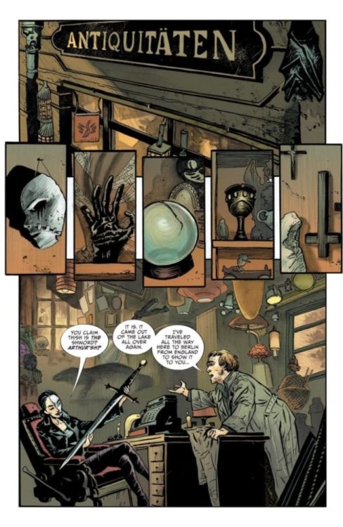
It may feel as though it’s just begun, but Pretty Deadly The Rat reached its dramatic conclusion earlier this month. The five issue mini-series published by Image Comics has been a magical journey through the depths of 1930’s Hollywood, blending reality with mythology using some of the most beautiful art work currently on the shelf.

It has been a story of tragedy, vengeance, and soul searching. Is this the end? In a way it is, but in an equally truthful way it isn’t. When it comes to Pretty Deadly, it isn’t about the endings, but the journeys.  

Pretty Deadly The Rat #5
Pretty Deadly The Rat #5 Credit: Image Comics

Final Words

In the final issue Ginny and Frank, the Conjure-Man, are within sight of their goal. Although they are in the clutches of the Reaper of Obsession they can see the end and an opportunity to free the lost Clara Fields. 

A deal is made but a deal with any form of Reaper is never a good idea.

Kelly Sue DeConnick’s script is poetry in motion. Her words build a world of abstract images and emotional drama derived from the dreams and thoughts of her characters. The cast represents a number of concepts which are sometimes easy to understand, like the Reaper of Obsession, but often more complex. DeConnick’s writing is about picking those concepts apart and looking at them from a different view point. 

In this final issue DeConnick brings the characters together and demonstrates how to move on in life, or in Clara’s case in death. The power of forgiveness is one of the strongest weapons that people possess which is why it features so strongly in the denouement of The Rat. A number of the speeches given by the characters resonant out of the pages; providing lessons for us all to learn. In these turbulent times, it is up to individuals to take control of their own lives. It is not easy and there are consequences, the fate of Ginny being one, but by standing up for herself and finding the confidence to rise above her mistakes, Clara is able to take the upper hand. 

In places the narrative may feel unsatisfactory, as the reader isn’t getting what they want. This however, is part and parcel of mythological storytelling. The tale is told by the teller and the listener has no control. One of the aspects of Pretty Deadly is the storytelling framing device of the Bunny and the Butterfly. 

These represent the creators of the comic and DeConnick uses them to speak directly to the reader. They are meta-fictional creations who don’t break the fourth wall as much as create it. They add an extra layer to the myth-building like a Bard, creating a story within a story. These characters act like conduits for the themes and meanings, creating a narrative bridge for the concepts to cross over from the comic to the reader.

The final issue of The Rat manages to draw in the narrative threads that were introduced in the first issue but also some of the story elements from previous Pretty Deadly comics. There is not a definitive ending for a number of characters and leaves a several story-lines hanging but as Bunny point’s out “This was Clara’s story. It is finished now,”

Pretty Deadly The Rat #5
Pretty Deadly The Rat #5 Credit: Image Comics

Drawing a Dream

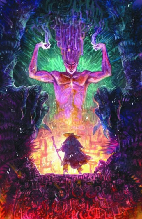
The Rat is set near the beginning of the Golden Age of Hollywood but it’s story is far from the glitz and glamour. Emma Rios clearly draws inspiration from movies of the 1930’s but not necessarily those brightly lit Hollywood greats. Instead her imagery and style comes from European cinema, especially the German Expressionists. The abstract nature of her storytelling and the wild mix of unbelievable landscapes with intimate close ups, creates a world of wonder that is familiar but unrecognisable at the same time.

On the one hand Rios is telling the story of the central characters and their journey through a broken dream. On the other Rios is capturing emotional concepts and relaying them in a form of visual poetry. Individual panels may not make sense by themselves but that is not the way to read this comic. Each page is a stanza to the comics poem. The images loop backwards and forwards, in and out, producing an emotional experience.

Jordie Bellaire’s colors heighten this experience by creating verses in the narrative. The changes in color palettes from one section of the story to the next provide breaks that the reader can instantly recognise. As you turn a page your mood is instantly affected by the change in color and the tone of that stanza is set.

Inside all of this emotion are the characters who are given their voices partially by what they say but, in large part, by how they say it. To differentiate the characters and inject individualism into their speeches, Clayton Cowles makes all of the lettering different. He gives each character their own style, whether it’s font or color, and them manipulates this to produce tone and intention. The cast’s voices are as individual on the page as if they were actors on a soundtrack. Take away the visuals and leave the speech and you still know exactly who is talking.

Pretty Deadly The Rat #5 Cover art
Pretty Deadly The Rat #5 Credit: Image Comics

Conclusion

Bringing all of these amazingly creative ideas together into one single comic has produced something sublime. This is the comic book equivalent of a Maya Deren film. The film Meshes of the Afternoon introduces the concept of a narrative into an Avant-guard movie using similar imagery and storytelling techniques that is used within the pages of Pretty Deadly.

The hopeful and the lost are often the same and The Rat focuses on contradiction of character and purpose. In the end this is a comic about the interaction of characters and ideas. The central story has a beginning, middle, and end but it becomes lost in the tales of others: just like in life. As one story ends, another starts.

Pretty Deadly The Rat is a beautiful work of visual poetry. The final issue has now been released and it proves to be an outstanding, one sitting read. If you have not picked this up then I highly recommend the collected volume when it is released in March this year. Each issue has been majestic but in totality, Pretty Deadly The Rat is a walk through a dream you will never forget.

I’ve said it before and I’ll say it again, every aspect of this comic is outstanding.

Monkeys Fighting Robots Youtube

Review: Player 2 Enters The Game in ALIEN VS. PREDATOR: THICKER THAN BLOOD #2

The second issue of “Alien Vs. Predator: Thicker Than Blood” is a beautiful but forgettable read. The plot itself is rushed and introduces new characters at random, but it’s helped out by some great AVP action and phenomenal artwork.

With nowhere left to run but into the Predators’ ship, every turn leads Maria and Tyler deeper into danger–until they discover a captive xenomorph. Could the Alien be the weapon to tip the scales in their favor, or will they find themselves caught in a crossfire?

Writing & Plot

The script in “Thicker Than Blood” #2 unfortunately doesn’t have the straight-forward momentum the first issue had. The actions of the two lead characters don’t really make much sense in the context of the story. Granted, one of them is an android, so this could excuse the nonchalant attitude he has towards his “parents” deaths. The older daughter’s actions however just seem rushed for the sake of getting to the action. The suspension of disbelief, even in a series such as this, can only get the audience so far. There’s a sudden introduction of a random side-character as well that feels completely out-of-place and purposeless in the goings-on of the plot. The action on the other hand is quite great. The kids gain a new member of their party near the end of the issue that will hopefully make for a more fun follow-up chapter.

Art Direction

The real draw and saving grace to “Thicker Than Blood” is the outstanding artwork. Doug Wheatley’s renderings of characters both human and alien are so realistic it’s a bit unnerving. This is meant in the best way possible, as its some of the best comic art currently hitting shelves. Shipboard details and gory bits are given great attention and sell the hell out of the atmosphere. Wheatley’s pencils and inks are given color by Rain Beredo, who nails the dark and grimy-yet-polished aesthetic an AVP series needs. Everything from the lighting to splashes of crimson red and glowing green blood looks absolutely stellar. If there’s any one reason to check out this comic outside of its franchise roots, it’s the visual work.

“Alien Vs. Predator: Thicker Than Blood #2” is a beautiful mess of a comic. The plot with Maria and Tyler rushes past the prior tragedy they have experienced to the point that the pair is almost unlikeable. The disjointed script is partially saved by some great action moments and absolutely phenomenal artwork. Hopefully this mini-series’ plot can pull it together in its final two issues.


Monkeys Fighting Robots Youtube

Exclusive DC Comics Preview: LUCIFER #16

Exclusive DC Comics Preview: LUCIFER #16

Lucifer #16 hits your favorite comic book shop on January 15, but thanks to DC Comics, Monkeys Fighting Robots has a six-page exclusive preview for you.

About the issue:
THE RARELY SPOKEN OF BODY FACTORIES OF HELL
Who is the Hunted God? That is what Lucifer must discover after prophecy dictates he must save this mysterious prey from a deadly fate in the Wild Hunt, a mythic quest led by one of the most dangerous entities in existence: Odin himself.

Lucifer #16 is written by Dan Watters, with art by Max Fiumara, Dave McCaig colored the book, Steve Wands is the letter man, and Tiffany Turrill worked on the cover.


Are you reading DC Comics’ Lucifer? Sound off in the comments!

CHECK OUT THE LUCIFER #16 PREVIEW BELOW:

Lucifer is based on the characters created by Neil Gaiman, Sam Kieth, and Mike Dringenberg.

Monkeys Fighting Robots Youtube

Review: Rich Plot, Uneven Pacing in 20XX #2

20XX #2

After an unceremonious introduction, Mer finds herself suddenly swept into the world of the sym gangs in 20XX #2, out this week from Image Comics.

Surviving the attack by East Side gang members, Lucas brings Mer to meet with the West Side leader. The question: how will she choose to use her new powers, and where will they lead her now?

The Writing

Our first issue of this four-part series focused primarily on establishing our story, worldbuilding, and introducing the cast of characters. With 20XX #2, though, the creators toss the reader into the deep end of the pool. The intricacies of inter-gang politicking take up most of this issue, with our protagonist barely managing to keep up.

Writers Lauren Keely and Jonathan Luna pack a lot of information into this single issue. The book is fast-paced in terms of how it’s plotted. However, characters tend to be rather long-winded, with a lot of dialogue crowding each page. The result is that the book can feel slow, despite actually moving along quite fast.

The writers also deepen the story significantly with 20XX #2, adding several new threads to the larger plot. We have more characters, each reacting to the state of the world in different ways. We have drug dealing and conflict between rival sym factions. Then, we have Mer’s life outside of the gang, as she tries to adjust and meet other nonaligned syms. It’s a rich narrative…almost to a fault. This all might have been helped by having one or two more issues to spread across, given the relative complexity of the story. This would have helped with the pacing of the story.

Keely and Luna aren’t subtle about the themes of oppression and fear regarding the sym population in 20XX #2. While it can be a bit heavy-handed, it’s still within the realm of believability, given the scope of this disease. It’s entirely believable how a disaster on this scale, compounded by catastrophic climate damage, might have warped society significantly.

In all, the writing is strong. Almost too strong, truth be told; as mentioned, this story really feels like it will need more than four issues to tell in a satisfying manner.

The Artwork

In addition to writing, Luna also provides illustrations for 20XX #2. The character designs are excellent overall, with the artist opting for a realistic style. The precision of the inks, along with the softer designs and lines and the absence of colors, gives the work a soft quality that is easy on the eyes.

Luna’s characters are generally expressive, and convey a sense of liveliness and animation. The reader can pick up on the doubt, confusion, or shock conveyed in a character’s eyes and body language. There are points at which they can feel a bit stiff, though, so it’s not as consistent as one might like.

While there is considerable detail in the illustrations, the settings themselves are very minimal. We see a lot of nearly-empty rooms and blank walls, with maybe a table or a window being the only set dressing. As a result, much of the focus is on the characters. That said, the figures feel almost as if they’re interacting in a blank void through much of the book.

Final Thoughts

20XX #2 is a solid second chapter for this miniseries. It’s a rich and complex story that holds the reader’s attention, even through the sequences of extended dialogue.

Monkeys Fighting Robots Youtube

Indie Comics and Creator-Owned Comics: What’s the Difference?

Indie Comics demonstrate the difference Alternative Comics

Indie Comics are becoming more popular, but most websites mislabel indies as creator-owned content. So what exactly is the difference between the two? Another site, “What’cha Reading?” also asks this question. Because let’s face it, what some people view as independent is not the same as what others think. This is the research from the gutters.

The People’s Definition of Indie Comics

The Uniques on originality
Who says Indie Comics need to be original?

According to Investor Words, any independent company is “a company not controlled by another company.” For comics, this has a lot of meanings; as Chuck Suffel of What’cha Reading points out, “independent seems to be one of the more nebulous terms.” Some say indie comics mean non-superheroes, thanks to titles like Elfquest or Bone. But there are several superhero titles like The Uniques that stand contrary to that statement. Others say that indies are any comic other Marvel or DC because of those publisher’s popularity. All of those, however, detail alternative press comics. Image and Dark Horse comics are just as popular, complete with IP notoriety, which comes to another argument.

Who Owns What?

So publishers, like Image and Dark Horse, host publishing platforms where creators retain the IP rights. Other publishers like Oni Press and IDW use this model as well. However, some of these other publishers are under higher ownership. IDW, for example, is part of Idea and Design Works; Oni Press and Valiant meanwhile got bought out by larger corporations. In layman’s terms, those companies’ series are not really indie comics. As for Image and Dark Horse, they’re another story.

Image and Dark Horse have no corporate owners, but they do have influential support systems. Dark Horse, for instance, is an overall entertainment company, the comics are now a division of the primary one. The rest of the company handles deals like merchandise or Netflix shows. Most of these companies have plenty of resources and don’t usually require additional help. That’s not to say some companies don’t try to take some advantages like Kickstarter.

Indie Comics Lack Support

To support themselves and cover the costs to keep publishing his or her comics, a few creators use crowdfunding websites, including “Kickstarter” and “Indiegogo.” Unfortunately, without established fanbases or viral hits, the financial angle proves to be difficult.


Most creators don’t even get a stable income from Patreon alone as Graphtreon displays. Of them, only the first ten publishers on the list make sales money comparable to annual small business sales near $100,000. Even MFR favorite indie comics series God-Puncher doesn’t receive a lot of support; just look at creator Lane Lloyd’s Patreon. Yet the use of crowdfunding to sustain themselves shouldn’t be what makes something indie. Even established artists like Jimmy Palmiotti have these accounts. One Image series does give some insight into the difference between indies and creator-owning comics.

The Indie Comics Connection

In Airboy by James Robinson and Greg Hinkle, Image publisher Eric Stephenson calls Robinson up for a job offer. This displays the main difference between creator-owning, alternatives, and indies more than anything, connections. Robert Kirkman, for example, mainly got into Image Comics through any connections he could find. Also, while Image Comics doesn’t own the series it publishes, the company owns the publishing, marketing, and distribution rights. Look no further than the copyright details saying “no part of this publication may be reproduced or transmitted, in any form or any means.” Meaning while the creators own creative rights, they can’t sell the comics on his or her terms. Not without a lot of paperwork anyway. It’s a different story if the creator owns both the series and publisher.

One such publisher is “Benitez Productions” and series Lady Mechanika. Joe Benitez owns both properties, and his website allows him to sell his products to consumers directly. However, Benitez holds several connections, not unlike Image or Dark Horse. This includes but is not limited to “Diamond Comics Distribution Inc.” which provides access to distribution. Indie publishers like “Unlikely Heroes Studios” however lack some of these connections unless they meet some criteria.Zach Dolan, you are an inspiration to indie comics.

The Non-Indie Criteria

Companies like Amazon and Diamond seem to have some high mark criteria to have anyone’s series featured. Amazon appears to be more lax as long as there is some hype or popularity behind something. UH Studios’ primary series Super! for example is available on Amazon unlike UH’s other series and merchandise. This is no small feat, as even companies that exist in name only like “Space Goat Publishing” still have content that can be purchased like Heroines. Diamond meanwhile has an even bigger threshold.

Diamond holds a near-monopoly over comic book markets, and it takes more than a cult following to get on its catalogs. According to Pen & The Pad’s Fraser Sherman, the publisher needs to make $2500 in retail orders. That requires quite a bit of networking to achieve, from paying for con booths to promoting at local bookstores. Most indie comics can’t even afford to mass print without crowdfunding.

The Price To Be Indie

This brings up a pretty decent question that a few creatives, including Michel Fiffe, likely go through. Is being a publisher independent of these support systems and connections financially worth it? Even the likes of Fiffe and Tesladyne had to compromise their independence by making deals with the creator-owned companies. When looking at circumstances like that, it’s no wonder people get the terms confused.

What do you all think; is a lack of licenses and business connections the thing that separates indie comics from simple creator-ownership? Leave your thoughts in the comments.

Monkeys Fighting Robots Youtube

WRETCHES #2 – New Worlds, New Characters, Same Mission

Shea’s search for her kidnapped brother continues in WRETCHES #2 as she runs into a badly beaten bot that maybe her only chance of finding Sean.

Wretches #2 Roughs to Pencils to Inks by Salo
Salo Farias Roughs to Pencils

If you need a refresher on Wretches #1, check out our review, then pick up the second issue from Scout Comics’ store.

From Wretches to Riches

Wretches #2 may not have the grandiose opening pages as the previous issue, but James E Roche grabs your attention nonetheless. Shifting the focus from the kidnapping of Sean, Roche instead introduces the reader to our new “Shocker Junkie” character, Burr. At first, the sudden shift to a new character comes as a surprise. This is due to it feeling as if Roche has dropped the plot of Shea finding her brother. But, by the end of Wretches #2, Roche develops Burr enough to were you want to know more about him while tying him into the overall scheme.

That’s not to say Roche focuses only on Burr throughout, as we get a quick glimpse of how well it’s going with Sean. But before going back to Burr, he shifts back to who we’ve all been looking for, Shea. Roche writes each character distinctly, with Shea being the most badass as she eats up every scene she is in. The one interaction shown of Shea showcases how she isn’t someone you want to cross, especially when she is on a personal mission. Even on the crime-ridden planet of Manerah, you’d never want to cross her path.

Wretches #2 Page without words.
Interior art by Artist Salo Farias, Colorist Chunlin Zhao

Art Worthy of The Crime

Although the focal point of the story changed, artist Salo Farias keeps the same vigorous energy from the first issue in Wretches #2. The planet our characters visit is labeled as the underbelly of a crime-ridden world. Even if this information was never stated, Farias’ art perfectly portrays this idea. The locations seen throughout Manerah gives off a cluttered and slimy vibe as if things that shouldn’t be spoken of transpires there. The times we are shown what occurs in Manerah, Farias makes sure the art hits all of your senses.

Helping Farias’ art take over your senses is the rough colors by Chunlin Zhao. In this sense, “rough” is for the dirty, gritty, dusty colors Zhao adds to the pages. The colors Zhao employs during some of the exterior shots of Manerah hits you so hard you’ll be tasting the grain. Yet, Zhao doesn’t color everything rustic. By adding in bright or light colors throughout Wretches #2, Zhao adds in colors that complement each other. During a panel that features a darker color palette, Zhao amplifies it with a bright/blank background.

An element that stood out significantly in the previous issue was letterer Chas! Pangburn’s use of varying designs for aliens. This multitude of different word bubbles and narration boxes return in Wretches #2. Pangburn’s fantastic lettering isn’t limited in differing alien lettering, as when a character shows emotion, he makes sure you read it in said tone. Throughout Pangburn uses the issue as a lettering sandbox, which works out magnificently.

Wretches #2 behind the scenes.
Pencils by Salo Farias

Conclusion

Even though Wretches #2 changes its spotlight to a new character (whom we’ll see more of), the one chance we see Shea shows how great of a character she is. That’s not to bring our new character Burr down, as his moments are equally as fun while adding in a fair amount of world-building. Combine that and the fantastic visual elements, and you’re treated to a tremendous follow-up issue.

Cover Story: The standard cover of Wretches #2 is impressive, yet I love the Farias and Marc Sintes variant. The variant mirrors the original to a degree, but the duo pumps up the brutal meter making for one epic cover.

Variant by Salo Farias and Marc Sintes

Dear Reader

If you got the chance to check out the first and second issues of Wretches, let us know what you think down below.

Monkeys Fighting Robots Youtube

GHOST-SPIDER #6: Is This A ‘FANTASTIC’ New Arc?

Gorgeous cover by Greg Land and Frank D'Armata

Hitting the shelves this week from Marvel Comics, Ghost-Spider #6 kicks off the newest adventure for our favorite inter-dimensional webhead.

We take a step back from The Jackal and all the oddities that follow him this issue. Ghost-Spider #6 starts five years back to show the Storm siblings, Susan and Johnny, are actually models in Earth-65, pompous, rich, models. We then jump one year ahead to see a younger Gwen watching the news showing the Storm siblings have gone missing since their tour in Latveria.

Yup. Those are the Storm siblings. Very different from what you might expect.

Previously, we have seen Earth-65’s Ben Grimm and Reed Richards already. Richards is a child genius who has developed tech for Gwen in the past, and Grimm being a police officer in the same precinct as Captain Stacy. Now that we have all four, and a name drop of “Victor Von Doom” in this issue, one can only imagine what’s in store for us in this next story arc.

Additionally, this issue has Gwen enjoying her life some more. We see her getting along well with her friends, including MJ, for once, and we even get a wholesome father-daughter interaction between the Stacys with a fun twist you won’t find elsewhere.

With the last issue ending on The Jackal’s escape and the death of Earth-65’s own Miles Warren, it’s a little awkward moving on from that arc right away. That being said, I don’t think we’ve seen the last of The Jackal or the weapon Earth-65 Warren created to potentially kill Gwen’s symbiote. All of that seems to be on the back burner for now.

Ig Guara and Rosi Kämpe handled the art for this issue; as such, it resembles the earlier issues of Spider-Gwen: Ghost-Spider before Takeshi Miyazawa started working on it. The style is very fresh, and the shading reminds me of a more pointillistic style with the shadows being dotted in.

This page is so sweet. It might be the calm before the storm, but I hope the calm just lasts a little longer, and we get more of these fun moments.

The best part of Earth-65 is honestly Earth-65. The constant purple shading over everything and the neon-colored windows and lights that pop out add so much character to the setting and show just how different it is from Earth-616. Ian Herring continues to prove he has an understanding of these palettes with His spectacular coloring issue to issue.

As mentioned, there’s a good scene between Gwen and Captain Stacy in this issue, and the lettering for that scene takes it up a notch. Their conversation feels genuine, and the pacing between them feels natural for a father-daughter discussion. They don’t seem like they’re fighting, because they’re not. They’re disagreeing and not outright exploding at each other. This shows a lot of progression in their relationship, as Captain Stacy seems to be accepting that Gwen’s grown into her own person.

Overall, Ghost-Spider #6 is a fine start to what’s coming next for Gwen. We get to continue seeing the average day of a more grounded superhero with a unique situation where everyone knows exactly who she is. There’s a lot of charm in this character that you won’t find in other comics.

While it’s still very up in the air what direction this arc will take, it’s off to a fun start in its ambiguity. Writer Seanan McGuire has a passion for writing this character, and it clearly shows in each issue. McGuire’s run has been a more uplifting tale of Gwen’s redemption. Something very different from the original started by Jason Latour and Robbi Rodriguez. Ghost-Spider has been very different from what I expected it to be, but I am still excited to see what happens every time a new issue drops.

Are you keeping up with Earth-65? What other characters’ doppelgangers from this Earth would you like to see? Let us know in the comment section below!

Monkeys Fighting Robots Youtube

Marvel Comics Exclusive Preview: VALKYRIE: JANE FOSTER #7

marvel comics exclusive preview valkyrie jane foster #7

Valkyrie: Jane Foster #7 hits your local comic book store January 15th, but thanks to Marvel Comics, Monkeys Fighting Robots has an exclusive four-page preview for you.

About the issue:
TIME OF DEATH: NOW!
Valkyrie teams up with Marvel’s Mightiest Medics to save the life of the ultimate patient – Death herself! With a universal force on the cosmic operating table, the end of everything is one slip of the scalpel away… but has one of Jane’s surgical team forgotten their Hippocratic Oath?

Valkyrie: Jane Foster #7 is by writers Al Ewing and Jason Aaron and artist Pere Pérez, with colors by Jesus Aburtov and letters by Joe Sabino. The main cover is by Mahmud Asrar and Matt Wilson, with the variant cover by Kris Anka.

One could call Valkyrie the successor to Jason Aaron’s incredible 7-year run on Thor, as it continues the story of Jane Foster, and Aaron himself is co-writing.

This issue will also be co-writer Al Ewing’s final issue; starting with issue #8 next month, Norwegian writer Torunn Grønbekk (whose name literally means “to love Thor”) will join Aaron as co-writer.

Check out the Valkyrie: Jane Foster #7 preview below:

marvel comics exclusive preview valkyrie jane foster #7

marvel comics exclusive preview valkyrie jane foster #7

marvel comics exclusive preview valkyrie jane foster #7

marvel comics exclusive preview valkyrie jane foster #7

marvel comics exclusive preview valkyrie jane foster #7

marvel comics exclusive preview valkyrie jane foster #7


Are you reading Valkyrie: Jane Foster #7? Sound off in the comments!

Monkeys Fighting Robots Youtube

I’d Buy That For A Dollar: SPAWN #10 (May 1993)

I'd Buy That For A Dollar

Welcome to ‘I’d Buy That For A Dollar’ a column where I will be exploring the weird and wonderful world of dollar bin diving. The only rule is each and every comic is purchased for one dollar (or less!).

This week’s comic is the infamous Spawn #10.

Spawn

Spawn #10
Story by: Dave Sim
Art by: Todd McFarlane
Letters by: Tom Orzechowski
Colors by: Steve Oliff & Reuben Rude

This issue was guest written by Cerebus creator Dave Sim (Cerebus was one of the longest-running indie comics in history and had a huge and controversial impact on the industry). Sim, along with Allan Moore, Neil Gaiman and Frank Miller were all brought in by Spawn creator Todd McFarlane and given an issue to write. It was news making at the time as Spawn was the biggest book in the market and all those writers were giants. What’s interesting about this issue specifically is that it’s the only one not reprinted in recent trades and collections of Spawn. So the only way to find it is in the wild world of bins!

The issues themselves were all also pretty good, with Sim’s being the weirdest. Where all the other writers sort of stuck to the Spawn mythos, Sim (ever the rebel) turned his story into a commentary on the ownership of artistic creation, specifically when it comes to comics. The whole thing is actually very clever and it’s an entertaining read too. But as a fifteen-year-old comics nerd, it went way over my head at the time it came out.

It was great finding it again in the wild and even greater reading and flipping through it with more mature eyes. Anyway, let’s take a look!

Here’s my copy. I love this cover (I love McFarlane’s black and white pencils and any chance to see them is great!)

Spawn

Next up is an early page that I think highlights how awesome those early issues of Spawn looked. There’s a great use of composition below and the colors are fantastic. It’s a beautiful page.

Spawn
Love the linework on the roman numerals and I ADORE the small Spawn image in the lower left.

The next image I want to focus on is a two-page spread the is the image I think most people will remember from this issue. If this issue is an essay, then this image is the thesis.

Spawn
Can you name all the character arms?!

It’s pretty striking and not subtle at all huh? Sim’s telling us selling your creations is literally putting them in a cage. The tied up and blindfolded just further pushes it; when you sell your creation you also make it impossible for you to ever have any say or control at all.

Pretty heavy stuff to throw in a book that was still not even a year into it’s run. In hindsight it’s was a daring fucking move and doesn’t stop there. Here’s another critical image.Spawn

Earlier I noted how much I loved these early Spawn issues. Let’s take a look at another beautiful page for the sake of the art alone. I love how colorful and alive the page feels.

Spawn

And then there are these great, small black and white moments too.

Spawn

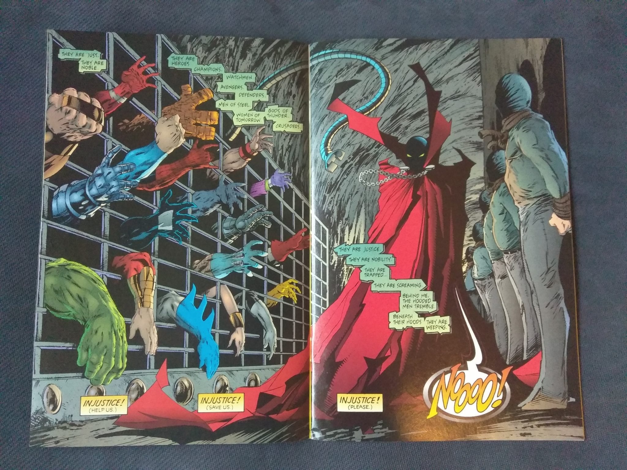
And then we get the final image of the issue, which drives home the ownership passion once again.

SpawnSpawn #10 was a definite great find and honestly, it belongs in any solid 90s comic book collection. Grab it if you see it!


You can find great dollar bins at almost every local comic shop. So find a shop, ask a comic clerk and start bin diving!

Got your own awesome dollar bin finds? Toss them at me! 
Send emails to manny@monkeysfightingrobots.com
Follow me on Instagram: _idbuythatforadollar_
Tweet at me: @MannyG1138

Monkeys Fighting Robots Youtube

Review: BATMAN #86 Begins A New Story With a New Creative Team

A New Era of Batman Begins

It has been a long time since the Batman title has had a new creative team. Tom King has been covering the series since Rebirth began and has made quite a few changes to the status quo, for better or worse. While it started strong, the series became more and more of a headache with flashbacks, twisting narratives, and one of the most disappointing weddings in comic history.

King’s run ended with Bane sent away, and Alfred dead. This isn’t the first time we’ve lost Alfred, but one of the first times in the prime DC universe. What will Bruce do now that his oldest ally is gone?

Batman 86 Cover

**Some Spoilers Below**

Story: 

Bruce Wayne has been pushing for the reconstruction of Gotham in the wake of Alfred’s death. With his name and charm, he is able to convince the politicians to build the improvements fast. Bruce has made differences as Batman as well. He asks Lucius Fox to create a new set of devices to help fight criminals easier.

Along with a brand new bat-like flyer, he is also given devices to project shadows of himself to face criminals. This is terrible news for the first group Batman meets: A group of assassins lead by Deathstroke. Meanwhile, The Joker kills off his entire crew as he plans the perfect crime.

Batman 86 p1

It feels refreshing to start from square one. The last time we had a Batman tale without all the extra baggage was I Am Gotham. That isn’t to say that this story completely erases King’s aftermath. It makes it better. You can see that the events of the previous run have affected Batman, both positively and negatively. He wants to change Gotham permanently through this reconstruction plans, which was a suggestion Alfred made in life. Batman is seeking a way to end the war that Alfred has begged Bruce to stop for years. It will obviously not end, but it’s nice to see the creative team honoring the previous team’s story rather than brush it off.

The only problem I have is that we don’t see how the Assassins are connected to the Joker. We only know they are connected because a random side character reveals it to Catwoman. If it were equally random assassins, I would have given a pass, but you can’t have characters like Deathstroke, Cheshire, and Merlyn without explaining their part more. It gets worse as we don’t actually see Batman take them all down. We will clearly understand it in the next issues, but stand-alone, it felt glossed over.

Batman 86 p2

Art:

Tony S. Daniel returns as the artist for the series, and he brings his A-game. His designs to the new tech are fantastic, and he continues to give us very emotive characters to get us hooked in. Tomeu Morey takes these designs further by adding vibrant colorwork to bring them to life. The team’s best work comes at the end where we watch Joker’s gang get killed. It’s drawn well and given haunting colors that will stick with the readers for a while.

Batman 86 p4

Conclusion:

This was a good start to the creative team’s first story. The overarching story up in a great way while keeping the previous team’s story. It feels like an organic next chapter in the Rebirth era of Batman. The art team delivers a spectacular look for the series going forward and has me extremely excited for the next chapter. The only issue I have is the forced inclusion of these deadly assassins without much explanation. This will probably become more clear over time, but it doesn’t ruin this opening to a whole new run.

Monkeys Fighting Robots Youtube