Home Blog Page 360

INTERVIEW: TARTARUS Creators Johnnie Christmas & Jack T. Cole

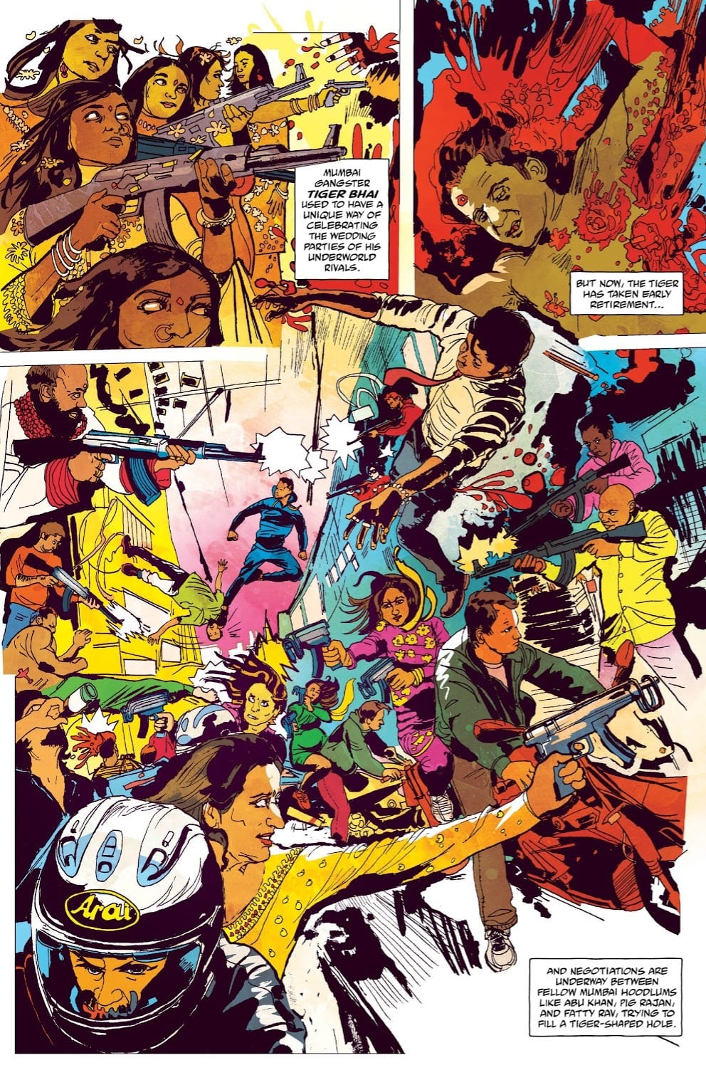
Tartarus #1 hits your local comic book store on February 12, but thanks to Image Comics, Monkeys Fighting Robots has an excellent interview with the creators of the series Johnnie Christmas and Jack T. Cole.

About TARTARUS #1:

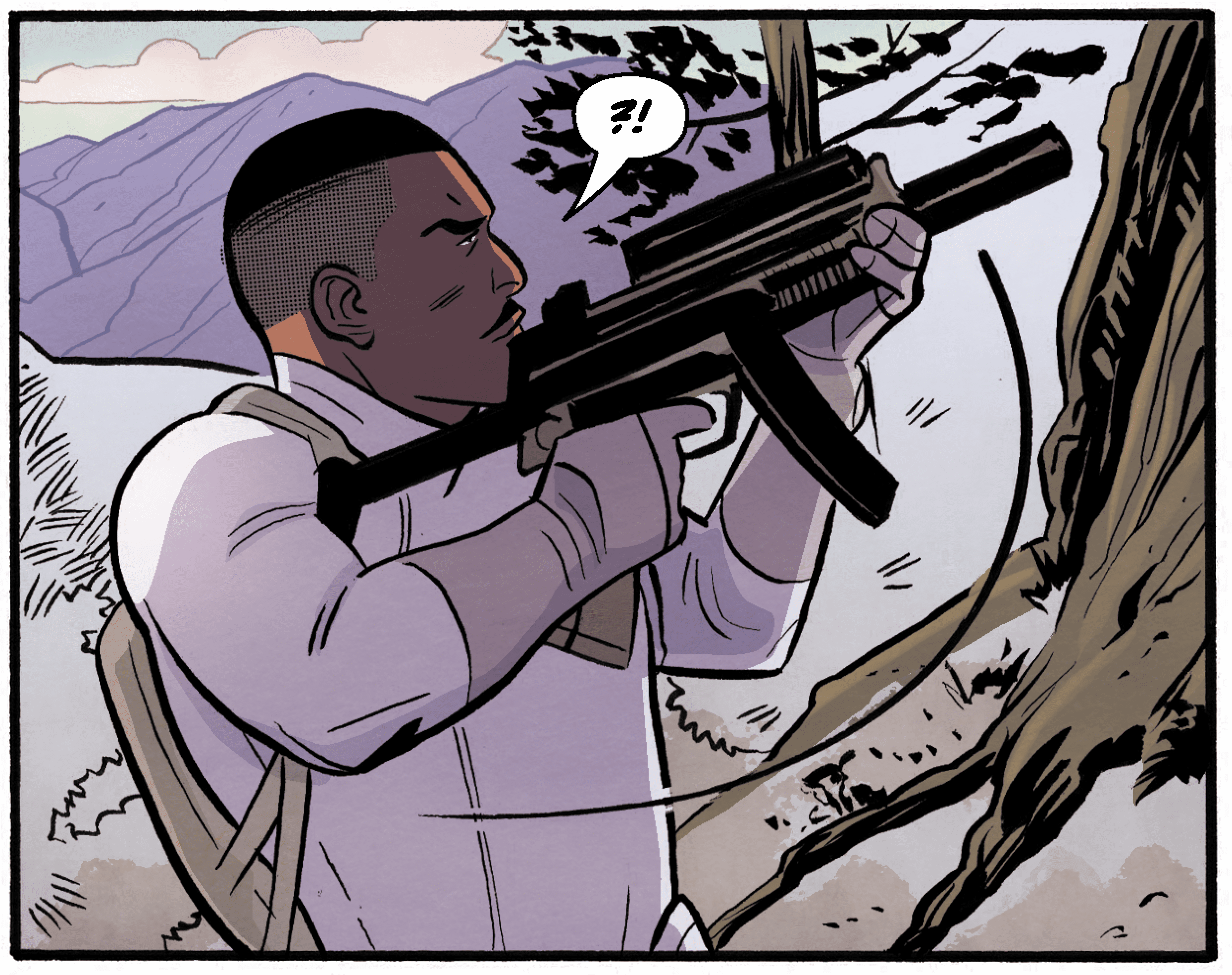
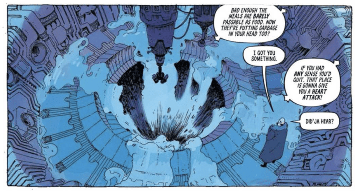
A new adventure series with all the sci-fi drama of Breaking Bad set in Mos Eisley! Promising young cadet Tilde is framed for crimes against the empire after discovering her mother was the ruthless warlord of the deadly colony Tartarus, a vital player in the galactic war. Now, Tilde’s only way home may be to reclaim her mother’s dark crown. #1 New York Times bestseller JOHNNIE CHRISTMAS (Alien 3) and artistic phenom JACK T. COLE (The Unsound) kick off this ongoing series with 44 big pages of story.

CHECK OUT THE INTERVIEW BELOW.

MFR: With a book like TARTARUS, how much world-building is involved?

JOHNNIE: On the writing side, quite a bit, in terms of history and setting. The tech that gave rise to the start of their civilization and its implications. But then I switch focus to the emotional arc of our characters and let Jack take the lead on designing the world. How those technologies evolve and how they’re implemented through his visual depiction of the world.

JACK: Quite a bit. There’s a lot of ideas that Johnnie and I will collaborate on to come up with, and then there’s a bunch of others that Johnnie comes up with, and I figure out how to render, and then another bunch that I figure out and put in to fill things in that I would like to see. For instance, on the space station the look of some of the computers that appear to be made out of a liquid is something that Johnnie and I came up with together, but Johnnie didn’t specify the look of the computers, or if they even needed to be these liquid computers, so it was up to me where to put them in and how they would appear and function in that instance.

Otherwise on my end I research buildings, objects, and styles before I get started on a drawing a panel or a character. Fundamentally world-building is just passive storytelling, so my goal with any world-building is to tell a story in the background that is concurrent with the main narrative and accentuates it. Storytelling like how people in the story dress, or what the advertising on their businesses looks like, or how their streets are designed. Things that your brain will pick up even if they’re not pointed out, and make the main narrative richer, ideally without distracting the reader in the process.

INTERVIEW: TARTARUS Creators Johnnie Christmas & Jack T. Cole

MFR: Johnnie, talk about your relationship with Jack since you are both artists. Are your scripts very detailed, or does Jack have a lot of room to play?

JOHNNIE: I have quite a bit of detail in terms of emotion and feeling. We have beats that have to be addressed on the road to where we’re going, for this arc and the series at large. But when it comes to a fight, action scene, or two characters having a long convo, we’ll switch to “Marvel Method,” and Jack fleshes it out. I won’t depict where each punch will land; I’ll write something like “Good Guy is fighting Bad Guy. Should feel desperate. Bad Guy wins but is missing a tooth.” and leave how that unfolds in Jack’s capable hands.

MFR: Jack, one aspect of your art that stands out is how detailed the world around the characters is. Why is that important to you?

JACK: Let’s say you see a really good picture of a forest, it will excite your imagination, your brain will want to know “What does the rest of the forest look like?” and in your imagination, you will continue the picture. Same goes for anything else, a good street scene you will want to know what the buildings look like on the street over, and your imagination will have a good idea of it. Or if you have an interesting object, your imagination will be engaged knowing that things like this exist in it, and other interesting things could be lurking nearby.

A detailed world when well done creates an experience that is larger than the sum of its parts and creates a space where the reader can go beyond what it is presented and in a way be a co-collaborator with the world.

INTERVIEW: TARTARUS Creators Johnnie Christmas & Jack T. Cole

MFR: Johnnie, with the first issue, how do you balance revealing enough to engage the reader and leaving enough mystery that the reader wants issue two immediately?

JOHNNIE: I try to focus on what motivates the characters in the moment. If it’s truthful, the moment to moment is interesting, since our characters have pretty strong desires. But all the while I’m planting seeds that will bear fruit that we’ll harvest in following issues.

MFR: Jack, can you talk about the vivid color palette of the first issue?

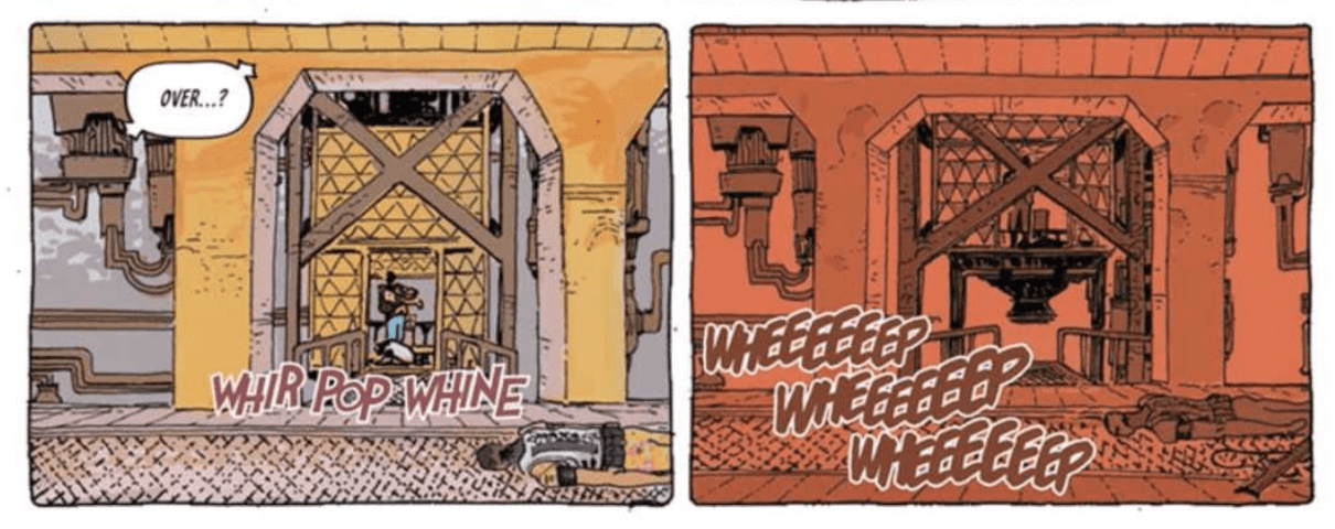
JACK: I was just coming off of THE UNSOUND, where I had been using color in abstract ways to heighten emotional tension and create odd moods. Additionally, I was sort of obsessed with comics from the 70s, 80s, and early 90s at the time and their color palettes, and how stark they could be, and how when the right palette came together it is genuinely divine. Issues 1 through 3 readers will see some more of the influence of this fixation, but recently I realized I had almost forgotten how to use brown and grey in my pursuit of this direction, so I’ve circled back around!

INTERVIEW: TARTARUS Creators Johnnie Christmas & Jack T. Cole

MFR: The title logo for TARTARUS #1 does not scream science fiction, what are the origins and meaning of the logo?

JOHNNIE: We worked with the talented Rian Hughes on that. I gave him the series pitch, a synopsis, and sketches of what Jack had planned for the first issue cover. What became our final logo was in the first round of ideas. I liked the strength and authority connoted in the columns up against the delicacy of the flowers and the deadliness of the thorns. It says, “TARTARUS, tough but pretty.”

MFR: How hard is it to create a main character that readers can connect with, and is Tilde on a “hero’s journey?”

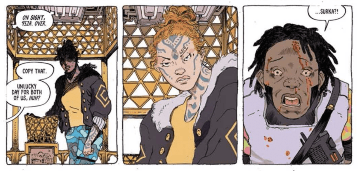
JOHNNIE: I guess I’ll see how well they connect with readers eventually, ha. But I think by giving our cast simple relatable desires is the key. Surka wants out of the clink. Tilde wants to go home to take care of a sick loved one. Klinzu wants to go on a hot date with a cute person, and Sevno wants to be good at his job. Stuff everyone can understand and relate to. If we follow what they want in a truthful way, then I’m hoping it’ll connect with folks. At least that’s the plan.
And Tilde is kind of on a hero’s journey, to begin with: She starts in the normal world, there’s an inciting incident, she begins her journey, then the descent into the cave. And that’s where things may start to diverge from the usual hero’s journey. The cave in TARTARUS is very deep.

JACK: It’s tough to know the extent a character will connect or not until people actually read it and a whole variety of complex factors come together. On my end, I try to come up with designs that have some appeal, and give the characters different sets of gestures to help convey their “character” and hope that readers will connect with it.

INTERVIEW: TARTARUS Creators Johnnie Christmas & Jack T. Cole

MFR: TARTARUS is an ongoing series; how far do you have the story outlined?

JOHNNIE: Just because I like to know where I’m going, I have a scratchy outline for the first four arcs. If we get there or beyond is entirely up to reader reaction. We also know the endpoint of each character’s narrative. Though sometimes characters have a mind of their own and decide to go their own way…

MFR: Independent publishing is a tough business. How will you measure success with TARTARUS?

JOHNNIE: Readers. They are the Alpha, the Omega, the measure of success. If they love it, if they buy it, if they talk about it with their friends, everything else will take care of itself.

JACK: If we have enough of a readership that allows us to sustain the story, that’s definitely a big success!

MFR: Thank you again for your time, and best of luck with TARTARUS!

JOHNNIE: Thanks so much for talking to us!

JACK: Thank you!

INTERVIEW: TARTARUS Creators Johnnie Christmas & Jack T. Cole

What did you think of the interview, are you going to add Tartarus #1 to your pull list? Comment below with your thoughts.

Tartarus #1 will also be available for purchase across many digital platforms, including the official Image Comics iOS app, Amazon Kindle, Apple Books, comiXology, and Google Play.

Monkeys Fighting Robots Youtube

X-Men Comics Are Flooding The Shelves, But Are There Too Many?

X-Men covers detail
A Selection of X-Men. Credit: Marvel Comics

Marvel Comics have announced that more X-Men comics are due out this year, and a planned Crossover event is scheduled for December.

Yeah, massive X-citement for the X-Men.

With five titles currently on the roster (six if you include Fallen Angels, however, that is due to finish at issue 6 with no firm announcement of restarting) and more titles announced, that’s a lot of X-Men comics for fans to get their teeth into.

So why, then, am I canceling my orders after the sixth issues are released? Simply put: there are just too many. 

As Eric Stephenson states in his interview with Newsarama, there are too many comics released every month. With each fighting for readers’ attention and money, this can ultimately be damaging to overall comic sales. 

One X-Men comic will sell well, especially with the right creators on board. Add another into the mix, and the chances are that they will both have good sell-through. However, have six titles on the go, and start to add more, and all you are doing is diluting your audience or taking readers away from other titles.

Too Many X-Men?
Cover Art fro X-Force from Marvel: Another X-Title to add to the mix

An extra complication is that all of the new X-Books are linked. Not massively, for the most part, you can read Excalibur and not read New Mutants, but there is an underlying story running through it all because that is how Jonathan Hickman works. With no clear idea, at the moment, what that story-line is or which comics best serve what is coming, there is an urge to collect and read them all.

Which is precisely what Marvel wants you to do.

However, not everybody can go all in and buy everything. Financially, it’s a big spend every month, especially as the release rate is more than one issue a month. Since the House/Powers of X comics started last August, Marvel will have released 44 single comics before February. That’s over 7 per month, and it’s just going to increase. March Solicitations contain 12 single X-Men comics.

You could cut down to one or two titles, follow your favorite creator, which is always a good piece of advice, but what of this crossover that’s looming at the end of the year? Which comics do we need to read to follow that, or doesn’t it matter? At this stage, we don’t know, so it’s a risk if you don’t pick up every X-Men comic on the shelf. 

In essence, what Marvel is doing with so many X-Men comics on the shelf is alienating a proportion of their readership. An elitist group of people who can, and will, buy all the titles will have an advantage over those who can’t. It also forces some people, like myself, to give up on the entire collection of comics because it is easier to do that than choose between them.

A number of times I’ve been committed to a comic only to get screwed over when it comes to the crossover event. Suddenly I have to buy 20 more comics and catch up on several other titles for the last 6 months to understand what is happening to the characters I enjoy. 

Just ditching the event is an option, but one that usually doesn’t work with Marvel or DC because everything leads up to and is resolved in the event. For example, take DC’s  New 52 Animal Man and Swamp Thing comics from 2012. Each title had critically acclaimed starts, with Scott Snyder and Jeff Lemire proving there was life in the old Vertigo characters. After a year and a half, both titles came together in an overlong crossover event, Rotworld. It was a disaster. 

But more than just being a terrible end to two excellent comics, it ruined potential re-reads. As everything was working towards the events in Rotworld, with the stories that started in issue one concluding in the crossover, the disappointing ending diminishes the prospect of re-reading. Why read so many comics when you know you’ll be disappointed at the end. You could stop reading before the end, but then everything is left open with no conclusions. Either way, you are less likely to pick them up over other comics. In fact, I recently gave my copies away because I doubt I will ever read them again.

Therein lies the worry with the current X-Men. If the crossover doesn’t satisfy, for any reason, then the 18 months of comics leading up to it will sit unwanted, on shelves or in boxes. And Marvel Crossover events have not been critical or satisfying successes in recent years, even the last one written by Jonathan Hickman.

With so many titles on offer, it may be better to trade wait, but that prospect isn’t necessarily any brighter. Based on current solicitations, Marvel is releasing the comics in two different ways. The first is the Dawn Of X collections, with each volume including one issue of each comic, and the second is individual trades collecting six issues of each title. So the choice, in essence, is still the same: All or nothing. 

X-Men comics
A collection of X-Men comics from Marvel

The X-Men comics are definitely the best they have been for years, content-wise, but the comics market is more than just content. The publishers have several other considerations, and the current trend for flooding the market with as many comics as possible can not continue. The quality of the comic becomes irrelevant if the audience struggles to buy them. A streamlining of the series might even create more demand, selling a higher number of a single title. 

But then, maybe not. Maybe the majority of X-Men readers are reading the ‘main’ title and picking up only one or two of the others. This would mean that losing the outlaying titles won’t affect the sales of the leads. In some ways, the sales figures for November and December seem to suggest this. Therefore, Marvel will probably see this as losing out if they cut the number of titles.

If only the obsession with ‘shared universes’ and ‘crossover events’ wasn’t such a big thing. That way, each X-Men title could be its own thing and self-contained. Readers could then pick what they want without having to worry about missing out on essential story elements from other titles.

X-Men Image
Cyclops gets it. Credit: Marvel Comics

I do not doubt that this year is going to be a big hit for Marvel’s X-Men range, and part of me wants to be along for the ride. The quality of the comics being released are all of a high standard at the moment, with some very interesting ideas. Unfortunately,  I can only buy and read so many comics. There are many other stories, from some other publishers, worth discovering, which is why I don’t want to put all my eggs in one basket.

Are you reading them all or picking and choosing? Why don’t you let us know how you do it in the comments below.


Monkeys Fighting Robots Youtube

HIT GIRL SEASON 2: The Beauty Of Color

Hit Girl Season 2 #9
Markets Of India in Hit Girl #9 Credit: Image Comics

If you want to set a tone or produce an identity for a location, one of the most immediate and noticeable ways of doing this is through the coloring. The choice of coloring style can make the difference between a comic leaping out at you from the page turn or sucking you into a specific panel or narrative moment. 

Frank Miller used color sparingly to highlight a character or an action in Sin City. The rest of the artwork was solid black and whites, emphasizing the grim world that the characters inhabit. In contrast, the majority of modern Superhero comics are inundated with color. Often bright, primary colors mark out the characters against well lit but more subdued, realistic backgrounds.

Changes in color, sometimes subtle but sometimes not, can affect the reader’s understanding of a situation or scene. The coloring in Supergirl #37, for example, is fairly naturalistic, but Cris Peter enhances tones in the background to reflect the mood of the foreground narrative. It can be subtle, and the effect mostly subconscious on the part of the reader. 

Jordie Bellaire’s color work is usually more obvious and emotional. Full panels and, often, entire pages are washed with a single base color with the details picked out in dark or light hues. The color is primarily used to create mood and emotional responses, with very little attention towards realism. A quick flick through Days of Hate gives the reader a sense of the narrative on each page and the relationship to previous scenes/chapters.

Supergirl #37
Background color changes in Supergirl #37 Credit DC: Comics

The Streets of India

In the latest chapter of the Hit-Girl world tour, where the Millarverse character hits the streets of India, Triona Farrell has been producing some of the most elaborate and effectively colored pages in modern American comics. 

A quick glance at the first page of issue 12 (below) tells you everything you need to know about the coloring in this comic and, more importantly, the setting of the story. The city of Mumbai is full of life, bursting from the streets in amazing technicolor. It is vibrant, intense, but also violent. 

Hit Girl Season 2 #12
Opening page of Hit-Girl Season 2 #12 Credit: Image Comics

The way that Farrell reflects the violence is interesting in itself. The explosions of blood in the second panel resemble flowers in bloom. Later in the comic, the blood flows like waves and scatters like seeds. The consequence of the violence has a natural feel to it, almost as if this is something that is accepted. It’s shocking, at the moment, but then dissipates into the scenery. Just another part of life in the Indian city. 

The vibrancy and energy of city life come across on every page. Even when the action shifts to a night scene or takes a character into a physically darker place, the array of color is still there. Lights flash in the background, and the shadows change to deep purples and blues. Even in darkness, there is an abundance of life, represented by the color. 

The most notable element of the comic that Farrell highlights is the character costumes. The beautiful designs by Alison Sampson are brought out of the page by depth and varied color. The differences in character’s lives become a part of the color palette with the street kids contrasting against the opulent criminal gang members. The rich tapestry of Mumbai society is featured within the pages as the character extra’s move through the marketplaces.

Hit Girl Season 2 #9
Crowd Scene artwork in Hit-Girl #9 Credit: Image Comics

Hit-Girl

And, one character stands out amongst them all: Hit Girl herself. Her costume, almost entirely violet in color, makes her a focal point on the page. The almost lack of purple coloring within the other costumes means that she is separated from everyone else. Mindy stands alone as a character in a strange land, an interloper into this complex underworld of India. 

The central story is about Hit-Girl, so Farrell makes it easy for the reader to follow her through the narrative. However, there is so much more going on. Farrell packs each panel with color and life so that it is almost impossible not to become distracted and admire both the artwork by Sampson and the numerous storylines written by Peter Milligan.

Hit Girl Season 2 #12
Follow Mindy in Hit-Girl Season 2 #12 Credit: Image Comics

Hit-Girl: India published by Image Comics is a beautiful looking comic, despite the violence that it contains. Farrell brings out the themes of the narrative and the intricate design work, holding nothing back on the color front. She produces an aesthetic that captures the spirit of Mumbai and reflects the complexity of the characters and their interactions. Color can be used for many things; in this comic, Farrell uses it for all of them.

Image Comics releases Hit-Girl: India (Vol. 6) on 19th February.

Monkeys Fighting Robots Youtube

Review: Triumph and Disembowlment in COUNT CROWLEY: RELUCTANT MIDNIGHT MONSTER HUNTER #4

The final issue of David Dastmalchian and Lukas Ketner’s “Count Crowley: Reluctant Midnight Monster Hunter” is here, and it’s riddled with emotion and foreshadowing. Dastmalchian places the monster conspiracy in the background to bring Jerri Bartman’s heartbreaking story to the forefront and bring peace to the chaotic protagonist. The cathartic plot coupled with series-best artwork makes this finale the absolute high note of the story.

The end is near! Jerri Bartman is battling the bottle, supernatural beasts, and a compulsory knack for self-destruction. If she’s going to survive, she’ll have to stay sober long enough to put up a good fight, learn a thing or two about killing a monster, and face the most frightening fiend of all . . . her past.

Writing & Plot

Writer David Dastmalchian has a tight focus this final issue on resolving the immediate monster threat and developing Jerri into an even more sympathetic and complex character than what we’ve seen so far. This is actually the first issue since the beginning that Jerri isn’t wearing her Count Crowley makeup. This small detail is actually a considerable plot symbol given what the audience discovers about her traumatizing past, as well as what she decides to do for her own development. Without entering spoiler territory, it should be said that there are very (very) few male writers who could pull off what Dastmalchian does with Jerri’s backstory and actually make appropriately sensitive. The character writing for Jerri is emotionally cathartic and emotionally compelling, and it proves that Dastmalchian knows what the hell he’s doing as a character writer. Unfortunately for B-Horror fans, the monsters take a backseat to the character development. While there’s still a fun melee to be had near the end, most of what wraps up this series’ main exterior struggle is expository dialogue about what types of monsters our favorite television host is up against. This is a minor mark against an otherwise fantastic script.

Art Direction

Lukas Ketner somehow manages to top his already stellar work on “Count Crowley” with what is without a doubt his most impressive art in the series. Ketner’s ever-present focus on character detail increases ten-fold to deliver on Dastmalchian’s crushing-then-uplifting script. Watching Jerri’s struggle from the top to rock bottom because of what she endured is made so heartwrenching because of Ketner’s incredible facial drawing. His environments and characters are as good as ever, but his work on facepaint-less Jerri is genuinely near-perfect. Lauren Affe‘s colors provide no small degree of daunting atmosphere to the flashbacks, as well as the grainy B-movie aesthetic to the rest of the comic. “Count Crowley” comes to an end with some of the most consistently appropriate and rock-solid artwork in comics of the past year.

“Count Crowley, Reluctant Midnight Monster Hunter” #4 wraps up one of the most fun and surprisingly compelling comic series of the past year. The choice to end on a character-focused high note comes as a minor cost to the movie-monster plot’s pacing, but Dastmalchian has dropped numerous hints that we haven’t seen the last of Jerri Bartman as Count Crowley. Artists Lukas Ketner and Lauren Affe deliver their most impressive work in an already superbly made series. The trade paperback collecting all four issues is scheduled to drop in May, so do yourself a favor and order it from your local comic shop for and get ready for some monster-laced and bourbon-soaked feels!

Monkeys Fighting Robots Youtube

The Mask: The Renewing Face of Outrage Culture

The Mask personifies not just chaos but outrage

The Mask, after twenty years, is back in comics and people’s minds. Unlike the Jim Carrey movie, which plays up the comedy factor, the comics tend to fall into cultural outrage. Even the initial title Masque was starting to become very political with commentary on the Vietnam war; so much so original creator Mike Richardson had to make it stop. Unfortunately for Richardson, after a while, political commentary seems too good to pass up. With today’s political climate, is it any wonder I Pledge Allegiance to the Mask comes out? Even then, what is the mask supposed to be if not outrage? Minor spoilers ahead!

“The Mask” Debut

Troll face, you got beat decades ago
Outta the way Troll Face!

Richardson might not be big into politics, but he doesn’t want his idea to go away either. The concept is, what would happen if people remove their inner inhibitions with the power to do whatever they want? That concept allows a revamp with a new design by Chris Warner. Series writer John Arcudi develops a story around the titular mask and how whoever has it wreaks havoc. Starting with the neurotic Stanley Ipkiss and his life in a bad town (Edge City), it shows how tragic the character’s fall is.

Stan starts sympathetic since he doesn’t have much to live for except his girlfriend, Kathy. The mask itself begins as a gift to Kathy, one that Kathy reveals is just a way of making up with her. Unfortunately, when Stan wears the mask and removes his inhibitions as Big Head, he slowly shows he’s another product of his environment. Stan becomes verbally abusive to Kathy and becomes addicted to the power of Big Head. Kathy later wears the mask to remove her inhibitions toward Stan and kill him. Does this mean the mask makes everyone evil? No, Arcudi reveals in later stories that this isn’t the case.

Getting Political… Again

The Mask’s real power is to remove people’s limitations, physical or mental. Meaning that rather than let reality or feelings get in the way, Big Head allows people to cut loose. People are products of his or her environment, and depending on their settings, there are forces out of their control. When circumstances allow some unsavory people to flourish while others did nothing wrong, these others want to lash out. In the second half of the original run, police lieutenant Mitch Kellaway has some of these problems.

With mafias and drug dealers getting free thanks to a corrupt district attorney, Kellaway is up against a wall by his captain. The use of the mask allows Kellaway to work outside the law. Because it looks like the FBI wasn’t cracking down mobs in his city. Unfortunately, when the outrage threatens the people closest to you, there will be problems. Kellaway almost kills his only friend in the force (Lionel) but resists Big Head’s temptations. This ends up being a common theme in series runs after Arcudi.

Phasing Out

Remember everybody, Joker's "Super" Sane not "in"sane.
How did Joker get the powers when he’s already crazy?

Most runs after Arcudi follow the same formula of people who were oppressed by powerfully corrupt people. The Mask allowed the wearer to go on sprees that are intended to help the people closest to them. Because who doesn’t fantasize about raging against your worst enemy? When things get out of control, it’s the wearer’s ties to their loved ones that keep them from going insane. By this point, The Mask is mostly seen in small appearances or crossovers like with the Joker. To get on Richardson’s nerves, we can guess that the reason for this hiatus is due to people’s focus outside the US. After 9/11, people out of the borders seem to take more precedent than inside. That is until people start to outrage over political ideologies post-2016.

Return of the Mask… Through Politics

It looks like nobody’s going to get over how ugly the 2016 election was; when two presidential candidates prove to be untrustworthy, outrage sparks. Appearing in time for the 2020 elections, Big Head decides to parody power against the court of public opinion. The Big Head candidate (Abner) uses the persona’s infamy as a platform to get himself across. Not unlike how President Donald Trump uses controversy as a financially friendly means to spread his campaigns. Nobody even seems to care if the candidate could be an insane murderer.Don't call it a come back, The Mask is just late

At the same time, Big Head doesn’t merely (and literally) kill his competition, he reveals their shady backing. Even Kathy, now Edge City’s mayor and presidential candidate is threatened by her backers. Naturally, it’s not enough to reveal people’s ulterior motives but to encourage the public to act more like him. Because when things aren’t going people’s way, the only thing they really listen to is their outrage. It’s no secret that movements like Three Percenters and Antifa rise in reaction to the presidential elections. Their policies for direct action over legal proceedings perfectly encapsulates The Mask’s goal to cause chaos. You can’t call this a comeback for Big Head, however, the outrage was always there.

Conclusion

People always have something to rage over; some people just know how to hold it in better. It’s just a matter of time before that tension explodes. As long as there is outrage in one form or another, there too will be a Big Head. That is the reason Death Battle hosts Wiz and Boomstick sick the Mask on Deadpool.

What do you all think? Is the Mask an embodiment for outrage, or are we just leaving targets for apolitical readers? Leave your thoughts in the comments.

Monkeys Fighting Robots Youtube

Exclusive Dark Horse Comics Preview: BANG! #3 Cover Art

Bang! #1 from Matt Kindt and Wilfredo Torres hits your local comic book store on February 19, courtesy of Dark Horse Comics. Keanu Reeves is promoting the book, so the hype is real; bug your shop before January 27 if you want a copy. Dark Horse gave Monkeys Fighting Robots the exclusive on the cover art for issue three by Kindt and Torres, check it out below.

About Bang! #1:

A best-of-the-best secret agent with memories he couldn’t possibly possess, a mystery writer in her 60s who spends her retirement solving crimes, a man of action with mysterious drugs that keep him ahead of a constant string of targeted disasters, a seemingly omnipotent terrorist organization that might be behind it all…

And they’re all connected to one man: a science-fiction author with more information than seems possible, whose books may hold the key to either saving reality or destroying it.

  • A mind-bending story that ties in with past Kindt works (Revolver).
  • Action, mystery, and altered reality!

Dark Horse released the trailer for the series yesterday

Bang! is written by Kindt, with art by Torres, Nayoung Kim adds colors, and you will read Nate Piekos’ letters.

BANG! #3 Cover Art:

Exclusive Dark Horse Comics Preview: BANG! #3 Cover Art

Exclusive Dark Horse Comics Preview: BANG! #3 Cover Art

From issue one:

Exclusive Dark Horse Preview: BANG! #1

Exclusive Dark Horse Preview: BANG! #1

Monkeys Fighting Robots Youtube

ROM: DIRE WRAITHS #1 Mixes Modern Comics With Silver Age Sci-Fi

Rom: Dire Wraiths #1 is a sci-fi throwback with a modern feel and IDW’s latest title for the legendary Spaceknight, Rom. The double-sized issue contains two stories, both written by Chris Ryall and lettered by Shawn Lee, with Luca Pizzari (pencils/inks) and Jim Boswell (colors) providing the art for part one and Guy Dorian Sr. and Sal Buscema (pencils/inks) and Ross Campbell (colors) doing the work for the second tale.

The first half of the book sees an alternate Earth where the American moon landing of July 1969 is altered somewhat. While there are still three astronauts making what the world believes to be a historic first contact with a new celestial body, there’s already a space station called Adventure-One located there. Adventure-One is manned by an international (and diverse) team of heroes looking for possible alien/monster activity in the area.

Cut to a quartet of our titular villains hiding on the moon, waiting for the Eagle to land so they can hijack it and travel to Earth to begin their takeover. For those unfamiliar with the Wraiths, their primary ability is to inject themselves into a target, not only to absorb their victim’s essence but actually becoming that being physically with their memories and abilities intact. The Wraiths were traditionally a Rom antagonist, but for me, their best outing was chronicled by Chris Claremont starting with Uncanny X-Men #185, the arc in which Storm lost her powers. The highlight was the following issue, the brilliant “LifeDeath” story penciled by Barry Windsor-Smith, who drew them as no one had before or since.

(Well, for another second or two, anyway.)

Ryall’s handling of the bad guys is a fun look back at the sci-fi comics of the Silver Age, which is appropriate given the story’s timeline. Instead of evil aliens bent on annihilation solely for its own sake, these Dire Wraiths are given human traits. Depicted as monsters with a desire for conquest, they also bicker and snipe at one another, giving them enough “humanity” to not necessarily empathize with them, but to at least have an understanding of what they’re about.

As the Adventure-One crew heads to the moon to meet the Americans, the Russian—the only one with experience fighting monsters—complains she isn’t going down there without a weapon. The rest tell her she’s paranoid. You see where this is going. Back on Earth, the team at Kennedy Space Center in Florida realizes they have a problem, and that’s when the fun begins.

Pizzari’s art is superb, combining a modern realistic flair with just enough of a Silver Age vibe that gives it an EC Comics touch. It’s a strong callback to the famous and controversial “Judgement Day” story from Weird Fantasy #18. His work is complemented by Boswell’s colors, continuing the feel of the modern and the Silver Age with both crispness and a look that doesn’t give the story a dated feel. The lettering done by Lee is solid. Strong lines providing a steady read, but nothing outlandish that detracts or distracts from the story.

The second story is a flashback of the events leading to the first one, showing how the Wraiths got to the moon in the first place and their battle with Spaceknight Dhorian. This story is darker, and we have our first appearance of Rom, along with the bear-like Spaceknight Nikomi. While we see the Wraiths kill in the first half, Ryall uses this second story to give some real insight into how evil and bloodthirsty they really are. The final panel provides a disturbing harbinger of things to come.

(The Spaceknight physical tends to be pretty invasive.)

I’ve always had a weakness for Buscema’s pencils, going back to his mid-80s run on the Avengers and his partnership with Dorian continues the book’s mixture of old-school and modern. Campbell’s colors work in perfect concert with the art.

Rom: Dire Wraiths #1 is a great book that feels big based on the characters and story but has enough of an indie vibe to harken back to the great sci-fi comics of the past.

Are you excited to see the return of Rom? Let us know in the comments below!

Monkeys Fighting Robots Youtube

Review: FREEDOM FIGHTERS #12 Achieves Victory on Earth X

The Freedom Fighters’ Final Stand

The Freedom Fighters have pushed back against Hitler II’s regime since issue one of this series. As they assault the final stronghold of the Reich, the Fuhrer is killed by his psychotic son, Adolf III. To cover his escape, the young dictator sends his soldiers and Cyborg Overman to slow down the Fighters. Uncle Sam, feeling the spirit of freedom come across the land, becomes empowered enough to stand toe to toe with the robotic supervillain. While the Freedom Fighters are distracted, Adolf III activates his family’s last resort: a nuclear bomb. How will the Fighters save the day?

Freedom Fighters 12 cover

***Some Spoilers Below***


Story: 

Uncle Sam continues to trade blows with Cyborg Overman as time continues to tick down on the bomb. It soon becomes apparent that the spirit of freedom in America has grown so strong that Sam is basically toying with the nazi. He soon puts down the superweapon and heroes off to find his team. The rest of the Freedom Fighters find Hitler’s inner sanctum and finds the remains of the Fuhrer. As Sam joins them, Adolf III sends them a message telling them of the nuclear bomb that will take out the mountain and surrounding area. With no other choice, the Human Bomb says them he will bury the bomb by blowing up the mountain, sacrificing himself.

Freedom Fighters 12 p1

The ending of the Freedom Fighters might feel off as a stand-alone issue. We just hop from each setting to the next so quickly that there isn’t much time to take in what’s happening during a first reading. When you take a second read, however, you get a large smile on your face. You see that the mission the Freedom Fighters has worked towards is finally over. You get a sense of hope that tyrants such as the Nazis can be overthrown if you have people who believe in freedom.

The biggest problem I have is the final two pages that we leave the story on. It involves tying up a loose end in an incredibly dark way. While justice is sweet, it would have been better if this story ended on that idea of hope that the Fighters pushed for all this time. It’s not enough to ruin the story, but it could have left us on a lighter note.

Freedom Fighters 12 p2

Art:

The art might not be as spectacular as the last issue, but still had some jaw-dropping visuals. They continue to provide dark and epic panels genuinely fitting to the world of the Freedom Fighters. Readers will be able to feel each blow during the battle and the horror of the final two pages. The best looking piece, however, comes in the continuously excellent character design. We are left with the reveal of three new heroes that help finish the fight, and while I won’t spoil, it certainly fills readers with hope. Eddy Barrows did a fantastic job this whole run and deserved all the praise he gets.

Freedom Fighters 12 p3

Conclusion:

Freedom Fighters was a series that nobody asked for but deserves to be recognized. This group of C-List heroes provides twelve issues of kick-ass, nazi fighting action, and adventure to gaze upon. The art team takes the story further by providing us with a dark, gritty look at this world. While I would have preferred a lighter ending, I won’t lie when I say that this issue was damn near the perfect. If you have a chance to pick up this series in a collected format, I highly recommend it. Freedom Fighters forever.

Monkeys Fighting Robots Youtube

Graphic Novel Review: HA.I.LEY is Claustrophobic Maze of A.I. Horror

From writer Shane Riches and artist Jared Barel comes an intense sci-fi thriller in the form of hA.I.ley. Equal parts Black Mirror and Play Misty For MehA.I.ley is a sharp and highly engrossing tale of cybernetic terror coupled with human flaws.

A husband and wife fight for their survival after he has an affair with a cutting-edge, housekeeping A.I. whose obsessive software calculates that it must purge the family. The encroaching, parental dread of A Quiet Place sliced with the technological fear and paranoia of Ex Machina with a new breed of monster — a lethal, hi-tech physical threat who also controls all things digital. Sold as the ultimate household aid, the dream becomes a nightmare. Coded. Driven. Unrelenting.

Writing & Plot

Shane Riches’ script is adorned with stellar pacing from beginning to end, entwined with natural dialogue and fantastic twists. The steady build-up in this graphic novel is unnerving and taut with tension from the moment the first warning signs show that this A.I. is a bit too good at its job. This book intelligently sidesteps the often tack trope of “technology is bad” warning signs and instead focuses on human nature and fallibility. Everything from the corrupt CEO over hA.I.ley’s creation to the easily preyed upon vices of the husband that serves as the protagonist are appropriately frustrating to witness and serve as nice foreshadowing fuel. The latter third of this book seems to flash by as the climax hits and the plot’s intensity reaches top-dead-center. It’s a fantastic ride of helpless terror that culminates in one of the best last-page twists in recent comics memory. All of the ingredients found in hA.I.ley, from the unpredictable A.I. to a stagnated marriage, have been seen in abundance in this genre. While Riches doesn’t necessarily do anything incredibly new with these ingredients, he still manages to make a serious impression on the genre.

Art Direction

The hybrid digital and photo-realistic art of Jared Barel likely wouldn’t work in most comics. Fortunately, it works great for a story like this. The articulated realism and detail in the human (and non-human) characters makes them more easily identifiable than in most other examples of the medium. Facial expressions are realistic almost to the point of eerieness. Speaking of eerie, the color choices tend to stick to a dark overtone, as if everything is constantly draped in some form of shadow. This could be completely coincidental or serve to parallel the ever-presence of the hA.I.ley A.I. Regardless, it bolsters the book’s tone fantastically. Barel’s art is perfect for this sort of close-quarters character-driven sci-fi thriller.

HA.I.ley is a smart and riveting science-fiction thriller in every regard. Shane Riches manages to take familiar genre tropes and capitalize on what makes them compelling while stripping away some of the more antiquated fat. Jared Barel’s unique art style capitalizes on the plot and adds to the tone with both believable and unnerving character art and a darkened color palette. This graphic novel from publisher Paper Movies is a highly entertaining experience of cinematic proportions. Pick it up online or order it from your local comic shop today!


Monkeys Fighting Robots Youtube

THE MAGNIFICENT MS. MARVEL #11 Is Kamala’s Breaking Point

Cover by Ian Herring

Out on January 8th from Marvel Comics, The Magnificent Ms. Marvel #11 tests the limits of our young hero with this crazy new foe.

The last few issues have been vicious for Kamala. With her father still under the knife, and having just kissed Bruno, fighting Supervillains is only adding to the high-stress levels. Still, our hero pushes onward to do the right thing as that’s just what heroes do.

Kamala’s newest foe, the Stormranger suit, her own Kree super suit, is now trying to kill Hyde, the villain she just subdued. The Stormranger appears almost like a dark side to Kamala, taking on her appearance with an electric blue and white aesthetic, and a face lacking in human features. This design drives home the theme that Kamala is fighting herself this arc as Stormranger may represent the hurtles that have piled up in front of her.

As far as evil parallels go, I like Stormranger’s look a lot. It’s eerie and kind of reminds me of old weird Fighting Game alternate colors

When Kamala first obtained the suit, it was very quickly compared to a Symbiote for many apparent reasons. The suit seemed sentient; it consists of Kree nano-tech, letting it be on Kamala at all times and appear onto her when needed. The suit seemed to enhance Kamala’s capabilities in many ways and saved her from a few hard situations in previous issues.

Watching the suit turn on Kamala when she refuses to let it kill Hyde is an interesting direction for Saladin Ahmed to take. Some might see it being too close to the classic Symbiote arc represented in previous Spider-Man media.

The suit hasn’t been around very long but so it seems like it’s been pushing Ms. Marvel on this from the start. Kind of fitting since it’s a warrior’s uniform

That being said, the execution of this idea is still fairly well handled. The focus of this issue seems to be pushing Kamala to her limits, as has been the theme of this story arc. The Stormranger suit embodies this last struggle Kamala has in front of her to overcome and move forward.

During the fight, Kamala monologues a lot about fighting the “worst version” of ourselves and the difficulty of it. What’s interesting is given the context where Kamala has consistently spoken ill of herself for doing heroics when she feels she should be at the hospital with her mom and brother. The fact that she is literally fighting her costume, it feels like Kamala is calling Ms. Marvel the worst part of herself.

We’ve seen Kamala struggle with her dual identity before, and even give up the mask entirely. What seems different this time is she is continuing the fight anyway. Kamala might not be happy about it, but she’s choosing to push on through this despite knowing what it means to her family. She’s doing this now because there’s no one else who can.

Minkyu Jung’s style complements the Stormranger’s design well, giving it these ghastly details from it’s floaty apparition-like shape and hair to its face consisting of eyes and a mask and not much else. Pairing with Ian Herring’s coloring, accenting these vibrant blues with white hair and metallic armoring gives it a haunting appearance that feels classically “evil-alter-ego.”

This panel is so good. The Embiggening, the proportions, the clashing colors, it really looks like a showdown between Ms. Marvel and evil Ms. Marvel

This story is presented to us in a very fast-paced way. Kamala is continuously trying to get away from Stormranger to bring Hyde somewhere it can’t get to him. The pacing adds to the stress of the situation, and Kamala’s rushed thinking is well represented in VC’s Joe Caramagna’s lettering.

From start to finish, The Magnificent Ms. Marvel #11 tells a story of a hero at her limits. Kamala’s been stressed, beaten down, electrocuted nearly to death, and is still pressing on despite her circumstances and trying everything she can to make it all work out. This issue is the embodiment of these themes and shows us the very limits of what Kamala can take and an ending that will leave you in shock.

The Magnificent Ms. Marvel is growing more enjoyable as this story continues. Finding itself more and more as the issues progress, #11 seems to be the highlight of the arc so far, and there’s still more we are dying to find out.

Most importantly, will Kamala’s catch a break? Will her father survive? Will something happen between her and Bruno? We still have so many questions that have to be put off while this is all going on. What do you think the outcome of these questions is? Let us know down below!


Monkeys Fighting Robots Youtube