Home Blog Page 359

The Lore of the Janes In LUMBERJANES #70

LUMBERJANES #70, out this Wednesday from Boom! Studios provides a glimpse into the past and the origin of the Lumberjanes themselves. It’s an enchanting tale, through and through. And is perfect for fans of the series.

What a sweet photo on the cover of Lumberjanes #70!

***SPOILER WARNING***

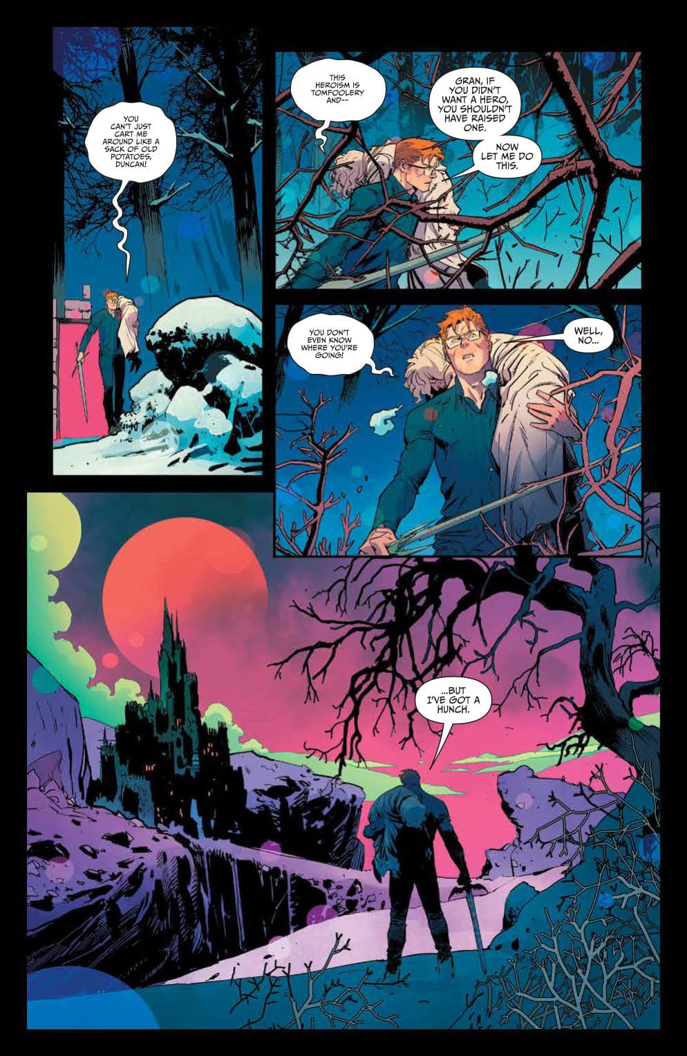
The Lumberjanes are at it again. It seems like even the most normal of circumstances result in some sort of discovery for these campers. But that is simply the Lumberjane way. A fact that we now seem to know, as we dive into the origin of the camp itself.

One comment in Lumberjanes #70 did get us thinking. April mentioned that summer was almost over…which leaves us wondering. What will happen to the series when the summer finishes? Will that be the end? Or will there be another jump in time? Here’s hoping the series isn’t due for a conclusion anytime soon.

The alternate cover for Lumberjanes #70 is perhaps one of the most striking thus far.

The Plot

Shannon Watters and Kat Leyh have teamed up to write this whimsical introduction to the past in Lumberjanes #70. It’s a delightful issue with lots of parallels being drawn. Oh, and maybe a few shockingly dangerous invasive plants.

This series has always had so much charm to it, and it feels like that sentiment grows with each and every issue. Learning more about Jane – the original Lumberjane has only helped to enhance that feeling. Though it’s not something many fans had thought to ask about until this point.

As per usual, a normal outing has turned towards something supernatural. The invasive plants that Rosie was teaching our campers about are something…more. That’s almost an expected twist at this point. But it is a fun one! And it allows for some much needed action and drama along the way.

The conclusion of this issue hints at an adventure of epic proportions. Not only will our usual Roanoke cabin be involved, but Rosie and Abigail as well. That’s a good enough reason to already be looking forward to Lumberjanes #71.

Rosie is probably not prepared for the round of 20 questions she’s about to receive.

The Art

Lumberjanes #70 is full of fun and endearing artwork. In short, it’s so perfectly Lumberjanes that it’s painful. The addition of Rosie and Abigail is a nice tough, as these two add some variety (mostly in height) to the mix.

Kanesha C. Bryant and Julia Madrigal were the lead artists for this issue, working alongside Maarta Laiho for colors, and Aubrey Aiese for lettering. This plot was fun and interesting, but the artwork is what really brought it all to life.

The character expressions are probably the biggest highlight of this issue. Their emotions ranged from curiosity to concern, then to jubilation and back again. The colors would have to be the second-best part of this issue, as they’re just so rich and fun for the eyes.

Behold! The very first Jane (of the Lumberjanes, that is).

In Conclusion

Lumberjanes #70 was a fascinating issue, one that balanced the present and the past in perfect proportions. It’s so refreshing to finally learn about the origin of the camp, even if that is something we never took into question previously.

Monkeys Fighting Robots Youtube

A Dramatic Conclusion In ONCE & FUTURE #6

ONCE & FUTURE #6, out this Wednesday from Boom! Studios concludes this dramatic retelling and twisted tale of King Arthur. This is a tale perfect for those who always felt that the story should be just a bit more sinister.

A dramatic cover for the conclusion of a dark and chilling series.

***SPOILER WARNING***

It’s hard to believe that the conclusion to Once & Future is already here. Then again, they told us from the start that this would only be six issues long. But man were those six issues pleasantly dark and worth reading!

There’s no doubt that it was the creative team behind this project that made it what it was. Kieron Gillen (writer), Dan Mora (artist), Tamra Bonvillain (colorist), and Ed Dukeshire (letterer) are an absolute dream team, and we can only hope to see more from this team in the future.

The sass and family dysfunction is strong on this page.

The Plot

Once & Future #6 was a conclusion that more series should aspire to. It delivered on all of the promises made while leaving enough room for a return – should the creative team feel so inclined. It was dramatic and foreboding, while also letting loose all that building tension.

Kieron Gillen’s writing was intense and at times broody, but it was the perfect note for this conclusion. Duncan’s story is far from over – but we were left at a point where we’re okay with leaving his journey unknown.

The major plot twist over the course of this issue was quite clever. We won’t go into detail, as it’s one of those moments better seen firsthand. But it was the perfect solution for how to put the legend back to sleep, so to speak.

Perhaps the most surprising part of this issue was just how much raw emotion was infused into the pages. You could really see Duncan overcoming it all, while his grandmother’s pain and mother’s uncertainty were clear as day. Their emotions felt real – they read as real. That made them feel more human, in the end.

Looking back on it, this wrap up made complete sense. It wasn’t predictable – and yet it very much felt like the conclusion we’ve been building to this whole time. It did justice to the previous issues of the series. And it lived up to the expectations of the fans.

What a beautiful scene for what is sure to be a dangerous task ahead.

The Art

Unsurprisingly, the artwork behind Once & Future #6 was as stunning as the plot was dark. This was a series unafraid of diving into rich details, or lush settings in order to tell its haunting tale. It worked quite effectively.

There were two worlds portrayed in this issue. The mundane, and the otherworldly. The two merged together in such striking ways. The details and colors were vibrant and eye-catching, all while portraying a legend better left alone. There’s something so very evocative about that combination.

There are many highlights that could be listed for this issue. But the truth of the matter is that everything here works best as one cohesive unit. Yes, the scenery is stunning, the monsters terrifying, and Duncan’s emotions distinct. But together? That’s where the magic happens.

Enter the Galahad and his oh so disturbed mother.

In Conclusion

Once & Future #6 was the conclusion that the fans deserved. It perfectly wrapped up Duncan’s quest, while leaving the door open for more. There’s a fine balance to be found there, but while there is hope to be found, there is no desperation in sight.

This darker retelling of King Arthur was fascinating. It’s refreshing to see a legend take such a morbid twist, especially considering how many retellings have been popping up all over the place this year. This one will continue to stand out among the rest.

Monkeys Fighting Robots Youtube

It’s Time For Some Honesty In WASTED SPACE #13

WASTED SPACE #13, out this Wednesday from Vault Comics, split up the conflicted team in order to force some soul searching from specific members. This is literally an emotional issue, full of debate and turmoil.

Things are not looking good for Billy on this cover of Wasted Space #13.

***SPOILER WARNING***

Wasted Space has been a quirky and shocking series right from the get go. So at a certain point, fans have just started to expect strange and exciting twists and turns. So it is impressive that they still manage to surprise readers each and every time.

This series is a space odyssey that is as inane as it is entertaining. It’s a series perfect for those searching for something completely different and out of this world – literally. It’s brutal and irreverent and absolutely refuses to pull punches. But all of that makes it so worth the read.

There is honesty, and then there’s brutal emotional honesty. The latter becomes a relevant factor in Wasted Space #13, as our characters are pushed to their limits once again. But this time this around, there’s not a quick and easy solution.

One of the more vibrant credit pages out there; we’re digging the colors.

The Plot

Wasted Space #13 is an emotional hammer of a read. It’s powerful and rips the characters apart, forcing them to face anything and everything they’ve been hiding from. That’s what makes it so shocking – and interesting.

The characters in this series are far from perfect. That’s a fact that Michael Moreci has made clear time and time again. If they had been, the revelations in this issue wouldn’t have been so compelling. So what Billy goes through here – and what Billy learns – is so full of impact. It’s enough to make one stop and think.

This issue was a fast-paced one, thanks in part to the fact that the group has been split into two. While Billy is off being tortured by emotion sucking vampires (perhaps literally), everyone else is off fighting a science fiction battle worth writing about. It makes for a nice balance – the intense and the entertaining. The emotionally brutal with the action.

There’s one running joke throughout this issue (series, actually) that was so hilarious. It really helped to even out all of the tension, giving us a much needed breather here and there. Plus, it was just plain funny. And it got funnier each time it came up.

A temple that demands people to work towards being happy…yeah this is going to go great for Billy.

The Art

The artwork inside Wasted Space #13 is vibrant and full to the brim of interesting events and moments to look at. Naturally, the battle scenes, in particular, are especially busy – and entertaining. But that isn’t to say that Billy’s scenes aren’t visually striking. In fact, the portrayal of his reactions is a highlight of this issue, and with good reason.

Hayden Sherman was the lead artist for this issue, working alongside Jason Wordie for the colors, and Jim Campbell for letters. They did a brilliant job, and it’s nice to think that they had a lot of fun illustrating some of these scenes. Because they sure were fun to read and look at.

Woah, Billy. Was not expecting that from you!

In Conclusion

Wasted Space #13 was another satisfying read in this dramatic yet slightly insane space adventure. Nothing ever goes the way we expect, and that makes the series such an exciting read. The conclusion of this issue is enough to leave readers looking forward to seeing what will happen next.

Monkeys Fighting Robots Youtube

Review: The Horrors Of President And Country Revealed In THE MASK: I PLEDGE ALLEGIANCE TO THE MASK #4

main cover artwork

The final presidential vote is tallied in THE MASK: I PLEDGE ALLEGIANCE TO THE MASK #4, available in comic book stores on Wednesday, January 22nd. Abner Mead, the slimy politician who bonded with Big Head three issues ago, is the newly elected President of the United States of America. But who’s in control: Big Head, or Mead? Either way, the people must live with a leader hell-bent on upending the very foundations of our society.

Story

The news of Big Head/Mead’s inauguration is making its rounds across the country. Vast swaths of people are either elated or horrified—those in the middle are few and far between. But unbeknownst to any group is the internal monologue occurring between the two “Presidents.” It’s here we learn that Big Head is looking to become even more radical during his administration, and Mead may not be the right man for his job.

Pushing Mead to the wayside, Big Head attends to his inaugural duties with the pomp and frills of King George from Hamilton. The people see what kind of person they’ve elected, and if they had any doubts, his first speech makes his intentions quite clear.

Christopher Cantwell’s writing echoes an all-too familiar sense of dread many feel in the political climate of the past few years. It’s an anxiety that’s never quite abated, despite attempts to rationalize what direction our country has moved in. In a hauntingly beautiful move, Cantwell casts these fears onto the insane Big Head.

But there is a resistance forming in response to the despot. Previous wearers of the Mask, including Mayor Kathy Matthews and Detective Mitch Kellaway, are experiencing some weird visions about The Mask. They know his days are numbered and will do anything to bring an end to his reign.

Artwork

Patric Reynolds’s artwork for this issue completes the masterpiece that is this issue. Combined with the coloring talents of Lee Loughridge, this book magically blends the realistic depictions of Inauguration Day in Washington D.C. with the cartoony Big Head. The style reflects the surprising circumstances that all too often infect our political landscape.

What drives home the issue’s message, however, is Nate Piekos’s lettering. In the midst of the traditional ceremony, readers are treated to Big Head’s off-kilter speech, represented by the slanted fonts. We know this being is a disruption in the system, but not to what extent.

Comic Book Covers

Main Cover

Reynolds’s main cover gives readers a clear message: the world is full of The Mask. Each person represented is fully embodied version of the anti-hero.

Variant Cover

Duncan Fegredo’s variant cover artwork gives readers a close look at Big Head in classic, thieving form.

Conclusion

THE MASK: I PLEDGE ALLEGIANCE TO THE MASK #4 wraps up this story beautifully. There’s just enough closure, but leaves enough mystery to wonder where the iconic characters will end up.

Do you think there’s a potential for a spin-off from this series? Let us know in the comments below!

Monkeys Fighting Robots Youtube

Review: RUINS OF RAVENCROFT: DRACULA #1 Captures The Essence of ’30s Horror

Ruins of Ravencroft: Dracula #1 Cover

Marvel Comics’ Ruins of Ravencroft: Dracula #1 (on sale January 22) infuses a classic monster movie with the superhero genre. Writer Frank Tieri tells a fun standalone story that smoothly sets up the launch of the upcoming main series, Ravencroft, by ending the issue on a captivating cliffhanger

Ruins of Ravencroft: Dracula #1

Writer: Frank Tieri

Artist (modern day): Angel Unzueta 

Artist (flashback): Stefano Landini

Colorist: Rachelle Rosenberg

Letter: VC’s Travis Lanham

 Tieri continues where the previous Ravencroft one-shots left off and maintains the same horror-based tone. Like its predecessors, this installment is primarily a period piece that takes us back to the ’40s. Tieri chronologically jumps through time and the story feels dynamic because it shows how Ravencroft has deteriorated over the years.

Ruins of Ravencroft: Dracula #1 Loki
Many famous characters have passed through Ravencroft’s walls through the years, including Loki.

Whereas last issue showed Nathaniel Essex’s mad science, this story villainizes the United States government, who’s willing to do whatever it takes to win World War II. Naturally, this desperation leads to more evil experimentation. From there, the plot naturally connects to Captain America, the government’s greatest success story. Tieri masterfully weaves various parts of Marvel history together and, even when he brings Dracula into the fold, he gets you to suspend your disbelief. In the Marvel Universe, it’s easy to buy into a world where the Count threatens to use his influence to sway the outcome of the war.

The art team brings the legendary vampire to life by paying tribute to the classic 1931 movie with Bela Lugosi. A few scenes feel like they’re ripped right from the film. When the Count attacks Cap and Bucky Barnes, he takes the form of fog. After Bucky questions the toxic cloud, Dracula ominously says, “…What mere fog can transform into death itself?” Here, flashback artist Stefano Landini depicts the vampire as his natural self, with his dagger-like fangs. In an issue full of borderline campy moments, this one is the most cinematic.

Likewise, when Dracula and Captain America duke it out, the Count delivers another enjoyably cheesy line that’s elevated by the art team. Dracula says that Cap is just a man, while he is “very much…not.” The line is separated into two panels, and, at the ellipsis, Dracula transforms into a bat. Colorist Rachelle Rosenberg exquisitely leads the reader to associate the red on Cap’s shield with Dracula’s affinity for blood; the weapon serves as the Count’s background during this transformation. The combination of the striking art and the entertaining dialogue delivers a story that’s in the same vein as the classic horror movies we know and love.

With that being said, Dracula’s involvement is underwhelming. His fight with Cap ends anticlimactically, and it takes a backseat to other narrative threads, like Jonas Ravencroft’s attempt to take his facility back from the government. The inconclusive battle leaves the reader wanting more, so there’s room for a sequel someday. Still, it’s disappointing to see Dracula feel unimportant in a book where his name is in the title.

Ruins of Ravencroft: Dracula #1 Gate
Like Arkham Asylum, Ravencroft always looks imposing, even from the outside.

As the last issue of Ruins of Ravencroft before the main series’ debut, Tieri clearly sought to earn the readers’ investment in the upcoming story. Mission accomplished. By the end of the issue, we see that Ravencroft is alive and well with a state-of-the-art-facility. Its new staff, led by John Jameson and Misty Knight, offers intriguing dynamics. We’ve seen Jameson and Knight butt heads throughout these one-shots, so we’re left wondering how their relationship will progress from here. Plus, a shocking addition to the faculty at the end of the issue sets the stage for even more mayhem within the walls of Ravencroft.

Ruins of Ravencroft: Dracula #1 doesn’t quite deliver the cover’s promise of a thrilling fight between Cap and Dracula. But it’s still a fascinating tribute to the horror movies of old and it organically builds the world ahead of next week’s Ravencroft #1.

What’d you think of Ruins of Ravencroft: Dracula #1? Where do you hope to see Ravencroft go from here?

Monkeys Fighting Robots Youtube

Review: Tim Questions His Identity In BOOKS OF MAGIC #16

BOOKS OF MAGIC #16, available in stores Wednesday, January 22nd, brings back the future version of Timothy Hunter, and his intentions appear to be far from innocent. After showing the younger boy a little taste of his true magical potential last issue, the future counterpart returns with the intent to show him why he should reject the rules of his guardians, such as Ms. Rose. But Celia Culpepper, a detective from the Other Side, has caught wind of Tim’s unauthorized use of magical trespassing and wants Rose to find him.

Story

Tim believes he’s in a good place now; his father is safe, the Cold Flame isn’t threatening him anymore, and his future double is showing him a whole new world of magical possibilities. He’s been told they’ve placed limits on his power. Now Future Tim is claiming that group believes they can limit his sense of right and wrong as well.

Our hero finds himself at a crossroads–Does he believe what Future Tim said about these limits? Does he really know what being “good” even means?

Writer Kat Howard portrays Tim’s existential crisis well. Using the tools of magic and fantasy, she illustrates a search for identity in a relatable way. Readers can resonate with doubts about their true “goodness” and questions of who they really want to be in this life.

While this is going on, Culpepper commands Rose to join her in the search for Tim. The seasoned detective plans to have him tried for his magical lawbreaking; will Tim be caught before he can find the answers posed by his future self?

Artwork

Tom Fowler’s penciling, Brian Churilla’s ink work, Jordan Boyd and Marissa Louise’s coloring, and Todd Klein’s lettering work harmoniously together throughout this issue. As the scenes transition from Tim’s present and the past remembered, the lines and shading become less solid and defined. We also see a clever use of brighter colors on our hero to distinguish him from the more bland background hues, as if he’s the one bright spot in a world of darkness. The lettering pairs well with the story’s rather chaotic elements by allowing  boxes to flow alongside the actions.

Comic Cover

Kai Carpenter’s Cover art features Detective…. with an inquisitive look on her face. This reminds readers of the everpresent watchful eyes aware of Tim’s magical jaunts.

Conclusion

BOOKS OF MAGIC #16 keeps readers on their toes with both the intrigue of Future Tim and the threat of Culpepper. The story is well written, and is clearing building up the narrative into something exciting.

Do you think Tim will ? Let us know in the comments below!

Monkeys Fighting Robots Youtube

Panel Breakdown: GUARDIANS OF THE GALAXY #1 Al Ewing, Juann Cabal & Federico Blee

Panel Breakdown: GUARDIANS OF THE GALAXY #1 Al Ewing, Juann Cabal & Federico Blee

Welcome to PANEL BREAKDOWN, a weekly series where we take a look at our favorite panels of a comic book. This week we are talking about the new Marvel Comics series Guardians Of The Galaxy #1 written by Al Ewing, with art by Juann Cabal, colors by Federico Blee, and you are reading Cory Petit’s letters.

With Guardians Of The Galaxy #1, we take a look at movement, and panel design as this is a dense issue with a ton of action.

About Guardians Of The Galaxy #1:

Once, they were a team of misfits. Now they’re a family, and they’ve earned their peace. But the universe is not a peaceful place — and it’s only getting worse. The Great Empires are in turmoil. The rule of law is dead. And amidst the chaos, the Gods of Olympus have returned — harbingers of a new age of war, reborn to burn their mark on the stars themselves. Someone has to guard the galaxy – but who will accept the mission? And will they survive it? Al Ewing (IMMORTAL HULK) and Juann Cabal (FRIENDLY NEIGHBORHOOD SPIDER-MAN) bring you in on the ground floor of a whole Marvel Universe of action and suspense!


Do you have Guardians Of The Galaxy on your pull-list, let me know what you think after you read it.

Monkeys Fighting Robots Youtube

On Reading the 1st Year of Al Capp’s Li’l Abner: Meet the Yokums

Li'l Abner
"Don't bring Salomey into this, Daisy Mae!"

After getting a sense of what Li’l Abner‘s creator was like, it’s time to meet Dogpatch, USA’s first family, the Yokums. Of course, readers are probably most interested in Li’l Abner‘s titular character so I’ll start with the big galoot himself.

Meet the Yokums: Li’l Abner Yokum

The heart and soul of Li’l Abner is, not surprisingly, the lovable and naïve Li’l Abner Yokum. Although some stories find Abner on the outskirts of the plot, no plot-line in the strip is ever free of the innocent and gigantic teen.

Capp deftly walks a difficult tightrope with his ongoing characterization of Li’l Abner. Longtime readers of the strip will be familiar with the way Capp poked fun at southern culture while simultaneously revering it. Li’l Abner may not be the sharpest tool in the shed but what he lacks in wit and charm he makes up for in bravery, loyalty, and unbeatable wrasslin’ skills, what he learnt from his Mammy.

Speak Softly But Carry a Big … Pair of Fists

Li’l Abner may be gigantic, but he doesn’t get violent often. His mammy taught him to use his head first and his fists as a last resort. Rest assured that if Abner has to “smack yo’ ’round a bit,” then yo’ deserve it.

Although Li’l Abner almost always does the right thing, he does have a blind spot. Li’l Abner’s relationship with women is decidedly outdated and relatively misogynistic. Li’l Abner sees “girls” as a bore, only reluctantly spending time with any but his beloved Mammy.

Southern Gentlemen Apparently Prefer “Po’k Chops”

“Oh, Li’l Abner…”

One girl Abner often finds hanging around, despite his suspiciously halfhearted attempts to spurn her, is the lovelorn Daisy Mae Scragg. Daisy Mae has to put up with a lot of crap over the first year of Li’l Abner‘s publication, including being psychologically manipulated by a suitor and enduring a fake wedding to Li’l Abner. Although their on-again/off-again relationship eventually culminated in a long-lasting marriage, Daisy Mae had to put up with nearly 20 years of waiting. Luckily, neither of them aged…

Noo Yawk

Although a number of plot-lines take place in the Yokums’ hometown of Dogpatch, USA, Li’l Abner is periodically called to New York by his Aunt Bessie, the Duchess of Bopshire. Abner’s well-to-do socialite aunt stands in contrast to the rest of his salt-of-the-earth family. Rather than taking the gigantic and lovable teen as he is, Aunt Bessie is always working on some plan to educate and refine Li’l Abner. In one such plot-line, Li’l Abner is called to New York to attend college so he might one day realize his Mammy’s dream for him and “be Presidunt.”

Where the rest of the Yokum family act as caricatures of southern hill-folk, Aunt Bessie acts as a caricature of bigwig New Yorkers whom Capp would’ve had much greater familiarity with as a New Yorker himself.

“Ain’t no place like Dogpatch!”

Li’l Abner’s trips to New York are bittersweet for his supporting cast: all are genuinely happy that the big dummy is trying to improve himself but things in Dogpatch just aren’t the same without him, especially for Daisy Mae. In addition to experiencing increased levels of romantic desperation during Abner’s absences, she continually finds herself at the mercies of one creepy yokel or another.

In true ’30s form, though, Abner’s absences only serve as opportunities to have hearty reunions. Abner almost always swoops back in the nick of time to wrassle whomever needs wrasslin’, but if he doesn’t then his Mammy’s always there to back him up.

Li'l Abner
“Mammy fix!”

Meet Mighty Mammy Yokum

Although Abner may have married Daisy Mae in 1952, his first real love was his pipe-smoking, ham-fisted, and po’k shop slingin’ Mammy. Check out my next article on the Yokum matriarch and the love of her life, the cowardly but tenderhearted Pappy Yokum.

Monkeys Fighting Robots Youtube

Review: Scum & Villainy in THE KILL LOCK #2

The second issue of Livio Ramondelli’s “The Kill Lock” invests itself into the flaws and backstory of its characters as they seek a cure for their condition. Guided by absolutely phenomenal artwork, “Kill Lock” looks to be one of the most promising new series entering 2020.

Bonded by their Kill Lock, four robots search for a cure—a way to live, and die, independently. Their only clue is a bot known as The Axial, supposed to be a creator of the Lock and keeper of its secrets. Of course, the first thing they have to do is find her… without getting themselves killed!

Writing & Plot

Writer and artist Livio Ramondelli progresses the plot of his characters via their backstories and flaws in “Kill Lock” #2. The quartet’s journey takes them to a crime-riddled planet of debauchery and red-light districts. Ramondelli uses this environment to challenge each of the character’s weaknesses and personalities, placing them in some dicey situations that also keep the forward momentum of the main plot moving. Something truly special about the character work in this comic is that none of the four characters are stereotypes. There are of course hints of other archetypes in the protagonists (the psychopath, the faithful soldier, the innocent child, and the honest working man), but they manage to surprise the reader at almost every turn. The dialogue is plenty natural and well-paced, which may be slightly ironic given that everyone’s a robot, but that’s likely even more of the charm.

Art Direction

Ramondelli combines a “used future” aesthetic with his almost trademark style of drawing humanoid machines. Aside from his fantastic ability to design individually distinct and original robots of all sizes, he also creates perfectly dingy or desolate environments for them to roam around in. The icy tundra from the prior issue is replaced by a grimy urban landscape for “Kill Lock” #2, and it manages to be appropriately claustrophobic. Ramondelli’s combat scenes are a treat as well, short as they may be. They don’t showcase any excessive posing or maneuvering, and everything happens very quickly. Regardless, they’re always a brutal and awesome sight to behold for the whole three panels it takes for the Wraith to disembowel an entire platoon.

“The Kill Lock” #2 is a chapter focused on the backstory and characteristics of the main cast. The environment Ramondelli places them in forces them to act on their own impulses (or lack thereof, for one), revealing more about the quartet of disgraced machines and their ability to work together. The script remains tightly paced with great dialogue. The art is absolutely breathtaking in every regard. “The Kill Lock” is a definite series to watch as we enter 2020.


Monkeys Fighting Robots Youtube

INTERVIEW: Composer Matt Novack Parodies Procedural Dramas And Thrillers On Medical Police

The creators of Childrens Hospital unleashed a hilarious spinoff on Netflix called Medical Police, which takes parodying procedural dramas and spy thrillers to a whole new level. Lacing all the action and comedy with just the right underscore is composer Matt Novack.

Creators Rob Corddry, Krister Johnson, Jonathan Stern, and David Wain scored a hit with Childrens Hospital back in 2009. The short-form web series premiered on TheWB.com but was picked up by Adult Swim later, where it found a strong following throughout its seven seasons. Now, the team reunites to take their doctors into the spy game where many jokes about nefarious villains and un-killable heroes will undoubtedly fill the screen.

PopAxiom reached out to composer Matt Novack to talk about his road to making music for film and television, the Harley Quinn animated series, and making music for Medical Police.

Beats

Matt became interested in music at an early age. “My dad played a little saxophone. He was a jazz musician for a while before I was born. My mom played a little bit. They encouraged me to pursue music.”

During his formative years, the would-be composer admits he was “… obsessed with film scores early on … Star Wars, of course.”

Matt started off as a percussionist. “Drums and keyboard percussion,” Matt says, “My dad actually bought me my first drum set without running it by my mom first.”

At Northern Illinois, Matt studied “… percussion performance and composition … “ After graduating, Matt says, “I moved out to L.A. and went to USC’s film scoring program and then started working.”

Road To Childrens Hospital

Before Childrens Hospital, Matt worked for “Craig Wedren, as his assistant.”

The young composer also spent time “… working for a music library as an assistant and sort of jack-of-all-trades; composer, orchestrator, office manager.”

He explains a bit about what a music library does. “These are music houses for commercials, documentaries, stuff like that. Their main thing is that they’ll produce albums of music for licensing. Movie trailers, commercials, TV shows, mostly reality TV shows. It’s typically for productions that don’t hire a composer to work on the show. So it’s pre-produced music.”

About working in a music library, Matt says, “It’s a good gig to do between shows.”

Matt considers Childrens Hospital as his big break. “It was my first show on my own with my team. I scored it for seven years. It opened doors for everything else.”

About Medical Police

Medical Police released January 10th on the streaming giant Netflix. “It’s a completely different score from Childrens Hospital. The score was a parody of Grey’s Anatomy.”

Matt continues, “There are some hints of the Childrens Hospital score at the beginning of the season, but then the rest of it we are in full-on international thriller score.”

Where Childrens Hospital leaned heavily into the comedic score, Medical Police takes things in a different direction. “We wanted to make a score that could fit into a more serious version of this kind of movie. The score could be lifted from Medical Police and put into one those kinds of movies and work fine.”

medial police-netflix-comedy

Wrapping Up

Matt rattles off three names in quick succession when asked about influences. “Elliot Goldenthal, John Williams, Jerry Goldsmith are all tied for how much they influence me.”

What would John Williams do? “Whenever I get stuck, I think ‘How would these guys do it?’ It usually helps me unlock my writer’s block. There’s so much to learn from them.”

In the age of remakes, what would Matt love to be a part of? “There was a Greatest American Hero pilot that didn’t go, but that would be so much fun. Maybe Gremlins. Growing up, I was obsessed with Gremlins and Goonies.”

Medical Police is out on Netflix and tickling funny bones, but there’s more to come from the composer. You can hear more of Matt’s work on “Harley Quinn on the DC Universe.”

Will you be watching Medical Police on Netflix?

Thanks to Matt Novack and Impact24 PR for making this interview possible.

Want to read more interviews like this? CLICK HERE.

Monkeys Fighting Robots Youtube