BOOKS OF MAGIC #17, available in comic book stores on Wednesday, February 26th, shows readers the full extent of future Timothy Hunter’s unsettling power. Ms. Rose and Detective Celia Culpepper, while attempting to track the Tim of the present time, notice a rift in reality that attempts to form in their office. They quickly realize that the rift was Tim, so they decide to enter the breach. But do they know what they’re jumping into?
Story
Tim is at a loss, both literally and figuratively. He’s been wandering a frozen wasteland for what feels like weeks, trying to stay alive while avoiding his future self; the doppelganger wants to enter Tim’s reality, and the book of magic in the boy’s possession is the key. Knowing this, Tim considers using it to escape from the dimension.
However, he soon finds what would happen if the book fell into the older Tim’s hands. And it’s a risk the young wizard finds he’s unwilling to take.
Kat Howard’s writing shows a side of Tim readers aren’t used to, focusing on his selflessness instead of the usual attention to his recklessness. His refusal to endanger his friends connects us with the character at our deepest understanding of integrity. It reminds us that even those who are less than perfect can become moral exemplars.
Artwork
Tom Fowler’s penciling and ink work, Marissa Louise’s coloring, and Todd Klein’s lettering walk readers through the unsettling nature of the narrative’s alternate reality. The snow-capped landscapes and buildings and highly detailed magical effects show the many possibilities in this dimension. A variety of lettering styles interspersed throughout these scenes to add to the dynamic nature of the story’s events.
Comic Cover
Kai Carpenter’s cover depicts Tim slowly sinking into a tar-like substance, with multiple hands trying to grasp him. This represents the multiple parties attempting to control the young wizard’s destiny.
Conclusion
BOOKS OF MAGIC #17 takes readers on a journey through Tim’s war with himself (quite literally). Only time will tell if he’s able to prevent his monstrous alter-ego from harming his loved ones.
Where do you think has landed himself? Let us know in the comments below!
Leigh Whannell is just showing off at this point because he directs The Invisible Man masterfully. Since arriving on the scene with his friend James Wan with their breakout hit Saw in 2004, Whannell has been a force to be reckoned with in the horror genre. His most recent hit was 2018’s Upgrade, but now he has returned to set the bar very high for the rest of the year with his new film, The Invisible Man. His highly skilled camera work combined with a solid script, haunting score, and a game-changing performance by Elisabeth Moss makes this film a must-see.
The Universal Classic Monsters have made a triumphant return with The Invisible Man. A reboot of the hit 1933 film, and a contemporary adaptation of H.G. Wells novel of the same name. Directed and written by Whannell, the film stars Oliver Jackson-Cohen, Storm Reid, Aldis Hodge, Harriet Dyer, Michael Dorman, and Elisabeth Moss. In the film, Cecilia Kass’s (Moss) life finally seems like it is going to change for the better after her abusive ex takes his own life. However, Adrian’s (Jackson-Cohen) demise is an elaborate hoax to continue tormenting Cecilia and make her life miserable, as he has mastered a way to be invisible.
Oliver Jackson-Cohen as Adrian in The Invisible Man
Moss is mesmerizing in her role as this distraught, broken woman who just wants to have some control in her life. She portrays her character in a way that immediately captures your attention from the opening scene. Cecilia has tried to put her best foot forward through it all, but she finally manages to escape her toxic relationship with Adrian. The breakdown of this woman is all made abundantly clear through Moss’s tears and facial expressions. While we don’t see Adrian for most of the film due to his John Cena status for most of the run time, it becomes clear that the secondary antagonist is those who don’t believe Cecilia’s claims.
Whannell’s script is a bit questionable towards the end as several things become illogical in one way or another, but overall it still is very well written. Only other issues were the fact that the other characters outside of Moss’s, even Adrian, felt underdeveloped and uninteresting. Aside from that, Whannell makes empty spaces horrifying multiple times in this script, as Cecilia wanders her surroundings unable to spot her stalker who is right in front of her at one point or another. In the original film, the invisible man himself was the one audiences spent the most time with. Whannell flips it allowing a modern touch that suits today’s climate, as this film plays out from the victims POV.
Elisabeth Moss as Cecilia in The Invisible Man
Aside from Moss, her co-stars deliver in their roles as well despite not being as important or interesting as the character of Cecilia. The Invisible Man cast gives it their all throughout this tense, fast-paced rollercoaster. Still, the performance that will receive the most attention will be from Moss. She shines with her expressive versatility, emotional depth, and her ability to fully embody the fractured nature of Cecilia, who does manage to get the last laugh in the end against Adrian.
As mentioned above, Whannell’s directing is on another level with The Invisible Man. He has previously directed Insidious: Chapter 3 and Upgrade, both films got him a lot of attention for his directing. This time around, he has crafted a film that is very atmospheric, suspenseful and shocking on multiple occasions. It turns out the trailers were misdirecting on purpose because there a few twists and jaw-dropping moments no one will see coming. Whannell’s direction is only heightened by a gut-wrenching score from Benjamin Wallfisch. The score boosts the dread and unknown that Cecilia faces in each scene as she searches for, or is preyed upon by her invisible assailant.
Elisabeth Moss as Cecilia in The Invisible Man
The Invisible Man is a great achievement for sci-fi horror and a nice return for Universal Monsters. Despite the script becoming a bit clunky in the middle, Moss’s performance and Whannell’s masterful direction are enough to keep this film afloat. The Invisible Man is the first solid mainstream horror film of the year.
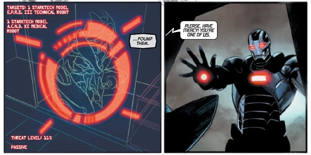
A team from the 90s has returned in Force Works 2020 #1 thanks to Matthew Rosenberg, Juanan Ramirez, Federico Blee, and VC’s Clayton Cowles. Is this revival beneficial to the 2020 event or it an unnecessary reboot?
The eruption of a violent robot revolution threatens all manner of biological life! Teetering on the precipice of extinction, there’s only one man with enough tactical skill, killer instinct and ruthless leadership to lead the rebellion: War Machine!
Writing
Unlike Machine Man 2020 #1, this issue feels necessary and adds to the world surrounding the 2020 event. It showcases how other parts of the world are being affected by the robot revolution and why a specially designed team to counter these factors is needed. The later reveal in the issue showcases a threat which is ideal to the 2020 event and has echoes to the Ultron Agenda storyline from Tony Stark: Iron Man.
Matthew Rosenberg sets up some great banter between the different team members. The dialogue between War Machine and U.S. Agent who have history and have been former teammates seems spot on. It’s the type of fellowship and bonding between allies you want to see between heroes when they appear in a team series together.
Artwork
The art team hits the ground running in a fantastic opening scene with incredibly detailed art as a nuclear bomb goes off. The scene is highly detailed and memorable is just the start of an issue of top-quality visuals thanks to Juanan Ramirez on pencils and inks and Federico Blee on the colorwork.
The lettering by VC’s Clayton Cowles offers the ideal aspect of the first issue of a team series. Each character gets an introduction box when they first appear in the issue. Though many of these characters are very recognizable, the intros have a bit of commentary to them and add to the entertainment of the issue.
Conclusion
Force Works 2020 #1 is a perfect installment in the 2020 storyline. It offers detailed artwork and great banter between the members of the squad. It is a shame the team is only a mini-series as they work well together. It would be thrilling to see them tackle more adventures in the future.
STAR #2, out this Wednesday from Marvel Comics continues the story of reporter turned villain. Ripley, aka Star, is making the most of her miniseries, though perhaps not in the way she had expected.
Star #2 brings a Marvel hero into the mix for a dynamic new team up.
***SPOILER WARNING***
Power consumes. It attracts unwanted attention. Even those who earn it will find themselves struggling to keep it.
That is the path that Star, aka Ripley Ryan, is facing. She was once a reporter, back in the day. But after a series of events caused her to feel weak and powerless, she decided to do whatever it took to never feel that way again.
Now she’s a villain, one who happens to be bonded with the Reality Stone. The real question is; will she learn to control it? Or will she run out of time, as heroes and villains alike seek to take the power she has found.
Now THAT is a team up worth talking about! Courtesy of Star #2.
The Writing
Star #2 takes the Captain Marvel alumni to unexpected places, pushing her character to new limits in an ironic twist of fate. To make matters more complicated for this villainess, she’s surrounded by allies and enemies alike – and she doesn’t even know the depth of it. Not yet.
Kelly Thompson is at the helm of this project, which is appropriate since she’s the creator of this unique character. We may be only two issues into this miniseries, but there have already been so many surprises thrown our way. It’s making for a thrilling read.
The inclusion of Scarlet Witch in this plot has actually gone a long way in adding both tension and grounding. After all, it makes complete sense that she would take umbrage with the Reality Stone being misused.
Let’s be clear on one thing. Ripley is not a hero. This arc is not a redemption tale. That being said, there is something oddly compelling about her story. In fact, the more we learn about her and her past, the easier it is to see her side of things. Seeing and agreeing with are two very different things, after all.
The final twist/revelation at the end of the issue is another element of this plot that is proving to make total sense. It’s also going to up the ante in the next issue, of that there is no doubt. After all, this group is not known for pulling punches.
It looks like she’s getting the hang of summoning weapons in Star #2.
The Artwork
There’s a lot to love about the artwork from Star #2. For one thing, there’s a lot of action and dramatic poses. That’s always a plus in any series, especially when you have two characters with interesting designs (Scarlet Witch and Star).
Javier Pina and Filipe Andrade were the lead artists for this issue. Their portrayal of Star’s power and Scarlet Witch’s magic was, simply put, phenomenal. It was dramatic and dangerous, yet also showing both the commonalities and differences between the two.
Jesus Aburtov took charge of the colors, and it was exactly what this issue needed. His use of vibrant colors posed against darker backdrops and dangerous creatures really made the scenes pop. Another highlight of this issue was the choice to mute the colors for the flashbacks. It was evocative and distinct.
Finally, VC’s Clayton Cowles was the letterer for Star #2, and that was the final touch for the artwork. His work perfectly carried the writing, balancing out the artwork and plot to make one cohesive piece.
In Conclusion
Star #2 was a thrilling read, one that put two unlikely characters together. Yet the more we see of these two, the more interesting their interactions become. It’s impossible not to look forward to seeing what will happen next, for it’s looking like it’ll be cataclysmic.
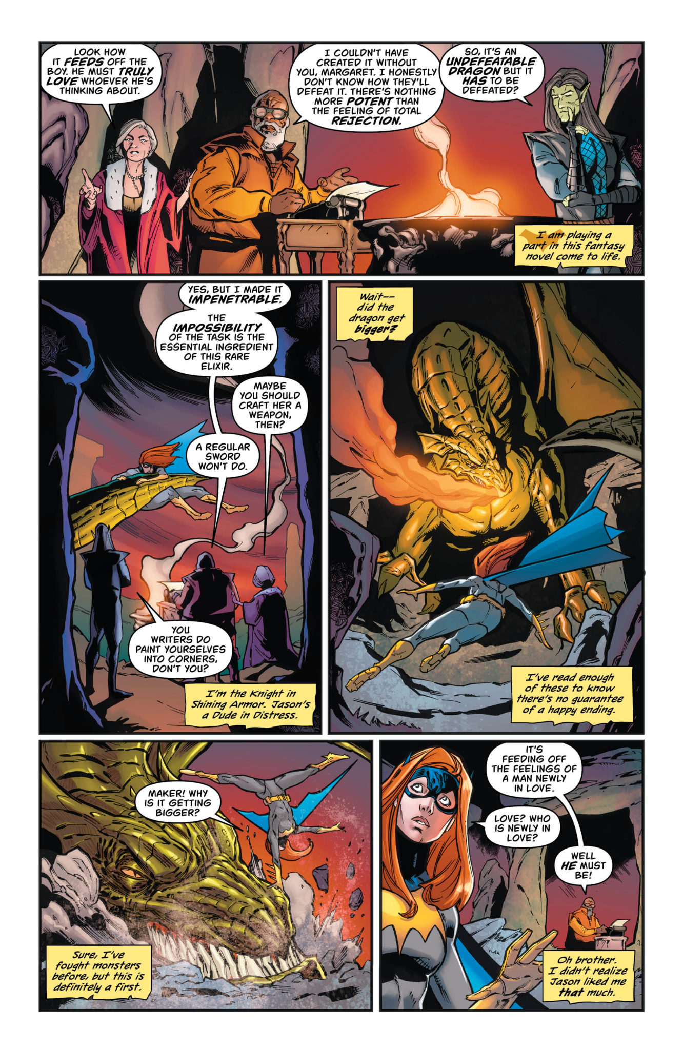
BATGIRL #44, out this Wednesday from DC Comics, continues the dramatic tale of magical realities and fairytale plots. This is a plot that turns subtext into text, forcing emotions and fears to the surface.
Batgirl versus a dragon powered by emotions in Batgirl #44.
***SPOILER WARNING***
Last we saw, Batgirl was battling a dragon fueled by fear and love – literally. It’s probably not what you expected to hear, but to be fair, Barbara is probably feeling the same level of surprise right about now.
The real question is; what is more surprising? That Batgirl is fighting a literal dragon, or that she is slowly falling for Jason? A man who has stood up against her family and her superhero persona? The fact that this plot arc forces both surprises together is really icing on the cake.
Batgirl looks like she means business on this alternate cover of Batgirl #44.
The Writing
Batgirl #41 is one of those issues unafraid to truly dive headfirst into the plot. Here Cecil Castellucci has forced her characters to verbalize all of their hopes and fears, all as a way to stand a chance against their newest antagonist.
It’s a surprising way of handling things, yet it is quite clever. The intentional parallels between Batgirl and Jason’s confessions were endearing and poignant. They were so full of emotion, especially of fear. Specifically, the fear the comes with new love; the fear of rejection and potential pain.
It’s something the series has been dancing around a lot lately, so it’s actually quite refreshing to see it spoken about so openly. It’s not something you see in comics every day, so appreciate this moment while it lasts.
There were several more twists that occurred after the dramatic heart-to-heart that culminated during the battle. One of these twists made thematic sense for everything that has just occurred. It felt right. The other? Well, that’s the beginning of a whole new set of adventures for Batgirl, from the looks of it.
And so the battle begins (or rather, continues) in Batgirl #44.
The Artwork
The artwork in Batgirl #44 took full advantage of what it had available. After all, it really isn’t exactly common to see Batgirl battle a dragon. Least of all a dragon powered by such strong emotions. The scenes that followed were dramatic, as one would hope and expect to see when a fire breathing dragon has entered the fray.
The colors for this issue were phenomenal, using a balance between vibrant colors and dark backgrounds. It was everything you’d expect to find in epic fantasy, with a touch of Batgirl’s classic color palette.
Batgirl #44 was illustrated by Cian Tormey, with colors provided by Chris Sotomayor, and lettering by Andworld Design. Together they’ve created us a world that is both fantastical (literally) and very much grounded in Barbara’s world.
A battle for love…without proper planning.
In Conclusion
Batgirl #44 was a highly entertaining read, one that was unafraid to address the elephant in the room: the budding relationship between Barbara and Jason. All while moving the plot forward and setting up for a whole new complication for our besotted heroine.
QUANTUM & WOODY #2, out this Wednesday from Valiant Comics is a chaos fueled and highly entertaining read, as Quantum and Woody face off against the infamous Doctor Toilet (pronounced ‘Twah-Ley’).
Quantum & Woody #2 is showcasing the differing personalities of these two characters, is it not?
***SPOILER WARNING***
Quantum & Woody, the dynamic and highly chaotic duo, are back for a miniseries, and they’re about to make the most of it. As if these two didn’t have enough energy to keep a series going, two more characters are about to join the fray.
Enter Doctor Toilet (though if you pronounce it as anything other than ‘Twah-Lay’ you’ll risk being scolded), and The Apprehension. These two couldn’t be bigger polar opposites if they tried. But they’re sure to keep our heroes (er, want to be heroes?) busy.
An ally is about to make her appearance in Quantum & Woody #2.
The Writing
With Christopher Hastings at the helm of this project, you just know that he’s having a blast. The writing in Quantum & Woody #2 pretty much gives it away. This is a fast-paced read, with something hectic always occurring on the pages.
It fits the duo well, actually. Quantum & Woody are not the type that can sit still. Unfortunately, they tend to go about problem solving in different ways…thus their hero missions tend to get a bit disorganized. On the bright side, that makes it all the more entertaining for us readers.
Quantum & Woody #2 is an issue full of wit and frenzied action. The banter, the pacing, and the introduction of new characters are all enough to keep the plot up in the air. Meanwhile, there’s something oddly compelling about The Apprehension and her character design.
For a brief moment the humor contained within this issue surpassed the foreshadowing. But it all came back down to reality quickly enough, leaving readers with one more reason to be concerned about ulterior motives and potential betrayals.
Quantum & Woody…looking more comical than dramatic. Yeah, that holds for these two brothers.
The Artwork
Quantum & Woody #2 had a bit of a hectic plot to keep up with – one that made plenty of demands on the artists. The panels in this issue are full to the brim of action, characters rushing to and fro, and lots of other entertaining other shocking elements.
Ryan Browne was the lead artist for this issue, and he really ran with some of the concepts provided. Doctor Toilet’s antics, in particular, lent really well to some…creative and hilarious scenes. But even without his inclusion, this issue would have been a lot of fun.
Ruth Redmond was the colorist, and his work really made the artwork pop. That introductory scene is a real eye-catcher! The bright colors really sold several of the scenes, while also leaving room for The Apprehension to look dramatic (and competent).
Finally, Hassan Otsmane-Elhaou was the letterer, and once again we’re left with the impression that they had a lot of fun with this issue. There were plenty of sound effects to go around, as well as carefully placed exclamations that made a scene all the more amusing.
In Conclusion
Quantum & Woody #2 was a highly entertaining read, one that will keep readers enthralled from beginning to end. The frenzied action nicely complements the sometimes desperate feeling we get from our heroes, as they try to become something greater.
The conclusion and foreshadowing of this issue is going to be more than enough to keep fans eagerly looking forward to Quantum & Woody #3.
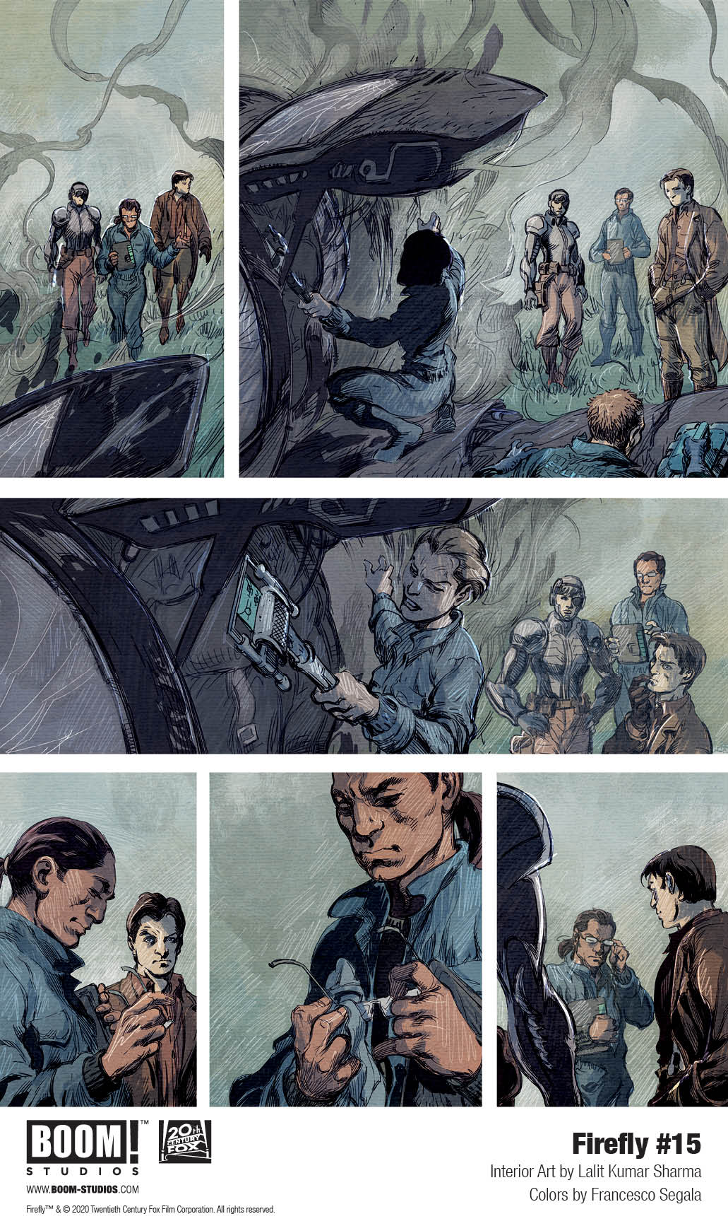
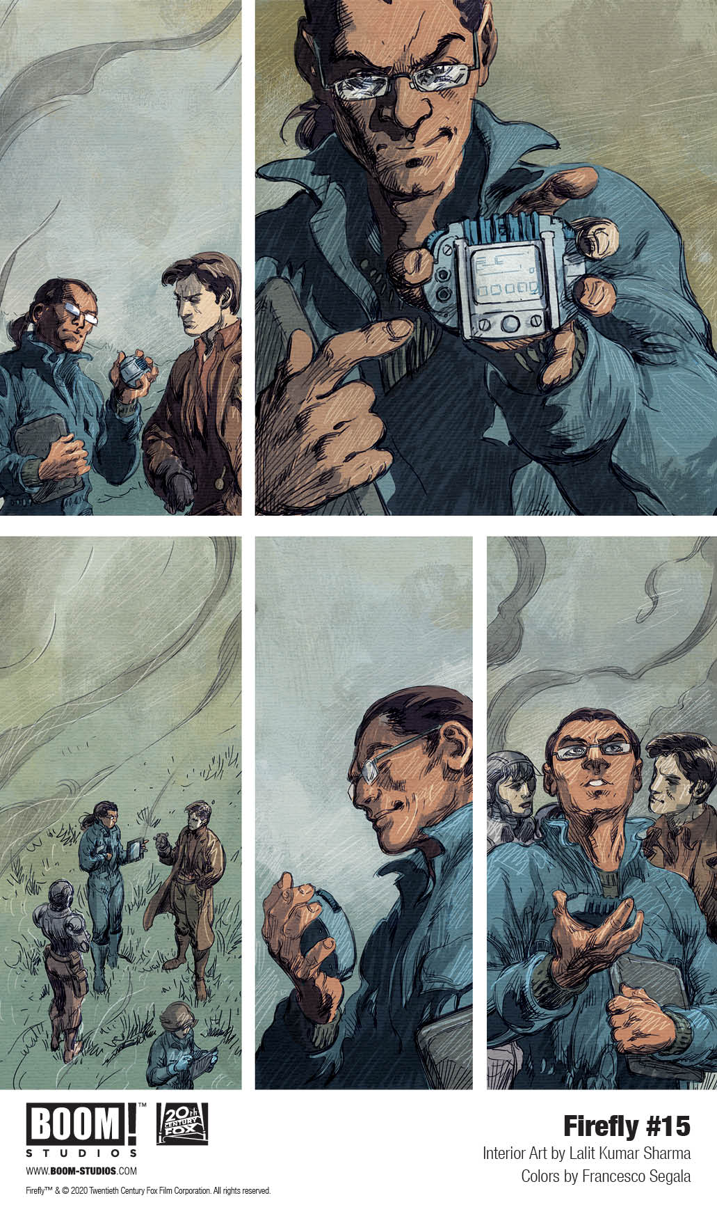
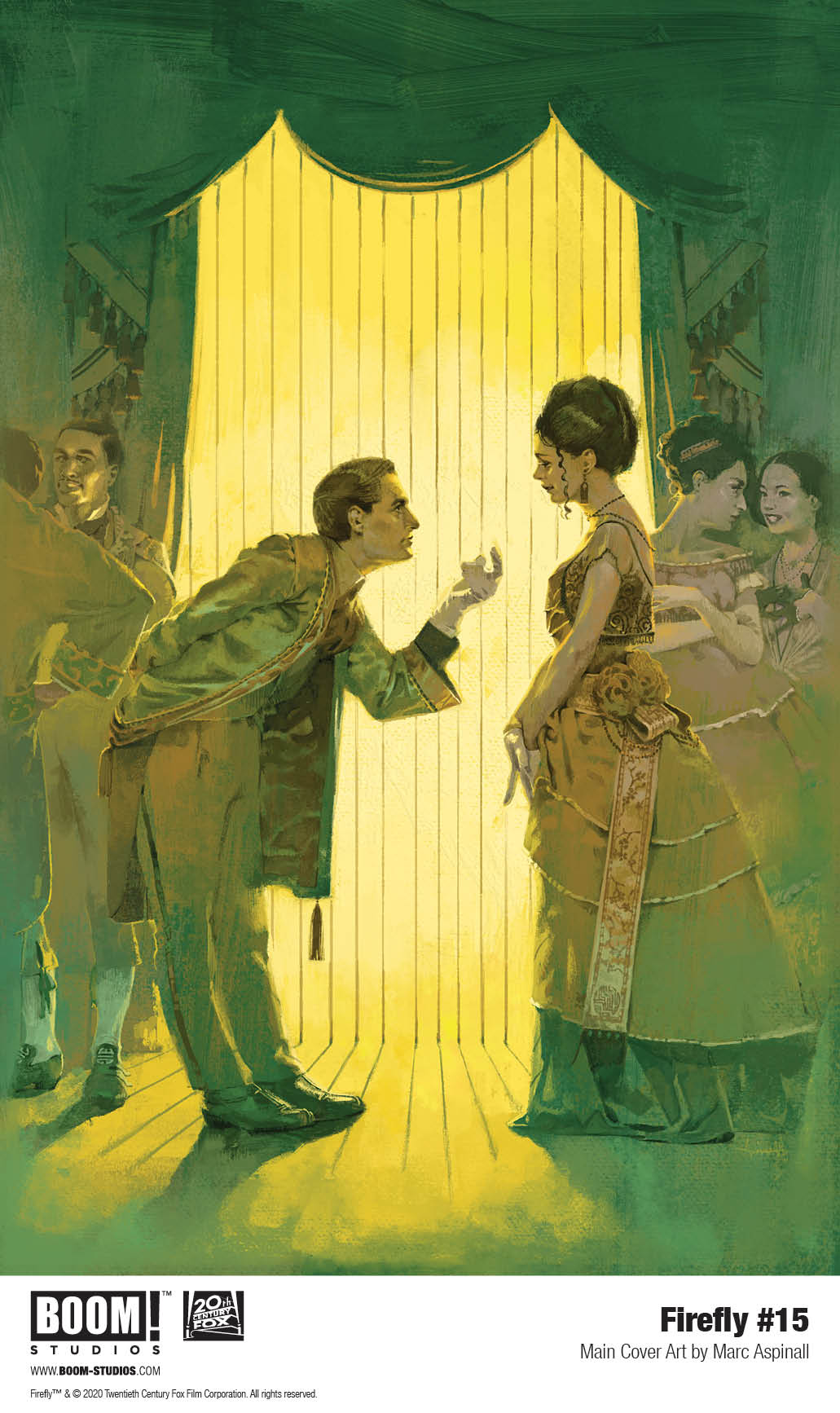
Firefly #15 hits your local comic book store March 18th, but thanks to BOOM! Studios, Monkeys Fighting Robots has an exclusive three-page preview for you.
About the issue: A Browncoat at heart, Sheriff Mal Reynolds does have to admit that there might be one single perk to a government job: actually having the time to court Inara Serra, now that he doesn’t have to worry about things like dodging the government. But something’s fishy with the Blue Sun executives who have taken up residence in Mal’s sector…will investigating it mean walking away from Inara?
Firefly #15 is by writer Greg Pak and artist Lalit Kumar Sharma, with colors by Francesco Segala, and letters by Jim Campbell. The main cover is by Marc Aspinall, with variants by George Kamboudais, Daniel Warren Johnson, and more. Firefly series creator Joss Whedon serves as a story consultant.
Created by Whedon and set 500 years in the future in the wake of a universal civil war, FIREFLY centers on the crew of Serenity, a small transport spaceship that doesn’t have a planet to call home. Captain Malcolm “Mal” Reynolds, a defeated soldier who opposed the unification of the planets by the totalitarian governed Alliance, will undertake any job — legal or not — to stay afloat and keep his crew fed. Thrust together by necessity but staying together out of loyalty, these disparate men and women are seeking adventure and the good life, but face constant challenges on the new frontier, such as avoiding capture by the Alliance, and evading the dangers you find on the fringes of the universe.
Check out the Firefly #15 preview below:
Are you reading Firefly? Who’s your favorite Browncoat? Sound off in the comments!
Available now, Firefly: Legacy Edition Book One collects previously released Serenity comics for the first time under one cover in a new value-priced format as Mal & the crew ride again in these official sequels to the critically acclaimed Firefly television series and Serenity film.
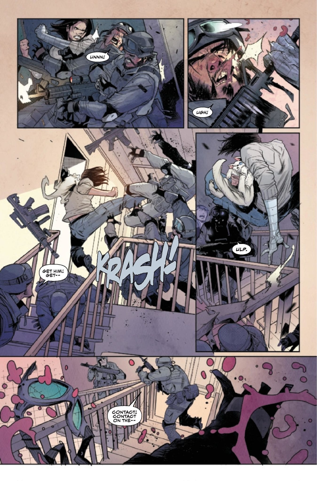
Livio Ramondelli has created one of the surprise-best comics of recent months with his all-robot cast in “The Kill Lock.” This third issue offers more of the fantastic characterization and thoughtful plotting in conjunction with foreboding artistic detail seen so far, and makes this comic one of the most anticipated series from month to month.
“Continuing their search for a cure by seeking out one of the Kill Lock’s creators, the bots bound by it find themselves on a world that was decimated by one of their own. Meanwhile, the group’s most dangerous member, the Artisan, decides it’s time he takes over the education of their youngest, the Kid.”
Writing & Plot
The true wonder of “The Kill Lock” has been the distinct humanization of each of the four main characters. The dialogue amongst them is completely distinct based on each one, and this is also based on each of their backstories. The flaws and personalities of these robots makes them endearing characters each in their own way. Even the serial killer of the group, who absolutely deserves his punishment, is oddly likable with his joyously sociopathic attitude. This issue focused primarily on the past actions of The Wraith as a warrior, as well as the tragic circumstances leading to The Kid being given the Kill Lock. There is more criticism of the society that created these machines in this chapter, making this issue more grand in scale while still maintaining the personal and quiet atmosphere. The growing complexity of the characters themselves and their story together keeps this comic deeply compelling from chapter to chapter.
Art Direction
The gorgeously grimy and dark visuals of “The Kill Lock” are here to stay with the arrival of issue three, as they’ve become this series’ prime aesthetic for the story being told. The used future setting in conjunction with the desperate plot have created the perfect world for this sort of art, and vice versa. The individual designs of the characters are original yet somewhat familiar in terms of robot design, but they have humanity and range despite their steel facias. The environment this time around is a planet decimated by a one-sided war, and so the air is gray and full of ash. This desolate and sad setting is another perfect stage for the story of these characters to continue on, especially given the tragic backstories given in the plot. Livio Ramondelli is a master of his specific craft, and the atmosphere he creates sells every moment of the story he tells.
“The Kill Lock” #3 is another stellar issue in one of the best comics running at this time. The story progresses not just in terms of forward plot, but in the stories of the characters that are divulged by Ramondelli in this chapter. The artistic vision of Livio Ramondelli continues to pull the reader into the desolate worlds the story inhabits and makes this cast of criminal machines relatable in a way that’s a testament to the power of the comic medium. Be sure to grab this issue and the two before it at your local comic shop on 2/26!
We’ll have to wait a while beforeThe Falcon and the Winter Soldier premieres, but Marvel Comics’ Falcon & The Winter Soldier #1 is sure to whet your appetite. On sale February 26, the opening installment of writer Derek Landy’s miniseries pays tribute to the fan-favorite dynamic of the Marvel Cinematic Universe’s Sam Wilson and Bucky Barnes. It also sets both heroes down a rabbit hole into an investigation of a Hydra revival. The stakes couldn’t be higher, and, by the end of the issue, Landy leaves us begging for more.
From the start, it’s clear Bucky Barnes is trying to escape his past.
Falcon & Winter Soldier #1
Writer: Derek Landy
Artist: Federico Vicentini
Color Artist: Matt Milla
Letterer: VC’s Joe Caramagna
In a good buddy cop story, the main characters have to be drastically different. Right away, Landy and the art team contrast Sam Wilson with Bucky Barnes. The first scene shows us that Bucky is trying to live a peaceful life at his house in Indiana. This idyllic scene is quickly ruined by the arrival of armed men. Letterer Caramagna accentuates this intrusion; he uses red to heighten the utter violence in the “Brakka, Brakka” sound effect of the goons’ bullets. Of course, Bucky defends himself, and he single-handedly defeats the mysterious squad.
Landy and the art team pay tribute to Bucky’s classic MCU fight scenes.
Landy then shifts to New York City, where Sam Wilson is chasing an investigative lead as Falcon. By simply showing us Wilson in this urban setting, Landy inherently points out the unique attributes of the two former Captain Americas. Plus, their clothing further sets them apart. Whereas Bucky wears unremarkable civilian clothes, Sam dons his colorful Falcon costume. Artist Federico Vicentini and color artist Matt Milla combine to show the sun reflecting off of the bright black-and-red outfit. Before the characters have even spoken to each other, Landy establishes their disparities.
Sam Wilson stays true to his superhero roots.
Naturally, the duo also differ ideologically. When Sam’s investigation leads him to a crime scene with dead bodies, he assumes Bucky is responsible because of his past as the Winter Soldier. Likewise, when Sam and Bucky fight a new antagonist, they get into an argument when Bucky tries to shoot their foe. While Bucky is accustomed to killing people, Sam firmly believes in a Steve Rogers-like moral code. Given that Sam and Bucky are investigating a resurgence of Hydra, they’ll have to iron out their moral conflicts if they hope to stop the infamous terrorist organization.
Though the first issue sets the series up to be an action thriller, Landy includes a few raw emotional moments in the story. Bucky and Sam go to see Veronica Eden, Bucky’s handler. Here, Landy and the art team depict her grief utter grief when Bucky tells her some heartbreaking news: all of her colleagues are dead. Bucky and Sam are hunting the then-unseen villain who killed them all. When Bucky delivers this awful news, Vicentini uses jagged lines for the background to convey Eden’s profound shock. Similarly, a few panels later, Milla shades in Eden’s face to complement the story’s cold, dreadful mood feeling as Eden processes this tragedy. This scene packs some powerful emotional weight, which makes Landy’s story more well-rounded.
When it comes to the relationship between Sam and Bucky, Landy hits a few of the same notes that we saw in the MCU. But he also adds enough twists to make it fresh; he leans away from the comedy and into a genuine clash, which has the potential for a more satisfying exploration of both characters. Along with plenty of thrilling action, Landy and the art team crafted a winning recipe with the opening installment of this series.
What’d you think of Falcon & Winter Soldier #1? Where do you hope to see the story go from here?
DC Comics recently (re)introduced Princess of The Gemworld sets out to enlist allies as she searches for her lost Kingdom in this weeks, Amethyst #1.
Art by Amy Reeder. Letters by Gabriela Downie
Amethyst was introduced into DC Comics’ newest continuity during the first arc of Young Justice in 2019 (Review). About a year later we see her in her own six-issue mini-series under the Wonder Comics imprint. Wonder Comics has given us a few wonderful series with Amethyst #1 seeming to follow suit. Albeit with a few bumps along the way.
GROWING PAINS WITH AMETHYST
Within the first few pages, Amy Winston (The Princess of Gemworld/Amethyst) gives the reader a quick background lesson. Who she is, the worlds she inhabits, her backstory, and that it’s her birthday. By doing this writer, Amy Reeder sets the story up where you don’t need to read Young Justice or the original series. Instead, she can go right into setting the plot of the six-issue mini-series.
Amethyst #1’s pace is consistent for the most part, with Reeder only dishing out details when needed. Therefore she keeps the readers invested with inklings of larger, darker happenings in the background. Furthermore, she shows Amethyst trying to stand on her own for the first time. This mirrors many teenager’s transitions to a life of their own following their birthday. Although she is still growing in the character department, you sense that she realizes she has to become independent from those that helped in her Kingdom. Becoming your own person is a hard feat, yet trying to find a whole Kingdom while trying to recruit others is even harder.
One problem that happens during a few moments in Amethyst #1 is the number of words in a single page/bubble. Nonetheless, it isn’t rampant, yet when it occurs it kills momentum. Towards the end of Amethyst #1, Reeder teases who might be behind everything. Hopefully, this is a bait and switch or a small part of the larger picture, as it seems easy to guess.
Art by Amy Reeder. Letters by Gabriela Downie
CRYSTALIZED ART
Reeder wears many hats for Amethyst #1 with her handling art and colors as well. Some of the pages presented benefit from this multiple workload, as Reeder plays around with paneling. One such page stands out where Reeder breaks page structure and forces the reader to read in a U shape. To clarify, Reeder begins with a vertical panel as Amethyst falls from the previous page. Usually, the next panel would be the top right, yet Reeder makes it the bottom right. She does this by having the next panel overlap the previous. The reason being, to show Amethyst climbing up the structure.
Reeder’s page structure is great throughout Amethyst #1, yet that page alone stands out. As Amethyst falls and rises so does the reader’s eyes. The natural movement of the reader’s eyes is amazing while making you feel as if you climbed the obstacle with her. Yet, not all pages are crystal clear. In some cases, Reeder’s panels become clustered with objects/people. These are far and few in between, but when they occur Amethyst #1’s pace takes a hit.
Color is a big factor in Gemworld with each of the twelve Kingdoms based on a different gem/crystal. Amethysts are violet-colored crystals; Reeder makes this well known. The Kingdom -albeit broken- is colored as such, so is Amethyst herself. The one other Kingdom that is showcased follows this trend. Nonetheless, Reeder never puts too much of the color on the page, as she adds varying shades of it and lighting effects. By using multiple layers to color each crystal, Reeder is able to make them shine in brilliant ways.
Art by Amy Reeder. Letters by Gabriela Downie
A HELPING EYE
Helping Reeder with Amethyst #1 is Gabriela Downie on letters. Downie helps declutter some of the heavier worded areas, which feels quite needed in those moments. Yet, during the more abstract pages/panels is were Downie’s lettering shines. Within the “up/down” page, Downie is essential in helping guide the reader’s eyes. This can be seen when the lettering overlaps the previous panel, helping guide where to go.
Another great moment occurs during the double-page spread where Amethyst regales her history. During this, Reeder includes multiple panels that tell Amethyst’s story, amazing visuals aside, some may find it hard to follow. Alas, Downie’s lettering elegantly takes your eyes and guides to amazingly through the double-page.
A GEMWORLD IN DANGER
Amethyst’s start isn’t crystal clear, yet there is a lot to love. By the end of the first issue, you can see how much love, time and effort the team put in. As it’s only a six-issue mini-series it’s exciting to see what the team has in store.
Fun Fact: Following Reeder on Twitter has been a blast as she’s been chronicling her work on Amethyst. The amount of detailing she has gone into for the gem/crystal visuals has been fascinating.
Amy Reeder’s crystal process. Via Twitter, @amyreeder
VISITOR OF GEMWORLD
How do you feel with the recent introduction to Amethyst’s world? Let us know down below.


")