Home Blog Page 340

Review: BATMAN #90 Shows The Villains’ Past With The Designer

Batman 90 cover

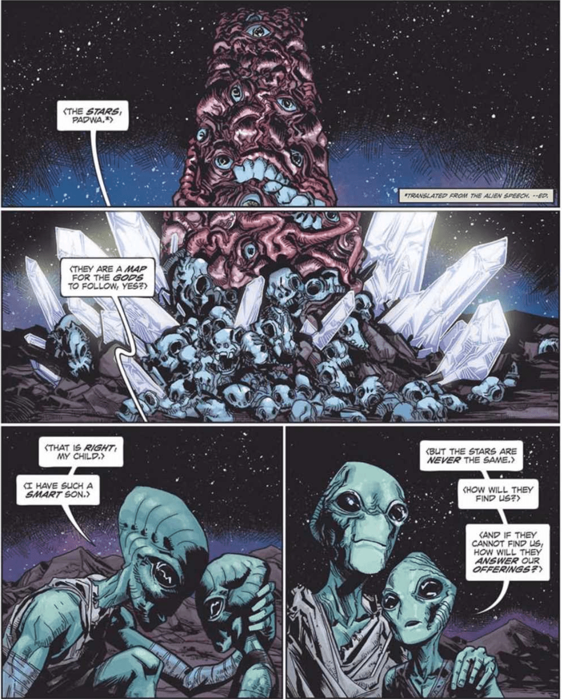
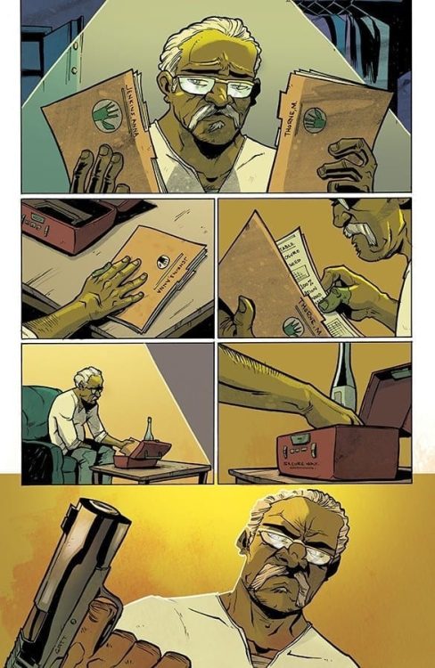
The Conspiracy against Batman Begins

With the start of a new Batman run, we were going to get a big overarching villain eventually. For King’s run, it was Bane. For this run, we get the new villain, The Designer. This strangely decorated supercriminal has helped Gotham’s most famous criminals create the ultimate plan. The shocking part is the fact that The Designer has also turned his gaze on the criminals. Through the help of the world’s deadliest assassins, Penguin has been sent to the emergency room, and Riddler has been taken. Catwoman, being a part of this grand conspiracy, steps forward, to tell the truth to Batman. So how did this all begin?

Batman 90 cover

**Some Spoilers Below**

Story:

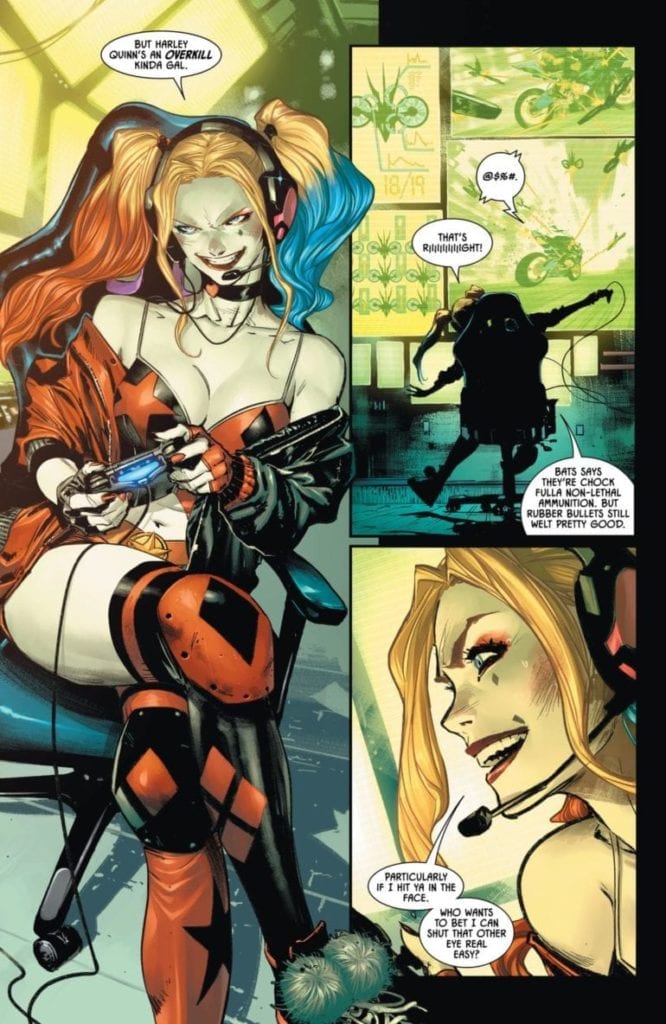
While Harley uses Bat-drones to chase down Deathstroke, Catwoman explains what happened. Near the beginning of Batman’s career, Selina is invited to meet with a legendary villain named The Designer.

Along with her is Riddler, Penguin, and the Joker as they head to the docks on Gotham Bay. There the group finds a boatman who takes them to a strange mansion out on the water. The Designer welcomes them all and gives us vague details of his tale. After the introductions, he takes each member into another room where he presents them each with a perfect crime designed for them.

Batman 90 p1

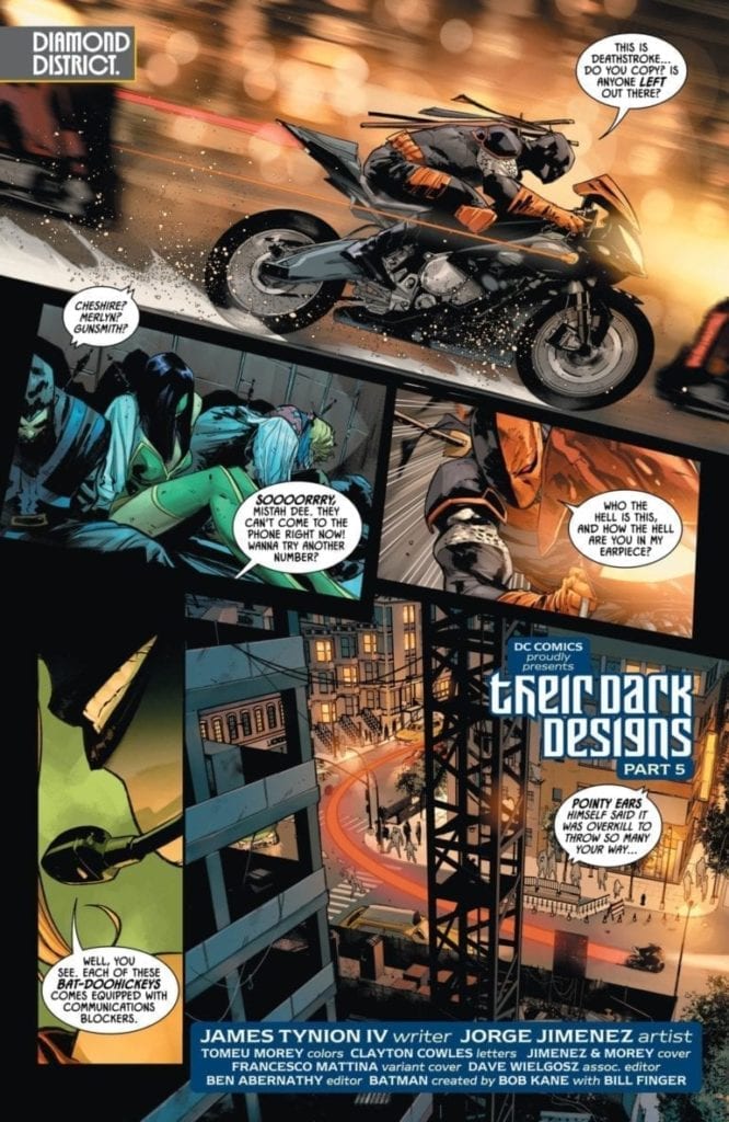
Well, we finally got information on our mastermind, and honestly, it has me more hooked than ever. The Designer telling his tale to the villains had my brain circulating possibilities of who it truly is. He’s treated like a boogeyman of crime, and it helps that the criminals treat him as such. It also brought a laugh when it was revealed why The Designer turned on the Bat-Villains. It makes perfect sense why a villain such as the Designer wouldn’t mesh with Gotham’s worst.

The biggest issue is how this whole story is presented to us. This story would have benefited if we got each bit of this history given to us throughout the arc. With it poured on all at once, it’s incredibly hard to digest. A superhero comic should find a balance of both action and story to hold readers properly. If we wait until the fourth issue of a six-issue arc to do an info dump, it’s going to turn people away. Obviously, the big Batman fans will be in it for the long haul, but it doesn’t make the issue any less dense and hard to completely enjoy.

Batman 90 p2

Art:

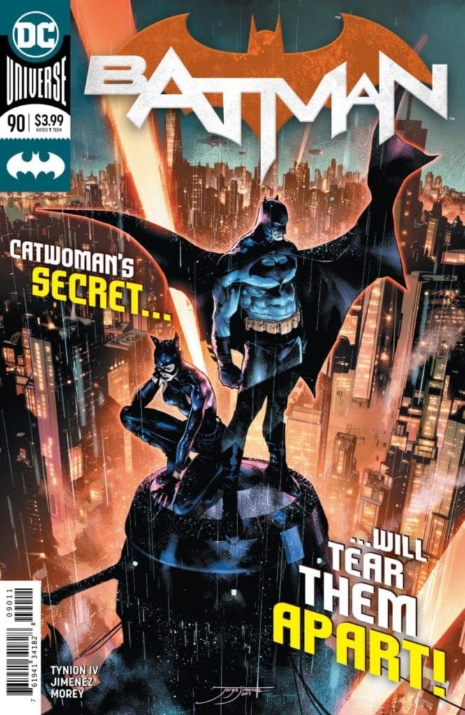
This time around, we have Jorge Jimenez doing the art, and he keeps up the quality the series has had so far. The classic looks of the Batman villains thrive off of his style of illustration. The best look of the bunch is the Joker, who pops off the page, thanks to the colorwork of Tomeu Morey. Another positive the team does exceptionally well is the flashback within the flashback recounting the origin of The Designer. They purposefully left out any major detail to allow readers to start forming theories on who the identity is. 

Conclusion:

Overall, while not a perfect issue, we finally get more than just action sequences with teases of a deeper story. The Designer continues to intrigue and has revitalized my hope for this new run. While the art team continues to rotate in and out of the series, this one does a great job of creating a classic Batman feel. The previous reviews have made it clear that the biggest issue was a lack of progression in the story. As we move forward in the series, I can only hope that the team can find that proper balance to reach the potential I know it has.

Monkeys Fighting Robots Youtube

Advance Review: ROGUE PLANET #1 – A Planet Of Horror Waiting To Be Explored

This April 1st join the crew of salvage vessel Cortes as they land on a planet filled with grotesque horrors in Oni Press’ newest series, Rogue Planet #1.

ROGUE PLANET – HORROR PLANET

Rogue Planet #1 shows that Cullen Bunn knows how to start a DAMN comic! Within the first two pages, Bunn is able to draw you into this new space horror. Alas, Bunn isn’t new to horror, as he has written multiple amazing titles in this genre. You don’t have to look far to know this with his famous series, Harrow County receiving a sequel series. Yet, where Harrow County takes place on earth, Rogue Planet takes us to the deep, dark, terrifying space.

Ah, the quit before the storm in Rogue Planet #1
Art by Andy MacDonald. Colors by Nick Filardi

Rogue Planet #1’s plot is familiar to 1979’s Alien, yet mixed with mind-boggling cosmic horror. Nonetheless, it isn’t a beat-by-beat tale, as Bunn’s own ideas make the first issue unique and stand out. One such idea that stood out was something I’d never seen before; the way hypersleep is handled. From the small amount shown, it looks as if the crew takes turns in having their bodies used by robots/drones. Furthermore, they take turns sleeping while another team makes the rounds working.

The captain of the crew – Joel Narris – mentions their brains being “turned off.” Thus it seems the crew’s bodies are used by the ship to maintain it while the mind is asleep. Once you see it, you’ll wonder why it hasn’t been done before. Brain sleep aside, Bunn brings a lot to the space horror genre in Rogue Planet #1. Each character seems to fit the typical characteristic you’d see in one of these stories. Yet, Bunn keeps them fun and fresh, much like the rest of Rogue Planet #1. Well, fun and fresh from a horror perspective.

What a family-friendly event! Rogue Planet #1
Art by Andy MacDonald. Colors by Nick Filardi. Letters by Crank!

THE BEAUTY OF DESIGN

On art duty is Andy MacDonald, whose work throughout the first issue is fantastic. Nonetheless, the highest praise goes toward his designs of aliens, creators/monsters, the spaceship, and the crew’s suits. For a space-faring story to stick, it needs a great design all around. But, for horror to stand out, you need to make the monster terrifying and grotesque. MacDonald knocks it out of space in all of those aspects. Sadly speaking on the design of the monsters in Rogue Planet #1 may ruin the surprise for some. However, it’s a sight to behold.

Cortes’ interior design looks extremely claustrophobic, even for just a crew of only eight. That in mind, this closed corridor ship seems like the perfect place for the team to have more horror-filled moments transpired. Yet, one ship design stood out most—the cockpit. As a fan of clustered cockpits in spaceships, MacDonald nailed the design.

Helping Rogue Planet #1’s creepy factor is the bleak colors by Nick Filardi. When the Cortes is introduced drifting through space, Filardi keeps the colors deep and dark, with only sprinkling of stars seen throughout. That is until their destination; planet Lonely Orphan comes into view. Lonely Orphan is a dulled down red with a bright red hue circling it. If we didn’t already know that horrors awaited our crew here, Filardi’s colors would tell us.

When the crew arrives on Lonely Orphan, Filardi gives the interior a brighter color. This color never betrays the darker shades but helps the planet’s creepy factor. Furthermore, once the creature makes its debut, Filardi colors add another layer upon its hideous appearance. Filardi’s colors mixed with MacDonald’s fantastic design makes the creatures in Rogue Planet #1 something that’ll stick with you.

The silence of space.
Art by Andy MacDonald. Colors by Nick Filardi. Letters by Crank!

ALIEN LANGUAGE

Crank!’s sound effects help bring Rogue Planet #1 to life. When the Cortes is drifting through space, Crank! makes sure there is no sound. A great portrayal of the vast soundless space. But, when building up to the creature the team does so with haunting sound effects. Once introduced the size of the creature is amplified by Crank! hiding part of the sound effects behind it.

HORRIFIC HAPPENINGS

Although Rogue Planet #1 feels familiar to other stories, it adds in its unique twists and does so amazingly. Yet, there was one thing that felt needed—name tags. Thankfully when introduced character’s name and title are included in a box. Yet, when they’re in their suits no name is displayed. However, this isn’t that big of a deal, yet having a name tag would’ve been great. Alas, if horror, space, creepy monster are your bag then tell your LCS that you want it!.

Cover Story: Honestly, I didn’t even read the synopsis for Rogue Planet #1, I just went in blind. The thing that sold me? This beautiful cover by MacDonald.

What a gorgeous cover.
Cover by Andy MacDonald.
Monkeys Fighting Robots Youtube

Review: FARMHAND #14 Reveals The History Of The Jedediah Seed

FARMHAND #14, available in comic book stores on Wednesday, March 4th, answers a question that’s been on fans’ minds: How was the Jedediah Seed created? Writer and creator Rob Guillory takes readers on flashbacks to Katrina 2, a horrific natural disaster that destroyed Freetown twenty years earlier. It is here Monica Thorne experiences a vision of a mysterious being claiming to be “God.” And it’s ready to alter the course of events in Freetown forever.

Story

In the present, widespread panic spreads throughout Freetown. The Jed Seed’s effects have been showing up in the townsfolk, even if they didn’t receive transplants.

Zeke and company conduct separate investigations throughout town, learning just how far the adverse effects have reached. People and animals are becoming more plant-like. Zeke and the group soon find that Thorne, manipulating Jeb, is behind it all. And Jeb is not happy.

Guillory’s writing plays out like the beautifully constructed sci-fi horror comic that it is. One thinks of cult classics such as The Happening in its ability to show what our world would look like of our ecosystems started fighting back.

Artwork

Guillory’s penciling and ink work is just as engaging as his writing. The blending of human anatomy with green plant-like appendages gives this issue an unsettling surrealness. Rico Renzi’s coloring helps create this effect by contrasting the “unnatural” colors of artificial items throughout the town with the earthy colors of those affected by the Seed.

Kody Chamberlain’s lettering fits wonderfully with the horror theme, employing erratic, red fonts when used for the demonic speech of the “God” figure.

Comic Cover

Guillory and Taylor Wells’s cover artwork features Thorne examining an eyeball growing from a mysterious plant, showing readers how integral she is to the Seed pandemic.

Conclusion

FARMHAND #14 reveals more about the Seed’s history than ever before, showing how involved Thorne was with it from the very beginning. The engaging narrative, digging deeper into the earth of Guillory’s imagination, keeps us coming back for more.

Do you think the Seed’s effects will spread to the rest of the country? Let us know in the comments below!

Monkeys Fighting Robots Youtube

Review: JUSTICE LEAGUE ODYSSEY #19 — A Fight Against Time

JUSTICE LEAGUE ODYSSEY #19, available in stores on Wednesday, March 4th, dives deeper into the mind of Epoch, the mysterious “Lord of Time.” Apparently, he’s a person of interest to Darkseid and his forces, meaning the League members could find some pertinent information. But in a race against the clock, what could the master of time unveil to combat the coming threat?

Story

The League members, along with Gamma Knife and Orion, met Epoch last issue after exploring Darkseid’s vessel. They learned that he was human who could manipulate time as he willed it. But with so much data and contraptions procured by the man, we still don’t know what his intentions are. One might reasonably wonder if he’s planning to take on the villain’s approaching kill team all by himself.

Earlier on in this storyline, Cruz saw her close friend and fellow Justice League member Cyborg fall prey to Darkseid’s control. But now it appears the evil overlord has overtaken Starfire, the sister of Blackfire and beloved Titans member.

The team must now decide how to alleviate the threat: should they attempt to subdue their mind-controlled friend without killing her, or would it be best to wipe her out completely? Ironically, Blackfire, in a true example of compartmentalization, calls for the latter. Her reasoning? Epoch can rewrite time/history and erase Darkseid and his evil influence plaguing the universe, saving her sister. And indeed, this method is the one Epoch proposes.

Dan Abnett’s writing asked a a hard-hitting philosophical question at the core of any person who’s serious thought about the evil in this world: What would the world look like if we could edit out all the bad parts of life? Unfortunately, our heroes may soon learn the ramifications of such a circumstance.

Artwork

Cliff Richards’s penciling and ink work, Rain Beredo’s coloring, and Andworld Design’s lettering come together beautifully in this issue. The sleek designs of Darkseid’s heralds have multiple variations of black armored suits that fit each character’s color palette. In addition, the letter boxes pace well with the action, increasing and decreasing in spacing depending on how quickly the scene is moving.

Comic Book Covers

Main Cover

José Ladrönn’s main cover gives readers a look at the Darkseid-controlled Starfire, showing us how far one of DC’s beloved heroes has fallen.

Variant Cover

Skan’s variant cover features Darkheid and his newly recruited minions, including Cyborg and Starfire. This shows readers just how complex the army our heroes are facing has become.

Conclusion

JUSTICE LEAGUE ODYSSEY #19 ramps up the stakes ten-fold by revealing Epoch’s plan. Only time will tell (no pun intended) if he will be able to pull it off, and what it will mean  for history itself.

Do you think Epoch’s plan will come to fruition? Let us know in the comments below!

Monkeys Fighting Robots Youtube

Review: The Fall of a Regime, the Rise of New Deceptions in THE BUTCHER OF PARIS #4

The fourth issue of historical crime-thriller “The Butcher of Paris” is here, and it once again provides intrigue and tension in spades. Stephanie Phillips’ scripts continue to be the perfect meld of WWII character commentary and sharp detective storytelling. This fact coupled with the artwork of Dean Kotz and Jason Wordie makes this another stellar chapter in a fantastic series.

“Paris has been liberated, but as the citizens rejoice, the killer’s wave of terror begins to fade from the public eye–which means he has an opportunity to escape!
Meanwhile, the French police begin to strive to oust the remaining Nazis inhabiting the city. Could there be one hiding in their own ranks?”

Writing & Plot

The biggest strength of “The Butcher of Paris” in terms of storytelling is its consistently sharp plotting despite handling so many subjects at once. This issue’s tackling of the liberation of France from Nazi occupation is riveting, but so is the underlying main plot of Detective Massau’s hunt for the Butcher. The way these two overlap while maintaining the gravity of both is what keeps this story so compelling from month to month. The dialogue as well is intelligent and naturalistic, making the narration-free read a smooth page-turner of an experience. Phillips‘ juggling of the winding plot is the work of an expert, and makes this series one of the most well-written in recent memory.

Art Direction

Artist Dean Kotz strikes again in “Butcher of Paris” #4 with his brand of unique character art and sense of visual direction. The panels for this series continue to give the essence of watching a well-directed thriller. Kotz’s unmistakable pencils provide the aesthetic of a European graphic novel, further entrenching the setting in the eyes of the reader. Jason Wordie‘s colors provide deep hues of red and rusty browns that sell the idea that there is a gross threat still at large in the midst of the Parisian population’s victory over the Nazis. An unsung hero of the visual direction of this comic is the wholly unique lettering of Tror Peteri. The fonts he uses look as though they were etched into the page by a crude ink quill, and they create a looming sense of atmospheric foreboding in the reading experience. This fourth chapter is yet again a triumph of visual storytelling in tandem with a phenomenal script.

“The Butcher of Paris” #4 is an excellent chapter near the end of this series. Stephanie Phillips’ airtight script and control of the plot balances the conspiratorial elements of the French victory over the Nazis with the thriller aspects at the comic’s core. The visual work by Dean Kotz and Jason Wordie maintains the comic’s unique vision and stands out as some of the most interesting work in the medium. Be sure to grab a copy on 3/4!


Monkeys Fighting Robots Youtube

Review: DOCTOR WHO THE 13TH DOCTOR Year 2 #3

Doctor Who 13th Doctor Year 2 #3
Doctor Who 13th Doctor Year 2 #3 Credit: TITAN Comics

Two Doctors and two alien threats mean four times the fun in Titan Comics Doctor Who The 13th Doctor Year 2. The third issue is released this week and the inevitable happens as the 10th Doctor meets his future. Or the 13th meets her past, depending on how you look at it.

It is a complicated story with a lot of back and forth but the writer Jody Houser has got Doctor Who under her skin. All of the elements of a classic duel Doctor story-line are here with the added bonus of two of the best foes of any era. As the action builds can the creators keep up?

Doctor Who 13th Doctor Year 2 #3
Doctor Who 13th Doctor Year 2 #3 Credit: TITAN Comics

Adventures in Time

The 10th Doctor and his future ‘fam’ have come, literally, face to face with a Weeping Angel. Meanwhile the 13th Doctor and Martha take flight from an army of Auton. All in all, the Doctor is having a busy day.

This issue sees the pace increase dramatically from previous issues. This is a standard turnaround for this type of Doctor Who story where the tension is slowly built to introduce the villains. Then comes the running, the shouting, and finally the reveal of the villains goal. It’s a classic four part Doctor Who story structure, although there is no motive in this issue. That has been left for future chapters.

Houser has a firm grip on the different characters from each of the time periods. The interactions between old and new are perfectly balanced although the 13th Doctor has an energy more akin to her past counterpart. It’s as if she is feeding off the vitality of her youth while maintaining the characteristics that she has developed. People will still recognise Jodie Whitaker in the speech that Houser scripts but the story is definitely more 10th Doctor.

The highlight of this issue involves the 10th Doctor’s discovery of the TARDIS, which is clearly a future version. The child like excitement of the character is reminiscent of Sarah Jane Smiths’ encounter with the time ship in School Reunion. There is a sense of awe, of wonder, and of longing.

Unfortunately this whole scene overshadows the Fam’s escape from the Weeping Angel and reduces the scary threat to something more comical. The intimidation of the Angels comes across much better later in the issue but surprisingly the Auton threat seems greater.

Doctor Who 13th Doctor Year 2 #3
Doctor Who 13th Doctor Year 2 #3 Credit: TITAN Comics

Drawing the Cast Together

There is a simplicity of form to much of the art work, with only a few backgrounds containing complex detail. This is because Roberta Ingranata is able to represent the characters with a minimum number of lines, almost like a caricature but without the comical exaggeration. She captures the essence of the character and relays this to the reader, rendering each cast member in a unique way. The general shapes of the cast are enough to identify who is depicted.

This simplicity makes the comic easier to read. The audience is able to immediately identify who is in each panel and is therefore not wasting time trying to work out which character they are following. This became a problem with some of BOOM! Studios Buffy comics last year where big reveals were dampened by lack of immediate identification. That is not a problem here. Ingranata’s character work is perfect.

There is also a certain dynamism to the pages. Not necessarily with the depiction of movement but just in the presence of the characters. The Doctor specifically holds the attention on the page, giving the reader a focus with which to follow the story. Each page of the comic has one aspect of the famous Time Lord and it is this figure that leads the directional reading.

Design and Color

The design of the page is such that the reader zones in on the Doctor in the opening panel and then weaves their way through the page, jumping from panel to panel in a search for the Gallifreyan. The placement of the speech by letterers Richard Starkings and Sarah Hedrick facilitate this movement. There is an easy to follow flow in this comic which helps to build the pace of the story.

The colorist, Enrica Eren Angiolini, picks out each iteration of the Time Lord and represents them through alternating color palettes. Each page that is dominated by one Doctor or the other has a theme that matches their general appearance.

The 10th Doctor is quite subdued with muted hues. There are a number of browns and deep blues with a serious, dark purple color flowing through his backgrounds. The 13th Doctor has much more color and vibrancy. Backgrounds feature an array of color, a range across the spectrum, much like the Doctor’s own clothes. It’s as if the very environment that the Doctor enters twists to fit them and their personality.

Doctor Who 13th Doctor Year 2 #3
Doctor Who 13th Doctor Year 2 #3 Credit: TITAN Comics

Conclusion

With the final episode on the most recent series now out in the world, almost any story is going to have difficulty following in the wake. Luckily for readers of the Titan Comic, Jody Houser is exceptional at writing Doctor Who. She captures the characteristics and mannerisms of the TARDIS crew but more importantly she brings the tone of the series to the pages of the comic.

With wonderfully fun and entertaining art work, this second comic season of the 13th Doctor is a great read for any fan. Not everything quite fits together yet but there is no indication that it won’t in the end: there is a definite feeling that this is heading somewhere fantastic.

Monkeys Fighting Robots Youtube

Exclusive First Look: QUANTUM & WOODY #3 With Commentary From Christopher Hastings

Quantum & Woody #3 doesn’t hit your local comic book shop until March 25, but thanks to Valiant Entertainment, Monkeys Fighting Robots has an exclusive four-page first look with commentary from series writer Christopher Hastings.

The four-issue mini-series is written by Hastings, with pencils & inks by Ryan Browne, Ruth Redmond handles colors, and you will read Hassan Otsmane-Elhaou letters (just not today).

About the Quantum & Woody:
Quantum & Woody — the worst superhero duo in the world — are Earth’s LAST hope against stopping a coalition of mad scientists from destroying the planet!

Ejoy the Preview – Page One

Quantum and Woody are two superhero brothers (one of whom is adopted, hence the difference in melanin across the two) who just do not get along. Unfortunately, their superpowers come paired with individual bracelets that will disintegrate the boys to nothing if not touched together every 24 hours. So they’re stuck with each other.

When telling a story about mismatched superhero brothers, you’re going to have to go back to their shared past from time to time, so here we show off a moment in their youth when Woody was bullied, Eric (Quantum) tried to help out, and it didn’t go great. – Hastings

Exclusive First Look: QUANTUM & WOODY #3

Page Two

Moving on to the present, at that very same locker room, a couple of teens sneak off to vape some kind of cool flavored nicotine product, but are interrupted by A SPOOKY GHOST. Quantum and Woody’s old high school is h-h-h-aunted! – Hastings

Exclusive First Look: QUANTUM & WOODY #3

Page Three

And just in case you skipped my first paragraph here, page three features our little recap/comic book theme song that tells you everything you need to know about Quantum and Woody (once it’s lettered). We’re big on doing self-contained, episodic stories that anybody can pick up, whether they’ve read previous installments or not, and this segment does most of the heavy lifting on the necessary continuity. – Hastings

Exclusive First Look: QUANTUM & WOODY #3

Page Four

And here’s Quantum! Lately, his slacker brother Woody has been showing off some mysterious new powers, so the much more disciplined (and jealous) Quantum is training hard to achieve the same super-powered growth. Right now, he’s trying to maintain his quantum energy shields under the tremendous heat and pressure under the Earth’s crust.

Will such training help at all while going undercover as substitute teachers at the old high school? Is there some sort of terrible link from that moment in Quantum and Woody’s past and the mystery of the present? Yes! Obviously! Read the book to find out what, please! – Hastings

Exclusive First Look: QUANTUM & WOODY #3


What have you thought of the series so far? Comment below with your thoughts.

Monkeys Fighting Robots Youtube

Review: SPIDER-MAN NOIR #1 Now’s The Time To Jump Onboard

Strap on your detective boots and put on your spider suit as the crimebusting, Private Eye Spider-Man of Earth-90214 returns this Wednesday in Marvel Comics’ five-issue mini-series, Spider-Man Noir #1.

Spider-Man Noir #1 Origin/Title page

Before joining Spider-Man Noir of Earth-90214 on his detective case, a little backstory is needed. The title page (seen above) does give you some info, yet not all. During 2018’s Spider-Geddon Spider-Man Noir was killed by Morlun. Alas, you can’t keep a good spider down as he was resurrected in Feburaury’s Spider-Verse #5. While you’re picking up Spider-Man Noir #1 at your LCS, make sure you pick up those titles to learn more.

Death and resurrections in comics, you got to love them, huh?

SPIDER-MAN NOIR IS ON THE CASE

For the first issue in the series, Margaret Stohl brings the reader right into the action with her writing. Instead of taking time to explain everything about Spider-Man Noir, she uses the above title page to explain all that’s needed. This effectively gives her the full page count to tell the story she wants, instead of catching readers up. This works out for the better as all the reader really needs to know is Spider-Man Noir is a Private Eye that’s not afraid of using a gun. Plus, within the first page, she can set the state of the world with a radio broadcast.

One massive factor of Spider-Man Noir that should stick out is the speech pattern. Detective/noir stories usually have a specific jargon, that people recognize. Stohl perfectly understands this lingo and the rhythm that the dialogue needs. Stohl’s dialogue has a music-like ebb and flow between characters that read smoothly. While reading Spider-Man Noir #1, you’ll be reminded of old Detective movies, for all of the best reasons. Furthermore, there is one story beat that was equally hilarious and well done containing an egg.

During the first page, Spider-Man Noir is peeling an egg but receives the call of action. Pocketing the egg, he takes on a few speed happy robbers. Once finished, he remarks that keeping the neighborhood friendly “ain’t over easy,” then proceeds to eat the over-easy egg in the next panel. This dry humor is fantastic and seen throughout. Yet the joke is amplified by Juan Ferreyra’s visuals.

A great opening page
Art by Juan Ferreyra. Letters by VC’s Travis Lanham

A BUSY AND DANGEROUS CITY

If anyone was tasked with the art department for Spider-Man Noir #1, it had to be Ferreyra. Ferreyra’s art has fluid movement to it that never feels like too much or little. Instead, it helps pace the story along while you turn the page.

Nonetheless, that isn’t the only reason his art makes perfect sense for the series. His lines are solid, helping the characters pop off from the busy background, which Spider-Man Noir #1 has a bit of. Furthermore, each action scene is fluid, lively, and moves along amazingly, whereas the backgrounds can be explained the same. Ferreyra adds the right amount of details to make the world feel alive, while not to busy.

Keeping the noir trend, Ferreyra colors Spider-Man Noir #1 with heavy blacks and whites compared to other colors. This expands to the usual white-colored panel lines. Instead, Ferreyra uses a pure black to keep the noir trend. Not all objects are colored as such, though. When he wants to highlight a person or object, he adds a bright color that stands out. This can be seen with Mary Jane, Aunt May, the dead victim, and his spider-sense, to name a few. Like all other Spider-Men and women, this version has a spider-sense. It’s used once, yet, Ferreyra colors it red and has it surround his face. It may sound simple, but he makes it gorgeous.

Not on my watch
Art by Juan Ferreyra. Letters by VC’s Travis Lanham

WORDS OF MYSTERY

As with most Detective tales, Spider-Man Noir #1 has a bit more dialogue. Furthermore, the darker shades of colors Ferreyra uses means the usage of pure white bubbles may look weird. Luckily VC’s Travis Lanham combats both of these in his lettering. During the heavier bits, he is able to flex the lettering around while putting indents in some to make others fit. For the color aspect, Lanham changes the bubbles inside color to a grey shade that matches the ton of art. The same can be said for the various sound effects seen throughout.

A GLOBETROTTING CASE

Spider-Man Noir’s first issue starts Spider-Man of Earth-90214’s newest case on a great foot. It’s a fastpaced story as the team goes straight into the globetrotting tale. Even if this is your first time reading a Spider-Man Noir story, you won’t be confused, and you’ll find why people love the character.

Memorable Quote: “Sometimes it’s not your mind that changes. Sometimes the world changes around you.” – Huma Bergmann

I’ve never heard that one, yet it has a simple beauty to it.

Monkeys Fighting Robots Youtube

Review: Paths Diverge in KILL WHITEY DONOVAN #4

Sydney Duncan and Natalie Barahona’s Civil-War era revenge series “Kill Whitey Donovan” nears its end with issue #4, and its approach is one of foreboding. This is an issue rife with internal character tension and more close escapes, all the while mounting towards an ending paved with mythic references. Duncan’s writing hits new poetic heights while Barahona’s stellar work maintains its gorgeous and moody aesthetic for yet another engrossing chapter of this series.

“The mysterious Oracle Jones, an Underground Railroad ”conductor,” claims to know the whereabouts of Hattie’s mother, whom he helped escape years ago after she was sold off by Old Man Donovan–and he says he can help Hattie find her.
But the women are close to Atlanta, and Anna can almost taste her revenge. Will this new revelation cause the unlikely pair to split for good, and if so, can Anna possibly kill her fiance without Hattie’s help?”

Writing & Plot

Sydney Duncan‘s writing on “Kill Whitey Donovan” #4 takes the artful yet naturalistic style of her work on this series and adds a layer of mythical foreshadowing to the plot. This issue includes intriguing character conversations and revelations that will no doubt keep the reader engaged while also including yet another intense and stressful escape sequence. The inclusion of a one-eyed newcomer with some much-needed knowledge for one of our two lead characters offers more of that grim foreshadowing that’s been discussed, while also giving the pair a much needed helping hand. Duncan’s usual excellent pacing of dialogue and silence adds a certain poeticism to the mix for this issue, as the series draws closer to its finale. The final page here offers a warning to our tired and battle-hardened leads, and makes the wait for the finale a punishing one.

Art Direction

The stunning and dark artwork of Natalie Barahona has maintained the atmospheric vision of “Kill Whitey Donovan” beautifully for its entire length, and this fourth chapter keeps this trend going. The sharp character detail paints suspicion, determination, panic, and every emotion in-between on the cast in this tension-filled comic. The crisp linework and darkened color choice create stunning and professional-looking work that oozes with atmosphere. The lettering from Troy Peteri comes in a more standard font, but it’s easy to read and has careful bold points that make the processing of the dialogue an easy task. Once again, excellent visual direction to be found in this issue of “Kill Whitey Donovan.”

“Kill Whitey Donovan” #4 is a tense issue that looms the promise of the threat to come in its dark and poetic words. Duncan’s script mixes her artful writing with her knowledge of when to let the art and setting do the talking. Barahona’s artistic vision once again creates a gorgeous and atmospheric world that pulls the reader into its swamps and humidity. Wih only one more issue to go, be sure not to miss out on this excellent series when issue #4 hits shelves on 3/4!

Monkeys Fighting Robots Youtube

C2E2 Aftermath: Tom Bilyeu Talks Publishing And HEXAGON

Hexagon by Impact Theory featuring Don Diablo

Tom Bilyeu, the founder Impact Theory, which has expanded into comic book publishing was at C2E2 this past weekend and talked with Monkeys Fighting Robots about recruiting talent and the company’s next series Hexagon.

Hexagon is a five-issue mini-series written by Michael Moreci, with art by Jheremy Raapack, and Jorge Corona worked on the cover. Dutch DJ and record producer Don Diablo collaborated on the project with Moreci. The first issue hits your local comic book store on March 18.

About Hexagon:
It’s the 1980s, and all twelve-year-old Don wants to do is play video games at the local arcade. Don’s father, however, refuses to let him play. Egged on by his friends and trying to impress a girl, Don sneaks out to join an all-night game-a-thon. Defying the odds (and on his first-quarter ever!), Don beats Crucible, a game long considered unbeatable. In an instant, his world is turned upside down when his victory triggers an alien invasion and sucks him into an intergalactic battle that has been raging for years, a battle his father was desperately trying to protect him from!

Enjoy the interview below

MFR: How did you find Michael Moreci for Hexagon?

Tom Bilyeu: I found Michael Moreci’s other comics like Wasted Space, and I just had to recruit him. I stalked him, begged, even borrowed favors just to get him on.

[Laughs]

MFR: How exactly does Impact Theory recruit new talents?

Tom Bilyeu: Mostly through networking. Having the right kind of portfolio helps a lot. But so does knowing the right people. Like when I want to have certain people for projects, I tell everyone about it. So whenever I’m doing something else a friend can tell me of a good time to speak with certain talents.

MFR: For Hexagon, was the team aware of the possibility of drawing parallels to 80s settings like in Stranger Things?

TB: Absolutely, drawing parallels is a good way to get a story out there for people to pay attention. If we can advertise this as “Stranger Things meets Star Wars” fans can be like “oh I like this” and jump onto the story.

MFR: Talk about the makeup of the creative team of Hexagon?

TB: Well like you said at first, everybody has a role to play. Don is obviously the heart and soul of this project. Michael, here is the writer. As for me, I barely do anything because I’m just the f***ing publisher. It is all just a matter of finding people to work with and finding how they create something good into something better.

MFR: Thank you for your time and best of luck with Hexagon!


Do you plan on picking up a copy of Hexagon #1? Comment below with your thoughts.

C2E2 Aftermath: Tom Bilyeu Talks Publishing And HEXAGON

Monkeys Fighting Robots Youtube