Home Blog Page 339

Stephanie Phillips Talks Spies, Assassins, and Time Travel In ARTEMIS AND THE ASSASSIN

artemis and the assassin aftershock comics stephanie phillips

Artemis and the Assassin #1 is out Wednesday, March 18th from AfterShock Comics, and Monkeys Fighting Robots had the chance to speak with writer Stephanie Phillips about the exciting new series.

The series is by Phillips and artists Meghan Hetrick & Francesca Fantini, with colors by Lauren Affe and letters by Troy Peteri. Covers are by Phil Hester.

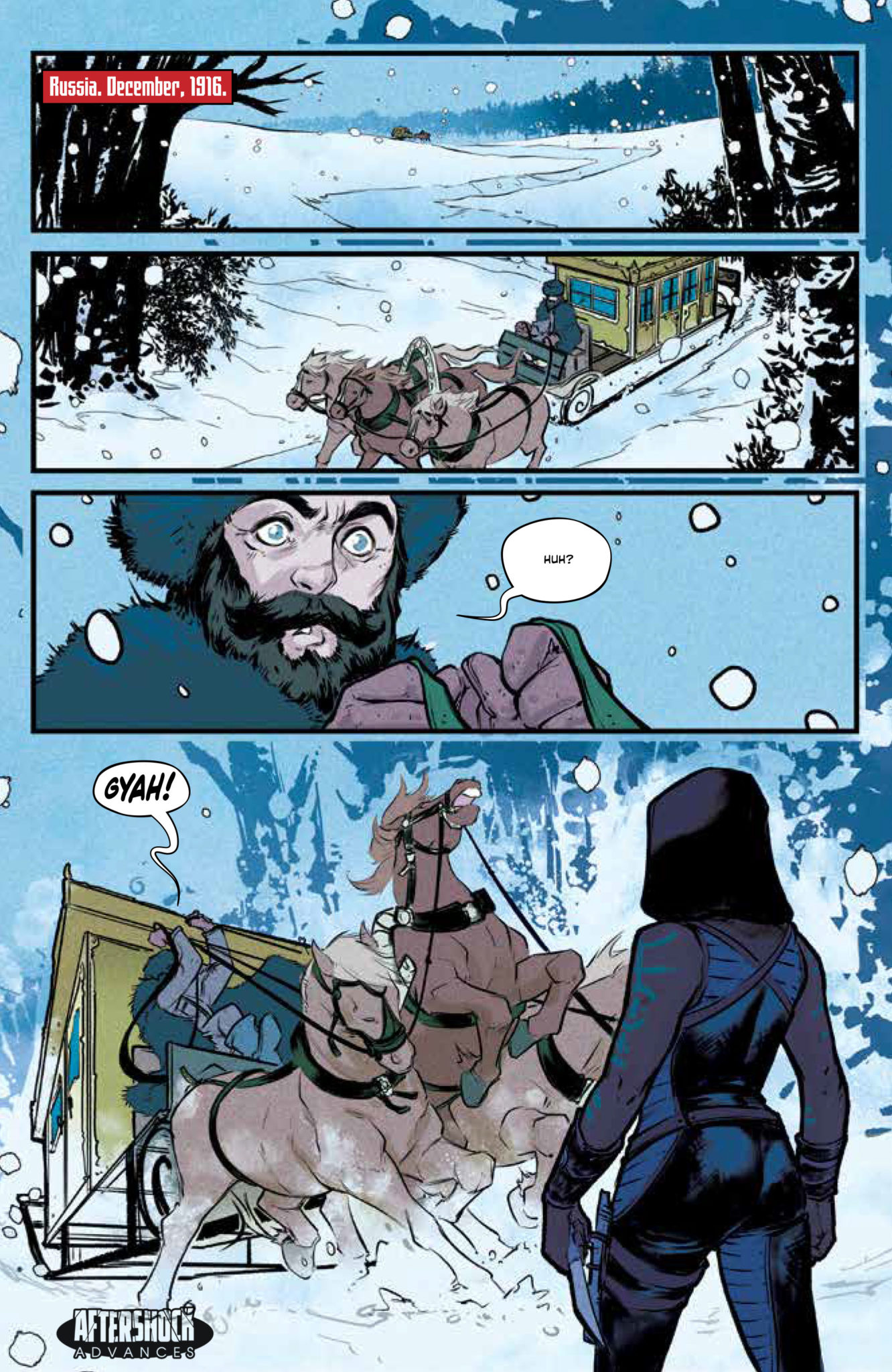
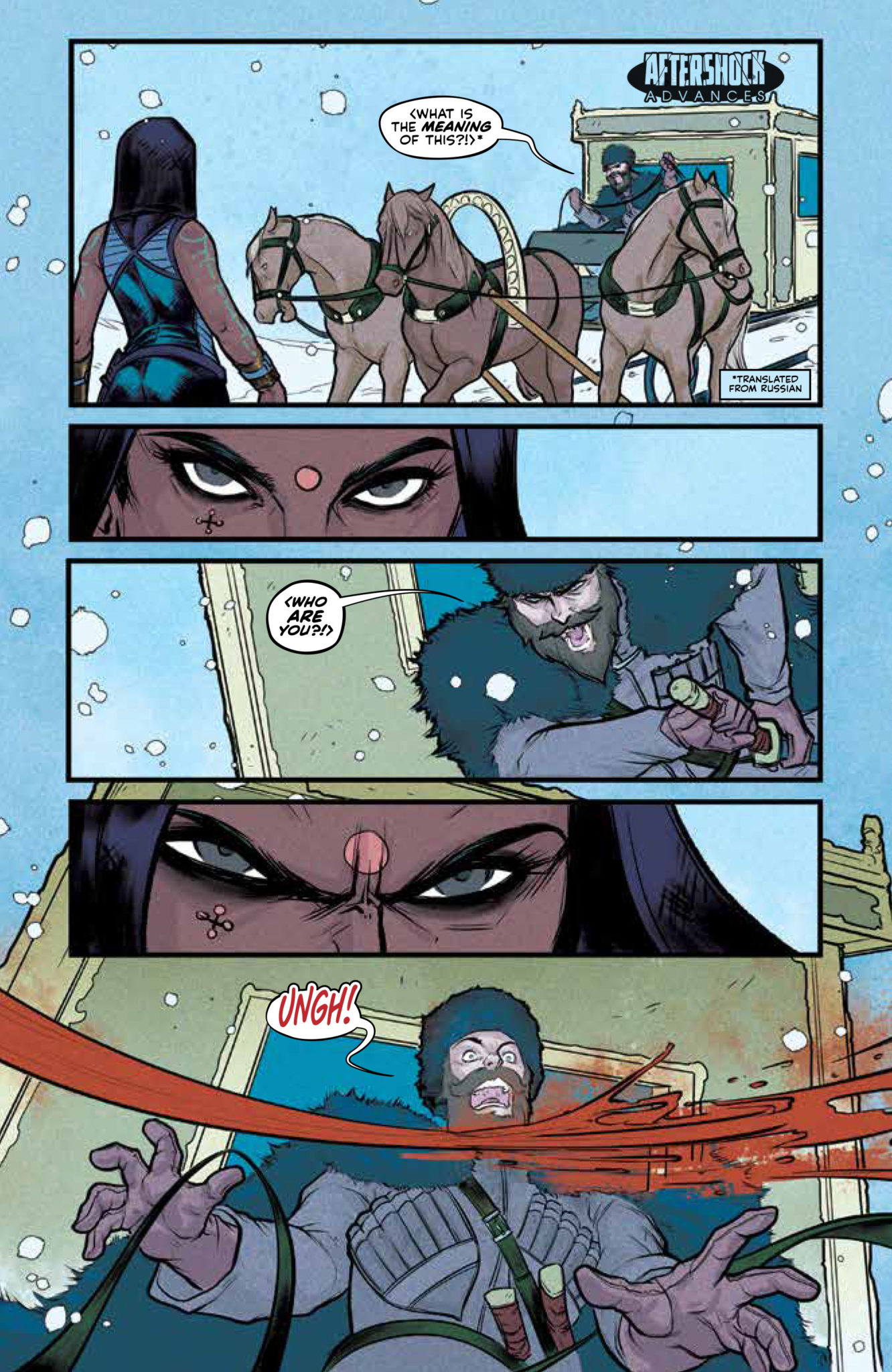
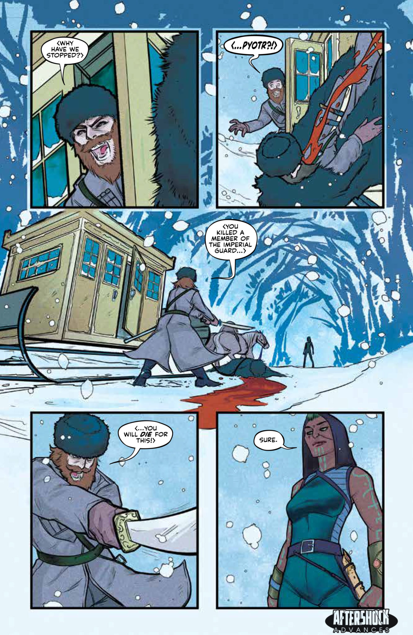
You can check out Monkeys Fighting Robots’ exclusive four-page preview of the first issue here.

About the series:
What happens when a time-traveling assassin and a spy from 1944 try to kill each other? 

For a price, a top-secret assassination organization will travel through time and interfere with watershed moments. Trained as the agency’s top assassin, Maya is sent to kill Virginia Hall, the deadliest spy of WWII. Charged with carrying important plans about the invasion of Normandy to the allied troops, Virginia’s death would have a cataclysmic effect on WWII as we know it.

artemis and the assassin aftershock comics stephanie phillips


READ ON FOR OUR FULL INTERVIEW WITH PHILLIPS:

Monkeys Fighting Robots: First off, I LOVE the opening to this book and how Maya is introduced hardly saying a word. There’s so much characterization conveyed in just her body language and facial expressions. What appeals to you about a silent introduction like this, and how closely did you work with Meghan and Francesca to get it right?

Stephanie Phillips: I think it says a lot about Maya’s personality. She’s really a woman of action rather than talk. She’s there to get a job done and move on to the next one. She’s also a loner, so not seeing her with any kind of partner to banter with is important for her. She’s not sarcastic or funny. She’s a killer. And I think Meghan did a great job with the opening sequence of giving the reader a sense of this woman-of-action character that we’re going to see throughout the series.

MFR: I feel like I always learn something from your comics, from the existence of the Butcher of Paris, to the conspiracy surrounding the Lindbergh baby, and now to the life of Virginia “Artemis” Hall. Is that something you set out to do with your stories, teach your readers nuggets of history and inspire them to seek out the true stories?

Phillips: I appreciate you saying that! It’s really for me more than anything else. I am endlessly fascinated by people and I like to include a lot of that in my writing. When I discovered Virginia Hall, I knew I wanted to really introduce her to the world, perhaps in a slightly unique way. Like, in a time traveling kind of way. 

MFR: ARTEMIS AND THE ASSASSIN is solicited as being “about the cost of changing history” — what sets it apart from other time travel stories with similar themes?

Phillips: The characters. There are plenty of great time travel stories in the world. There is time travel in this story, but this story is about Virginia and Maya. The time travel element allows for them to interact across time and space, and also pits them against endless foes. It makes for a great setting to throw these two characters into the deep end and see if they sink or swim together.  

MFR: How much worldbuilding is involved in creating Maya’s future and the impact her agency has had on history?

Phillips: There was a lot more worldbuilding for Maya than any other character I have written before. Her backstory will unfold over a series of issues and is really unique. It’s hard to say much without giving it away, but I will say that building Maya took a really interesting blend of history and mythology. 

artemis and the assassin aftershock comics stephanie phillips
1:15 Incentive Variant by Dave Johnson

MFR: You just announced another new book, RED ATLANTIS, also through AfterShock, and you’re working with Jan Neumann, former intelligence officer in Russia’s Federal Security Service. What is it like working with someone and building a story from his personal experiences as opposed to your own?

Phillips: It’s definitely a different experience having others involved in the story like that, but it has been a really positive collaboration. Like I said, I’m really fascinated by people and Jan is one of the most fascinating people I have ever had the privilege to work with and talk to. Honestly, one of my favorite moments of working with Jan was discussing fight choreography. I was Muay Thai fighter, so I approach a lot of my fight scenes with that specific skillset. Jan has some pretty extensive combat experience and training, so he helped impart a lot of his wisdom in order to ensure the fight scenes in Red Atlantis are truly authentic. He also offered to do a combat demo via Skype and I’m pretty stoked. 

MFR: Troy Peteri has lettered most of (if not all of) your work; what about Troy’s work stands out to you and makes him the right choice for your projects?

Phillips: I’m really glad you asked about this. Yes, I love working with Troy! On some level, it’s really practical. I can use shorthand with him since we’ve worked together so much. But, I also elect to work with Troy because he’s talented and inventive. He is always looking for ways to make sure the lettering is adding something to the page, and he makes a lot of smart decisions. Lettering can make a huge difference with regards to how a reader interacts with the page, and Troy is one of the best at understanding the reader’s experience and laying out the page. 

MFR: Finally, what are some of your favorite time travel stories that influenced the way you approached the time travel in ARTEMIS?

Phillips: Most of the influence for ARTEMIS really comes from pulps with a sense of big adventure and lots of action. But, if there was a time travel story that I love that I’m sure influenced this project, it would be A Connecticut Yankee in King Arthur’s Court by Mark Twain.


Thank you again to Stephanie Phillips for taking the time to chat with us. Call your local comic shop today and tell them you want Artemis and the Assassin #1 when it comes out March 18th.

And check out Monkeys Fighting Robots’ exclusive preview of the first issue here!

Monkeys Fighting Robots Youtube

AfterShock Comics Exclusive Preview: ARTEMIS AND THE ASSASSIN #1

artemis and the assassin aftershock comics stephanie phillips

ARTEMIS AND THE ASSASSIN #1 hits your local comic book store March 18th, but thanks to AfterShock Comics, Monkeys Fighting Robots has an exclusive four-page preview for you.

About the issue:
What happens when a time-traveling assassin and a spy from 1944 try to kill each other?

For a price, a top-secret assassination organization will travel through time and interfere with watershed moments. Trained as the agency’s top assassin, Maya is sent to kill Virginia Hall, the deadliest spy of WWII. Charged with carrying important plans about the invasion of Normandy to the allied troops, Virginia’s death would have a cataclysmic effect on WWII as we know it.

ARTEMIS AND THE ASSASSIN #1 is by writer Stephanie Phillips and artists Meghan Hetrick & Francesca Fantini, with colors by Lauren Affe and letters by Troy Peteri. Covers are by Phil Hester.

Monkeys Fighting Robots had the chance to speak with Phillips about the new series; read the full interview here!

Check out the ARTEMIS AND THE ASSASSIN #1 preview below:

artemis and the assassin aftershock comics stephanie phillips

artemis and the assassin aftershock comics stephanie phillips

artemis and the assassin aftershock comics stephanie phillips

artemis and the assassin aftershock comics stephanie phillips

artemis and the assassin aftershock comics stephanie phillips

artemis and the assassin aftershock comics stephanie phillips


Are you excited for ARTEMIS AND THE ASSASSIN? Sound off in the comments!

And be sure to read our interview with writer Stephanie Phillips!

Monkeys Fighting Robots Youtube

Review: Preparing For Boss Battles In SONIC THE HEDGEHOG #26

Sonic the hedgehog

Preparations for a major battle begin in Sonic The Hedgehog #26 from Ian Flynn, Evan Stanley, Priscilla Tramontano, Matt Herms, and Heather Breckel. Does the issue drag from all the build-ups or is there something more for the readers to enjoy?

Summary

“All or Nothing,” Part One. This is it. The few remaining fighters from the Restoration and their allies are ready to launch a final assault to reclaim the Chaos Emeralds and finally eliminate the Metal Virus.

Sonic The Hedgehog

Writing

This issue offers a perfect setup for a boss battle. Sonic gives a down the Deadly Six and what his allies can expect when they face them in combat. Each of the allies is paired off with the opponent they have the best chance of defeating but it becomes clear very quickly it will not be an easy operation. The issue offers a perfect amount of build-up and payoff to the action scenes which will come in the next set of issues in this arc.

Ian Flynn makes sure to add a bit of character development to this issue and not simply make it the setup for future action. In the middle of the tension, there is a great bit of dialogue as Sonic takes the time to express his disappointment in Metal Sonic for returning to Eggman’s side. In response, Eggman plants the seeds of doubt in Sonic, insisting he may have been responsible for helping to spread the Metal Virus. Hopefully, these points will be touched upon in later issues.

Sonic The Hedgehog

Artwork

The artwork by Evan Stanley and Priscilla Tramontano pays a lot of attention to the little details. Characters showing exhaustion and brief moments of peace are littered throughout the issue. There are also a few humorous expressions to break the tension and allow for some comedy to occur.

The colorwork by Matt Herms and Heather Breckel allows for impressive special effects. The portals the characters are using to teleport to their opponents are especially impressive. This is only outdone thanks to perfectly blending the camouflage ability of Espio the chameleon.

Sonic The Hedgehog

The Lettering work by Shawn Lee helps to perfectly deliver all the important dialogue the issue possesses. Proper balance like this can often be hard to obtain as if too much dialogue is present in any one panel, the reader will feel overwhelmed. Thanks to proper placement, no one panel feels too crowded but a lot of information is still delivered to the reader.

Conclusion

Sonic the Hedgehog #26 is a fantastic in-between issue. It helps to set up the fight scenes and emotional problems coming down the road. At the same time, it feels like a great starting point as it reminds the audience what has happened until now without a major feeling of missing out on the big picture. For those who enjoyed the new Sonic the Hedgehog film, this would be a perfect starting point for jumping into the comic series.

Monkeys Fighting Robots Youtube

Review: THE DREAMING #19 – One Magical Movement

Writer Si Spurrier and artist Bilquis Evely begin the final arc of their run on The Dreaming with issue #19. This chapter offers an emotionally cathartic experience for any longtime Sandman fans, as it’s rife with poeticism and narrative beauty. This combined with the absolutely flawless art direction of Bilquis Evely and colorist Mat Lopez makes for a comic that will sit perfectly with fans of Gaiman’s original creation.

“A lost dream has returned to the Dreaming to rally the troops against the rule of Wan-but without Dream himself, do his subjects have the strength they need to prevail? Or has the unconsciousness of humankind already been changed forever?”

Writing & Plot

Si Spurrier‘s writing in “The Dreaming” #19 is more laden with exposition than usual, but it’s expressed with such poeticism that it’s easy to look past. The sudden surprise of having his run end after 20 issues has likely put on more pressure to wrap this arc up, and so the first few pages are an enjoyable but dense block of revelations. This being said, Spurrier levels out the script with some ingenious plotting, the kind that is sure to make even the most skeptical Sandman fans feel a tug on their heartstrings. This issue brings back important plot devices and moments from Sandman history to straighten out its conflict. However, it also shows immense love for the characters that inhabit the Dreaming, reminding the reader that these characters in and of themselves are the plot. It’s both artful and intelligent storytelling, so while it’s not the most poetic of The Dreaming chapters, it’s still immensely satisfying to behold.

Art Direction

There may not be enough words in English or any language to praise the immense talent on display between artist Bilquis Evely and colorist Mat Lopes on The Dreaming #19. The detail in terms of character and world design becomes more impressive the more it’s looked over. Characters themselves are again all as unique as this wondrous story calls for, with a plethora of emotional and physical detail to accompany them. The many scenes played out in this issue’s pages arrive in wildly fantastic page and panel layouts that will leave the reader gawking in awe. The colors loom large and in a massive variety. The stark black and white’s of Wan’s identity are bombarded by explosions of fiery oranges and reds and neon plumes. This is undoubtedly some of the best artwork in the history of Sandman comics, and one of the best looking series on stands right now.

The Dreaming #19 is a dense but triumphant and emotionally gripping beginning to Spurrier & Co.’s final arc on this series. The presentation of classic Sandman elements is brilliantly heartfelt. The visual direction is staggeringly wonderful and sure to get readers lost in its pages. Be ready to pick up a copy of this issue when it releases on 3/4!

Monkeys Fighting Robots Youtube

Review: RESCUE 2020 #1 Makes You Feel For Pepper Potts

Rescue

Pepper Potts finally gets an issue of her own in Rescue 2020 #1 thanks to Dana Schwartz, Jacen Burrows, Pete Pantazis, and VC’s Joe Caramagna. Does this outing allow Pepper enough time for the character to get her due, or does it need some rescuing of its own?

Summary

Pepper Potts moved on from Tony Stark. She’s getting her life together, finding her place in the world. Unfortunately, that’s exactly when Tony Stark decides it’s time for a full-tilt, full-blown meltdown.

Rescue

Writing

This book gives off a sense of discomfort but in a good way. There is an emotional reaction sympathizing with Pepper and all she had had to put up with over the years. The issue doesn’t try to reinforce the idea Pepper Potts is Iron Man’s one true love like in the movies. Instead, flashbacks show how one-sided their relationship has been at times and how Pepper has sacrificed so much to help Tony. It makes you feel for her, and at the same time, you can’t help but wonder why Pepper would be so keen on getting him back at all.

Writer Dana Schwartz does an excellent job with the emotional side, but the plot does leave something to be desired. The goal is hoping to clone Tony Stark again. Why? Are they hoping to get a better version this time? Mark-1, leader of the Robot Rebellion is a cloned version of Tony Stark and look where he is now. This seems like a plan doomed from the start. Maybe the plan will turn around in the second issue.

Rescue

Artwork

Jacen Burrows does a fantastic job capturing the look of the Rescue Armor from Avengers: Endgame. The more impressive part comes from the showcasing Pepper Potts through the ages. From when she was a kid, to graduating from college and being a businesswoman, the stages of her life on full display.

The colorwork by Pete Pantazis offers some great detail work on the Rescue armor. From holographic displays to weapon attacks, the coloring helps to showcase all the new armor has to offer. This helps to distinguish it as being as the suit was made for different purposes than regular Iron Man armor.

Rescue

The lettering by VC’s Joe Caramagna helps to give the story a great sense of flow. The main achievement comes from giving a sense of sound to the issue. This becomes necessary with the finale of the issue.

Conclusion

Rescue 2020 #1 may not be the greatest story ever told featuring Pepper Potts, but it does generate emotions. Hopefully, when the 2020 event is over, Pepper will be convinced to stick around a bit more and use this new armor to the fullest.

Monkeys Fighting Robots Youtube

CRONE #5 Concludes a Tale of Vengeance and Forgiveness

CRONE #5, out this Wednesday from Dark Horse Comics, concludes the thrilling and brutal tale of the one and only Bloody Bliss. This is an event that fans are not going to want to miss out on, as it satisfyingly wraps up the journey.

Crone #5 provides a breathtaking cover, one with iconic imagery to match Bliss’ quest.

***SPOILER WARNING***

Crone has been a bloody and alarming read from start to finish. It is the tale of Bloody Bliss – a warrior turned crone. She made her name a legend when she saved the people. Only it turns out that a hero’s job is never quite not.

That was certainly not the case for Bliss, who as an old crone waiting for death learned the truth of the world. It is once again torn apart by war and conquest – and she has been called upon to save the people. Again.

Crone #5 ends this journey, with Bloody Bliss once again taking up her mantle to save the day. It’s been a harrowing read, seeing her ups and downs. The world has come to life in this miniseries, as has her backstory and the pain it brings with it.


The Plot

Crone #5 was every bit the finale that fans deserved. Dennis Culver wrapped up the series alongside all of the loose threads, giving us a satisfyingly conclusion worth the wait. And yes, it is every bit as tense and emotional as you might have expected.

Following the conclusion of the last issue, it’s safe to say that the past month’s wait was a rough one. Last we saw, Bliss was falling to her presumed death, leading us wondering how on earth this series was going to wrap up.

This fifth issue took all of that anxiety and curiosity and used it well. The story told here was the perfect conclusion, in that it kept the promise to the readers, all while following its own path. This was not a predictable series by any means, and this issue stayed true to that.

While the core plot to this issue was well written, there are many other elements worth appreciating as well. The glimpses into the lore and legend of this world made it feel all the more real – while also leaving us hoping to see another series set in this world someday. The themes were familiar and thus carried weight, lending well to this wrap-up.


The Art

Crone #5 had some truly stunning artwork to support the plot. There were ethereal scenes bracketed by scenes of death and battle, yet the mixture worked exceptionally well in this series. This issue, in particular, seemed to go above and beyond in that sense, running with themes of life, death, forgiveness, and revenge. All of those elements have a strong visual component, and thus blended well with the core of the story itself.

The real shining example in this issue? Bliss’ transformation. It was both subtle and profound, a perfect portrayal of everything that she had gone through – and the mental state she had achieved before the story concluded.

Justin Greenwood was the lead artist for this issue, with Brad Simpson providing the colors, and Pat Brosseau doing the lettering. Together they made this thrilling series so much more.


In Conclusion

Crone #5 lived up to all of the promises made to the fans. All while delivering a conclusion that both Bliss and readers alike deserved. It was an ending that made thematic sense. Yet it has left us in hopes of one day seeing more from this world.

Monkeys Fighting Robots Youtube

Turmoil and Disturbances Begin in MERCY #1

MERCY #1, out this Wednesday from Image Comics, is a disturbing beginning to a series worth keeping an eye on. The village of Woodsburgh is about to be irreparably altered – and the readers along with it.

Lady Hellaine looks monstrous and beautiful on this cover of Mercy #1.

***SPOILER WARNING***

Mercy is a brand new series springing from the mind of Mirka Andolfo. You probably recognize that name – they’re the author and artist behind Unnatural, another unique read. A fact that is already proving true for this latest run.

Set in a remote mining village, this is a story full of murders, turmoil, and fear of the unknown. There is something supernatural about to strike this small town, and they are woefully unequipped to handle it.

As with her previous series, Mirka Andolfo is both the writer and main artist for Mercy. That’s given her an immense amount of control and creative freedom for this project – and it shows. Her iconic style shines through every inch of this first issue.

We wonder what Lady Hellaine is holding on this cover of Mercy #1?

The Writing

Mercy #1 is exactly the sort of introduction to this plot we had been hoping for. It’s dark and disturbing, while also laying about plenty of hints for what is actually happening. Being the first issue, there was a lot of groundwork to be laid out. And yet, it was written in such a way as to avoid any sense of info-dumping.

The backstory of Woodsburgh – the isolated mining town – is quickly revealed. Yet, even so, it still feels like there’s so much left to the story itself. Though perhaps it just feels that way because of the monster in their midst.

One this is certain – this series has immediately caught the attention of its readers. The backstory alone is compelling enough, even without the implied supernatural elements to bring the series to an even darker point.

The tone and combination of elements are more than enough to keep us coming back, and begging for more. The darker and monstrous elements have been perfectly matched with human and endearing characters, leaving us both interested and concerned about their fate.

Lady Hellaine is striking one heck of a pose on this alternate cover for Mercy #1.

The Art

The artwork inside Mercy #1 is simply stunning. As are the variety of covers that can be found for this issue. Don’t believe us? Take a look for yourself. The covers included alongside this review are a mere sampling of what can be found out there.

The character designs are without a doubt one of the highlights of this issue. There’s a variety of characters introduced in this first issue, and each and every one of them is iconic, carefully styled, and memorable.

Then there’s the coloring for this issue, which is unparalleled. The scenes are filed with unexpected pops of color, but they feel elegant, striking, and almost natural in the scenes portrayed. The colors add a rich depth both to the characters and their backdrops.

Working alongside Mirka Andolfo is Fabio Amelia. Amelia provided the lettering for this issue, and they did a fantastic job of it. They had a lot to work with in this issue, and yet they laid out everything in an ideal way, keeping our eyes flying over the pages.

A classy and elegant alternate cover for Mercy #1, with some subtle hints at the darkness within.

In Conclusion

Mercy #1 was a chilling first issue in what is sure to be a memorable series – one that fans will eagerly wait each month for a new issue of. While there’s no doubt that this village is in for a spot of trouble, we’re still looking forward to seeing what happens next.

Monkeys Fighting Robots Youtube

LOIS LANE #9 is Everything That Makes This Series So Brilliant

LOIS LANE #9 is Everything That Makes This Series So Brilliant

Written by Greg Rucka, with art by Mike Perkins, colors by Andy Troy and letters by Simon Bowland, Lois Lane #9 is an unassuming masterpiece. In some ways, it feels like an injustice to write a single article on this issue. A ten-page paper or a college class might be more fitting. It’s the quiet culmination of an already brilliant series, and it’s a creative team at their best. So let the injustice begin:

Writing

Rucka knows every character inside and out. Every line or gesture feels like the result of him pouring over all their appearances in the history of comics. Yet it also feels new and fresh. The Question and Batman talk like familiar pals, yet Renee throws Bruce completely off-kilter. We see a side to Batman that feels like a secret we shouldn’t know. But where Rucka sticks the landing in this issue, is his inclusion of immigration. Instead of politicizing his series and drawing a line in the sand of who is welcome to be a reader and who isn’t, Rucka takes the human angle. No matter what side of the aisle you’re on, can you imagine for a second what it would be like to be detained? He dodges political heavy-handedness but retains his authenticity brilliantly.

Lois Lane Rucka Batman the Question

Art

Perkins proves his intimate understanding of each character. He puts smiles on the faces of the perpetually frowning and raises the eyebrows of those who know everything. But each choice feels earned and genuine to the moment. It just feels like it hasn’t happened ever before. After all, nothing about this series feels recycled or used. In this issue, Perkins allows us to see cracks in the masks of the stoic. We see Lois fighting back tears (the fact that she never actually cries drives the moment home.) Then Alejandra tearfully speaks about her lost family. We even see the faceless Question grin. The humanity of the issue is impossible to miss. Even in the rare moments when it happens beneath a mask or cowl.

Coloring

Troy’s coloring plays against every moment in the issue. He creates balance by giving the darker moments in the writing a splash of orange, and the lighter moments an overhanging shadow. When the Question and Batman talk on a Gotham rooftop, they’re so dark it’s hard to tell where they start and the night begins. But the tone of the writing is surprisingly light. It’s Troy’s work of setting a dim stage that makes the levity of the scene a delightful surprise. Similarly, when Lois visits Alejandra in the detention center, everything is well-lit and clean. And so their conversations, about loss and despair, feel as though they are happening in an unsympathetic world.

Lettering

Bowland’s lettering is often easy to miss. While there are a couple of colorful sound effects, few and far between, much of Bowland’s lettering is worked into the artwork. Handwritten letters, signs out the front of buildings, magazine covers. It’s all so seamlessly worked into the rest of the artwork we get completely lost in the world we’re visiting. Yet in bright blue and red letters, he reminds us at the end we’re reading a series. We snap out of it just long enough to go, “Dang, I need to pre-order that next issue.”


At face value, this issue might not seem like much. A few conversations, a brief cameo by Batman, a chase for an off-panel killer. But the sheer humanity and groundedness of the issue make it one for the history books. It’s raw and hopelessly ordinary, in a world of the superpowered stoics. Don’t miss this issue or this run. Pick up Lois Lane #9 March 4th and a comic book shop near you.

Monkeys Fighting Robots Youtube

STRANGE ADVENTURES #1 Gives Us Two Stories for the Price of One

STRANGE ADVENTURES #1 Gives Us Two Stories for the Price of One

Writer Tom King and artist Mitch Gerads are back! This time, they’re working with artist Evan “Doc” Shaner. Or are they? The King and Gerads duo that has become known for gritty tales like Sheriff of Babylon or Mister Miracle bring their distortions and grime to Adam Strange in Strange Adventures #1. But King works with Shaner to tell a different story. A story of crisp lines and flawless heroes. The question inevitably becomes, who is Adam Strange really?

King and Gerads: Adam Strange the Warlord?

Writing

King crafts two opposing narratives in this brilliant first issue. In one tale, Adam Strange is on a book tour with his wife for his autobiography, also called Strange Adventures. He’s fought wars in outer space; he’s earned his retirement on Earth ten times over. Or at least that’s what he wants to believe. When Adam is accused of having committed atrocities on Rann, everything begins to fall apart. Alanna, Adam’s wife, defends him like a wolf backed into a corner. Adam, on the other hand, seems like he’s trying not to look resigned over the whole thing. Only putting the amount of effort necessary into proving his innocence that will get people off his back.

Art

Gerads’ art gives us a slightly distorted view of a man trying to look like he gives a damn. This half of the issue is colored brightly in an almost artificial way. Insisting nothing is wrong. The first time we see Adam smile at a book signing, it seems genuine and kind. When Gerads recreates that smile for another signing later in the issue, and then another, and another, the sincerity fades. Adam Strange suddenly seems like the kind of man that can’t muster a genuine smile. Even when his innocence is questioned, he can’t quite set his jaw like Alanna. When we see him lying down on a bed in full uniform, we get the picture. He’s in a costume he doesn’t care for, living a life he’s too bored to fight for. He’d just rather be in bed.

Lettering

Clayton Cowles’ lettering for this narrative is minimal. We get three sound effects in this half of the issue, that’s all. The most noticeable of these is the sound of clapping on a morning show. Big and yellow, it draws attention in a way that the later sound effects don’t. Every other sound is pushed to the side or written in small letters. It gives us the impression that life through a screen is not as realistic as it may seem. Everything but that one moment feels as true to life as possible. Even the credits and end quote are made to look like they were written on a typewriter. It’s only on TV that lettering suddenly becomes larger than life.

King and Shaner: Adam Strange the Hero!

Writing

King tells the other half to this story in a voice that is unfamiliar. Rarely with King is something cut and dry. It’s the consequences and fallout of humanity that are his bread and butter. So it’s telling when every time Adam Strange shoots his laser gun, it hits someone off-panel. We never see the damage; we only see the smiling, adventurous hero. King echoes the writing of the Silver Age. Consequences have no home in these pages; the hero must always win. And he must win with honor and dignity. The chilling realization of the issue is that these are not necessarily events as they transpired, but what Adam Strange and Alanna are telling themselves. After all, it’s Shaner’s cover that appears in the issue as the cover to Strange’s autobiography. These are his version of events.

Art

Shaner’s art similarly echoes the Silver Age of comics. But in the same way that Gerads’ brightness seems to be a facade, Shaner creates a false dark tone. It’s as though the hero is ever aware of the great odds he faces. He’s David, covered in the shadow of Goliath, so there is no reason to question his actions. The crisp lines and over-explanatory dialogue assure us we are in the quintessential comic book. Shaner’s art is the clean, perfect comic book world we’ve come to know and love. And with big spaceships and monsters, the problems are forever on the outside and our chin-dimpled hero is a light in the darkness. Though it’s clear from the tone of this book that Shaner’s art represents the lies Adam tells himself, it’s hard not to believe the lies too. Shaner tells them so well.

Lettering

Cowles pulls out all stops in the Shaner half. He makes up for every moment he holds back in the Gerads’ pages. Large orange letters make the sound of an alien chomping down. Electric blue sound effects accompany Adam’s pistol and jetpack. Huge explosions splash across the page. It feels as though Cowles has been tasked with distracting us. We aren’t allowed to think about the inner turmoil, or perhaps lack thereof, so our gaze is constantly drawn outward. It’s a brilliant reminder of the fun of Silver Age comics, paired with a satire and commentary of those same works.


It feels like we know how this is going to end. The tone, the characters, the inciting incidents have already established a coming doom. It’s up to the creative team to make us care that these characters might be headed for the slaughterhouse. And in one issue, they seem to have already achieved it. Strange Adventures is the start of something brand new in comics. So new, I had to come up with new ways to review it. Don’t miss this brilliant series, starting March 4th with Strange Adventures #1 coming out in a comic shop near you!

Monkeys Fighting Robots Youtube

Review: Magic School Begins In STRANGE ACADEMY #1

Review: Magic School Begins In STRANGE ACADEMY #1

What do you get when you have two Asgardians, a Sorcerer, a Fairy, a Frost Giant, a minion of Dormammu, a demon from Limbo, and a creature from Weirdworld in a school? – Marvel Comics’ newest institution, Strange Academy #1.

If you’d like to check out more about Strange Academy #1 before going to your LCS this Wednesday, take a gander at our preview and synopsis here.

What kind of monster is attaching Dr. Strange and the Strange Academy?
Art by Humberto Ramos. Colors by Edgar Delgado. Letters by VC’s Clayton Cowles.

WELCOME TO STRANGE ACADEMY, HOPEFULLY, YOU SURVIVE

Writer, Skottie Young, is no stranger to stories revolving kids, humor, and all-around weirdness. This past experience helps him craft Marvel Comics’ newest school that hosts kids with magic from all walks of life. That’s were Strange Academy #1’s story succeeds, yet takes a dip. There is such a vast array of students with varying powers that no two are alike. Even the twins aren’t much like each other.

On the contrary, that’s where the quality dip occurs. All students introduced are only named once or twice. That in mind, towards the end of the issue, you’ll be racking your brain to remember who is who. This could easily be fixed in future issues with a “roll call” page with names, powers, and whatnot. This “roll call” page makes even more sense, as each character seems to be a newer Marvel Comics entry.

Name confusion aside; Young sucks you into Strange Academy #1 fast. Every new character introduced is fun, different, and makes you want to know more about them. The same can be said of the building itself that houses multiple unique classrooms. Young’s newest school story is a great new idea that with a few fixes could be the next Avengers Academy.

Time to meeet some of the teachers
Art by Humberto Ramos. Colors by Edgar Delgado. Letters by VC’s Clayton Cowles.

MAGIC WORDS

Strange Academy #1’s cast is all visually distinct, yet VC’s Clayton Cowles lettering makes them even more so. There are a few human (that we know) characters that retain the usual lettering. But, when it comes to the other characters, Cowles letters them differently. The Demon from Limbo is pink/purple, Dormammu’s “minion” has a shaky lettering bubble with symbols under some words and the Asgardians have the usually stylized lettering. These differing letter styles significantly improve each character design, plus it helps visually.

MAGICAL SCHOOL, MAGICAL ART

Humberto Ramos is known for his overly stylized exaggerated art in The Amazing Spider-Man that may divide some readers. Yet, his work has an in motion feeling that perfectly fits the comic medium. Strange Academy #1 cements this feeling, especially in the magic and fight scenes. That’s not to say his conversational moments are stiff, as they are the opposite. But, when the story revolves around gifted students using powers, those powers better hit hard. That they do. The few moments where the student’s powers are showcased Ramos makes you believe in magic. These are far and few in between; nonetheless, they look fantastically magical with his execution.

Ramos’ visual magic and the character design are taken to the next level with Edgar Delgado’s lively colors. Delgado keeps the trend of portraying each character differently with the use of colors. This can be seen when all of the kids in Strange Academy are near each other, and the color palettes differ. Yet, the highlight of his colors is during power usage. As the kids have visually different powers, Delgado colors them as such, yet keeps them vibrant. Furthermore, the vast usage of bright colors complements each other in these action moments, making for some beautiful panels.

Visually gorgeous action
Art by Humberto Ramos. Colors by Edgar Delgado. Letters by VC’s Clayton Cowles.

SCHOOL HAS BEGUN

Strange Academy #1’s only fault is trying to explain too much in a singular first issue. Young’s great storytelling is there and beckons you to read more. Alas, at times too much info is being thrown at you, causing pages to feel to word heavy. Nonetheless, with all the info dropped in the first issue the following shouldn’t feel as such. Now, just a “roll call” page for the students and faculty, and you’ll have an A+.

Extra: Strange Academy #1 does include an application letter, which is really cool to add.

Memorable Quote: “I know some of you are freaking out at how awesome and scary this all is. And some of you are probably thinking you don’t need to be here because you’re such badasses already. Either way, soak it all in. Have fun, and most of all, try not to die.” – Dr. Strange

What a great Introduction speech, complimented with an amazing final few pages.

DEAR NEW STUDENT

What did you think of the first day of magic school? let us know below.

Monkeys Fighting Robots Youtube