DRAGON AGE: BLUE WRAITH #3 out this Wednesday from Dark Horse concludes this dramatic miniseries. But as with any series set in this world we’ve come to love, it never truly feels like an end. Only a pause.

***SPOILER WARNING***
Dragon Age: Blue Wraith may have been a short series, but it certainly was an entertaining one. Focusing on characters from both the games and other graphic novels, this series called upon fans to further invest in the world.
You may have fallen in love with Fenris in the games, but now’s your chance to learn more about him. Both his past and his future are hinted at within these pages. It may not be quite the same, but at least it makes the wait between games more bearable.

The Writing
It’s always hard to see a series come to a conclusion, even when you know it’s coming. Yet Dragon Age: Blue Wraith #3 didn’t truly feel like an ending. Instead, it felt like a natural progression to the story.
That means there was plenty of drama and action to be found within these pages (we’re talking about Fenris, after all), as well as personal growth for many beloved characters, and so much more. Perhaps it’s because all of these changes felt so organic that it didn’t read as a wrap-up.
Our writers, Nunzio DeFilippis and Christina Weir were careful with how they developed this series. They would have to be, given that it was only three issues. Everything fit smoothly onto these pages, and while we’re sad to see it go, it also felt right. Not that we’d say no to seeing more stories from this franchise.

The Art
Dragon Age: Blue Wraith #3 was a beautiful issue to behold. There were so many elements that were pleasing to the eyes in this issue, from the characters themselves to the backgrounds and the magic being flung all over the place.
Fernando Heinz Furukawa was the lead artist for this issue, providing the lines and framework for everything that followed. Their characters, particularly Fenris, had so much raw emotion to show all, all while clearly doing everything possible to bring this plot to a close. It was a case of the artwork supporting the plot to perfection.
Michael Atiyeh was the colorist, and they did a wonderful job here. We’re talking soft colors merging with vibrant hues to portray a natural world full of magic and lore. It was a perfect balance, one that made the story come to life.
Finally, Nate Piekos of Blambot stepped up to handle the lettering, and they also did an excellent job here. It was their placement that kept our eyes roaming around the pages, ensuring that we spotted every little detail hidden within.

In Conclusion
Dragon Age: Blue Wraith #3 was a dramatic and entertaining conclusion to this miniseries. It hit all of the right tones, wrapping up the plot while leaving it open-ended enough for fans to have hope for more. That is well suited for this world, and the characters that have been developed over several series now.


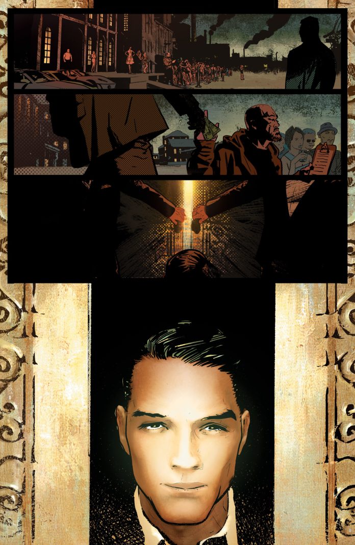
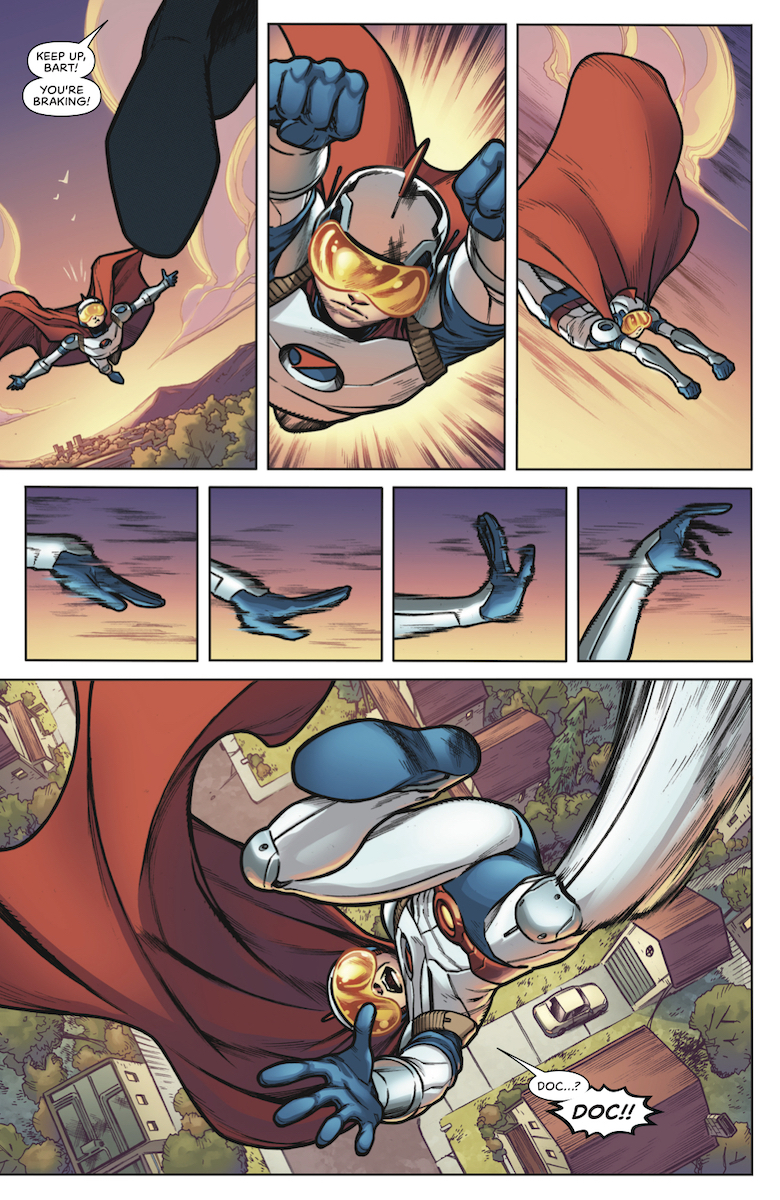 Jim Towe continues to provide some dynamic artwork in Doctor Tomorrow #2. The subtle but notable body language provides detail into how small changes can make significant differences. From how Bart pilots his super suit to the confrontation with Hadrian. But by the time most of the Valiant Universe shows up, there’s a certain lack of detail that takes away from the big moment on the last page. Faith and Livewire practically have the same face for example.
 Clayton Cowles arguably is the most consistent in Doctor Tomorrow #2. The captions and word balloons feel inspired and appropriate. Perhaps that best comes in when Doctor Tomorrow spreads a message while recorded on the phone. The text and word balloon indicate both the medium and how the Doctor’s voice would be altered. The onomatopoeias are, for the most part, color-coded for character acts. Light blue is for Bart and Doctor Future when not using their equipment. The ones that aren’t are for standing out against the background and are mostly mundane actions like knocking.

 Simon Bowland has a much simpler time in The Visitor #4, keeping a decent flow with the word balloons. The few times there are onomatopoeias they get a color code to match Arreola’s bright lights. But perhaps the best usage comes from when The Visitor meditates and data in futuristic fonts decorate his silhouette. An admittedly impressive feat and one that shows the momentum of the series picking up.