Home Blog Page 333

WICKED THINGS #1- When The Detective Becomes The Suspect

Following their award-winning series Giant Days, John Allison and Max Sarin show how being everyone’s favorite child detective isn’t what it’s cracked up to be years later in BOOM! Studios’ Wicked Things #1 out this week.

Wicked Things takes place in Giant Days world, so now is the best time to check it out if you haven’t! The series was a huge departure from the usual comics while being an immensely great read. If you haven’t read the previous series, check your LCS, as you should. Nonetheless, check out how Giant Days changed Samuel Pratt’s concept of comics.

A MURDER MYSTERY BEGINS

Yes, Wicked Things #1 takes place in Allison’s previous universe, yet at no time will you be lost if you’re new here. Instead, Allison spends the first issue effectively setting the plot, characters, and the world. We’re introduced to everyone’s favorite child detective – Charlotte Grote – and her most recent case: growing up. As with any child detective, at one point, they become a teenage detective, then a full-grown detective—hopefully. During the first few pages, Allison establishes Grote’s personality and a bit of her history for the readers.

That is a lot of stuff.
Art by Max Sarin. Colors by Whitney Cogar. Letters by Jim Campbell.

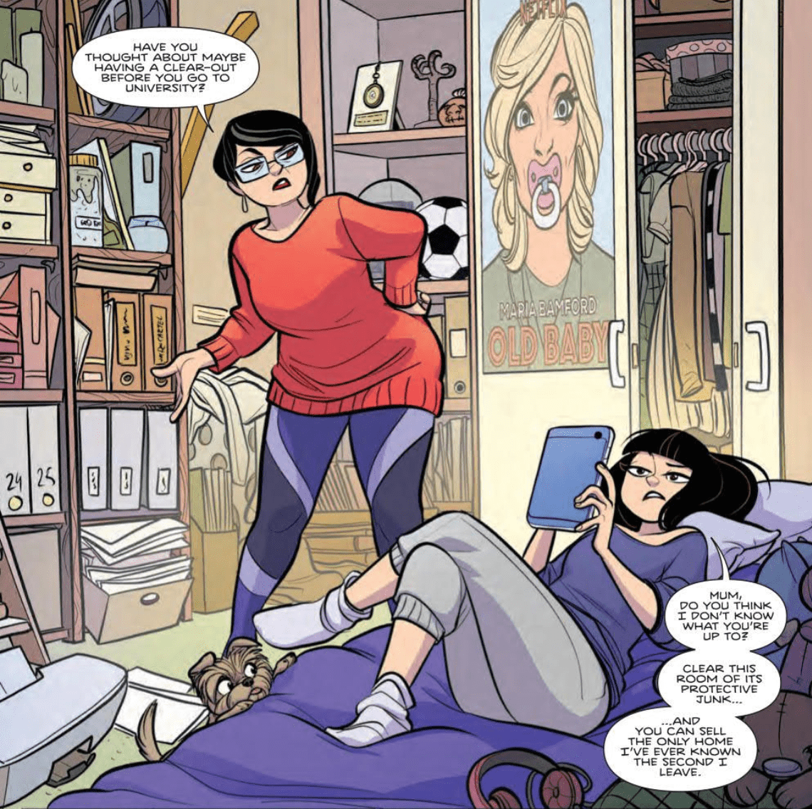
Once Wicked Things #1 moves to the hotel where the “teen detective of the year” award is hosted, Allison starts to introduce a multitude of characters. Each of these characters mirrors their place of origin in their clothing and mannerisms: a small, yet fun touch. Allison excels at writing side-characters. As each character is introduced, you want to learn more of them, which Allison keeps teasing throughout with small interactions.

Nonetheless, one element stands out, which hopefully will be explored in future issues. Wicked Things revolves around Grote becoming a suspect of murder. This occurs due to her being lured in by the translator of another famous detective, who previously had a fantastic interaction with Grote that sets this scene up. But alas, the whole “set-up” feels too staged, with quite a few questions coming up. Why Grote? Was it meant to be her? Could it have been anyone? How’d they know she’d fall for it?

The set-up all felt lucky that it even transpired as such. Luckily, this is a detective story, so all that will come to fruition in time.

Some history on the now almost adult detective.
Art by Max Sarin. Colors by Whitney Cogar. Letters by Jim Campbell.

THE MYSTERY IS IN THE DETAIL

Sarin’s art matched with Allison’s writing continues to bring the panels to life with lovely energy. Whenever a panel calls for a character to react to something transpiring, Sarin makes sure you can see the emotion strained across their face and body. Yet, in some scenes, they draw the character overreacting in an anime-esque style that further emphasizes how they feel. Throughout Wicked Things #1, this style caters to the visual gags making the jokes land quite well. However, this isn’t the only place Sarin’s art stands out, as their panels include quite a bit of detail. In other words, a perfect style to have for a detective story.

Also returning from Giant Days is colorist, Whitney Cogar, whose bold colors help bring Sarin’s pages to life. As Sarin includes a variety of details, Cogar makes sure each stands out independently with color. Another element she brings to the pages are the single color panels. During these moments, she helps the object pop by adding a shade behind it that never takes away from the foreground.

When Allison introduces the side characters and the country, letterer Jim Campbell adds the information above their heads. The way Campbell displays the information feels like what you’d see in BBC’s Sherlock, which is a pleasant touch. In some moments, when characters overact or are seen doing certain movements, Campbell adds onomatopoeia that helps amplify what they’re doing.

Art by Max Sarin. Colors by Whitney Cogar. Letters by Jim Campbell.

WICKED THINGS ARE AFOOT

Wicked Things #1 had one huge hurdle to get through once it was announced; be on par, or greater than Giant Days. With such a huge series in the rear-view mirror, people are sure to compare the two due to it being the same team. Yet, Wicked Things is a whole different beast. Fans of the team’s previous work will find something to love, while newcomers will too. If it keeps this momentum it could very well be your next favorite detective comic.

Monkeys Fighting Robots Youtube

TARTARUS #2 Continues to be The Next Epic, Must Read Series

When your first issue is a damn masterpiece, it’s hard to follow up with the same quality, yet Image Comics Tartarus #2 proves that the team knows what they’re doing when showcasing it’s one of the best series out there.

If you haven’t had the chance to check out the first issue – what I called “the best of 2020 contender” – then make sure you click the link and check it out. Plus, make sure you pick up the first (if you haven’t) and the second at your LCS, as you don’t want to miss out on Tartarus.

THE WORLD OF TARTARUS

First and foremost; Tartarus #2 may not be for everyone. Yes, that can be said for a lot of comics, yet it rings true here. That’s due to how different the series is from others being published. This can be seen in the heavy dosage of politics and a huge roster of characters. Those and the fact it feels much like Frank Herbert’s Dune (and 1980’s European Comics) with its vast history and rich mythology. In its first double-sized issue, Johnnie Christmas spent about half the page count fleshing out some of the past. Although Tartarus #2 doesn’t contain that huge page count, Christmas sprinkles in important history throughout.

Art/Colors by Jack T. Cole. Letters by Jim Campbell.

Whereas Tartarus #1 is slow-paced throughout, its second issue detours a bit. For example, more action takes place, yet Christmas still allows breathing room. During these moments, characters and the world are fleshed out, giving you a better understanding of the characters and the world they inhabit. Each moment this transpires, you are sucked into their world, making you want the next issue even more. Pretty soon Tartarus will become the next craving you seek. Words aren’t enough to talk about how great this series is, even in its second issue you can tell it’ll become the next epic.

Art/Colors by Jack T. Cole. Letters by Jim Campbell.

EACH PAGE A WORK OF ART

Jack T. Cole’s art continues to be nothing short of drop-dead gorgeous. Nearly every page could be a work of art you’d find at a Museum. Cole’s lines are a beautiful blend between Frank Quitely and Moebius. Throughout Tartarus #2’s panels contain fascinating amounts of details in every aspect that you’ll be inspecting each panel for hours to come. Yet there are two aspects he excels at. The first being one that wasn’t delved into much in my first issue review.

Above all, designs are everything, especially when crafting a world from the bottom up, more so a sci-fi tale. Cole’s designs for every aspect of Tartarus is gorgeous in its execution between the busy, cluttered skyscrapers, ships, costumes, and weapons. Each page you’ll be enamored by the elegant designs of ever aspect. The other element Cole excels at is the colors.

Much like the first, Cole keeps the 80’s science fiction palette with a bright retro feeling. There’s nothing ever “too” bright, as the colors are more of a flat bright. Specifically, they keep the pop bright colors will have, but tones it down to not overpower the art. Yet, some of the most excellent examples of Tartarus # 2’s fantastic art can be seen in the action when the crew’s ship is crashing with chaos surrounding. Cole portrays a chaotic crash with his art. Yet it’s the clashing of colors all around the sell the brutality of the crash.

Art/Colors by Jack T. Cole. Letters by Jim Campbell.

AN EPIC NEEDS LETTERS

Letterer, Jim Campbell’s work continues to mirror some of Tom Frame’s work on Judge Dredd. Like the previous issue, and the work in Tartarus #2, it matches the European Comic vibe. Except, to just focus on that would be a disservice to Campbell, as the lettering isn’t just about the font choice. Throughout the issue, Campbell continues to make each of Cole’s panels stand out, never covering up pieces and adding great sound effects. In addition to adding varying font sizes and opacity to some word bubbles, helping make a point.

WHEN CAN I GET THE NEXT ISSUE? (CONCLUSION)

While writing this review, I had to step away from my computer for a few moments, because everything about Tartarus #2 spoke to me. Likewise, reading you’ll feel all giddy and realize you are taking part in what may be one of the next huge comics released in America. Every element in the book works perfectly in conjunction with the other, while constantly complimenting each other. If Tartarus sounds like your type of comic, its second issue will continue that feeling. Yet, if you didn’t give it a chance, as it may not be your type of book, I’d recommend going to your LCS and picking up a copy.

Memorable Quote: “Everything you just said. Was profoundly stupid.” – Tilda

Each new issue I fall in love with Tilda’s character even more.

Monkeys Fighting Robots Youtube

Review: BATMAN #91 Sets Up Phase 2 of the Designer’s Plan

Batman 91 cover

Batman faces off against Deathstroke!

Batman faces an assault on all fronts. The Designer has given Gotham’s greatest criminals the ultimate plans for control near the start of the Dark Knight’s career. While Penguin, Riddler, and Catwoman take them, Joker begins a fight with the master criminal. While it appears the battle ended in his death, the Designer appears many years later, initiating the plans. Starting with bringing the deadliest assassins into the city, Batman takes each one down, with only Deathstroke getting away. Catwoman soon stops Bruce to explain while Harley Quinn chases down Deathstroke with drones. Batman then realizes that the Designer and his cohorts are targetting both him and his alter ego, Bruce Wayne. How will he overcome this threat?

Batman 91 cover

**Some Spoilers Below**

Story:

After it becomes clear that Harley is doing more bad than good, Batman steps back in to stop Deathstroke. He flies in on the Bat and takes him high above Gotham. When Deathstroke prepares to fight, Batman reveals his thoughts on everything. He understands that his fight against the super criminals isn’t working anymore and wants to try something else to help Gotham. When Deathstroke doesn’t care, the pair continue the fight. 

Meanwhile, Joker reveals why he didn’t join the Designer to a captive bartender. While they were all good plans, it would have given Gotham over to the Designer. Instead, he has his own plan to unleash.

Batman 91 p1

As we conclude this first arc, we finally get that progression I’ve been begging for! We see Batman reveal his intentions for trying to change the city, and honestly, it makes sense. After King’s run, Bruce would probably try and find a new way to help Gotham, as his usual methods have just left the door open for a return of villains. We also learn why Joker stood apart from the Designer and hints to an even more dangerous plan. It’s moments like these that make me realize we are moving forward. Tynion could have passed off all of King’s work and wiped the slate clean for himself. Instead, he is building upon the Gotham and Batman we’ve read for over 90 issues. 

The only real problem this issue has is Batman expositing his troubles to Deathstroke. Why would Bruce Wayne ever vent his frustrations to a mercenary of all people? If it were one of his usual costumed foes or a member of the family, it would make sense. Like if he were talking about this grand plan to Selina or Mr. Freeze, it would make sense. When it’s a character like Deathstroke, whose prime motivation is money, it’s pointless. This is definitely a nitpick, but it stayed with me after closing the issue.

Art:

We have a large group for the art team this time around, and it’s a bit overwhelming. We jump to each story, constantly changing styles with each set of characters. The best look would have to be the Catwoman and Harley style, with their linework being smooth and overall pretty to look at. The colorwork of Tomeu Morey helps all the art styles, but it would have been a bit better if we just stuck to one style instead.

Conclusion:

Overall, the end of this opening arc is an overall great issue. We get story progression that gets me excited and continues to show the threat of the Designer. Even though Batman’s rant to Deathstroke seems off, what he does say shows how this character has been growing since the start of Rebirth. The art suffered this time around due to the number of people chipping in to help. So far, we’ve had a wide variety of artists coming in and out to contribute to the comic, and honestly, it’s time to settle on a team. Despite that drawback, I really enjoyed this issue and am excited to see what comes next.

Monkeys Fighting Robots Youtube

Review: HOTELL #1 Is The Last Stop on the Edge of Reality

The comics world (and the world at large) seems to be missing a good ol’ short horror anthology. Luckily, writer John Lees and artist Dalibor Talajić have seen this drought and decided to remedy it with “Hotell” #1. This issue does service to the horror genre by wrapping real-world struggles in with a Twilight Zone meets  Rosemary’s Baby plot that’s a twisted blast to read.

“You won’t find it on any map, but if you happen to be driving down Route 66 late at night
and you’re truly desperate for shelter, sanctuary or secrecy, you might see a battered sign
on the side of the road: The Pierrot Courts Hotel – where many check in but few check
out.”

Writing & Plot

Lees’ plot for this first issue of “Hotell” centers around a pregnant woman on the run from an abusive husband. On her road to escape via Route 66, she is drawn to a seemingly innocuous roadside motel. Her stay there turns for the strange, then downright deadly as she experiences strange dreams where she speaks to her unborn child – and awakes each night with bite marks on her body. John Lees does great work here by taking some relatively familiar concepts – strange motel, odd nightmares, unseemly infants – and mixing them together to create something unexpected. There’s a small element of Twin Peaks style oddity in motel’s cast and their dialogue, mixed in with the normal dialogue of the mother and her abusive ex. The real highlights of course are the chilling nightmare sequences, filled with foreboding words and omnipresent infants. The feeling of drained isolation is borne in through the issue’s steady pacing and introduction of increasingly uneasy elements. Lees never dives into exposition, leaving the audience to interpret the meanings of this strange motel’s events. There are plenty of strange loose ends that, while possibly out of place in this issue, very much add to the lore behind this bizarre little motel.

Art Direction

A horror comic that dances with the line between reality and scarcely coherent dreams like “Hotell” #1 needs an artist with a suitable vision to execute. Fortunately, Dalibor Talajić is on hand to deliver pencils that emphasize natural character art and the intangible. The dream sequences are created with a pointed metaphorical message as to their setting, while also blending that with the traumas the protagonist has faced. Frightening images and unsettling reveals are created with an artistic deliberation that isn’t too over-the-top, so they don’t hamper the comic’s atmosphere. The colors from Lee Loughridge are solid and fill in the world well enough, but don’t do much to add dimension to Dalibor’s pencils. Speaking of dimension, the lettering from Sal Cipriano is stellar. It constantly alters in bold fonts and styles depending on who’s speaking and how they deliver lines. This is truly fantastic work on one of the easiest to ignore aspects of a comic, as it shifts how the reader takes in the dialogue as the terror ramps up.

“Hotell #1” is a reality-bending and disturbing roller coaster of a horror comic. Lees’ familiar but inventive plot for this issue stands strong while also fueling the lore behind this strange desert motel. Talajic’s pencils bring the audience face to face with nightmarish dreamscapes and monstrous revelations. While this comic does have events that some may consider too strange or out of place, these events serve as a stark reminder that this is a motel with history – such as will be revealed in comic issues. All horror fans, be sure to pick up this new release when it hits stands on 3/18!

Monkeys Fighting Robots Youtube

Review: NIGHTWING #70 And The War Within

“Richard” Grayson has been undergoing an identity crisis over the past few issues. The break in mental control Dr. Haas held over him returned many of his lost memories, but they’re in direct conflict with the implanted experiences. On top of this, the Joker is making his way through Blüdhaven and attacking the Nightwing team.

Will Grayson and the city refrain from falling apart? Find out in NIGHTWING #70, available in comic book stores on Wednesday, March 18th.

Story

Grayson would like nothing more than to simply live his life by the implanted memories. But his inquisitive nature won’t let him rest until the truth is unveiled.

The hero knows there are two lives worth of memories floating inside of his mind. But one feels vastly more “real” to him than the other.

This psychological warfare in Grayson’s mind leaves him restless as ever. And he’s determined to uncover his true identity if he has to dismantle the Court of Owls themselves.

Elsewhere, the team of Nightwings are recovering from their recent run-in with the Court of Owls. Most of the team is demoralized, realizing the true danger of fighting major crime in Blüdhaven. Sap, the leader of the group, is determined to hunt down those who’ve caused so much pain. But it’s not an owl-themed murderer the vigilante finds: it’s the Joker.

Dan Jurgens’s script hits the nail on the head in its detail of complicated psychological issues. Through Grayson’s struggle with memories, he portrays the difficulties in believing the truth about ourselves despite what our feelings tell us otherwise.

Artwork

The artwork for this issue was engaging in its fluidity. Ryan Benjamin’s penciling and Scott Hanna’s ink work captures the acrobatic grace of Grayson as he leaps from building to building. Rain Beredo’s dark hues coloring the city helps our hero and each character stand out from the rest of the scene. And Andworld Design’s lettering follows each moment by placing the word boxes alongside each moving figure, generating a sense of movement.

Comic Covers

Main Cover

Mike Perkins and Jason Wright’s main cover artwork gives readers an eery look at the Joker in a Nightwing costume. Could this be the Joker’s ultimate goal — the reason he’s been tracking down our hero?

Variant Cover

Alan Quah’s variant cover gives readers a close view of Grayson performing amazing feats of acrobatics. The determination on his face shows readers he’s after something important.

Conclusion

NIGHTWING #70 gives readers a heart-felt look at the pains Grayson is feeling throughout the recent traumatising events. And the introduction of Joker into the mix will only increase the amount of chaotic elements in the story.

Where do you think Joker fits into all of this? Let us know in the comments below!

Monkeys Fighting Robots Youtube

Review: MIDDLEWEST #16 — Escape From Raider Farms

MIDDLEWEST #16, available in comic book stores on Wednesday, March 18th, is about to shake things up in the series. Beaten down and miserable, Abel, Bobbi, and their new friends have decided to plan an escape from Raider Farms. But on the eve of their escape, Abel has a cryptic dream of Fox attempting to rescue him. Could this be a sign of things to come?

Story

After weeks of planning and information gathering, Abel, Bobbi, and the rest of the crew are finally ready to set their escape in motion.

The thrill of a breakout surges through Abel as they navigate a complex set of sewers. The past few months have beaten him down and, simultaneously, stoked the rage locked within his chest. Channeling the energy into a liberation attempt was the perfect call to make.

However, as most people know, every high has a comedown. The group soon finds themselves thrown off course by an overflow of rainwater. And when they attempt to head back, the escapees find themselves face-to-face with none other than Raider himself-mad as hell.

Skottie Young’s narrative is a perfect blend hope and despair. We feel as if we’re in same shoes as the children as they found themselves so close to success, only to find their dreams crash around them.

Is this the end of Abel and the others’ chances of escape? Will Abel and Bobbi’s family of vagabonds eventually come to their rescue?

Artwork

Jorge Corona’s penciling and ink work, Jean-Francois Beaulieu’s coloring, and Nate Piekos of Blambot’s lettering worked well together in this issue. Each panel has a sense of urgency, using loose lines, swirling sections of colors, and wavy lettering balloons. Readers will find it quite easy to feel Abel’s pressing need to escape the hell in which he’s trapped.

Comic Cover

Corona’s cover artwork features our braves hero poised and ready to take on Raider. The determination on their faces in nothing short of inspiring.

Conclusion

MIDDLEWEST #16 shakes up the path of this narrative, gearing readers up for a confrontation for the history books. We’re anxiously awaiting the conclusion to the Raider Farms arc.

Do you think Abel and the others will ever escape Raider Farms? Let us know in the comments below!

Monkeys Fighting Robots Youtube

A Dramatic Twist in RUNAWAYS #31

RUNAWAYS #31, out this Wednesday from Marvel Comics brings with it several new changes for the Runaways. It also concludes the latest plot arc involving the one and only Doc Justice, and it is a dramatic moment all around.

Chase is looking a little messed up on the cover of Runaways #31.

***SPOILER WARNING***

The latest plot arc in Runaways has been steadily building tension. At the core of that tension is one Doc Justice. He quickly went from being a hero these youngsters could idolize, to something infinitely more dangerous.

Granted, only the readers and a few select members of the team actually seemed to be aware of that fact. That just made his actions all the more insidious. Especially when you take into account how many times these kids have previously been betrayed by the adults in their lives.

All of that is about to come to a head in ‘Cannon Fodder Pt VII’, Runaways #31. Based on the events of the last issue, we knew that something dramatic was about to happen. However, perhaps not quite as dramatic as what we were handed.

Thankfully, the creative team has stayed the same for Runaways #31.

The Writing

Rainbow Rowell has written a seriously intense plot here, providing us plenty of reasons to become increasingly alarmed and concerned. It’s been a slow build-up to this point, but Runaways #31 easily proved that it was worth every moment spent.

Honestly, there is so much that happens in this issue. It’s the sort of read that makes you put down the pages, take a deep breath, and dive back in. It was dramatic and intense, it was brilliant, and it was emotional. And it was full of sneaky little hints at what is to come.

In short, this entire issue had clearly been carefully planned out right from the start. All of the elements hinted at in previous issues came to fruition here. There is something extremely satisfying in knowing that.

It felt like each member of the Runaways got a moment here, be it a dramatic, concerning, or comical (okay, only Molly got a comical moment) one. That went a long way in increasing the drama of what was happening, and of reminding us of the individual members that make up this team.

One highlight of this issue actually has to be the sneaky nature of the writing here. There are lots of little hints snuck into Runaways #31. Eagle-eyed fans will surely be able to spot most of them, and that’s fantastic. Though perhaps mildly concerning for what some of those hints imply.

And Molly is out for the rest of this fight!

The Art

Runaways #31 would not have had nearly the same level of impact, if not for the artistic team behind the helm. They were responsible for portraying everything from the fights, to the emotions, to those sneaky little elements mentioned above.

Andres Genolet was the lead artist for this issue, and they did a fantastic job bringing our beloved characters to life. You could practically feel the tension vibrating off their bones at certain points, a fact that Genolet perfectly portrayed.

Meanwhile, Dee Cunniffe was the colorist, and they likewise did an excellent job. There was one scene in particular that required a subtle shift in colors, yet it made all of the difference in what was being implied. It was stellar (pun not intended, but welcomed).

Finally, VC’s Joe Sabino provided the lettering that carried the plot forward in such a strong manner. The details are what really made the difference here, and with good reason.

Speaking of being out, Gib doesn’t look too good.

In Conclusion

Runaways #31 was perhaps the most dramatic issue in recent times. It heavily implied and provided several major changes, both to the team and their new ‘allies.’ It was a satisfying moment all around, as the events we’ve been promised finally came to fruition.

Only time will tell what happens with some of the hinted elements, but it probably won’t be good. But we’re planning on coming along for that ride, no matter what happens next.

Monkeys Fighting Robots Youtube

A Climatic Return In SPIDER-WOMAN #1

SPIDER-WOMAN #1, out this Wednesday from Marvel Comics brings back a beloved character, Spider-Woman, aka Jessica Drew. Once again, the sassy hero is back, and she’s going to leave her mark on these pages, don’t you worry.

Spider-Woman is back! And with explosive force, from the looks of it.

***SPOILER WARNING***

Is it true? Is Spider-Woman really getting her own series? (Again). While it may be hard to believe, it is in fact, true! Jessica Drew is back in action, and she’s getting her own series to boot. That means more explosions (naturally), venom, and sass than ever before.

Taking lead on Spider-Woman you’ll find a new creative team worth getting excited about. Karla Pacheco (Fantastic Four 2099), Pere Perez (Uncanny X-Men), Frank D’Armata, and many more creatives have already become involved.

After the attention Drew has been getting during Strikeforce, it’s really no surprise that she’s getting another shot at a solo series. That being said, if you’re behind on Strikeforce, you really won’t have any problem following along. Just know that Jessica Drew is as active as ever, and that means she’s facing all-new challenges.

And here’s a peek at who was involved in Spider-Woman #1.

The Writing

Spider-Woman #1 starts off explosively, being unafraid to throw Jessica Drew into the thick of things. Though perhaps this is not what she had in mind when she opted to take on a few new jobs. But such is the life of a superhero, huh?

Karla Pacheco has managed to simultaneously portray the sass and tension that tend to go hand and hand with Drew. And she’s done so in perfect balance. Here is a character we all love, but she’s been taken to all new heights…and risks.

This issue is actually split into two parts and is part of the reason why it’s slightly longer than normal (which you probably already noticed). There’s the main plot, in which Jessica is gloriously back and dealing with villains and teens.

Then there’s the second half, which is humorously titled ‘New Costume, Who Dis?’ This second plot went a lot way in explaining some of the hints and concerns revealed earlier, all while leaving us with more questions. Not to mention a renewed interest in reading Spider-Woman #2.

Jessica Drew is not a woman to mess with, as evidenced in this intro to Spider-Woman #1.

The Art

The artistic team behind Spider-Woman #1 is absolutely massive, thanks in part to the split-plot arcs. It was worth it. The panels in this issue varied dramatically, jumping from humorous to dramatic, and then back again. It’s everything we could have wanted from a Spider-Woman comic.

Pere Perez (pencils/inks) and Frank D’Armata (colorist) took charge of the first plot, and you can tell that they had more than a little bit of fun portrayed Drew’s antics. It was an entertaining read, one that showed Jessica’s powers to the full extent. Okay, it also showed her frustration, but that just made it all the more entertaining.

Paulo Siqueira, Oren Junior, and D’Armata all teamed up for the second arc in the issue, ‘New Costume, Who Dis?’ It’s safe to say that this was a dramatic change, due in part to the time and costume changes. But it’s also the tone and setting as well. The artists did an excellent job of portraying all of that and managed to sneak in a bit of humor along the way.

VC’s Travis Lanham was the letterer for the issue, and their work is exactly what was needed here. It provided a cohesive element for the whole issue and guaranteed that we followed through each panel accordingly.

Annnnnd now we understand her frustration in Spider-Woman #1.

In Conclusion

Spider-Woman #1 was everything we could have hoped for, and then some. It’s great to see Jessica Drew getting her solo series back, and we have high hopes for where it’ll take her (and the readers, by proxy).

The dramatic and sassy introduction was perfection and a strong reminder to fans old and new for what is in store. It’ll be fascinating to see what sort of trouble she gets in next…and how she’ll get out of it.

Monkeys Fighting Robots Youtube

A Dramatic Transition in FAMILY TREE #5

FAMILY TREE #5, out this Wednesday from Image Comics continues the horror-filled family drama, but perhaps not in the way that many fans will expect. The series is about to take a dramatic turn, as the plot progresses towards a dark point.

Tree or girl? You decide after reading Family Tree #5.

***SPOILER WARNING***

One family’s trials and tribulations have officially hit an epic proportion in Image Comic’s Family Tree. This is series combines horror with family drama, leaving us both unsettled and concerned. It’s been a chilling reading experience, and it has really only just begun.

Family Tree #5 brings with it many changes and surprises – far beyond what the average reader might expect. It’s all the proof we need that this series is going to take a sudden change in direction, for better or for worse. That all depends on your perspective.

One thing is certain; this creative team has really been pulling out all of the stops. It’s clear that they’re going to do everything possible to make this a memorable series. Working on this project you’ll find Jeff Lemire, Phil Hester, Eric Gapstur, and Ryan Cody.


The Writing

Where the rest of this series has been chilling, Family Tree #5 is a blend of heartbreak and surprise. Many events occur that will absolutely tug at your heartstrings. There are also elements that will make you think.

Though there are certainly some chilling elements to be found – they’ve just altered tone slightly. In a way, these notes almost feel more personal, likely due to what is actually occurring. As well as everything that it implies.

Then you get most of the way through the issue and…everything changes. This is suddenly a completely new story. Albeit a story rooted (pun intended) on the original one. It is a surprising twist, to say the least. Nevertheless, it’ll be fascinating to see where the creative team goes with it.


The Art

The art behind Family Tree #5 is as striking and gritty as the emotional toll is taken. A large part of the issue is full of dark tones, being predominantly purples and blacks. This sets the mood, as well as suiting everything that happens.

But, like the plot itself, there’s also a dramatic change. The artwork stops being somber and muted and instead transforms. Suddenly the art and world feel alive – the tones shift to being predominantly green, and with good reason.

That’s not the only change hinted at in those final pages, but we won’t spoil them by talking about it too excessively. But don’t worry, it’s looking to be a fascinating change of pace, one that the artists can keep up with.

The cover of Family Tree #6 hints at all of the changes arising.

In Conclusion

Family Tree #5 was a powerful read. It knew exactly how to hit readers in the emotional gut. It then immediately followed up with that by further unsettling readers with a dramatic shift in focus. The series has once again proven it’s unpredictable nature, and that is brilliant.

Monkeys Fighting Robots Youtube

The Plot Thickens in FIREFLY #15

FIREFLY #15, out this Wednesday from Boom! Studios is a dramatic continuation to Mal’s latest grand scheme – one that fans probably never expected to see in this franchise. This is an issue full of twists and surprises, and then some.

Mal is looking mighty proper on the cover of FIREFLY #15.

***SPOILER WARNING***

The beloved series created by Joss Whedon has really taken several surprising turns over the last several months. Firefly (in comic book form) has changed the status of many characters, but none more than Malcolm Reynolds.

Admittedly, the changes he’s been facing are ones that fans would never have guessed or expected – and that is no exaggeration. Who would ever imagine seeing Mal on the other side of the law? Certainly not us.

On the right side, that means that this entire plot has become unpredictable, forcing fans to step away from all of their assumptions and expectations. There’s something oddly refreshing about that fact.

Aww, Kaylee has a new boyfriend, and they look so happy together on this variant cover of FIREFLY #15.

The Writing

Sheriff Mal Reynolds (man are those three words we never expected to say together) has been dealing with several surprising cases as of late. By cases, we, of course, mean lots of crime and murder. You know, the usual. At least, the usual for a small moon. And Firefly #15 is going to continue that trend.

That has resulted in some surprising elements and changes in this series thus far. Mal has become isolated from his crew – which in itself is fairly strange. And that is only the beginning. Fans that have been following the series know exactly what we’re talking about there.

One thing is certain, Greg Pak has done an excellent job of keeping us on our toes. This may not be the crew as we remember them, or the story we expected. But it has been an interesting journey. It leaves us wondering if this is the path the series would have taken, if not for a cancellation. Who knows.

The increase in focus on the Blue Sun has been an excellent choice. This is a dark and dangerous world (well, universe), but it also needs a few named big bads in order to add weight to the tension, and it looks like Blue Sun is exactly what this series needed. Especially since they’re toeing the line, neither being good nor horrible (well, mostly).

That’s one shiny badge, Sheriff Reynolds.

The Art

The artwork behind Firefly #15 is truly remarkable. There’s no doubt that it’s a highlight, as they show the variety of tones and styles a series such as this calls for. There’s dramatic highs and precarious lows, all while showing the gritty nature of death and fighting for one’s life.

Lalit Kumar Sharma was the lead artist, and they provided us some seriously intense scenes. That in itself isn’t surprising – Mal is the sort of character that will always find himself in a mess. It’s the way those scenes are portrayed that really hit home, and it’s all thanks to Sharma.

Francesco Segala was the colorist for this issue, and their colors really drive home all of the points being made, while setting the tone. It’s somber at times, and other times lushly defined. There’s so much depth, even in the simple backdrops, and especially in the brighter elements.

Finally, Jim Campbell was the letterer, and you can see how carefully they worked on this issue. The sound effects lead us from one panel to the next. As does each and every conversation, for that matter. It all tells a comprehensive story.

The creative team behind such an unpredictable series of events.

In Conclusion

Firefly #15 was a surprisingly compelling issue, one that has taken our characters so far outside of the realm of what we’ve expected. Yet there’s something to say about that, as we see new sides of beloved characters, and new circumstances for them to deal with.

Monkeys Fighting Robots Youtube