Following yesterday’s announcement from Marvel Comics that the next story arc after Age of Khonshu will be Enter the Phoenix, Marvel has released a series of variant covers highlighting a host of Marvel characters carrying the Phoenix Force.
The variant covers will be available to retailers this November, and we have a first look at the covers just for you. You can check out the covers below, and read all about it in the official Marvel press release.
It’s been a while since we’ve seen the Phoenix Force unleashed on the Marvel universe. Are you excited for its return? Let us know what you think in the Comments section, and please share this post on social media using the links below.
MARVEL HEROES EMERGE AS HOSTS OF THE PHOENIX FORCE IN FIERY COVERS!
Upcoming Avengers Story, “Enter the Phoenix,” Heats Up the Marvel Universe
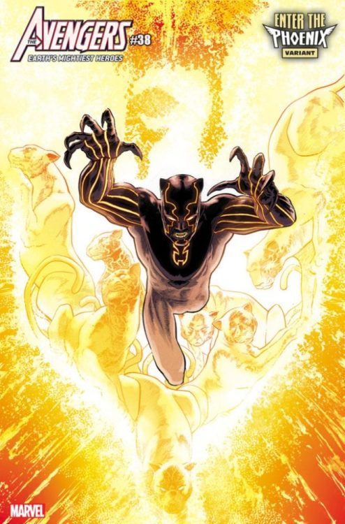
New York, NY— August 13, 2020 — “I AM PHOENIX!” Those immortal words will take on new life this December when Jason Aaron and Javier Garron’s next great Avengers epic, “ENTER THE PHOENIX,” begins. To anticipate the return of the cosmic chaos-bringer, your favorite Marvel characters will be reborn as Phoenix hosts this November in astonishing variant covers by some of the industry’s top artists including Salvador Larroca, Kris Anka, and Aaron Kuder. Captain America, Black Panther, and She-Hulk are no longer the heroes you knew as they bond with the Phoenix Force to spread rebirth—or destruction—throughout the Marvel Universe. In the end, only one will be chosen to wield this terrifying and great power when the Phoenix Force chooses a new host. Find out more when “ENTER THE PHOENIX” begins this December but in the meantime, check out the Phoenix Variant covers listed below and keep your eyes peeled for more coming your way in November!
AVENGERS #38 BLACK PANTHER PHOENIX VARIANT COVER by AARON KUDER with colors by MATTHEW WILSON
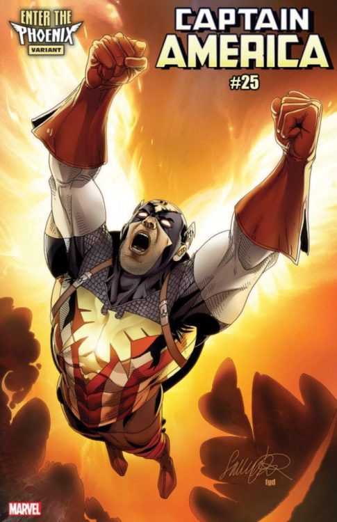
CAPTAIN AMERICA #25 CAPTAIN AMERICA PHOENIX VARIANT COVER by SALVADOR LARROCA with colors by FRANK D’ARMATA
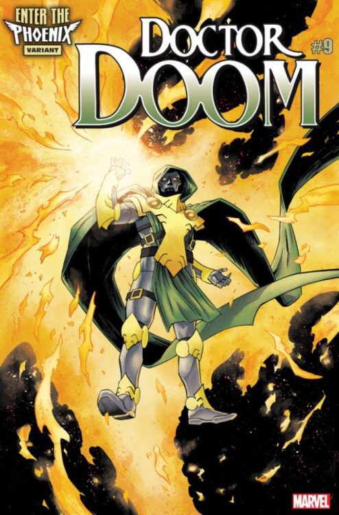
DOCTOR DOOM #9 DOCTOR DOOM PHOENIX VARIANT COVER by DECLAN SHALVEY
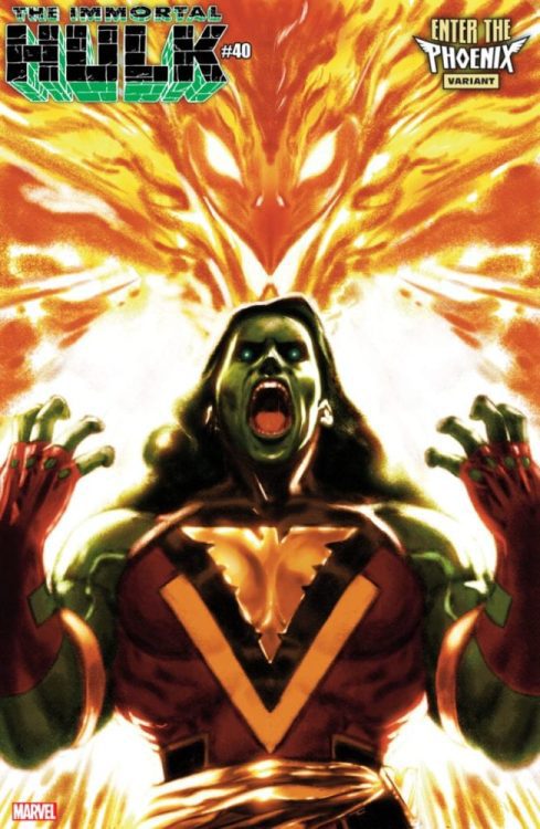
IMMORTAL HULK #40 SHE-HULK PHOENIX VARIANT COVER by TAURIN CLARKE
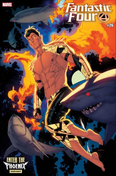
FANTASTIC FOUR #26 NAMOR PHOENIX VARIANT COVER by KRIS ANKA
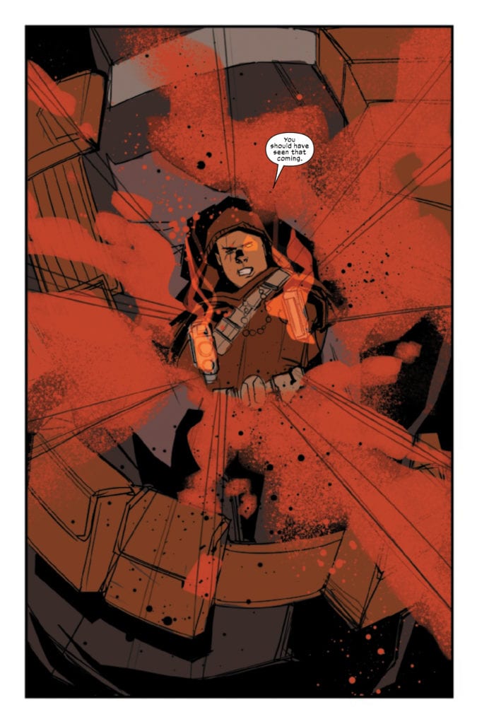
CABLE #3 hits your local comic book store August 19th, but thanks to Marvel Comics, Monkeys Fighting Robots has an exclusive three-page preview for you.
About the issue: REUNITED FOR THE VERY FIRST TIME!
Deadpool considers Cable one of his oldest and best friends. Cable hasn’t met Deadpool, yet. He’s in for a treat.
CABLE #3 is by writer Gerry Duggan and artist Phil Noto, with letters by Joe Sabino. Tom Muller is the book’s designer, as he has been for all of the new era X-Men titles.
Though the Merc with a Mouth doesn’t appear in the preview below, Cable & Deadpool is a fan-favorite pairing: the two shared a title for 50 issues and appeared together on-screen in 2018’s Deadpool 2. They were ranked #7 on Marvel’s list of “The 10 Greatest Buddy Teams” of all time. However, this isn’t the same old Cable Deadpool loves to annoy, so this meeting will be interesting to see.
Check out the CABLE #3 preview below:
Are you excited to see Deadpool and Cable team-up again for the first time? Sound off in the comments!
She was the breakout character from “Joker War,” and now Punchline will be the star of a new one-shot comic in November. James Tynion IV, Sam Johns, and Mirka Andolfo unite to give readers the backstory on the new Bat-star of 2020.
James Tynion IV, Sam Johns and Mirka Andolfo Take Fans on a Journey Behind the Origins of The Joker’s New Field General
From her first appearance in the pages of Batman to her spotlight story in The Joker 80th Anniversary 100-Page Super Spectacular, Punchline has quickly established herself as one of 2020’s breakout comic book characters. On November 10, the mystery behind this new character is explored further in Punchline #1, a special oversized (48-Page) one-shot.
Written by Batman scribe James Tynion IV and Sam Johns (DC’s Crimes of Passion, Over the Garden Wall, Razorblades) with art by Mirka Andolfo (DC Comics Bombshells, Hex Wives, Harley Quinn), this one-shot will also feature a main cover by Yasmine Putri (DCeased) and variant cover by Frank Cho.
“Back when I first introduced Punchline, I said many times that this wasn’t going to be a flash in the pan character. That I had big plans for her moving forward, that would drive big story next year and beyond,” says Tynion IV. “Joker War is over, but Punchline’s plans have only just begun. I’m thrilled to be telling this frightening story that expands her past, and sets up her future, with the amazing Sam Johns, and the incredible Mirka Andolfo. This is only the beginning!”
Facing the consequences of her role in “The Joker War,” Punchline is the story of Alexis Kaye, and how she’ll take Leslie Thompkins, Harper Row and Cullen Row on a harrowing journey that reveals her radicalization to The Joker’s ideology.
“Fans immediately responded to Punchline,” says Johns, “so I’m thrilled to be part of the team that gets to build the foundation of this deadly cult icon. Working with such a talented artist as Mirka means we didn’t have to hold back on any of the action, horror, or romance…And when it comes to Punchline and Joker, you often need to pull off all three at once!”
Punchline #1 arrives in open and operating comic book stores and participating digital retailers on Tuesday, November 10, 2020.
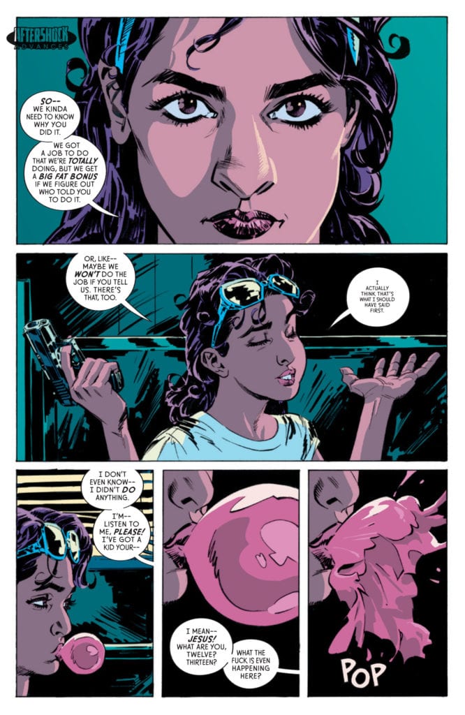
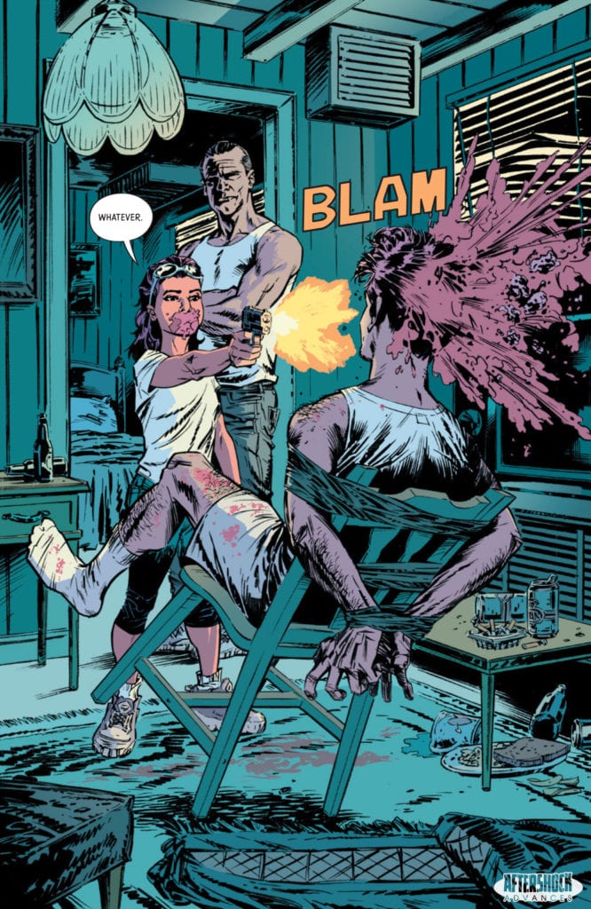
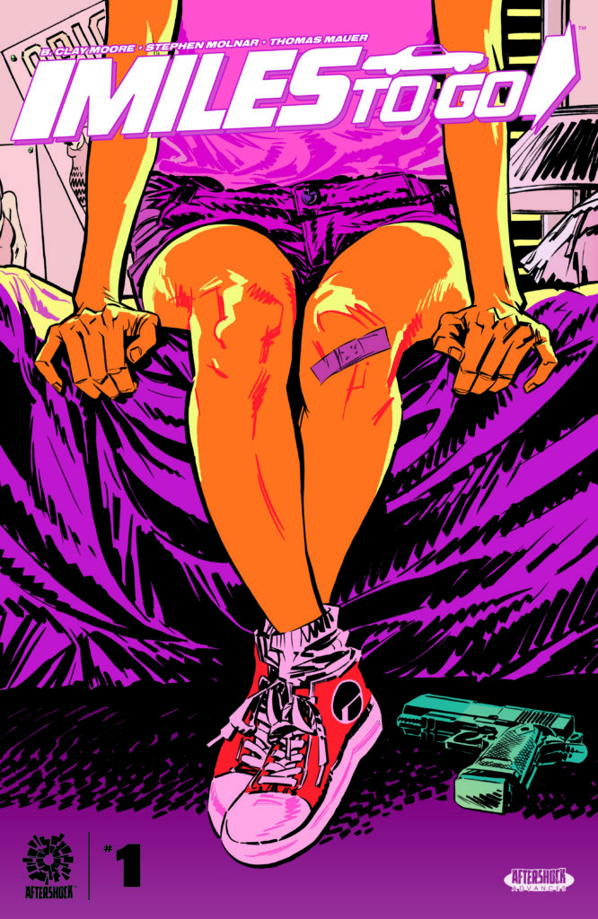
MILES TO GO #1 hits your local comic book store September 23, but thanks to AfterShock Comics, Monkeys Fighting Robots has an exclusive four-page preview for you.
About the issue: Amara Bishop is a newly single mother with a long-buried past. Raised by an alcoholic father in a rundown trailer, Amara was a child when she learned to kill. And she hasn’t killed anyone since she was thirteen. When her aging mentor is murdered, and her daughter is threatened, that will soon change…
MILES TO GO #1 is by writer B. Clay Moore and artist Stephen Molnar, with letters by Thomas Mauer. The main cover is by Molnar, and the incentive variant is by Francesco Francavilla.
“A DEADLY GAME OF CAT AND MOUSE“
The turn between the first and second page of the preview below is everything we love about comics, and should be enough to get you to add MILES TO GO to your pull list.
Check out the MILES TO GO #1 preview below:
Are you looking forward to MILES TO GO #1? Will you ever look at bubble gum the same way? Sound off in the comments!
Cruel Summermay not be the end to Ed Brubaker and Sean Phillips’ brilliant series Criminal, but it’s certainly its culmination. Seeds planted in the first volume of Criminal bloom in Cruel Summer with poetic brilliance. It’s a simple, unassuming story that will lull you into a heartbreak. And you’ll love every second of it. Writer Ed Brubaker, artist and letterer Sean Phillips and colorist Jacob Phillips have poured their souls onto every page. It’s tragic and beautiful all at once.
Writing
Brubaker knows his characters so fully, that even when they’re walking contradictions, we can still relate to them. In his afterword, Brubaker describes his character Ricky Lawless, we see Ricky feels this contradiction in his bones. It’s a feeling Brubaker remembers from his own days as a teenager. “Like being pulled between childhood and real life and missing it already while you’re trying to burn it down at the same time,” he says. It shouldn’t make sense, it’s not logical, but it’s this kind of contradictory force that drives Ricky Lawless.
It’s in Ricky’s father too. Teeg Lawless somehow manages to be both a monster and a teddy bear at the same time. This isn’t the first time we’ve met Teeg, and Teeg has never seemed to be very happy. He’s always seemed like he was given this lot in life, and he was going to be a mean son of a bitch so he could just get on with it. But in Cruel Summer, we see Teeg smile. Ricky even points out how strange it is to see Teeg smiling, “like no one had ever taught him how to do it.” Brubaker lures us in with lines like these. We see the human underneath the pair of fists. The one we want to just give a hug. But we know from the first issue, that all is doomed. That’s what makes this summer so cruel.
Art
Sean Phillips’ art should have warning labels on it: “Proceed with caution: will spoil all art for you in the future.” Phillips shows his characters’ souls on their faces. But he does it with such beautiful subtlety. These aren’t characters who wince or guffaw, hell we’ve already established Teeg barely ever smiles. These are characters who keep their cards close to the vest. They never show how they really feel if they can help it. And that’s what makes Cruel Summer so brilliant. The ever-so-slight looks of panic, mixed into their steady gazes. Phillips uses the smallest tells to let us know that these level-headed characters are scared as shit.
Phillips highlights the stoicism in Cruel Summer by juxtaposing characters against young Ricky Lawless. As cool and collected as Ricky might think he is, his fear and anguish are plastered all over his face. At one point, he and Jane have to secretly “get rid of some evidence.” We see Ricky looking down at what they’re doing, his eyebrows creased and his eyes full of terror. He’s petrified. And only a few pages later, he and his friend Leo are robbing a place together. Ricky gets impatient and jumps the gun. This allows us to see Leo from the same angle as we just saw Ricky. But he’s not terrified or nervous. He may be the same age as Ricky, but he’s as stoic as any of the adults. Phillips tells us with these simple repeated angles that Ricky and Leo are both very different people than we might expect.
Coloring
Ed Brubaker and Sean Phillips have worked with some really brilliant colorists on Criminal. But none of them have quite understood their work as well as Jacob Phillips. He is their perfect match. Ed Brubaker and Sean Phillips can kiss the days of being a dynamic duo goodbye, because they have found their third man. This duo is now a trio. Jacob Phillips manages to capture the style of their art and writing, by making a page look both messy and beautiful at the same time. Colors don’t stay within the lines, but then neither do these characters. Phillips is in these characters’ heads.
When Teeg doesn’t want to leave the nightclub where he met Jane, we get it. The gorgeous pink and blue colors make you wish you didn’t have to turn the page either. And when Dan is searching for Jane, but all he knows is she has a red leather jacket, we see him picturing her out there, in scenes of black and white. Her jacket stands out in brilliant crimson. Phillips’ goal, it seems, in Cruel Summer is to make every panel unforgettable. A cop car stopping in an alleyway should look simple enough, but the red of their lights drenches the alleyway in vibrant color. Phillips colors may look haphazard, like they were flung onto the canvas rather than painted on, but they all fall together to create a beautiful whole. It’s not unlike the world of Criminal. Haphazard, even messy, but somehow still beautiful.
Lettering
Sean Phillips’ lettering is often as subtle as his art. The sound of gunshots look bland compared to your average comic. They’re shown in white lettering, not at an angle and not any bigger than other sound effects. At first this seems odd. Your eyes might tell you that that’s not what a gunshot sounds like. But Phillips seems to be saying, in the world of Criminal that is what they sound like. They sound normal, just like any other sound. Because gunshots are a commodity in this world.
As characters are introduced, to the plot of Cruel Summer, each of them tends to get a “character page” of sorts. A full page of them sitting there, thinking to themselves, with captions lined up on one side of the page letting you know what they’re thinking. For the most part, the caption boxes line up along the left side of the page. The boxes of different sizes create a kind of jagged edge, running into the character who’s sitting on their right, as a kind of representation of the character’s own unevenness. But a few times, the caption boxes line up on the other side of the page, so the flat side of the boxes line up against the character. When Teeg first finds Jane and feels whole, when Tommy Patterson is planning their heist, and when Leo is holding a gun. These are the characters who are level, as straight as the edge to their captions. They’re cold and collected. They’re different.
Cruel Summer is easily the best part of an already magnificent series. It’s a culmination of Criminal that promises a lot, and delivers to devastating effect. Brubaker, Phillips and Phillips have outdone themselves. Pick up Image Comics’ Cruel Summer from your local comic book shop now!
Image Comics’ Adventureman #3, written by Matt Fraction, with pencils and colors by Terry Dodson, inks by Rachel Dodson and letters by Clayton Cowles, welcomes us deeper into the world this creative team has prepared. Most series, in any medium, would give their character special treatment. The main character sees things others don’t, they can do things that others can’t. That’s generally why they’re the main character. But in this issue, we see Claire beginning to lose the things that make her special and unique, while she’s simultaneously falling deeper into a brand new world.
Writing
Fraction humanizes Claire a lot in this issue. In the past, she’s had a level-headedness that was almost supernatural. Now, as she’s coming off of the events from the last issue, she’s completely scrambled. And she’s going through an interesting transition. In the past, she’s been the only one to see things right under everyone’s noses: skyscrapers everyone seems to ignore, books mysteriously dropped into her lap. But now she’s losing that ability, and life seems to be going back to normal. In taking Claire’s “sight” from her, Fraction discards a surface-level thing that makes Claire special, to get to what’s really special about her. She’s not someone who gives up, and though she’s beginning to forget some things, she’s sharp enough to get the job done. With each passing issue, we’re beginning to see Claire is the real Adventureman of this series.
Art
The Dodsons brilliantly play into Claire’s amnesia. Elements of the supernatural are often obscured in this issue, through all kinds of ways. At one point, when Claire envisions herself on a boat, the chaos of the scene distracts us from the details. It feels like being lost in a crowd, trying to get to someone. Instead, you’re being pulled away by the tide of people, further and further from the answers you’re looking for. Similarly, scenes in the ultravoid, or in Claire’s memory, are overshadowed by darkness. It’s not easy to see who is doing what when the lights aren’t on. We almost begin to doubt everything has been real up until this point ourselves, as we dive deeper into Claire’s perspective.
Coloring
Terry Dodson draws a clear line in the sand between the supernatural and normal scenes in this issue. The scenes that have supernatural overtones are colored in a washed out color palette. Light greens and blues give those moments a spooky feeling. When Claire is running around in her normal day-to-day, the colors are vibrant and warm. But the best part of Dodson’s coloring comes at the end. Just as we’re starting to wonder where the supernatural ends and the natural begins, the rules change.
Claire sits with her son and father, watching TV, in a pale green scene. We immediately switch to a scene in the ultravoid, which has the exact same coloration. As the comic closes out, we resume our focus on Claire. While some of the coloration has come back into the scene, it still looks predominately pale green. With this, Dodson blurs the lines between reality and “fiction.” It gives us the spooky feeling that the ultravoid might be closer than we think.
Lettering
Cowles’ lettering does such a brilliant job of showing us how Claire is feeling. At several points, Claire says something in large lettering, but follows up with another line in smaller letters. “But I can help” she says, confidently in large letters. It’s closely followed by “I think I can help,” in letters that are half that size. We’re seeing Claire being torn between worlds. Is she the confident adventurer, like Adventureman, or is she the quiet bookkeeper that enjoys reading all day? We see some of her thoughts, written as captions, throughout the issue. But the caption boxes seem either too far apart, or like they’re right on top of one another. It shows us how scattered Claire is feeling, right on the page!
Image Comics’ Adventureman #3 is as fun as any issue so far. But this issue dives deeper into the tug-of-war Claire is experiencing. And as worlds collide, this series promises it’s only better from here. Pick up Adventureman #3, out from Image Comics on August 12th, at your local comic book shop!
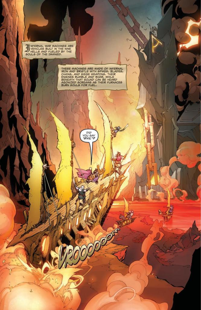
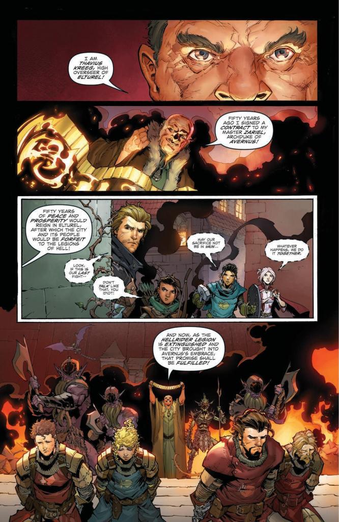
DUNGEONS & DRAGONS: INFERNAL TIDES #5, available in comic book stores on Wednesday, July 12th, concludes Jim Zub’s thrilling tale of paladins and hellfire. Our band of heroes is prepped and ready to take the fight to the minions of Zariel. Can they save Elturel in the midst of the Blood War?
Story
DUNGEONS & DRAGONS: INFERNAL TIDES #5 offers the fiery conclusion readers have been waiting for. The entire party comes together to raid Zariel’s stronghold, destroy the Infernal War Machines, and free the realm from her control.
Unfortunately, taking down this imminent threat is more difficult than once though. After a brief scuffle, the band of heroes meet Thavius Kreeg, the High Overseer of Elturel. Rather than restoring order, he’s signed a literal pact with the devil in order to unleash the powers of Hell.
The party finds themselves at the mercy of Kreeg and his golden contract. And though they fight back, all hopes are extinguished when the former righteous Solar, Zariel (now archdevil), makes her appearance. Fortunately, paladin-in-training Aubree is ready to confront the hero-turned-villain. But instead of fighting swords, she plans on employing her words.
Aubree’s heartfelt dialogue with Zariel brings us back to our childhood, reminding us of those times our heroes failed us. Zub’s portrayal of this and other character interactions bring this issue to life.
Artwork
Max Dunbar’s penciling and ink work, Sebastian Cheng’s coloring, and Neil Uyetake’s lettering gave us illustrations that perfectly captured the thrills of this story. The panels depict the party’s unique fighting styles, employing solid red backdrops to help them stand out. We also loved how the lettering set the tone for this issue’s fantasy theme through the use of scroll-like word balloons.
Conclusion
DUNGEONS & DRAGONS: INFERNAL TIDES #5 is the satisfying conclusion we were waiting for. We’re excited to see more Dungeons & Dragons stories from Zub and team.
Were you satisfied with the conclusion to this series? Let us know in the comments below!
Bathed in blood and a monster once more. The Immortal Hulk #36 from Marvel Comics see’s Al Ewing make the big green hero both a victim and an aggressor. It’s a tale of tragedy and horror with no rest for the wicked or the divine.
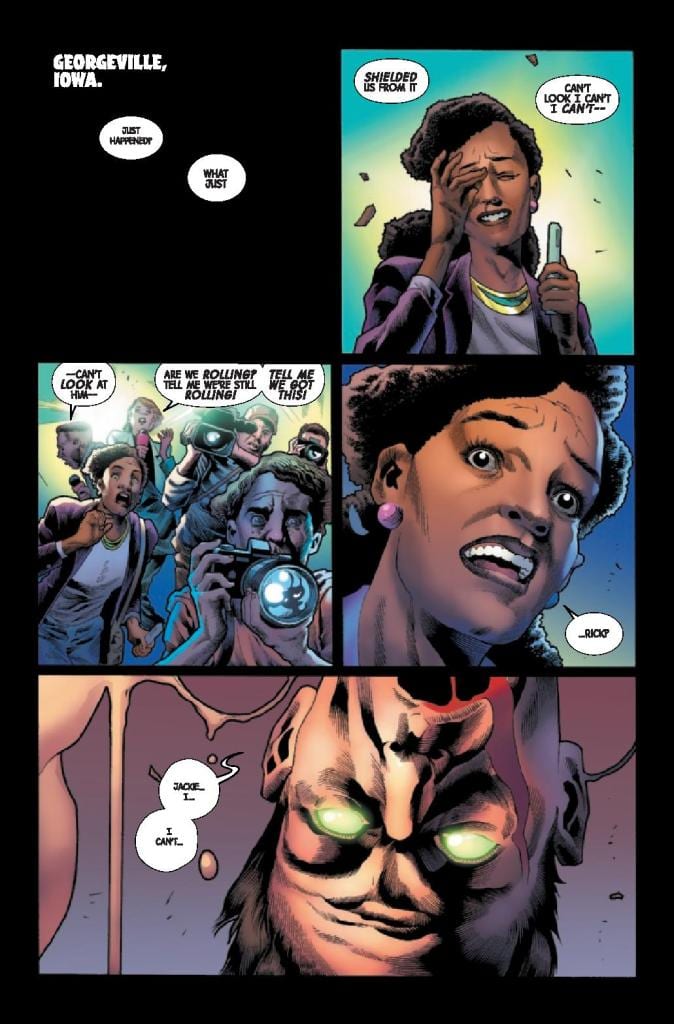
In Georgeville, Iowa Rick, in control of The Leader, forced the Hulk to explode. The massive Gamma Bomb explosion has devastating effects on the locale and a number of the populace. News reported Jackie McGee bares witness to the piles of rubble and bodies just as Gamma Flight enter the scene.
The Immortal Hulk #36 Credit: Marvel Comics
Outbursts and Mutations
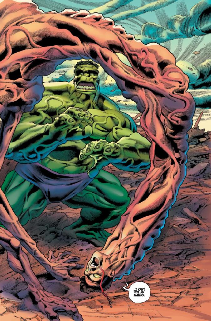
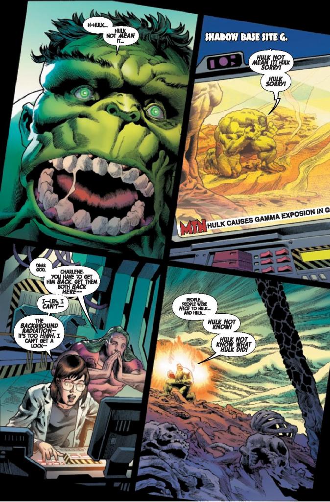
Al Ewing opens this issue with the devastating aftermath of Hulks explosion. The focus, however, is not on the destruction but the warped mutation of Rick. Played as a tragedy, the reactions from the cast to Rick’s deformity is at the heart of this issue. The Hulk, comically drawn by Joe Bennett and Ruy Jose, stares in shock at what he has done to his friend.
Ewing emphasises Hulks reaction, making it central to the other characters view of the destruction. It is important to know how distraught the Hulk is at this point and how he believes he has failed his friends. It is after all central to not only The Leaders plan but the character of the Hulk. There has always been a battle between Man and Monster, and being a protector makes the Hulk more human. To fail at that is to fail in his life.
Ewing then pours on the trauma by throwing Gamma Flight, with their weapons held high, into the mix. To add more conflict to the situation greatly destabilises the Hulk. But the real beauty of Ewing’s storytelling in this issue is that the Hulk going ballistic is only a diversion from a more disturbing threat emerging elsewhere.
The plot for this issue is fairly standard with the villain manipulating the hero into a situation where he will look like the villain. With the Hulk it adds a little more gravitas as it plays into the core of the character and the cost is greater. When the Hulk begins to lose control it has wider reaching consequences than, for example, Spider-Man losing his cool. Ewing knows this and is able to get that message across in the story.
The Immortal Hulk #36 Credit: Marvel Comics
Representation
For a straight forward story, such as the one in this issue of The Immortal Hulk, the ‘wow’ factor has to come from the art work. It should reach right of the page and slap you around the face. The requirement is dynamic fights and hard hitting emotional scenes. What the reader gets in this issue is, however, lacking.
The Immortal Hulk has become known for its horror elements over the last few years. The first issue of this run was a triumphant return to the horror genre, a fitting place for the Hulk to be. Unfortunately, the artwork in this issue doesn’t capture that vibe.
Joe Bennett’s pencils and Ruy Jose’s inks are highly detailed and capture the emotional aspect of the comic very well, especially in the human characters. The reaction panels with Jackie are superb and the reader really gets a sense of the scene unfolding in Iowa. The other, mutated or super powered, characters are less impressive, at least for a horror story. The Hulk is comical in appearance throughout with over the top facial expressions that make him over-dramatic.
Other than the grotesqueness of Rick’s mutation there is nothing especially horrific about anything in this issue, until the very end. It is enjoyable and there are a few moments that may take you by surprise but not make you scared, not shocked. The visuals are too bright, too run of the mill and standard superhero. That’s not to say the artwork isn’t good; the panel layouts are intriguing, especially with the tilted page frame to give the impression that everything is off kilter; the compositions are impressive and there is real energy in the fight sequences. It just doesn’t have that horror aesthetic required to make this a truly memorable issue.
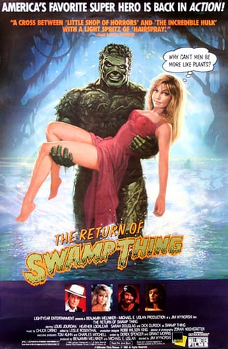
Return of the Swamp Thing Movie Poster
Confused Tone
Colorist Matt Milla gives everything in Iowa an Earthy feel which allows the Hulk to stand out on the page and in the action. There is a clear contrast between the panels featuring the Hulk and those that contain Gamma Flight. It is a competition between red and greens, fighting for dominance on the page.
This provides a satisfying reading experience but it again leans into the contradicting tone of the comic. On the one hand it has a horrific nature but much of this is being lost in almost comedic scenes. It’s like the movie The Return of the Swamp Thing. There is a blend of horror and comedy that just doesn’t mix well. This isn’t the Evil Dead II where you’ll laugh out loud before hiding in terror; it’s more of a puzzle, leaving you wondering what the intent was.
The only element of the comic that matches the mixed tone of the comic is the lettering. Some of the speech is wonderfully merged with the emotional reactions of the characters. Small text within large balloons illustrate moments of thoughtfulness or concern, whereas other balloons can’t contain the speech. Heavy, black letters break the border of the balloon and spill out into the panel, out of control like the character screaming them.
To counter this, a large portion of the text is more confusing with random emphasis on certain words. Trying to extrapolate the meaning of the bold text pulls you out of the comic, disrupting the momentum. It is as if the cast are a mix of seasoned actors and wooden, B-Movie extras.
The Immortal Hulk #36 Credit: Marvel Comics
Conclusion
If you have been reading The Immortal Hulkfor a while then this issue will fit neatly into your collection. It is not the pinnacle of recent months but is also not the worst superhero comic currently on the shelf.
If you’re new to the comic you’re going to have problems. Not following the story, that’s straight forward enough, but attempting to figure out exactly what this comic wants to be. On the one hand it’s horror but the presentation is so tongue in cheek. A number of the jokes don’t land, assuming they are supposed to be jokes in the first place.
If the aesthetic on the page was different, if the coloring included layered shadows and violent shades, then everything about the comic would change. It would horrify and the grotesques would make you cower away. Alternatively, if the violence was played down and a looser style brought to the pencils and inks, it would work as a tragic comedy.
Unfortunately, The Immortal Hulk #36 never quite finds the right balance and that detracts from the narrative and from the great storytelling happening across the pages.
I was lucky enough to get to talk to the immensely talented Katie Batchelor about her recently released graphic novel Her Name Is…Savage, a fantastic and action-packed spy-thriller from publishers Paper Movies and ComicMix. We got to discuss her adding to the 50-year-old legacy of Gil Kane, her creative freedom under smaller publishers, and the subversion of tropes within a male-dominated genre.
MFR: For any who may not know, His Name Is…Savage and the original character were the creation of Gil Kane back in the late ’60s. Was approaching this legacy with a new perspective and with a woman as the protagonist more of an exciting or intimidating challenge?
KB: Both. It was exciting to jump into the universe of such an iconic character and creator and launch a new world to modernize Gil Kane’s vision to be more relevant for current audiences – to make a new generation aware of his iconic work. But it was also intimidating in that Kane has a huge legacy and devoted fans. One of the many engaging aspects of Kane’s work is that it’s very accessible. That’s an aspect that the team took very much to heart, that HER NAME IS…SAVAGE be accessible to both avid fans and new readers.
Kane was very ahead of his time in that he viewed comics as cinematic back in the sixties, if not earlier. He referred to his action sequences as choreography. If you reread his Savage, they’re extraordinarily film-like. I love that cinematic choreography notion and wanted capture that epic feel and dynamic with HER NAME IS…SAVAGE to really lunge readers into an engaging adventure.
Having a female character as the lead was an amazing opportunity to create a resilient and enduring character, but also one that we can have fun with and who has a sarcastic sense of humor. Savage is a woman who defines herself — an empowering character to write and an empowering character for readers. Growing up, I always admired Wonder Woman who displayed such strength and tenacity, I was honored to be able to create a character in a similar vein, albeit without the powers.
MFR: It can be difficult to make major additions or changes to old stories with large publishers. Did having a smaller publisher like Paper Movies make a difference in how much freedom you were allowed in this project?
KB: Absolutely. Paper Movies is a creator-driven company, as is ComicMix, our fantastic co-publisher. We were fortunate to be surrounded by an amazing team who gave us the creative freedom to literally do whatever we wanted while also honoring Gil Kane’s legacy. The #1 goal was to create a badass, smart lead who could be as memorable, as tough, and as savvy as any other character you can find on the stands or in film or television.
HER NAME IS…SAVAGE can be read completely independent of Steven Grant’s recent relaunch of HIS NAME IS…SAVAGE (which is fantastic!) or Kane’s original. The character definitely forges her own path and you do not want to get in her way. We also had the added advantage of following in Grant’s modernization of HIS NAME IS…SAVAGE, so we have several Easter eggs and connections to that relaunch and Kane’s original – including a fun cameo from HIS NAME IS…SAVAGE.
MFR: What classic spy story tropes did you target to subvert (other than the obvious gender-swap of the protagonist) and how did you go about turning those tropes on their heads?
KB: Spy movies tend to be either realistic or fantasy. HER NAME IS…SAVAGE is escapism into a heightened yet grounded reality. It’s a world that doesn’t exist, but also isn’t too different from the world we live in. I didn’t want to be constrained to spy motifs like the CIA or MI6 – we wanted the flexibility to go bigger and grander just like Kane’s original.
Typically spy tropes have government agents as protagonists. Savage is not a government agent. A government agency might view Savage as working with them, but Savage views the agencies as working for her. They are a means to an end, not a job. She doesn’t trust government agencies. But Savage is someone so smart, so dangerous, and so competent, that the government is willing to work outside its own boundaries because they know she is that good.
In many spy stories, the spy wants to remain hidden or unknown from their targets or the ‘bad guys’. In Savage, she utilizes her fear-inducing reputation and immediately throws herself out in the open to become their target for her plan to ultimately succeed. The spycraft of Savage is the mental cat-and-mouse game. No one other than Savage herself knows her end goals. And her end goal is massive – literally a world changer. By the time readers finish the book, they’ll realize that not only is Savage the most dangerous person on the planet, she’s also the smartest.
MFR: Something I noticed in this story that separates itself from your usual action/espionage thriller is the more intimate and charitable motivations of Savage’s mission. Instead of a quest for vengeance or to stop a global plot, Savage is accomplishing a task with specific people she cares about in mind. Was this something you wanted for Savage as another way to differentiate this book from thenorm or was this the story you always wanted to tell regardless of “He” or “She” being Savage?
KB: I want women to feel empowered by Savage and root for her. The more female protagonists we can have, the better. Savage should also be relatable to everyone — with real flaws and complexity, as well as a sense of humor. This is the story about the most dangerous person on the planet – epic and with amazing set pieces. So Savage should be someone who women and men can really root for and say ‘that’s badass.’
The story starts with Savage in the last place one would expect a spy to be laying low – an orphanage – a seemingly humanitarian mission. But the reality is that the orphanage is a great cover, a very strategic location to implement her plan and draw out an untouchable enemy. Savage, for better or worse, doesn’t do anything by accident. Plans may change and the unexpected occurs, but her actions always have a purpose, always goal orientated. Even in the violent action scenes, it’s all about what’s the most efficient way for Savage to deliver her brand of justice.
Early in the story, another character recognizes that Savage is trying to ‘save everyone’. But Savage would never admit that. In her mind, she’s more trying to prevent collateral damage and eliminate those who would prey on the innocent – she wants to change the world and create a new system.
Savage wants to root out the untouchable headline grabbers – particularly those ‘bad guys’ that governments are too inept or afraid to go after themselves. Those that negatively impact real people and real events, but for whatever reason are protected via political clout, money, wealth, power, connections… Savage doesn’t trust authority to do its job. That’s where she comes in.
MFR: Men are often drawn to these dashing and badass hero archetypes such as Savage and James Bond as they are obviously a form of a male power fantasy. With the rise in seeing women star in these similar roles not just in Her Name Is…Savage but also with works such as Atomic Blonde, The Old Guard, and even calls for a woman as 007, do you think women get a similar rise out of such representation in the way men do? Or are the motivations and reactions around crafting and taking in such characters more socially driven?
KB: Empowerment, certainly. I hope all readers can imagine themselves or people they know in Savage’s role and identify with Savage on a personal level. Whether it’s a sense of empowerment or escapism or roller coaster ride, readers should get real satisfaction and entertainment — and motivate people to see someone in a spy role like this beyond stereotypes.
I hope Savage doesn’t conform to any preconceived notions. I want her to surprise and keep readers at the edge of their seats, and even make you laugh. She’s witty, brave, smart and tough – but also complex with real flaws.
Growing up, I had an Eleanor Roosevelt quote on my wall: “Do one thing every day that scares you.” I’m a big fan of taking risks, diving off cliffs. Savage does that multiple times a day. I figurately dive off cliffs; she really does it. There’s a scene in the graphic novel where Savage literally crashes through glass. It’s not a ceiling and we didn’t intentionally write it as a metaphor, but it’s impactful – such a great visual that it became our cover. This powerful woman shooting out a glass wall and breaking boundaries.
There are certain traits associated with being feminine — being kind, being a humanitarian — but those should be human traits. So, Savage has a kindness in her that should be an attribute of all people. She’s multi-layered and multi-dimensional in that she wants good people in the world, wants kindness, and she herself is. But she also feels like she needs to use her unique abilities to achieve her results – whether you agree with that morally or not is up to the reader to decide.
“The most dangerous person on the planet lunges back into action with the expertise and ferocity that made her a covert legend — to hunt down a ruthless international syndicate hellbent on seeing her dead first. Her Name Is…Savage fuses the bone-breaking fury of the John Wick franchise with the cerebral intelligence of Homeland. Savage is a titan — unapologetic and ferocious — righteously consuming any depravity in her way. Challenging expectations. Defying limits. Walking straight into the inferno…”
Her Name Is…Savageis co-authored by Shane Riches and drawn by Jesus Antonio Hernandez Portaveritas, and is a standalone companion piece to both the original works by Gil Kane and Steven Grant’s His Name Is…Savage. Be sure to grab these and other fantastic graphic novels from publisher Paper Movies at their website!
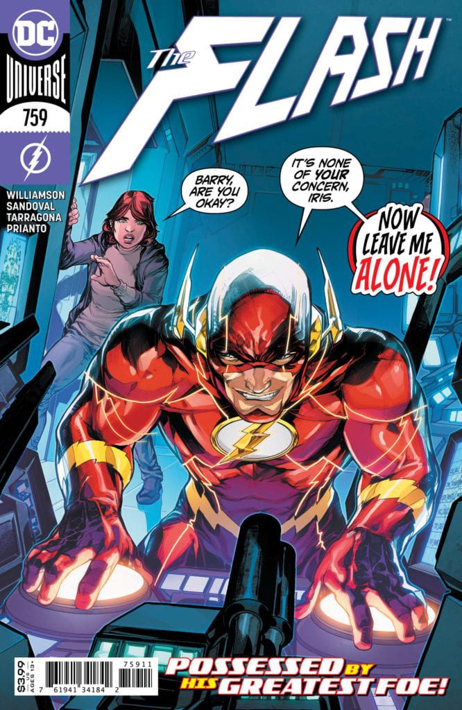
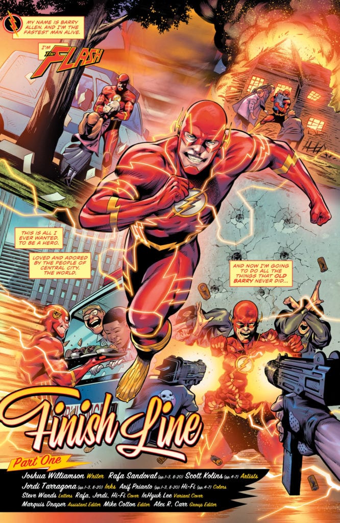
Barry Allen is gone, long live The Flash. After Barry finds the location of the Legion of Zoom, the supervillain team overpowers him. As each member takes their time providing the appropriate amount of pain, Eobard reveals his real plan: Take Barry’s Place. Using his speed phasing, Thawne becomes one with the Flash, taking over his body. This sends Barry to The Speed Force, where he reunites with Jesse Quick and Max Mercury. The problem is they want him dead as they have become zombies. As we enter the final arc for Williamson’s run, Barry and Thawne are in the most precarious position either has ever been in. Will either survive?
**Some Spoilers Below**
Story:
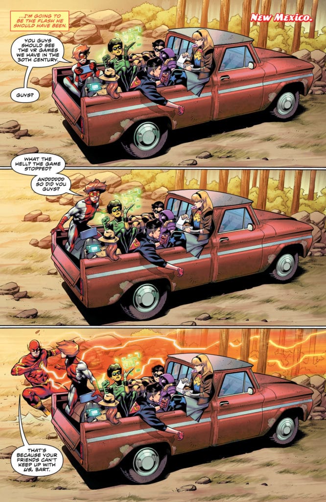
We open with Thawne playing the part of The Flash a bit too well. He does the heroic things Barry has done over the years, but more quickly and precisely. In between crimes, Thawne goes to find Impulse and offers a team-up. The speedster pair run back to Central City to find the Rogues robbing a bank. They dispatch them quickly, but Thawne becomes a bit brutal with Trickster. Despite looking like his grandfather, Impulse begins to question the identity of The Flash. Meanwhile, Barry is touched by the zombie speedsters, remembering who they are and return them to their original looks. Max tells Barry what has happened and proceeds to help him learn about the speed force.
This issue basically flew by at a breakneck speed, which can be seen as a good or bad thing. On the negative side, one could say that the suspense of the heroes not learning about the possession could have made for great storytelling. Something akin to Superior Spider-Man, where the heroes could have pieced it together over the course of the arc. This, however, is impossible due to how few issues we have left in the run. It’s just a missed opportunity that could have made a great build-up.
That being said, seeing the blocks of a Flash Family reunion being moved into place always puts a smile on my face. With Impulse trying to unite everyone against his fake grandfather, we get the team-up that’s been missing in the Flash series. This is the final story of Williamson’s run and if there is any aspect that has been covered well by him, it’s the Flash Family. With the return of Jesse, Max, Impulse, and one surprising return character, this arc will bring the run to an epic close.
Art:
We have two long time Flash illustrators covering the action in the real world and in the speed force. The Speed Force section is covered by Scott Kolins, whose style complements the creepy looks of the zombified speedsters. He also does well in honoring their original looks when changed back. Rafa Sandoval takes over the real world section and provides us with cool-looking action and subtle details that make our favorite speedster menacing. The best look in the book comes from Impulse attacking Thawne. Due to Rafa’s style, we can practically feel the high-speed kick to the face the speedster of the future delivers. Both artists are perfect for this final story and I can’t wait to see what else they have up their sleeves.
Conclusion:
While there could have been more built around taking Barry’s identity, this was still a great issue. All the pieces are set for this nailbiting conclusion to one of the longest creative runs of the Rebirth Era of DC. The art team is able to provide an excellent look for the two realities this story takes place in, as well as fantastic looking action. The Flash and Thawne will face off one last time, and this reviewer can’t wait to see it.