Marvel Comics has released a preview of VENOM #28 from the upcoming storyline, Venom Beyond, available to retailers on September 16th.
Donny Cates’ Venom run has been one of the bright spots for Marvel in a COVID-19 world, and that run looks to continue, culminating in the King In Black event due this December. You can check out the cover below as well as read Marvel’s press release.
Let us know what you think of the cover in the Comments section, and please share this post on social media using the links below.
EDDIE BROCK LASHES OUT ON RYAN STEGMAN’S VENOM #28 COVER!
New York, NY— August 11, 2020 — “Venom Beyond,” the latest mind-melting story in Donny Cates’ acclaimed run on VENOM continues in September with VENOM #28! With incredible art by Juan Gedeon, “Venom Beyond” finds Eddie Brock and his son, Dylan, trying to find their way in a dangerous new world. This monumental story is packed with monstrous new threats, mysterious new allies, and an eye-popping variant cover by regular VENOM artist, Ryan Stegman! Check out Ryan Stegman’s cover below and pick up VENOM #28 when it hits stands on September 16th.
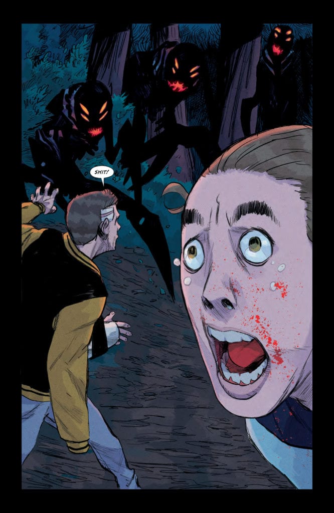
In Something Is Killing The Children #9 from BOOM! Studios, James Tynion IV’s writing gives the story a sense of helplessness that accompanies the dread from Werther Dell’Edera and Miquel Muerto’s art and the terror from Andworld Design’s lettering.
Recap
Continuing from the last issue, monster hunter Erica Slaughter needs help in slaying a monster nest. Unfortunately the only way to do that is through using a child as bait.
Something Is Killing The Children #9 On Helplessness
Despite Erica being the best chance at resolving the overall conflict, Tynion goes to show how vulnerable she is. Erica shares her backstory with her previous helper James in order to get his help as bait. What makes this so notable, however, is how Tynion avoids the Hero’s Journey formula. Despite Erica knowing how to fight the monsters and revealing their existence to others, this doesn’t really help anyone. She’s nobody’s mentor and she’s not some mythic figure who counteracts against the monsters; Erica, much like everyone, is just trying her best. If anything, Something Is Killing The Children #9 is a display of futility in the face of utter helplessness. Everyone is in the abyss at this point and nobody can change for the better, just try with all of their might.
Art
Werther Dell’Edera continues with providing the sense of dread with panels full of close-ups and claustrophobia. Just the panel work of pages get tighter as the panels contract after an initially large panel. Once the monsters appear, the tension explodes into a full splash page where monster circle characters with one having a fearful close-up.
The coloring by Miquel Muerto makes these tense moments feel absolutely horrifying. The black and other dark colors really bring out how uncomfortable some of the settings can be. The dark forest where the monsters dwell and a darker hospital room both feel dreadful. It’s also what makes the brighter colors that contrast everything so eye-catching. Bright red blood appears suddenly; brighter colors accompanying a hospital room to display intentions with clarity. All of it feels like a struggle for a state of equilibrium.
Lettering is by Andworld Design; each word balloon is contained within panels so the reader never gets misses the effects. In addition, the word balloons enhance the suffocating situations by taking up space in already tightening panels, especially when the font and outlines of the word balloons embolden once characters’ emotions heighten. But even those things pale in comparison to the dedicated wordmarks in red, which become more terrifying than the roaring they are meant to interpret. It’s as though a sense of detachment from the monsters is what kills the victims.
Tensions Rise in Something Is Killing The Children #9
Something Is Killing the Children #9 is yet another reason why this series has high marks. It’s story never misses a beat when it comes to its intense atmosphere where characters find ways to interact. Because, before the next conflict, you at least have to connect with the character otherwise you won’t connect with them. The artwork just makes this feeling all the more foreboding. And it doesn’t look it’s going to end anytime soon. No one’s quite out of the dark yet, and there’s more to come. So best make the journey in this issue before meeting the destination for the next issue.
Paskettiwestern Productions’ The Makers could have just been a run-of-the-mill homage to comics. Instead, series writer, artist, colorist, and letterer Dave Howlett decides to go a step further. When most series would throw in a character or two that are clearly inspired by other works and call it a day, Howlett dives deep into the business and personalities behind the comic book industry.
Writing
There’s no doubt Howlett loves comics. And his passion for the medium is clear on every page. Whether it’s his excited discussion of creator-ownership or his comics-within-comics that pay tribute to the classics, The Makers is full of enthusiasm. Yet, Howlett also isn’t afraid of shining a light on some of the dirty parts of the industry. His character “Amiable” Art Fine represents the big business tycoons that gladly profit off of an artist’s hard work, without giving artists their due. Though, it’s funny that this is what Art Fine represents because Howlett still makes the guy kind of likable. He’s a shyster you’d like to grab a drink with.
A whole other review could be written just about the comics-within-comics in The Makers. Howlett’s own version of Spawn, Captain America, The Fantastic Four only appear briefly, but they feel fleshed out and unique enough that you wish you could read the whole series in Howlett’s voice. It’s worth noting that half of these characters Howlett recreates are from the big industry he’s critiquing. In doing this, Howlett adds another layer to the discussion. He says, “Alright, there are problems with their business models and ethics, but that doesn’t mean they haven’t given us some of the characters we love the most.”
Art
When you read the first few pages of The Makers, you might assume you get Howlett’s art style. It’s a familiar one. Thin lines, lots of details, it has a grittiness to it. But Howlett refuses to be put in a box. Only a couple pages later, and you see pages with a completely different art style. Crisp, clean, thick lines that look like something out of the Silver Age. Every comic that makes an appearance in The Makers has its own style—a style you’ve seen in stories like it.
Howlett’s ability to tap into artistic tropes, while also celebrating their visual storytelling, is both exciting and astounding. It’s in his art, most of all, that we see Howlett’s love for the medium. This is a world he’s lived in for a long time, one he’s familiar with. We know this because, with every new comic he presents, his art feels familiar as the comics where Howlett first found these styles of storytelling.
Coloring
Howlett’s changing artistic style bleeds into his coloring. His modern-day scenes, set in the real world instead of the world of comics, are often washed out and a little grim. It’s here that we see these characters aren’t as put together as their press would suggest. They look pale, and like they’re trying to keep it together. But when we jump back to 1991, things seem more colorful. The Ben-Day dots that Howlett uses to color those scenes makes it feel like art is everywhere. It’s not just a day job for these artists; it’s a way of life.
And every new comic Howlett presents has a new color scheme that immediately fills us in on the world we’re presented with. Hellfire is colored with a funky green and purple, over a realistic background, showing us how out of place the character feels. Cinder’s comic is colored in undeniably 90’s fashion. Sergeant Infinity is full of red shadows, giving every scene a flair for the dramatic.
Lettering
Howlett’s lettering for this series is a play-by-play of old comics’ tropes, and it’s incredible. With the parody/homage comics he’s inserted into the plot, he has lots of fun. First, whenever a new character enters the fray, their name is written in a different font. It’s a little nod to when comics do that to advertise their other series, creating brand recognition. And of course, Howlett has fun playing lines from different scenes off of one another.
When Chuck Tolliver is chatting with Josh Armstrong, back in ’91, he says, “…But it’s just that, for me, the same old, same old seems to be somebody else’s same old, same old.” Howlett puts this word balloon in the right-hand bottom corner of the page, so when we jump back to the present day, it’s the last thing we’ve seen. And in the present day, right in the middle of the page, the first thing our eyes see, Tolliver’s looking out into space saying, “Well, that sure is different.” It’s a great joke that works because Howlett makes sure we see a one-word balloon after the other in quick succession.
If you love comics, then you’re Dave Howlett’s kind of person. His series, The Makers from Paskettiwestern Productions, is a celebration of comics like no other. It doesn’t just celebrate the surface level, it celebrates the nuts and bolts, and it has fun doing it. Get your online copy of The Makers (issues 1-3 are out now) here!
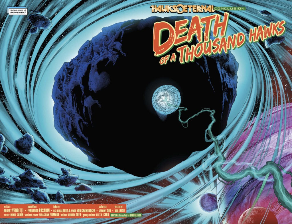
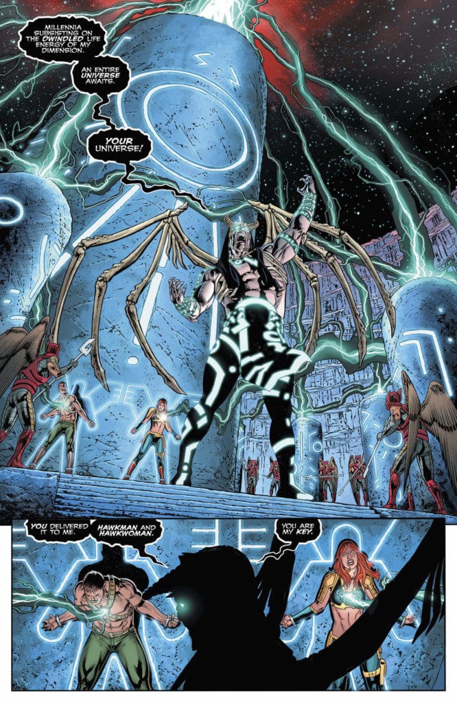
DC Comics’ Hawkman #26, written by Robert Venditti, with pencils by Fernando Pasarin, inks by Oclair Albert and Wade Von Grawbadger, colors by Jeromy Cox and letters by Rob Leigh, may have just redefined Hawkman for a generation. If the implications of this issue are taken seriously, not only will this series drastically change direction but so will the character of Hawkman. It’s an entertaining end to a 26-issue arc where this creative team lets loose. A few spoilery moments are referenced, so read this issue before diving in!
Writing
Venditti is playing a high stakes game in Hawkman #26. Shiera and Carter face their primordial enemy. It’s a fun issue that delivers on its stakes. Most big supervillain battles wouldn’t. But while this is a fun, high stakes shootout, it makes up a few rules on the fly. Venditti backs his characters up against the wall and then gives them an out that hasn’t already been established. It’s a little convenient for sure. That said, it’s in the final moments of this issue that the writing really shines. Venditti pulls together the plots of the last 26 issues in a way you wouldn’t think he’d ever do. The final pages give us hope that even big characters like Hawkman can be met with real stakes.
Art
Pasarin, Albert, and Von Grawbadger pull out all the stops in this issue. The pain, anger, and sadness on every face are intense. As Shiera and Carter fight off the Lord Beyond the Void, their rollercoaster of emotions is clear as day. But it’s actually in the more restrained moments that Pasarin, Albert, and Von Grawbadger do their best work. The Lord Beyond the Void is chilling, as he smiles casually. As the issue closes out, there are a few opportunities missed. When Shiera and Carter think they might die, their intensity detracts from the moment. Less is more. Just as when Atom thinks he may have lost his friends and tears stream down his face. Atom is feeling a little too much for us to empathize with. There’s so much emotion in the scene that we feel like we don’t need to add in our own. Atom is doing enough feeling for both of us.
Coloring
Cox makes this issue such a beautiful thing to look at. The deep blues of the Lord Beyond the Void’s temple feel cold and daunting. Carter and Shiera look lost in the sea. And as the Lord Beyond the Void rips the life force out of them, the fear they must be feeling can be seen in the yellow energy that’s being taken from them. This energy quickly becomes the source of their salvation, however, and red begins to filter into these scenes. The red of their strength, which, when mixed with the yellow, becomes the gold of their victory. In the final moments, we see Carter and Shiera taken to a mysterious place. It should feel scary and unwelcoming, I mean they’re walking on a bunch of skulls. But Cox makes it feel safe, even peaceful. The gentle coloration makes a potentially terrifying moment one of the most beautiful moments of this series so far.
Lettering
A big part of what makes this chapter feel so cut loose is Leigh’s lettering. From the title page, the big letters look like something off an old horror poster. Big, bright, they promise that this is going to be an adventure, and anything could happen. Throughout this issue, the lettering is constantly changing. Carter and Shiera whisper to each other in small lettering, while the Lord Beyond the Void yells at them in white lettering on a black background. When he’s struck by the Hawks, the “FWAKKAASSH” noise of them hitting him is behind his twisting body. The destruction takes the foreground, while also making the letters look like they’re piercing him. Leigh makes this issue so fun, but also allows for little whispers to get us leaning in to hear what’s being said. He really does it all in this issue.
DC Comics’ Hawkman #26 makes some big changes. It brings real stakes into the story of a man with a thousand lives. This creative team may not have created the perfect comic in this issue, but boy have they created a damn fun one! Pick up Hawkman #26, out from DC Comics August 11th, from your local comic book shop!
Some events tend to focus on the story that’s unfolding on the page, the literal battle between heroes and the latest threat they face. Marvel Comics’ Empyre #5 (on sale August 12th) bucks that trend, as writer Al Ewing explores the costs of loyalty, a theme that has been a consistent through line during the series. In this latest issue, Ewing explores differing consequences of power for two of the most influential leaders in the Marvel Universe right now: Quoi, Black Panther and Emperor Hulkling.
Through Ewing’s script, we see how these three figures respond to the challenges caused by the Cotati invasion of Earth. First, Quoi now embodies the saying, “Absolute power corrupts absolutely.” Last issue, he rejected Mantis’ emotional pleas for her son to end the violence because the Swordsman convinced him that listening to his mother would be a sign of weakness. The Swordsman continues to mentor his son, the Cotati’s Celestial Messiah, and the consequences could be deadly. Here, we see that Quoi has become almost as wicked and power-hungry as his father.
In Empyre #5, the fate of the universe is in in the hands of…Wiccan?!
”I will become a god, a god of the trees,” Quoi declares. “My divine wrath will be all-consuming…and none shall stand against it.” Here, Artist Valerio Schiti shows Quoi staring off into the distance during this villainous monologue, and shows the supposed savior with arrogant pride written all over his face. And why wouldn’t he? The death blossom, an appropriately blood-red seed, has been planted in Wakanda’s Great Mound; victory for the Cotati has all but been assured. Quoi has every reason to be proud.
Speaking of Wakanda, its ruler tries to overcome “impossible odds,” at least according to Shuri. Unlike Avengers: Endgame, where the Earth’s Mightiest Heroes face Thanos’ minions, the Cotati army can constantly regrow troops. Black Panther battles a never-ending swarm of invaders, and of course his fighting spirit is admirable. But ironically, his persistent battle for survival turns the tides of this war in the wrong direction.
Is Empyre secretly a love story?
While T’Challa seeks to win the day so he and his countrymen may live, the Cotati lackeys sacrifice themselves because they can defeat Black Panther even in death. The invaders aim to overwhelm T’Challa in the sap from their corpses, and the resulting image is horrifying. Schiti shows the Cotati horde drowning T’Challa, who is covered with their vines and their claw-like roots. Schiti zooms in on Black Panther, whose face is split between sheer fear and determination to defend his country. This complex emotion is conveyed by his bulging eyes, which color artist Marte Gracia fittingly fills with a green that’s the same shade as the Cotati’s expansive garden.
The lackeys tie T’Challa down, and once he’s neutralized, the Cotati successfully plant a death blossom in Wakanda’s Great Mound. In other words, the bad guys just got what they wanted. T’Challa has the perfect response, as he borrows from Dr. Strange’s iconic line from Avengers: Infinity War— “We’re in the endgame now.” By all appearances, the heros have lost this battle. But, hopefully, they haven’t lost the war yet.
With Empyre #5, this event remains unspectacular, though the stakes on the page couldn’t be higher. The fate of the universe is at stake, but Slott and Ewing don’t present a flashy story. Instead, Ewing’s script relies on good old-fashioned storytelling, and it’s a refreshing change of pace. Events don’t have to blow you away with every issue, as long as the entire product offers the reader a compelling, satisfying narrative. As a result, Slott and Ewing might be revolutionizing event stories, and the comic book industry, before our very eyes.
What’d you think of Empyre #5? Where do you hope to see the series go from here?
Check out your local comic shop to see if you can pick this issue up there, or consider buying it online.
Usagi Yojimbo Color Classics #6 continues to reprint the Fantagraphics publication in a new display. While Ronda Pattison continues to provide color to the original black and white story, Stan Sakai’s classic beginnings remain intact.
Background
Usagi Yojimbo’s earliest publications began in Fantagraphics Books’ Critter anthology until Usagi received his own series. With influences including Groo, The Wanderer and samurai cinema, the franchise goes through several publishers as a testament to its success.
Usagi Yojimbo Color Classics #6 Tributes
Usagi Yojimbo Color Classics #6 makes use of two unconnected stories as a way to display and contrast character. This serves as a good jumping on point to anyone who hasn’t been reading from the beginning. All any reader needs is a character introduction. Usagi doesn’t strike unless he absolutely has to, and even then the most he would do to rowdy crowds is scare them with his swordsmanship. This comes in contrast to Zato-Ino, a blind swordsman who genuinely wants good company. But his hair-trigger temper at threats in addition to his swordsmanship causes wanton destruction. The clash between these kindred spirits feels tragic when they get along in their first encounter.
Art
Stan Sakai’s art complements his writing skills. While Sakai’s art changes after decades, this early version of artwork is a display of humble beginnings. Usagi for example looks only marginally similar to his design on the cover. There is also a three-headed dragon for some unknown reason. It’s simple yet cartoonishly detailed, allowing for the casual times to feel lax and at ease. When things get serious however, these details sharpen to reflect the mood. Not unlike Usagi and Zato-Ino’s clash featuring speed lines.
Ronda Pattison’s coloring, however, gives Usagi Yojimbo Color Classics #6 its title. The coloring and simple shading certainly gives the art a little more depth, otherwise they may look a little flat. But it’s the backgrounds that benefit from the coloring the most. A sunrise looks better as the lighter color begins to illuminate a formerly dark sky. Moments of intense emotion like Usagi and Zato-Ino’s duel even get a background to demonstrate the intensity.
Usagi Yojimbo Color Classics #6 is Waiting For You
Whether you are feeling nostalgic or are looking for a place to begin, Usagi Yojimbo Color Classics #6 might be for you. You might not get Usagi’s backstory, but you do have a chance to see everything you need from an Usagi Yojimbo story. Some things will be a little strange like character designs that doesn’t match the cover. But there are good stories and character unavailable in modern times like Zato-Ino.
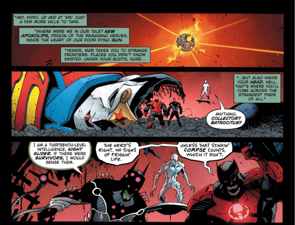
In Dark Nights: Death Metal #3, cool guys don’t look at explosions.
In DC Comics’ Dark Knights: Death Metal #3 (on sale August 11,) the latest chapter of writer Scott Snyder’s epic unleashes even more outlandish inventions and packs more heartfelt storytelling than you’d expect in an event that can seem like it’s trying to be crazy for the sake of it. This third installment shows that Death Metal features plenty of substance through its exquisite dialogue and Snyder’s consistently firm grasp on the characters he’s using.
Dark Nights: Death Metal #3
Story: Scott Snyder
Art: Greg Capullo and Jonathan Glapion
Strange Frontiers
“War takes you to strange frontiers,” Sgt. Rock appropriately narrates on the opening page. Places you didn’t know existed. Under your boots, sure…but also inside your head. Hell, that’s where you’ll come across the strangest finds of all.” Isn’t that Dark Nights: Death Metal in a nutshell? Snyder’s creations get crazier with every passing issue. By now, it may seem redundant to point out every fun thing he packs into the story, but we just can’t help it.
Sgt. Rock continues to be the perfect narrator for Death Metal.
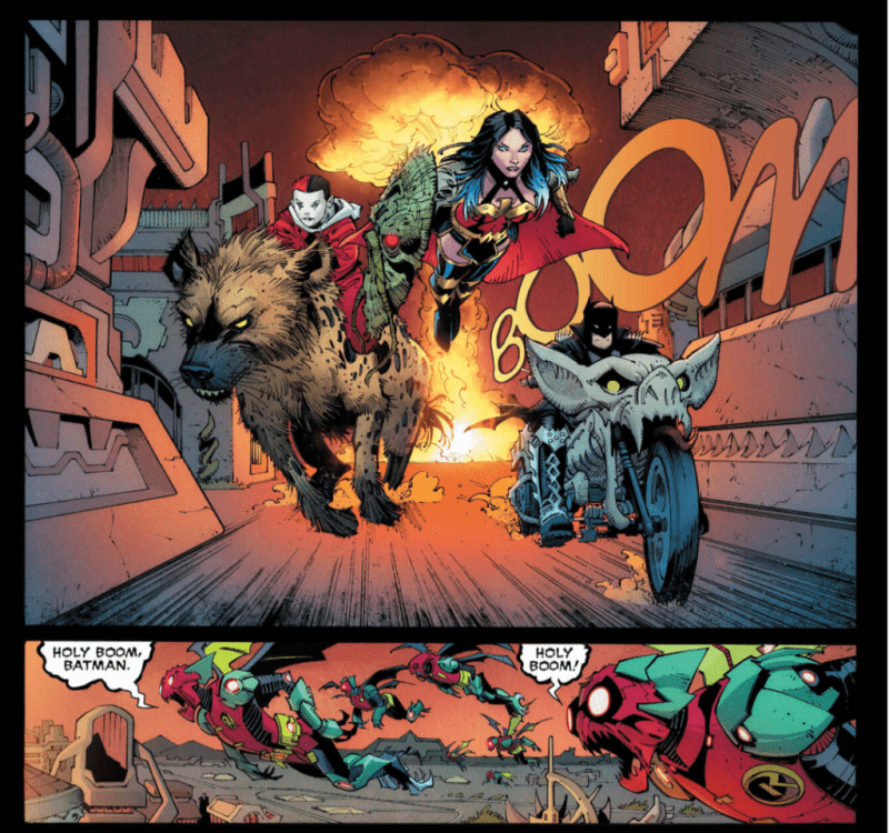
I mean, come on. Lobo slaughtering a goofy imp named Mr. Wobo, a self-proclaimed “widdle twee,” who screams an expletive when the “Main Man” shoves his fist down the creature’s throat is the most bonkers image you’ll see this week. Artists Greg Capullo and Jonathan Glapion make the scene as wacky as it should be, as cartoonish surroundings and Mr. Wobo’s bulging eyes make the fifth dimension feel like an old-school Disney cartoon turned on its head. Every page of Snyder’s Death Metal absurdity makes you beg for more, especially when you toss in robotic Robin-Parademon hybrids and Harley Quinn riding a hyena with an explosion wreaking havoc behind her.
Fear Itself
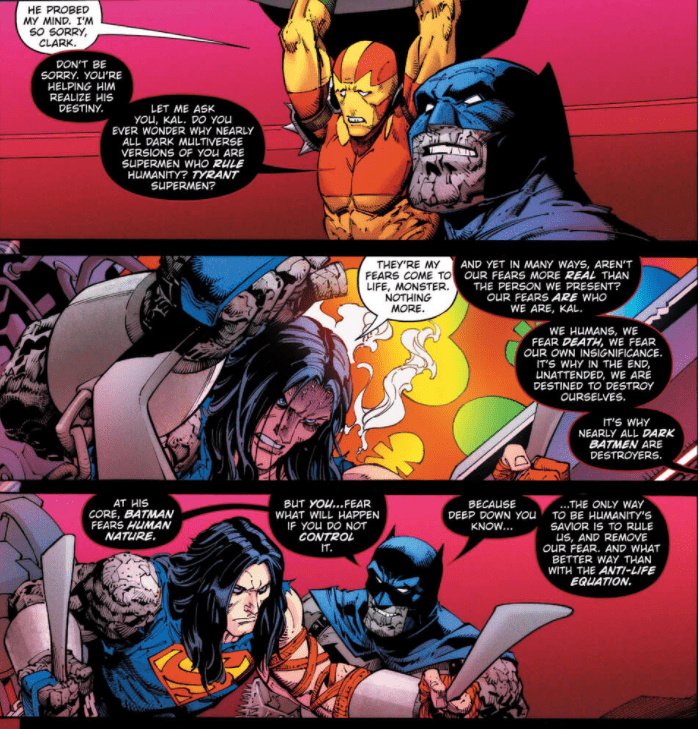
But the best thing about this series continues to be the balance between Snyder’s wonderfully wacky innovations and his remarkably addicting narrative. Here, an exchange between Darkfather (an evil Batman/Darkseid hybrid) and Superman shines brightest. When the villain asks the Man of Steel why his evil counterparts rule over humanity, Clark Kent dismisses these dark reflections as nothing more than his fears. But Darkfather wisely fires back, “Aren’t our fears more real than the person we present? Our fears are who we are, Kal.” With this line, Snyder takes the scene to another gear.
Darkfather is one of Snyder’s many innovations we’d like to see more of.
Capullo and Glapion place Darkfather right by Superman’s side and place a smug smirk on his face, so he literally looks like the devil on Clark’s shoulder. This sight perfectly fits Snyder’s insightful dialogue, as Bat-Darkseid is trying to convince Superman to come to the dark side. His strong sales pitch might even work on a lesser being. “At his core, Batman fears human nature, but you… fear what will happen if you don’t control it,” Darkfather says. “Because deep down, you know…the only way to be humanity’s savior is to rule us, and remove our fear.” Darkfather urges Superman to embrace his destiny. But thankfully, with an Earth-shaking punch, the Last Son of Krypton tells him, “No deal.” Still, this conversation shows Snyder’s handle on the intricate dynamic between Superman, Batman and human nature itself is second to none.
The Robin King Cometh
Snyder has been hyping up the Robin King, and he enters the spotlight in this issue. His arrival couldn’t be more chilling, as he comes prepared with some sinister hero-killing weapons. As he smiles at the Flash, the Robin King describes his devious anti-speedster gadget. “I dug up your dead mom, covered her remains in this great Speed Force-cancelling toxin that liquifies your muscles,” he says. “…Such cool stuff. I stuffed rotting corpse into a Flash Ring that he stuffed the hero’s dead mother into a Flash Ring.” In just two lines, the Robin King already comes across like he’s evil incarnate. Capullo and Glapion zoom in on his face, where his costume only shows two white circles for eyes, and his genuine smile make his words even more menacing. The best is yet to come with the Robin King, and we can’t wait to see what’s next.
Death Metal doesn’t need every issue to have that singular moment that makes your jaw drop, and this installment doesn’t. Instead, it continues the series’ tradition of offering delightfully bizarre additions to the DC Universe, like Batrocitus and Night Glider, and masterful storytelling, such as the profound reflection on Superman’s fears. It’s hard for any event to live up to the hype but Snyder keeps knocking it out of the park.
What did you think of Dark Nights: Death Metal #3? Which one of Scott Snyder’s innovations is your favorite?
Check out your local comic store to see if you can pick this issue up there, or consider buying it online.
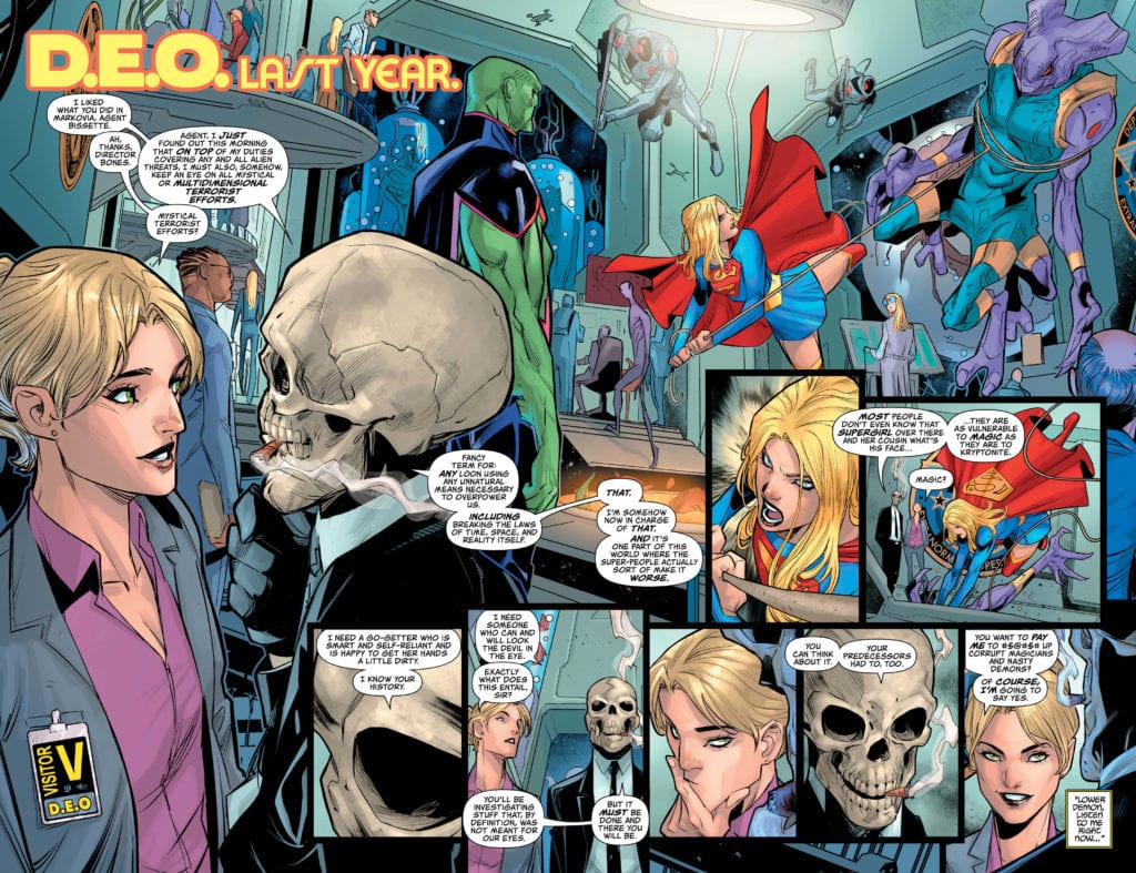
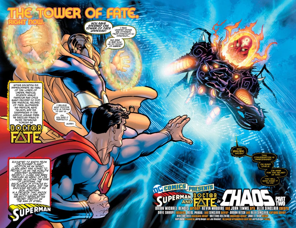
SUPERMAN #24, available in comic book stores on Tuesday, July 11th, pits our hero against a threat just as dangerous as kryptonite: magic. An ancient evil is hell-bent on stealing the Helmet of Fate from Khalid Nassour, the new Doctor Fate. With the mystical god Nabu on his side, the forces of good may stand a chance. But could Superman’s vulnerability prove fatal to their plans?
Story
The evil Xanadoth, one of the ancient lords of chaos, has invaded the Tower of Fate. Her imprisonment eons ago clearly wasn’t permanent, as Nabu makes clear. She appears to have acquired a vessel by the name of Veronica Bissette, a DEO agent. And with that connection she plans to instill chaos upon the world once again.
Brian Michael Bendis’s writing did a great job of capturing the essence of these magical characters alongside Superman. Their otherworldly powers and grandiose plans are complemented by the down to earth, can-do nature of the Big Blue Boy Scout. What’s more, it turns out Superman’s vulnerability may be the key to defeating the monster.
Artwork
Kevin Maguire and John Timms’s penciling and ink work, Alex Sinclair’s coloring, and Dave Sharpe’s lettering give readers illustrations that are reminiscent of stories past. The characters embody the features that are most well-known about them—whether it be Superman’s chiseled muscles or Dr. Fate’s flowing cape. These images are brought to life through bold blues on their suits and much harsher reds on Xanadoth. In addition, the lettering is distinctive when moving from character to character, helping readers distinguish between each ones’ speech.
Conclusion
SUPERMAN #24 wrapped up this arc in an unexpected way. It was great getting to see Superman team up with a purely magical character.
Do you want to see more magic in Superman’s stories? Let us know in the comments below!
September marks the release of Detective Comics #1027, a milestone issue in the history of Batman (who debuted in 1939’s Detective #27). DC Comics is going all-out with the issue, a massive 144-page comic priced at $9.99.
Now we get a peek inside two of the stories in the issue. Check ’em out below:
Detective Comics #1027:
A “Fractured” Future for Batman and the DC Universe?
What’s in the “Black Casebook?”
When DC announced that Detective Comics #1027 would feature some of comics’ greatest storytellers, there was also mention that this must-have comic book would contain …”a few early hints at what’s in store for the future of the Caped Crusader!”
DC also said that fans would have to wait until September 15 to find out, but that’s not fair, so here’s a first look at two stories revealing more about what’s to come, not just the Dark Knight, but all of the DC Universe!
Written by Dan Jurgens with layouts and finished art by Jurgens and Kevin Nowlan, “Generations: Fractured” pits Batman against a would-be gang of museum vandals, led by Calendar Man. As the Dark Knight tries to stop him from torching priceless artifacts, a mysterious flash of light appears to break reality, and Batman finds that everything is different in Gotham, as he’s transported back to 1939!
Eisner award-winning writer Mariko Tamaki and artist Dan Mora team up to tell a tie-in story to “The Joker War.” In “A Gift,” The Joker’s attack on Batman and Gotham City leaves a GCPD officer dead. His partner identifies the perpetrator as the Caped Crusader, swearing that he’ll bring him to justice. This tragedy forces Batman to reluctantly open the pages of a mysterious “black casebook,” the contents of which are yet to be known.
Hardcore Batman fans can look forward to some of their favorite writers and artists taking part in this landmark issue, including Greg Rucka/Eduardo Risso, Grant Morrison/Chris Burnham, James Tynion IV/Riley Rossmo, Tom King/Walter Simonson and Scott Snyder/Ivan Reis. They’re also joined by Kelly Sue DeConnick with John Romita Jr. and Klaus Janson, Marv Wolfman/Emanuela Lupacchino/Bill Sienkiewicz, Brian Michael Bendis/David Marquez and more top creators!
Detective Comics #1027 arrives at open and operating comic book stores and participating digital retailers on Tuesday, September 15 with a retail price of $9.99.
Buffy the Vampire Slayer #16 out this past week from Boom! Studios picks up right where we left off in the previous issue.
Following the conclusion of the Hellmouth crossover, the Scooby Gang are on a break, to quote Ross Geller. Willow’s in England, Xander’s ostensibly dead, and Buffy’s feeling quite alone and full of guilt. Writer Jordie Bellaire uses a dream sequence to draw the reader into the mystery.
In his book The Secret Life of the American Musical, Jack Viertel describes the “recess” number, a classic motif of musical theater. The recess number is usually a fun, noisy song designed to reinvigorate the audience in preparation for the next hour or two of the show. In the Buffyverse, the recess number is the dream sequence.
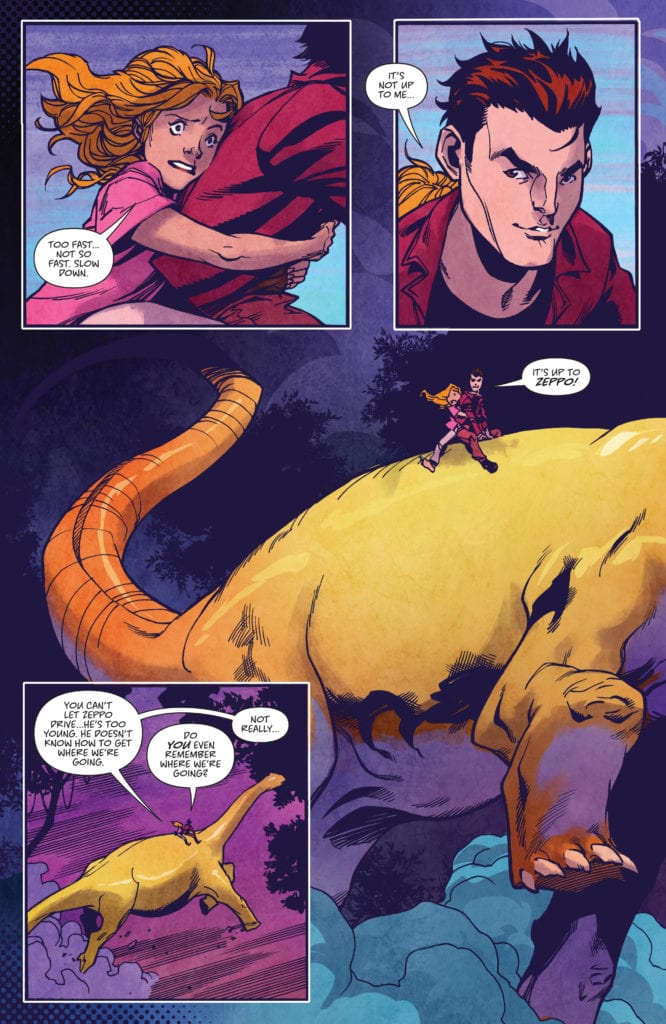
Bellaire used a subtle moment in issue fifteen to foreshadow a character’s return. Cleverly referencing season three, episode thirteen of the TV series, Buffy’s almost-boyfriend, Robin, calls a toy brontosaurus “Zeppo.” This brontosaurus reappears in issue sixteen in Buffy’s bizarre dream in which she and Xander ride a full-size Zeppo.
The Zeppo
Zeppo is what Cordelia calls Xander in the episode of the same name. The name refers to Zeppo Marx, the youngest of the five Marx Brothers. He’s the last-minute stand-in, the one who doesn’t have much to contribute among a group of gifted people.
In this Xander-centric issue, however, he’s not really a Zeppo at all. In fact, he’s a vampire. It’s a heartbreaking twist the seasoned Buffy fan might have seen coming given that he’d already been halfsies and lost his soul completely in issue twelve.
Another motif adapted from the TV series comes in the form of a tarot card presented in the issue by Ms. Calendar. Xander, in an Angel-esque move, assaults Jenny and sets her house on fire, then fights Buffy and Kendra. He flees, leaving Buffy to discover the now charred tarot card. It’s The Fool. Jenny had been giving herself a reading and picked an upside-down Fool out of the deck right before Xander came knocking.
The Fool
According to The Tarot Guide website, an upside-down Fool portends bad tidings, symbolizing both new beginnings and uncertainty in a current relationship. An apropos card if you’ve been keeping up with the story so far. After all, an evil Xander poses new challenges to the gang’s already tenuous relationship.
Buffy dreams of Xander and Zeppo.
But The Fool’s message hasn’t been revealed to the gang. The card gets passed on to a distraught Giles who may or may not later uncover its meaning.
The issue concludes with Willow’s return to Sunnydale. Buffy, post-Zeppo dream, sought out her witch friend’s guidance and revealed that her ex-girlfriend’s in a coma. While the redhead can definitely help Buffy save Ms. Calendar and restore Xander’s soul, her return will complicate matters. We all know that the forces of evil have nothing on teenage drama.
Buffy the Vampire Slayer #16 employs all the hallmarks of the Buffy TV series, offering fun and an enticing mystery. There’s a new Big Bad in Sunnydale and he’s got Hell(mouth) to pay.


 Werther Dell’Edera continues with providing the sense of dread with panels full of close-ups and claustrophobia. Just the panel work of pages get tighter as the panels contract after an initially large panel. Once the monsters appear, the tension explodes into a full splash page where monster circle characters with one having a fearful close-up.