

Bathed in blood and a monster once more. The Immortal Hulk #36 from Marvel Comics see’s Al Ewing make the big green hero both a victim and an aggressor. It’s a tale of tragedy and horror with no rest for the wicked or the divine.
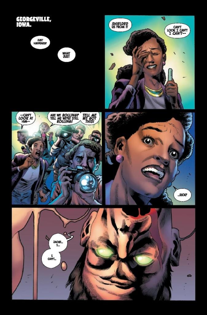
In Georgeville, Iowa Rick, in control of The Leader, forced the Hulk to explode. The massive Gamma Bomb explosion has devastating effects on the locale and a number of the populace. News reported Jackie McGee bares witness to the piles of rubble and bodies just as Gamma Flight enter the scene.
Outbursts and Mutations
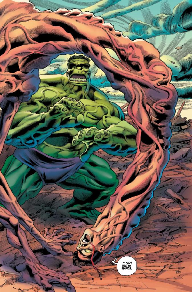
Al Ewing opens this issue with the devastating aftermath of Hulks explosion. The focus, however, is not on the destruction but the warped mutation of Rick. Played as a tragedy, the reactions from the cast to Rick’s deformity is at the heart of this issue. The Hulk, comically drawn by Joe Bennett and Ruy Jose, stares in shock at what he has done to his friend.
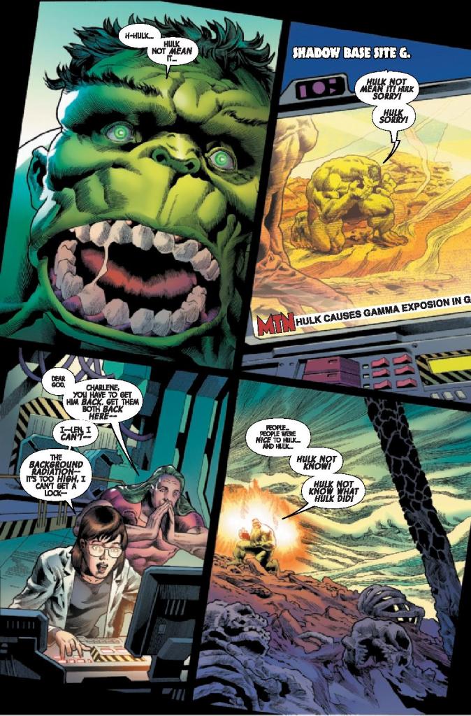
Ewing emphasises Hulks reaction, making it central to the other characters view of the destruction. It is important to know how distraught the Hulk is at this point and how he believes he has failed his friends. It is after all central to not only The Leaders plan but the character of the Hulk. There has always been a battle between Man and Monster, and being a protector makes the Hulk more human. To fail at that is to fail in his life.
Ewing then pours on the trauma by throwing Gamma Flight, with their weapons held high, into the mix. To add more conflict to the situation greatly destabilises the Hulk. But the real beauty of Ewing’s storytelling in this issue is that the Hulk going ballistic is only a diversion from a more disturbing threat emerging elsewhere.
The plot for this issue is fairly standard with the villain manipulating the hero into a situation where he will look like the villain. With the Hulk it adds a little more gravitas as it plays into the core of the character and the cost is greater. When the Hulk begins to lose control it has wider reaching consequences than, for example, Spider-Man losing his cool. Ewing knows this and is able to get that message across in the story.
Representation
For a straight forward story, such as the one in this issue of The Immortal Hulk, the ‘wow’ factor has to come from the art work. It should reach right of the page and slap you around the face. The requirement is dynamic fights and hard hitting emotional scenes. What the reader gets in this issue is, however, lacking.
The Immortal Hulk has become known for its horror elements over the last few years. The first issue of this run was a triumphant return to the horror genre, a fitting place for the Hulk to be. Unfortunately, the artwork in this issue doesn’t capture that vibe.
Joe Bennett’s pencils and Ruy Jose’s inks are highly detailed and capture the emotional aspect of the comic very well, especially in the human characters. The reaction panels with Jackie are superb and the reader really gets a sense of the scene unfolding in Iowa. The other, mutated or super powered, characters are less impressive, at least for a horror story. The Hulk is comical in appearance throughout with over the top facial expressions that make him over-dramatic.
Other than the grotesqueness of Rick’s mutation there is nothing especially horrific about anything in this issue, until the very end. It is enjoyable and there are a few moments that may take you by surprise but not make you scared, not shocked. The visuals are too bright, too run of the mill and standard superhero. That’s not to say the artwork isn’t good; the panel layouts are intriguing, especially with the tilted page frame to give the impression that everything is off kilter; the compositions are impressive and there is real energy in the fight sequences. It just doesn’t have that horror aesthetic required to make this a truly memorable issue.
Confused Tone
Colorist Matt Milla gives everything in Iowa an Earthy feel which allows the Hulk to stand out on the page and in the action. There is a clear contrast between the panels featuring the Hulk and those that contain Gamma Flight. It is a competition between red and greens, fighting for dominance on the page.
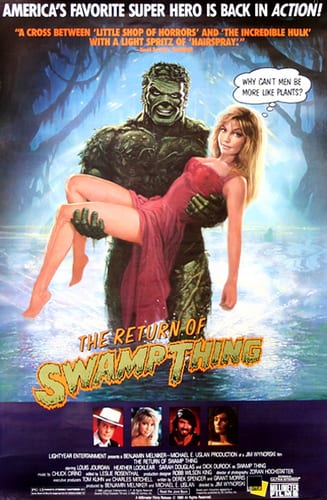
This provides a satisfying reading experience but it again leans into the contradicting tone of the comic. On the one hand it has a horrific nature but much of this is being lost in almost comedic scenes. It’s like the movie The Return of the Swamp Thing. There is a blend of horror and comedy that just doesn’t mix well. This isn’t the Evil Dead II where you’ll laugh out loud before hiding in terror; it’s more of a puzzle, leaving you wondering what the intent was.
The only element of the comic that matches the mixed tone of the comic is the lettering. Some of the speech is wonderfully merged with the emotional reactions of the characters. Small text within large balloons illustrate moments of thoughtfulness or concern, whereas other balloons can’t contain the speech. Heavy, black letters break the border of the balloon and spill out into the panel, out of control like the character screaming them.
To counter this, a large portion of the text is more confusing with random emphasis on certain words. Trying to extrapolate the meaning of the bold text pulls you out of the comic, disrupting the momentum. It is as if the cast are a mix of seasoned actors and wooden, B-Movie extras.
Conclusion
If you have been reading The Immortal Hulk for a while then this issue will fit neatly into your collection. It is not the pinnacle of recent months but is also not the worst superhero comic currently on the shelf.
If you’re new to the comic you’re going to have problems. Not following the story, that’s straight forward enough, but attempting to figure out exactly what this comic wants to be. On the one hand it’s horror but the presentation is so tongue in cheek. A number of the jokes don’t land, assuming they are supposed to be jokes in the first place.
If the aesthetic on the page was different, if the coloring included layered shadows and violent shades, then everything about the comic would change. It would horrify and the grotesques would make you cower away. Alternatively, if the violence was played down and a looser style brought to the pencils and inks, it would work as a tragic comedy.
Unfortunately, The Immortal Hulk #36 never quite finds the right balance and that detracts from the narrative and from the great storytelling happening across the pages.