Home Blog Page 231

Review: THE AUTUMNAL #2 – Horror Via Family Drama

Writer Daniel Kraus and artist Chris Shehan return with the second chapter of their slow-burn horror series in “The Autumnal” #2. This issue solidifies this series’s status as a slower, more character-driven horror tale with an issue that focuses more on the two protagonists’ relationship to this strange new setting – as well as the weird mystery surrounding this quaint, quiet town. While the stellar visuals are on hand to deliver a couple of good false scares, it is abundantly clear that this is a comic for patient readers who like their horror delivered in steady bites rather than all at once.

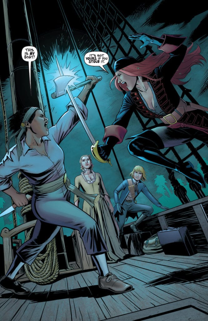
“After missing the funeral of her estranged mother, Kat and her daughter, Sybil, hope to fit into the quaint town of Comfort Notch. But the town’s obscure history and strange customs make it a struggle, leading to a shocking confrontation.”
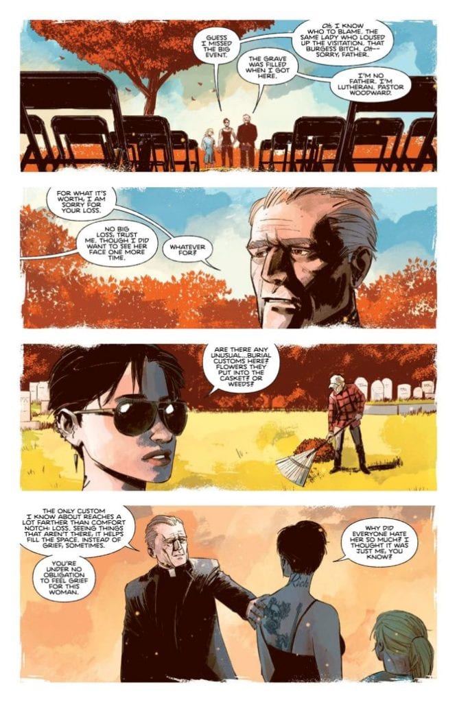
Writing & Plot

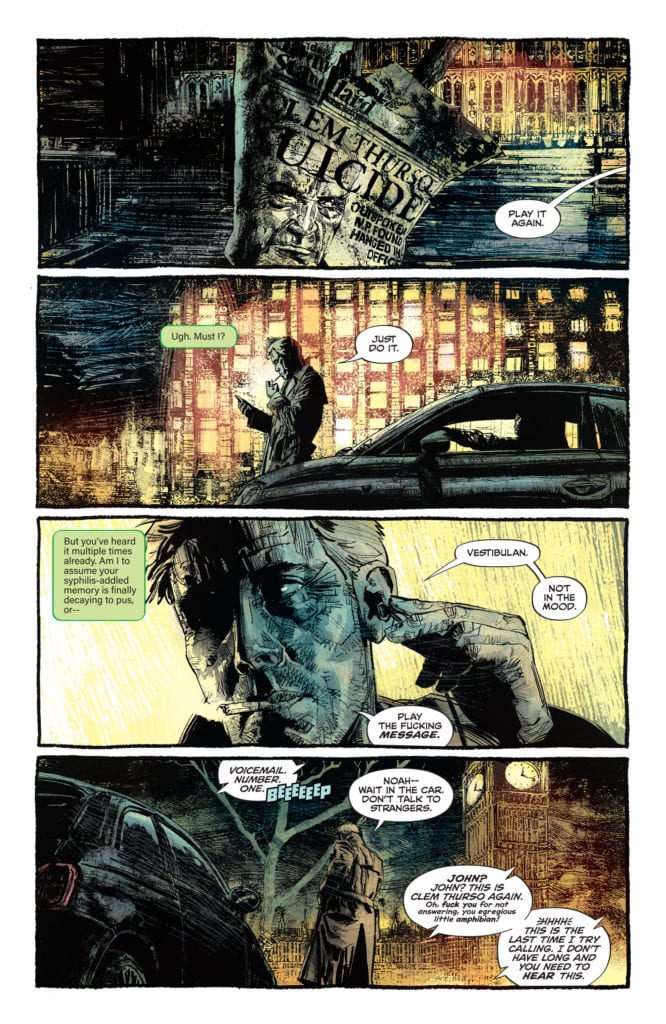
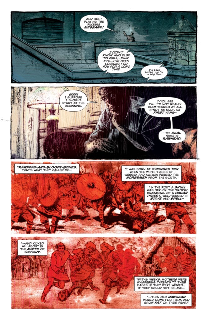
With his work on “The Autumnal” thus far, writer Daniel Kraus takes his time to ground this supernatural creepfest in the story of a single mother, her daughter, and their turbulent existence. Grounding a horror story in familial drama centers the audience’s attention on the experiences of the human characters, and when these characters are written in a realistic and relatable manner, it subtly forces empathy for them. This translates into a heightened sense of fear and tension when watching unexplainable and horrific things start happening to these same people. The Exorcist, Rosemary’s Baby, The Omen, Hereditary, and many other great horror tales have used this tactic to outstanding effect. Kat and Sybil, our mother-daughter duo in “Autumnal,” are fantastically unique characters that I loved reading in the first issue and continue to do so in this one. Their relationship and their personalities feel genuine, and this makes their mysterious backstory as well as the slowly creeping horror they begin to experience all the more enthralling. This issue takes its time to instill the relationship between the main pair and the peaceful but secretive town of Comfort Notch. This issue cements this comic series as a slow-paced mystery of a horror story, where most of the “horror” aspect comes in the form of its unsettling atmosphere and resolve to give the audience almost nothing about what is happening here. The horror elements of this comic are intoxicating, making the wait for the next chapter of this mystery a torturous one.
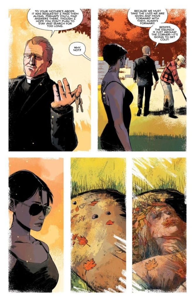
Art Direction

That oppressive atmosphere that “The Autumnal” #2 carries that I mentioned earlier is mostly the product of Chris Shehan and Jason Wordie. Shehan’s pencils bring out the humanity in every character that appears on panel, but especially succeeds in humanizing Kat and Sybil. His sense of panel direction also offers up a couple of great false scares that do occur in this issue, and they don’t come across as cheap. This comic frames the two protagonists as being alone in uncharted waters, both in terms of the town and strange circumstances of Kat’s mother’s death (and life, for that matter). Shehan constantly paints a focus just on these two characters, going to great lengths to make everything else seem strange and alien. The atmosphere is largely cultivated by Jason Wordie’s colors, who makes this comic feel like a haunted vision of its titular season. Every page looks like a cool autumn evening, but with an almost inexplicable dash of something not quite right in the air. How this effect is achieved in a comic is astounding on its own. The lettering from Jim Campbell is a classical and refined style, which still uses enough variation in its font to sell the tone of whichever character is speaking. From the visual angle, this comic is brilliant in terms of both fidelity and atmosphere.

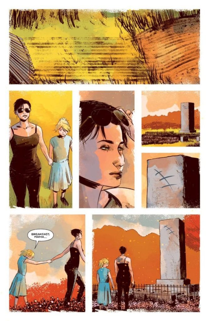
“The Autumnal” #2 is a brilliant character-driven chapter that sells this comic as a slow-burn horror experience while maintaining a uniquely unnerving atmosphere. Daniel Kraus’s script is a thoughtful exploration of a struggling but happy mother-daughter relationship being exposed to strange circumstances both realistic and supernatural. The visuals of Chris Shehan and Jason Wordie are beautifully haunting, with detailed character animations and fantastic directing sensibilities. If this series can keep up its momentum, “The Autumnal” has the potential to become a new horror classic. Be sure to pick up this 2nd issue when it hits shelves at your local comic shop on 10/28!


Monkeys Fighting Robots Youtube

How A Series Wraps Up In BATGIRL #50

BATGIRL #50, available now from DC Comics, is a bittersweet issue. It brings with it closure, as well as the end to Barbara Gordon’s latest comic series. Yet her story is far from over, as she is still a hero in her own right.

She’s swinging into action on this variant cover of Batgirl #50.

Batgirl #50 is a landmark issue, in this case for a couple of reasons. The first one is fairly obvious, given the number of the issue itself. The second reason is a little harder to take, as this issue also marks the end of Batgirl’s series (for the moment). Thankfully, the issue is also a giant-sized one, giving fans more time to get a true sense of closure around this series.

Thanks to the Joker Wars, there have been a lot of changes as of late. Many characters are seeing the effects, including Barbara Gordon herself. Unfortunately, that’s far from the only thing that she’s tackling right now.

In a way, the sheer volume of change that Barbara is facing makes this a disappointing place for her series to end. On the bright side, this issue does contain three separate stories, all of which help to wrap up loose ends, and to leave hints as to how Bat Girl plans to move on from here.

Little Wonders starts off on a somber note.

Little Wonders

The first story in Batgirl #50 is also the longest, Little Wonders. Written by Cecil Castellucci, this is the plot that picks up exactly where the previous issue left off. That is to say, it starts off on a moment of change, as well as a moment of great sadness.

Yet the plot is also shockingly empowering, as Batgirl/Barbara Gordon picks herself up and continues to carry on – just like she always does. It doesn’t matter if she’s wearing the mask or not, she’s always going to be fighting for change. This message is practically screamed from each and every page, thanks to the actions of her character.

As a huge fan of Batgirl, this issue is difficult to take in. Mostly because we never really want to see a story about our heroes’ end. Yet, if I had been asked to chose how Batgirl’s series would end this time around, I couldn’t have asked for more than this. It doesn’t wrap up every little detail, but it doesn’t need to. We all know that Batgirl is going to keep on fighting, and that means her story isn’t over. Just her series.

The artwork worked hand and hand with the writing to help tell Barbara’s story. Emanuela Lupacchino (pencils), Wade Von Grawbadger (ink), Mick Gray (ink), Scott Hanna (ink), Jordie Bellaire (colors), and Becca Carey (letters) all did a fantastic job here. You can really see the conflict, not just in the physical sense, but in the moral sense as well. Everyone is struggling to adapt after the Joker War, and it shows.

Trying to find happier moments (Batgirl #50).

Stay Centered

Next up in Batgirl #50 is Stay Centered. This is a plot that really hits home. Through the use of heavy narration, Barbara’s story further unfolds. As with the first plot, this one is set after the events of the Joker War.

Cecil Castellucci was once again at the helm, and she imagined how it must feel for Batgirl. To be constantly pulled in so many directions, but so infrequently seen as her own being. It juggled this concept with the introduction of a new enemy, all of which seem to fit the theme (of Batgirl continuing her battle).

Marguerite Sauvage took charge of the artwork, providing some great action scenes and bold colors. Not to mention a really interesting design for a villain and her calling card, so to speak. Meanwhile, Becca Carey was responsible for the lettering, which was an impressive feat here. There was a lot to portray, and yet it was all smooth and distinct.

A venting of emotions (Batgirl #50).

Game Night

The last story in Batgirl #50 is Game Night, and it’s a fun take on the theme. The inclusion of several other heroes/friends certainly didn’t hurt things. Imagine the crew that Batgirl usually hangs out with, now picture them trying to learn an RPG, and suddenly you have an idea of the fun that is to be had in this plot.

Also written by Cecil Castellucci, this story continues the overarching themes found within this issue. Batgirl is facing change, some of which she’s even seeking out for herself. It’s the lightest plot in the collection, but is still full of her vitality and determination. Okay, and a fair amount of humor as well.

Aneke (art), Trish Mulvihill (colors), and Becca Carey (letters) were in charge of the artwork for Game Night, and you can tell that they had a bit of fun here. It’s not every day you get to portray dynamic heroes in anything other than their standard garb, after all.

Joining in with the movement for change.

Conclusion

Batgirl #50 is absolutely the ending that this series, and it’s fans, deserved. It’s bittersweet, and yet also carries so many wonderful and empowering messages. In that sense, it really did stay true to Batgirl, and everything that she stands for.

Monkeys Fighting Robots Youtube

A Thrilling Tale in BLACK WIDOW: WIDOW’S STING #1

BLACK WIDOW: WIDOW’S STING #1, available this Wednesday from Marvel Comics, with the Black Widow movie looming on the horizon (a distant one, admittedly), it’s time for a reminder of the Black Widow’s past, and just what she’s capable of.

A dramatic introduction to Black Widow’s current mission.

Natasha Romanoff is a long-standing favorite in the world of Marvel, one with a rich and complex past. That much is not, and has never been, a secret. Yet sometimes it’s good to be reminded of what she is capable of. As well as why she is so cherished as a spy.

Black Widow: Widow’s Sting #1 is a blast from the past. As Natasha is off on yet another mission from S.H.I.E.L.D. This time with the intent of taking down an infamous crime boss, Silvermane.

This tale is set back before Black Widow made herself known as an Avenger. Back when she was still heavily involved in deep cover cases for S.H.I.E.L.D. – she was the best of them, even back then.

Time for a wardrobe change in Black Widow Widow’s Sting #1.

The Writing

Black Widow: Widow’s Sting #1 was written by Ralph Macchio (yes, that Ralph Macchio), and it portrays a one-shot adventure for the one and only Natasha Romanoff. It’s a quick and fun spy thriller issue, full of action.

In short, it perfectly succeeds at what it is: a classic tale of Natasha the badass spy. Here Natasha is portrayed at jumping through all of the hoops, and succeeding where no other spy could possibly hope to do so.

As a standalone escapade, it is far from a bad one. Compared to the groundbreaking events of Kelly Thompson’s Black Widow series (which is actively updating), it may lose a little bit of that shine. It is an amusing adventure, to be sure, but it lacks any sense of depth or permanency.

However, it does quite a nice job of setting the scene, especially if one were to put it in the context of the impending movie. In one fell swoop, it showcases her abilities, her drive, and even her favorite weapon.

Enter Silvermane, or as he’s called here, “Mr. Silvermane.”

The Art

Black Widow: Widow’s Sting #1 is about as vibrant as the character herself, and not simply because of her bright red hair. The artists had a chance here to portray a spy adventure through and through, and they did not pass up on the opportunity.

Simon Buonfantino was the lead artist, and their version of the Black Widow at times feels larger than life. To be fair, her talents frequently make her seem that way, so there’s really nothing wrong with this take. She’s bold and confident, and up for surviving the strangest of circumstances.

The colors, provided by Rachelle Rosenberg, take those lines to a whole new level. The use of colorful backdrops to portray motion was a clever one, and it actually works really well with the character herself. It also enhances the look and feels of all the action, making it overall aesthetically pleasing and thematic.

VC’s Travis Lanham’s letters helped to add to that sense of movement, as well as a serious level of impact, when needed. Obviously, this further enforced the idea that Widow’s Sting was an action and spy thriller, bringing the point home.

Setting the scene quite nicely, as Silvermane lays out his plans.

Conclusion

Black Widow: Widow’s Sting #1 was a quick and bold dive into the history of Black Widow. Its story must be one of many, as Natasha surely took on countless cases during her time with S.H.I.E.L.D. It raises some interesting questions along the way, but overall just has fun exactly as it is.

Monkeys Fighting Robots Youtube

Tricking a Trickster in STAR WARS: DOCTOR APHRA #5

STAR WARS: DOCTOR APHRA #5, available this Wednesday from Marvel Comics, continues the adventures of the one and only Doctor Aphra. In hindsight, perhaps it is a good thing for this universe that there is only one of her. The sheer level she brings all on her own is more than enough.

A dangerous conversation may not be the best time to ogle all the pretties.

This latest series for Doctor Aphra wasn’t afraid to dive right into the deep end. While she may have made some grand promises to herself (and to others) to stay safe, and well behaved…Well, let’s just say that promises aren’t her thing.

Star Wars: Doctor Aphra #5 is definitive proof that even when things go right for Aphra (which in itself is a rarity), she’s still going to find herself in hot water. It’s a gift, one that she doesn’t relish, but she has learned to live with.

What started as an adventure (and heist) looking into an ancient and lost tomb quickly spiraled into something else, something infinitely more dangerous. Once again, that isn’t terribly shocking, given who we’re talking about here.

An egomaniac if ever there was one.

The Writing

There’s a lot of trickery and sneaking around in Star Wars: Doctor Aphra #5. While this isn’t unusual for Aphra, Alyssa Wong has succeeded in making this adventure feel entirely new, and somehow even managed to raise the stakes in the process.

On that level, there is quite a lot to appreciate here. On the surface, Aphra’s character doesn’t seem to have changed all that much. But there are subtle details that raise up, upon a close inspection. Details that make it appear that Aphra is still very much capable of feeling. Shocking, I know.

Doctor Aphra #5 is every bit the space caper that little Chelli grew up dreaming about. The high stakes, the sheer amount of treasures available for the taking, even the emotional ties (which increase the tension, and the reward, naturally).

It all made for a thrilling adventure, one with room for a touch of humor, a classic balance for Doctor Aphra. All of this was accomplished while setting up for yet another, and presumably much larger, confrontation. After all, this is Doctor Aphra, and even the most basic of missions result in her running for her life and making enemies.

What a pathetic way of leaving a mark.

The Art

Everywhere the writing succeeds for Star Wars: Doctor Aphra #5, the artwork goes a step farther. The action and adventure are vibrant and daring, the details hidden but present, and so much more.

Marika Cresta (art), Rachelle Rosenberg (colors), and VC’s Joe Caramagna (letters) really did something impressive here. It’s not just the action, or the explosive nature of some of the scenes. It was everything, especially all of those little details that make the series shine.

By all appearances, Aphra is one cool cucumber – until you look closer. The artistic team managed to leave little tells here and there, to make her stress levels evident. It may not feel like much, but it spoke volumes about her actions – and what it was costing her.

Then there are the colors, which really made certain scenes pop right off the pages. It’s all a perfect complement, both to the characters and the mess that they’ve managed to get themselves into. All while setting the tone – one of danger and intrigue.

Where the art and colors provide the groundwork, the lettering by and far is the final touch. It’s through Caramagna’s work that there’s a real sense of sound. You can practically hear the hissing of doors, the impact of shoulders on flesh. To say that these additions enhance the scene would be quite the understatement.

Here’s hoping that this is part of her plan…

Conclusion

Star Wars: Doctor Aphra #5 was another fun and chaotic adventure for the one and only Doctor Chelli Aphra. This issue managed to bundle all of her character development in with several action-filled scenes, and still have time to set up for the future.

Monkeys Fighting Robots Youtube

Review: Acceptance Through Penance In IRON MAN #2

Iron Man #2, Ross cover

IRON MAN #2, available from Marvel Comics on October 21st, reveals this arc’s Big Bad and continues Tony’s quest for self-discovery by reckless means. Written by Christopher Cantwell and drawn by CAFU, the sophomore chapter in this run has really high highs and a couple of deep, down lows that make for a mixed issue.

Cover Art

Alex Ross can do no wrong in my book with his art. Famous for his phot-realistic style, Iron Man is steeled against the next blow with the smoke of battle wafting up from his armor. It’s a tense and dramatic cover from Ross.

spoilers ahead

Writing

Cantwell’s writing takes the interesting character work from the first issue and pushes further into the self-doubt territory for Tony Stark. It’s a nice change of pace to see one of the frontline Avenger’s personal struggles not brushed off so easily or resolved in a nice, neat bow. There’s a real opportunity for personal growth here with Tony Stark, and I’m looking forward to seeing if Cantwell can capitalize on the setup.

Iron Man #2, Art sample 1

That said, a majority of this issue’s writing didn’t work for multiple reasons. The immediate reveal of Korvac completely diffused the anticipation from issue #1 (read the review here). It would have served the issue better to provide some build-up and drama to the reveal. In spots, Tony’s self-doubting dialog went so extreme as to come off as esoteric and out of character for the narcissistic playboy (“Is Iron Man just a wish in some kid’s game of pretend?”). It’s commendable to explore facets of the character in a new light, but taken too far, the character’s voice is lost. Lastly, Hellcat as the “tough love buddy” is anything but. She’s written as confrontational and it’s unclear why Hellcat is in this series. I hope Cantwell can clarify Hellcat’s role, and stabilize the erratic narrative that had such a strong start in issue #1.

Iron Man #2, Art sample 2

Pencils/Inks

Thankfully, the strong art so prevalent in the first issue was carried through here from CAFU. Where a majority of the first issue relied on emotional acting, there’s a ton of action in this issue, and it’s exciting stuff. CAFU’s near-photorealistic style, similar to Alex Ross but stylistically unique, infuses all the panels with a cinematic quality that gets as close as possible to film without really being there.

Iron Man #2, Art sample 3

This is a gorgeously rendered book, and I’m looking forward to seeing what happens when Korvac makes his presence known.

Coloring

Frank D’Armata’s coloring work is a perfect mate to CAFU’s renderings. D’Armata breathes life into every panel with shading in such high detail that you can see every wrinkle, fold, and crease in something as mundane as a t-shirt.  That high detail works and adds texture that gives Iron Man’s suit a rich metallic sheen, making it stand out just a little more. Exceptional colorwork here by D’Armata.

Lettering

VC’s Joe Caramagna does an excellent job adding distinction to Tony Stark and Iron Man’s many voices in this issue. At various points, Tony is talking, whispering, talking through his helmet, talking over a communicator, etc.. Therefore this is one of the rare examples where a single character logistically needs multiple visual versions of his voice. Caramagna pulls it off to keep the narrative straight and the story flowing.

Conclusion

IRON MAN #2, available from Marvel Comics on October 21st, has great action and fantastic art but fails to build on the story potential from the first issue.

Monkeys Fighting Robots Youtube

Review: The End is Nigh in JOHN CONSTANTINE: HELLBLAZER #11

Hellblazer Spurrier DC Comics

To call the cancellation of DC Comics’ John Constantine: Hellblazer unfortunate is underselling it. Writer Simon Spurrier, along with brilliant artists like Matias Bergara and Aaron Campbell, have created a truly beautiful series. As a creative team, they allow events to unravel in each arc so gradually that every narrative beat feels inevitable. But with Hellblazer‘s cancellation, this creative team has the task of tying everything up in the space of a couple of issues. DC Comics’ John Constantine: Hellblazer #11 sees writer Simon Spurrier, artist Aaron Campbell, colorist Jordie Bellaire, and letterer Aditya Bidikar hurriedly getting through what feels like five issues worth of material. They continue to do incredible work, though one wonders about the scope of what they had planned.

Writing

Spurrier’s script is pretty tightly packed in this issue. Clem Thurso, the British M.P. that this issue centers around, explains to Constantine how they are connected. Spurrier uses Constantine’s voicemail to get through all of this exposition. So much of what Spurrier does here shouldn’t work. But the substance of what Spurrier has to say is always so mesmerizing. Brilliantly, Spurrier uses real-life horror to scare us. It’s not the demons or underground cults that should scare us; it’s the growing collective hatred for others. Spurrier has his finger on the pulse of Britain, which works in Hellblazer as a microcosm of the world at large. Putting us in the shoes of Clem Thurso for an issue and watching his rise to power as he feeds off of hate and fear, we see the real horror that’s going on, both on and off the page.

Hellblazer Spurrier DC Comics

Art

Campbell makes this issue outright terrifying. For one, we see Clem Thurso on the phone to Constantine at the beginning. With his face folded back a little, we can tell he’s not fully human. But the fear in his eyes is. Then, as we see Thurso’s rise to power, Campbell depicts him as laid back and comfortable in the midst of all of the evil he’s causing. Evil is Thurso’s comfort place. So seeing the fear in his eyes, Campbell has us question, “What could scare a demon?” Every chance Campbell gets, he keeps the horror off the page. We don’t see what’s scaring all the other characters. It’s Thurso’s eyes like pinpricks as he runs in the opposite direction that Campbell wants us to see, or Constantine trying not to hurl. When Campbell finally does lift the curtain, the horror and disgust do not disappoint.

Hellblazer Spurrier DC Comics

Colors

Bellaire uses reds, yellows, and greens to depict the various forms of evil throughout this issue. When we see Thurso’s rise to power, Bellaire depicts these scenes in an untainted red. It has the look of pure evil, but an evil we can understand. In the modern-day, we see Constantine investigating what got Thurso so upset. The greens with which Bellaire colors these scenes look sickly like something is rotting beneath the surface. And as we cycle back and forth between these scenes, we begin to see Thurso’s scenes get infected. It’s no longer the pure red we saw at the beginning. These scenes begin to turn a little orange as Thurso’s own experiences with this new evil begin to spread the yellowing rot. Thurso’s influence is becoming something else. It’s evolving into a different kind of evil. One even he doesn’t fully understand. In the final moments, Bellaire allows green to become overpowering. You can almost smell death in the air.

Lettering

Bidikar nails the voice of Thurso. Plenty of letterers use bolding a lot in their work, but Bidikar uses it with incredible effect. Every word Bidikar bolds is a word that Thurso is savoring. “But OHHH! If we dare to say so?” Thurso says to a crowd. The “OHHH” takes up several lines of his dialogue and looks uneven. It has a flourish to it, just like Thurso’s speech. He revels in the hate. “We’re persecuted for being politically incorrect.” Bidikar shows how Thurso harps on every word that he knows will get a rise out of people. He has his buzzwords to keep the sheep in line. But Bidikar also shows how sadistic Thurso is on his own time. “I simply had to have his face,” Thurso says. “He peeled with the very greatest of ease.” You can almost hear Thurso licking his lips, relishing every sick moment.


DC Comics’ John Constantine: Hellblazer #11 is another incredible issue. There are signs of this creative team rushing, but far less than one would expect. This series is huge and bold. It deserves 30 more issues, and this creative team does a spectacular job tying these threads together. With one issue to go, they gear up for a heartbreaking finale. Pick up John Constantine: Hellblazer #11, out from DC Comics October 27th, at a comic book shop near you!

Monkeys Fighting Robots Youtube

Review: SUICIDE SQUAD #10 is Really Sad by Choosing to be Very Fun

Suicide Squad Tom Taylor DC

Written by Tom Taylor, with art by Bruno Redondo, colors by Adriano Lucas, and letters by Wes Abbott, DC Comics’ Suicide Squad #10 doesn’t get caught in trying to make us care. With the devastating events of the last issue, this creative team allows the tragedy to speak for itself. In a loud and colorful series, they opt for a more subtle approach when it comes to Deadshot’s death. This allows us to feel the loss of Floyd on our own, not because we were told to.

Writing

Taylor doesn’t waste time in this issue. None of the characters gather around to say some words about Deadshot’s life. I mean, hell, they don’t even get a chance to bury him. Instead, they are all forced to run off on the next act of this wild ride. Taylor speeds past the Suicide Squad’s pain and sadness. This actually makes the pain feel more real. Not only does it feel like they’re avoiding thinking about it, but it also feels like what Floyd would want them to do. Instead of allowing his death to be a waste, the Suicide Squad is hot on the trail of the real puppet master behind the scenes. Taylor allows just a couple nods to Floyd’s sacrifice: Harley grabs his mask and wears it for a fight and is later dragged away from his body. There’s no time to mourn, but Taylor’s acknowledgment of there being no time gives us a moment to feel the pain anyway.

Suicide Squad Tom Taylor DC

Art

Redondo shows us how each of the Suicide Squad members deals with Deadshot’s death. Of course, there’s the initial sadness seen in all of their faces. Redondo beautifully depicts the recognition of Deadshot’s death as a kind of pieta. The Aerie acts as a Mother Mary figure, holding the body of Deadshot, who’s in the position of Christ. By bringing up this image, Redondo highlights the injustice and sacrifice of Deadshot’s death. As the issue progresses, we see most of the Suicide Squad’s faces go from sad to angry. And Redondo helps us feel their anger. Black Mask’s nonchalance is infuriating. He barely has his eyes open throughout the issue. Killing Deadshot is just another Tuesday to him. But things begin to change when we see the Squad face the army sent to stop them. They all look off-panel, their faces full of fury. We see Harley pull on Deadshot’s mask. Even with the mask obscuring her face, we can see the change in her eyes. It’s a dangerous change for anyone who gets in her way. Deadshot was a martyr, and his disciples are out for blood.

Coloring

Lucas’s vibrancy is still going strong. There’s no black cloud that hangs overhead in this issue. Lucas colors action scenes with backgrounds of bright yellow and orange. The skies are still blue. But there’s a looming death too. When we first see Deadshot, the background is a dark red. It’s easy to associate red with death at this point. The problem is, the Suicide Squad is often cast in a red glow from then on. We see the red shine of the sun as Black Mask’s helicopters swoop in. We see the red lights aboard Black Mask’s private jet. Even Harley Quinn is still sporting her red jacket. With Deadshot’s mask on, it’s hard to find this color in her uniform as innocuous as it once was. But the question remains, is it the death of the Suicide Squad that is drawing nearer, or are they about to bring death in their wake?

Suicide Squad Tom Taylor DC

Lettering

Abbott also keeps the buoyancy of issues gone by. Every punch, kick, and explosion is given a giant neon sound effect. Even the issue cover has a kind of lettering that seems to fly in the face of what you’d expect the tone to be. Blue Beetle, cowering at the sight of the Suicide Squad, is saying, “Wait! You’ve got it all wrong!” in what can only be described as fun letters. Abbott pushes the doom and gloom back, again insisting that these characters don’t have time to mourn. And later, as one character is smacked across the face, Abbott gives us whiplash. We see the noise of a hand making contact and the person’s scream in agony, flying off to the right side of the page. But the next panel brings us back to the “k-klang” of something hitting the floor on the opposite side of the page. We almost feel how the character’s neck feels at that moment. The sudden move from one side of the page to the opposite mimics the movement of their head.


DC Comics’ Suicide Squad #10 is funny, joyful, and loud. It isn’t the issue you would expect coming on the heels of a major character’s death. But that’s what makes it so great. Taylor, Redondo, Lucas, and Abbott insist that the Suicide Squad doesn’t have time for goodbyes. They have a mission that they have to get through. And ignoring the pain only makes it worse. So this creative team manages to make a truly devastating comic that’s in the guise of a very happy one. Suicide Squad #10 is out from DC Comics on October 27th. Pick it up at your local comic book shop!

Monkeys Fighting Robots Youtube

Review: FOX HUNT DRIVE Delivers Adrenaline Fueled Nightmare

Fox Hunt Drive is one of those rare films that manages to subvert every expectation you could have going into it. It relies on a few conveniences and the premise is simple, but it’s taken to heights you wouldn’t expect. As rideshare continues to grow, crime has been increasing as well, so this film couldn’t have arrived at a better moment. Fox Hunt Drive is a meticulous take on the worst scenario a rideshare employee can find themselves in.

Uber and Lyft certainly have made life easier for many individuals, but the drivers are always at risk when they let strangers into their car. Recently, there have been several criminal acts involving rideshare, which only adds to the unease offered in Fox Hunt Drive. Directed by Drew Walkup, the film stars Lizzie Zerebko, Michael Olavson, Ryan Forrestal, and J.R. Ridge. Fox Hunt Drive was written by Adam Armstrong and Marcus Devivo, it follows Allison Meyers (Zerebko), a struggling architect trying to make ends meet through rideshare. After deciding to take one more client for the evening, she finds herself in a treacherous situation.

Michael Olavson as Mike in Fox Hunt Drive

Armstrong and Devivo take pleasure in making the audience feel for Allison before pulling the rug from underneath. Fox Hunt Drive includes some cleverly placed twists that will only add to the film’s rewatch value. A second viewing will lead viewers to watch certain scenes differently. Allison recently lost her architectural position and is very depressed, as she has dreamed of being an architect since she was a young girl. Those small details alone will be enough to feel for the character because many people spend time at a job while seeking something better. However, Allison’s position being lost is rooted in a bigger issue. Her nightly adventures as a driver lead her to meet Mike (Olavson), a thief with a drug addiction who has some personal demons.

Walkup does a terrific drop creating tension throughout the ride, as Allison and Mike have a seemingly normal conversation at first. Still, Mike’s mannerisms along with his intimidating gaze make Allison uncomfortable throughout their drive. Allison’s late-night spin eventually progresses to a nightmare fueled adventure. The writers effectively flesh out these two and give audiences a look into who they are, and what has brought them to this point. There is odd chemistry between them, and the performances are to thank for that. Zerebko is great at portraying this innocent driver who just wants her career to take off, and Olavson is amazing as the restrained, but menacing passenger.

Lizzie Zerebko as Allison Meyers in Fox Hunt Drive

Their performances alone will have audiences glued, and eager to witness what happens next. Allison is a seemingly polite individual with a squeaky clean resume behind her, and Zerebko brings that to life with ease. As mentioned above, Walkup masterfully creates tension during this drive and builds upon it when they are out of the car. The moment Mike enters Allison’s life, Walkup doesn’t let up and corners the audience into a very uncomfortable position. Also, the twists in this script really will catch many by surprise because every expectation is subverted. The cinematography by Anthony Kuhnz helps convey the terrifying nature throughout Fox Hunt Drive, while also elevating the audience’s concern for Allison.

Fox Hunt Drive is a well crafted independent film and another relevant feature that speaks to today’s society. While only grazing over the topic, the film does draw attention to mental instability and depression as well. Its simple premise is catapulted into a thrilling journey that will frighten those in the rideshare field. While it’s similar to other films, it packs enough to be considered refreshing at best.


Monkeys Fighting Robots Youtube

FUTURE: Fatalism Breaks In Reaction To Memory

Future Cover for the Kickstarter

Future is a graphic novel from a new publisher, Cast Iron Books, collecting in a Kickstarter ending on Halloween. This graphic novel serves as the first of comedian Tom Woodman acts as writer with Rupert Smisson as artist, with veteran letterer Aditya Bidikar.

Background

Future is the first project of Cast Iron Books, a new publisher dedicated to empowering writers and artists through storytelling. With a hook like that, a first impression is everything. So what better way to show a way to empowering people than a story fighting back against fatalistic realities?

Writing For Future

Despite Woodman’s comedic background, this doesn’t push him away from a rather serious topic about taking risks. Future revolves around Murray Rui Mielniczuk, the last astronaut of Earth, as it faces numerous crises. With all of this, including a terminal illness Murray faced since childhood, the only sensible thing is to wait for the end. Murray’s wife, Kay Mielniczuk, gets them an opportunity to change everything. While not everyone can time travel, the desire to take a chance with a loved one is a universal feeling. Because who at the time feels satisfied with the hopelessness of 2020?

Throughout Future the reader sees a world in ruin that serves as a bleak forewarning to everyone. For the Mielniczuks, it’s how after centuries of progress, it’s the feeling that all of their efforts are in vain. There’s no cure for Murray’s illness, and there doesn’t seem to be a way back. As the only humans left, the world is practically telling the Mielniczuks that their fates are inevitable. Murray seems content, but Kay won’t stand for it. It’s for that very reason that Murray experiences some of the more heart-warming sequences in the art.

The Art Of Splinters

A display of art from FutureSmissen instills Future with some impressive visuals that provide background elements. Throughout the story, Murray has some episodes where she glimpses into her past. Sometimes they splinter like glass shards from a cracked helmet. This serves as a good metaphorical look into the world and how messed up it has become. The purple coloring of this episode is practically a warning sign of a hopeless situation that comes with some comfort. At least the views of her marriage to Kay suggest that latter part.

At first glance, this is a hallucination from Murray’s illness, but that might not be the case. Considering the nature of the photonic time travel and why the Mielniczuks backers wanted Murray despite her condition, making her less than ideal for space travel, this might explain her place in the grand scheme of things. Especially during an episode where Murray seems to be experiencing walking through where the ocean used to be. But more importantly, the bright flashes of memory contrast with the dark abyss-like background Murray is walking in. That’s even despite the memory of her mother telling her not to waste effort on hopeless causes because even a bad memory connects to a brighter one where Murray recalls how she met Kay.

Lettering

As the most experienced of the creatives in Future, Aditya Bidikar displays his award-winning lettering. Bidikar’s letter work provides Smissen’s art with good company. Pages that practically have no backgrounds or panels rely on the word balloons to guide them. In context, it also lets people see Murray’s condition worsening and how its Kay’s words that she listens to with strong intent. Because again, Kay is what keeps Murray going despite all of the bleakness. This style of lettering is just Bidikar’s way of showing the reader how.

Plan For Your Future

Future is without a doubt a decent way of displaying how a person’s love for something or someone can provide hope. In the tough times of 2020, where things keep getting bleak, it’s important to try and make something good out of it. A startup company like Cast Iron Books is certainly trying their hardest. But if you want something more solid than a review, check out the first chapter: https://tinyurl.com/FutureCh1

Or the Kickstarter: http://kck.st/3jHUHDd

Monkeys Fighting Robots Youtube

Review: A MAN AMONG YE #3

A Man Among Ye #3 Credit: Top Cow Publications

It’s all back-stabbing and storms at sea in the third issue of Top Cow Productions high seas drama A Man Among Ye. Released this week, Stephanie Phillips and her crew continue their adventurous semi-biographical tale of Anne Bonny, pirate extraordinaire.

While the King’s men trade with the mutinous pirates for the head of Calico Jack, Anne and Mary attempt to steal a boat. Unfortunately, they face stern resistance in the shape of Jane Castor, a wealthy runaway, and her once servant Iris who are in turn attempting to escape the lives they once led. The four women must learn to work together if they are to escape and survive the cruelties the world throws at them.

A Man Among Ye #3
A Man Among Ye #3 Credit: Top Cow Publications

Surface and Depth

A Man Among Ye #3 opens with a dramatic and classic pirate confrontation that even Errol Flynn would be proud of. Craig Cermak captures the moment that two pirates meet, their weapons clashing, with a flourish of dynamism. As the fight progresses, over the shoulders of Jane and Mary, Stephanie Phillips unravels important plot elements through a conversation that is natural and befitting of each character. Phillips has a wonderful ability of embodying the characteristics of the cast members in the speech, thereby not becoming reliant on visual representation. This makes exposition dumps, similar to the one in the opening scene, much easier to digest and feels more like entertainment than information sharing.

As the story jumps from Anne and Mary to the fate of Calico Jack, Phillips paints a picture of pirate life and the hardships that surround them. The stakes are high because they are constantly fighting for their life, and their freedoms. The central characters are portrayed as romantic heroes and, compared to the rest of the society depicted, you will definitely be rooting for Anne, Mary and their new crew mates.

The surface story of A Man Among Ye may be a tale of swashbuckling pirates, but a mere scratch reveals a more complex narrative about the portrayal of women, especially in historical settings. This is as much about a woman’s fight for freedom from servitude or marriage than it is about sword fights and ship sailing.

A Man Among Ye #3
A Man Among Ye #2 Inked Artwork Credit: Top Cow Publications

Romantic Ideals

The only drawback to the narrative in A Man Among Ye is the artistic style. Cermack is a wonderful illustrator who creates exciting fight sequences through a clever use of panel placement and manipulation. Unfortunately, the style of the art is very smooth and crisp which is in contrast to a lot of the narrative themes. Cermak’s line-work is precise, a series of delicate lines that shape the characters and scenery. On top of this John Kalisz’ colors also have a pristine quality to them.

The clean, precise colors beneath the matching inked lines produce a particular look that is romanticised in nature. Just like classic movies in the Golden Age of Hollywood, the characters and the locations appear very staged and presented. Despite the undertones within the narrative, the artwork does not reflect the coarse life the majority of these characters have lived.

There are elements of design and composition which leap from the page. Some of the storytelling is absolutely wonderful with the reader being led around from panel to panel as if the action is being followed by a camera. The static elements of some of the scenes have been countered by the wonderful figure work in the mid to foreground. There is a lot going on, and this keeps you in the story at all times, however in retrospect, the grittier ideas are easily lost in the romanticism.

A Man Among Ye #3
A Man Among Ye #3 Credit: Top Cow Publications

Conclusion

Phillips has created an engaging script full of character, which letterer Troy Peteri brings out through rhythmic balloon placements and integrated boldface emphasis. The sound effects create atmosphere and a feeling of dread, especially through the color and shape of the gun shots. There is something specifically abrupt and final about the pistol shots that reflect the violence better than a heap of dead bodies.

The contradiction within the comic created by the art style and the underlying narrative doesn’t detract from the pure enjoyment that the creators are having, or that most readers will share in. Cermak is using a distinct aesthetic voice to visualise the story and this relates to a classic ideal of pirate fiction in early pulp magazines and cinema. It is appealing even if it does lean more towards whimsy than serious biography.

However, there is so much to love about A Man Among Ye, sometimes it’s not worth getting tied up with stylistic choices, and better just to sail on the ship, wherever it takes you. It has so far been an enjoyable series and continues in the same vain, month after month.

Monkeys Fighting Robots Youtube