

Just in time for the changing of the seasons and just shy of Halloween, acclaimed novelist Daniel Kraus (The Shape of Water, Trollhunters) and artist Chris Shehan bring readers the first issue of “The Autumnal” from Vault Comics. With help from colorist Jason Wordie and letterer Jim Campbell, this debut issue is a deceptively quiet start that will have readers begging for more with its engaging characters, measured pacing, and outstanding visual work.
“Following the death of her estranged mother, Kat Somerville and her daughter, Sybil, flee a difficult life in Chicago for the quaint – and possibly pernicious – town of Comfort Notch, New Hampshire.”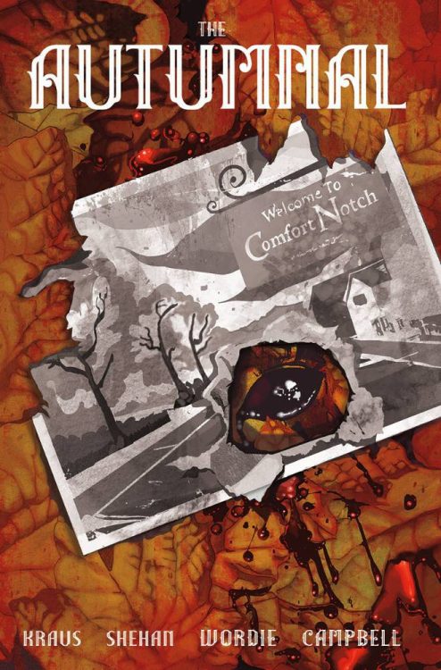
Writing & Plot
Daniel Kraus’s script for “The Autumnal” #1 offers accomplishes an immense amount of storytelling – while also doing very little. The characterization and is accomplished primarily through the considerable but not overbearing dialogue. The act of bringing the audience up to date with Kat and Sybil Somerville is also done this way, but also with the inclusion of environmental and visual context clues. This pair has had a hard life, and they don’t take crap from anyone. The pair are instantly endearing and I found myself caring about their story almost immediately. The dialogue and internal narration from Kat is primarily layered with anger and spite born out of being protective of her child, but also flecked with her own inner sadness and trauma. This representation of a low-income single mom would almost seem like a stereotype if it wasn’t portrayed so damn well and in such a thoughtful way.
Now based on what I’ve described above, you might think that this is some comic about a familial drama. Admittedly, the horror elements in this issue take their time in being presented. This is the most impressive aspect of “Autumnal” #1. The information given about the Somerville family beyond Kat’s woes is sparse and allows for the setup getting into the late pages to be as well-hidden as possible. See, this really does feel like a pointed drama for most of this comic, but its transition into an eerie horror still feels natural. There’s isn’t any sudden flip of the switch and the world turns upside down. The strangeness just steas=dily compounds until the issue’s climax. There isn’t much that can be said without giving away the plot, just know that in terms of slow-burn horror hiding the bit, this comic nails the act.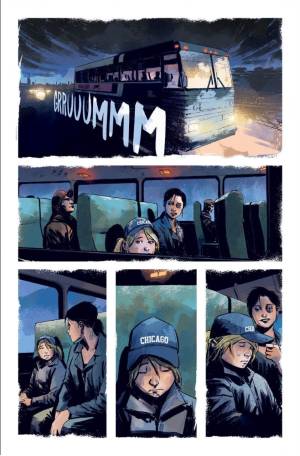
Art Direction
What gives “Autumnal” #1 its immersive and increasingly haunting atmosphere is the character-centric pencils of Chris Shehan and otherworldly colors of Jason Wordie. Shehan has a notable gift for crafting distinct characters and their expressions that makes getting into them as a reader an effortless task. Kat’s personality and hidden depths are made outwardly obvious by Shehan’s talent, as are Sybil’s deceptively complex emotional range. Just as impressive is his eye for visual directing. This comic does have a cinematic approach to how it frames character and progresses the story in the early segments. His approach increasingly hinges on cues specific to the comics medium. Building tension by leaving the focus of a scene covered but gauging the terror in the eyes of the characters is a tactic that packs a heavier punch in comics than in film, and this comic does so brilliantly. Building this comic’s unique atmosphere in a whole new way is colorist Jason Wordie (one of my favorite colorists in the business right now). Each page and/or scene is given its own color palette that bathes everything in that sequence in a hue, such a pale green, light blue, or autumnal orange. However, there are also some sequences where he introduces an effect that almost looks as though he splashed random transparent colors on the page. This look blurs the reality on the page, and is mainly used at the comic’s more unusual sections. It’s gorgeous, atmospheric, and highly detailed work that rally makes this slow-burn horror comic shine.
“The Autumnal” #1 is a successfully riveting opening chapter for a character-centric, slow-burn style horror comic. Daniel Kraus’s scrip offers a stellar portrayal of a hardened low-income single mother and her exceptionally smart but equally troubled daughter, wrapped up in a brilliantly paced and increasingly uneasy horror story. Chris Shehan and Jason Wordie’s visual work is outstanding i every regard and fills this book with the perfect atmosphere to successfully immerse the reader in its enviornment. If this kind of horror is your thing, then pick up this new printing when it hits shelves at your local comic shop on 9/23!