Home Blog Page 207

Seeing Eye to Eye in THE MAGNIFICENT MS. MARVEL #17

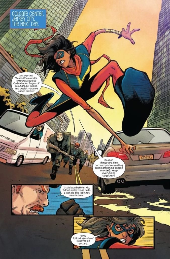
THE MAGNIFICENT MS. MARVEL #17, available Wednesday from Marvel Comics, brings fans back to a world that is being torn apart by a brand new law. Kamala’s Law. The law that allows government agencies go after underage heroes – using Kamala Khan’s name.

Odds are pretty good that the interview didn’t go as planned…(The Magnificent Ms. Marvel #17)

Everything that has been happening in Ms. Marvel’s series lately has been directly tied to that one fateful event in Outlawed. While her name may be getting used for the law, it’s pretty clear that Kamala does not agree with what is being done.

That’s not all that much of a surprise. What is a surprise are some of the events that have been happening around her, ever since she woke up. She’s lost friends and allies, and not all of them in a predictable manner. The Magnificent Ms. Marvel #17 is another surprise waiting to be unveiled.

So C.R.A.D.L.E. is still on the hunt, huh? (The Magnificent Ms. Marvel #17)

The Writing

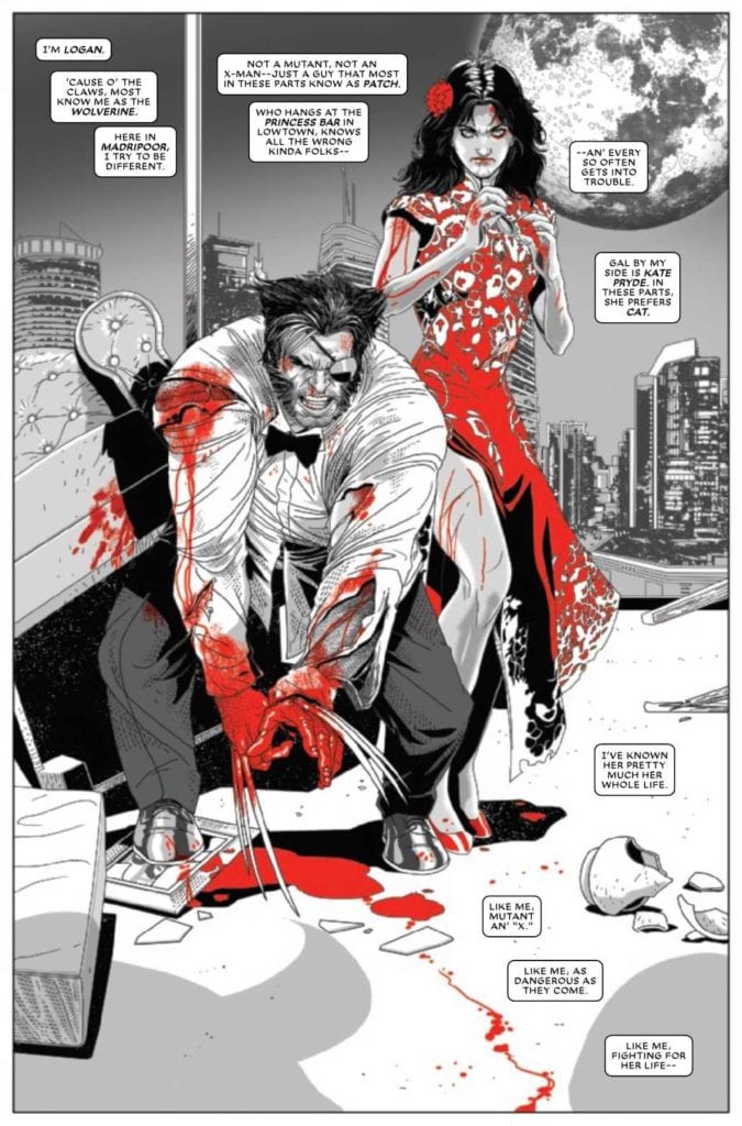
The Magnificent Ms. Marvel #17 feels like a merging of the old and the new. As an enemy from Ms. Marvel’s past makes a move – all while she’s still dealing with current events. It’s a surprising move on Saladin Ahmed’s part, but it’s one that worked out well here.

The entirely of Outlawed is a plot that hits home for many Marvel fans, as it feels achingly familiar to previous events in Marvel. Fans aren’t the only ones hurting, as young heroes are forced to make tough decisions.

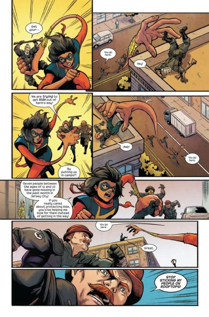
For Kamala, it was never a question of what side she would take. It’s one of the many reasons why fans have loved her from the start. That nature of hers shines through in this issue, as she deals with problems from two fronts. All while still continuing to try and do the right thing.

That’s Ms. Marvel in a nutshell, really. To think, this issue allowed for a moment of that to shine through, continuing an on-going arc, and introduced a new plot arc all in one. A plot arc that is going to raise many questions, until it is all resolved.

To balance out all of that tension, there are a few comical moments woven into the narrative. Especially earlier on, as Ms. Marvel has found an amazing (and hilarious) way to deal with those that get in her way. It’s not something you’ll want to miss out on.

That’s one way to deal with those agents! (The Magnificent Ms. Marvel #17)

The Art

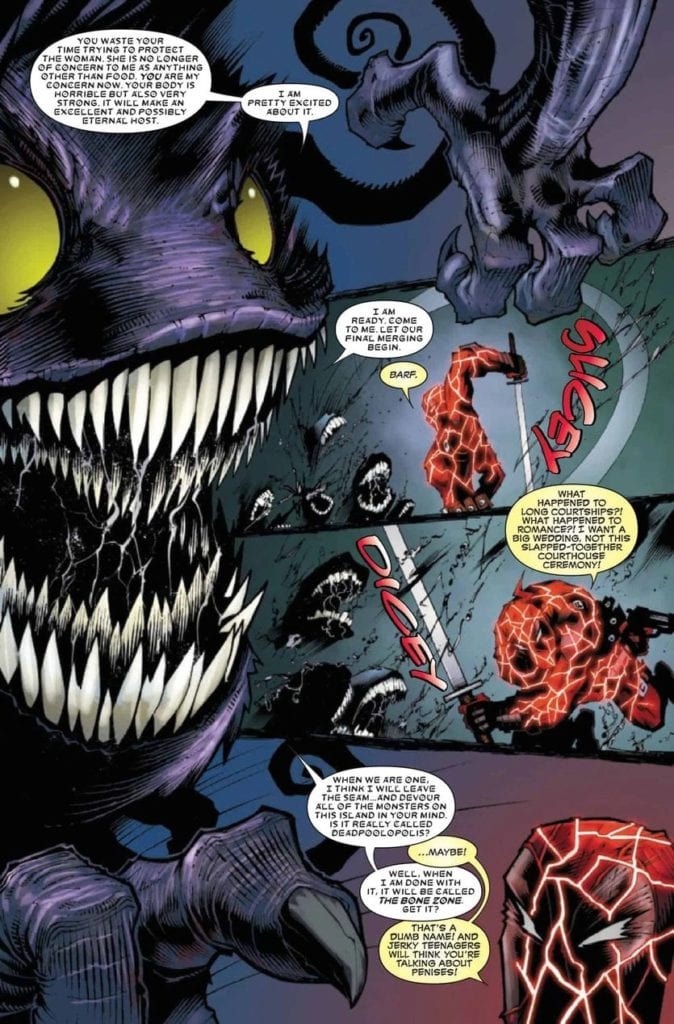
Once again, there’s quite a lot going on inside the pages of The Magnificent Ms. Marvel #17. Dozens of characters, several plots, and plenty of raw emotions to go around. Yet the artistic team didn’t seem to have any trouble keeping up.

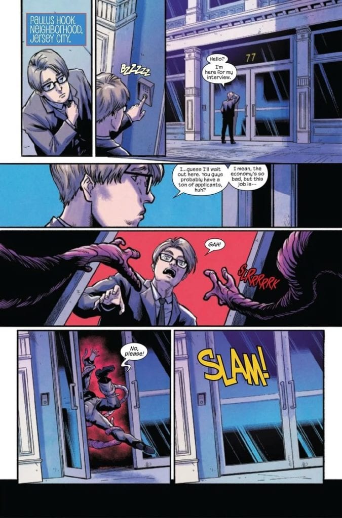
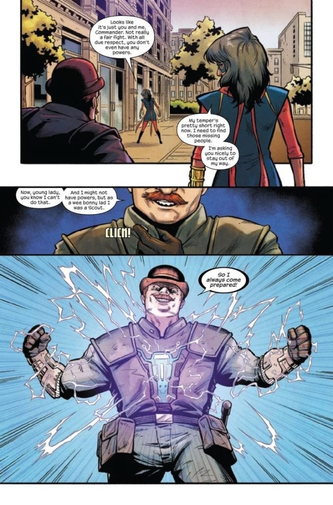
Minkyu Jung had a chance here to draw Ms. Marvel, Dum Dum Duggan, his agents, and a bunch of zombies – all in one scene. It made for a lot going on, and yet was still highly entertaining. That was only the start of it, as Ms. Marvel used her abilities to their best – as shown by the artwork.

Ian Herring’s colors make everything bright, from the bold backgrounds (sometimes going as vibrant as to be yellow), to the arching blues and purples of electricity. All of it makes for eye-catching panels, especially when Ms. Marvel’s color palette comes into play.

VC’s Joe Caramagna’s lettering is understated when needed. And yet it is so wonderfully graphic at other times. There’s this viscous sensation to the letters, which only amplifies (and horrifies) what is happening all around.

That’s…gonna be a problem. (The Magnificent Ms. Marvel #17)

Conclusion

The Magnificent Ms. Marvel #17 had so much going on, and as such it really did feel like it was over in the blink of an eye. It’s impressive to see how much was balanced in one go. All while not feeling rushed or overwhelming. The setup included at the end of this issue is more than enough to keep fans waiting for The Magnificent Ms. Marvel #18.

Monkeys Fighting Robots Youtube

How The Stories Merge in ONCE & FUTURE #14

ONCE & FUTURE #14, available Wednesday from BOOM! Studios, is about to throw a few more complications Duncan’s way. You know, because he didn’t already have enough of those to deal with, what with being in two stories at once.

An image of some of the enemies lurking in the shadows.

If there’s one thing we can take away from Once & Future, it’s that one should never raise the beings of legend and lore. Not in today’s day. They wreak all sorts of merry mayhem all over the place, and the more you know about them, the more danger you’re in.

When this series first started, Duncan was just an ordinary guy. An ordinary guy with a strange grandmother, but otherwise he seemed…boring. Now he’s found himself in the root of two stories, either of which would happily kill him given half a chance.

That is where Once & Future #14 begins, which should give readers plenty of ideas on how much worse things are going to get, before they get better.

Duncan has become part of the story.

The Writing

We all remember just how anxiety-inducing that cliffhanger was from the last issue. So to pick up Once & Future #14 was a bit of a relief, if I’m being honest. The Green Knight making a sudden (and bloody) introduction towards the end left quite the impression.

The writing in this issue was shockingly intense. Kieron Gillen worked hard to elicit a reaction to what was happening and even succeeded in forming a bond based on pity for somebody fairly horrible. It’s impressive writing if a bit saddening.

Amidst the tension and the horror, there’s just a tiny bit of room for humor. Not much, granted. But it does help to ease things a bit. Credit for that goes to Gran, who naturally has seen and done so much more than this.

After that, it’s back to the horrifying drawing board, as it seems like countless monsters and villains are rising to the surface once again. It begs the question, how much can one family solve on their own? Are there other monster/legend hunters out there? Because now would be a good time for them to start doing their job.

Meanwhile, the Green Knight wants to play.

The Art

If there’s one thing you can count on this series for, it’s having fantastic artwork. Once & Future #14 is no exception to that rule. While the imagery in this issue leans towards the more graphic side (nothing new there), the fantastical elements are strong as well.

The scenes mentioned above would have been interesting in written form, but complemented by artwork…they carry so much weight. The gore, the horror of death, and the beyond. It’s unavoidable here, and that fits the nature of this beast.

Dan Mora’s monsters are such memorable entities. They’re surreal and larger than life, and yet you can see see the origins of their stories within their bones. It’s quite effective and has almost become a trademark of the series.

Meanwhile, Tamra Bonvillain’s colors are so bold and vibrant. They’re brighter than one would typically expects in a series so full of horror, yet it is one of the many reasons why this series stands out. The decision to use a vibrant green hue to indicate when stories have come to life was such a great move. It adds this insidious nature and removes any delay in identifying the nature of enemies. Not to mention, it looks terrible and amazing, all in one.

Ed Dukeshire’s lettering is not to be forgotten either. His work is another key piece in what distinguishes man from legend. Not to mention, there’s something so extremely satisfying about the way he portrays screams and more.

And by play we mostly mean kill.

Conclusion

Once & Future #14 is an issue worth waiting for, as the ante continues to climb. The legends of old are waking up, and it’s starting to look like one family of hunters will not be even remotely enough to keep up with it all.

Monkeys Fighting Robots Youtube

How the Battle Continues in FIREFLY #24

FIREFLY #24, available Wednesday from BOOM! Studios, continues the first crossover event for a series that has long held a special place in our hearts. Malcolm Reynolds and crew are up against a new foe, and it is their strangest one yet.

spoilers ahead

For a time, it seemed like Firefly would happily continue onward in comic book form, focusing on the past. Meaning that there would be few changes made to the plot or characters that we know so well.

Now, the series has started forging ahead, taking risks, and generally altering the series that fans know so well. For good or for ill, at least it’s a series that is still trying to take those grand risks, and do something different with what is available.

Firefly #24 is set in a nebulous point in time, where the crew is still together (and alive), yet the Alliance seems to be out of the way, or at least not as strong as they have previously been. Unfortunately, that left a void that Blue Sun Corporation stepped into. There’s a new big bad here, and they’re just as bad. If not worse.

The Blue Sun Rising Crossover event only has one issue left to its story. Blue Sun Rising #1. There’s still a bit left that needs to be explained, including how the crew survives what is about to happen next.

The next plot starts up in Firefly #25, which is set to jump ahead to a point following the events of Serenity…which probably means it’s time to say goodbye to certain characters all over again.

Inara taking center stage on this variant cover of Firefly #24.

The Writing

Firefly #24 is full of grand schemes and events. This is a plan thought up by Malcolm Reynolds, after all. So of course it’s grand. It’s also just as likely to have something (or several things) go wrong. Again, it’s just his luck.

Greg Pak did an excellent job of capturing that fact in this issue, while also bringing his own idea into the mix. It’s an interesting issue, with a surprising amount of moments that just felt…right. Granted, I’ve never been a fan of those robots, so seeing them fall was probably more satisfying than it should have been.

The subplots revolving around Kaylee and Mrs. Reynolds did a lot to carry the plot along, adding two totally different elements. The rom/com vibe, and a harsher side more focused on money (Jayne would approve).

All things said and done, this issue is well-rounded, and doesn’t shy away from the risks being taken. Or the fact that it is just so much fun to watch the world (or in this instance, an evil corporation) burn. Even if we know it probably won’t last. Or succeed nearly as much as it needs to.

A flashback to one of the more heartbreaking episodes, in Firefly #24.

The Art

Firefly #24 is full of space battles and shoot outs, in an almost classic Firefly series of events. Of course, there are several changes in the mix, mainly surrounding the newly introduced characters. Their character designs run the gambit, but overall do seem to balance out the aesthetics of the crew.

Lalit Kumar Sharma and Daniel Bayliss are the lead artists, and you can really see how much work went into those fight scenes. Likewise, attention was paid to how the characters felt at any given moment, and the best way to express it.

Marcelo Costa’s colors nail the general feeling of the original world, while throwing in a few changes. There’s this rusty/space feeling to it all, which is actually fairly on point. The backgrounds are one of the many places where Costa’s work excels.

Finally, Jim Campbell’s lettering unifies the whole issue. There’s plenty of room for expressive lettering here, thanks to what is occurring. Combine that with the sounds of battle, and one can almost feel this issue as it plays out.

Time to see where this goes…

Conclusion

Firefly #24 tightens up this otherwise strange plot, setting it up for a solid conclusion. All of which will free up the series to head in a new direction, as fans finally get to see what happens following the events of Serenity.

Monkeys Fighting Robots Youtube

AfterShock Comics Exclusive Preview: WE LIVE #3

we live #3 aftershock comics exclusive preview

WE LIVE #3 hits your local comic book store today, December 16th, but thanks to AfterShock Comics, Monkeys Fighting Robots has an exclusive four-page preview for you.

About the issue:
Luck has abandoned the group. Humbo and Alice have lost track of their newfound friends, Tala and Hototo. The siblings are being held prisoner and will soon discover that the world hides dark corners, where screams of help are no more than fallen spirits.  

Meanwhile, time runs out for Hototo; the shuttle train to Megalopolis Mother 9 is about to depart…

WE LIVE #3 is by brothers Roy and Inaki Miranda (with both on writing duties, and Inaki on art duties as well). Colors are by Eva de la Cruz, and letters are by Dave Sharpe.

Check out the WE LIVE #3 preview below:

we live #3 aftershock comics exclusive preview

we live #3 aftershock comics exclusive preview

we live #3 aftershock comics exclusive preview

we live #3 aftershock comics exclusive preview

we live #3 aftershock comics exclusive preview

we live #3 aftershock comics exclusive preview


Are you reading WE LIVE? Sound off in the comments!

Monkeys Fighting Robots Youtube

Review: DEADPOOL #9 Shows Us Why Wade Wilson Is Master Of Pain

DEADPOOL #9 hits stores on Wednesday, December 16th, featuring the Merc with a Mouth and Elsa Bloodstone in their final battle with the Queen of the bone beasts. Last issue saw the two (and Jeff the shark, of course) travel to the monster’s dimension. Deadpool found a number of children held hostage, and sought to save them while also searching for a cure to Elsa’s Bloodgem curse. This unfortunately required our hero to take the gem into his body, effectively cursing himself. Fortunately, curses occasionally come with gifts. 

Story

Despite Elsa’s shocking betrayal last issue, Deadpool finds the motivation in himself to use the new powers of the Bloodgem infection to protect her from the Queen.

Seeing Deadpool take in the pain of Elsa’s dishonesty, plus the literal demonic forces of the bone beasts, reminds us of why we love his character. He knows pain, but his ego, and perhaps a hint of goodness, lead him to carry on the fight.

Kelly Thompson’s writing is some of the best we’ve seen yet in this Deadpool run. From the sexual innuendos and gory jokes to his inspiring stand against the Queen, readers will fall in love with his character all over again.

Artwork

Gerardo Sandoval’s penciling and Victor Nava’s ink work created an epic landscape for our heroes to duke it out with the Queen. The bone beast dimension is full of swirling spirals of dark shades, courtesy of colorist Chris Sotomayor. We also loved how VC’s Joe Sabino’s lettering was able to clearly differentiate Deadpool’s own thoughts, the Queen’s thoughts in his mind, and each character’s spoken words.

Conclusion

DEADPOOL #9 is the climactic story fans of the series have been waiting for in this arc. The thrilling dialogue and action will keep readers on the edge of their seats right into the next installment. 

What other power-ups do you think Deadpool could gain in this series? Let us know in the comments below!

Monkeys Fighting Robots Youtube

Review: POST AMERICANA #1 Shows What A Post-Apocalyptic America Could Look Like

An all new series arrives on the comic book scene in POST AMERICANA #1, hitting stores on Wednesday, December 16th. This story explores what a post-apocalyptic America would look like if the elite barred themselves off from the rest of country. But their machinations don’t stop there; the group has captured dissenting voices and forced them into forced labor. Is there anyone who can stand against them?

Story

The issue opens with a speech from the new leader of the former United States. His address speaks to a reinvigorated plan to reclaim the country as their own. Readers soon learn of a catastrophe that lead the elite of the world to craft a “Bubble” to both isolate themselves from the rest of the world and craft weapons to soon conquer it.

However, we find that a pair of dissenters are planning a massive breakout with other workers. With hopes of revolution the two seek out a new locale, which turns out to be Fresno, California. But unlike its real world counterpart, this community is virtually identical to any scene from post-apocalyptic film.

We’re introduced to a woman named Carolyn who recently showed up to the camp, a man name Mike from the revolution, a literal cannibal named Rudy, and a self-proclaimed hero named F.F. Each of these has their own unique personality that lends value to the story and pushes the narrative forward.

Steve Skroce’s script sets up this series to be one of the greats. The pacing is well done, from the time it takes for the revolutionary group to make their escape to their eventual arrival in the Fresno encampment. Readers get a good understanding of the characters Carolyn, Mike, and even the F.F. We’re excited to see who else is introduced in the subsequent issues.

Artwork

The illustrations in this issue were unique in their gory yet intriguing styles. Skroce’s penciling and ink work cast scenes full of blood, death, and destruction, right down to the exploding heads. Combined with Dave Stewart’s coloring, these images burst forth with bright reds, blues, and whites, which add to the comic’s overall theme. In addition, Fonografiks’s lettering does a brilliant job of placing word balloons so it frames the characters’ action.

Conclusion

POST AMERICANA #1 is a post-societal tale for the ages. We’re excited to see how the protagonists attempt to face this version of America.

Do you there is any hope for defeating this new “America?” Let us know in the comments below!

Monkeys Fighting Robots Youtube

Review: RORSCHACH #3 is Full of What You See in It

Rorschach King DC Comics

It’s fitting that writer Tom King, artist Jorge Fornes, colorist Dave Stewart, and letterer Clayton Cowles make DC Comics’ Rorschach such an ambiguous storyline. After all, that’s what a Rorschach is. An ink blot that seems different from each new set of eyes. DC Comics’ Rorschach #3 is full to the brim. Full of what? Well, that depends on the reader.

Writing

I’ve said it before, I’ll say it again: Rorschach is unlike any other work from King. It’s full to bursting with dialogue and captions. Rorschach #3 begins with a New York Times article about a coal mine explosion. It’s tangentially related to the plot, and even then, it’s not clear how. King is allowing the reader to make the connections they see instead of spoonfeeding us answers. King shows us some of Laura’s upbringing, one of our antagonists (protagonists?), in this issue. We witness her and her father bonding over death and guns and fear. But what do we see? It could be that we see a dangerous indoctrination into the beliefs of the radical right. We might see the unlikely beginnings of someone who shook off their upbringing to save the world. Or, we might see something deeper that evades words. Really, it depends on how you look at it. Somehow King does it again. He flies in the face of his own style, with huge chunks of text and plenty of dialogue, but maintains every ounce of the subtext and subtlety he’s known for.

Rorschach King DC Comics

Art

Fornes’ use of time in Rorschach #3 is inspired. It’s something he’s been playing within this series. The last issue had a brilliant back and forth between flashbacks and modern-day. But Rorschach #3 begins to blur the lines. Fornes divides one page right down the middle. Panels on the left-hand side are modern-day, and panels on the right are in the past. But these characters almost seem to be able to see each other. It’s eerie. There are also a few moments where panels have gutters running through them despite them depicting a singular moment. They’re one image, divided into several panels. And though it seems to be purely decorative initially, it reads differently upon closer inspection than a single uninterrupted image would. We see Laura, shot as she was in the first issue. But it’s four panels. It makes the moment feel like it lasts longer like it puts time on pause. Fornes is constantly pushing the boundaries of how he can communicate time on the page, and with each issue, his experiments are bringing forth more jaw-dropping results.

Coloring

Stewart is a big part of the reason that Laura’s upbringing feels so disturbing. There’s a calmness to these scenes. As Laura’s father shows her his gun collection or teaches her about mind-controlling squids, it’s as though the page refuses to clue in on what’s being said. The page stays a calm yellow, depicting a mid-afternoon, or a light blue showing the early morning glow. This is how Stewart shows us how normal these things are to Laura and her father. Yet Stewart also continues to remind us where this is all headed. With the occasional interruption of Laura’s demise thrown in, in bold red, Stewart depicts a casual saunter towards doom. It’s beautiful, it’s infuriating, and it’s a magnificent visual representation of dramatic irony. It gets right under the reader’s skin.

Lettering

Cowles shows us Laura in her natural habitat. We see how gunfire and laughter are all part of her environment. As she’s shooting targets with a machine gun, we see her surrounded by the “RATATAT” noise. The sound is in the background, almost like something she doesn’t even notice anymore. Similarly, we see her around a campfire with a bunch of guys. A twelve-year-old girl among a bunch of militiamen. But her smiling face, with her tongue out, is shown in front of the noise of their laughter. And while the “BLAM” of her gunfire is quite noticeable throughout the issue, it comes up so often it becomes commonplace. The “BLAM” of her shooting beer bottles is as innocuous as the more devastating shots that follow. It’s only the “BLAMM,” with an extra “M” added in, of her being gunned down, as she was in the first issue, that stands out. The sound looks mechanical and unfeeling compared to the playful gunshots of earlier pages. Cowles reminds us that this girl was born into violence but leaves us to wonder if she’s quite the same as the men who took her out.


DC Comics’ Rorschach #3 feels timely, but it’s hard to say just how. That’s because this creative team doesn’t offer their own interpretations. They ask the reader to look at the inkblot and tell them what they see. It’s a brilliant example of how a text-heavy script can still maintain subtlety and subtext, leaving room for the reader to do their work. Pick up Rorschach #3, out from DC Comics on December 15th, at a comic shop near you!

Monkeys Fighting Robots Youtube

How Cats Fight in CATWOMAN #28

CATWOMAN #28, available today from DC Comics, continues this latest series of adventures for the one and only Selina Kyle. Apparently, helping Batman save the day wasn’t enough, as now she’s set to take on one of the mobs of Alleytown.

Catwoman doing what she does best on this variant cover of Catwoman #28.

One year. That’s how long she’s giving Batman to make up his mind. It’s how much time she has to clean up her share of the city and take down all of the new enemies she’s made. That isn’t a whole lot of time, but apparently, she’s set to make the best of it.

She moved back into Alleytown and quickly set about cleaning up the streets, taking in the kids, and teaching them the ways of thievery. Now? Now she’s got her eyes set on bigger game, and in Catwoman #28, some of those plans are about to come to fruition.

Alleytown, aka Catwoman’s new (and old) territory.

The Writing

Catwoman #28 is an exceptionally fast-paced read, courtesy of all the action, mayhem, and table-turning events that Ram V managed to sneak into the pages. There’s a lot to take care of in this part of town in her defense, and much of the crime seems to set up like dominoes. You can’t handle one without planning for the rest.

At least, that is the impression that this plot arc has been giving off. Perhaps this is more of Selina’s ‘go big or go home’ mentality, as she’s poking at new enemies – instead of dealing with all the ones she already has.

It’s an interesting move, but it’s also a smart one. By allowing Catwoman to create her own antagonists – antagonists that run through her self-declared turf – the series is allowing Catwoman to have a sense of independence once again. She’s no reliant on Batman, nor is her series reliant on his enemies.

This is the part where the last few issues worth of scheming and planning all finally pays off. Hence all of the action and less of the plotting. Still, there’s plenty for readers to pick up on as the war continues on multiple fronts.

Enter Catwoman’s latest quarry. Things are probably not going to go well for them.

The Art

It’s safe to say that a lot is going on in Catwoman #28. Multiple fights, locations, and perspectives had to be portrayed for it to make any sense at all. This means the artists did a lot of the heavy lifting here.

Fernando Blanco’s artwork is bold and decisive – much like the character being portrayed. The action scenes move so quickly; it’s almost hard to follow along. Almost, but not quite. Blanco’s work easily captured the many layers of this plot, showcasing all the different sides to this fight and where the lines have been drawn.

FCO Plasencia’s colors work well to make everything pop out. As even what would normally be deemed duller colors seem to pop. All thanks to the unique color combinations. It makes this grungy part of town feel like a place worth fighting for while still leaving room for the characters to pop out even further.

Tom Napolitano’s lettering is the final touch. He took full advantage of the action to increase the impact of it all. You can practically hear, even feel, the whip as it flips through the air and catches on some poor sap.

On the other side of things, here are the kids that Catwoman has taken in and trained – and they look ready for a fight (Catwoman #28).

Conclusion

Catwoman #28 is another fast-paced addition to this series. Allowing for a heavy amount of confrontation as all of her planning comes to fruition. It’s full of satisfaction on that level while also setting up for future conflicts along the way.

Monkeys Fighting Robots Youtube

WOLVERINE BLACK WHITE & BLOOD #2: The Many Names

Wolverine Black White & Blood #2 Cover

Wolverine Black White & Blood #2, a Marvel Comics anthology, hits your local comic book shop on December 16. This time showing the loyalties of Wolverine instead of the berserker. Starting things off is “Unfinished Business” by writer Vita Ayala, penciler Greg Land, inker Jay Leisten, and colorist Frank D’Armata. Following this is “Seeing Red” by writer Saladin Ahmed and artist Kev Walker. Finally, there comes “Do We Die Today?” by famed X-Men scribe Chris Claremont and artist Salvador Larocca. Tying everything together is letterer Clayton Cowles of VC.

Wolverine Black White & Blood #2: Tales of Loyalty

Wolverine Black White & Blood Greg Land artLast issue, readers view Logan at his most grim and gritty. In the pages of Wolverine Black White & Blood #2, readers see Logan in his social life. Within Ayala’s story is his rivalry with Sabretooth and the causes they fight for. Sabretooth is looking for anything to fuel his bloodlust, unlike Wolverine, who goes out to help someone despite presenting a threat to him in the form of a “mutant cure.” That even leads into Ahmed’s story describing how some of Logan’s enemies, like Arcade try to bring out his bloodlust. It’s a trait Logan does want not to be defined by despite always being around him. To drive that point home, Ahmed presents Wolverine as putting himself risk first before anyone else in a resourceful manner.

Claremont arguably does the best story. Instead of the berserker, Claremont focuses on Logan’s bond with Kate Pryde. Their chemistry is equal parts concern and trust. They have each other’s backs and even when their backs are against the wall, they communicate to overcome challenges. Not to mention, it’s good to see Claremont make humorous usage of Logan’s “Patch” persona. The dialogue suggests everybody knows he’s Wolverine, but nobody really cares about it.

Capturing The Moment

Using art to tell a story's mood shiftGreg Land has a reputation in comics, which continues in this issue. Most of his artwork looks similar to poses other artists, including himself use in character models. Usage and effectiveness vary with the best of it, displaying dynamic movement of both Wolverine and Sabretooth. The worst usage displays it being very messy, like a bunch of random images pasted together for some semblance of movement. Otherwise, Leisten’s inking brings a little more detail to the images like the trees and when characters take emotional precedent. Like when Sabretooth makes his debut in a splash page, and the background fades. The coloring by D’Armata is what stands out the most to me because it’s the only thing that feels constant.

The fact the rest of the stories’ art is all by one artist each is awe-inspiring. Walker brings quite a lot of scale and danger in “Seeing Red.” Much of the architecture by Arcade’s designs and machines genuinely feel fear-inducing enough to try and force a cornered animal to attack. Something that gets all the more intense with a meter that fills with a red color up every time Logan attacks. Now imagine that context in a different light thanks to Larroca in “Do We Die Today?”. Due to some story context, Logan’s healing factor is stopped, and his heavily bleeding arms show his vulnerability. Whatever fight Logan could’ve had in previous stories is quickly being taken away. It really brings up an intensity that comes out on each page.

Lettering By Trade

Looks like Wolverine has a new best.

Clayton Cowles seems to be bringing his best in Wolverine Black White & Blood #2. In addition to word balloons and captions arranging in a way that guides readers without slowing down, his wordmarks look tailor-made. Every little sound or loud yell intensifies the situations and actions. Often they feel like they have more weight than the actions themselves. Unlike the more digital-looking ones, the use of hand-drawn wordmarks adds to feelings of desperation.

Get Wolverine Black White & Blood #2

Overall, Wolverine Black White & Blood #2 is a solid comic that brings several famous comic creators together to show how much they can get out of Logan. Claremont and Larroca’s story works so well. Not only did Claremont write a good story, but Larroca’s illustrations also go out of their way for some highly evocative imagery. How Ahmed brings out Logan’s resourcefulness and how the artist displays the scales of the situation was entertaining as well.

Monkeys Fighting Robots Youtube

BOMB QUEEN TRUMP CARD #4: The Perfect Trashy Ending

Bomb Queen Trump Card #4 Cover

Bomb Queen Trump Card #4 is the grand finale to a mini-series that gives zero bullspeak about anything. Jimmie Robinson ends his series on brand by keeping things minimal.

Bomb Queen Trump Card #4: What A Twist!

If there’s one thing Robinson does more than anything with Bomb Queen, it’s that he never apologizes. Keeping his stories simple is what allows him to bounce back from any plot holes. When the mini-series’ plot seems to be coming together near the end, Bomb Queen Trump Card #4 goes out of its way to troll readers. Not to make them feel bad, mind you, Bomb Queen never takes itself seriously; continuity and character identifications are elements purely for parody. Even before the twist ending, there are little blink-and-you’ll-miss moments in the issue that reveal it was planned. Because how did characters other than Bomb Queen get meta-knowledge of past events in issue/volume form? In the end, nobody really cares; readers like myself want to laugh at the absurd hijinks.

Just Enjoy It For What It Is

Robinson shares this feeling of not giving a hoot in just one page of Bomb Queen Trump Card #4 before the climax. In it is an eight-panel 2×4 grid that is an abstract discussion between Bomb Queen and Donald Trump. Two or three panels are plot-relevant, but everything else is up to the reader. It almost evokes scenes from Ghibli films, habits that have no plot elements. The only reason they are around is that these characters act like people. There’s nothing special about it at all; it’s just natural.

The lettering also makes everything easy to follow with its sense of blunt honesty. Throughout the issue are the newsreels that have some plot relevancy but just as easily change into news about a viral puppy video. It brings a real sense of nihilism in this issue; the kind of ‘nothing matters’ attitude that plays everything for laughs. Because if absurd things surrounding an election happen in real life like in this comic, it’s healthier to laugh at these settings than despair.

Finish Bomb Queen Trump Card #4

If you’re a casual comic reader with enough tolerance for adult humor and jokes at others’ expense, this issue will reward you. With nihilistic humor being the backbone of the series, any kind of reader is welcome. Unless you’re a reader who expected this series to fit in with continuity or a critic who will slam it for irrelevance, if that’s the case, this issue will roast you.

Monkeys Fighting Robots Youtube