Home Blog Page 208

Review: BLADE RUNNER 2029 #1 Continues A Legacy

Continuing the legacy of one of the greatest and most influential science fiction stories of all time is no simple feat. Luckily, writers Michael Green and Mike Johnson and artist Andres Guinaldo seem more than up top the task with the stellar “Blade Runner 2029” #1. This sequel to both the original Ridley Scott film and the Blade Runner 2019 series from Titan Comics opens up with a chapter that perfectly encapsulates the original cyberpunk look and feel of this world while also maintaining the tone and emotional center that has always made Blade Runner so important. With colors by Marco Lesko and letters from Jim Campbell, this is a must-buy for fans of the original film.

“It is 2029, and Blade Runner Ash continues to hunt the streets of the rain-
soaked dystopian world of Los Angeles for renegade Replicants, but this time she’s
trying to protect as many as she can find.”
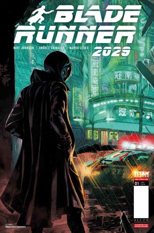
Writing & Plot

Stories set in Blade Runner’s world require the kind of narratively subtle and tonally rich storytelling techniques that make the original film and cyberpunk as a whole so effective in its messaging. Fortunately for “Blade Runner 2029” #1, screenwriter Michael Green (who worked on Blade Runner 2049) and Mike Johnson are clearly up to the task of telling great stories that properly continue the artistic legacy of this sci-fi universe. “2029” has the narrative stylings of a noir story blended with a desperate tale of survival; for both the people living in the product of late-era capitalism that is Neo- L.A., as well as the replicants who are running and hiding to stay alive. This comic is a follow-up to the events of the Blade Runner 2019 comic series, but don’t let that put you off of reading this if you haven’t read the former. Green and Johnson immediately set about creating a sense of place and character for this particular story and Ash as a protagonist without needing to read the previous series. The focus of Ash’s journey and her place in this cyberpunk world is set upon from the go with a quick flashback that sets up how she has changed from 2019 to now and how her story continues the themes that Blade Runner is so well-known for. In all honesty, Ash is very reminiscent of Deckard, the iconic protagonist of the original film. Maybe that’s what this story needs for its message to work, though. In terms of what “2029” deals with, it feels like a logical stepping stone after what Deckard experiences in the film. Ash’s saving and freeing of replicants instead of retiring them is logically what Deckard would have done (and did, if 2049 is any indicator). The plot’s pacing is methodical and smart, allowing each scene to breathe and give every moment weight. The dialogue and narration are naturalistic and, of course, slightly noir styled. The reading experience of “2029” #1 is a fantastically thematic return to this world.
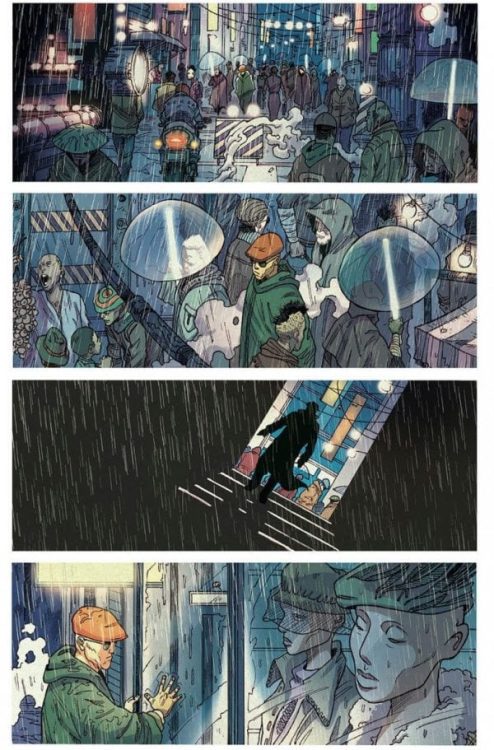
Art Direction

Replicating (no pun intended) the iconic visual style of Ridley Scott’s film should be the main focus of any artist tasked with recreating the world of Blade Runner. Artist Andres Guinaldo has proven himself more than up to the task on “Blade Runner 2029” #1, displaying a style that is equal parts character animation-focused and cyberpunk architecture. Guinaldo utilizes a panel direction that pays tribute to the original film’s aesthetic and direction while telling a story in a way that is only achievable in the comics medium. Each panel sings with the dreary and rainy atmosphere of Neo-L.A. and the desperation – and determination – that each person, replicant or not, survives with. Unlike the memories of Roy Batty, however, these moments will remain like melancholy art pieces in the pages of this comic for as long as the reader keeps it on the page. This experience is given its dimension and color by Marco Lesko, who utilizes a palette straight out of the original film’s cinematography. The characters’ colors and features both blend in and simultaneously stand out from the rest of the dank blue-grey environmental and architectural coloring. The lights coming off of police spinners glow with a hazy effect pulled right out of 1982, and light refracts off of raindrops in a show of immense detail. Jim Campbell’s letters offer a smooth reading experience with an angled, large font that’s a mix of classical and a rough-hewn modern style. The visual experience of this comic is fantastic and very much worthy of the Blade Runner legacy.

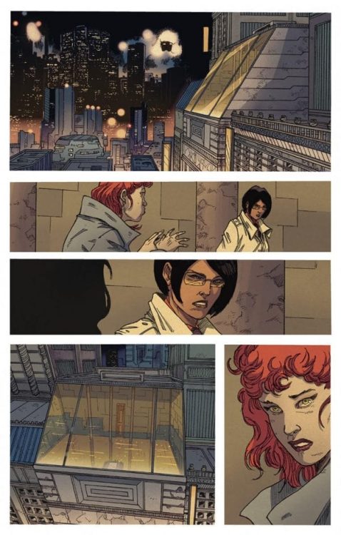
“Blade Runner 2029” #1 is a poignant start to this next chapter of the Blade Runner story in the comics medium. Michael Green and Mike Johnson pen a focused script that brings all of the thematic issues Blade Runner is known for to the comics medium in stellar fashion. Andres Guinaldo and Marco Lesko’s visuals bring Neo-L.A. to life in all of its polluted uncontrolled capitalist glory. This will be a must-read for Blade Runner and cyberpunk fans everywhere, so be sure to grab this one from your local comic shop on 12/16!


Monkeys Fighting Robots Youtube

Review: PANTOMIME #2 – The Dangers Of Being A Teen Criminal

PANTOMIME #2, out now from Mad Cave Studios, is the second issue of the crime miniseries by writer Christopher Sebela, artist David Stoll, colorist Dearbhla Kelly, and letterer Justin Birch. This issue meets the high expectations set by the first wonderful issue and amazes the readers with new, imaginative ways in which it tells its exciting story.

About the issue:

The Manager has broken into the lives of our teen criminals and pulls them further into the darkness. Giving them a crook’s playground to train their skills to send them out on jobs for him. Can the kids get out before it’s too late, or will The Manager swallow them up?

spoilers ahead

Writing

Sebela opens Pantomime #2 with a panel of Kestrel glancing at the reader in a look filled with horror, telling us: “We’re all gonna die.” This throws the readers right back to where the first issue has left off, reminding us of the dangers lying in their new situation. These kids are robbers, and one day, they’ll probably get caught. Throughout the issue, the reader and the main characters keep forgetting that this job is incredibly perilous. It might be because they’re just kids, and we think nothing bad will happen to them, or because the main character, Haley, explains to us how the kids were able to find the fun in their tough training to become masterful robbers.

But every time the characters feel in charge and think they can outsmart their adult captors, Sebela violently bursts their bubble so effectively whereby the end, the reader isn’t so sure the kids will even get out of their situation alive.

Art

Stoll handles those moments of danger beautifully. Whether it’s a character getting cut by a razor or the captors revealing they know everything about the teens’ families, each moment is filled with great terror and dread. Stoll uses everything at his disposal, like the use of clever angles or extreme close-ups of violent acts, to help Sebela further elevate the feeling of unsafety. Coupled with great narration and clear facial expressions, the reader leaves each event slightly traumatized. They begin to feel the danger in the air even when it’s not present.

Coloring

Kelly brilliantly chooses never to romanticize the teens’ criminal lives with her colors. Kelly could’ve colored the scenes where the kids steal and lie in bold colors to help Pantomime #2 feel more alive and fun. But with each new opportunity, Kelly decides against it. Kelly colors most of the crimes in a frigid and grim manner. This again helps the reader feel the taste of danger in the air.

This especially rings true in the montage sequence taking place after the teens steal for the Manager for the first time. In this montage, Kelly uses natural light and overemphasizes it. At day, where the kids are at school, their mundane actions are colored brightly and beautifully. But at night, when the kids commit crimes, their actions are colored in the exact opposite way. This creates an ingenious juxtaposition and emphasizes how these kids basically have two very different lives.

Lettering

Birch continues to deliver the goods with its effective lettering work. Each balloon or caption is placed in the right place, guiding the reader’s eye easily through every page. I personally liked to see more of the use of captions inside dialogue balloons when the Manager talks to the teens. This simple yet smart choice helps the reader feel like they never left Haley’s point of view throughout this comic’s entirety. Great work from Birch.

Conclusion

Pantomime #2 plays with the reader’s emotions brilliantly. It continues to excite the reader and immerse them in this realistic yet new world. The creators choose to make a point of un-romanticizing the life of crime these teens took on. Please do yourselves a favor and pick up this comic. It is truly one of the most exciting miniseries of 2020.

Monkeys Fighting Robots Youtube

Review: SONGBIRD Delivers Atrocious Pandemic Thriller

Songbird is a mess from start to finish, and the moments that could save it are never explored. A film that capitalizes on the current ongoing pandemic sweeping the world, but exacerbates the reality of it all. Songbird attempts to do too much and introduces one too many subplots along the way. This was filmed and released during the current world crisis, so that might lend to it striking a core with some viewers. However, this film is an overall convoluted mess that suffers due to its narrative.

A Michael Bay produced pandemic film was bound to be awful in many ways, and Songbird has a lot wrong with it. This film might be considered distasteful and too soon, but that’s a minor concern compared to what went wrong here. Ironically, this is the only film where mentioning the pandemic is useful to discuss it. Directed by Adam Mason and co-written by Mason and Simon Boyes, Songbird stars KJ Apa, Sofia Carson, Craig Robinson, Bradley Whitford, and Demi Moore. In the film, COVID-19 has mutated in COVID-23 and the year is now 2024. Nico (Apa), an immune resident must try to save the love of his life Sara (Carson), after she and her loved ones are targeted under the new regulations in place caused by the pandemic.

KJ Apa in Songbird

Mason and Boyes have crafted a world where infected individuals are thrown into quarantine camps known as Q-Zones, and the film spends a good time mentioning these camps only to never showcase them. This is just one of several instances where Songbird seems to not utilize the premise it is working with. Our two leads, Nico and Sara are bland at best. It is implied that these two haven’t actually spent much time together in person, but found love online somehow. Elsewhere, the film introduces Piper (Moore) and William (Bradley) Griffin. A couple that is selling illegal immunity bands, and ultimately becomes Nico’s lifeline to save Sara. This script doesn’t offer much for you to care about any of these characters but instead builds interest in structures it never reveals during the film’s runtime.

There is an underlying message of hope to be found from Songbird, and while it’s clear that’s what the love between Nico and Sara represents. It doesn’t matter in the end because the characters are uninteresting and poorly written. The circumstances surrounding the illegal wristbands are glazed over at best, so once again the film isn’t completing the subplots it introduces. Lackluster writing aside, the performances were adequate from Kapa and Carson. The predicament they find themselves in will evoke tears from some, but otherwise, the pair do what they can with the lackluster material presented to them. Moore and Whitford are adequate as well, but their performances feel uninspired at times. Songbird does so little with these characters and squanders its premise, so it’s great to see the actors try to make the best of it.

Sofia Carson in Songbird

An ill-timed film that serves up a half-baked scenario that is probably not going to happen anytime soon. The direction here is not that impressive, and Songbird expects viewers to care about two individuals’ love for each other, but they barely share scenes. There is no tension building or a single moment where anything presented on screen is felt to be worth caring about. The filmmakers knew they were just cashing in on the current crisis here, and delivered a watered-down film in the process. The film is probably going to be forgotten about in a little time, so that’s good for everyone that dares to watch it.

Songbird is a poorly crafted, rushed project that resembles every bad Transformers sequel Michael Bay has released over the years. It offers nothing for audiences to care about, juggles too many subplots, and overlooks the potential it had with a better plot point. An exacerbated COVID-19 might be worth enduring than watching this film for a second time, but time will tell if its outlandish scenario will reflect the current reality in America.


Monkeys Fighting Robots Youtube

Review: All My Life Is Emotional But Hollow

Nothing kills a romance film quicker than a rushed angle between the two lovers involved, and All My Life suffers greatly due to this. Based on a true story, the film tells the tear-jerking story of Solomon Chau, as he is diagnosed with liver cancer after falling in love. Unfortunately, All My Life doesn’t live up to the story it’s trying to honor and respect. The emotions the film tries to evoke seems unearned due to its hollow narrative and short runtime.

When films centered around falling in love take no time to develop the characters, it just always falls short as a result. All My Life’s reassuring message about living life to the fullest doesn’t go unnoticed. However, its handling of the couple it’s centered on makes All My Life an underwhelming watch. Directed by Marc Meyers and written by Todd Rosenberg, All My Life stars Jessica Rothe, Harry Shum, Kyle Allen, Chrissie Fit, Michael Masini, and Greg Vrotsos. The film follows Solomon Chau (Shum) and his soon to be wife Jennifer Carter (Rothe), as they are forced to rush their wedding process after Solomon becomes diagnosed with liver cancer. The premise alone is heartwarming, and as mentioned, the film does get its point across to the audience. Still, the rushed love scenario might take some viewers out of the film. 

Jessica Rothe and Harry Shum in All My Life

Jennifer and Solomon come face to face for the first time after Solomon’s friend try to impress Jennifer’s group of friends at a bar. Jennifer doesn’t hide her interest, and within seconds she and Solomon are dating. They have moved in with each other, and then a proposal occurs after some time passes. The problem with this script is how very little goes into establishing who these two people are. All My Life tells a great story about love, loyalty, and passion, but Solomon and Jennifer’s development is nonexistent. Sure, there is a lesson to be learned from the unfortunate diagnosis, and the performances contribute to making the film emotional. It’s just disappointing to have the relationship be rushed after learning very little about either character. Luckily, the writing isn’t incoherent, it’s just All My Life’s set up is ridiculous.

Rothe and Shum are brilliant as the on-screen couple and the chemistry between them is undeniable. These two make up for their characters being uninteresting by delivering performances that will pull at the heartstrings of everyone. All My Life is saved by the strong leads, and how they will keep you interested in watching Jennifer and Solomon navigate through life together. Rothe’s portrayal of Jennifer is gutwrenching to watch, as she learns of Solomon’s diagnosis, it becomes easy to want the best for these two due to their amazing acting throughout the film.

Jessica Rothe and Harry Shum in All My Life

Meyers wonderfully directs the film, as it begins with an overly positive vibe, and then it shifts into this depressing drama for the remainder of its runtime. There’s a constant sense of hope despite knowing the result, which makes All My Life that much more enjoyable. Meyers does a great job balancing the shifts in the mood of the film, and once it does take a turn for the worst it doesn’t let up. The score by Lisbeth Scott is a great addition and accompanies every moment of happiness and heartbreak in the best way possible. Overall, this film isn’t bad, but it’s rushed narrative combined with the short runtime leaves an underwhelming feeling.

A film about capitalizing on what matters most in life, and taking it all on with your soulmate will always be a crowd-pleaser for the most part. Still, the narrative hiccups are the film’s greatest issue. All My Life is a generous attempt at crafting a great love story, but the lackluster handling of the two leads is ridiculous. The short runtime is to blame, and a decent film still was made nonetheless. All My Life’s tearjerking premise and the incredible lead performances may be enough for most that decide to watch it.


Monkeys Fighting Robots Youtube

Review: THE AMAZING SPIDER-MAN #54 — Kindred’s Motives

The Amazing Spider-Man #54 Cover

The Amazing Spider-Man #54, out now from Marvel Comics, is what the series has been building up to for dozens of issues. Finally, we begin to see Kindred’s motives, and he and Spider-Man engage in more ferocious combat.

Warning: Major spoilers for the current run of Amazing Spider-Man ahead.

spoilers ahead

.

.

.

.

.

The Amazing Spider-Man #54 Story Reveal

Nick Spencer’s writing always keeps the reader on their toes. The Amazing Spider-Man #54 constantly has stuff happening in a way that doesn’t give you time to absorb it. First, it’s Peter’s reaction to the enormous reveal he has been faced with, followed by intense combat and hurtful dialogue, which eventually leads to Kindred beginning to reveal his motives to both Spider-Man and the reader. The issue is one pop in the face after another, making the story difficult to put down. It is clear from the dialogue that Spencer knows these characters like the back of his hand, which allows him to make statements that have a lot of history behind them. It makes the issue more intense for long-time fans and gives the sense of a fleshed-out world for new readers.

Mark Bagley and John Dell turn The Amazing Spider-Man #54 into an absolutely wild ride from start to finish. The action sequences are so in-the-moment, and Bagley and Dell use action lines to add energy to these scenes. Characters also frequently overlap the borders of panels, which is a fantastic way to immerse readers in the issue. Facial expressions are astonishing (as always) and never fail to show the many emotions a character may be going through. The brutality of the action and the clear facial expressions are integral parts of the issue that it would not be nearly the same without.

The Amazing Spider-Man #54 Lettering Example

The Amazing Spider-Man #54 features the coloring talents of Edgar Delgado, which perfectly reflects the tone of the issue. The grim and dark conversation the issue centers around is portrayed with an equally dark color palette. If events get more violent, red tints and backgrounds add energy to the scenes and make any actions seem even more brutal. On top of it all, Delgado provides a distinct color palette for flashbacks, which makes them easy to distinguish and provides an older tone.

The Amazing Spider-Man #54 Art Example

VC’s Joe Caramagna crushes the lettering in The Amazing Spider-Man #54. From the classic bold fonts and vibrant colors, to speech bubbles overlapping panel borders, to letters bursting out of their speech bubbles, Caramagna does whatever he can to give the lettering more weight. It adds to the tense moments of the story and vastly improves the issue.

This is what has been built up to for so long, and it comes to us in an intense, action-filled issue. For those who have been following the series, The Amazing Spider-Man #54 is worth purchasing just to see Spencer’s story creep nearer to its conclusion. For those who haven’t, the outstanding talents of Bagley, Dell, Delgado, and Caramagna are sure to have you turning the pages.

Monkeys Fighting Robots Youtube

Review: Michael Walsh’s SLEEP STORIES Will Keep You Up At Night

sleep stories michael walsh kickstarter review

Michael Walsh’s THE SLEEP STORIES is currently available on Kickstarter, and if you aren’t already afraid of things that go bump in the night, you will be after reading this comic.

THE SLEEP STORIES is a webcomic that Walsh writes, draws, and independently publishes; it’s a series of black and white vignettes based on his own nightmares (and, as he puts it, “occasionally, the unreality of [his] waking life”). The Kickstarter is funding a physical collection of the webcomic, plus an all-new, exclusive 5-page story.

Welcome to my rotting dreams.” – Michael Walsh

sleep stories michael walsh kickstarter review

The vignettes are presented in a sort of “stream of consciousness” kind of way. Each sleep story barrels directly into the next, without any sort of breaks or markers. Sometimes, you can’t even really tell where one story ends and another begins, and this presentation has a few different effects. First off, it adds to the overall tension. The reader feels trapped in this series of nightmares; there is no escape. There’s also a surreal poetry to it. Even as the stories change, they all retain the same eerie tone, connecting them and making this feel like one beautiful whole instead of a bunch of different tales.

Walsh’s art ranges from unsettling, to creepy, to downright horrifying. His use of blacks and greys generates this aura that sucks you in and causes your heart to sink. He highlights the little moments of horror — like pulling on a strange string of hair, or a child standing in a dark hallway calling out for his parents — as well as the big monster reveals. Describing a horror story as “chilling” can be cliché, but the fact of the matter is that there were several times where I felt a literal chill go down my spine while reading this comic.

The writing is equally macabre and haunting, again feeling like little horror poems placed over the art. That’s one of the (many) cool things about THE SLEEP STORIES: both the writing and the artwork are equally striking and frightening in their own right. If you separated them, they would both still send shivers down your back, but together they elevate one another and create a spectacular spooky synergy.

sleep stories michael walsh kickstarter review

Walsh may be drawing from his own nightmares, but these sleep stories are ones that we all can relate to. Who hasn’t seen a shadow shift in a dark corner, or held their breath as they walked to the bathroom in the middle of the night? The “corner man” will forever haunt my hallways and keep me from drinking water right before bed. It’s this kind of raw truth and relatability that makes these brief vignettes so impactful.

Michael Walsh’s THE SLEEP STORIES is currently funding on Kickstarter, and it’s essential reading for horror fans, sure to give you even more reason to be afraid of the dark.

Monkeys Fighting Robots Youtube

Review: RAI #10 — A Conclusion Leads To A Haunting New Beginning

Rai #10 Cover

Rai #10, out December 16th, concludes this chapter of Dan Abnett’s science-fiction saga in the Valiant Universe. Art duties on this issue are split between Juan José Ryp and Beni Lobel, while Andrew Dalhouse and Dave Sharpe retain their respective coloring and lettering roles.

Rai #10: Anticipation Is Key

Rai #10 opening page
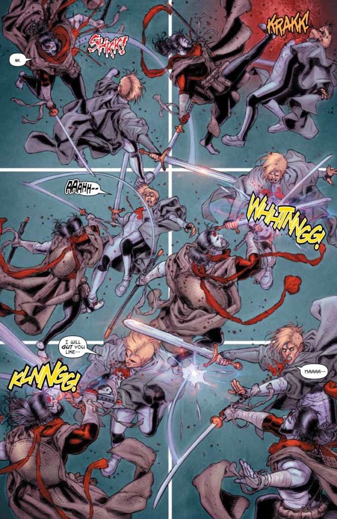
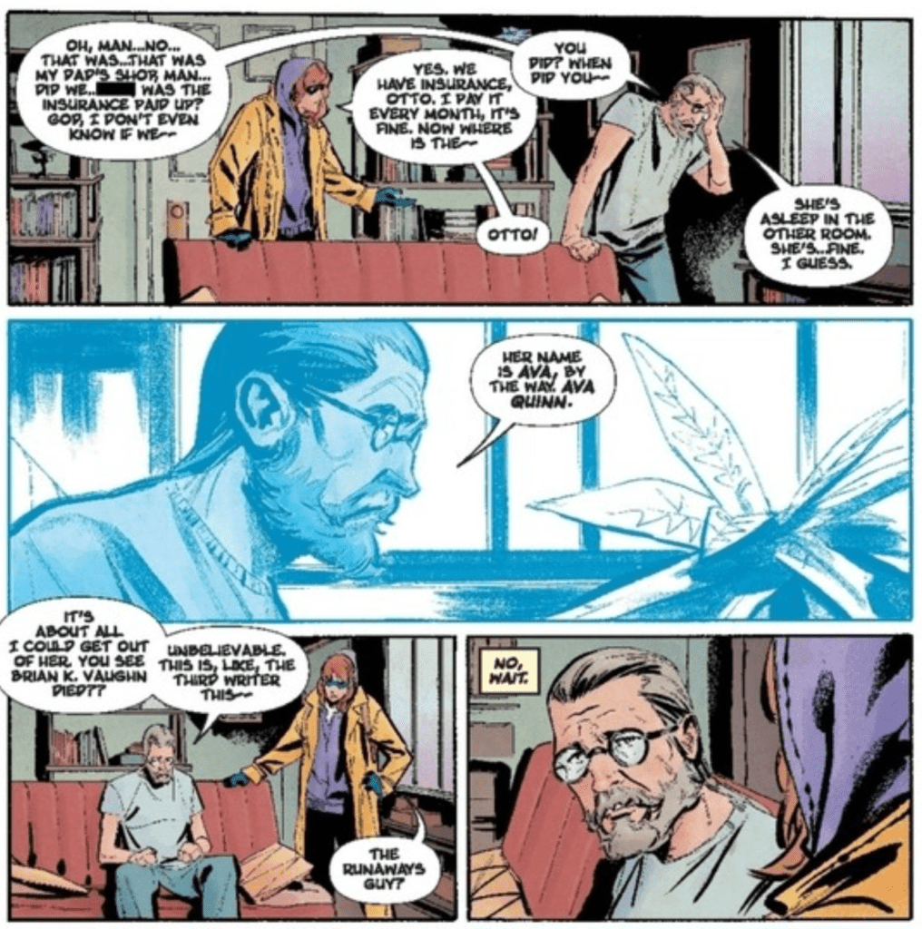
Within Rai #10 is a lot of anticipation both for what’s in the story and what’s to come afterwards. The opening pages call back to a conflict that stirs issues past, a conflict with technology and indifference. One of Rai and Raijin’s inner conflicts comes from how they want to live like humans, but they can’t deny that they’re part of their creator’s hold on the world. That same creator is a threat so severe that Lula has to abort her task on helping Bloodshot. But both conflicts come together near the end that will undoubtedly have the reader question the morality of the situation. Can beings of technology like Bloodshot and the cyborg brothers really live alongside organics? Or will they only destroy the memory of people like Rai’s companion Alice? Abnett leaves these questions in the air for the reader as the issue announces Rai’s return.

Closing The Gaps

A better portion of the issue

Ryp illustrates most of Rai #10, giving the action scenes a lot weight to movements. The use of afterimages displays Rai’s speed and strength above the average positronic android. It’s why the fight with Fusion is so notable, as every one of their movements can be followed by their body language. There’s no artistic licensing, just movements that the reader can follow to find the impact. Given the speed that Rai can go at, it makes the impact blows all the more impressive.

Then there’s Lobel, whose simpler art style contrasts with Ryp’s ultra definition. The two pages of Lobel’s art makes the fight from before lose half of its impact. Unlike before when each move looks telegraphed to give weight, the blows in these pages substantiate on speed lines on the borders; it’s almost like Rai and Fusion are rushing rather than fighting. Fortunately, the coloring by Dalhouse makes up for this by retaining the definition throughout. In Ryp’s fight scene, a splash of red heightens the impact of a kick by highlighting the speed it’s traveling. Then, in Lobel’s scene, the wrinkles of a coat are visible without lining and a glimmer of light of a sword. It’s that kind of consistency in color that allows readers to follow through despite Rai #10‘s sudden shift in artwork.

Words As Loud As Actions

Sharpe’s lettering gives impact in every page and panel in Rai #10. Making use of his stock wordmark images, the little changes make each action feel unique. Even the grunts in Rai and Fusion’s fight leads to the intensity of their battle. All of this leads to one wordmark that looks in dedication to a splash page marking the end of their fight. Sharpe also takes the opportunity to give characters a distinctive voice through fonts and word balloon coloring. Fusion’s classic font implies an older dialect, while Bloodfather’s red outlined word balloons gives off his fierce and commanding voice. Each word and little noise feels authentic and gives every moment twice as much impact.

Rai #10 Leaves Readers Wanting More

After such a climatic battle and major developments, readers have to wonder what’s next. Everyone involved in Rai #10 puts so much work and dedication to their craft, it feels shameful to leave things on a cliffhanger. Only time will tell what the next saga of the Valiant Universe’s future will display. But until then readers will be pleased with this chapter opening new possibilities.

Monkeys Fighting Robots Youtube

Review: RECKLESS Aims For Perfect, But Settles For Mind-Blowing

Brubaker Reckless Image Comics

Written by Ed Brubaker, with art and letters by Sean Phillips, and coloring by Jacob Phillips, Image Comics’ Reckless is nearly a perfect graphic novel. It’s a wild ride through a version of the 1980’s which feels more like a stale 1970’s. We meet a cast of characters, including titular Ethan Reckless, who are clinging to a past that’s gone, because there doesn’t seem to be much of a plan to see the future.

Writing

“If I had more time, I would have written a shorter letter.” That’s a quote that’s been attributed to Mark Twain, Winston Churchill, Blaise Pascal and more. It’s one of those things that rings so true, everyone wants to claim their hero said it. (Pretty sure it was actually Pascal, by the way.) Brubaker’s script is a good example of this idea. It’s just one draft away from being perfect. About a third of Brubaker’s captions feel unnecessary. As he introduces us to Ethan Reckless, we are also introduced to Ethan’s inner monologue. Some of it is just Brubaker giving us a sense of where we’re heading, and what Ethan has planned next. Other times, Brubaker harps on the right detail.

Details like our antagonist Wilder’s impression of Ted Bundy, or a flashback where Ethan and his old flame Rainy think they can just run away together. These are the kinds of details that tell us so much, while pretending to be innocuous. It’s still an incredibly strong script, with wonderful twists and turns. But there’s room for a little more mystery in these pages. And the strongest moments happen when there is no narration and Brubaker lets events speak for themselves. Like when Ethan and Special Agent Hancock take a tense ride home. Brubaker often does use extensive narration in his works — it provides the neo-noir feel that he’s mastered — but this feels a little bit heavier than usual. As we get deeper into the story, Brubaker becomes more and more focused on the right details, until we hit the magnificent finale.

Brubaker Reckless Image Comics

Art

Sean Phillips creates a visual rhythm in Reckless. There are essentially three forms his pages take: 1) with three rows of panels, two rows separated from the page’s edge by a white margin, while the third row is one wide shot that goes all the way to the edge of the page; 2) instead of the wide shot, Phillips has one panel connecting to a corner of the page; or 3) we get a splash with art covering the entire page. Phillips varies small things in these formats, but the layouts become familiar quickly. This means that the 10 pages, out of a good 150, that don’t fit the format slap the reader right in the face.

The few pages Phillips has that have a white margin around all of the art make the reader feel trapped. One page is even depicting gridlocked traffic. Another of these pages, Reckless is watching as his life explodes, unable to do anything. But one page layout, which Phillips only uses twice, sticks in the mind. On the upper left corner of the page and on the lower right, Phillips has two panels that go right to the page’s edge. On one page, we see Wilder. He’s a monster in the first panel, but in the last he suddenly feels dangerously human. On the other page, we see Reckless. In one corner he looks determined, maybe angry. In the other corner, he’s trying to look like he hasn’t just been crushed. These pages begin and end with a close up of a character, but what happens in between these images deeply affects how we see the character by the time we come back to them.

Brubaker Reckless Image Comics

Coloring

Jacob Phillips colors Reckless in a way that’s deliberately reminiscent of old pulp comics and paperbacks. At times, the coloring looks like it’s just a little off. The coloring for Reckless’ hair is smidge too far to the left, so it falls outside of the lines. It gives it the feel of something that went through the printer with the coloring and inking out of sync. But it isn’t distracting. It’s an accent to each page. Occasionally they’re to be noticed and appreciated as a callback, but only if you’re looking for it. Phillips used a similar style in Pulp, giving that graphic novel the same old-comics feel.

Phillips also balances a monotone feel with simple beauty brilliantly. We get the impression that Reckless’ life is pretty bland. Much of the color palettes showing his day-to-day don’t have much variation to them. But Phillips adds dashes of colors that jump out at you. Whether it’s the pink haze of what it’s like to see Rainy again, the neon orange and yellow of their erotic acid trip, or the bright red of a fist to the face, these are moments where our unfeeling protagonist actually feels. And while the rest of the comic does feel quite monotonal, each page being predominantly different shades of one color, it’s still gorgeous. Phillips manages to capture an unfeeling existence and keep it interesting at the same time.


Image Comics’ Reckless is nearly perfect. If the script were whittled down slightly, it would be perfect. As it is, it’s still a mind-blowing beginning to another fantastic series from Brubaker and the Phillipses! Don’t miss another awesome, pulpy, neo-noir crime comic from the guys who do it best. Reckless is out December 16th, from Image Comics, at a comic shop near you!

Monkeys Fighting Robots Youtube

Review: CROSSOVER #2 – The Calm Before the Storm

Crossover #2 Cover

Crossover #2, out now from Image Comics, is the second issue of this fun, fascinating world that is sure to become an epic for the ages that no comic fan will want to miss.

Crossover #2 Writing Example

A world where all of your favorite characters straight from the comic book pages come to life sounds terrific until you begin to think of all the innocent bystanders that are brutally murdered in the pages of your favorite superhero series. Crossover brings us this strange place where the horrors of people’s response to the heroes maybe even worse than the tragedies caused by the heroes’ presence. Crossover #2 shows us more of this situation where people’s fear turns to hate, which eventually leads to atrocities that are difficult to stomach. As always, Donny Cates creates a tale that establishes a strong emotional connection with ease. Whether it be through an innocent child that you hope no harm comes to or relatable comic-book-loving main characters, Cates gives you a reason to be engaged with the story.

Crossover #2 Art Example

Geoff Shaw’s work in Crossover #2 turns every time that Cates’ story pulls on your heartstrings into a vicious tug that leaves you feeling a deeper connection with the protagonists. The faces are stunningly emotive and bring the issue to life. Shaw also provides some gruesome art when given a chance. This issue didn’t feature much of this, but when Shaw can provide gore-filled art, it is incredibly effective at disturbing the reader.

Dee Cunniffe knows how to set a tone with coloring. Crossover #2 is a shining example of this. From the lifeless colors of jail to the malevolent reds of a threatening office, to the peaceful blues and purples of a “calm before the storm” scene, Cunniffe makes the reader feel the way he wants them to. It’s almost as if every color has a specific purpose, and it transforms the issue into a highly memorable read.

Crossover #2 Lettering Design

Crossover #2 features the lettering and design talents of John J. Hill, who created the fantastic logo of the series and organized the speech bubbles of the issue in a manner that allowed for the dialogue to flow naturally. Hill also uses distinct lettering for the headlines of a news channel in the issue. The choice of fonts and logo beautifully mimics real news stations and wonderfully immerses the reader into the fictional world.

You do not want to miss picking up Crossover #2 from your local comic shop. Cates, Shaw, Cunniffe, and Hill make it an enthralling experience and continue to set up its vast world. It continues to dip its toes into the water of the epic setting they have created, and it will leave you desperate to read more.

Monkeys Fighting Robots Youtube

Exclusive First Look: Marvel’s KING IN BLACK: GHOST RIDER #1

marvel comics exclusive king in black: ghost rider #1

KING IN BLACK: GHOST RIDER #1 is a one-shot hitting your local comic shop in March, but thanks to Marvel Comics, Monkeys Fighting Robots has the privilege of revealing the cover and solicit text for you.

The comic is by writer Ed Brisson and artist Juan Frigeri, with a cover by Will Sliney.

About the issue:
THE WAR FOR HELL’S THRONE MEETS THE KING IN BLACK!

All Ghost Rider wants is to destroy Mephisto, round up an army of escaped demons, and secure his seat on the throne of hell. Is that so much to ask? But now a dark god from space has shown up to throw the world into chaos, and some of Johnny’s old friends have come to ask for his help. It may take everything they’ve got to stop this madness. Maybe even…the devil himself?!

I miss writing Danny and Johnny, so was thrilled to get my mitts on Ghost Rider again. I think fans of what Aaron, Juan and I did in our recent series will be thrilled with this one shot, which will answer all of the questions they’ve been asking since it ended. Doing it all with backdrop of such an explosive event is the icing on the cake.” – Brisson

Check out the KING IN BLACK: GHOST RIDER #1 cover below:

marvel comics exclusive king in black: ghost rider #1


Are you enjoying Marvel’s KING IN BLACK event so far? Sound off in the comments!

Monkeys Fighting Robots Youtube