

Crossover #2, out now from Image Comics, is the second issue of this fun, fascinating world that is sure to become an epic for the ages that no comic fan will want to miss.
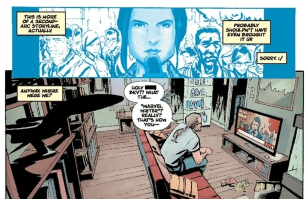
A world where all of your favorite characters straight from the comic book pages come to life sounds terrific until you begin to think of all the innocent bystanders that are brutally murdered in the pages of your favorite superhero series. Crossover brings us this strange place where the horrors of people’s response to the heroes maybe even worse than the tragedies caused by the heroes’ presence. Crossover #2 shows us more of this situation where people’s fear turns to hate, which eventually leads to atrocities that are difficult to stomach. As always, Donny Cates creates a tale that establishes a strong emotional connection with ease. Whether it be through an innocent child that you hope no harm comes to or relatable comic-book-loving main characters, Cates gives you a reason to be engaged with the story.
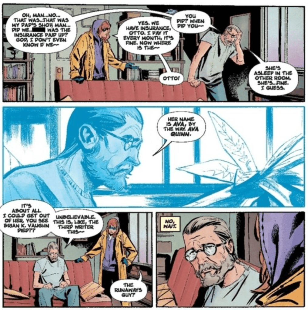
Geoff Shaw’s work in Crossover #2 turns every time that Cates’ story pulls on your heartstrings into a vicious tug that leaves you feeling a deeper connection with the protagonists. The faces are stunningly emotive and bring the issue to life. Shaw also provides some gruesome art when given a chance. This issue didn’t feature much of this, but when Shaw can provide gore-filled art, it is incredibly effective at disturbing the reader.
Dee Cunniffe knows how to set a tone with coloring. Crossover #2 is a shining example of this. From the lifeless colors of jail to the malevolent reds of a threatening office, to the peaceful blues and purples of a “calm before the storm” scene, Cunniffe makes the reader feel the way he wants them to. It’s almost as if every color has a specific purpose, and it transforms the issue into a highly memorable read.
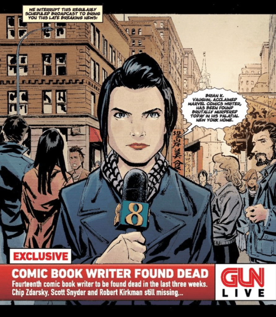
Crossover #2 features the lettering and design talents of John J. Hill, who created the fantastic logo of the series and organized the speech bubbles of the issue in a manner that allowed for the dialogue to flow naturally. Hill also uses distinct lettering for the headlines of a news channel in the issue. The choice of fonts and logo beautifully mimics real news stations and wonderfully immerses the reader into the fictional world.
You do not want to miss picking up Crossover #2 from your local comic shop. Cates, Shaw, Cunniffe, and Hill make it an enthralling experience and continue to set up its vast world. It continues to dip its toes into the water of the epic setting they have created, and it will leave you desperate to read more.