

It’s fitting that writer Tom King, artist Jorge Fornes, colorist Dave Stewart, and letterer Clayton Cowles make DC Comics’ Rorschach such an ambiguous storyline. After all, that’s what a Rorschach is. An ink blot that seems different from each new set of eyes. DC Comics’ Rorschach #3 is full to the brim. Full of what? Well, that depends on the reader.
Writing
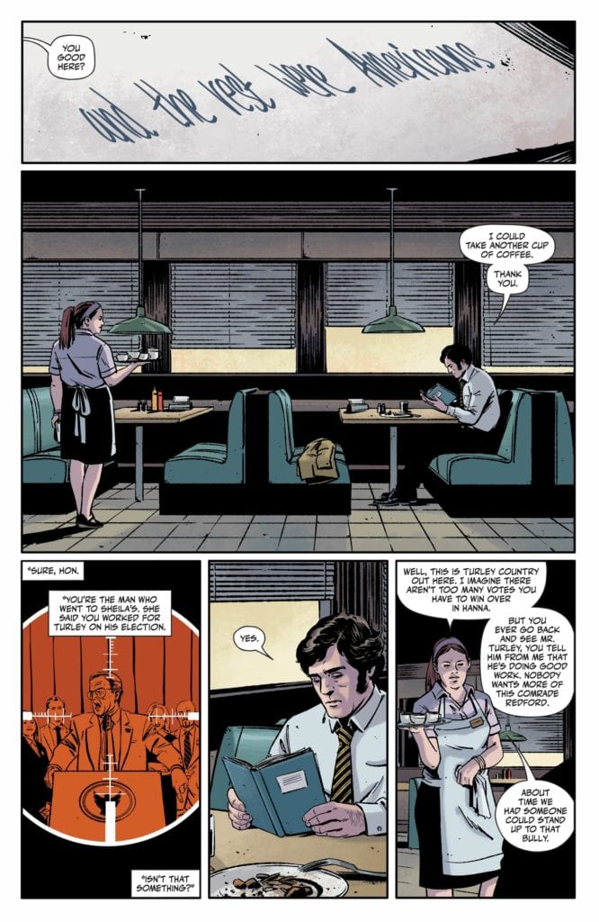
I’ve said it before, I’ll say it again: Rorschach is unlike any other work from King. It’s full to bursting with dialogue and captions. Rorschach #3 begins with a New York Times article about a coal mine explosion. It’s tangentially related to the plot, and even then, it’s not clear how. King is allowing the reader to make the connections they see instead of spoonfeeding us answers. King shows us some of Laura’s upbringing, one of our antagonists (protagonists?), in this issue. We witness her and her father bonding over death and guns and fear. But what do we see? It could be that we see a dangerous indoctrination into the beliefs of the radical right. We might see the unlikely beginnings of someone who shook off their upbringing to save the world. Or, we might see something deeper that evades words. Really, it depends on how you look at it. Somehow King does it again. He flies in the face of his own style, with huge chunks of text and plenty of dialogue, but maintains every ounce of the subtext and subtlety he’s known for.

Art
Fornes’ use of time in Rorschach #3 is inspired. It’s something he’s been playing within this series. The last issue had a brilliant back and forth between flashbacks and modern-day. But Rorschach #3 begins to blur the lines. Fornes divides one page right down the middle. Panels on the left-hand side are modern-day, and panels on the right are in the past. But these characters almost seem to be able to see each other. It’s eerie. There are also a few moments where panels have gutters running through them despite them depicting a singular moment. They’re one image, divided into several panels. And though it seems to be purely decorative initially, it reads differently upon closer inspection than a single uninterrupted image would. We see Laura, shot as she was in the first issue. But it’s four panels. It makes the moment feel like it lasts longer like it puts time on pause. Fornes is constantly pushing the boundaries of how he can communicate time on the page, and with each issue, his experiments are bringing forth more jaw-dropping results.
Coloring
Stewart is a big part of the reason that Laura’s upbringing feels so disturbing. There’s a calmness to these scenes. As Laura’s father shows her his gun collection or teaches her about mind-controlling squids, it’s as though the page refuses to clue in on what’s being said. The page stays a calm yellow, depicting a mid-afternoon, or a light blue showing the early morning glow. This is how Stewart shows us how normal these things are to Laura and her father. Yet Stewart also continues to remind us where this is all headed. With the occasional interruption of Laura’s demise thrown in, in bold red, Stewart depicts a casual saunter towards doom. It’s beautiful, it’s infuriating, and it’s a magnificent visual representation of dramatic irony. It gets right under the reader’s skin.
Lettering
Cowles shows us Laura in her natural habitat. We see how gunfire and laughter are all part of her environment. As she’s shooting targets with a machine gun, we see her surrounded by the “RATATAT” noise. The sound is in the background, almost like something she doesn’t even notice anymore. Similarly, we see her around a campfire with a bunch of guys. A twelve-year-old girl among a bunch of militiamen. But her smiling face, with her tongue out, is shown in front of the noise of their laughter. And while the “BLAM” of her gunfire is quite noticeable throughout the issue, it comes up so often it becomes commonplace. The “BLAM” of her shooting beer bottles is as innocuous as the more devastating shots that follow. It’s only the “BLAMM,” with an extra “M” added in, of her being gunned down, as she was in the first issue, that stands out. The sound looks mechanical and unfeeling compared to the playful gunshots of earlier pages. Cowles reminds us that this girl was born into violence but leaves us to wonder if she’s quite the same as the men who took her out.
DC Comics’ Rorschach #3 feels timely, but it’s hard to say just how. That’s because this creative team doesn’t offer their own interpretations. They ask the reader to look at the inkblot and tell them what they see. It’s a brilliant example of how a text-heavy script can still maintain subtlety and subtext, leaving room for the reader to do their work. Pick up Rorschach #3, out from DC Comics on December 15th, at a comic shop near you!